Tag: royal
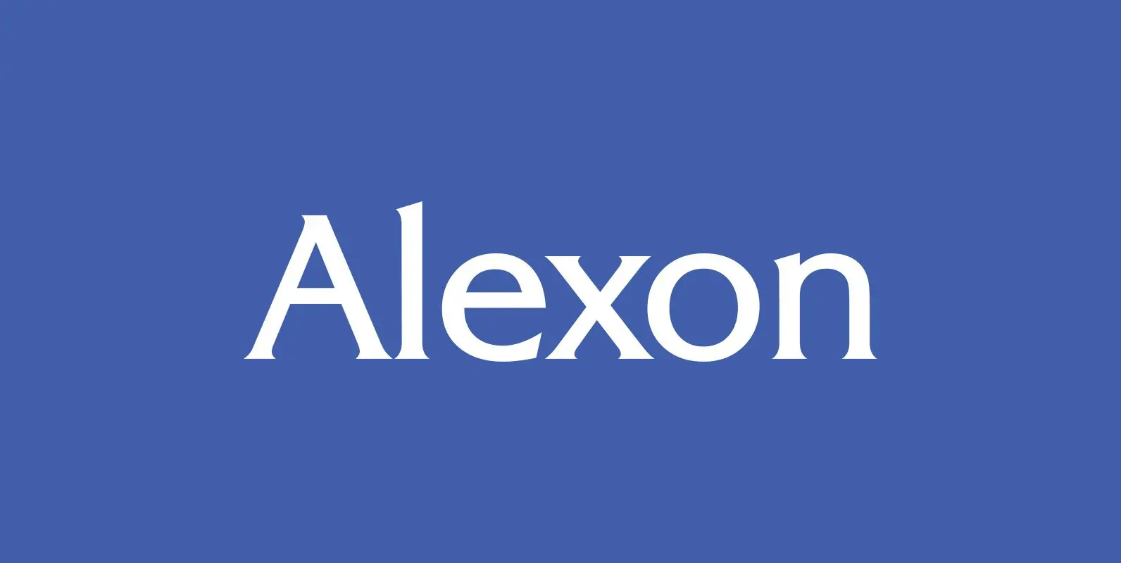
Alexon Font
Designed by Les Usherwood. Digitally engineered by Steve Jackaman. Originally in one weight, Steve designed and produced three additional weights. Published by Red RoosterDownload Alexon
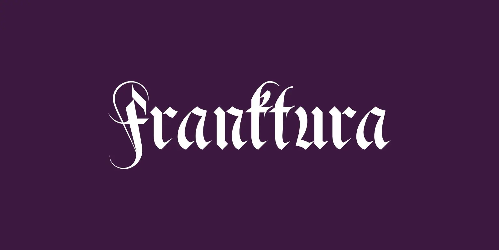
Fraktura Font
“Fraktura” and “Fraktura Plus” is a set of classical Fraktur (Blackletter) in a modern interpretation. The two fonts differ in the amount of embellishments and can and should be mixed. I only sell the pair, but for a fair price.
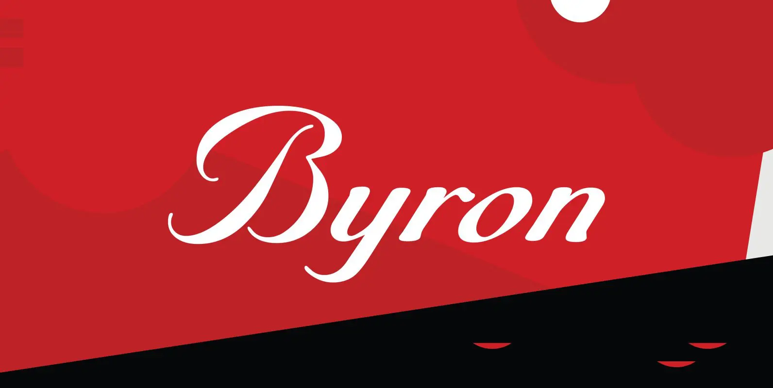
Byron Font
Designed by A. Pat Hickson, Byron is a script font based on a turn of the century design. Published by Red RoosterDownload Byron
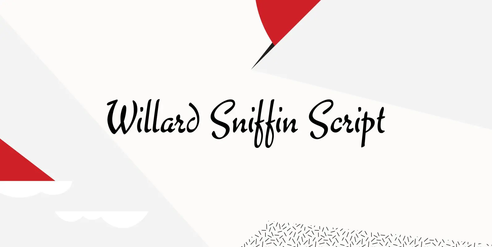
Willard Sniffin Font
Designed by Willard T. Sniffin. Digitally engineered by Steve Jackaman. Based on the original Willard T. Sniffin design of 1933 for ATF, this informal brush script was known as Keynote. Published by Red RoosterDownload Willard Sniffin
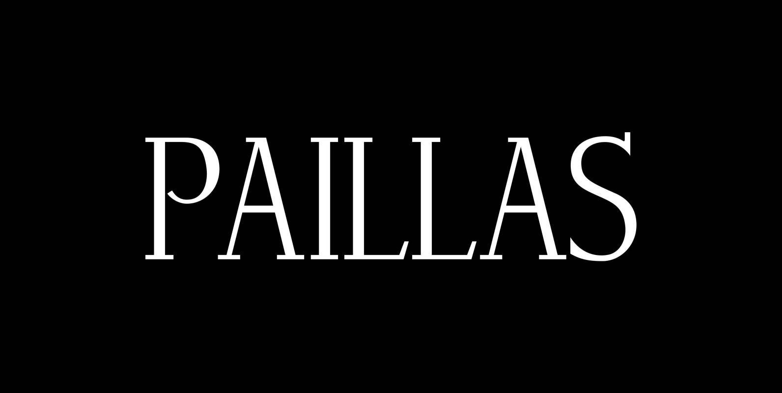
Paillas Font
“Paillas” is a very elegant and unusual Antiqua typeface I have been working on during the last three years. So far I just have the normal and oblique cuts, but eventually I will design a bold version as well. Published
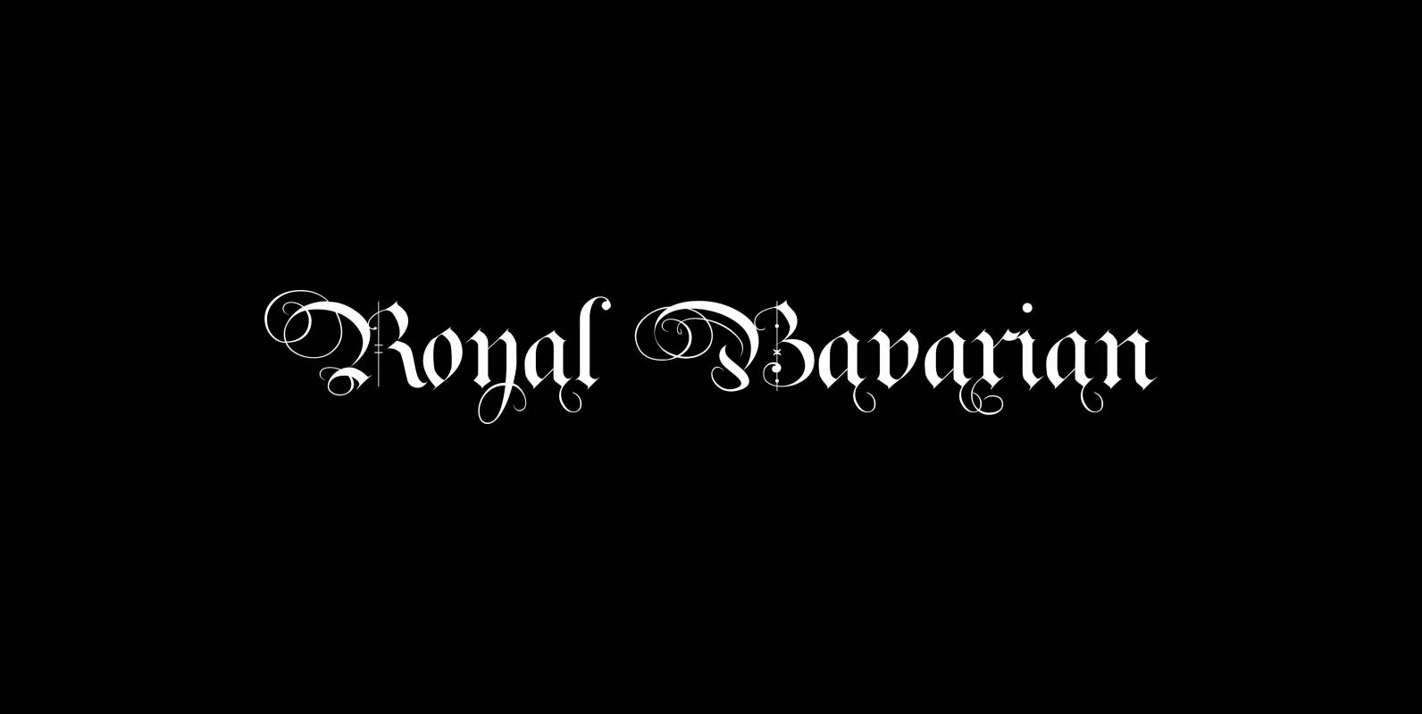
Royal Bavarian Font
“Royal Bavarian” was commissioned by King Ludwig 1st of Bavaria round about 1834. He was probably the greatest king Bavaria ever had, but he fell in disgrace for a short affair with the famous infamous “Lola Montez” and subsequently had
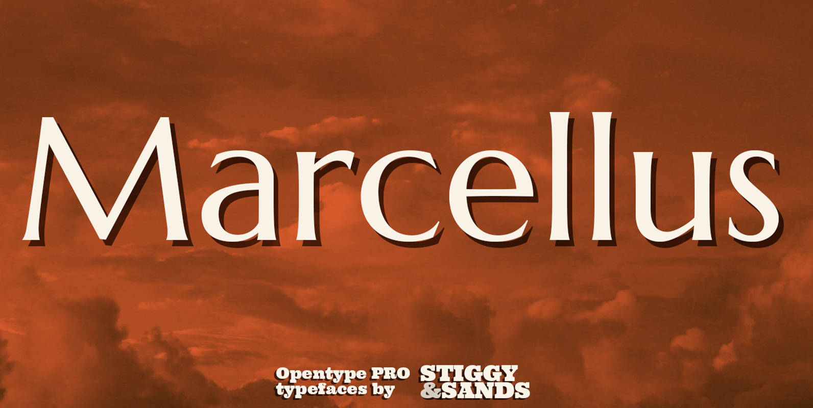
Marcellus Pro Font
Our Marcellus Pro was inspired by classic Roman inscription letterforms. Clarity and beauty are embodied in the standard lowercase, while this historically influenced typeface also nods to the powerful presence of the Trajan titling style with its SmallCaps set. When
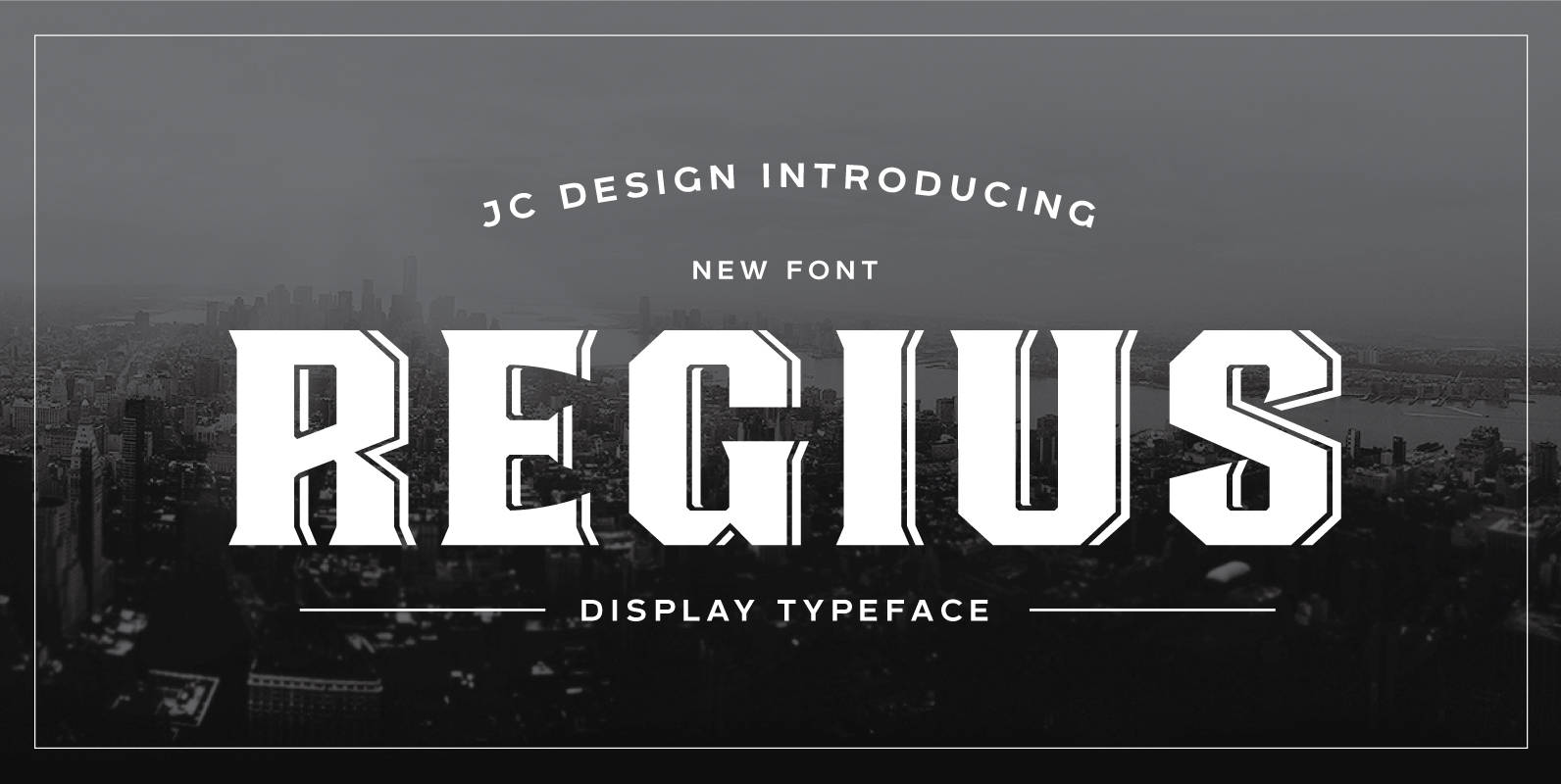
Regius Font
Regius was originally created as a corporate typeface for etiket packaging-design. It takes its inspiration from the old english pub signs. This retro font boasts simple shapes and reduced ornamental structures, yet still yielding an overall art deco -influenced look
Balladeer Font
Balladeer is an elegant, classical script design coming in three styles as Light, Medium and Bold. Published by URW Type Foundry GmbHDownload Balladeer
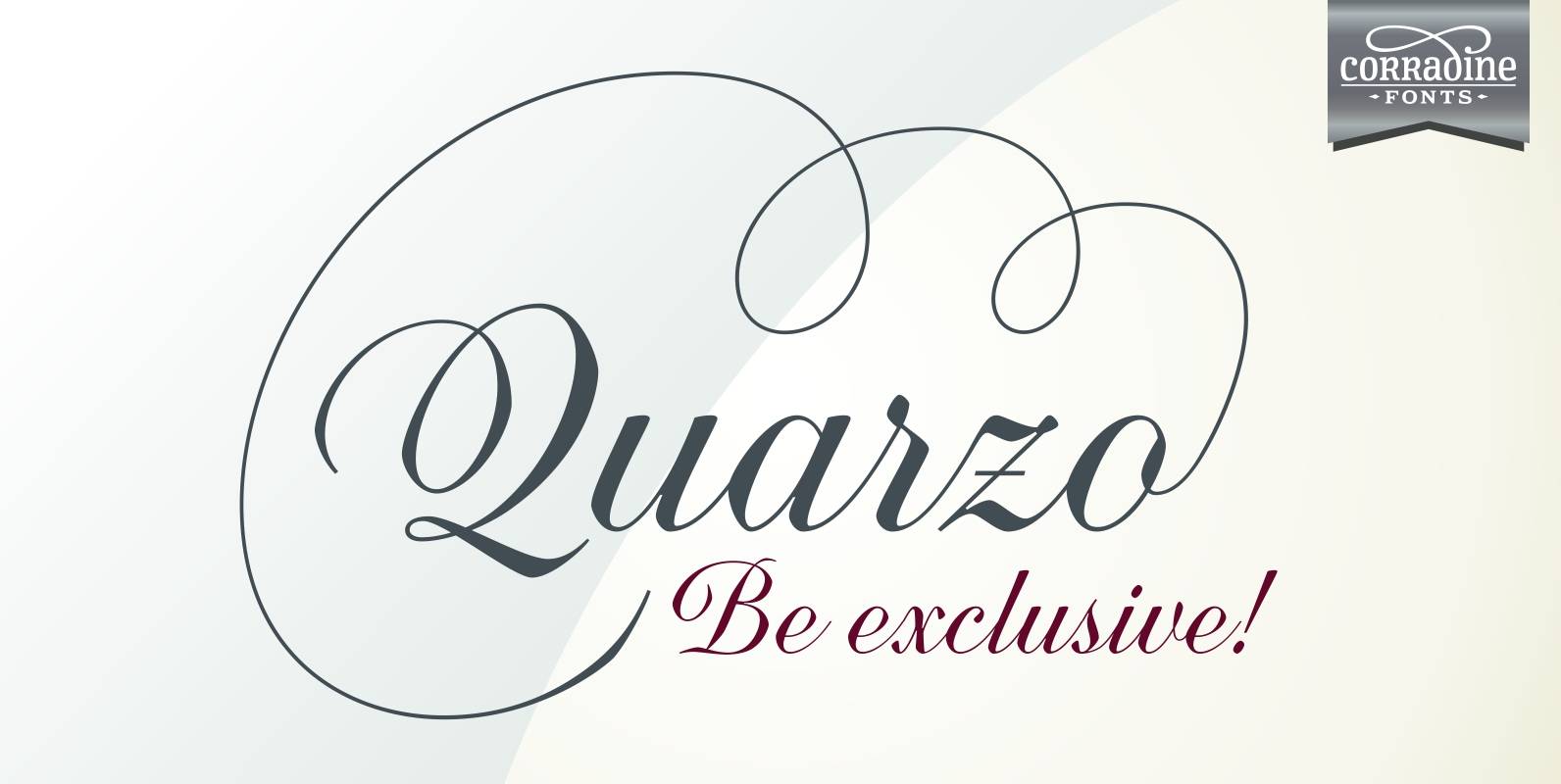
Quarzo Font
Quarzo is inspired by the flexible nib strokes to create a concatenation of refinement with character mixing the contrast with pronounced but rounded angles. This angles along with the inktraps give the font a better performance when printing. Texts will
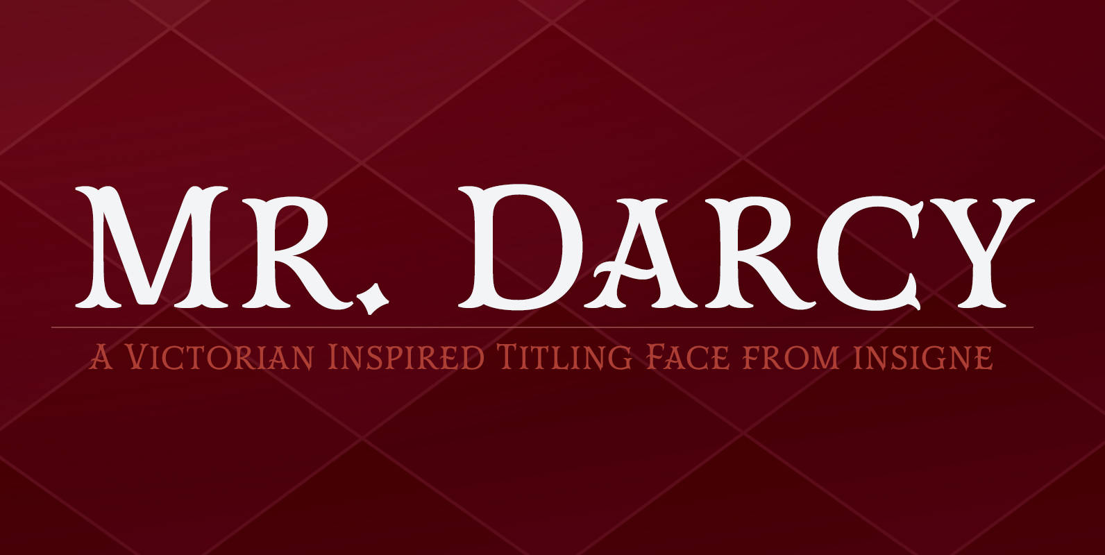
Mr Darcy Font
The elegant and very graceful Mr. Darcy is sufficiently compete with its additional characters–to be stated more precisely, over 136 defining alternates. These optional features are carefully displayed within the supplied brochure. The employ of the Mr. Darcy family moreover
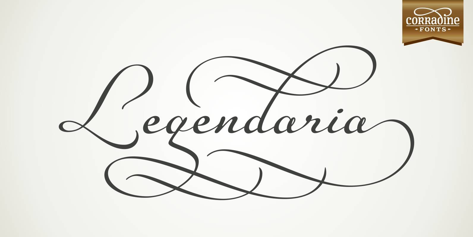
Legendaria Font
Legendaria is a very sophisticated and elegant connected script font. Its more than 1300 ornamented characters make it incredibly versatile. Most lower case letters have at least 15 different options, including tails and flourishes. Published by Corradine FontsDownload Legendaria
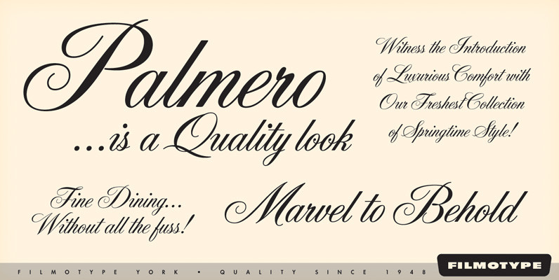
Filmotype York Font
Offered by Filmotype in the late 1950s to establish its Formal Script category with this copperplate script, Filmotype York is perfect for formal wedding invitations and formal or elegant occasions while retaining a balanced weight making it both visually stylistic
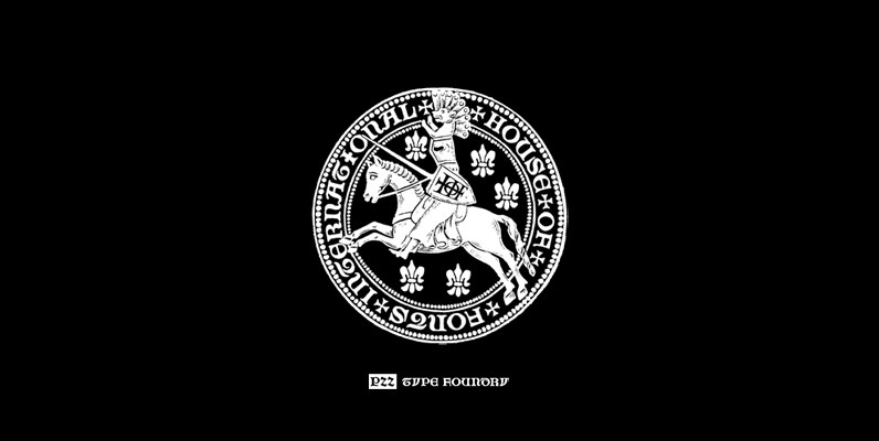
P22 Numismatic Font
Originally offered by the Devinne Press in the early 1900s, the Numismatic typeface features the letters, Arabic figures and ornaments used by designers and engravers of seal, coins, medals and inscriptions upon metal or stone during the fifteenth and sixteenth
PF Monumenta Pro Font
Royal, majestic, elegant. These letters are based on Roman and Greek characters carved on stone. They come in 3 different styles. Normal and Shaded are designed to have serifs with a finer thinning. On the other hand, Metallic is bolder
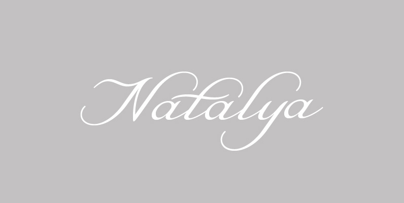
Natalya Font
Natalya is a flashy and rhythmic script. The script has more space between characters than most for better legibility, and the basis point for the ornate swirls is the golden ratio. This makes for an especially harmonious typeface with timeless
Astoria Font
Based heavily on Gill Sans especially in the mid weights, Astoria has a subtle top left serif which makes it not quite a Roman and not quite a Sans. Designed specifically as a text face it still works very well