Tag: russian
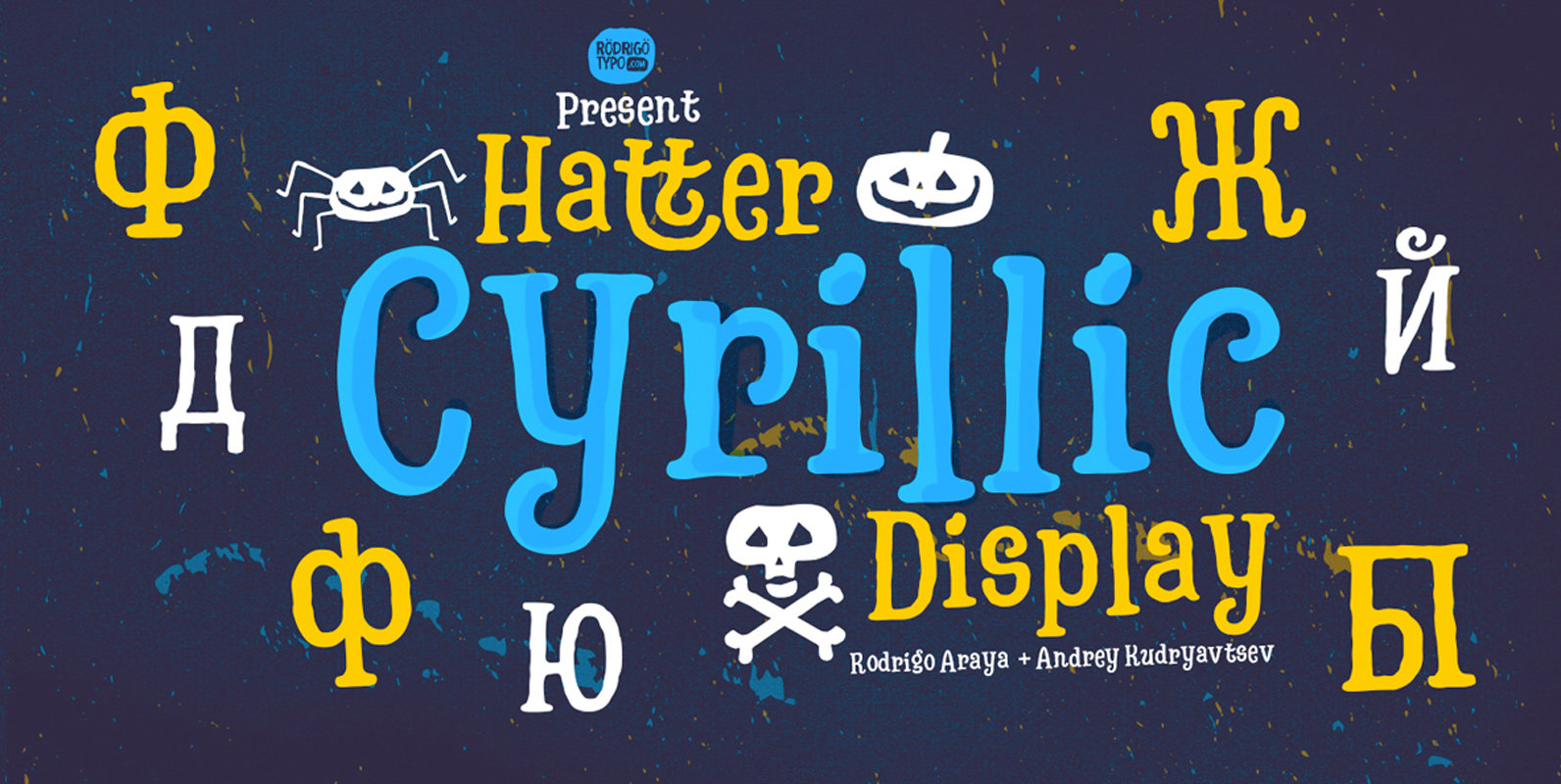
Hatter Cyrillic Display Font
Hatter Cyrillic Display is a decorative font design published by RodrigoTypo Published by RodrigoTypoDownload Hatter Cyrillic Display
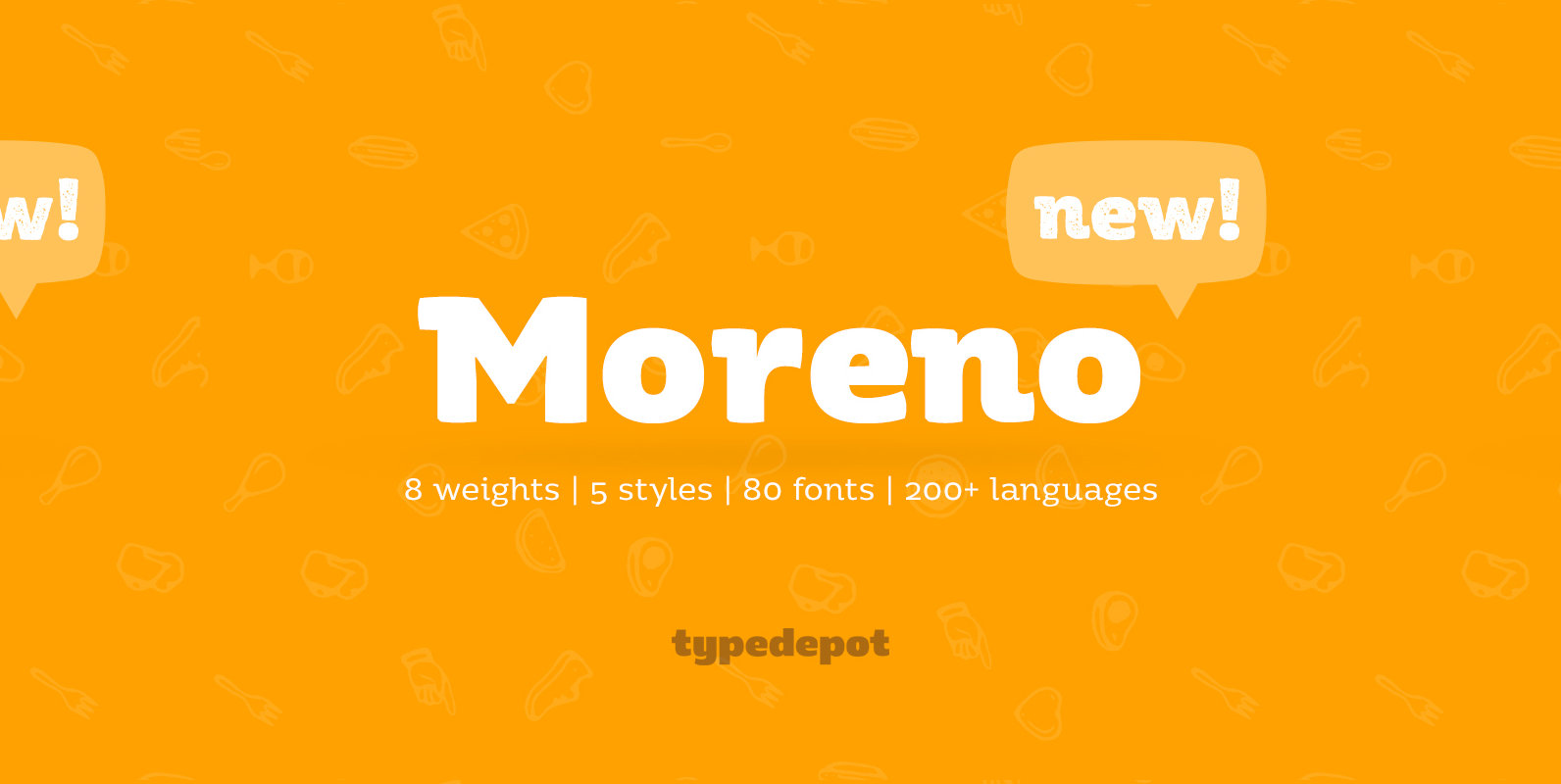
Moreno Font
Meet Moreno – a semi serif typeface full of personality and flavor. A display typeface in its nature Moreno is free and informal yet stable and trustworthy. Moreno comes with extensive OpenType support – with its more than 15 Opentype
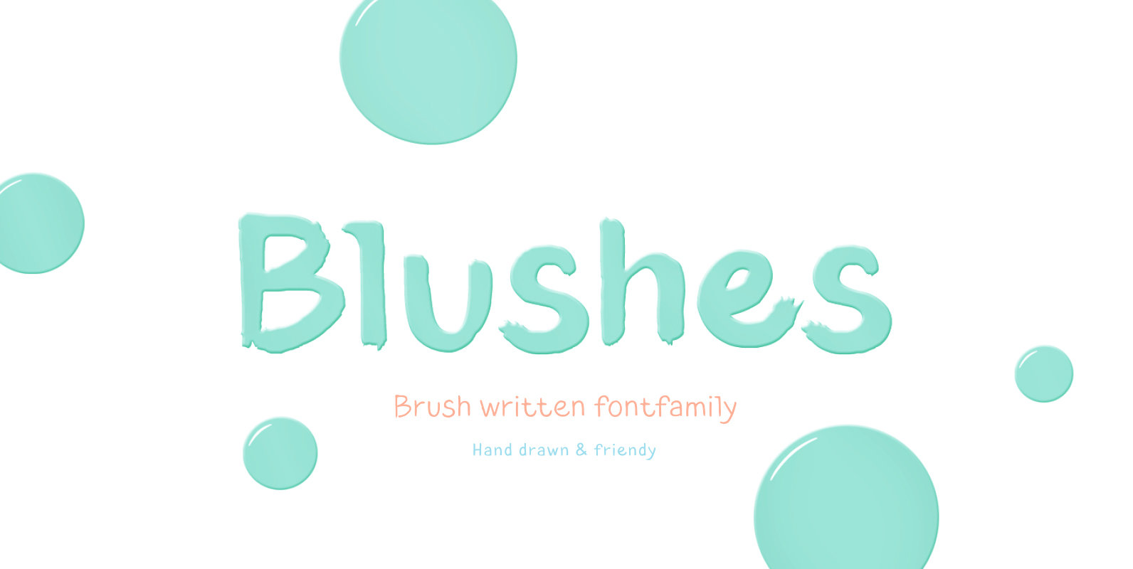
Blushes Font
Glitter, flashing cameras and fame – now you know how to deal with this stuff! Freshness and brightness is what defines the Blushes font family, which is created for beauty and fashion industries. Blushes is a vibrant part of you
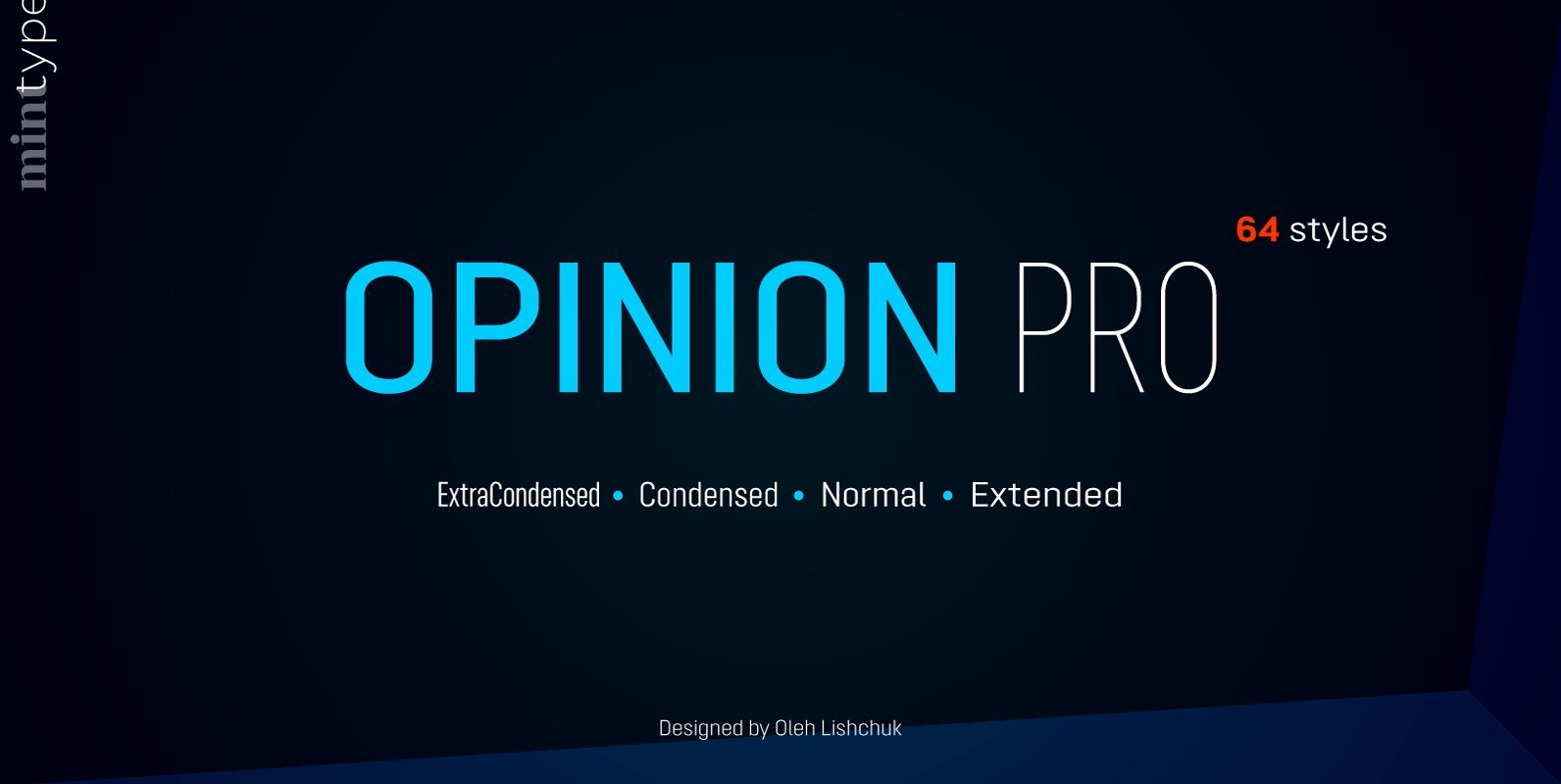
Opinion Pro Font
Opinion Pro is a geometric sans-serif typeface with extra-large x-height that comes in 64 styles. It is composed of 4 width variations, each in 8 weights with respective italics. Its rigid curves with pronounced vertical stems makes it useful as
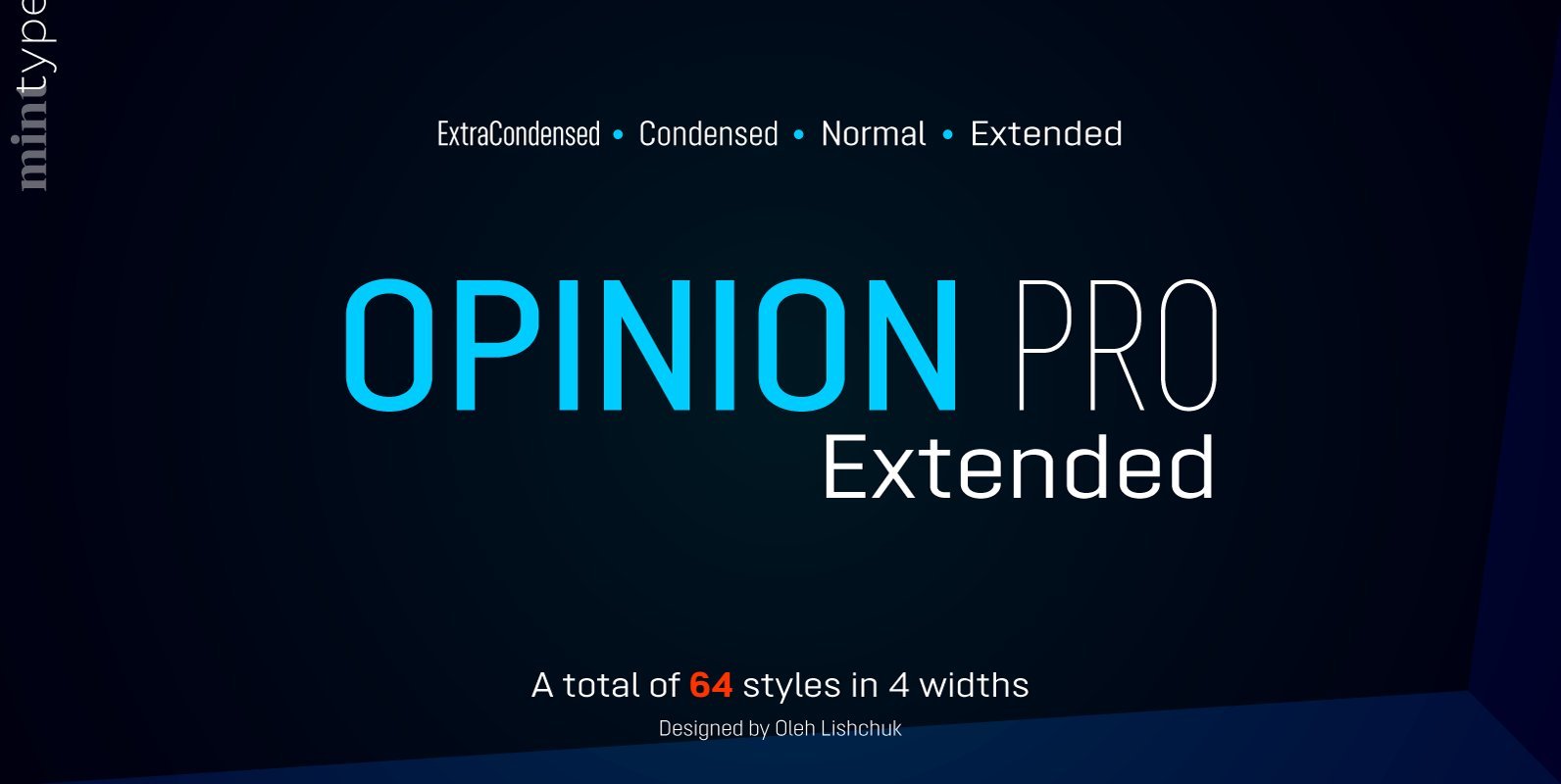
Opinion Pro Extended Font
Opinion Pro is a geometric sans-serif typeface with extra-large x-height that comes in 64 styles. It is composed of 4 width variations, each in 8 weights with respective italics. Its rigid curves with pronounced vertical stems makes it useful as
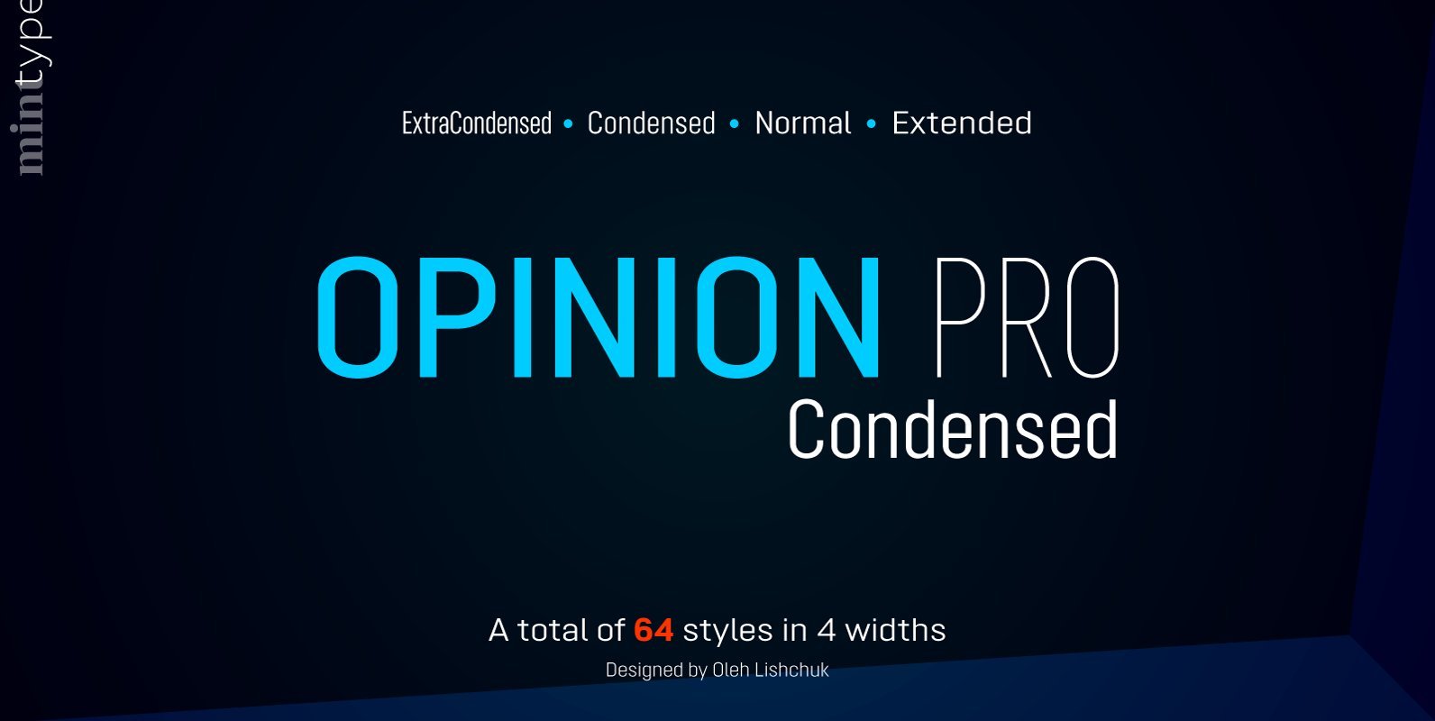
Opinion Pro Condensed Font
Opinion Pro is a geometric sans-serif typeface with extra-large x-height that comes in 64 styles. It is composed of 4 width variations, each in 8 weights with respective italics. Its rigid curves with pronounced vertical stems makes it useful as
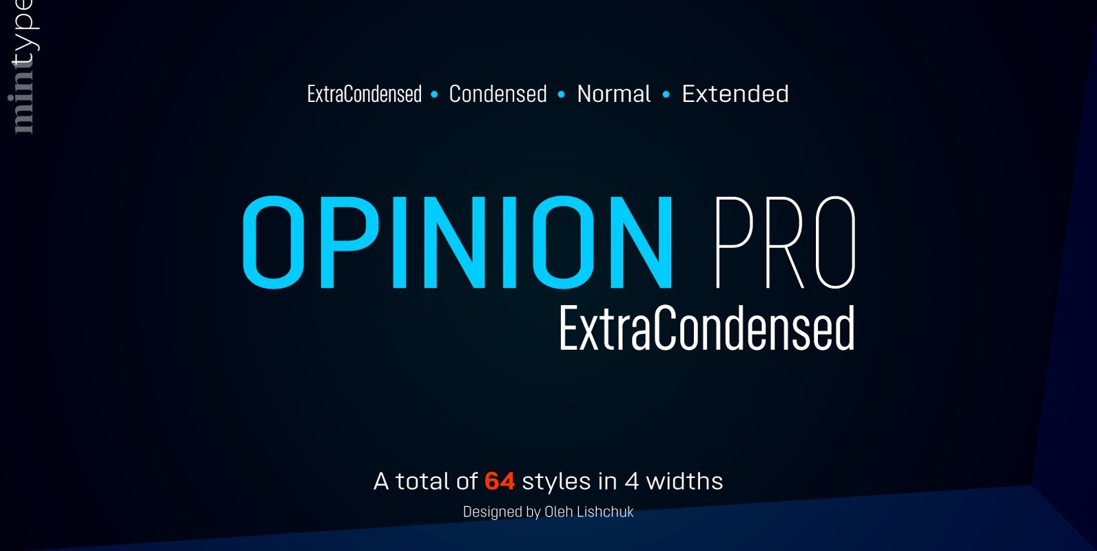
Opinion Pro ExtraCondensed Font
Opinion Pro is a geometric sans-serif typeface with extra-large x-height that comes in 64 styles. It is composed of 4 width variations, each in 8 weights with respective italics. Its rigid curves with pronounced vertical stems makes it useful as
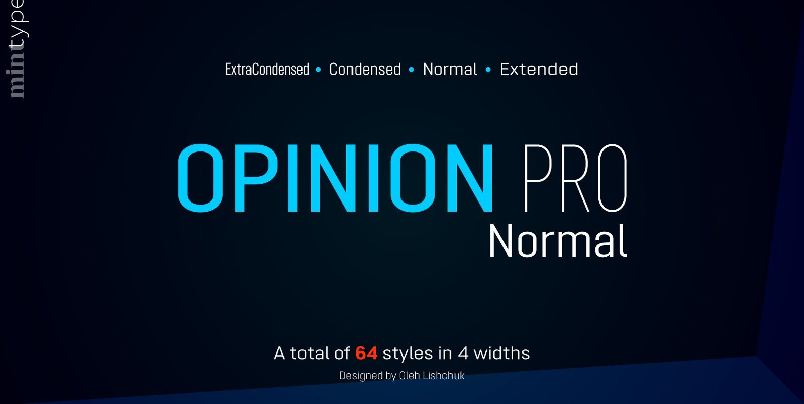
Opinion Pro Normal Font
Opinion Pro is a geometric sans-serif typeface with extra-large x-height that comes in 64 styles. It is composed of 4 width variations, each in 8 weights with respective italics. Its rigid curves with pronounced vertical stems makes it useful as
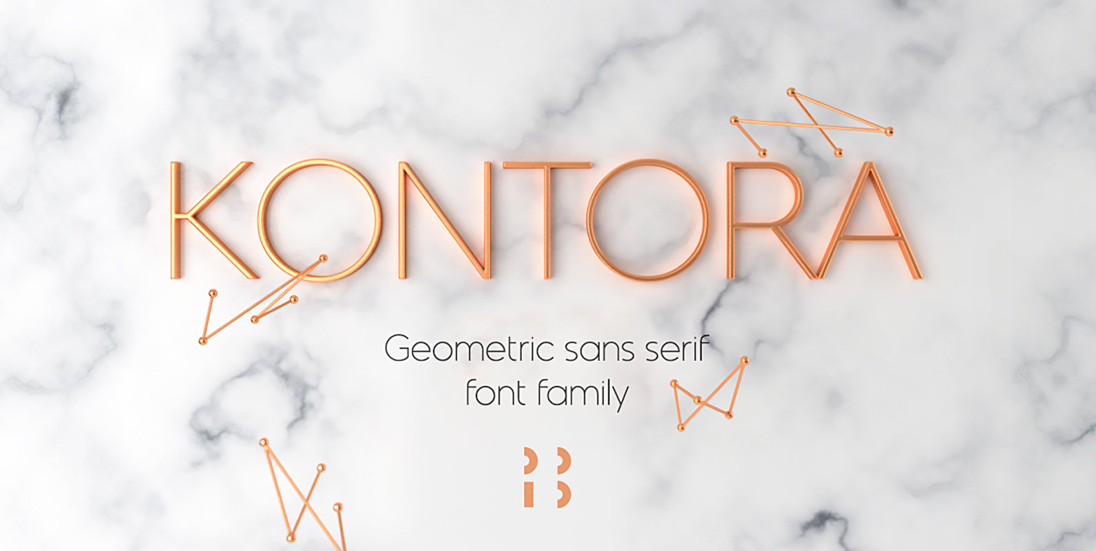
Kontora Font
Kontora is a basic and universal geometric grotesque design, that can be applied to various styles of layouts. It has minimum details, mostly modern proportions and letter forms, along with a touch of retro. Published by NaumTypeDownload Kontora
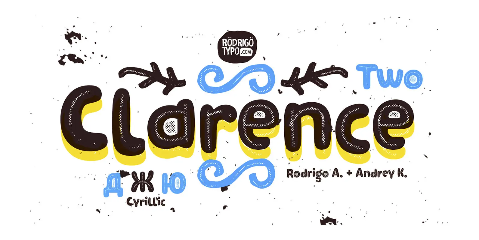
Clarence Two Font
Clarence Two is a decorative and rounded style sans-serif font design. Published by RodrigoTypoDownload Clarence Two
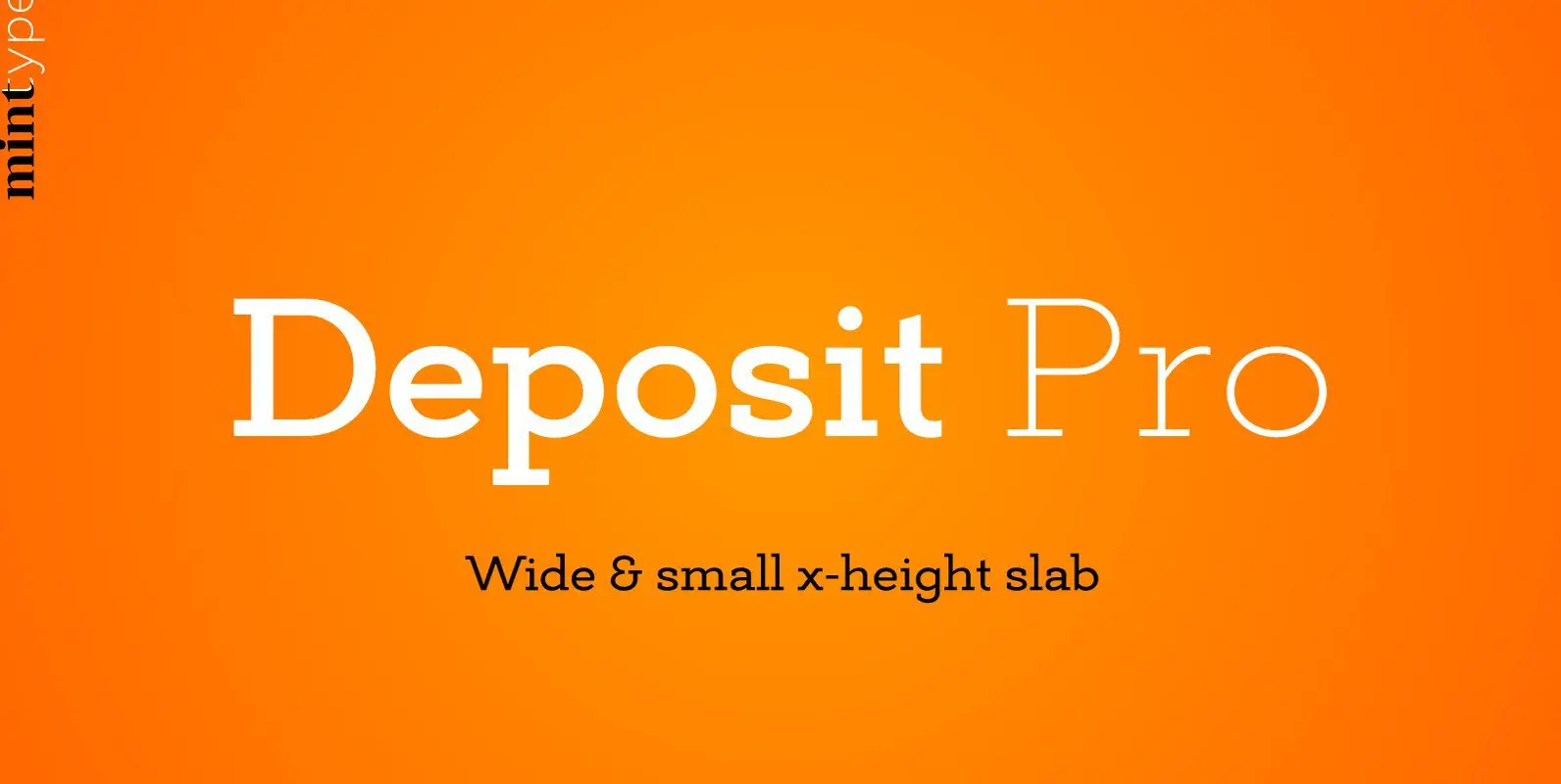
Deposit Pro Font
Deposit Pro is a wide slab-serif family with low x-height. In both headlines and paragraph text it creates a serious yes friendly texture, making it particularly suitable for corporate communication design. Deposit Pro consists of 16 styles (8 weights and
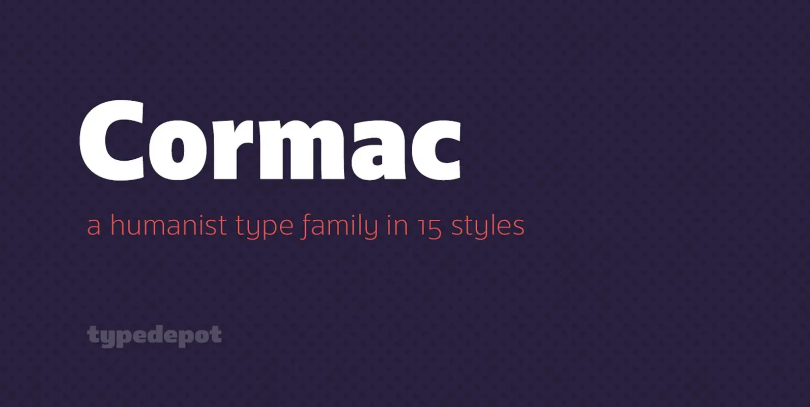
Cormac Font
Cormac is a humanist typeface characterized with it’s large x-height and slightly flared stems. The word that best describes our ideas in the beginning of the project is “simple” – the idea behind it was to strip the letter forms
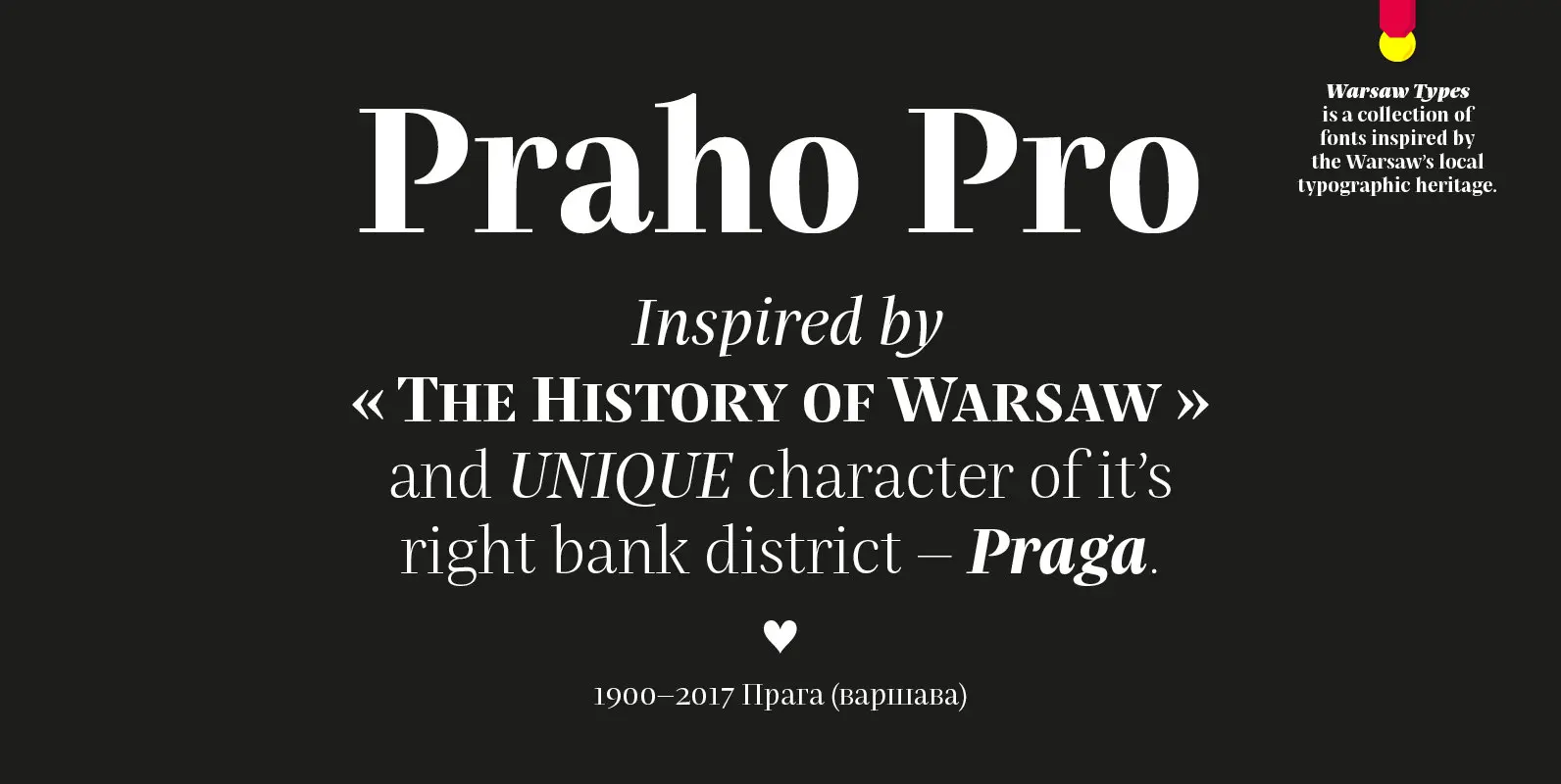
Praho Pro Font
Praho Pro is a part of Warsaw Types – a project based on Warsaw’s local typographic heritage. The project, presented at the Museum of Praga, is a collaboration of 12 young Polish typographers. Praho Pro is a multilingual family inspired
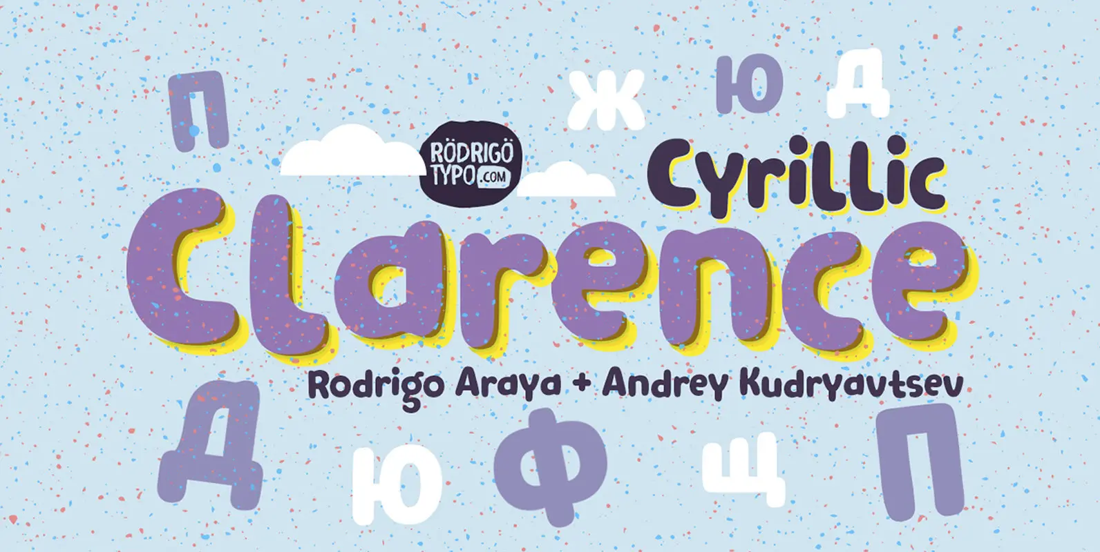
Clarence Cyrillic Font
Clarence Cyrillic is a playful and rounded display font design. Published by RodrigoTypoDownload Clarence Cyrillic
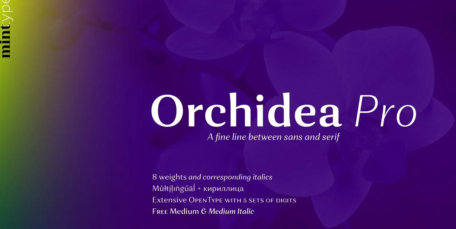
Orchidea Pro Font
Orchidea Pro is a typeface balancing on the verge of sans and serif. Called a stressed sans or a serifless serif, it does not feature any serifs, but resembles a serif typeface by build, and features unilateral nibs that speed
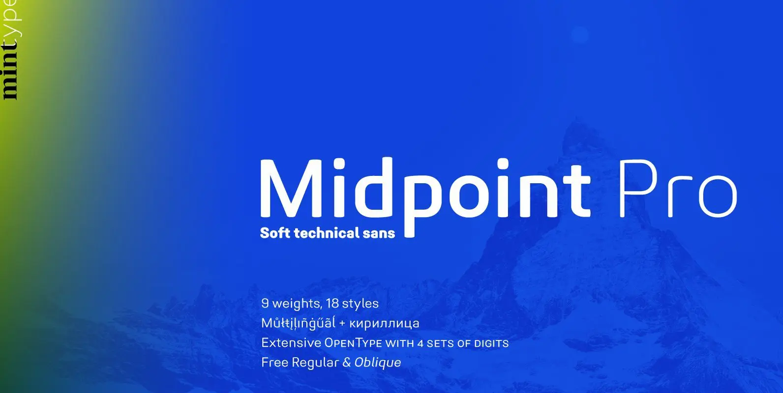
Midpoint Pro Font
Midpoint Pro is a soft sans-serif typeface with a modern technical look. Its spurless design creates a perfect balance between static rigid verticals and softened endings. The interplay of open and closed forms suggests increased legibility in small sizes and
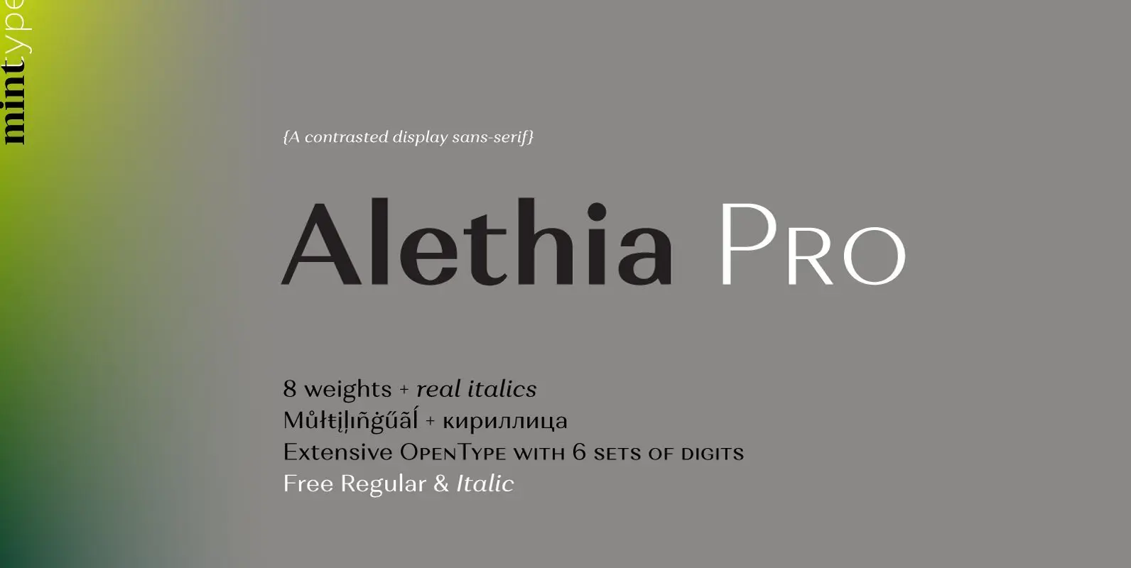
Alethia Pro Font
Alethia Pro is a grotesque sans-serif typeface with high contrast in all weights. It has been designed to serve as a display typeface in various editorial projects, such as magazines or corporate brochures, as a sans-serif pair to serif types
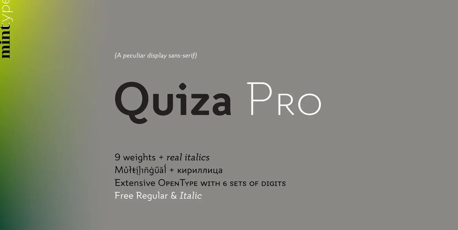
Quiza Pro Font
Quiza Pro is a geometric display sans with added playfulness created around a single dot. Its peculiar rounded diamond shape has inspired many additional details such as similar cuts in diagonal strokes, or occasional serifs in ascenders and capital letters.