Tag: Sans-Serif
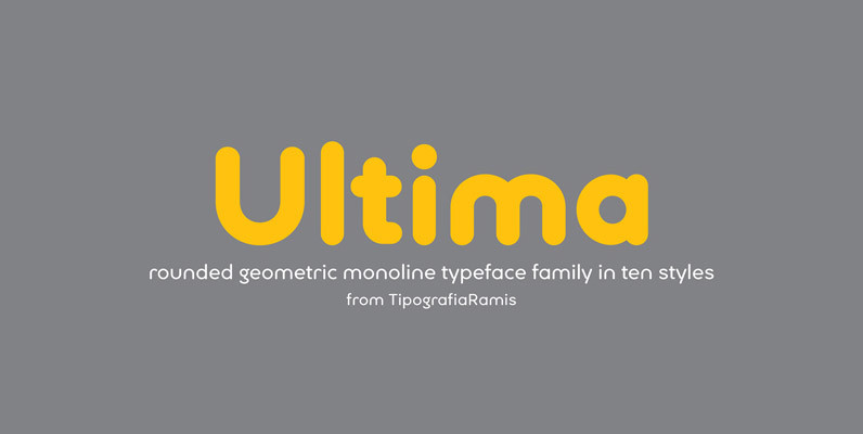
Ultima Font
Ultima is a rounded geometric monoline typeface family, built in ten styles. The typeface is ideal for use in display sizes, though is quite legible in text. Published by TipografiaRamisDownload Ultima
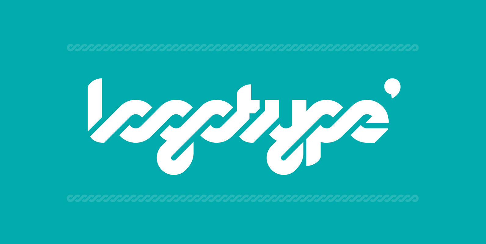
Logomotion Font
This is a typeface specially designed for logotypes, but can also be used in headlines, posters & signage. It has many OpenType programming features, that give a more playful and rhythmic spirit, creating an interesting geometric-sans and script mixture. The

Martines Font
An interesting and clean sans originally designed by Claudia Kipp in 1980, works great in both body and headline usage. Published by URW Type Foundry GmbHDownload Martines
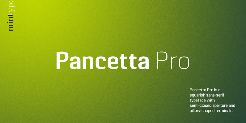
Pancetta Pro Font
Pancetta Pro is a squarish sans-serif typeface with semi-closed aperture and pillow-shaped terminals. The shape of a pillow is furthermore used to enliven the boring horizontal stems which are very frequent in Cyrillic script, and get rid of the right

Merlo Round Font
Font Merlo Round is the younger brother of Merlo. Font Merlo Round is characterized by twelve different varieties – lower and uppercase characters. It is inspired by a You And Me Monthly published by National Magazines Publisher RSW „Prasa” that
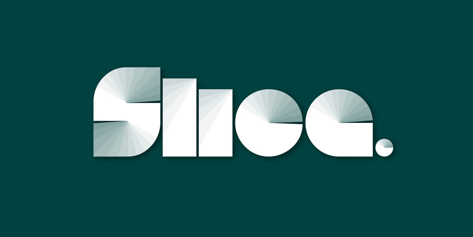
Slice Font
Slice is an experimental, circular, display typeface designed by Superfried. Slice, like its big brother Slash, also features key incisions to form the glyphs. Unlike Slash, Slice is much simpler in design based on basic geometric forms and features both
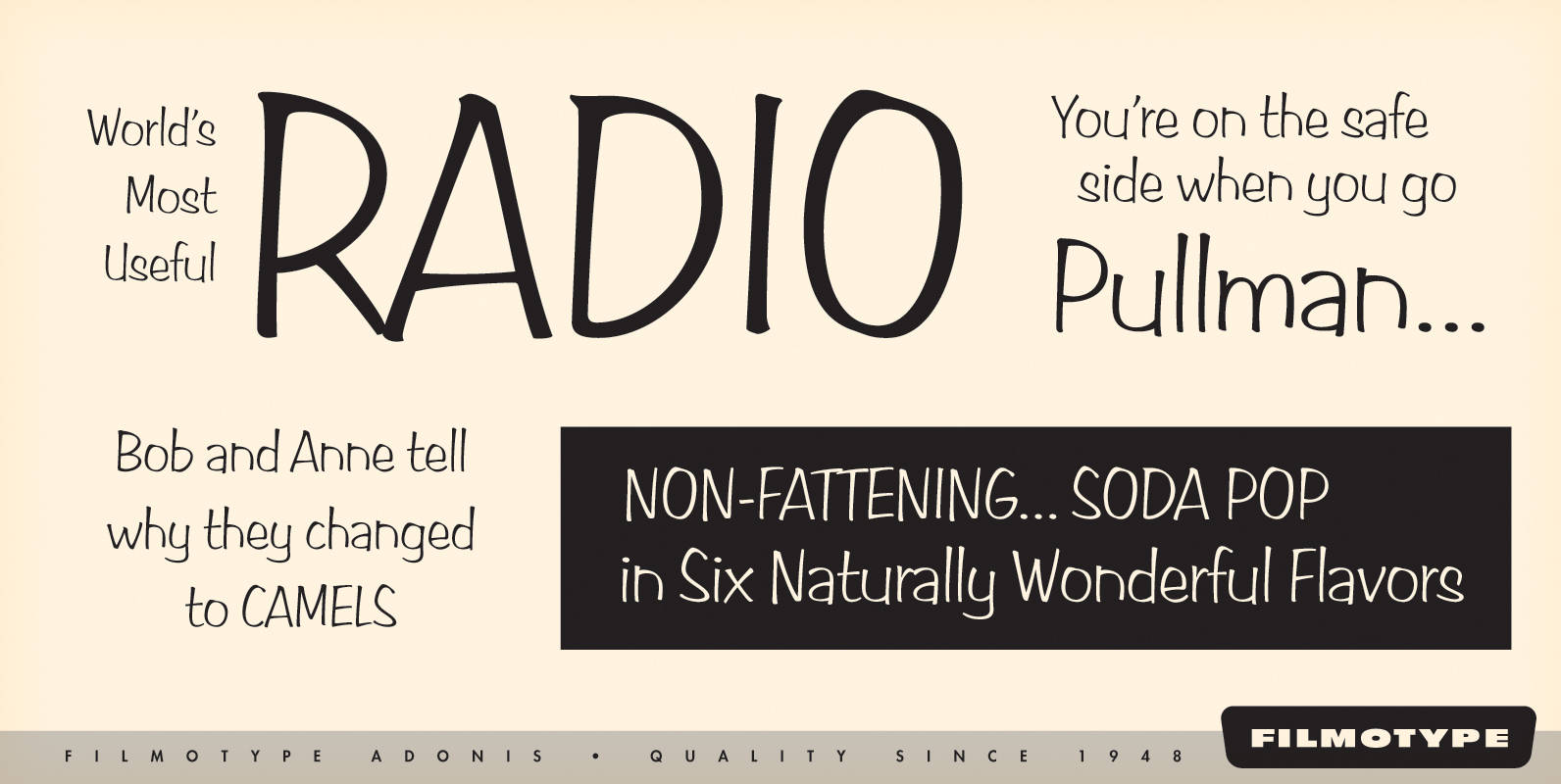
Filmotype Adonis Font
Filmotype Adonis is one of the earliest casual handwritten scripts that was introduced by Filmotype in the early 1950s. It perfectly captures the mid-century playfulness of hand lettering while providing comfortable readability. Filmotype Adonis was developed from the original font
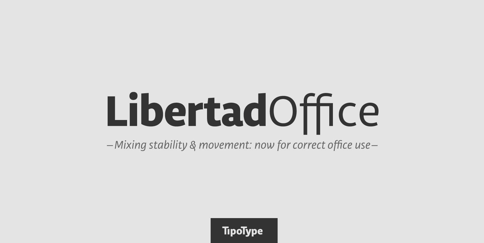
Libertad Office Font
Libertad is a sans-serif typeface that mixes humanist and grotesk models – It’s most interesting feature is the combination of balanced regulars with dynamic italics, which makes it a very versatile font for different uses. This special package is a
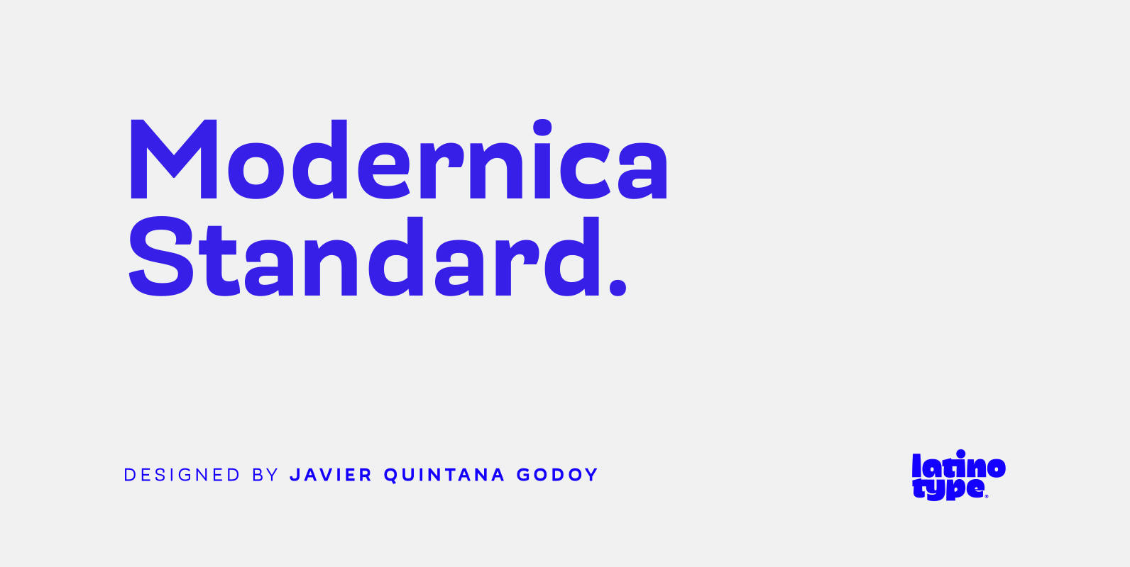
Modernica Standard Font
Modernica Standard™ is an excellent tool that provides a large range of possibilities in design work. It is a sans serif font that contains eight weights plus matching italics. Modernica Standard™ is the extension of the Mazurquica family, a condensed

Bandoengsche Font
Bandung is home to numerous examples of Dutch colonial architecture, most notably the tropical Art Deco architectural style. This typeface was adapted from the finest Art Deco landmarks and signage in Bandung, Indonesia and strongly added native elements of traditional
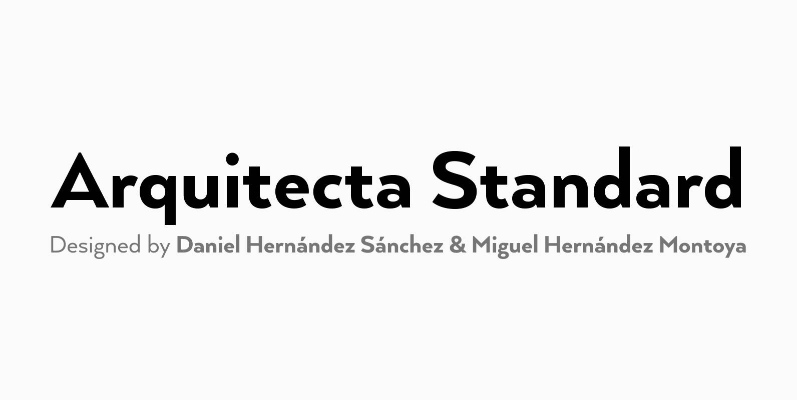
Arquitecta Standard Font
Arquitecta Standard. The humanist typography as a rational project. Since the experimentation from the Bauhaus through modern sans history we looked for a new mix to construct a rational geometric typeface with humanist proportions suitable for text layout and continuous
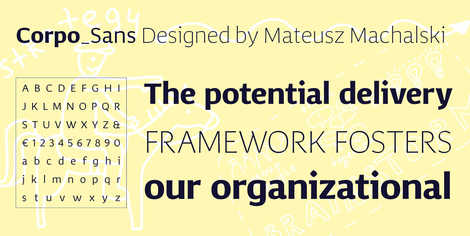
Corpo Sans Font
Corpo Sans is a refreshed version of my old font Korpo_Sans. Corpo_sans, designed by Mateusz Machalski, is a sans type family with a friendly feel. This type comprises 12 variants with 6 weights.The high contrast and high x height is

Elastica Font
Elastica is a new handwritten type system created by Resistenza, it is based on humanistic sans serif fonts of early 20th century. Irregular handwritten strokes that gives a D.I.Y feeling perfect to get a close sense of communication. When using
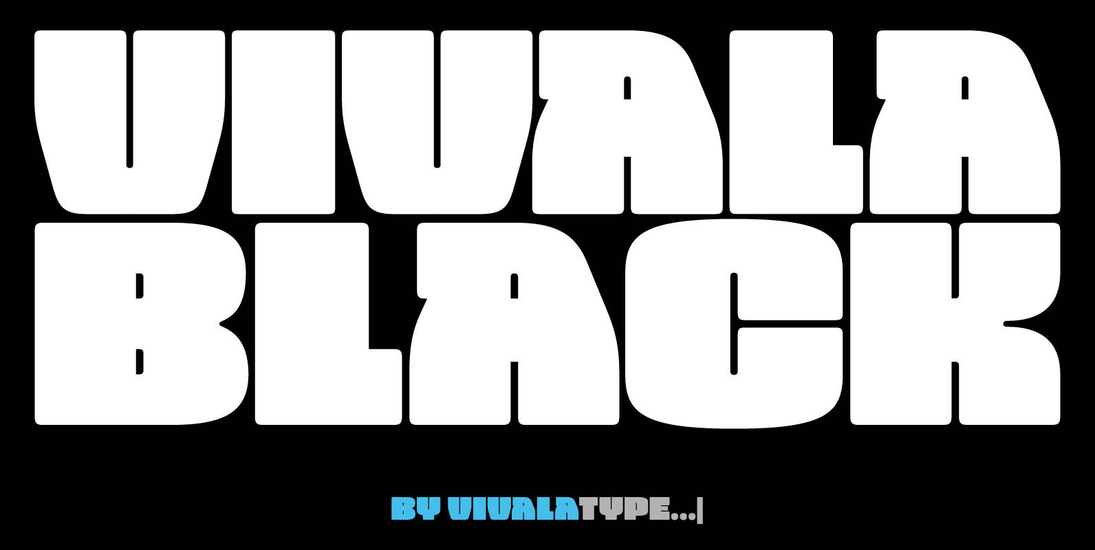
Vivala Black Font
The idea was to create a unicase typeface with a high black ratio that supports a compact typographic style. The four widths of Vivala Black share similar metrics, so they can be easily interchanged in a body of the text.

Filmotype Major Font
Filmotype Major is one of the hallmarks of the Free Style faces of the Filmotype Library. This bouncy sans serif was originally introduced in the early 1950s and captures the essence of mid-century casual playfulness. Its most popular use can
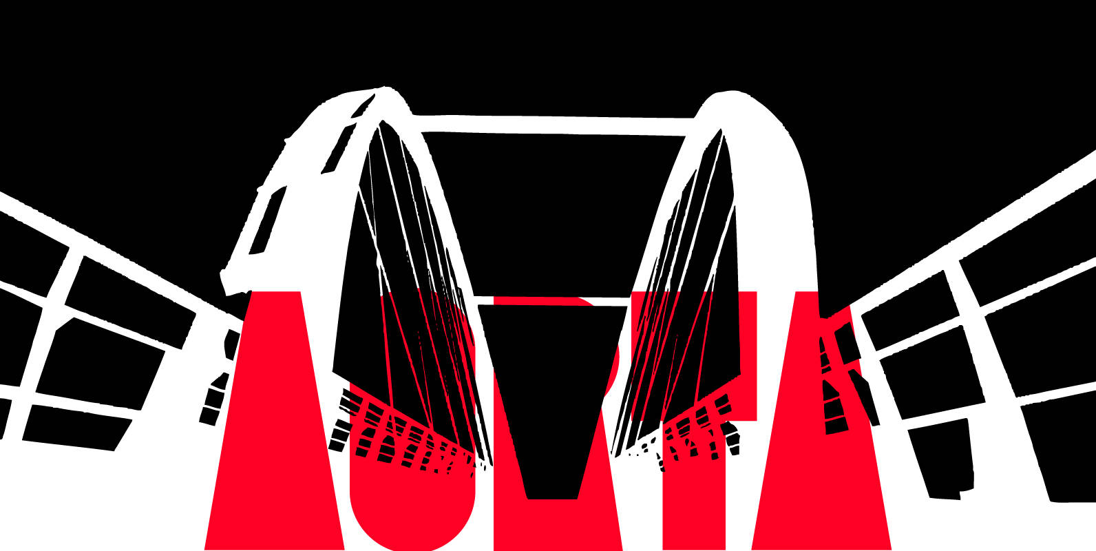
Aorta Font
Aorta was designed for independent subcultural zine. It have stencil in place of lower-case and digit stencil in place of old style digit. Aorta good for headlines, posters, editorial design… Aorta have condensed proportion and good in solid matter. Published
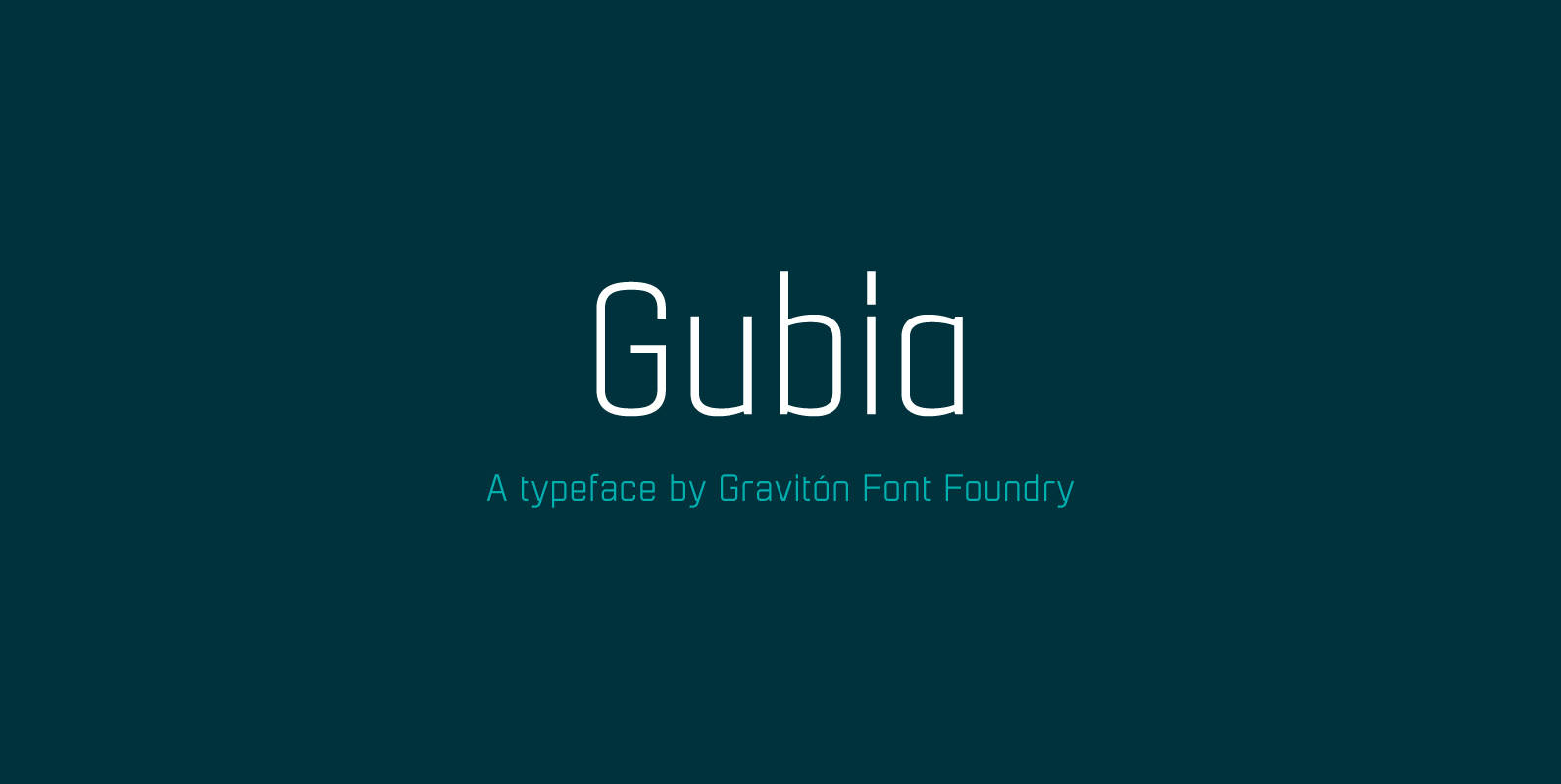
Gubia Font
Gubia font family has been designed for Graviton Font Foundry by Pablo Balcells. It is a geometric, sans serif typeface with a slightly condensed design. It has been conceived to be most suitable for all sized headlines, as well as