Tag: sans
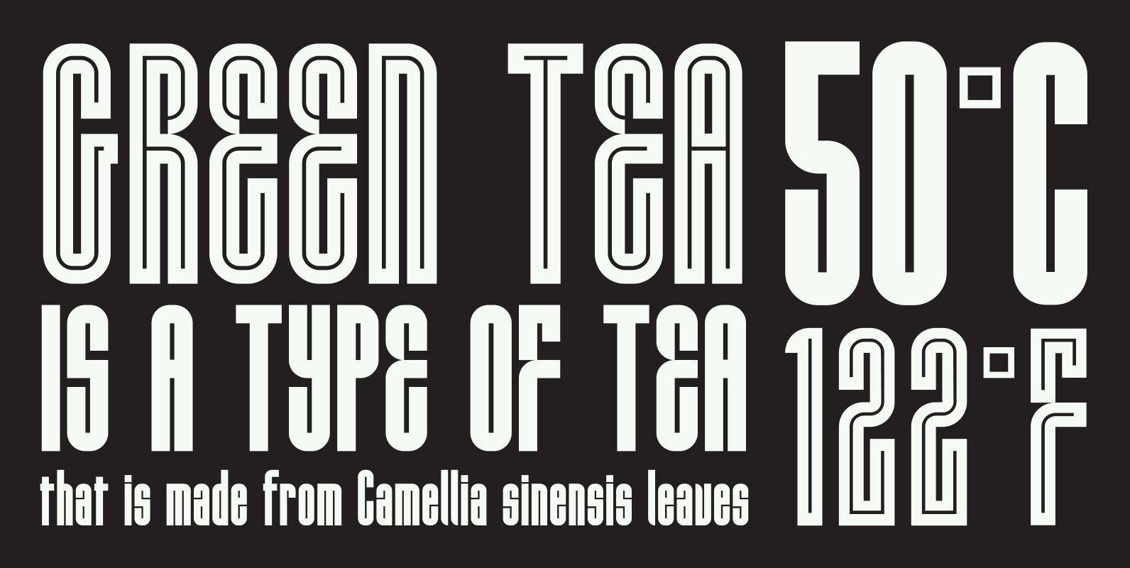
HWT Lustig Font
Euclid. A New Type,’ originally designed in the 1930s by modern American designer Alvin Lustig (1915-1955), has been revived as ‘Lustig Elements’ through a collaboration of designers Craig Welsh and Elaine Lustig Cohen. Only twelve letterforms from the original font
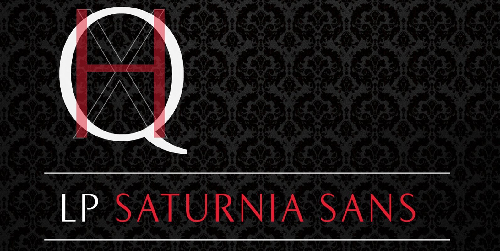
LP Saturnia Sans Font
Following up on the LP Saturnia, which is a modern interpretation of the classic Roman letterforms, comes the LP Saturnia Sans. While keeping the clear forms, this well-balanced Sans transports the original draft even further in the modern and at
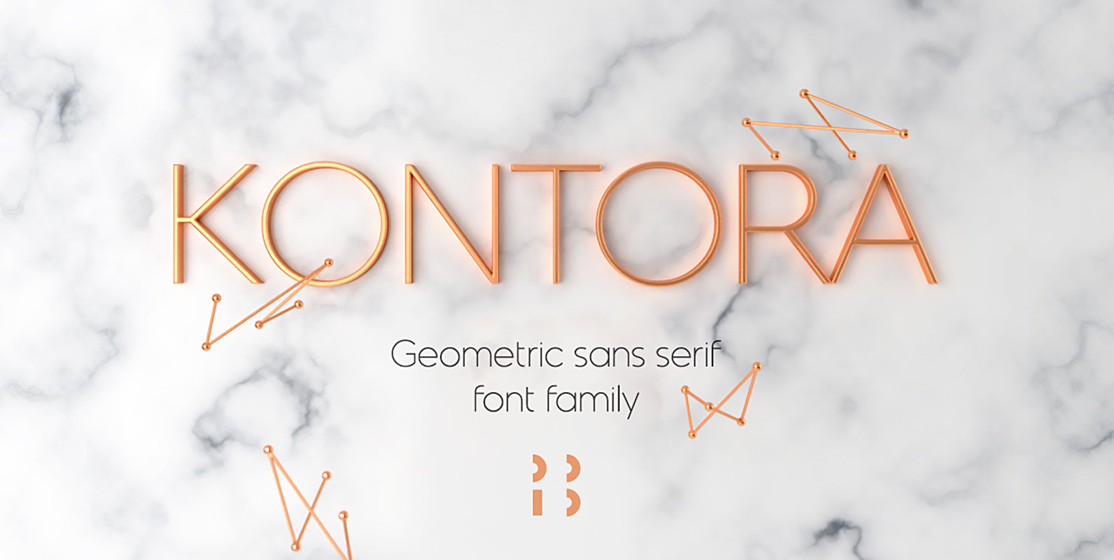
Kontora Font
Kontora is a basic and universal geometric grotesque design, that can be applied to various styles of layouts. It has minimum details, mostly modern proportions and letter forms, along with a touch of retro. Published by NaumTypeDownload Kontora
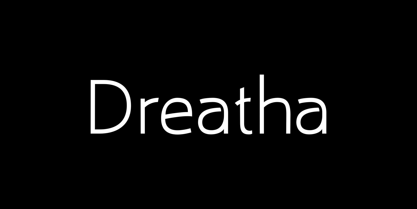
Draetha Font
Draetha is the 6-font companion to Biblia and Biblia Serif. It is a monoline sans with a clear style. It also has an outrageous Ultra version which pushes monoline to the extreme of boldness. It has the same font metrics
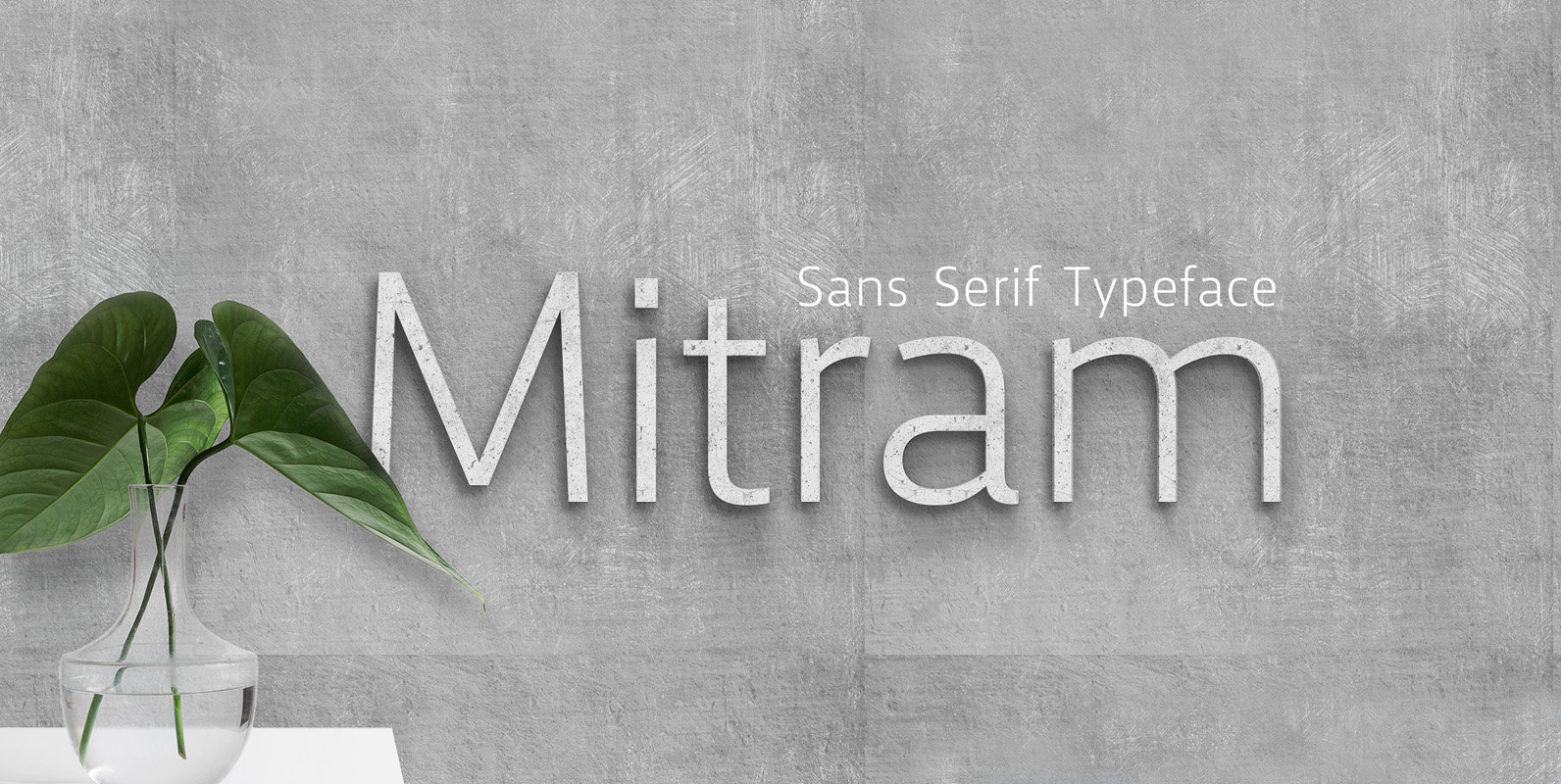
Mitram Font
The Mitram family has 7 weights, ranging from Thin to ExtraBold (including italics) and is ideally suited for advertising and packaging, book text, logo, branding and creative industries, small text, wayfinding and signage as well as web and screen design.
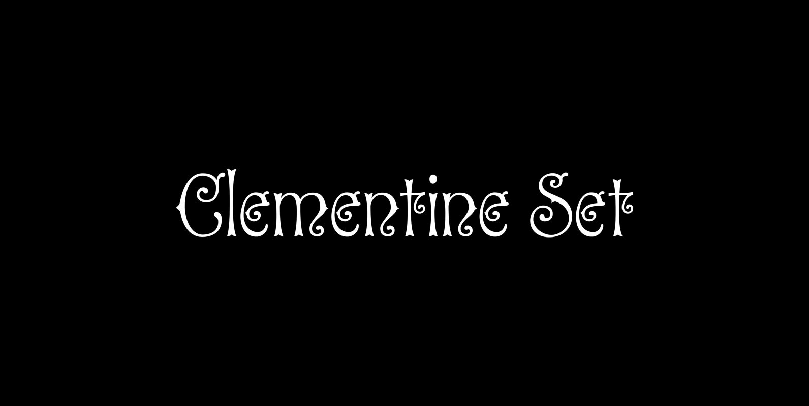
P22 Clementine Font
A bit of Victoriana whimsy from Ted Staunton. This set of two fonts is heavily inspired by a variety of 19th Century faces without being a direct revival of anyone in particular. Undulating curves, swirly terminals and bifurcated semi-serifs give
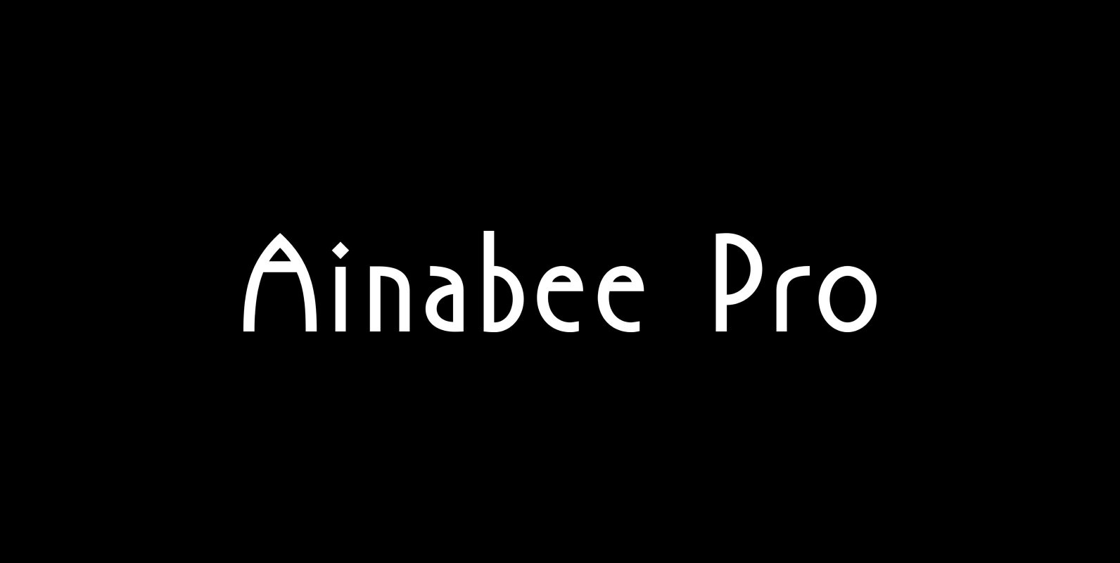
P22 Ainabee Pro Font
P22 Ainabee is an Art Deco inspired type design. The designer states: “The Art deco period has always fascinated me. The Architecture, The Furniture, The Car Industry, Letters etc, much of what I associate with 20s and 30s. This design

Haboro Contrast Font
Meet Haboro Contrast, the stylish little sister of the Haboro hyperfamily. While built from the same clean, geometric shapes of Haboro Sans, this new addition has been rebalanced for elegant performance with her high-contrast sans letterforms and has been adjusted

Keymer Block Font
Talbot Type Keymer Block is a display face available in three weights, it is a distressed variation of Keymer Radius. Its textured look brings a characterful, time-worn quality. Keymer Block features an extended character set to include old style numerals,

Syncopate Pro Font
The Syncopate Pro Family is a unicase design where the traditional lowercase x-height has been abandoned and a single uppercase height rules the design of all of the alpha and numeric glyphs. Some uppercase glyphs are copied to their lowercase

Atlan Font
Atlan—a Latin ’spin-off’ of classic geometric sans typefaces. Remembering typefaces like ‘Kabel’ by Rudolf Koch while paying attention to current design needs was the starting point for ‘Atlan’—a simple, elegant and appealing font. This typeface is based on highly expressive

Cadet Font
Cadet is an all new, five weight, sans serif typeface family. It began as a study of the Bauhaus type styles of the 1970s, descendants of Herbert Bayer’s experimental designs of the 1920s. What I set out to achieve with

Rawson Font
Designed by Alfonso García and Latinotype Team. Rawson is inspired by early humanist sans-serif English typefaces. We have added a bit of Johnston, a bit of Gill and a lot of Latinotype to the font. Rawson is an elegant font—but

Davis Sans Font
Over the past couple of decades, the many applications that joined print as media requiring design solutions have combined to necessitate a visual evolution that favours controlled optical geometry and careful counter-space consideration over ornamental features traditionally associated with print
