Tag: sans

Basic Sans Font
Basic Sans: A necessary sans. Designed by Daniel Hernández A family of Grotesque features with a functional, neutral and seeming clean style that looks to keep a neutral (or basic) appearance on paper, but including lots of details that give

SmytheSans Pro Font
SmytheSans Pro is a contemporary workhorse sans serif family that is eminently readable on-screen and in print. It is an updated version of our popular family Smythe Sans—we extended the characters sets, redrew most of the characters, rigorously spaced and

SmytheSoft Pro Font
SmytheSoft Pro is a contemporary workhorse sans serif family that is eminently readable on-screen and in print. It is an updated display version of our popular family Smythe Sans with custom rounded terminals, rigorously spaced and kerned. Smythe Soft Pro

Gerlach Sans Font
As the foundry’s new flagship family, Gerlach Sans was named after the highest peak in Slovakia. Its functional design is enhanced by a few subtle ingredients, adding life and giving words a more playful voice. The family has eight weights

Grandstander Font
Bringing back some handmade block letters. Grandstander contains over 350 glyphs with 20+ ligatures. It was inspired by children's' books, caffeine, and my fun, silly son. Published by Tyler Finck Download Grandstander

Migrena Grotesque Font
Migrena Grotesque designed by Mateusz Machalski is a classical sans geometric family. This typeface is characterised by a lot of details, which gives it a friendly character. Scalable x height, rounded corners makes Enigma good choice for many purposes. All

Frank Woods Font
“Frank Woods” is a wooden typeface based on the form of Franklin Gothic Heavy. The three cuts fit together and enable the user to create a lot of impressive variations. The amount of points in the font make it impossible

Scrans Font
Scrans (Script + Sans) is a modern script family that gets both, conceptual and formal elements, from classic rational and geometric styles. It’s main purpose is to make the difference in an innovative manner. In other words, you can use

Latina Font
Latina is our first humanist typeface designed for use in continuous text. This font is based on calligraphy, but calligraphic features have been changed in order to make Latina a more neutral font. This prevents readers from losing their focus

Haboro Sans Font
Quit trudging through the thick with encumbering fonts, and spring to the front of the pack with the cutting edge sans serif, Haboro Sans. With nothing to clutter up your work, your editorial designs, websites, and software will be sharp

Sabler Titling Font
Make the right statement with the elegant Sabler Titling. This showstopping font features an inherent grace combined with the classic style of the Art Deco period. The subtle beauty of its letters is highlighted by the typeface’s stems, which taper

Retrograde Font
Retrograde is round, simple, and crystal clear. It reproduces incredibly well at any size, and was created with the physical world in mind. Each character is the same width, in both regular and bold weights, which makes applying it in

Gineso Font
Michaelangelo. da Vinci. Bellini. Rafael. Masters of Italian art whose names have dwarfed those of many other great Italian artists. Yet relics from these other artists remain, though often unnoticed because of their practical nature. These unknowns are the Italian

TT Octas Font
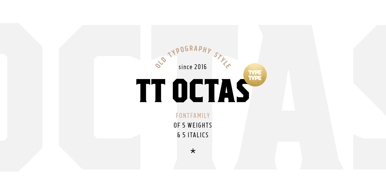
TT Octas is a narrowly proportioned font family built upon the principle of octagonal forms: all circles in this font family are actually octagons. Thanks to small serifs, TT Octas has a saturated and vintage character to it. Simple depiction

Byblos Font
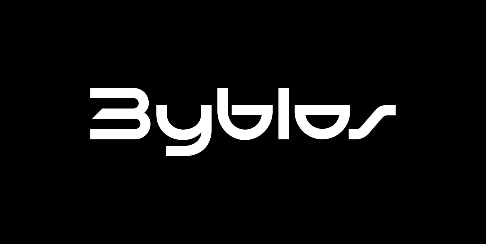
“Byblos” is the name of a town in Lebanon and the name of a famous hotel in St. Tropez. Some time ago I discovered their old logo in an old french magazine, just 5 by 3 centimeters small without any

Corporative Sans Rounded Condensed Font
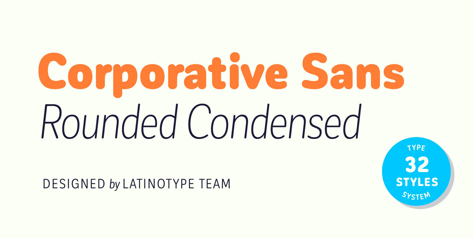
Corporative Sans Rounded Condensed is the narrowed version of Corporative Sans Rounded that offers high performance when using for text, what makes it the perfect match for Andes Rounded. The font works well at both display and small sizes. Corporative

