Tag: sans
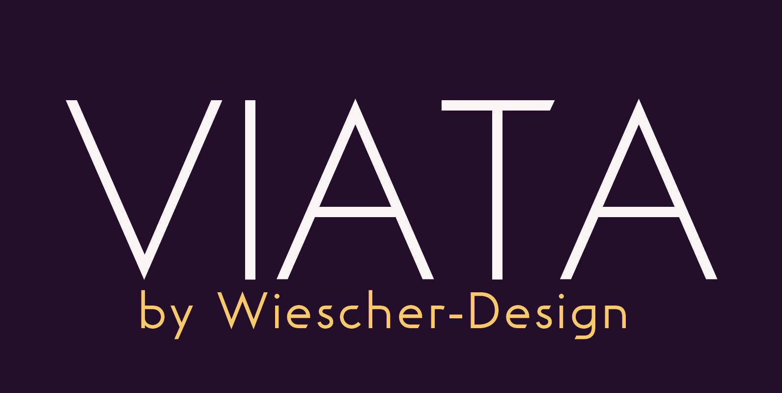
Viata Font
“VIATA” is my new experimental Sans again based on the modernistic, constructivist letterforms of the “Bauhaus” era. The names Herbert Bayer and Paul Renner come to mind as design beacons of that time. “VIATA” has flat tops and round bottoms,
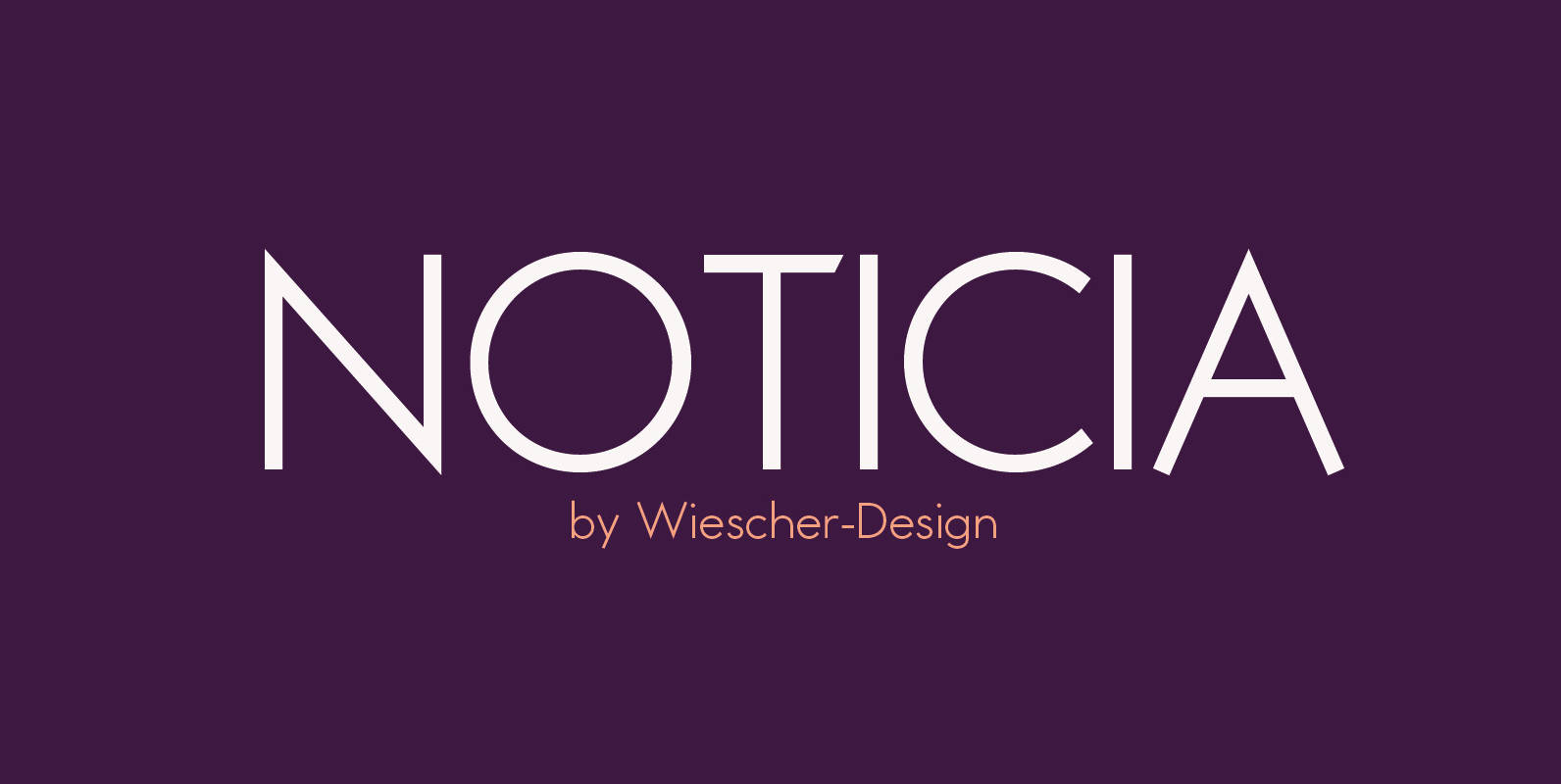
Noticia Font
“NOTICIA” is my new Sans based on the modernistic, constructivist letterforms of the “Bauhaus” era. The names Herbert Bayer and Paul Renner come to mind as design beacons of that time. “NOTICIA” is different in its proportions and long ascenders
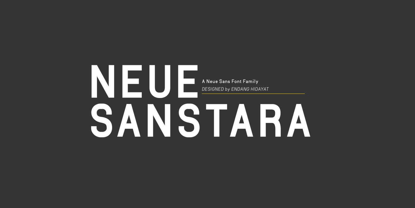
Neuesanstara Font
Neusanstara font family is about when classic meets modern. Contemporary New sans with aesthetic and elegant shape. Neuesanstara is characterized by excellent legibility both in print and on the web. Consists of 10 unique font styles and weights. Look great
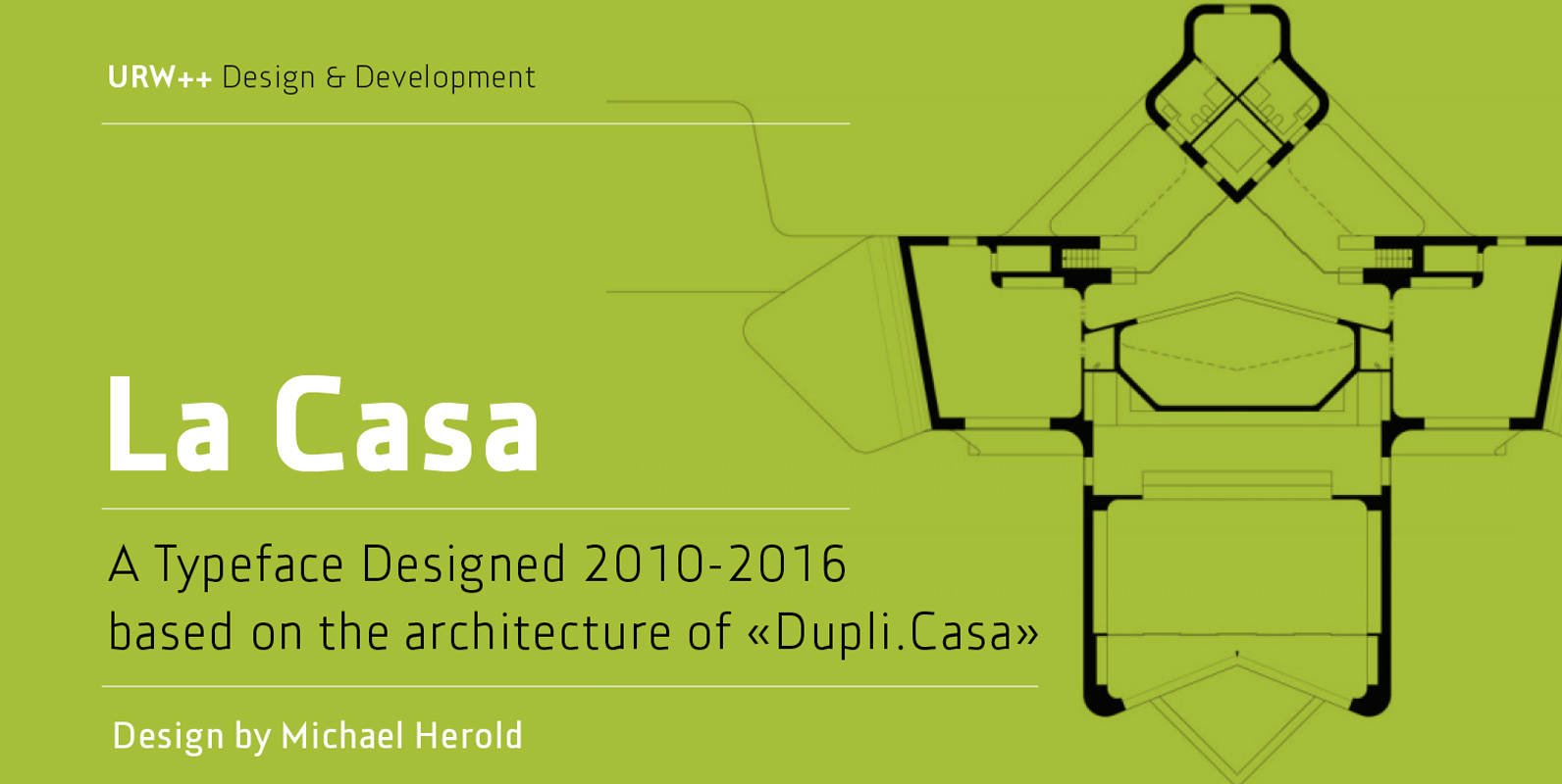
La Casa Font
Fontdesign meets architecture – the unique and architectural design of the urban villa “Dupli.Casa” by the architect J.Mayer.H triggered the inspiration for the typeface “La Casa”. Inclinations and curvatures mirror the linear, modern impression of the architecture. The overall impression of
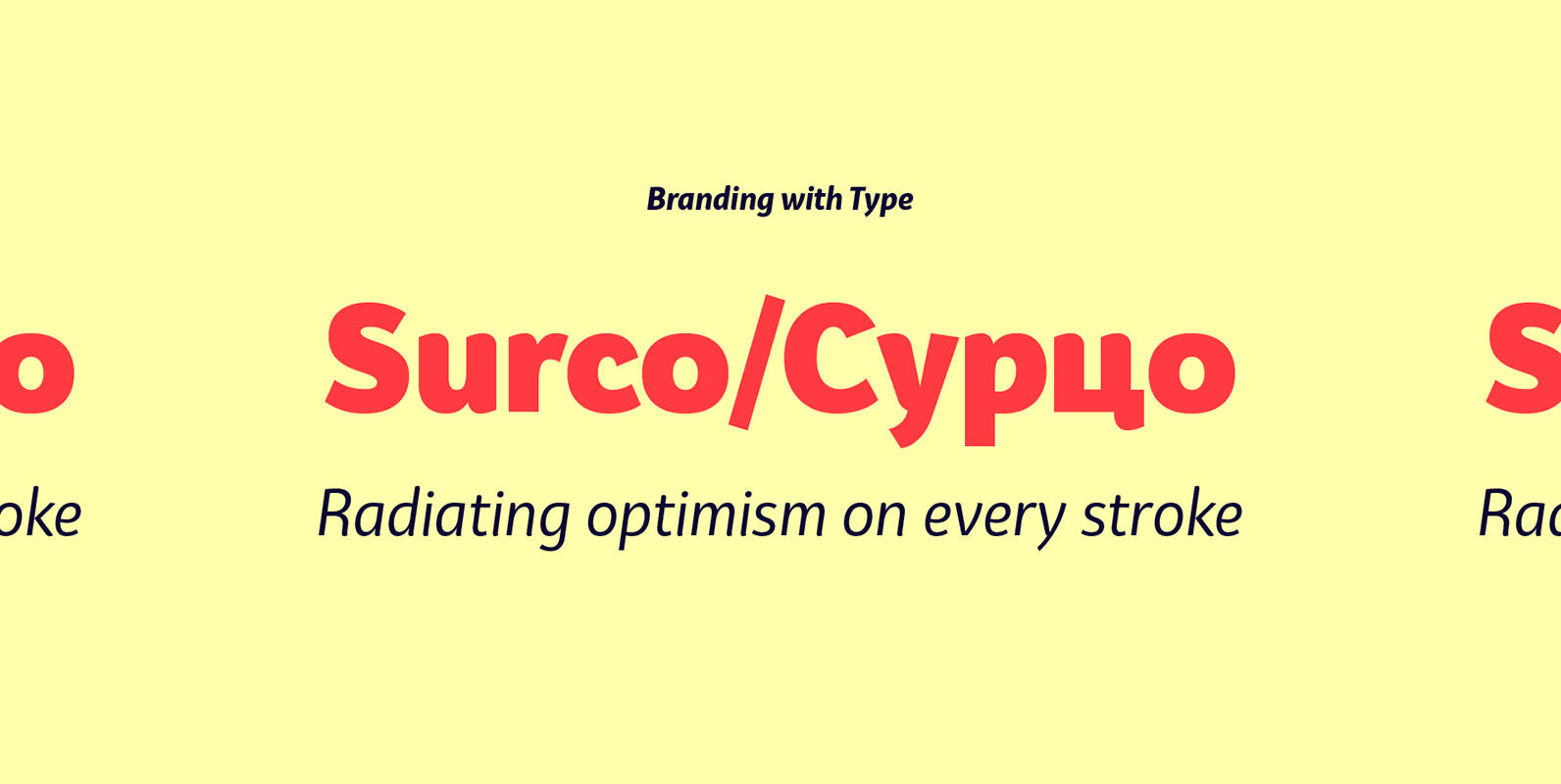
Bw Surco Font
Bw Surco is a fresh and optimistic humanist sans serif with hand-stroke cues. Its soft, rounded shapes, balanced x-height and the contrast between the romans and the true italics, all build towards a very practical font family with a friendly

Semikolon Font
Optimal readability by reduced, distinct letter forms. Appropriate for early readers of any age in schools and other educational institutions. SemikolonPlus minimizes the risk of confusing similar characters and therefore is predestinated for the use in text blocks, work sheets,

Hinton Font
Hinton is a modern, clean text font, that contains 840+ characters & many Opentype features. It is calm, orderly and a bit perky. Hinton has a lightweight and pleasant design, so it fits well and easy to read. Its characters

Bobik Font
Bobik is a display type family with three faces – sans, serif and slab. The family was drawn initially on basic principles described in Jean Alessandrini’s Codex 80 and then further developed, including adding a lowercase and ligatures. With a

Supra Condensed Font
“Supra Condensed” designed by Gert Wiescher in 2013 – is the condensed version to this new sans typeface family of eight weights with matching italics. The condensed version is designed for space-saving typography but with high legibility in mind. The
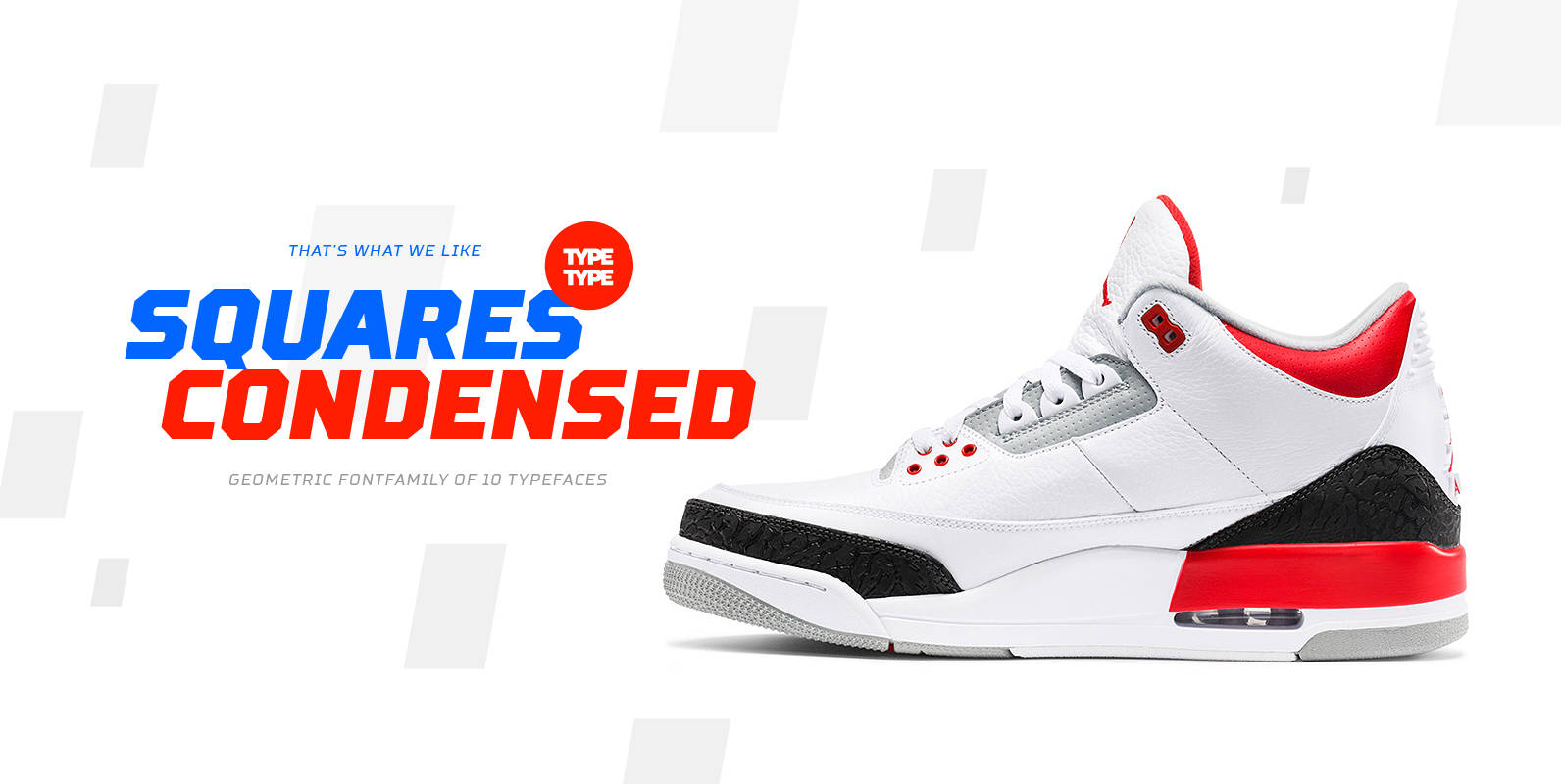
TT Squares Condensed Font
We’ve expanded the Squares font family and created a narrow version of the typeface. Just as its older brother, Squares Condensed fits perfectly for any engineering, military, and technological theme. The font is ideal for implementation in interior design, packaging
Supra Compressed Font
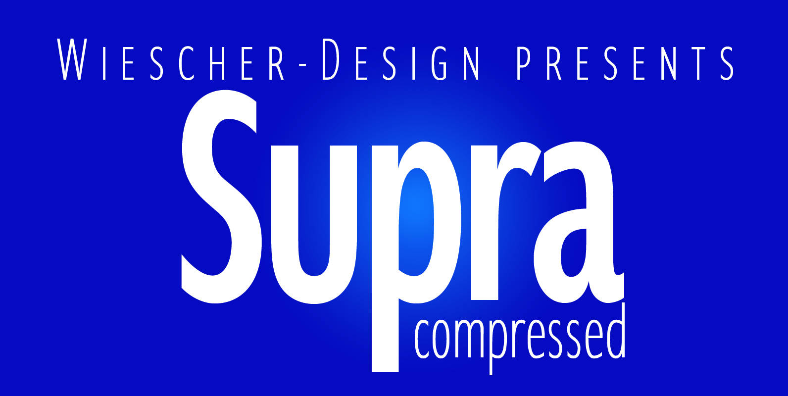
“Supra-compressed” designed by Gert Wiescher in 2013 – is the extreme version of this family. But despite it being very slim it is still – because of its openness – a very readable font. The light and normal weights and
Veneer Clean Font
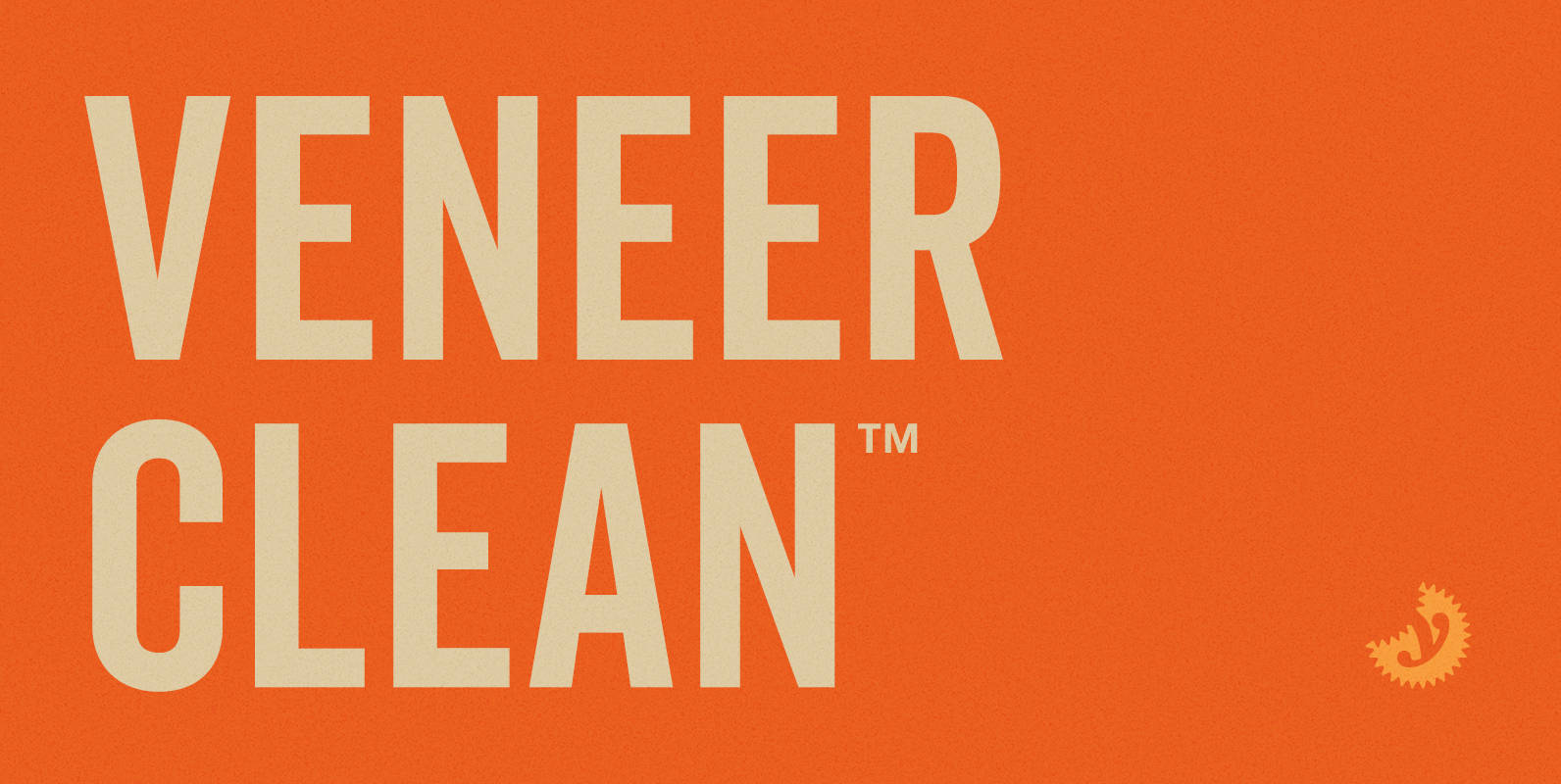
Veneer Clean from Yellow Design Studio is the non-distressed version of the Veneer letterpress type family. The 8-font family includes Regular, Soft and Round versions with italics plus a free set of funky icons. Published by Yellow Design StudioDownload Veneer
Supra Mezzo Font
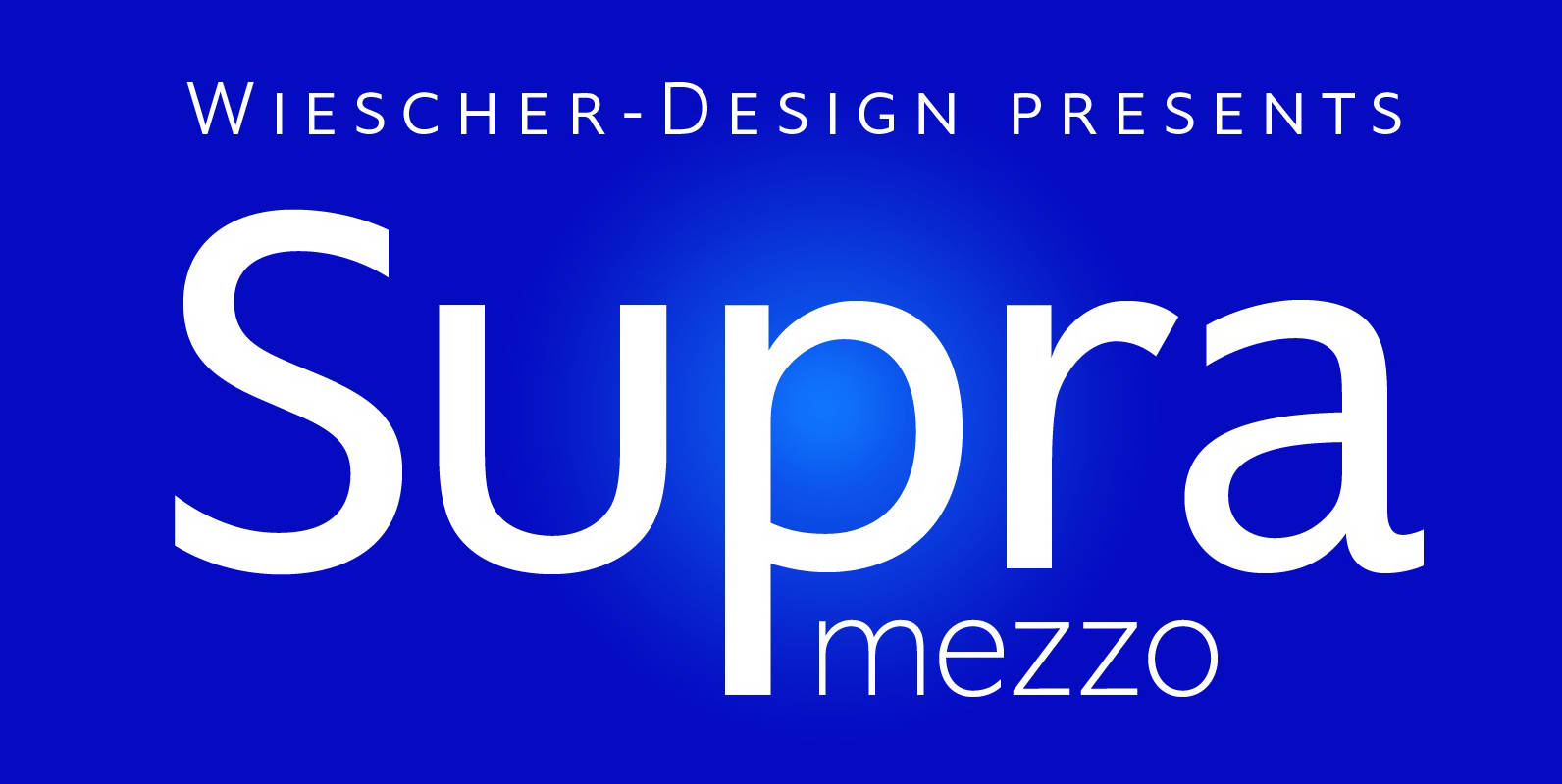
Supra Mezzo designed by Gert Wiescher in 2012/13 – is an unusual addition to the Supra family, aweight in between the normal and the condensed width. This cut comes in very handy if you need to put lots of text
Monrad Font
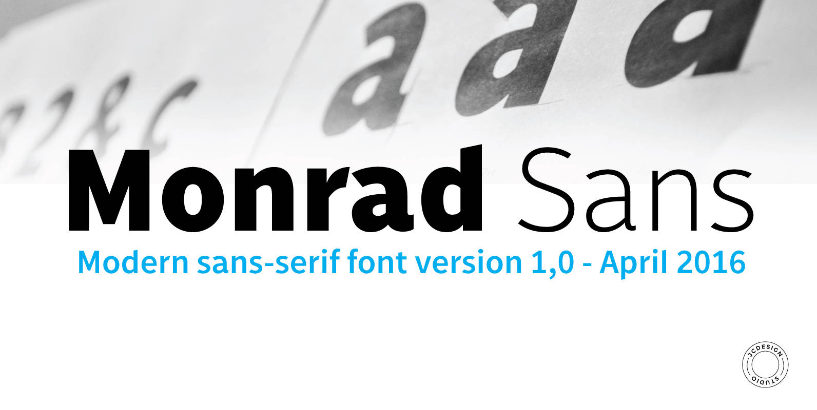
Monrad is a font family characterized as grotesque sans serif. The final ink consists 6 styles including italic version, manually edited kerning. The idea of the font is to create a blend of dynamics and organic balance in the letters.

