Tag: sansserif
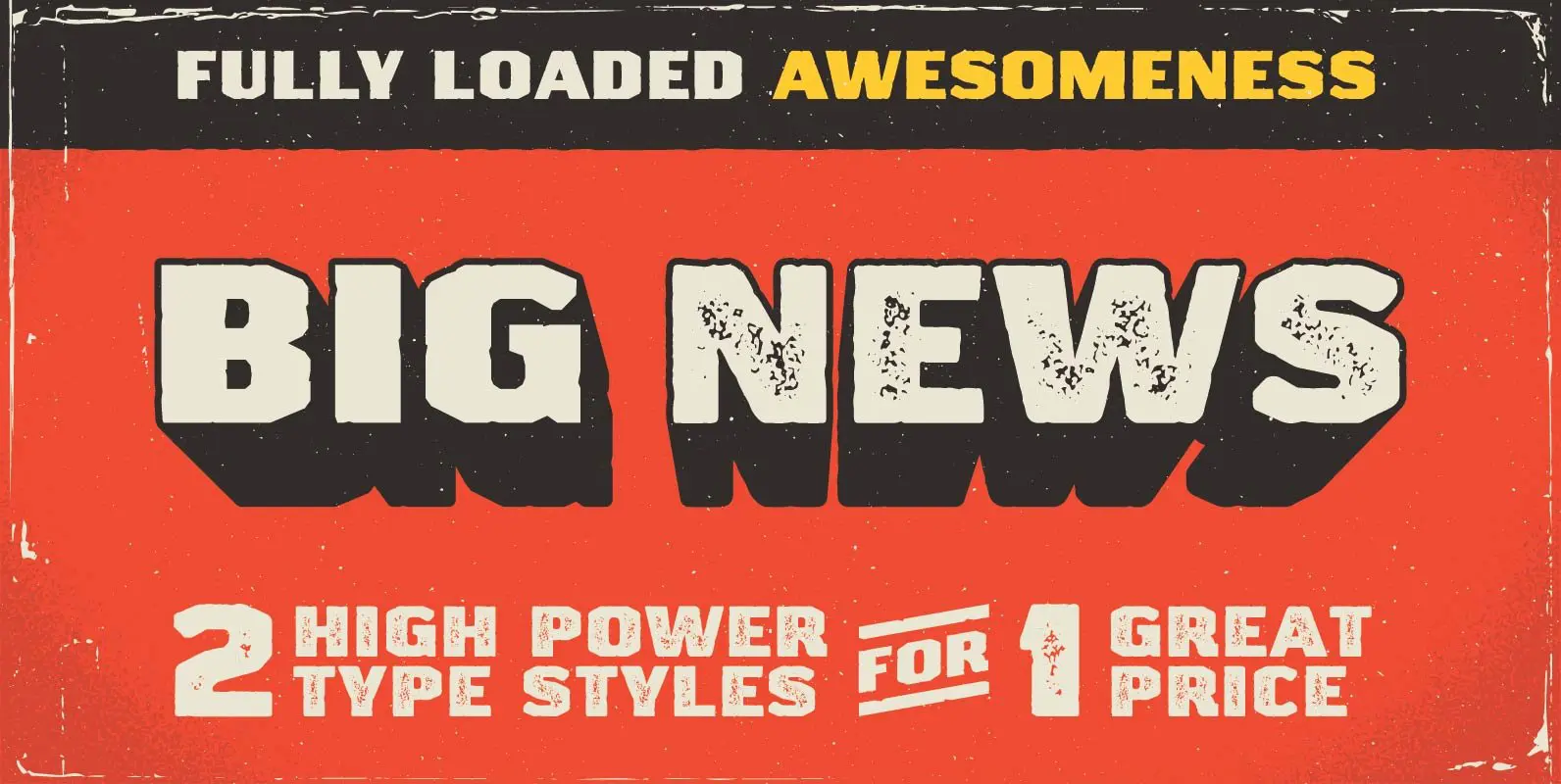
Big News I & II Font
Looking for some type that has a strong and rugged voice? Here it is. Big News features 2 options—clean-ish and distressed. This type can take a beating and keep on working for you. It even has the scars to prove
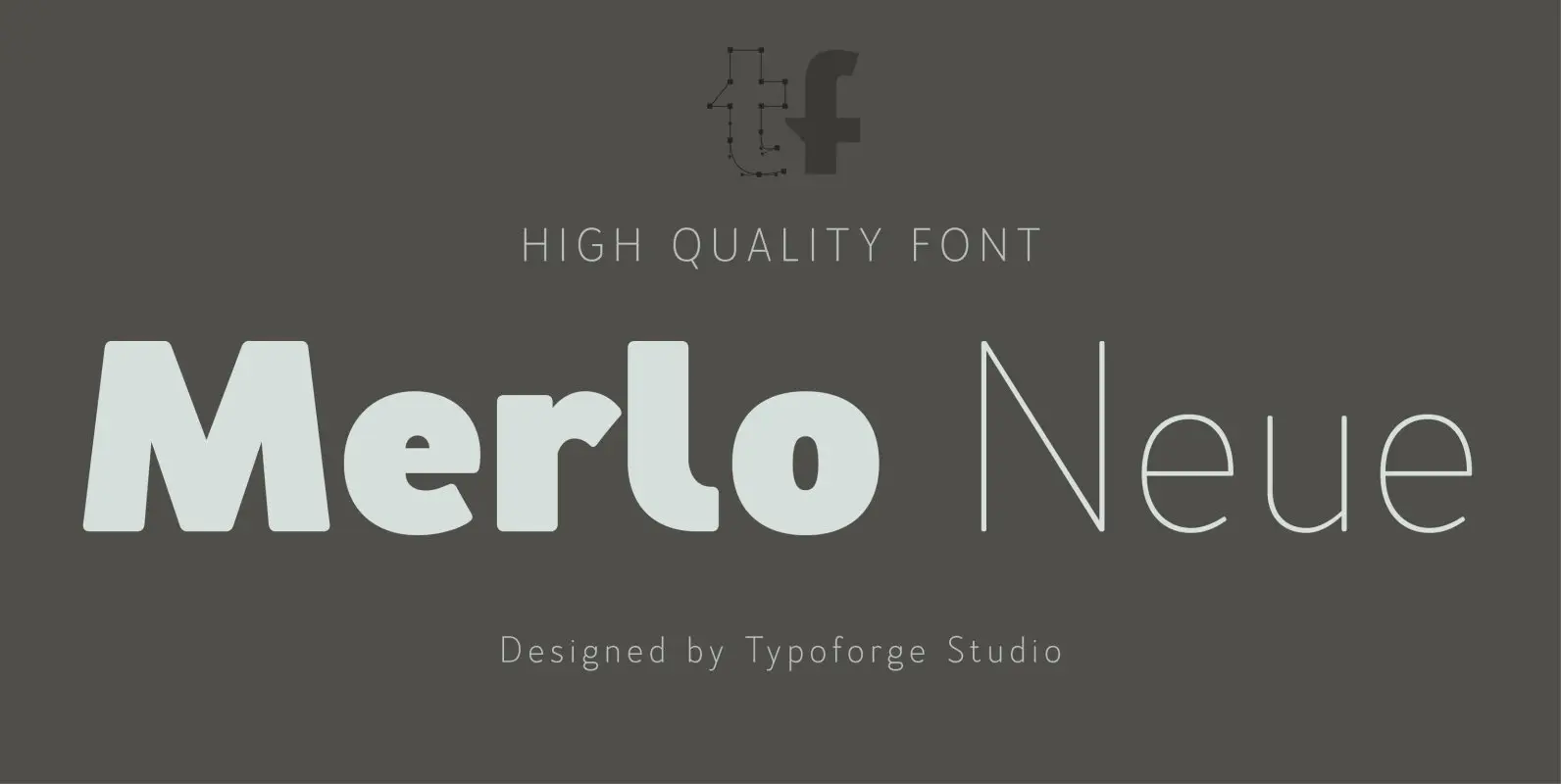
Merlo Neue Font
Merlo Neue is the younger brother of Merlo. New family received refreshed, more square proportions and a new shape of many glyphs. However, what is the most important in new Merlo, is the wide range of instances – nine new weights,
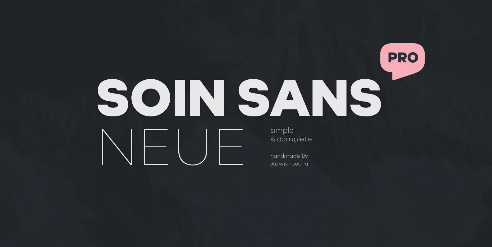
Soin Sans Neue Font
10 hours a day for almost as long as one anniversary of the Olympics to harvest the experience of designing many typefaces, thinking process and refining the craftsmanship throughout these years. From Soin Sans that has been designed and released
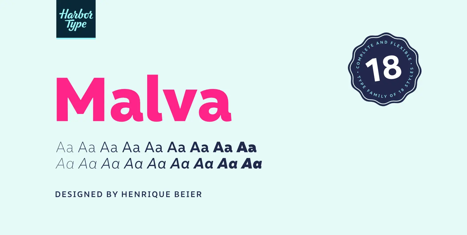
Malva Font
Malva was designed to perform as a branding element, providing a clean look for visual identities and publications. It brings a touch of friendliness to the communication without compromising the professional look every brand strives for. Legibility was one of

Furiosa Font
Hey, typophile. Imagine spending your days in the apocalypse. You need to write that “Get off my lawn”-sign to protect your compound from riff raff, thieves and/or an occasional zombie or two. And you remember the good old days –
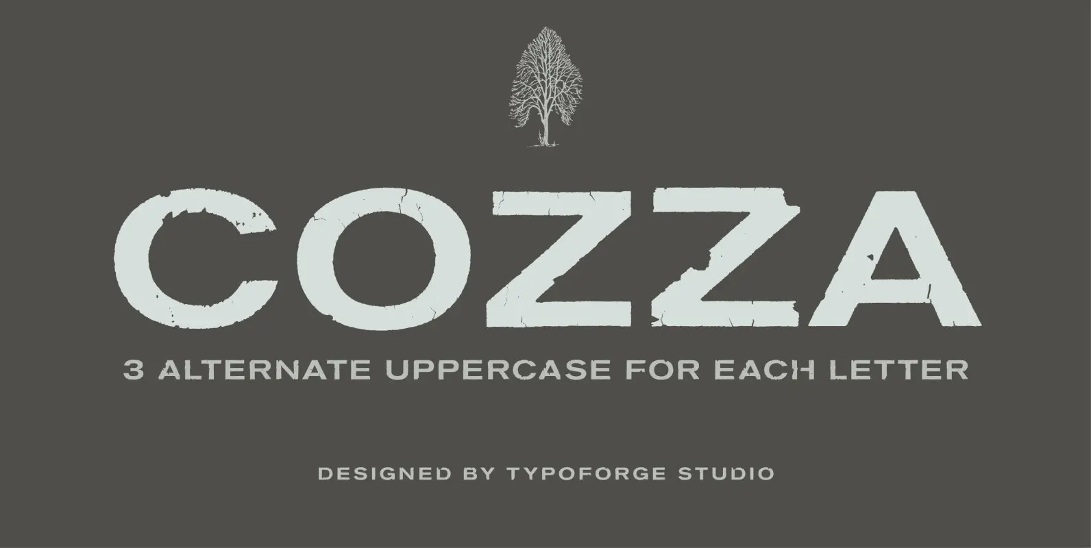
Cozza Font
The inspiration for the design of the font Cozza was Unitra Letraset from the 80s. Dry transfer lettering was used by architects from Poland and Czech Republic. Font Cozza, for each character has three alternative characters with their automatic replacement.
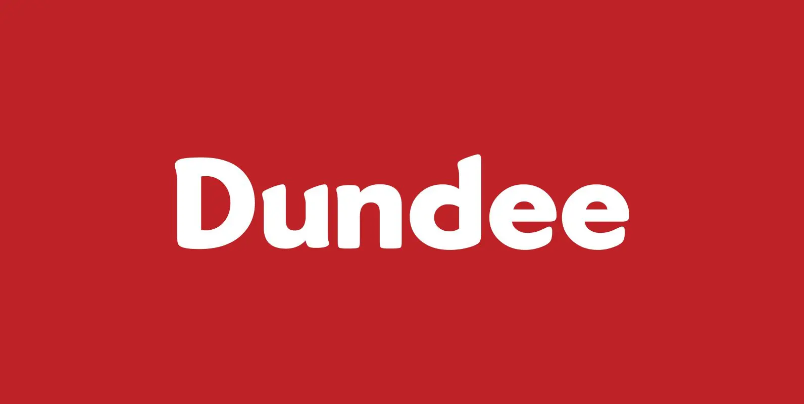
Dundee Font
Designed by A. Pat Hickson, Dundee is a new design inspired by the various mastheads used in children’s comic books in England, published by D.C. Thompson of Dundee, Scotland. Published by Red RoosterDownload Dundee
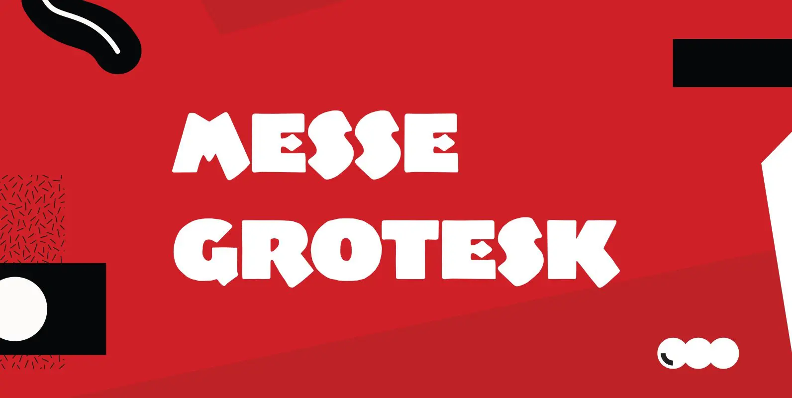
Messe Grotesk Font
Designed by Paul Hickson. Based on the Albert Augspurg design, circa 1921-27. Published by Red RoosterDownload Messe Grotesk
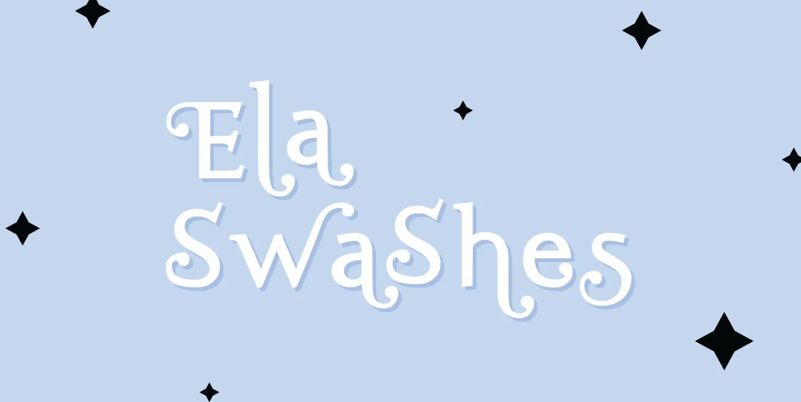
Ela Swashes Font
“Ela Swashes” are not meant to and can not be used as a standalone typeface. Swashes are a set of many different embellished letters to be used together with Ela Demiserif fonts of corresponding weights. Published by Wiescher DesignDownload Ela

Nexstar Font
A display font in the best american tradition, made for sports, leisure, outdoors and any other occasion of elegant leisure. Published by Wiescher DesignDownload Nexstar
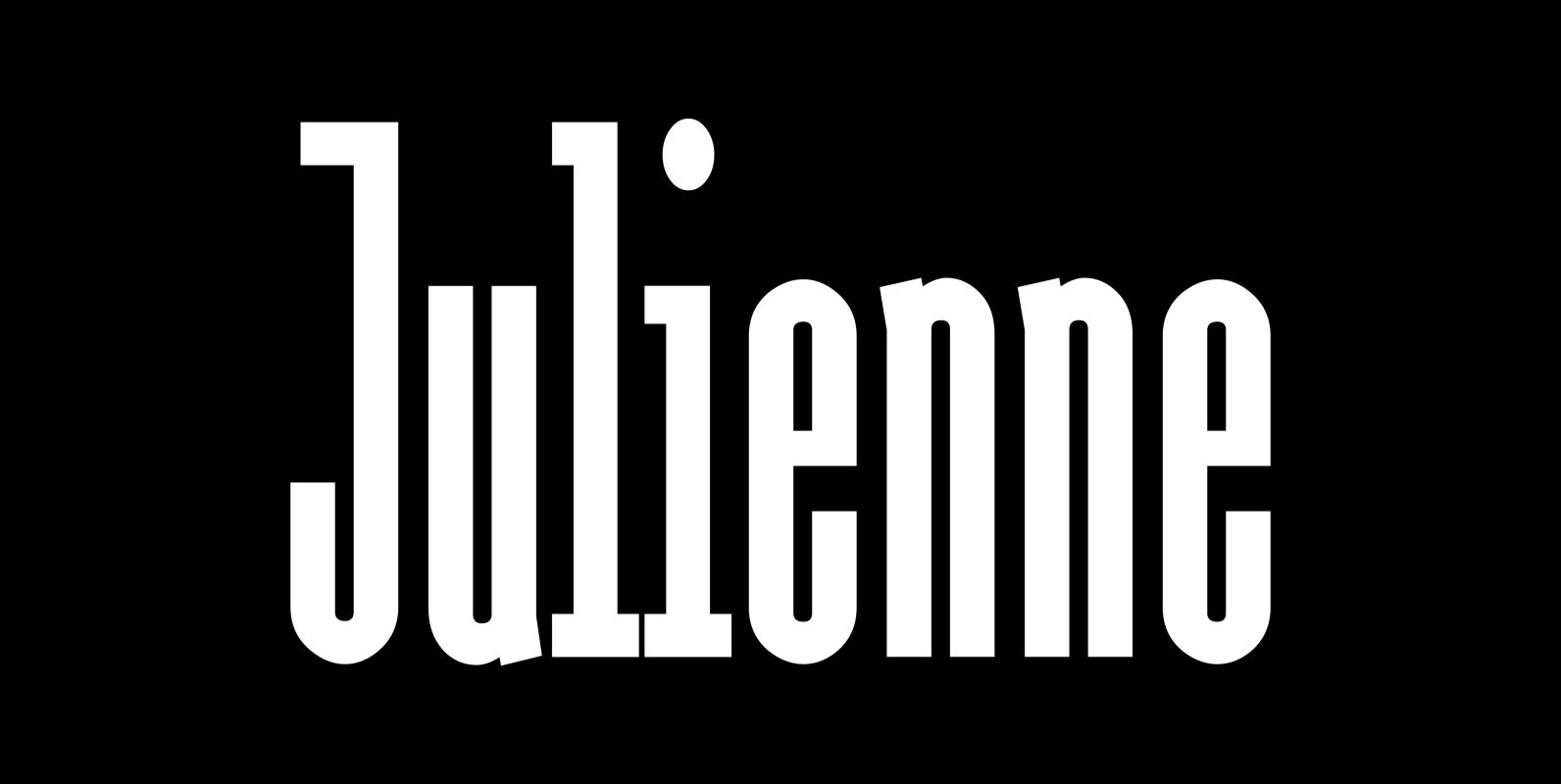
Julienne Font
Cooks call thinly cut – like matchsticks – vegetables »Julienne«. I found that was a fitting name for this very narrow typeface. Julienne Slim is the extreme cut of the two. Personally I do not use narrow typefaces very often,
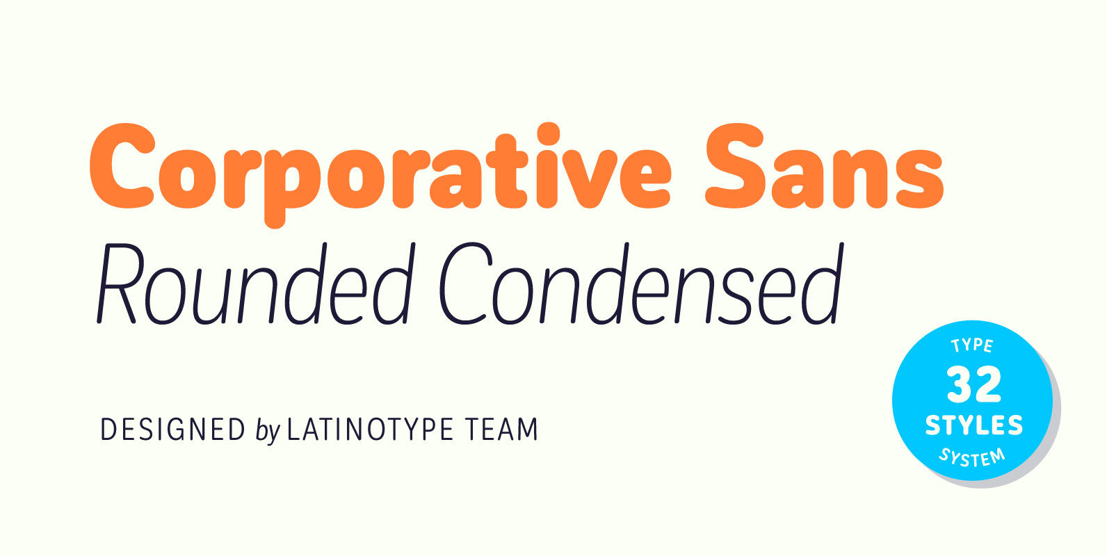
Corporative Sans Rounded Condensed Font
Corporative Sans Rounded Condensed is the narrowed version of Corporative Sans Rounded that offers high performance when using for text, what makes it the perfect match for Andes Rounded. The font works well at both display and small sizes. Corporative
