Tag: semi-serif
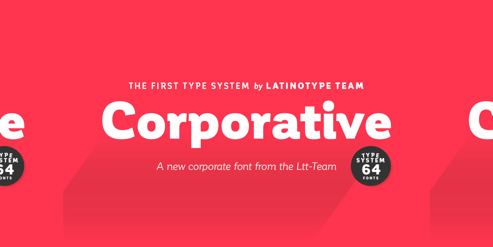
Corporative Font
The first typeface developed by Latinotype Team. Corporative is a semi serif font that has a marked personality and distinctive traits, what makes it suitable to be used at large text sizes. Since it is a condensed font, it can
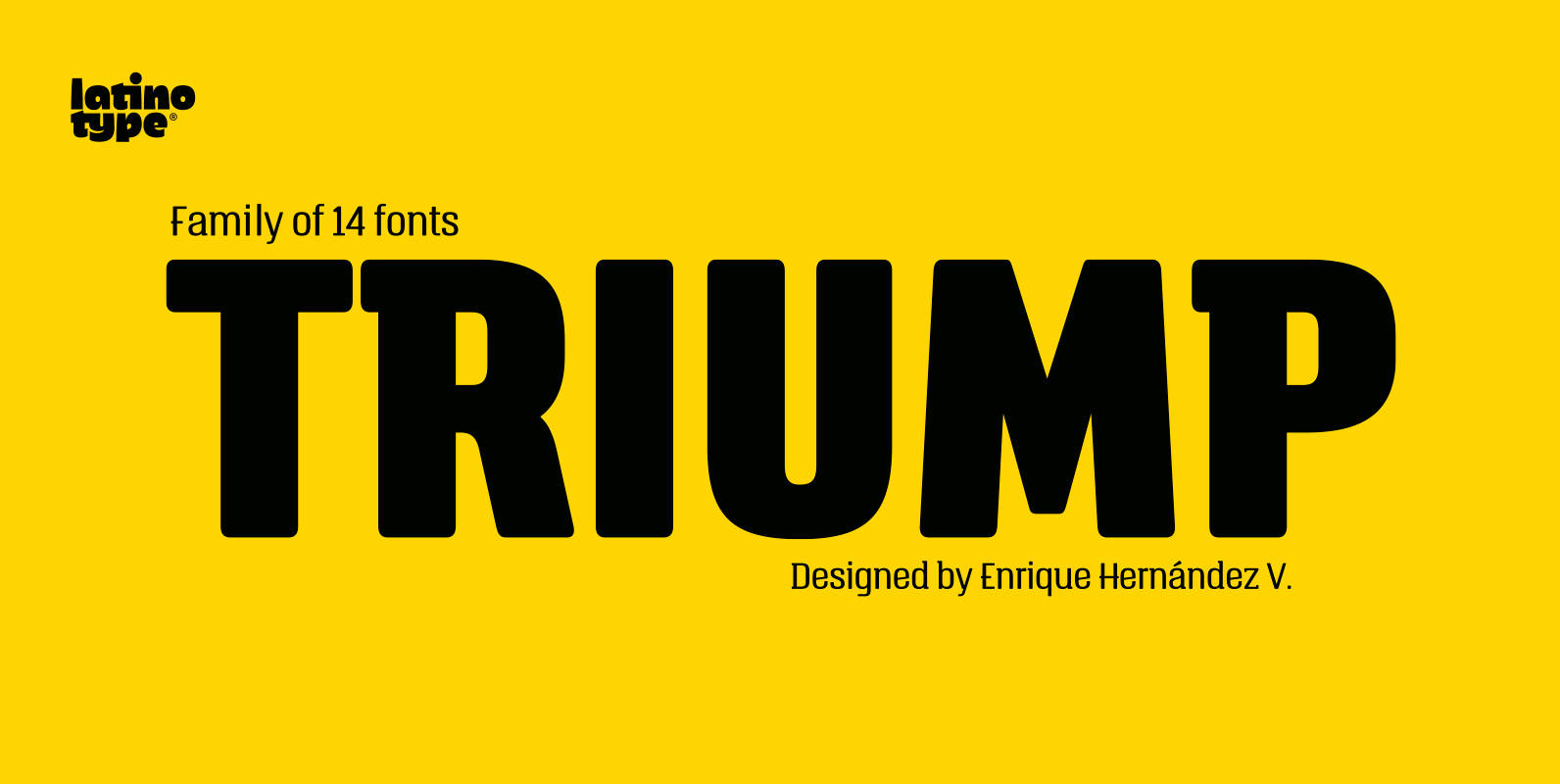
Triump Font
The typeface family Triump is a simple sans serif with 6 weights from Thin, ideal for use as an epigraph, to Black for head titles of special impact. Excellent for applying in graphic design as logos, trademarks, posters, editorial and
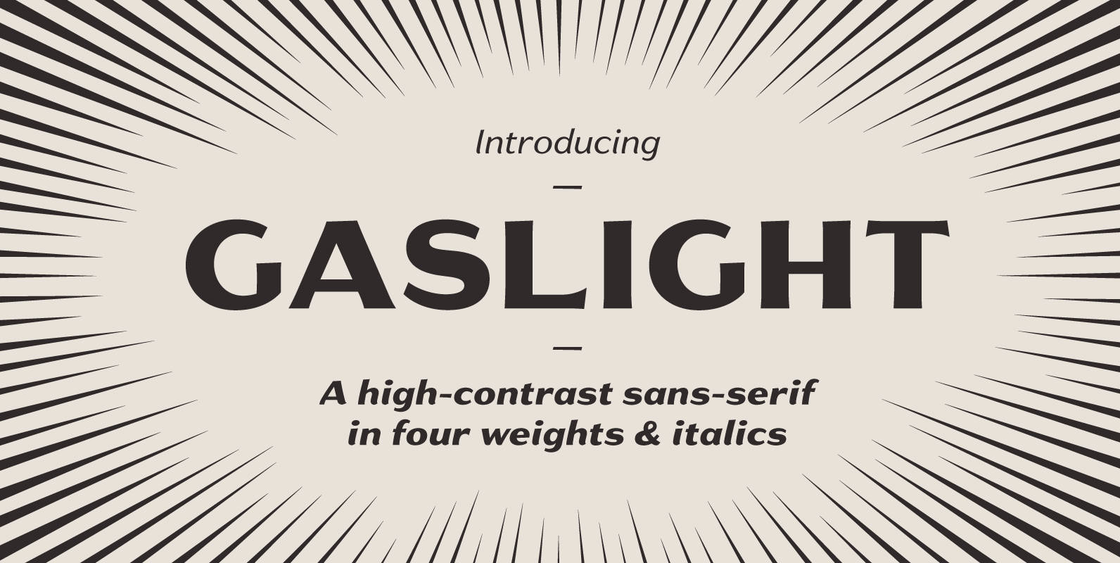
Gaslight Font
Gaslight is the result of a desire to create a sans-serif rich with humanistic charm and lyrical curves, to provide some relief from the highly rational, low-contrast faces we’re surrounded by at every turn. Gaslight can lend an old-fashioned elegance
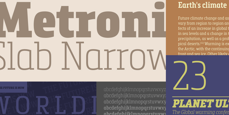
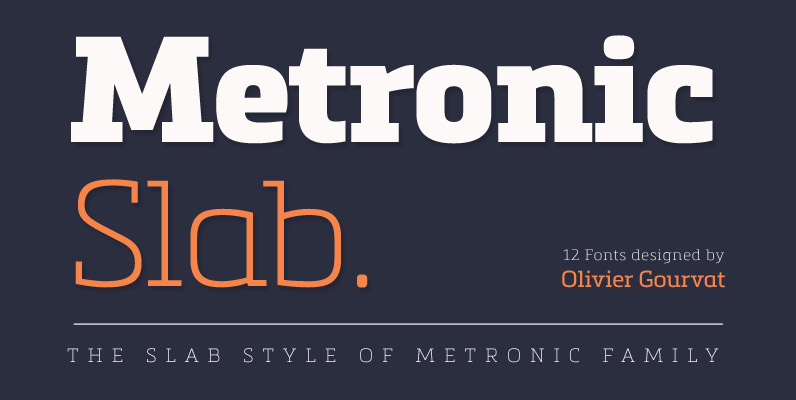
Metronic Slab Narrow Font
Metronic Slab Narrow is the condensed version of the Metronic Slab font family. This condensed style is designed for space-saving typography but with high legibility and versatility in mind. This Family also improved the needs of developers and graphic designers
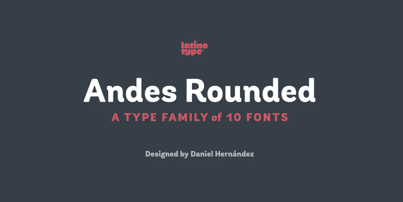
Andes Rounded Font
Andes Rounded, designed by Daniel Hernández, is a display typeface that has neo-humanist characteristics. Its different terminals, among other elements, give it a look of mixed typography. Andes is a typeface with 10 Upright weights, 10 Italics & Condensed versions,

Silent Font
Silent is a semi-serif typeface that combines readability with fluidity in a discreet and clean design. It works great on short texts such as captions, charts and graphs. The soft curves offer a calm rhythm and brings silence and concentration

Martin Font
Martin, a condensed semi-serif with rounded edges and friendly serifs, shows its charme best in short, pointed sentences, in headlines set in about 20 to 36 point. The playing with serifs in a condensed, very characteristic type design is attractive
Metronic Slab Pro Font
Metronic Slab Pro is a slab serif typeface with a technological and minimalist look for text and headlines. It has six versatile weights from Air to Black with an alternative glyph set to improve its use in different graphic contexts.
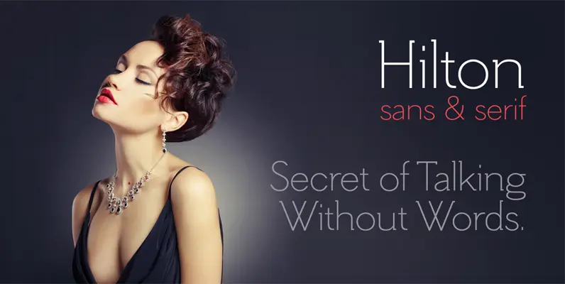
Hilton Serif Font
There is something special about thin fonts. On one side there is the sensitive, charming and warm touch, on other side they are uncompromising, thoroughgoing. Here the contrast can’t hide the clear shapes. Hilton Serif and Hilton Sans are a

Publio Font
Publio is small unusual and unique font family, characterized with sharp, triangular semi-serifs. Published by Tour de Force Font FoundryDownload Publio
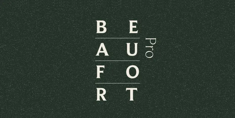
Beaufort Font
This type is almost a sans serif. It has legibility proportions, and a very large, useful family with specially adapted condensed and extended sub-families. Compared with type set by older technologies, PostScript type, imageset and printed by high-resolution offset lithography,