Tag: sharp capitals

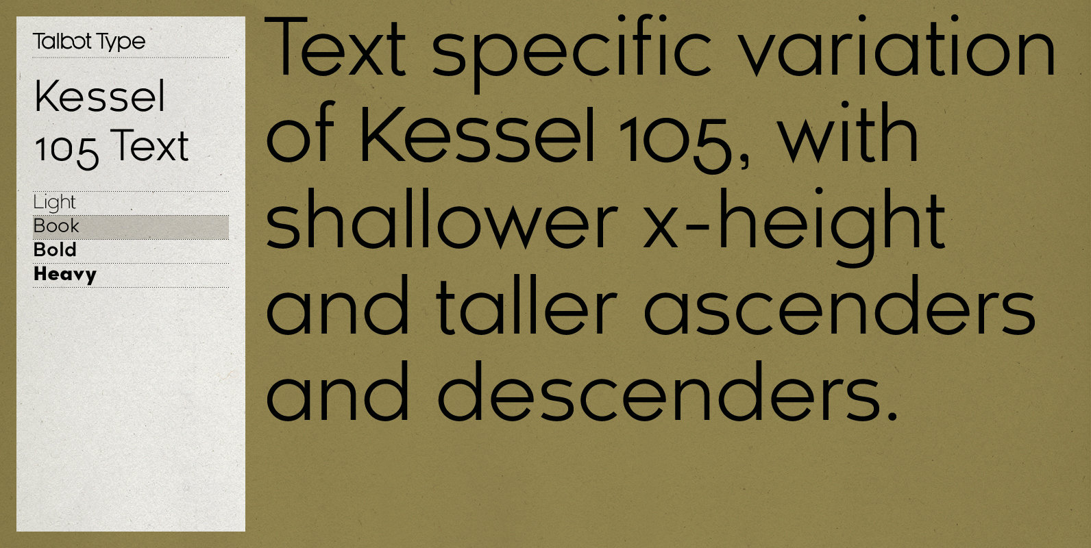
Kessel 105 Text Font
Kessel 105 Text is the text specific variation of stablemate, Kessel 105. With a narrower x-height and longer ascenders and descenders, its more traditional proportions make it more economical with space and better suited to continuous text. It’s a versatile,

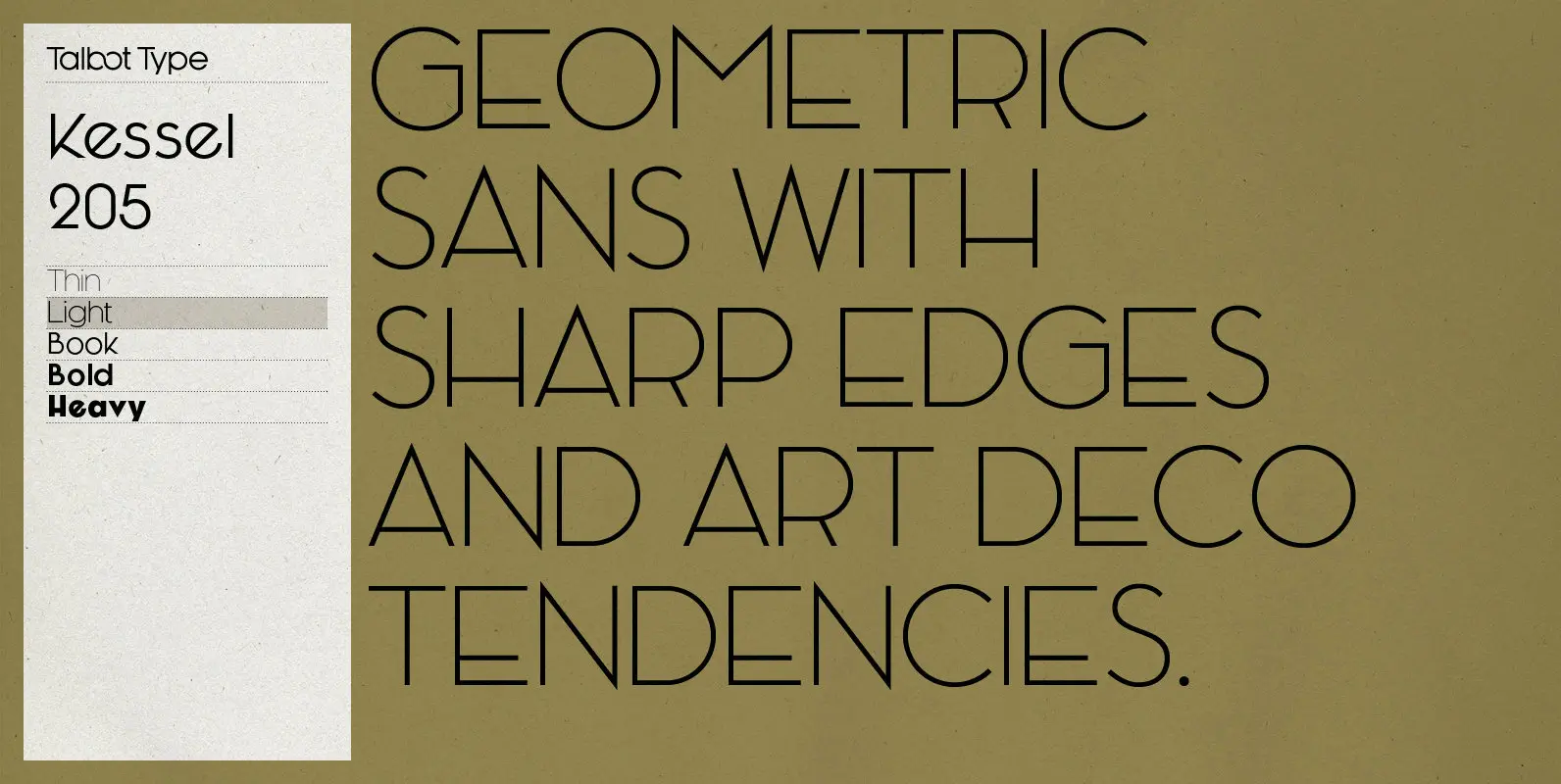
Kessel 205 Font
Kessel 205 is inspired by the classic, geometric sans-serifs such as Futura, but has shallower ascenders and descenders for a more compact look, and features an art deco influence with sharp points at the apex of many characters, lowered crossbars

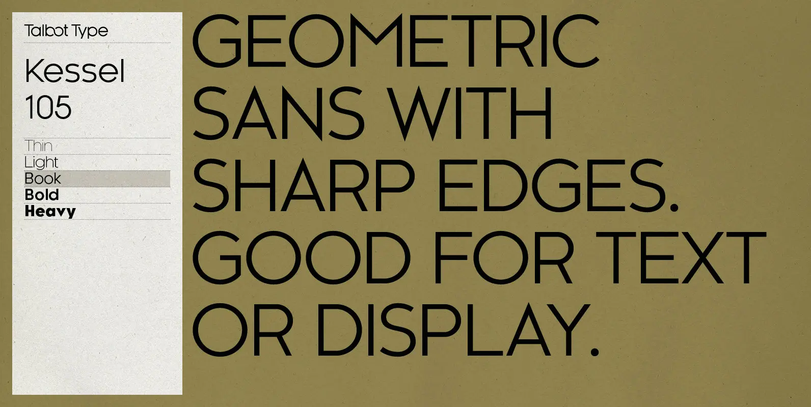
Kessel 105 Font
Kessel 105 is inspired by the classic, geometric sans-serifs such as Futura, but has shallower ascenders and descenders for a more compact look, and features an art deco influence with sharp points at the apex of many characters. It’s a