Tag: sharp
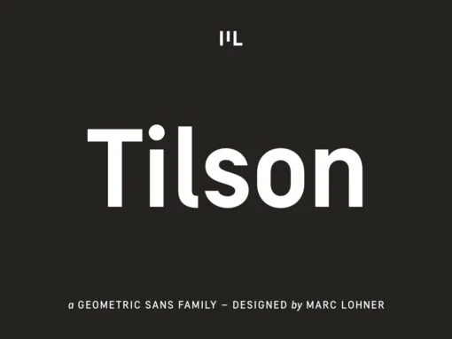
Tilson Font
Meet Tilson, a versatile workhorse family for both texts and headlines based on a geometric and straight-lined design. It will give your apps, websites, logos, posters and so much more a techy and masculine look and feel. However, some friendly
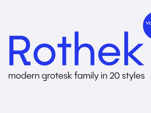
Rothek Font
Rothek is defined by its strong and unique character. It comes in 21 styles — 10 uprights and 10 italics and 1 variable font — and is a perfect tool for any designer who needs a versatile font for a
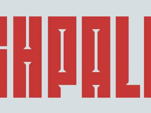
SK Shpala Font
SK Shpala is a modern geometric display typeface inspired by the aesthetics of railways. The typeface is built on a system that includes a combination of wide lines and thin gaps, which creates a unique character pattern. The name of
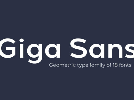
Giga Sans Font
Giga Sans is a modern sans serif font with a clean and elegant geometric touch. Consists of 9 uprights and 9 matching italics ranging from Thin to Black. Besides being suitable for strong headlines, Giga Sans can also be used
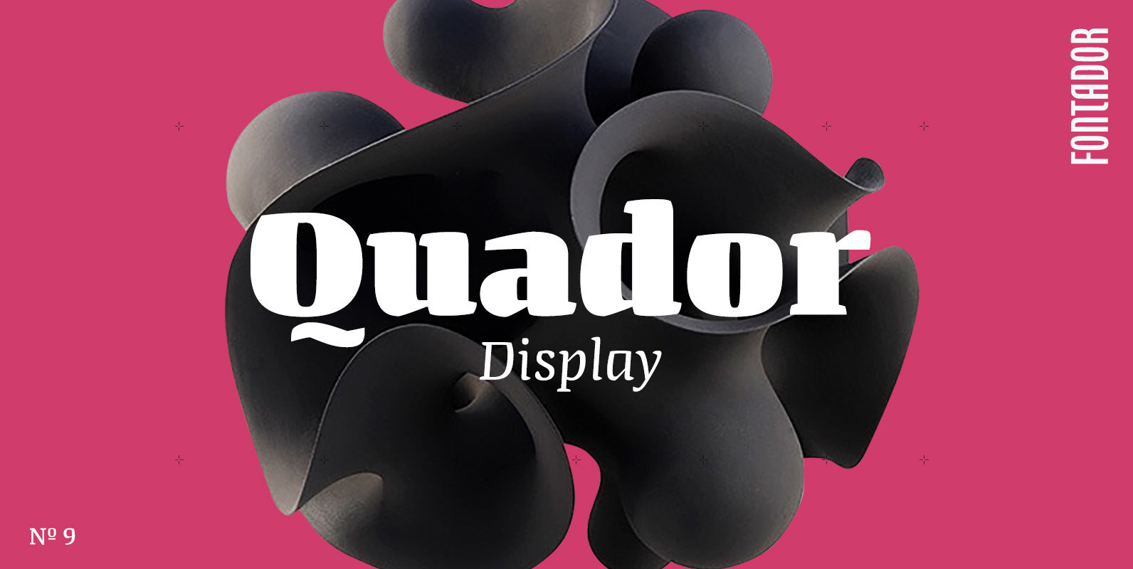
Quador Display Font
Quador Display is a serif, especially designed for contemporary typography on print and screen. The superellipse-based forms and high x-height allow large and open letterforms, perfectly adapted to the pixel grid on screen. The font contains 6 weights from light
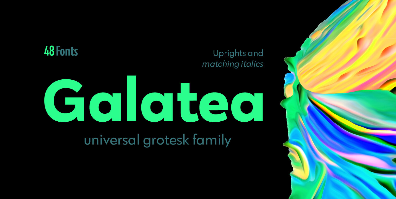
Galatea Font
Galatea is a universal sans serif family – clean and timeless. Both iconic and legible, Galatea is suited to cover many needs from brand identities to editorial design, advertising, logos and beyond. Cyrillic characters are featured and a wide range
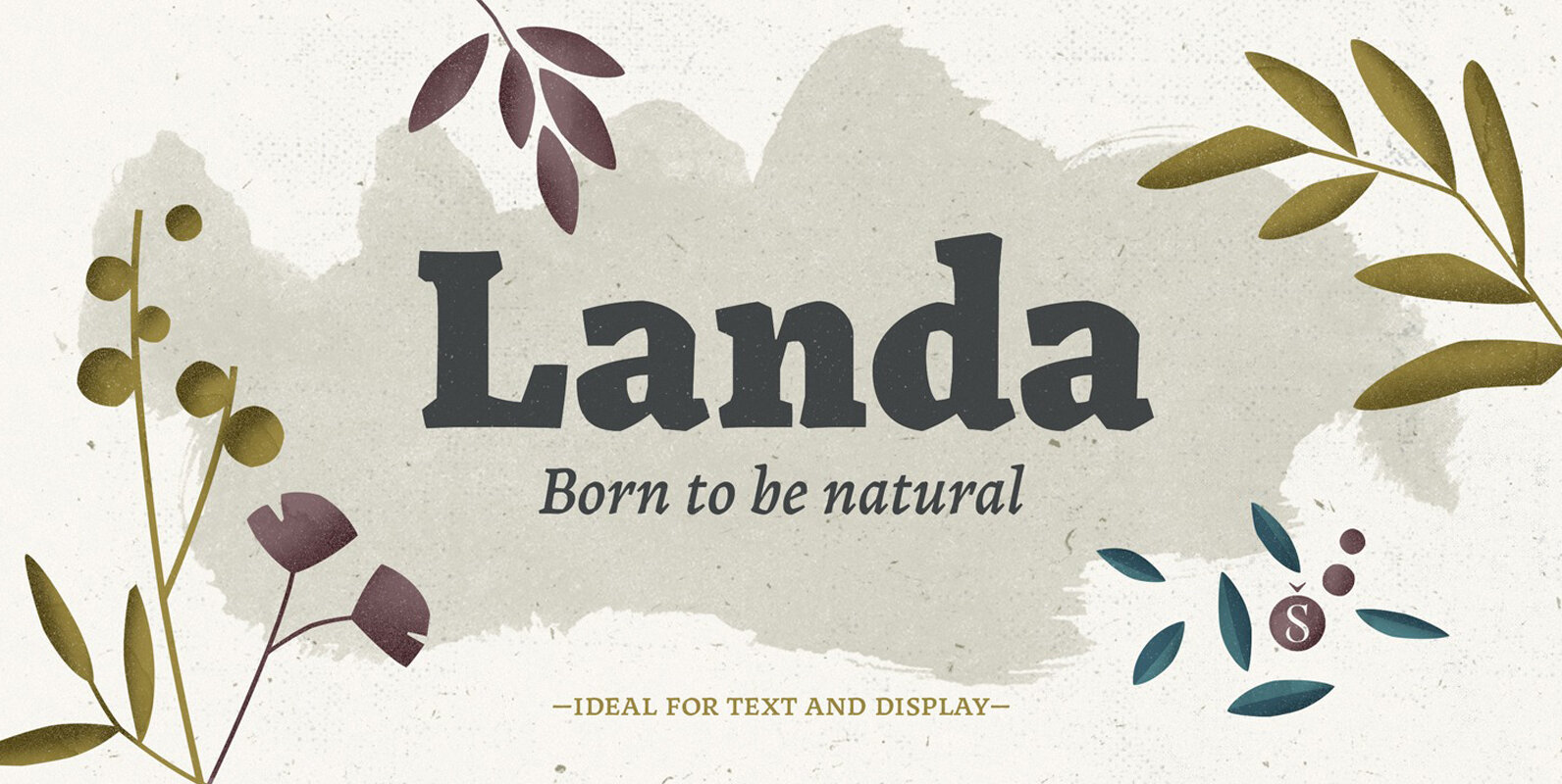
Landa Font
As good as Nylon is, there’s nothing better than a nice woolly blanket. The smell and coarse, uneven texture are relaxing and feel reassuring. More comfortable. In a world where technology can reach millimetric precision, sometimes it’s good to connect
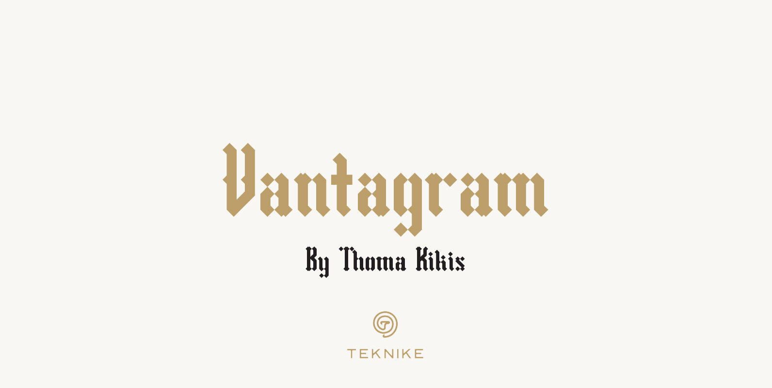
Vantagram Font
Vantagram is a modern display font. The typeface is made from basic square geometry. It is inspired by blackletter typefaces of the medieval period in Europe. The Vantagram name is a combination of two words derived from “vanta” French for
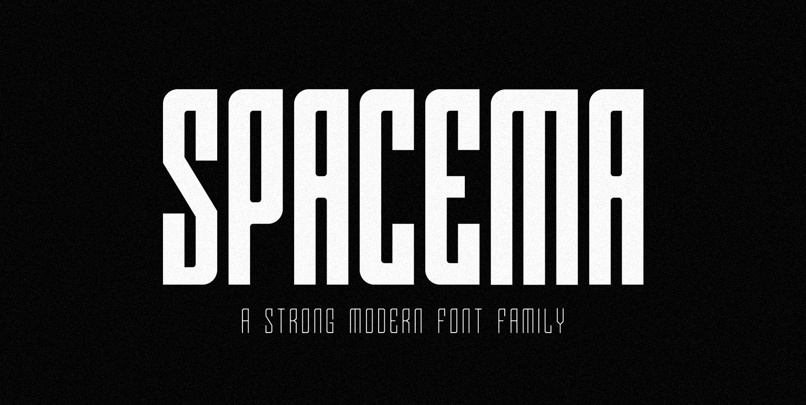
SPACEMA Font
Spacema is a modern condensed typeface with a strong vertical emphasis while maintaining prominent geometric quality to it. With a balance of hard lines and smooth curves, Spacema is an eight-weight typeface which includes uppercase, numerals, extended characters and accents.
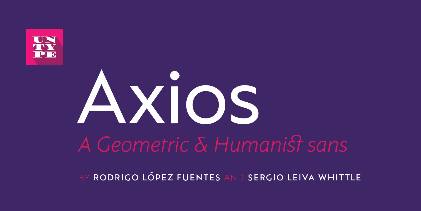
Axios Font
Axios was designed, on one side, due to its rational intention of searching the beauty on the purity of its forms, assuming the language of the early XX century geometric sanserifs. But its structure foundations are deeply attached into the
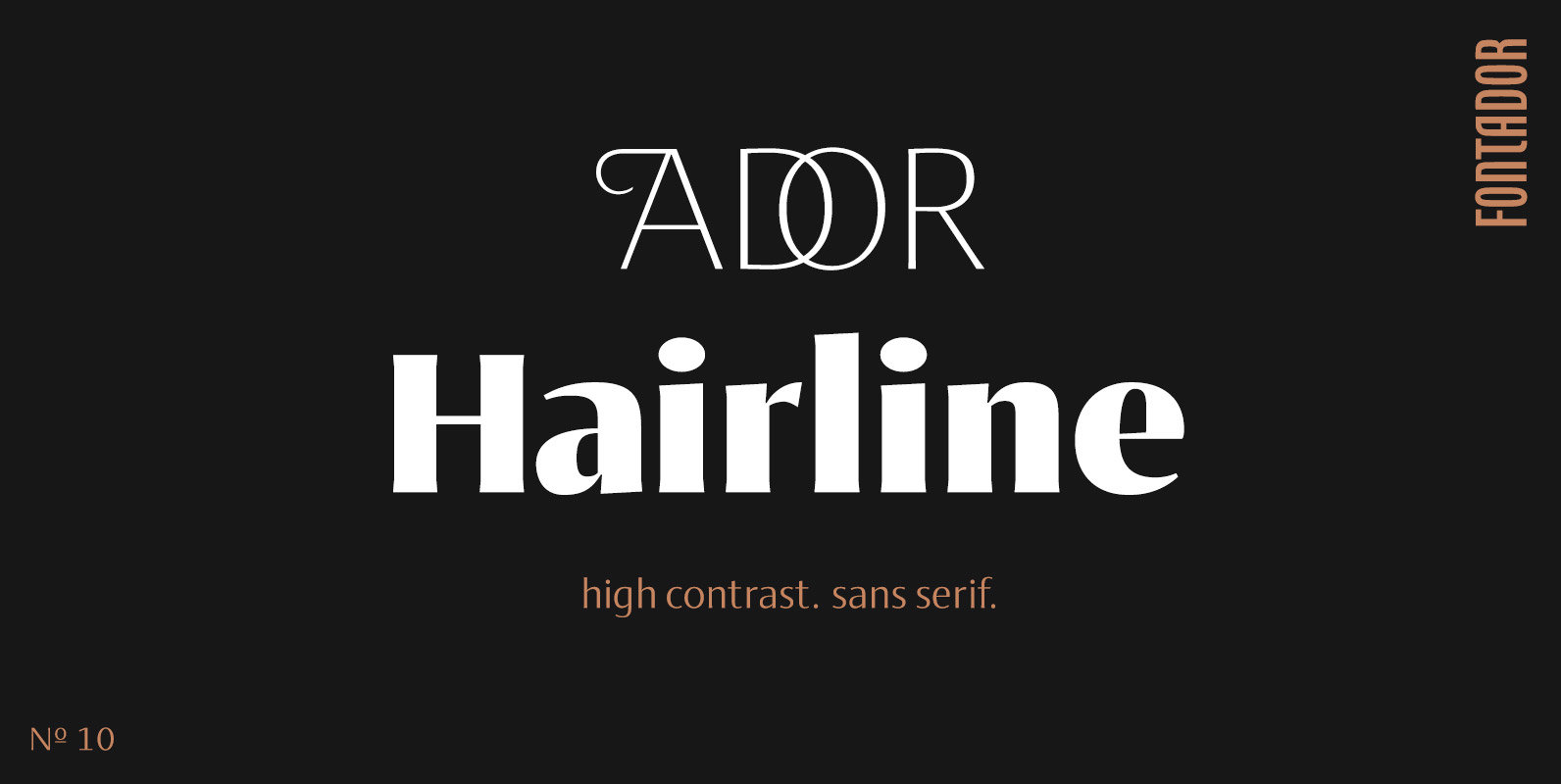
Ador Hairline Font
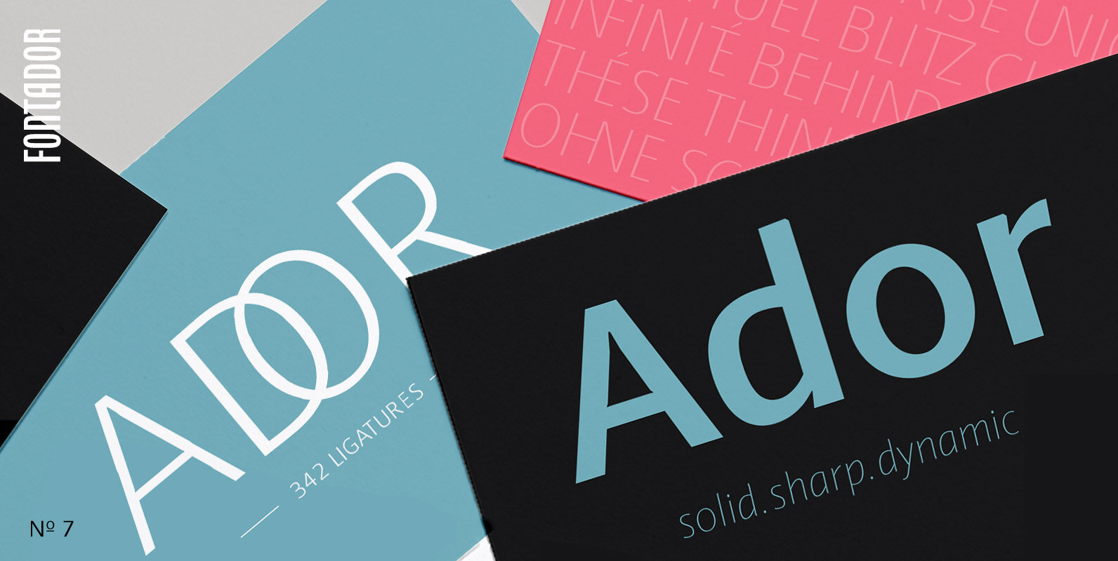
Ador Hairline is the high contrast version of Ador. A humanist sans serif that falls in the “evil serif” genre, especially designed for contemporary typography and comes up with 7 weights from extralight to black plus true italics and 293
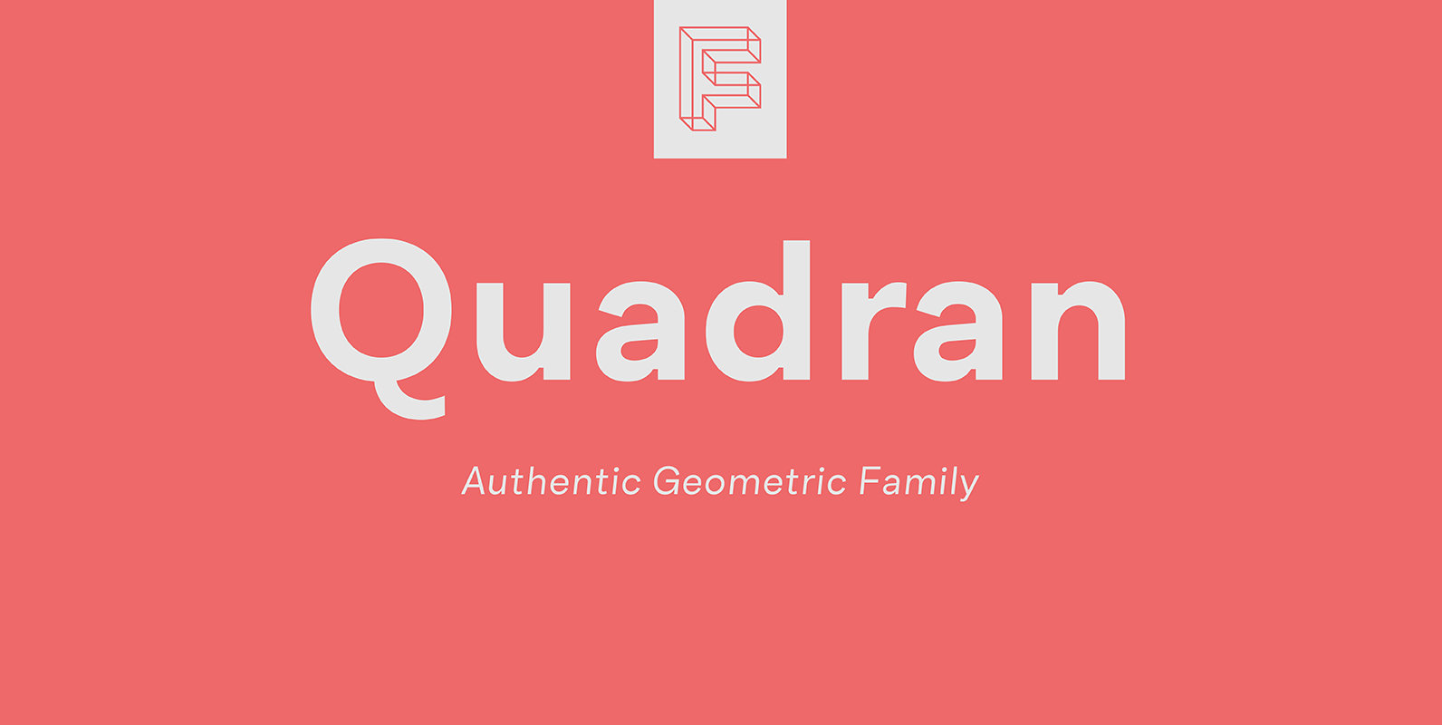
Quadran Font
Quadran is a new geometric grotesque type family, each character tailored to established alternative design communications for today trends, and the unusual double story g is customized to meet this classic style. Quadran consists of several weights including ExtraLight to
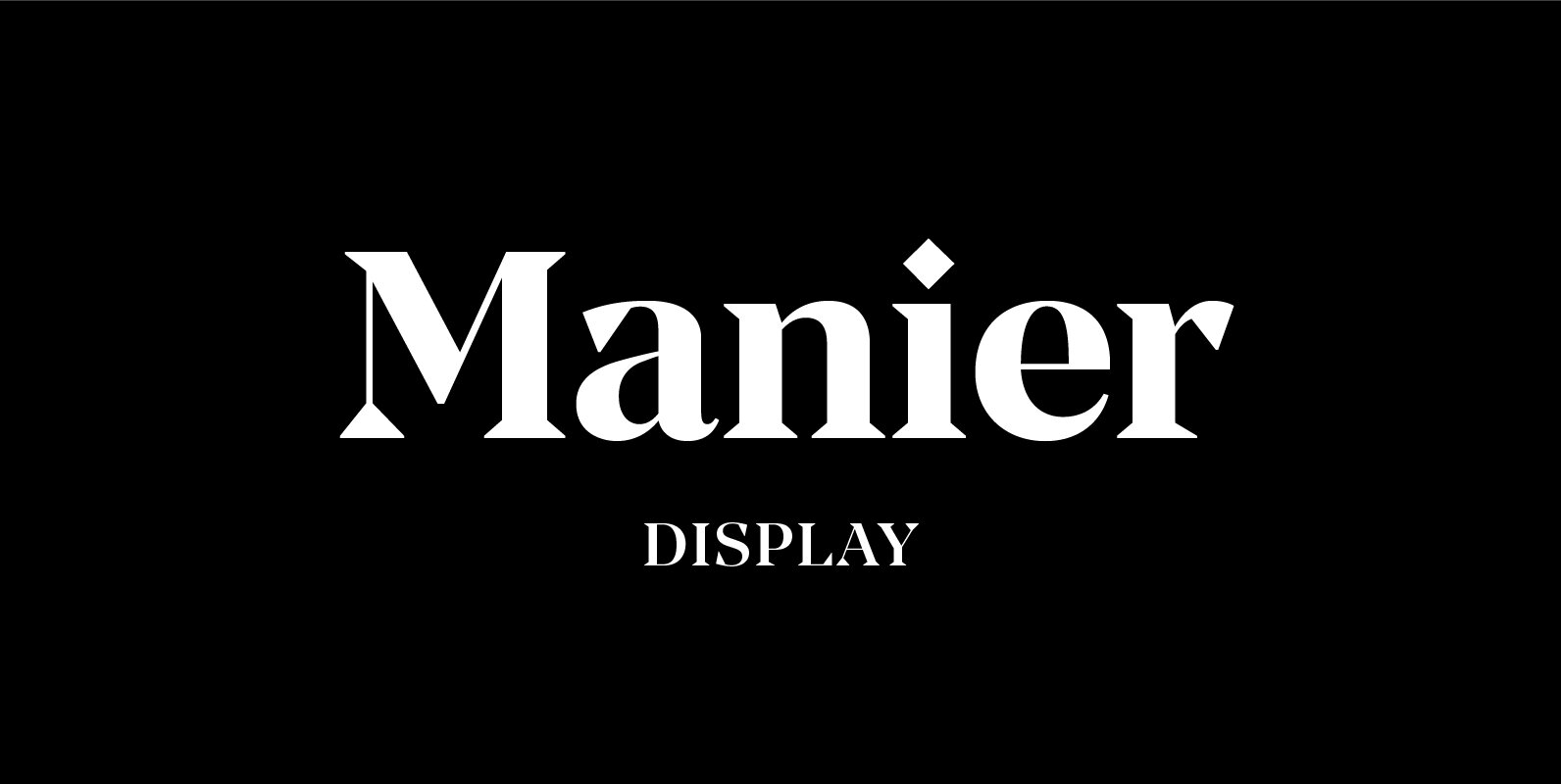
Manier Font
Manier is a fresh, display, wedge-serif font family inspired by transitional and contemporary typefaces. Manier has a big x-height value, modern proportions, sharp serifs and an extreme stroke contrast with a vertical stress. The typeface is a great choice for
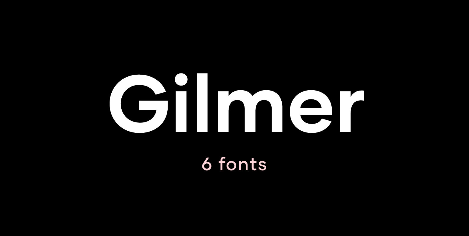
Gilmer Font
Gilmer is a fresh, geometric, sans-serif font family inspired by the iconic typefaces like Futura and Avant Garde. Gilmer has a big x-height value, geometrical letterforms, sharp edges and very small stroke contrast as the neo-grotesk fonts from 20th Century.
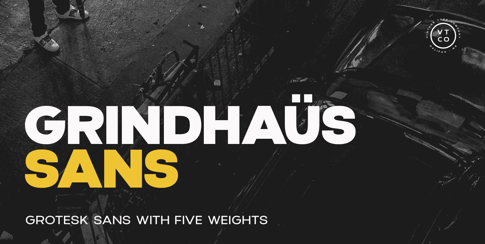
Grindhaus Sans Font
Grindhaus Sans is a cross between a geometric & humanist grotesk, inspired by the vintage grotesk typography of the 19th century. A style that was popular on shop windows, book covers, and minimalist labelling. The letterforms in Grindhaus Sans have
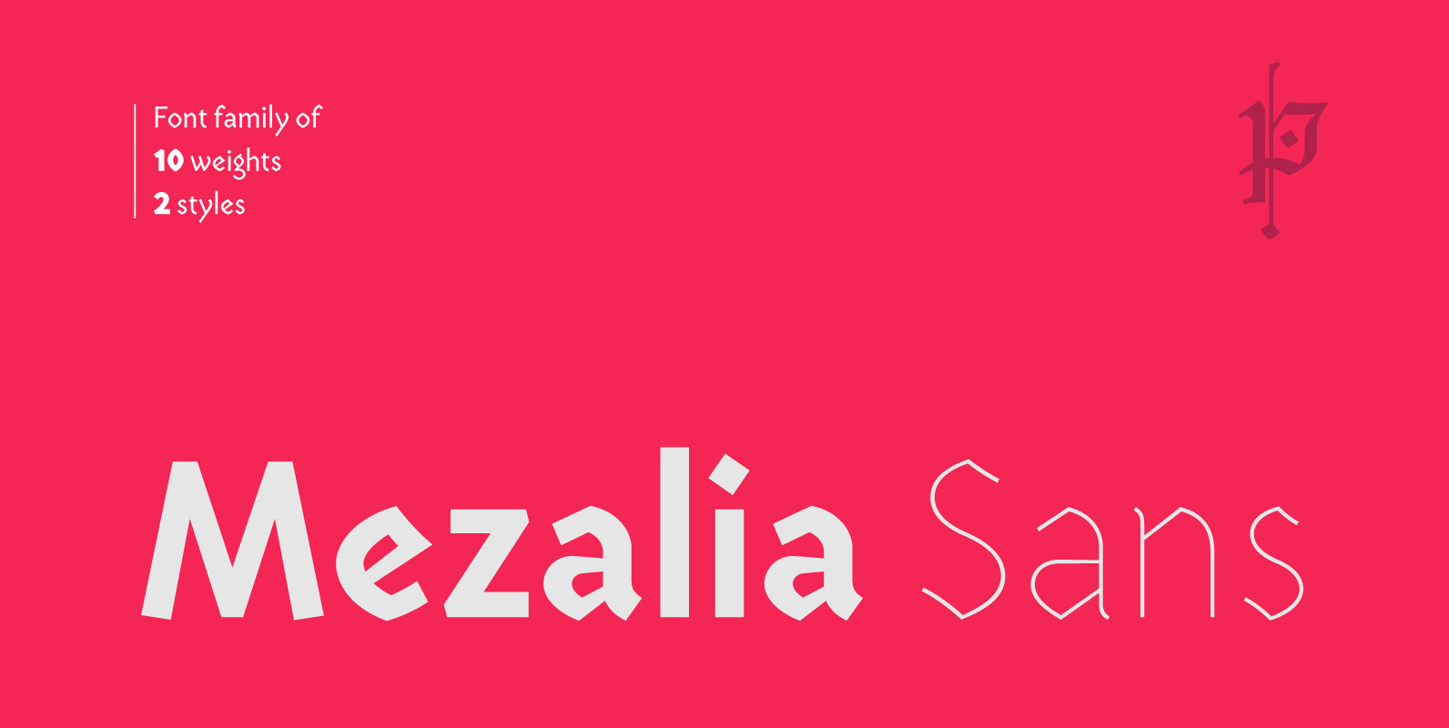
Mezalia Sans Font
Mezalia Sans is a logical continuation of the Mezalia family. Its shapes are based on medieval calligraphic style: the Bastarda. This time the evolution is taken a step further, as these classic shapes are merged with the straightforwardness of a
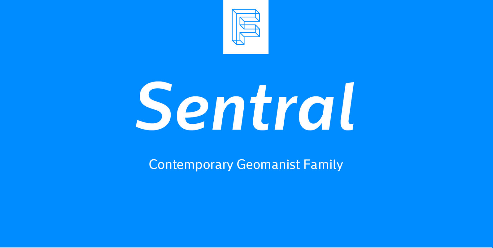
Sentral Font
Sentral is a sans serif font design published by Formika Labs Published by Formika LabsDownload Sentral
