Tag: sharp
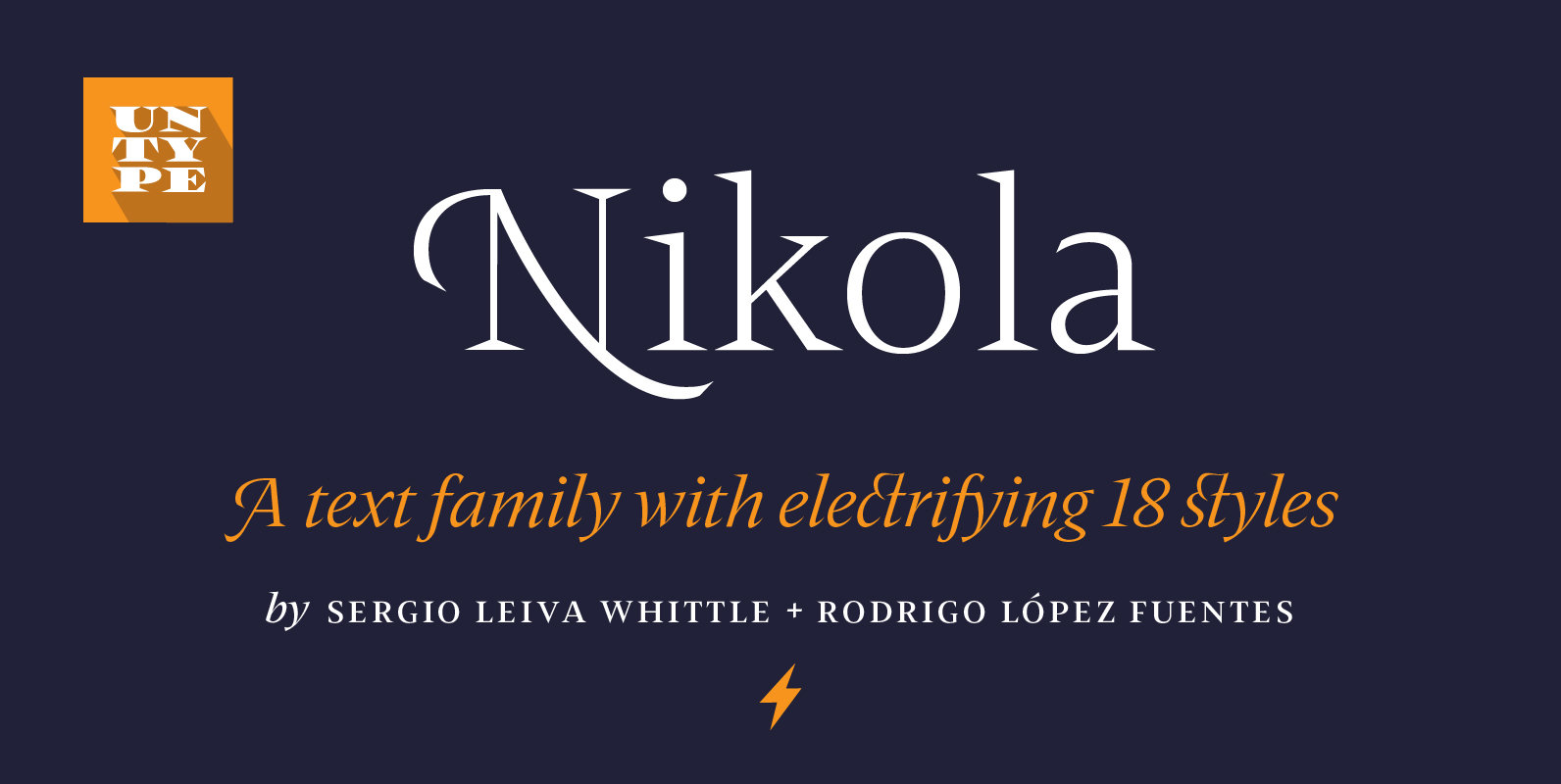
Nikola Font
Nikola is a text typeface that offers a wide range of possibilities. While its regular and medium weights were specially optimized for maximum performance, balanced for excellent legibility and carefully crafted to spread a scent of tradition on long text
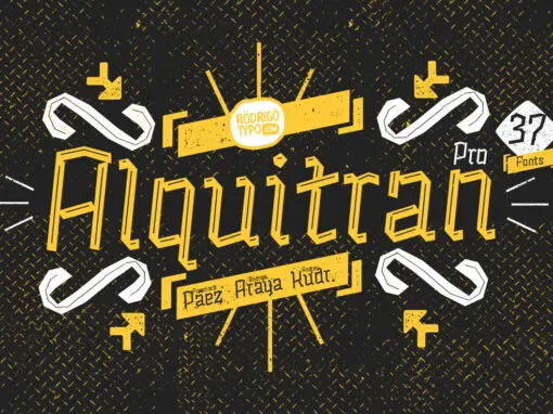
Alquitran Pro Font
Alquitran Pro is a retro font design published by RodrigoTypo Published by RodrigoTypo Download Alquitran Pro
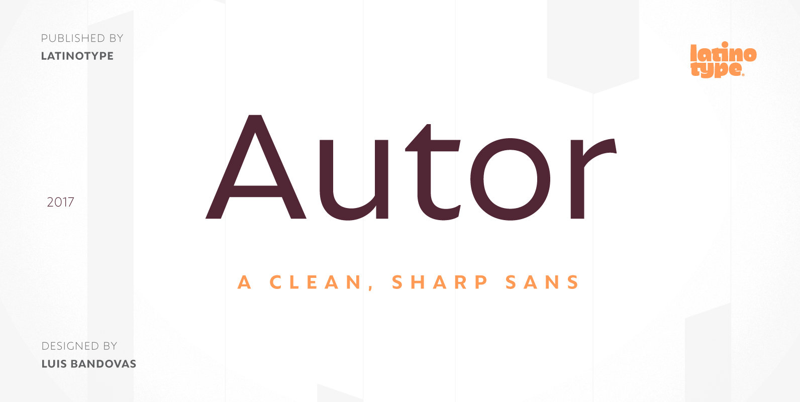
Autor Font
Autor is a medium-contrast sans serif font with a dynamic stroke modulation. Its clean look and angled terminals give your designs a ‘sharp’ and contemporary feel. Autor Family comes in 7 weights, ranging from Thin to Black, with matching italics,
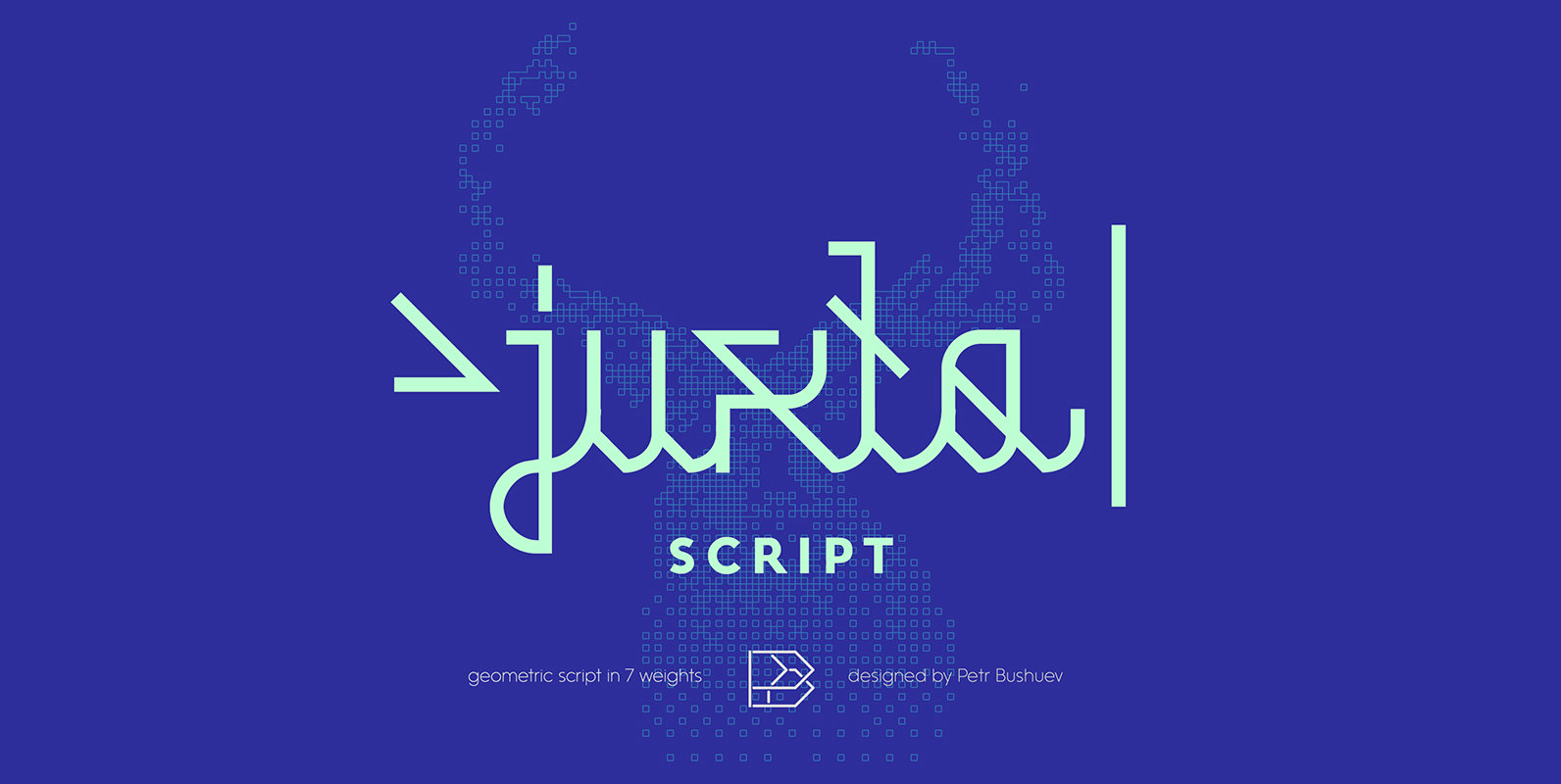
Juxta script Font
Juxta script is a script font design published by NaumType Published by NaumTypeDownload Juxta script
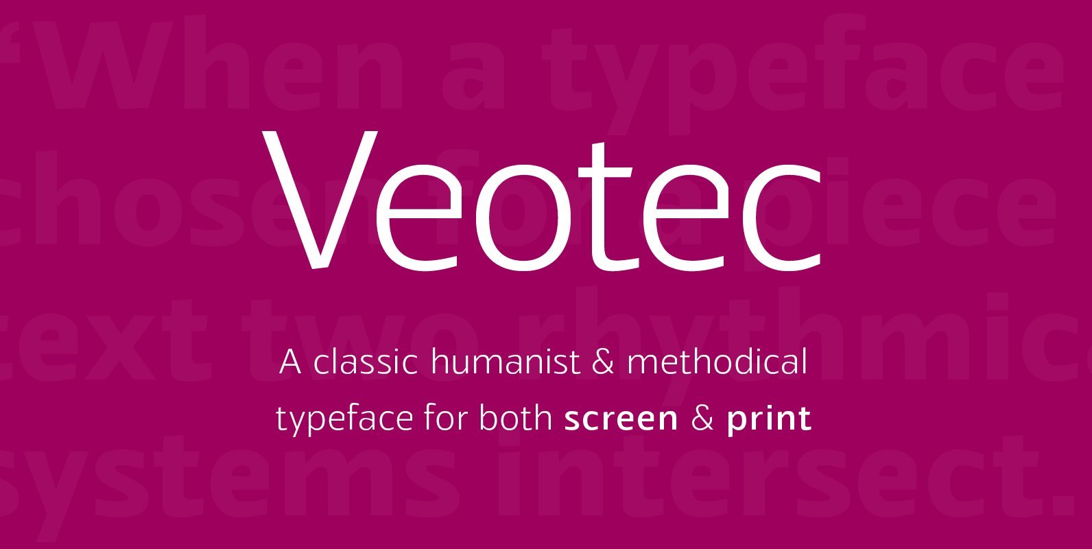
Veotec Font
Veotec is a classic humanist sans that skilfully works for both screen and print due to its steep and precise angles enabling more negative space. Not only does this methodical approach improve legibility and readability at small sizes, it allows

Attorney Font
Attorney shows a systematic, yet unconventional placing of its serifs, hard corners and a clean design which make it ‘an outstanding semiserif with a clean record’. Typeset in 7 weights, from Regular to Black, each of them accompanied by an
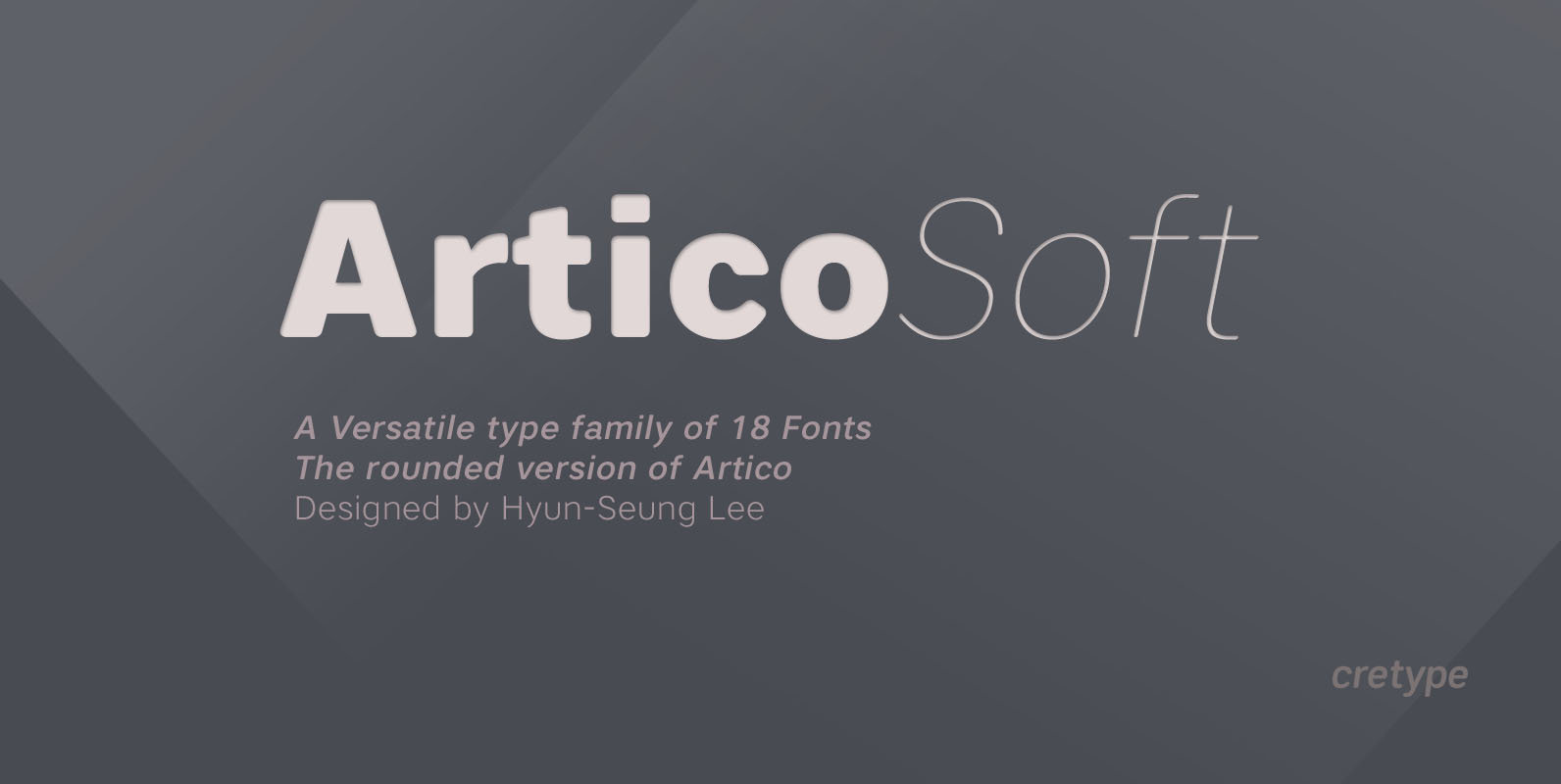
Artico Soft Font
Artico Soft is the rounded version of Artico. Artico Soft Family is a modern sans-serif typeface that is clean, simple and highly readable. Letters in this type family are designed with genuine neo-grotesque and neutral shapes without any decorative distractions.
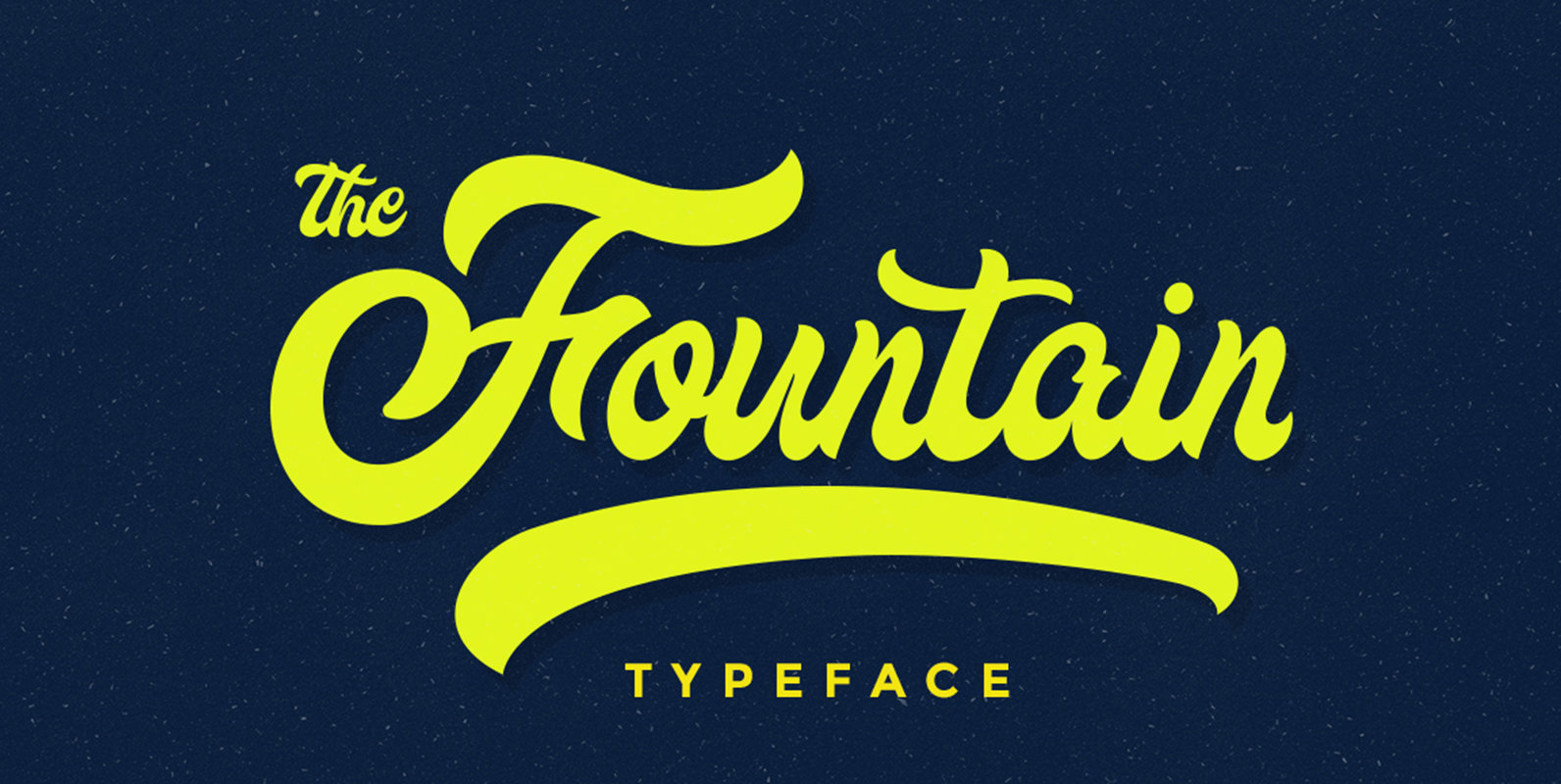
Fountain Font
The Fountain Typeface is a script typeface designed with bold character. Published by Ramandhani NugrahaDownload Fountain
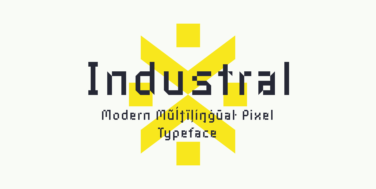
Industral Font
Industral is a “pixel style” typeface for modern use. Highly suitable for small text. The common feature is sharp edges and square base construction which enables legibility for long text paragraphs. Contains a total of 413 glyphs, including latin extended
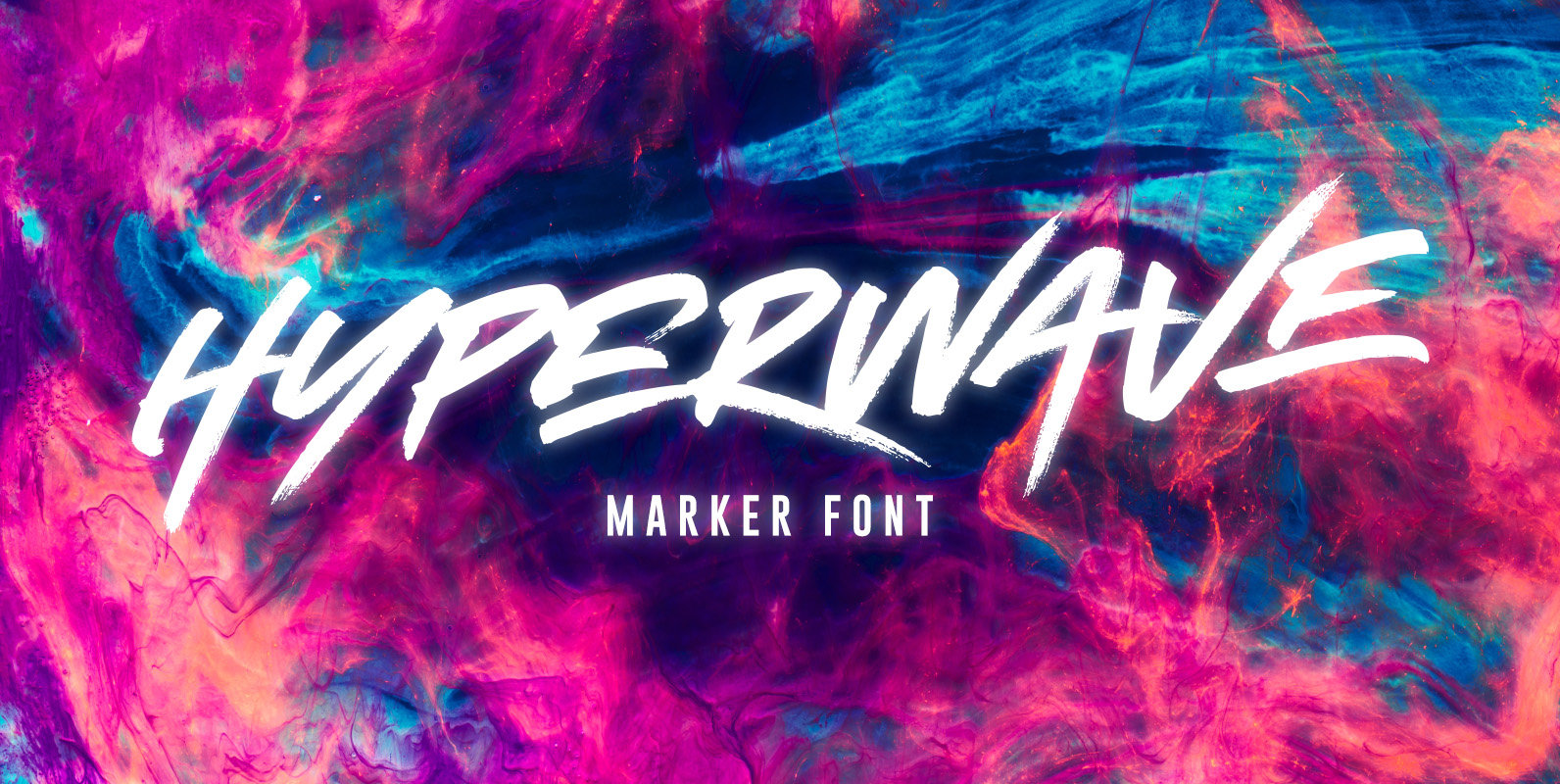
HYPERWAVE Font
Crank up the intensity with HYPERWAVE! An energetic set of brush fonts with a sharp attitude. With THREE sets of each letter, each equipped with distinctive fast brush strokes, HYPERWAVE is ready and raring to make a big statement on
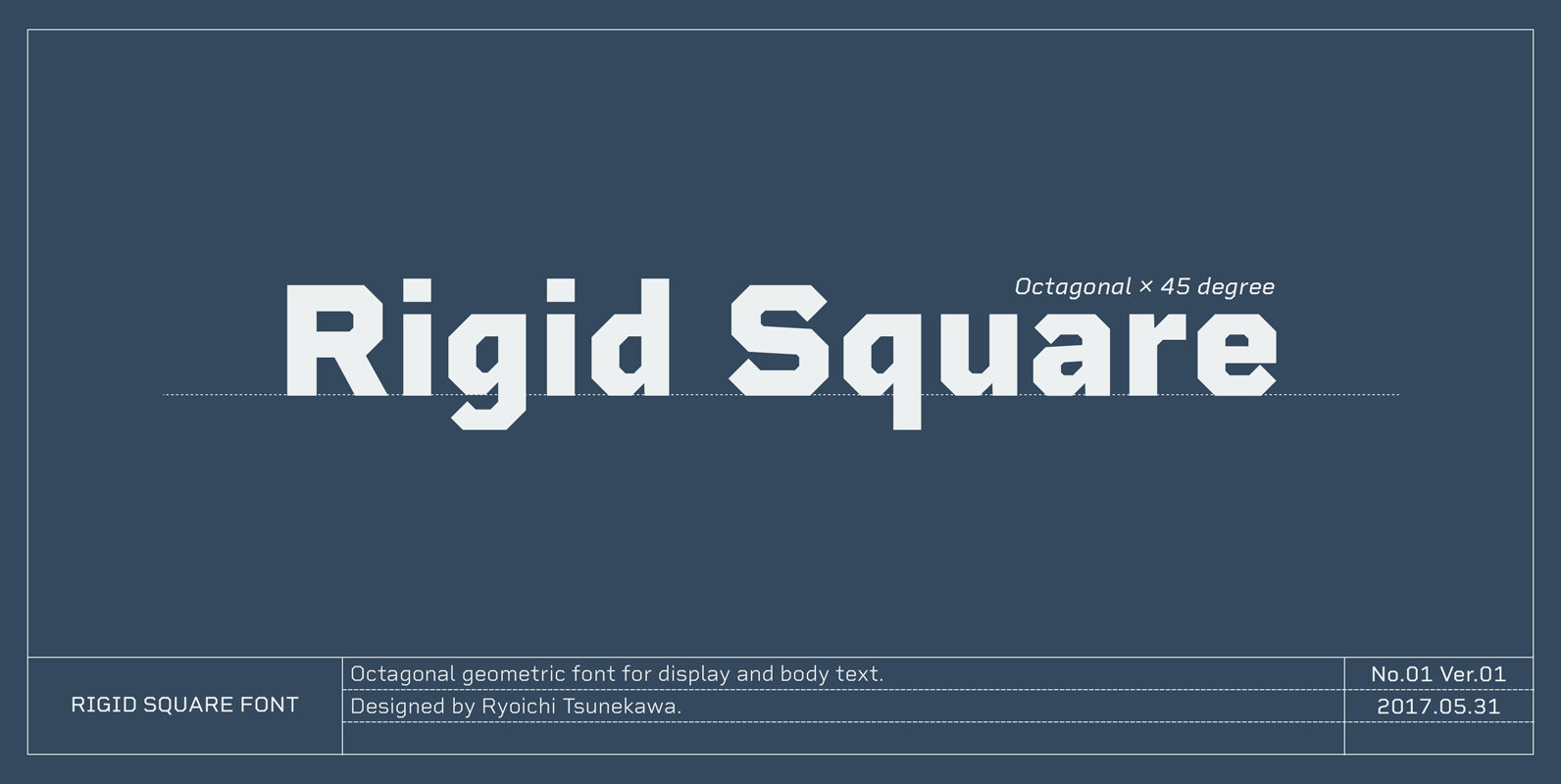
Rigid Square Font
Rigid Square, There is a rule, Octagonal shape and 45 degree cuts. Very geometric shape but designed especially for body text, long sentence such like a mechanical instructions. Capital I and lower l have distinguishable shape. Neo-humanist shape on lowercase
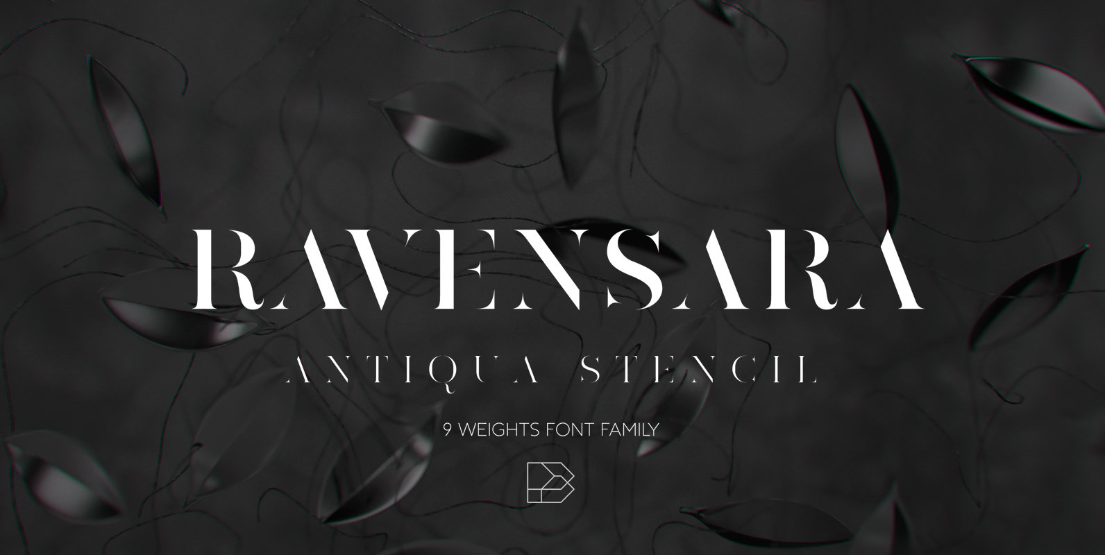
Ravensara Antiqua Stencil Font
Ravensara Antiqua Stencil is display font family with 9 weights, from Thin to Extrablack with hightest contrast. This font was inspired by old style classic typefaces, such as Didone and Baskerville, and got a modern feel by getting rid of
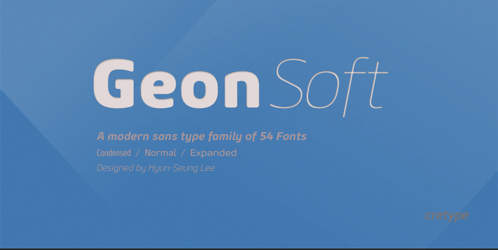
Geon Soft Font
Geon Soft is the rounded version of Geon. Geon Soft Family is a modern sans-serif typeface that is clean, simple, soft and highly readable. Letters in this type family are designed with geometric shapes without any decorative distractions. The spaces
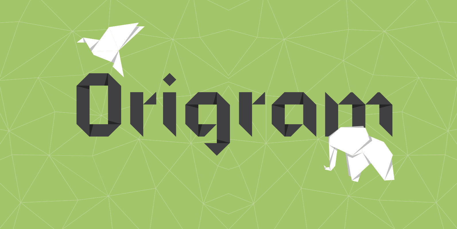
Origram Pro Font
ORIGRAM PRO is the full version of ORIGRAM Free Font, a font with over 100k downloads, and counting! This font was already featured in dozens of websites and Design Blogs. I decided to remake this font, smoothing out a few
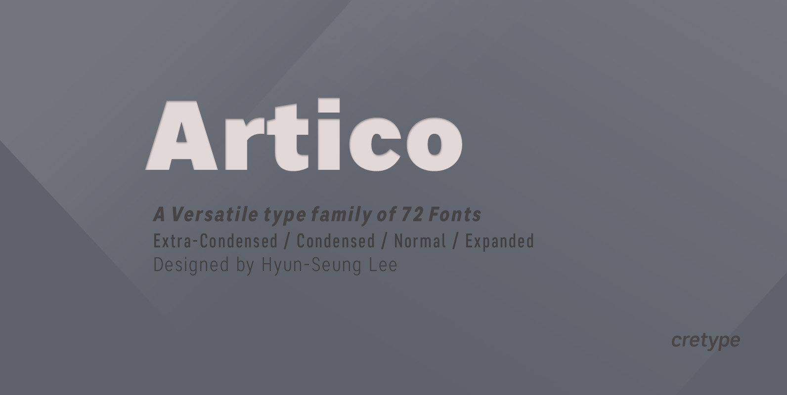
Artico Font
Artico Family is a modern sans-serif typeface that is clean, simple and highly readable. Letters in this type family are designed with genuine neo-grotesque and neutral shapes without any decorative distractions. The spaces between individual letter forms are precisely adjusted
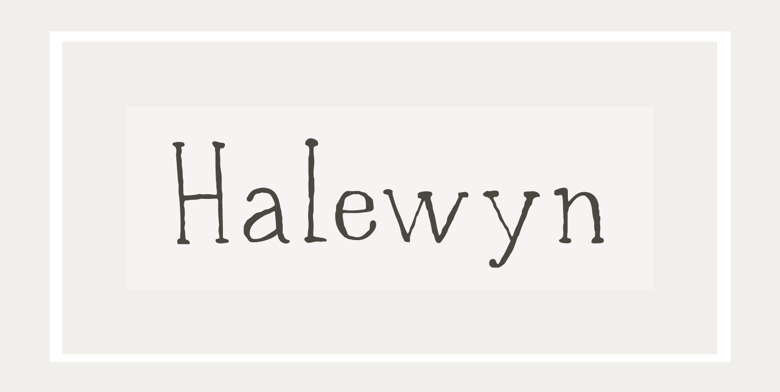
Halewyn Font
Heer Halewijn (The Song of Lord Halewijn) is a 13th century Dutch folk tale which survives in folk ballad. The story tells of a man called Halewijn, who lives in the woods and who lures pretty women with his songs
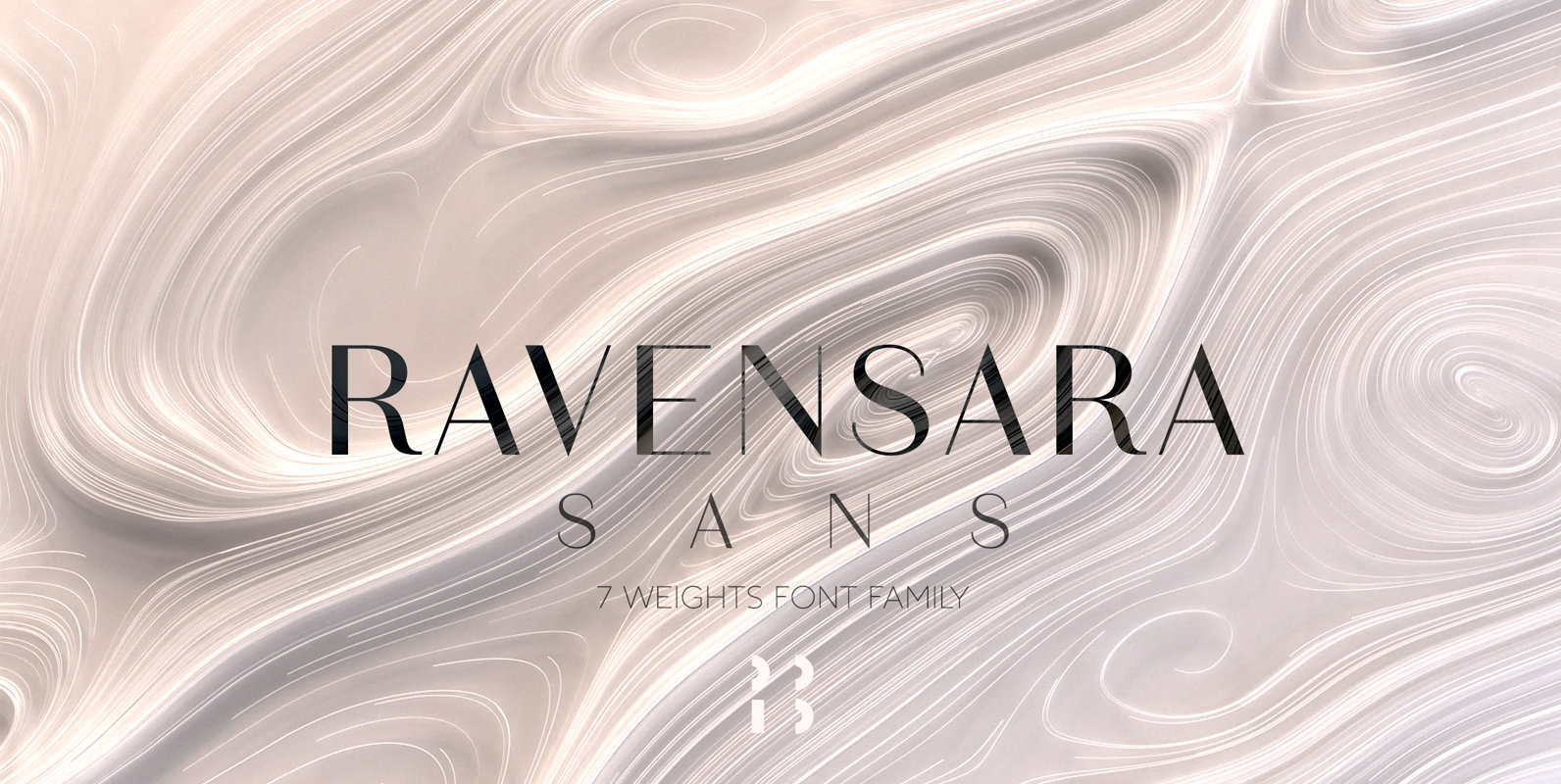
Ravensara Sans Font
Ravensara is a contemporary, high contrast, sans-serif font family that contains 7 weight options. Published by NaumTypeDownload Ravensara Sans
