Tag: signage
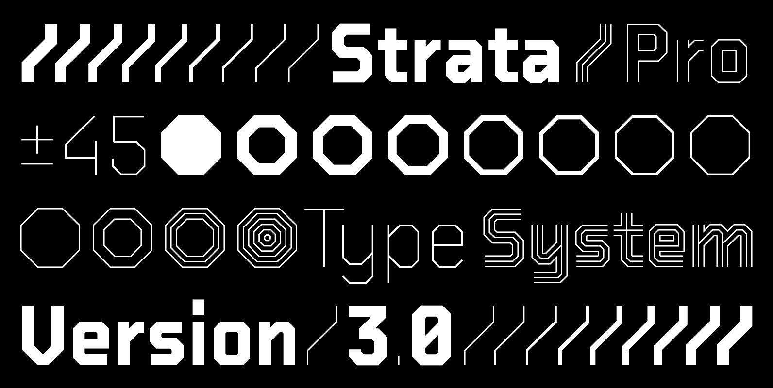
BB Strata Pro Font
BB Strata Pro is the first font with only octagon angles (±45°), polyspacing (same width in every weight), optical shape and monoline variants for any type of use. The ideographic system was created for an exhibition in 2015 to visualize
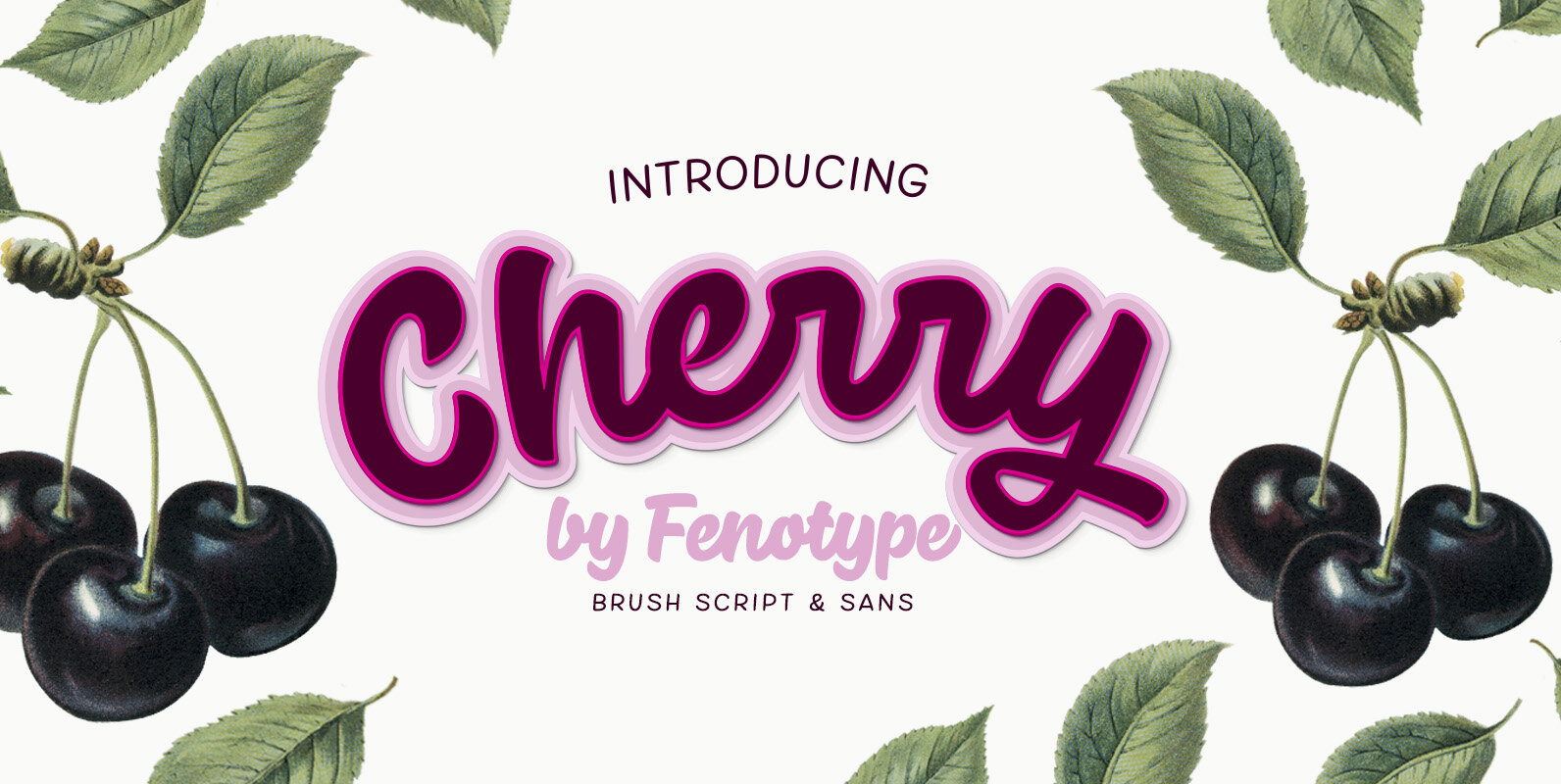
Cherry Font
Cherry is a bold and smooth display family with connecting script “Brush” and supporting thin marker caps “Sans”. In addition there is “Extras” which is a set of strokes and ornaments designed to go with the fonts. Cherry Print is
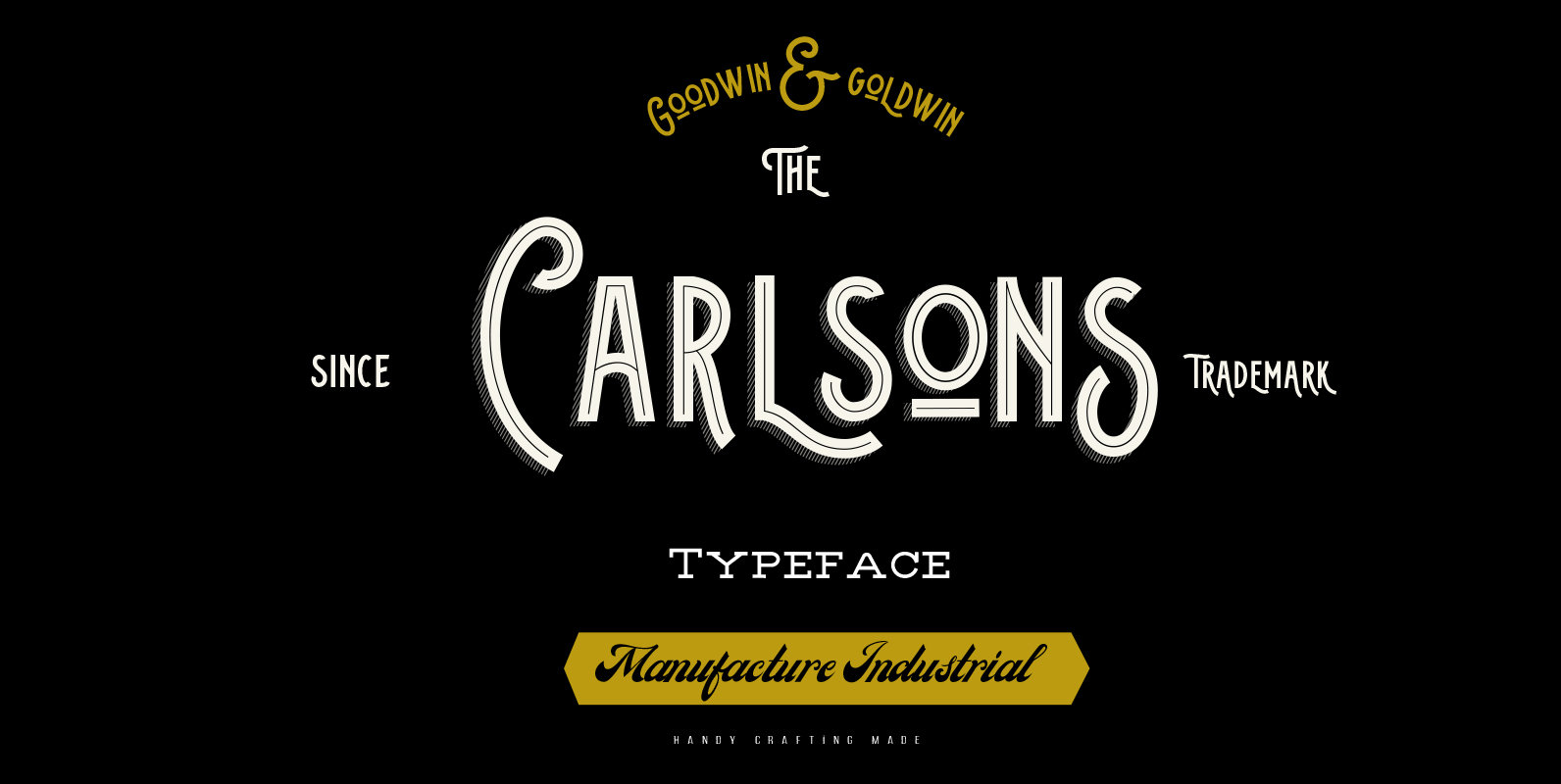
Carlsons Font
Carlsons is a decorative font design published by Ramandhani Nugraha Published by Ramandhani NugrahaDownload Carlsons
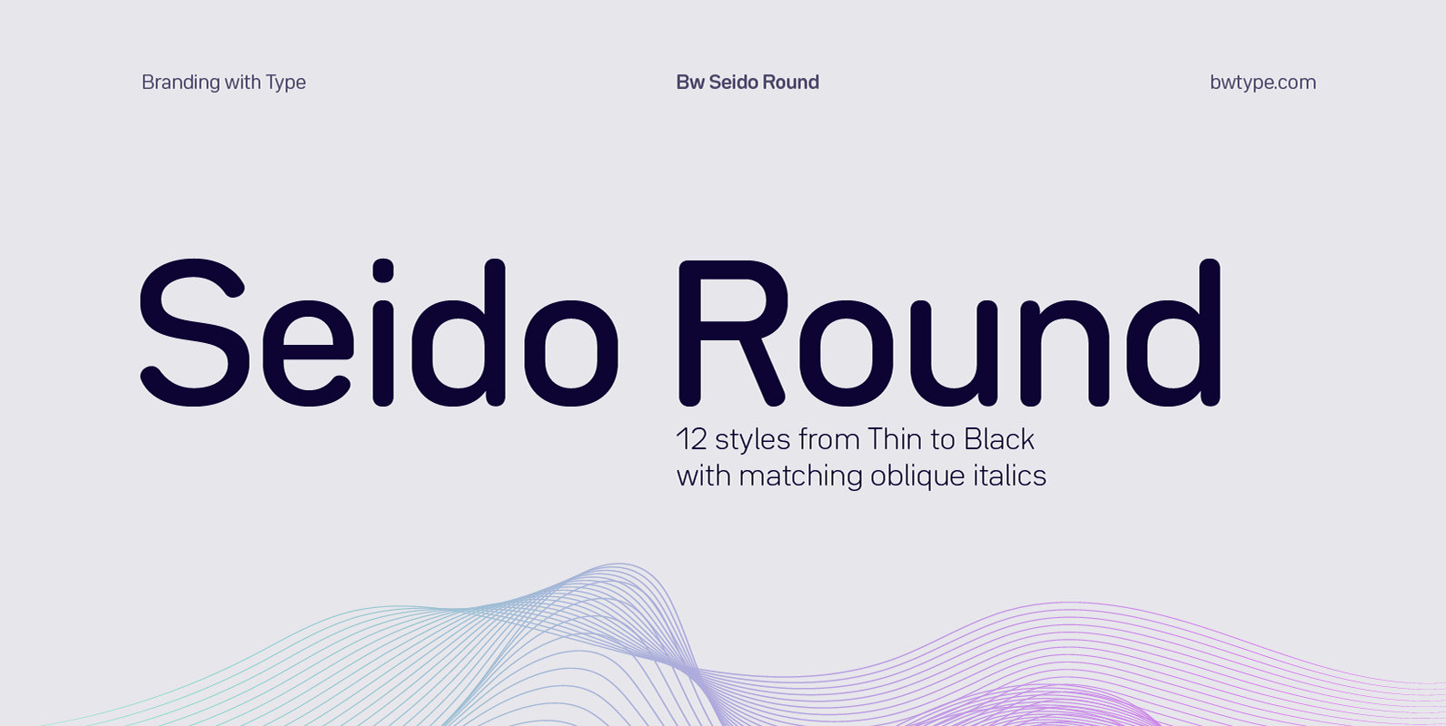
Bw Seido Round Font
Designed by Alberto Romanos, Bw Seido Round is a semi condensed font family with rounded corners striking a gentle balance between minimal strict geometry and typographic refinement, conveying a subtle industrial yet friendly feel. It consist of 12 styles (6
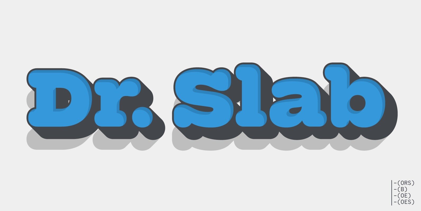
Dr Slab Font
Extraordinary impact and visual conspicuousness. Dr Slab is a super 3D serif family for posters, logos and all display. The basic idea is not a brand new. Stacking type system have been used since before wood type age. As you
Big Fish Font
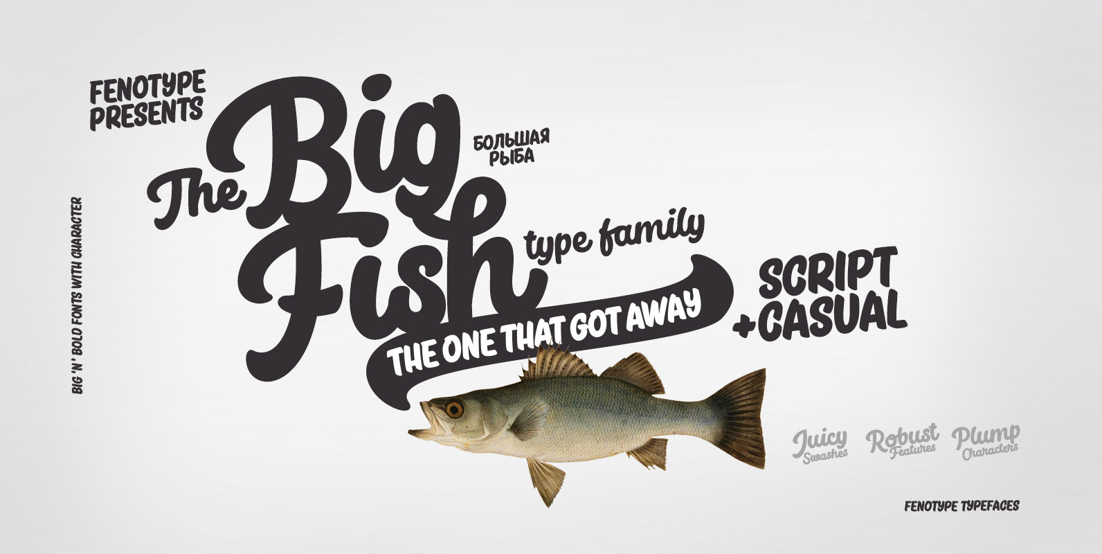
Big Fish is a low contrast Script and Slanted Casuals with bold characters. Big Fish has three weights of Script and a set of Extras that can be used as themselves or combined with script charters for custom swashes. Big
Bourget Font
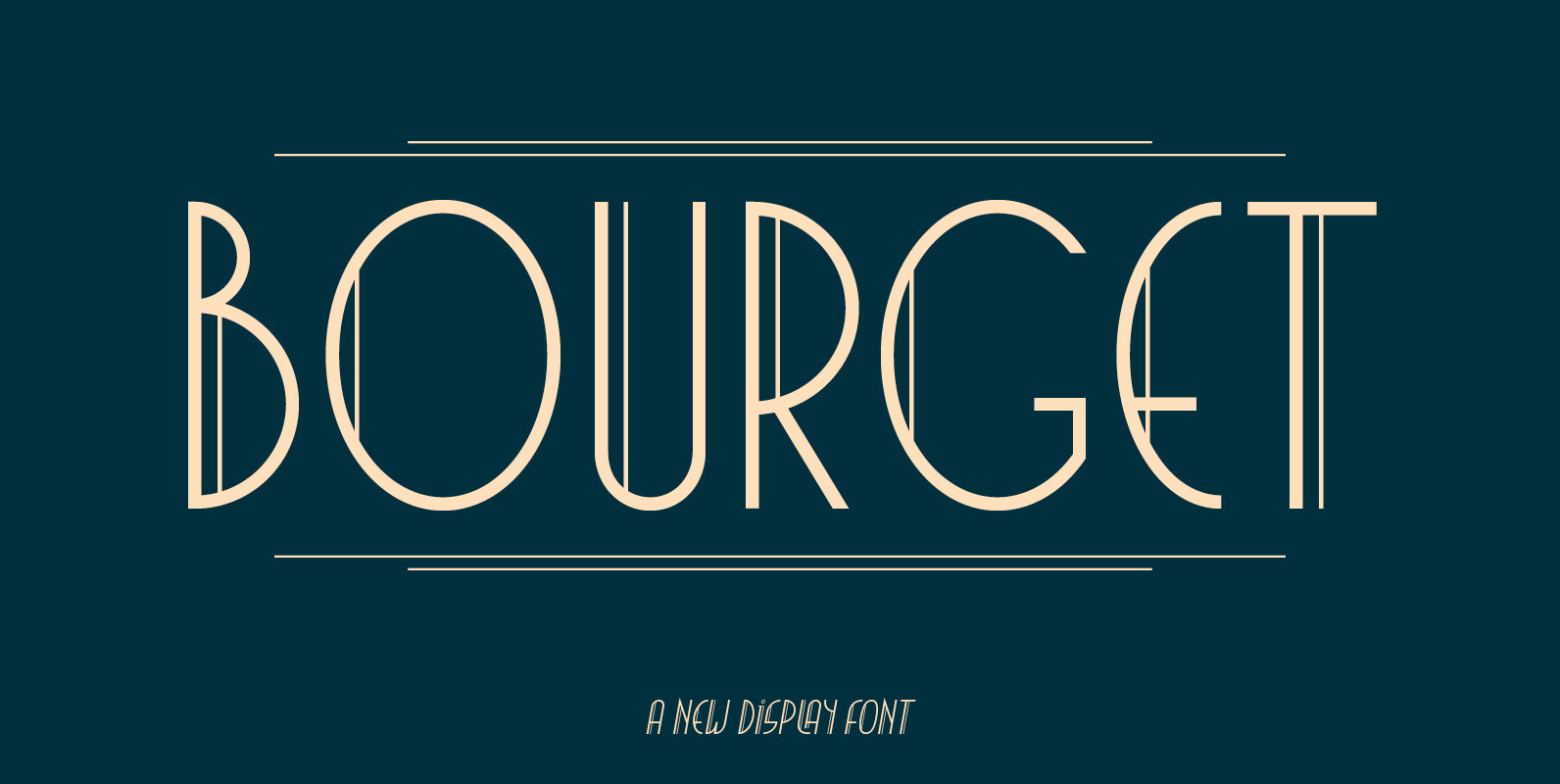
Bourget is a Display-Sans, which is inspired by the Art Déco Typography of the 1920´s, 1930´s years. It has a very characteristic and unique style by its thin line through every letter. The upright and italic versions have each 750+
Sunborn Font
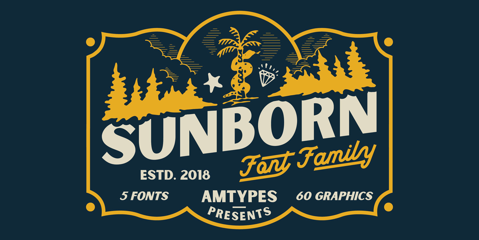
Sunborn is a script font design published by Angga Mahardika Published by Angga MahardikaDownload Sunborn
Dillan Font
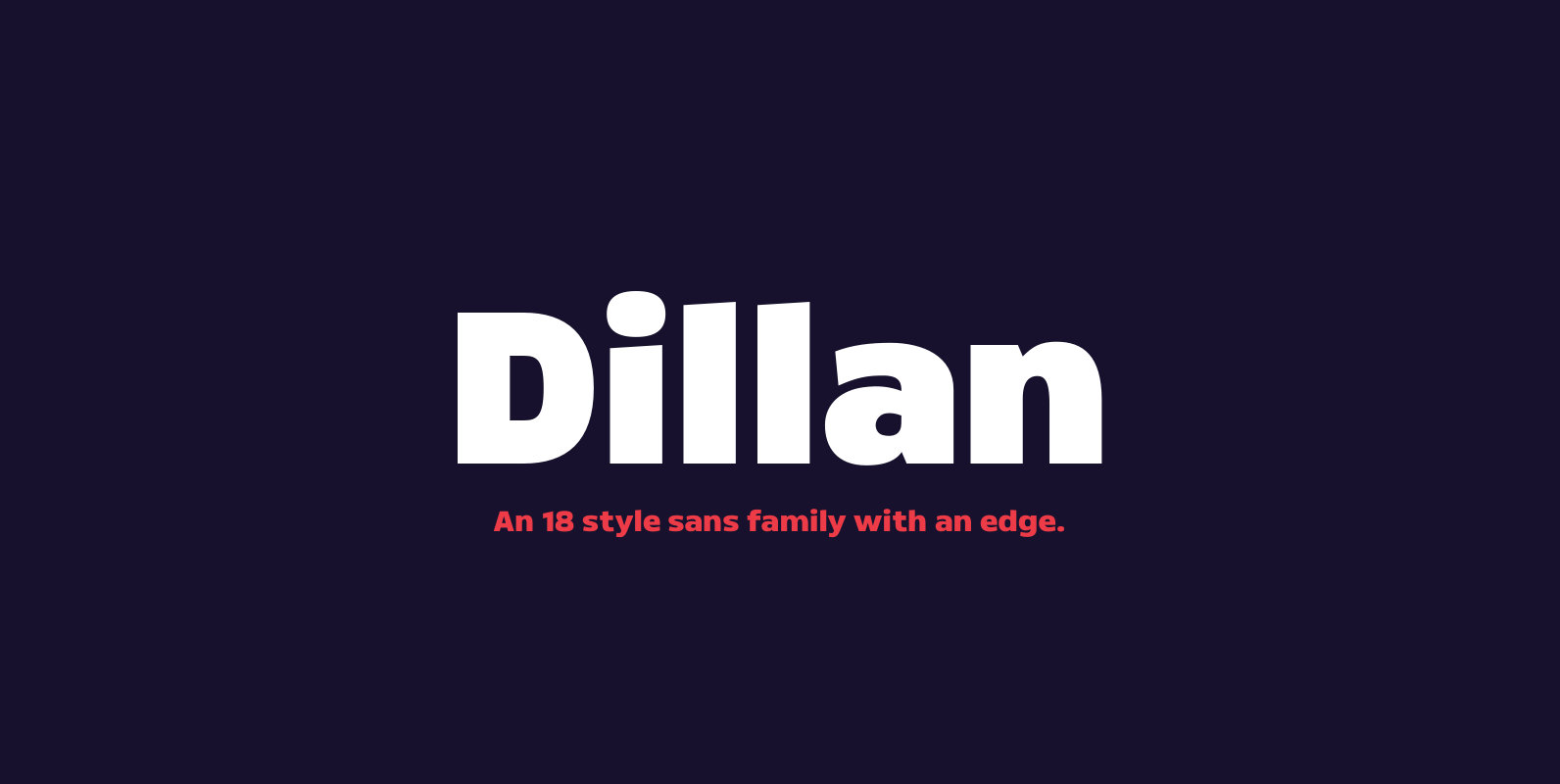
Dillan is an 18 style sans family with an edge. Its angled ascenders add movement and a unique appearance, whilst its flatter terminal angles gives a more fluid connection to partnering letters. The angles give the font a contemporary feel
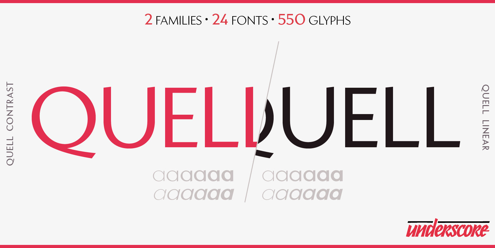
Quell Font
Quell is a novel attempt to bridge the gap between geometrically constructed shapes on the one hand, and modulated strokes and subtle calligraphic influence on the other hand. The visual tension in Quell stems from conflict between two tendencies: The
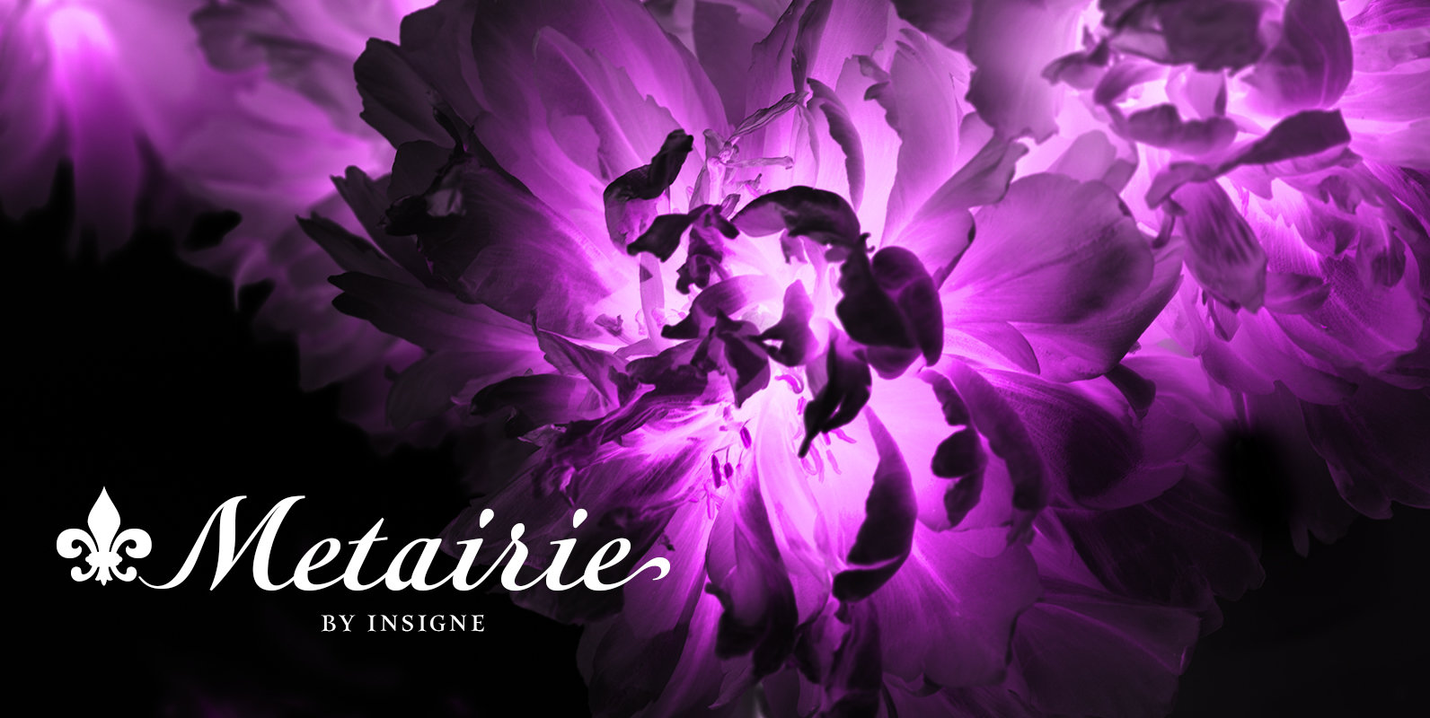
Metairie Font
Get in the swing with Metairie. This high-contrast script from Jeremy Dooley sets the rhythm for your next headline or short phrase with its fresh, expressive forms. Metairie’s (sometimes exaggerated) scrawled letterforms play on the colorful world of calligraphy to
