Tag: sketch
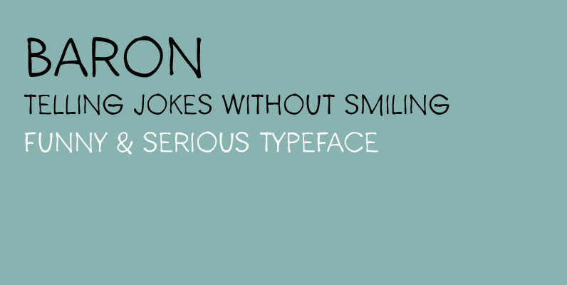
Baron Font
After Baronessa – funny but not crazy cartoon style font, Baron is an other handmade typeface, warm and friendly but not excessively childish. If Baronessa is a little feminine, Baron is neutral and it’s funny and serious at the same
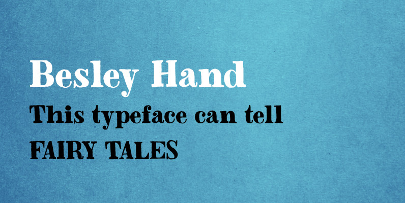
Besley Hand Font
A funny childish handwritten font, with a spirit. This typeface can tell fairy tales. Besley Hand is a slab serif that goes well with the sans serif Trango. Published by Juraj ChrastinaDownload Besley Hand
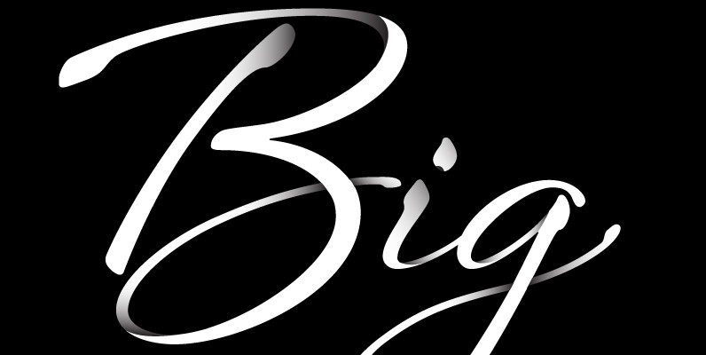
Sheila Font
Sheila strikes the perfect balance between casual handwriting and careful calligraphy, making it both approachable and aspirational. Put Sheila’s airy, breezy letterforms to use in friendly or feminine settings like inspirational quotes and fashion layouts. Contextual alternates and ligatures lend
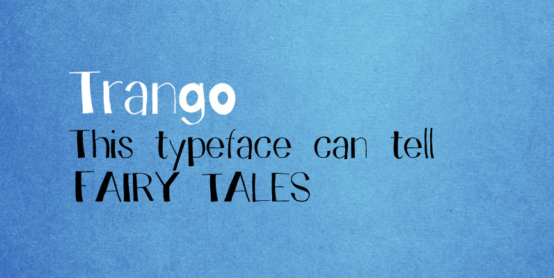
Trango Font
A funny childish handwritten font, with a spirit. This typeface can tell fairy tales. Trango is a sans serif that goes well with the slab serif Besley Hand. Published by Juraj ChrastinaDownload Trango
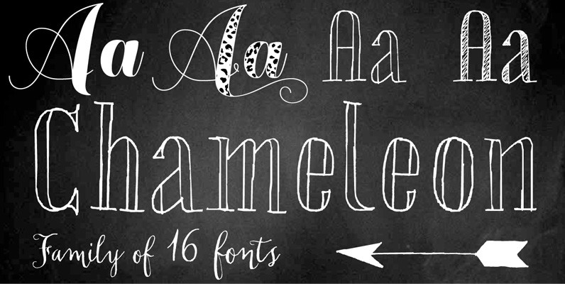
Chameleon Family Font
Chameleon consists of 16 fonts based on 3 completely different designs. Different but specially designed to complement each other. Together they form a well balanced design kit suitable for many different projects, e.g. invites, menu’s, magazines, brochures, packaging, etc. Chameleon
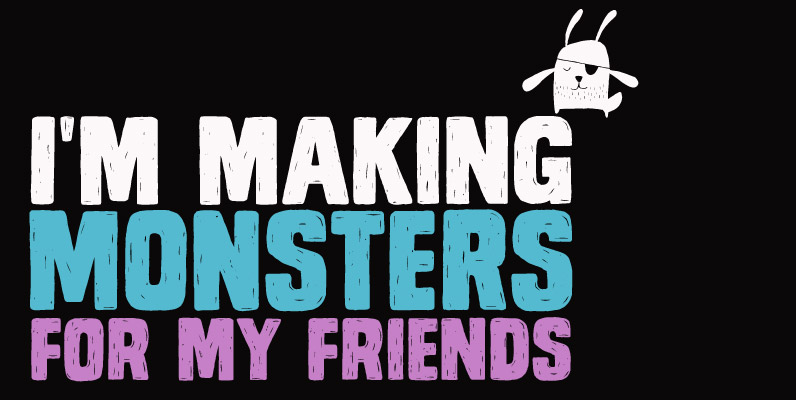
Monstro Font
Monstro is a carefully hand crafted typeface with different lettershapes on upper and lowercase slots although being an all caps font. When working in OpenType savvy applications the contextual alternates feature can take care of alternating the glyphs preventing double
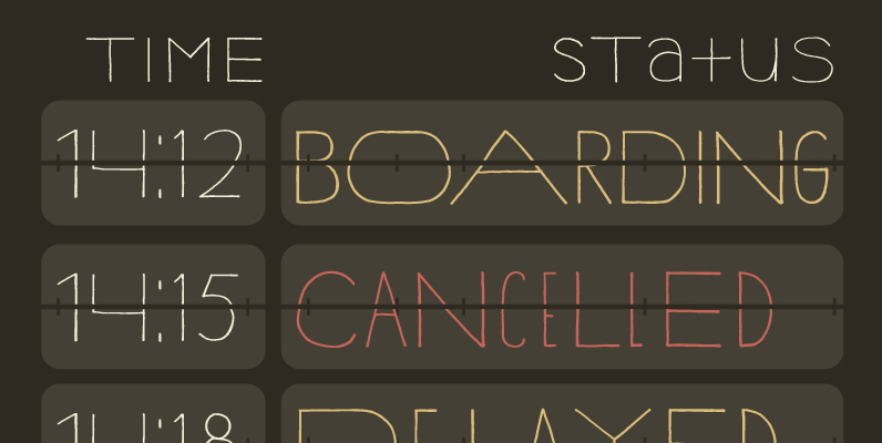
YWFT Hannah Font
YWFT Hannah is a type design comprised of three versions that work together as one, producing not variation and contrast between weights but between widths. The loose, hand drawn quality adds yet another layer of personality to the font. Hannah
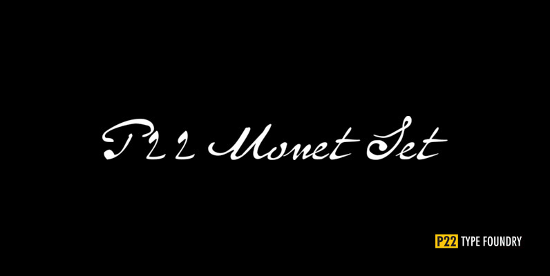
P22 Monet Set Font
This font set was developed for the Albright-Knox Art Gallery and their 1999 Monet exhibition, Monet at Giverny: Masterpieces from the Musee Marmattan. Monet Regular is a fairly straightforward script font with an undulating thick and thin stroke. Monet Impressionist
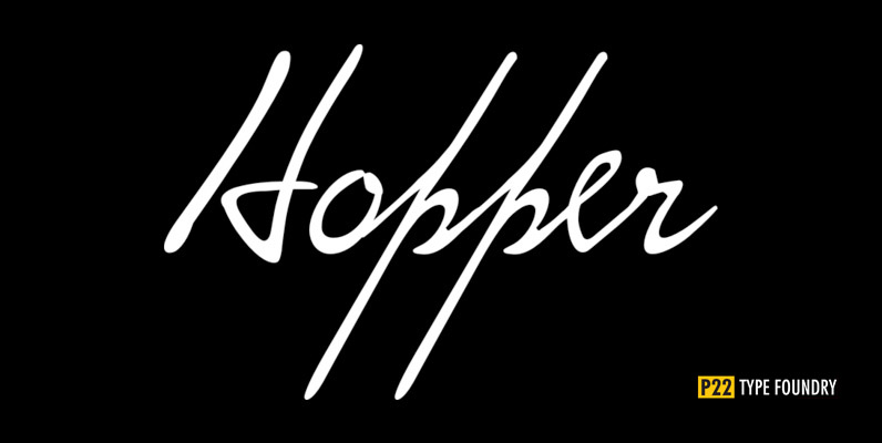
P22 Hopper Set Font
This font set is based on the handwriting styles of quintessential American artist Edward Hopper and his wife, Josephine Nivison Hopper, and was produced in conjunction with the Whitney Museum of American Art. Both artists kept a record of Edward’s
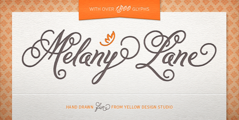
Melany Lane Font
Melany Lane from Yellow Design Studio is a flourishy script based on traditional letterforms, but with the added quirks and warmth of hand-drawn type. The base character set has traditionally connected letters and an expressive charm. Contextual alternates add flair
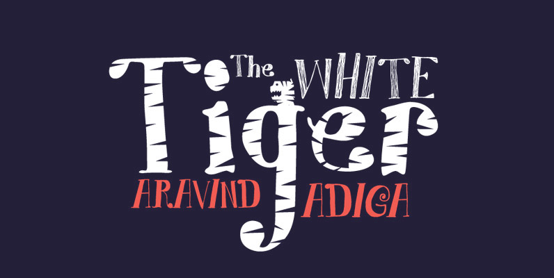
YWFT Mr Hyde Font
The potion led to the manifestation of evil within, and this twisted, stunted font certainly leaves no evil stone unturned, with fine linework that would make Edward Gorey shave his beard. With stylistic alternates and mutiple letterforms, along with pieces
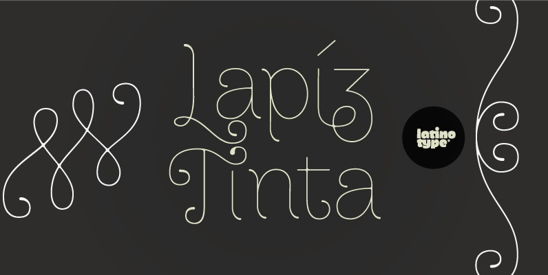
Dulce Font
Designed by Paula Nazal Selaive. Dulce is a swash typeface with an elegant and romantic touch. It is thin, but it becomes thick where two terminals meet and it also has swelling at terminals. Its wide range of ligatures makes
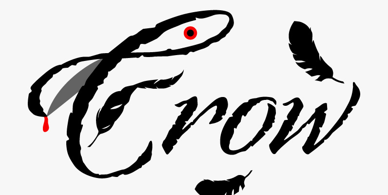
Origins Font
Based on letters hand-drawn with a crow quill on parchment paper, Origins combines calligraphic grace and antique ambiance. Its tight, energetic angularity can be complemented with swooping swash capitals, alternate ascending and descending letterforms, and graceful ending characters. Origins sings
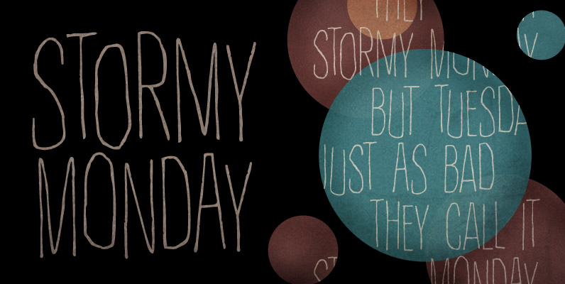
Rather Both Font
Rather Jazzy, Rather Loud: a family of two quite distinct fonts that perform together handsomely well. Both fonts include 2 versions for each letter, easily reachable through keyboard upper and lower keys. They also come packed with Contextual Alternates functionality
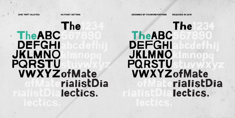
YWFT HLLVTKA Font
With great pride, we present this hand-drawn alphabet in both upper and lower case, derived from the beloved standard of all existing things: Helvetica. Originally hand drawn in 2007 by YouWorkForThem, we revisited these drawings in 2010 and developed them
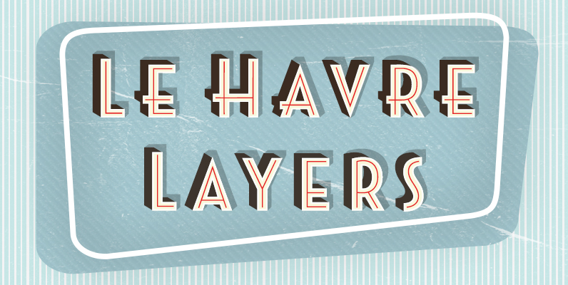
Le Havre Layers Font
Play around a bit with the potential of Le Havre Layers. Build effects which include realistic 3D appearances reminiscent of the storefronts of old and adding centerlines, dotted centerlines, and shadow variations. Inspired by the affable appearance of vintage signage
