Tag: slab
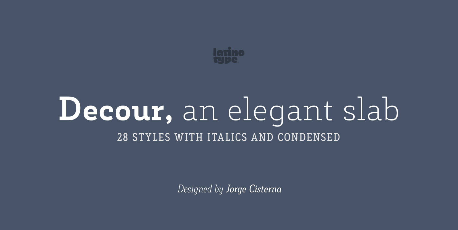
Decour Font
Decour is a Slab Serif typeface that features low contrast between thick and thin strokes and whose proportions were based on those of Art Deco design. A big height difference between lower case and upper case letters makes Decour a
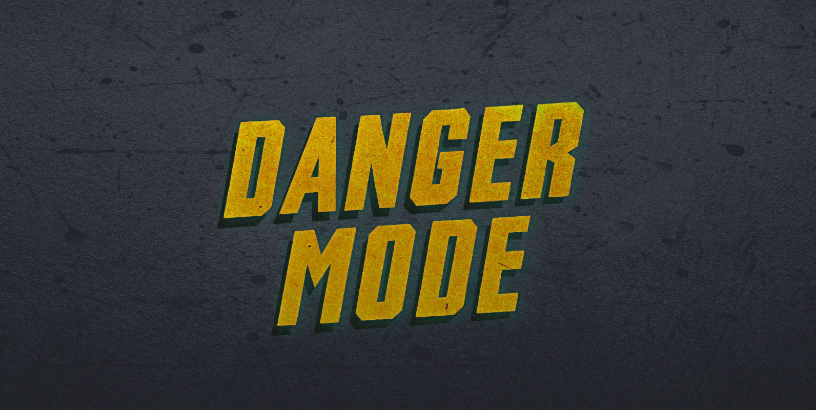
Danger Mode Font
When Raptor flies, I don’t care about surface to air missiles, attack helicopters, or tanks. I don’t even need powerups. I play in Danger Mode. And I win. Published by BLKBKDownload Danger Mode

Chennai Slab Font
Chennai Slab is a simplified slab serif with over sixty OpenType alternates. These alternates include alternates for the ball terminals, unique simplified alternates and more traditional capital forms. Use Chennai Slab when you need a fun and versatile slab serif.

Newslab Font
Newslab is a slab serif font – designed by Daniel Hernandez – which is the result of the combination of three different typefaces: Andes, Sanchez and Roble. Harmony among every feature of the typefaces makes Newslab a neutral but imposing
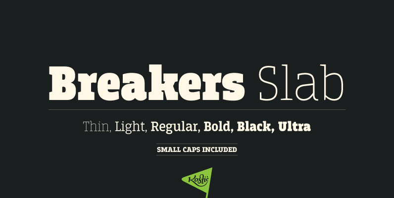
Breakers Slab Font
Breakers Slab is a companion to sans serif Breakers. It’s a versatile typeface that is strong in headlines and legible in text, with a range of distinct weights from delicate thin to chunky ultra. With small caps included and over

Seagull Font
Designed by Adrian Williams & Bob McGrath in 1978, Seagull is a simple, smooth and elegant slab-seerif style font design. Published by URW Type Foundry GmbHDownload Seagull
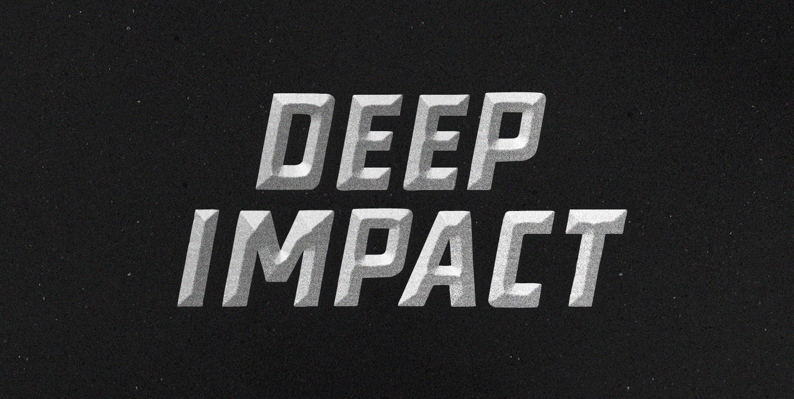
Deep Impact Font
After calibrating your diesel hammer, to optimize its performance , increase its piston’s ascent. Increase the speed of its descent. Break bedrock. Achieve Deep Impact. Published by BLKBKDownload Deep Impact
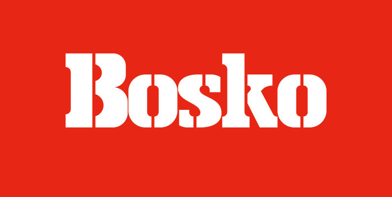
Bosko Font
A robust slab serif typeface that combines classic proportions with contemporary styling. These carefully crafted letterforms are best suited for use on book jackets, news headlines, packaging, posters and t-shirts. Details include 4 distinct styles, a full character set, manually
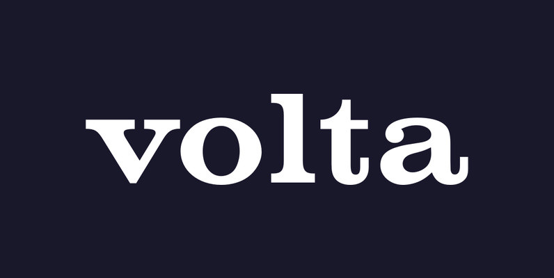
Volta Font
Designed by URW Studio, (Dr. Konrad F. Bauer, Walter Baum), Volta is a heavy slab-serif design released in 1993. Volta contains six unique styles, including a very interesting stencil option. Published by URW Type Foundry GmbHDownload Volta
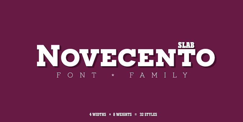
Novecento Slab Font
Novecento Slab is the “slab serif” companion of Novecento Sans, a font family inspired on european typographic tendencies between the second half of 19th century and first half of the 20th. This font face is designed to be used mostly
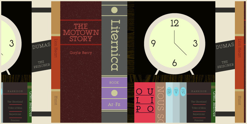
YWFT Motown Font
YWFT Motown is a geometric slab serif that contains a total of 5 weights. Although it was intended to be used as a display face, YWFT Motown’s heavier weights can be used effectively for text as well. The angled crossbars
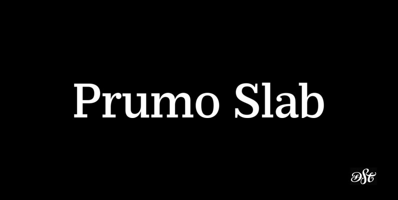
Prumo Slab Font
Prumo is a new type system, based on a unique skeleton that flows, like a pendulum, from high contrast to low contrast fonts, is a sort of typographic journey, from the eighteen century typefaces to the nineteen century slab serif
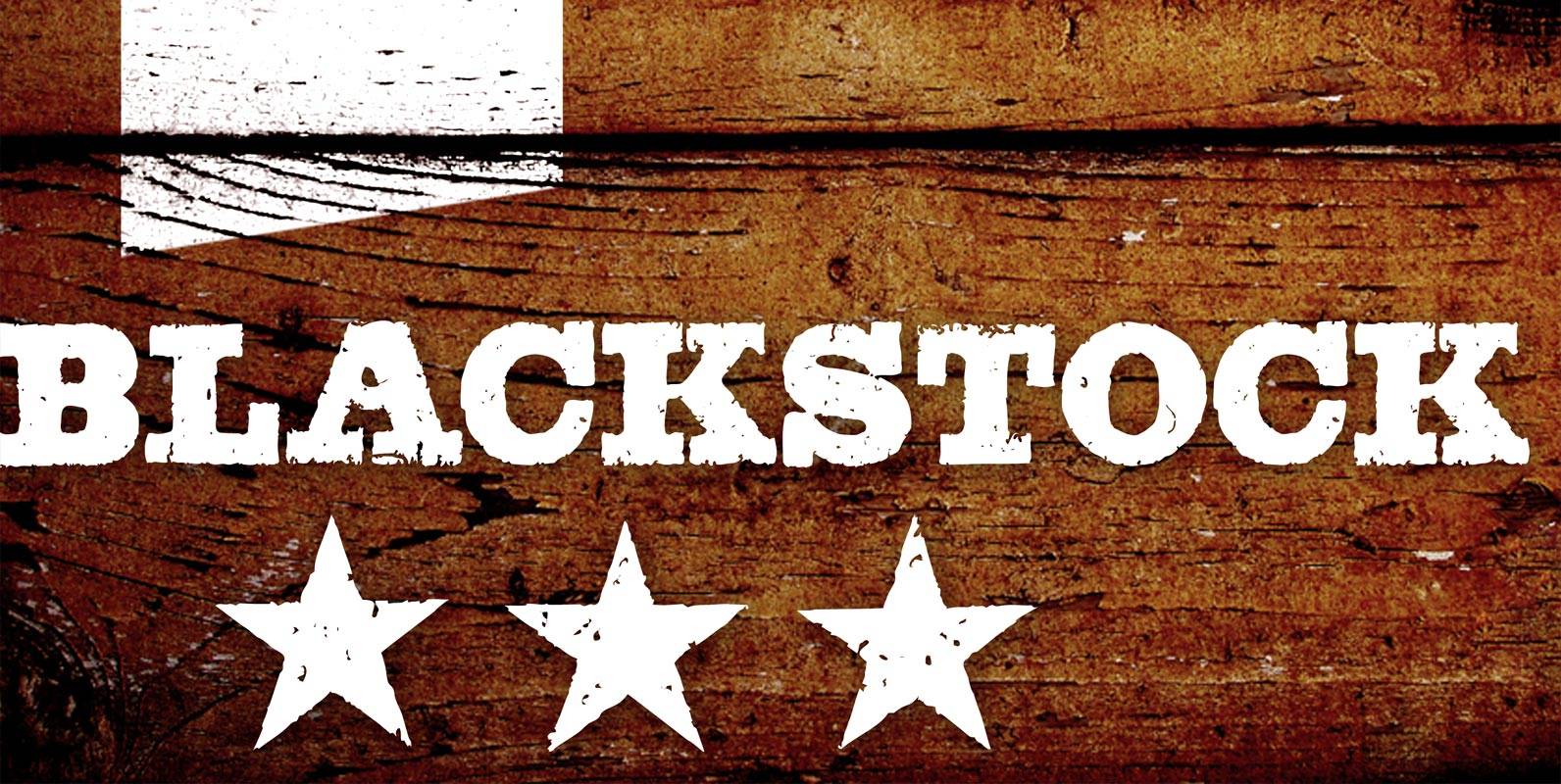
Blackstock Font
Blackstock has 52 OpenType features that automatically substitute a unique pair of distressed characters when any upper or lower case letter is keyed twice in a row, as well as features for Old Style Numerals and Small Caps. Published by
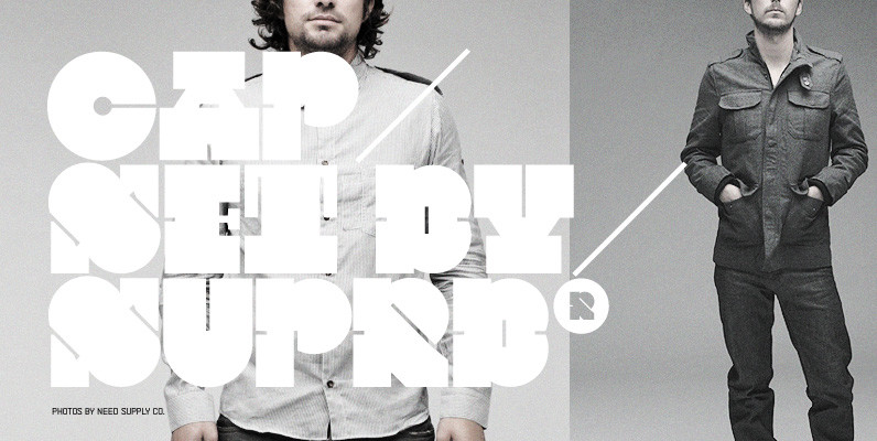
CAPSET Font
Designed by the Swedish design studio Suprb, this was a custom-made typeface for the Nordic magazine Cap & Design. The typeface was originally designed to be used as the main headline style and as a strong graphical element throughout the
