Tag: slab
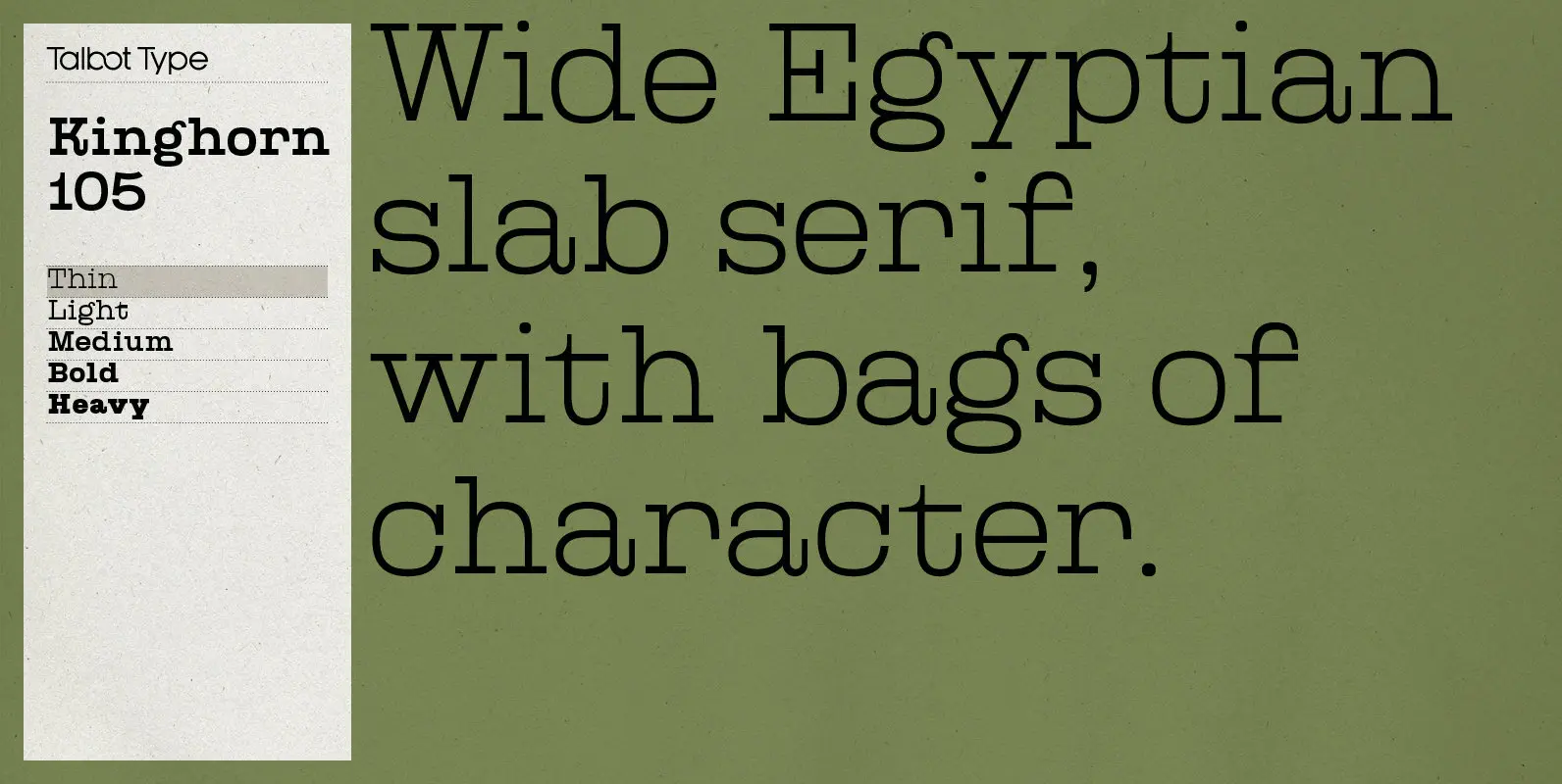
Kinghorn 105 Font
Kinghorn 105 is an Egyptian style slab-serif. The strokes are all of a roughly equal weight for an even, geometric look. Although original Egyptian slabs date from the early 19th century, the even look gives the font a balanced, contemporary
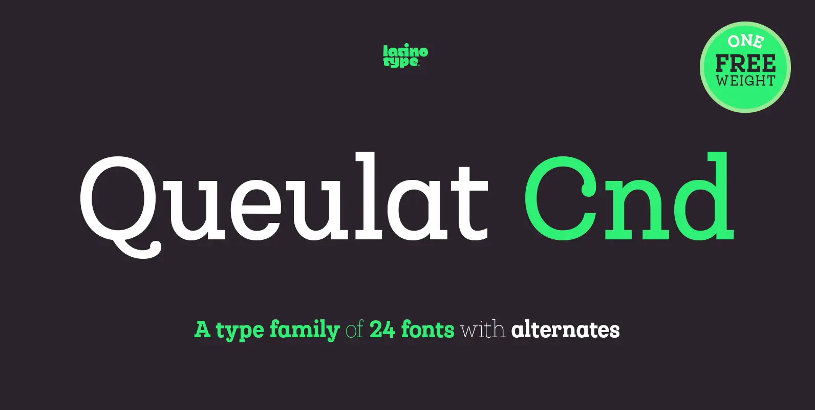
Queulat Cnd Font
This font is the condensed version of Queulat, but keeping the same features as the original typeface. Queulat Cnd is a hybrid typeface that combines different styles, reflecting charm, freshness and, especially, a strong personality. Since it is a condensed

Henderson Slab Font
A few bold caps drawn by Albert Du Bois for the 1906 Henderson Sign Painter book started me in the direction of looking at how sign painters approached slabs after the industrial revolution. The usual happened from there. My exercise
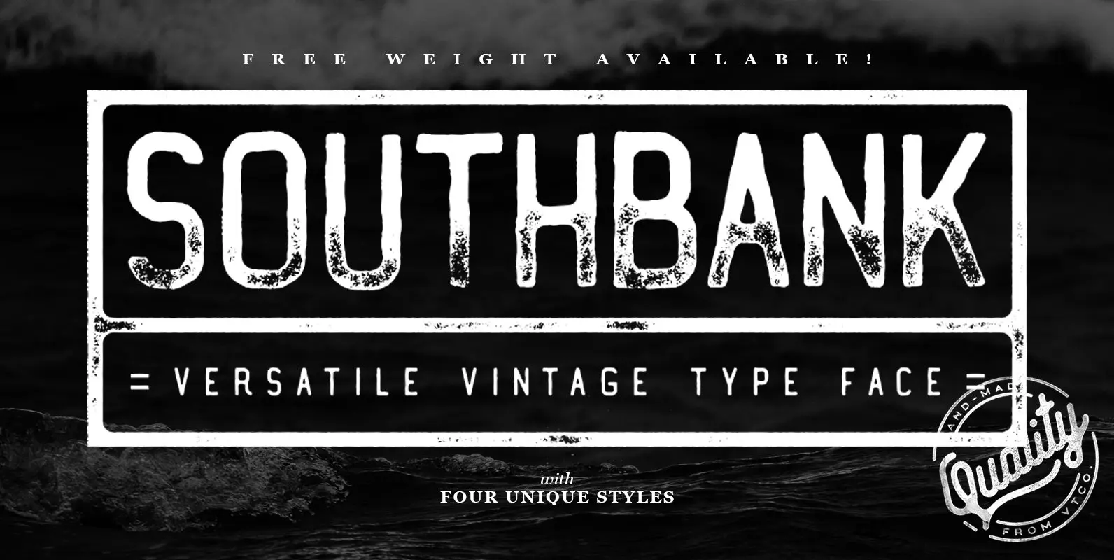
Southbank Font
Southbank Display Font is the latest font from Vintage Type Co. and comes with packed 4 unique condensed styles, each with an italic, and inked counterpart. Whatever you’re designing, one of these styles is sure to fit your needs! Aside
Whangarei Font
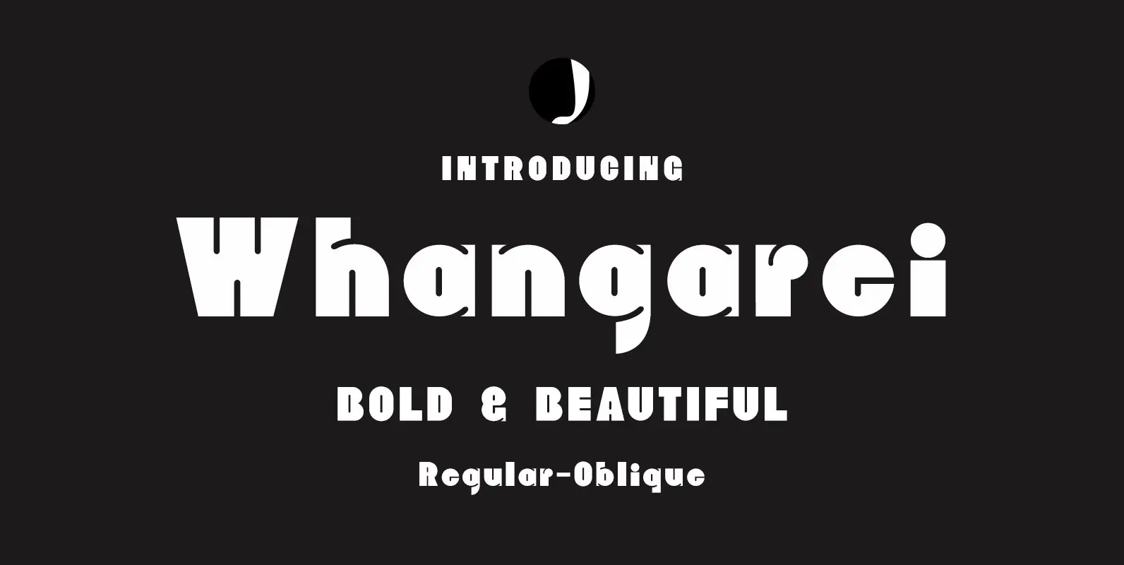
Whangarei is a bold, retro styled design that contains 2 styles. Published by Jadugar Design StudioDownload Whangarei
Alianza Font
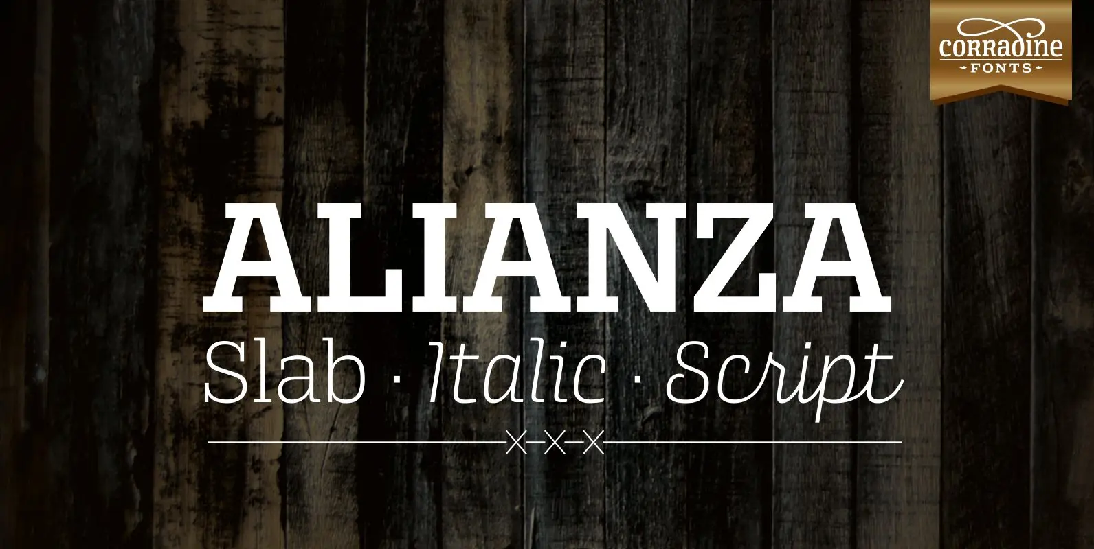
This is a complex typographic system which includes three different but complementary styles so far: Slab, italic and script, with nine weights each one; plus three sets of ornamental fonts: labels, negative labels and ornaments. The soul of the family
Matcha Font
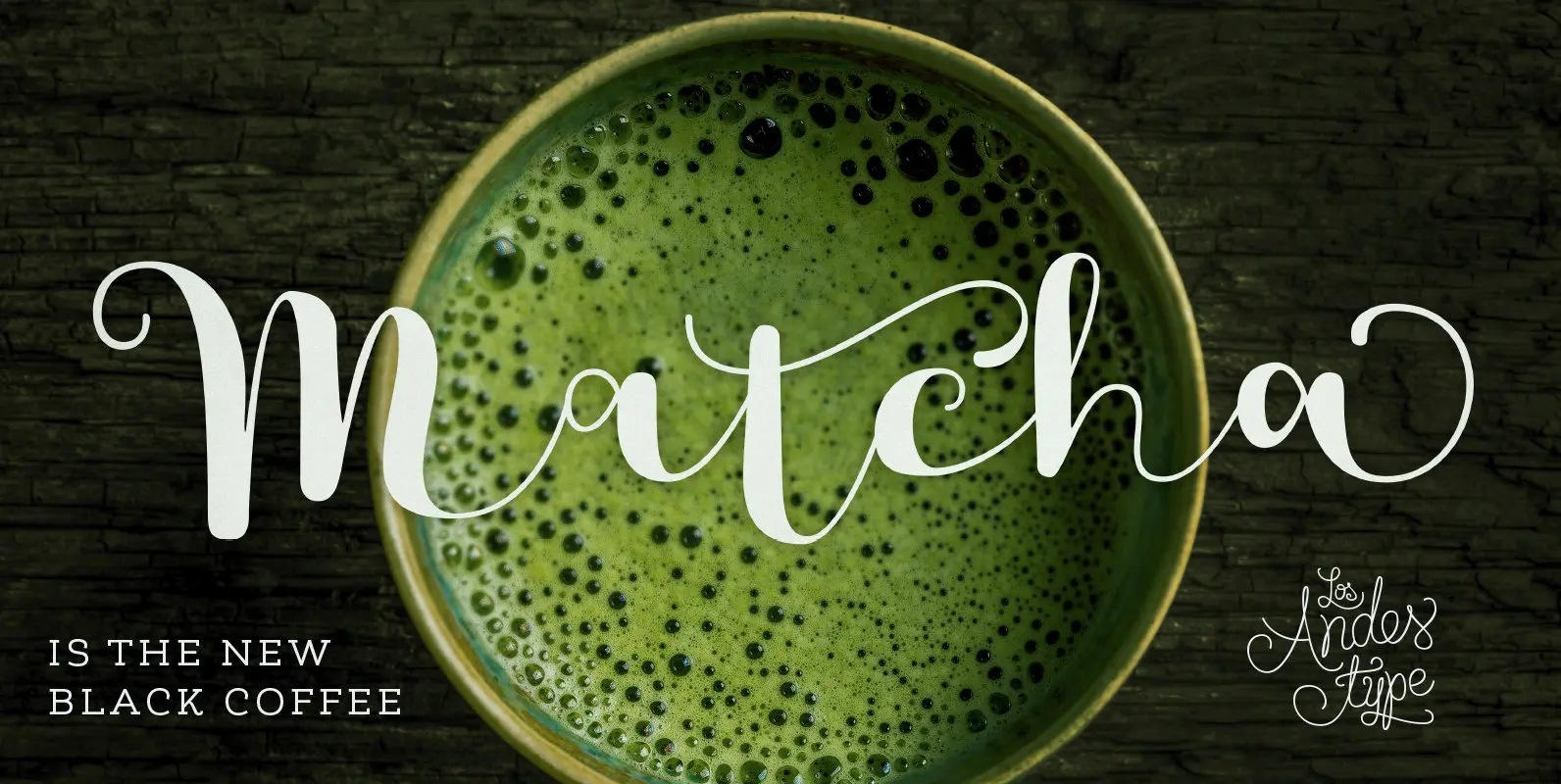
We decided to explore the concept of fitness, but from a more natural perspective. With so many people drinking detox drinks and eating raw food, we were inspired to create a font that mixes the ‘strength’ of sports and the
Pret a Porter Font
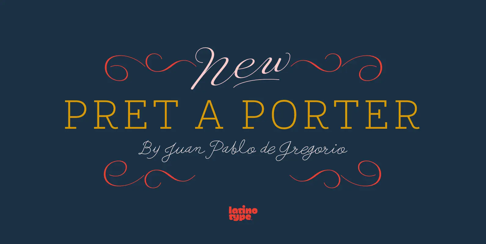
Prêt-à-porter is a project developed as part of a series of type experiments appearing on the blog ‘Letritas’. Prêt-à-porter is a very expressive friendly font with a handwritten look, smooth curves and strong identity. Its counterforms make it a carefree,
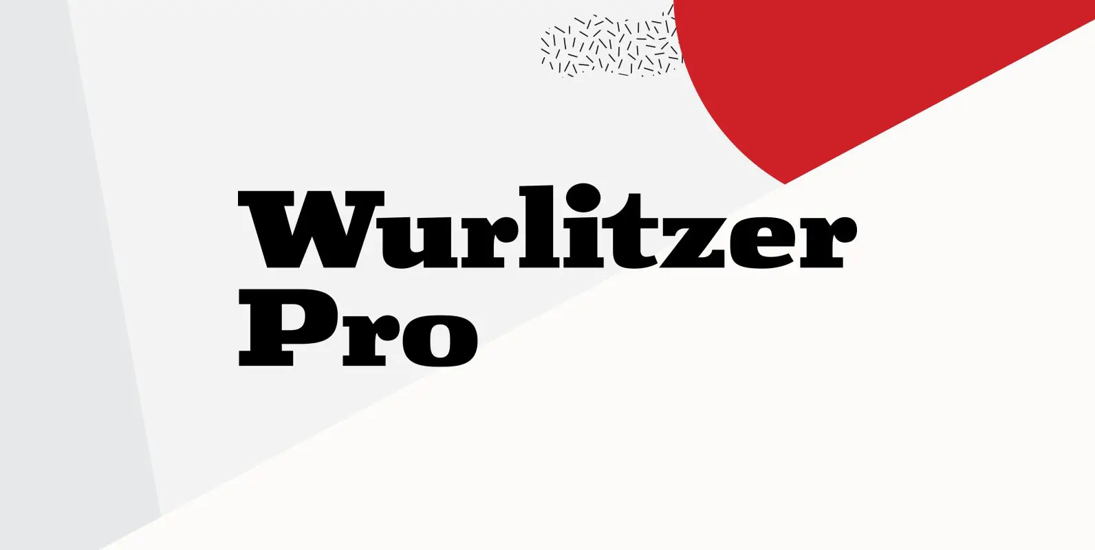
Wurlitzer Pro Font
Designed by Steve Jackaman & Ashley Muir. This design was inspired by an early 20th century woodtype. Wurlitzer contains all the high-end features expected in a quality OpenType Pro font. Published by Red RoosterDownload Wurlitzer Pro
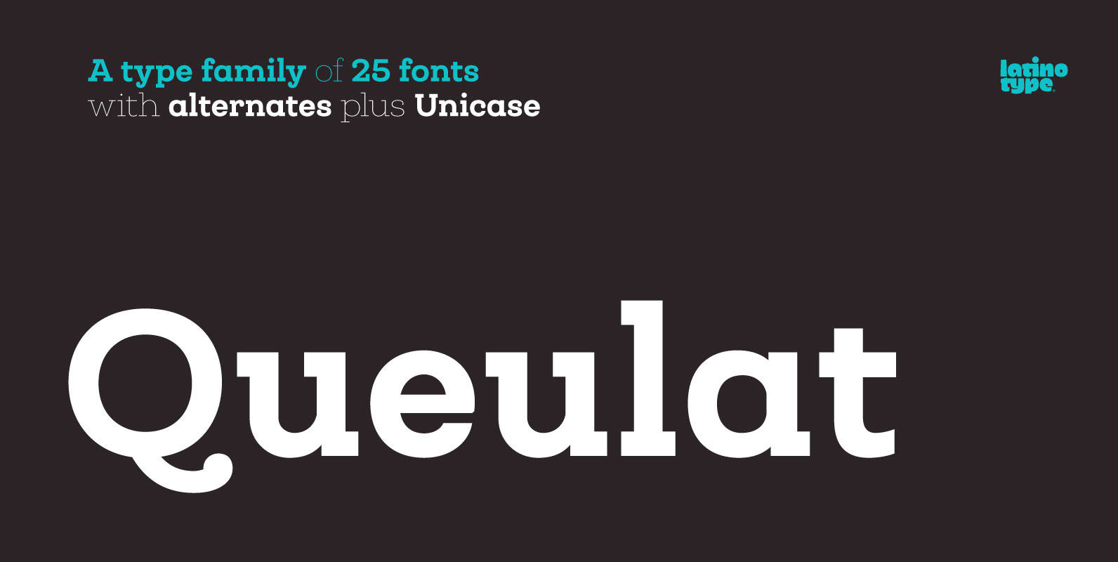
Queulat Font
Queulat is a hybrid typeface that combines two different styles, reflecting charm, freshness and, especially, a strong personality. The font is inspired by Modern and Grotesk styles. The former is shown in some characteristic features such as teardrop terminals, which
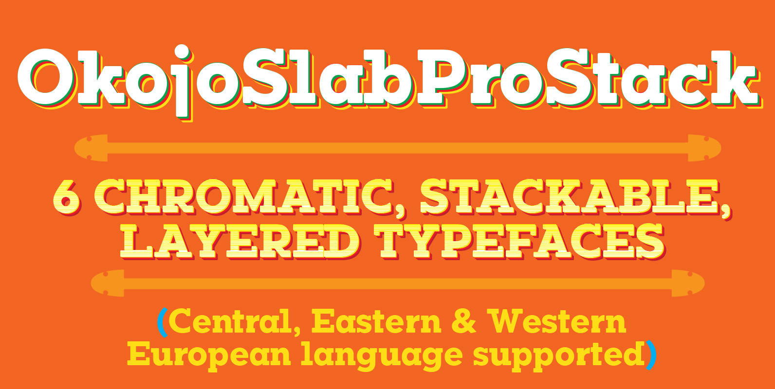
Okojo Pro Slab Stack Font
Once upon a time, a young man with scribbles on his face rapped the words, “Stacks on stacks on stacks”. Prophetic. Engaging. And more than anything―*interesting*! OkojoPro Slab Stack is a family of six stackable typefaces: three layers of extrusion,
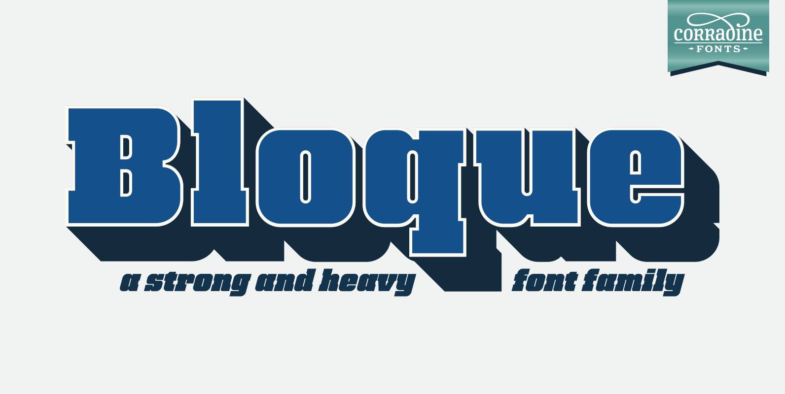
Bloque Font
Bloque is a heavy slab font family which contains six fonts. It has three layers for both roman and italic styles, including an inline and a shadow versions to make different color combinations. Published by Corradine FontsDownload Bloque

Bobik Font
Bobik is a display type family with three faces – sans, serif and slab. The family was drawn initially on basic principles described in Jean Alessandrini’s Codex 80 and then further developed, including adding a lowercase and ligatures. With a
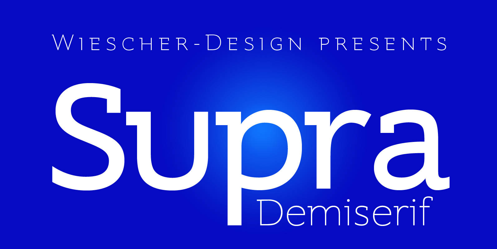
Supra Demiserif Font
“Supra Demiserif” is the demi serif addition to the Supra family. I am no fan of slab serif fonts, so I designed this one with half serifs, that makes the serifs less important. Then I found, that the italic does
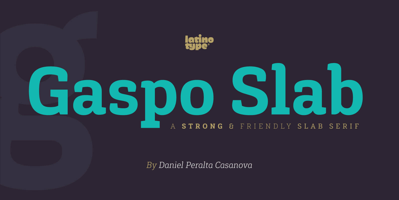
Gaspo Slab Font
Gaspo Slab is a fresh slab serif typeface that features aesthetically pleasing curves, strong serifs, ample counters, humanist proportions and ink traps. The result is a very functional font with a contemporary design and highly readable at small sizes. Gaspo

Grenale Slab Font
Grenale Slab adds to the new standard of elegance within the Grenale family. Not your typical slab, Grenale has some unique forms that give it a look all its own. This glamourous slab still draws much inspiration from Grenale’s Didone
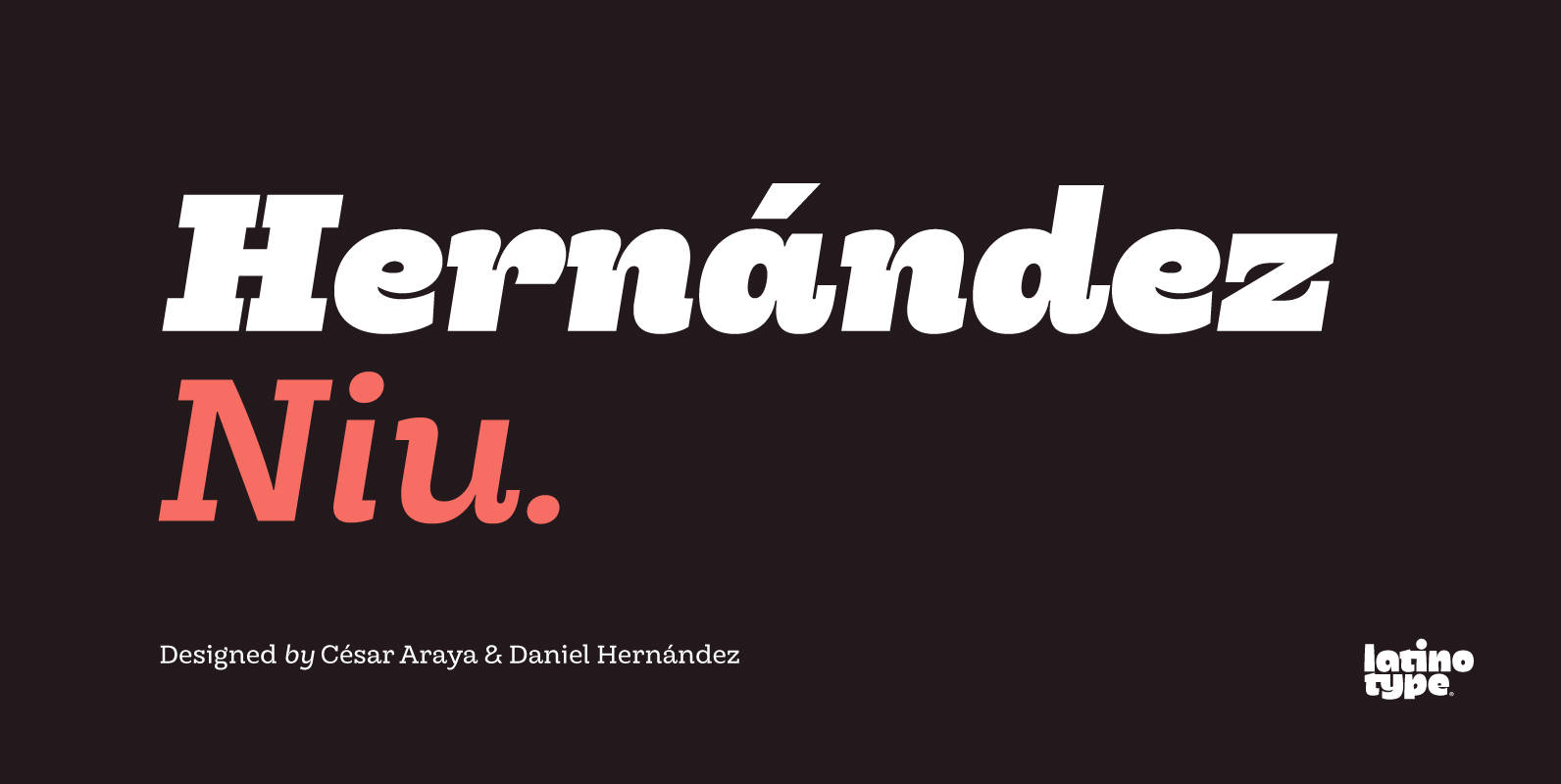
Hernandez Niu Font
In the typedesign industry the terms ‘nova’, ‘neue’, ‘next’, ‘new’ are often used to refer to a typeface that has been modified in different ways: redesign, technical readjustments, greater number of characters, etc. At Latinotype we are now starting to
