Tag: small caps
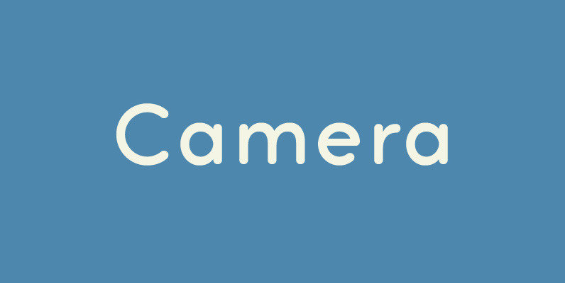
Camera Font
Legible, simple and very lovely sans serif is based on artdeco advertisment from 1800s to early 20th. The sweetest sans for your retro-style project. Published by Dharma TypeDownload Camera
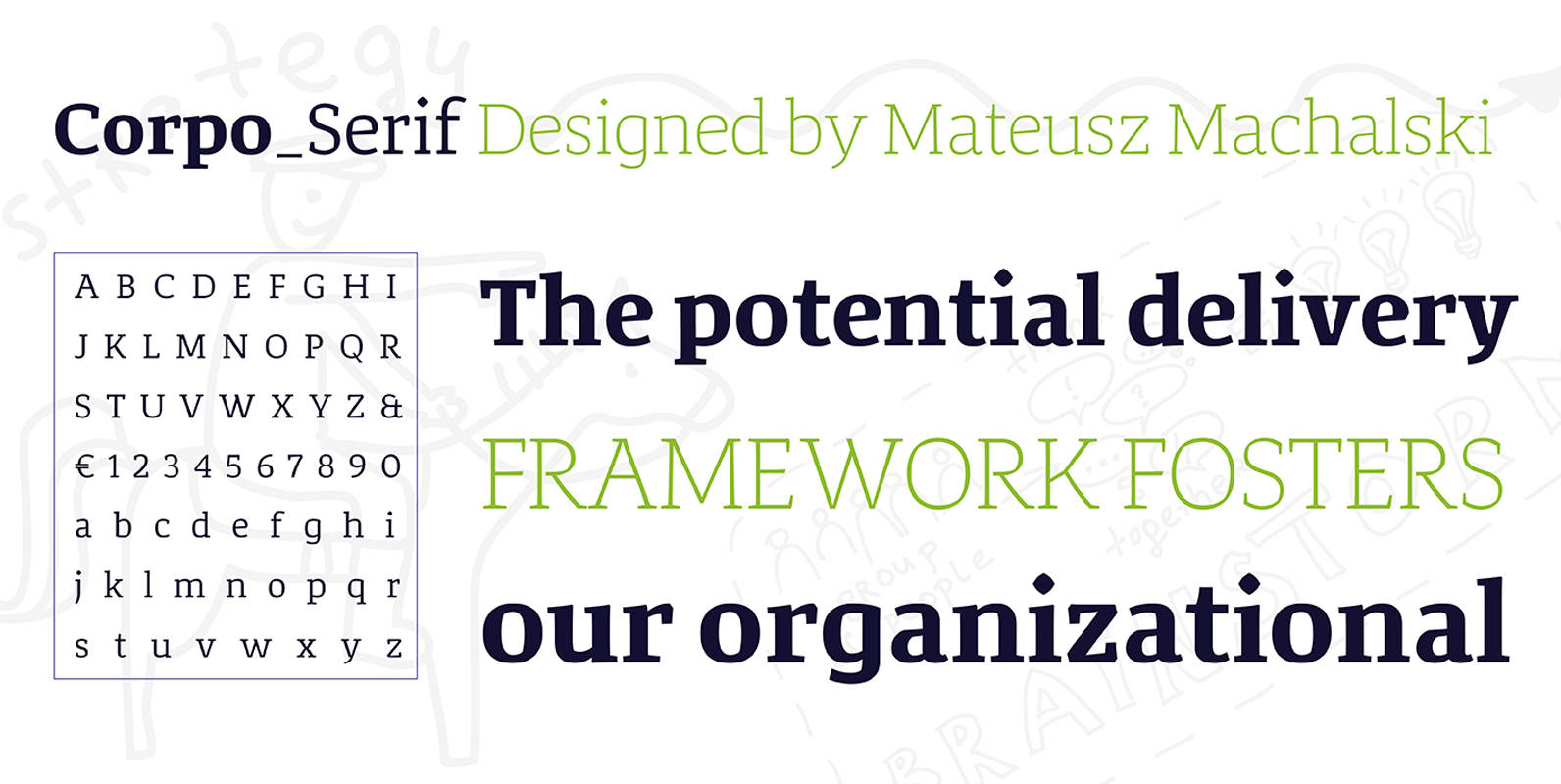
Corpo Serif Font
Corpo Serif is a refreshed version of my old font Korpo Serif. Corpo Serif, designed by Mateusz Machalski, is a serif type family with a friendly feel. This type comprises 12 variants with 6 weights.The high contrast and high x
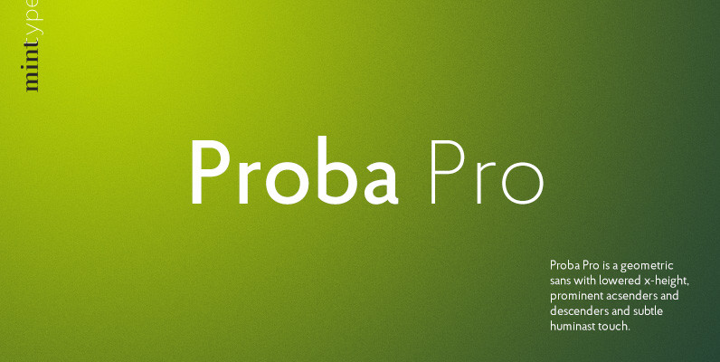
Proba Pro Font
Proba Pro is a geometric sans with lowered x-height, prominent acsenders and descenders and subtle huminast touch. It comes in 7 weights + matching italics each supporting numerous Latin-based languages as well as major Cyrillic languages. It is packed with
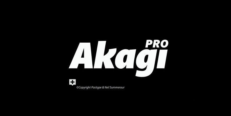
Akagi Pro Font
Akagi Pro is a complete rebuild and expansion of my popular Akagi typeface. Contemporary, clean, simple and friendly continue to serve as the adjectives for an expansion that includes 250 additional characters per weight, many new ligature options, expanded stylistic
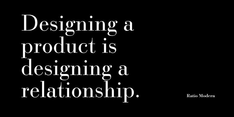
Ratio Modern Font
Designed in 1923 by Friedrich Kleukens for the Stempel foundry, Ratio was one of the first metal faces to bring the Didone genre to the forefront of industrial mass publishing as a headline and magazine face. Though essentially modern in
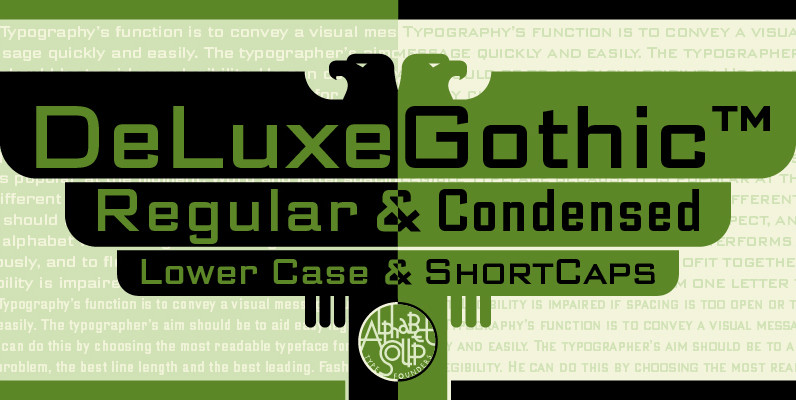
DeLuxe Gothic Font
Michael Doret was always very aware of the fact that Morris Fuller Benton’s classic Bank Gothic, a longtime favorite of his, didn’t contain any lowercase characters. So he set out to remedy that by designing his all new DeLuxe Gothic,
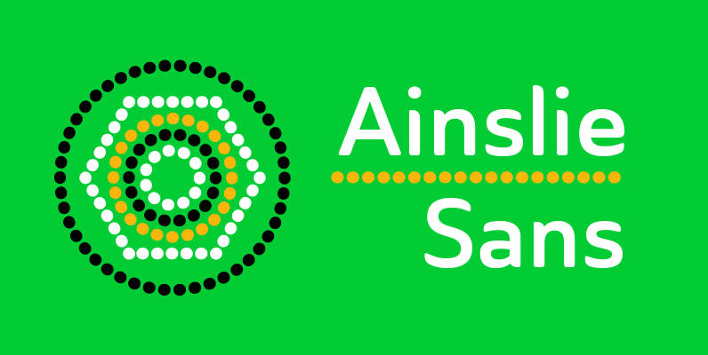
Ainslie Sans Font
The original Ainslie was inspired by Mt. Ainslie and the city of Canberra’s inner suburb of the same name. Canberra is Australia’s capital–a planned city designed by American architect Walter Burley Griffin. Griffin’s style and geometric design for the city,
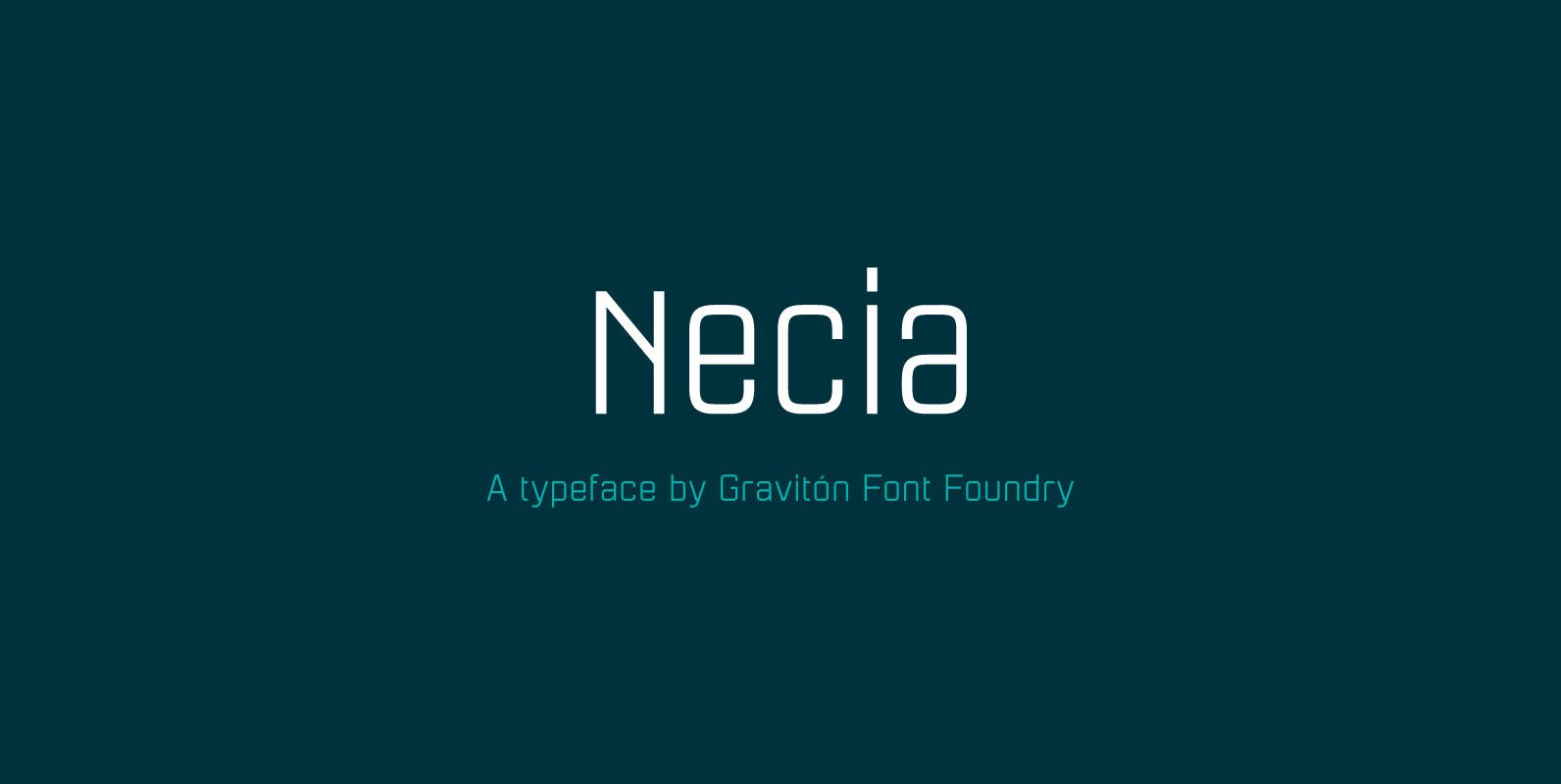
Necia Font
Necia font family has been designed for Graviton Font Foundry by Pablo Balcells in 2014. It is a modular, geometric and slightly condensed typeface which has been conceived to be primarily a display typeface, but given its clarity it can
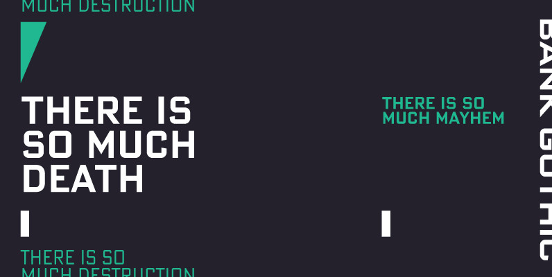
Bank Gothic Pro Font
If there was an American Typeface Hall of Fame, Bank Gothic, designed by the great Morris Fuller Benton would hold a place of special distinction considering this design has survived so many trends in typographic fashion since being introduced in
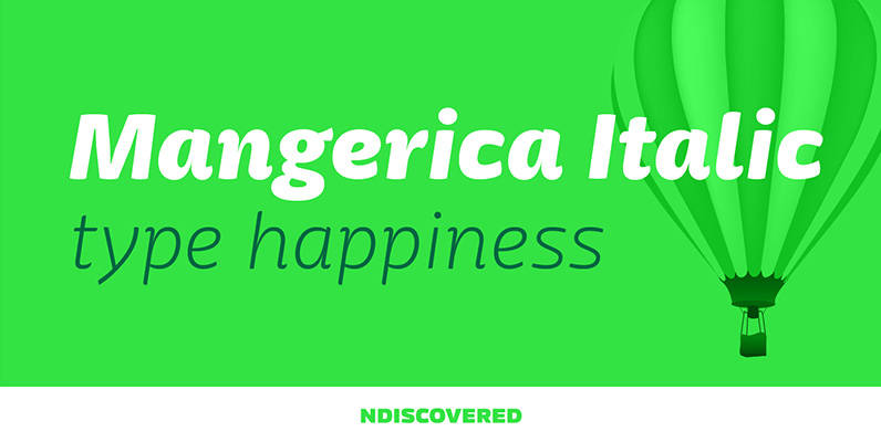
Mangerica Italic Font
The italic version of Mangerica is deeply rooted in the calligraphic heritage of the Italics. This way the brush inspired strokes are emphasized as well as an overall calligraphic look. Far from being a mere slant, Mangerica Italic had every

Gilman Sans Font
Gilman Sans is the family member of Gilman, the serif that it was derived from. The idea for Gilman started simple enough, a serif typeface that works well for large amounts of text. However, after many struggles creating a quality

Kautiva Font
Kautiva is a comprehensive modern sans serif family that includes true italics, small caps, and unicase variations. Kautiva was developed to be efficient in both text and display environments. Kautiva serves as a refreshing middle ground between serious geometric and
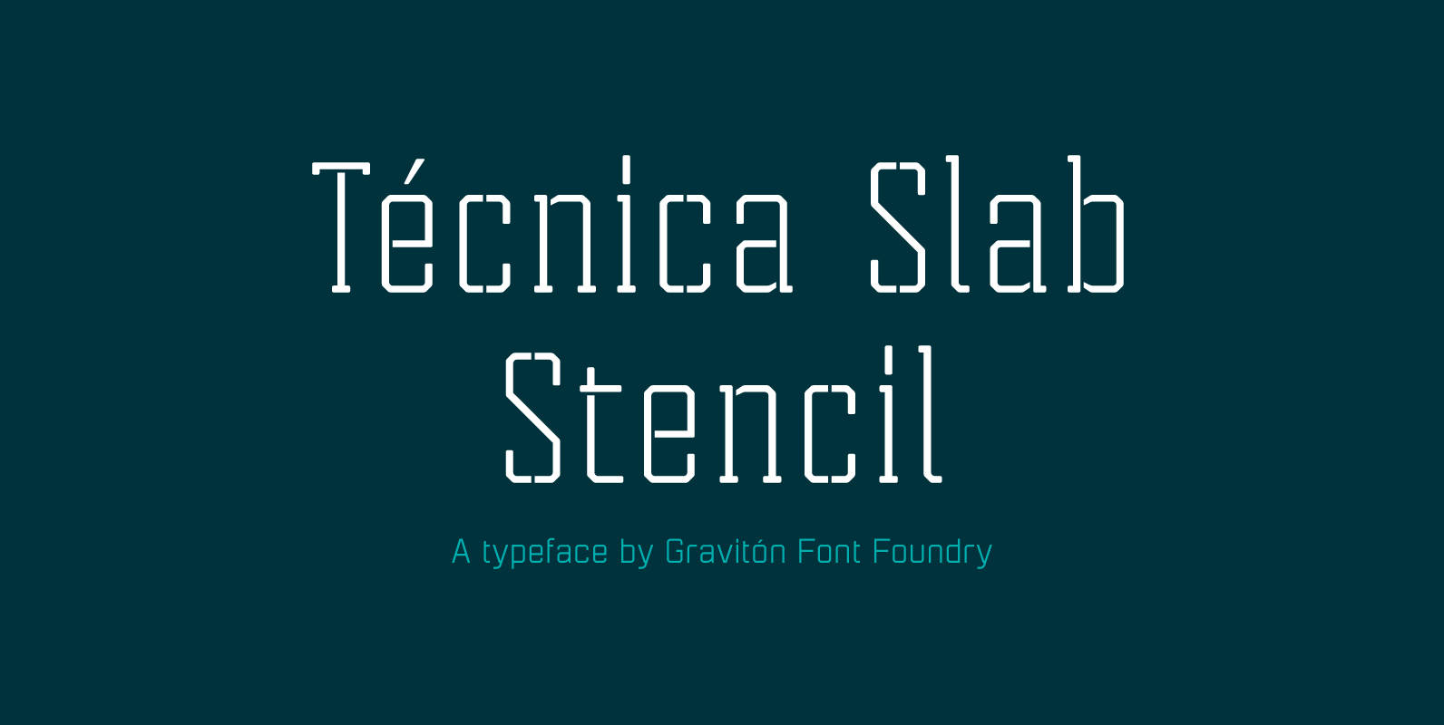
Tecnica Slab Stencil Font
Tecnica Slab Stencil font family is the stencil version of Tecnica Slab font family, it has been designed for Graviton Font Foundry by Pablo Balcells in 2014. Tecnica Slab Stencil consists of 8 styles. The 4 “Stencil 1” styles contain
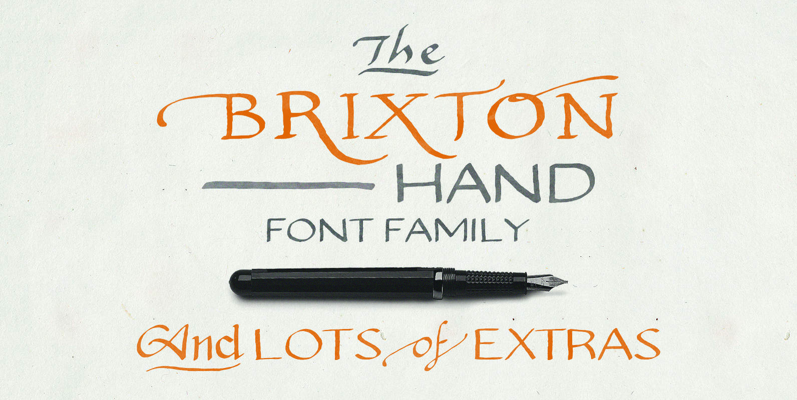
Brixton Hand Font
Brixton Hand and Brixton Hand Condensed both include plenty of stylistic alternatives, some letters have up to 8 different options! Both lowercase and uppercase are different alternatives, and they both have separate stylistic alternatives that you can activate within the

Servus Slab Font
This family is very special to me. I started working on it right after my first son was born. I decided to name the typeface “Servus” which means “Hello” in my country. The whole idea of the family symbolizes a
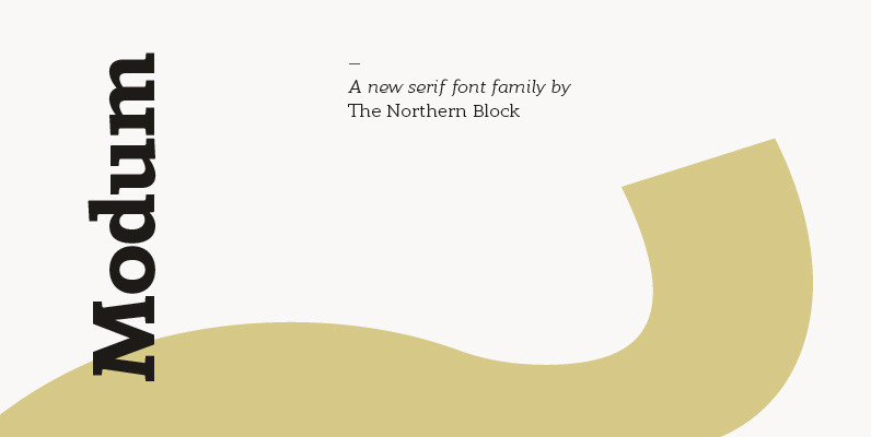
Modum Font
A contemporary serif font family. The design takes influence from traditional serif forms to develop a precise, highly functional text face with a low contrast. Smooth radius details are blended with carefully drawn angles that give a crisp, distinctive aesthetic
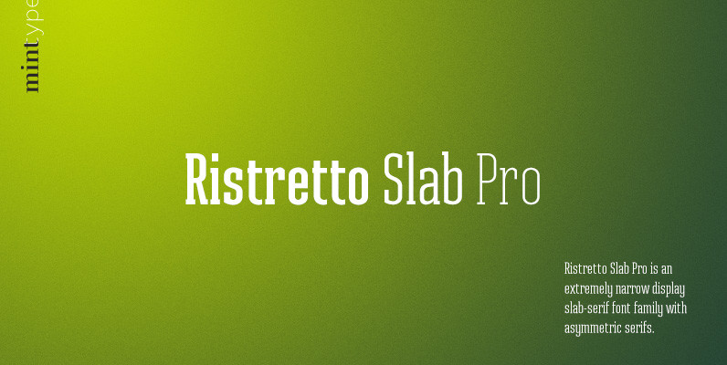
Ristretto Slab Pro Font
Ristretto Slab Pro is a slab-serif companion to Ristretto Pro. It’s an extremely narrow display slab-serif font family with asymmetrical serifs and consistent character width across weights, available in 8 weights. It features rich language support, 6 sets of figures
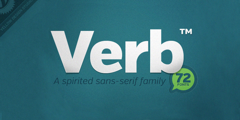
Verb Complete Series Font
Verb from Yellow Design Studio is a 72-font sans-serif superfamily that’s confident, friendly and energetic. At text sizes it’s highly legible, while at larger sizes it reveals lively shapes and personality. It has four subfamilies including Regular, Condensed, Extra Condensed,