Tag: small caps
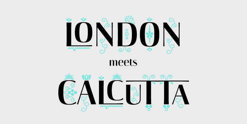
Darjeeling Font
Darjeeling combines British Elegance and Indian Flavor. It is flared like Optima, with a scent of Bodoni. By layering Regular and Ornaments over each other You will create astounding pieces of colorful typography. Additionally there is a Regnaments style which
Liebelei Font
“Liebelei” – dalliance, flirtation, hanky-panky (leo.org); kind of diminutive of “Liebe” (German for love) The typeface Liebelei has its roots back in 1932, when Vienna-based painter Rudolf Vogl created the poster for a movie called Liebelei after the popular play
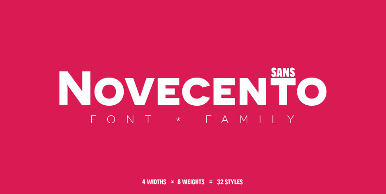
Novecento Sans Font
Novecento sans is an uppercase-only font family inspired on European typographic tendencies between the second half of 19th century and first half of the 20th. It looks rational and geometric. However, it is optically corrected and balanced. This font face
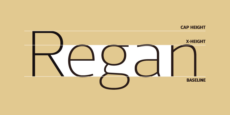
Regan Font
A finely crafted sans serif typeface with an uncomplicated appearance. Soft curves are mixed with minimal angles to create a readable font ideally suited for identity, editorial and online uses. Details include 10 weights with italics, 540 characters, 5 variations
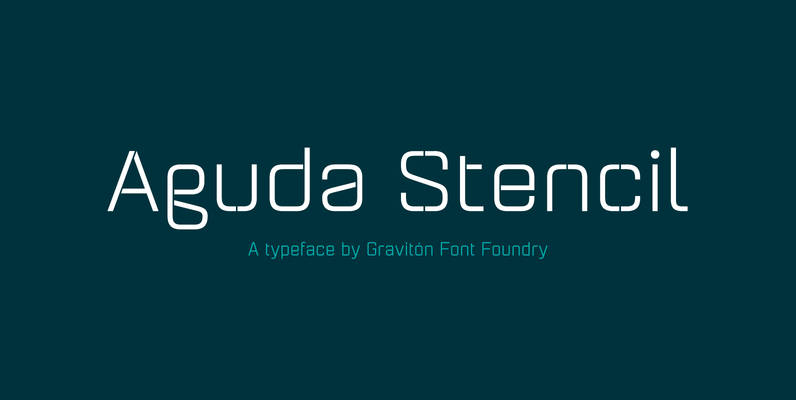
Aguda Stencil Font
Aguda Stencil font family is the stencil version of Aguda font family, it has been designed for Graviton Font Foundry by Pablo Balcells in 2014. Aguda Stencil consists of 16 styles. The 8 “Stencil 1” styles contain a narrow stem
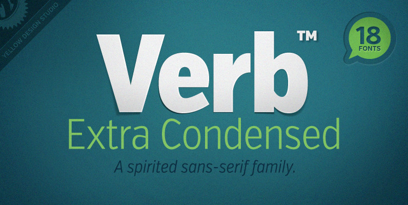
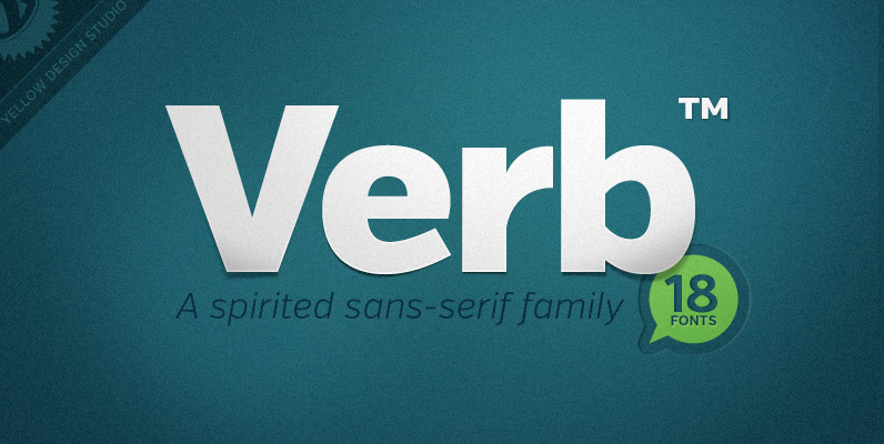
Verb Extra Condensed Font
Like the original Verb family, Verb Extra Condensed from Yellow Design Studio is confident, friendly and energetic, but has been carefully re-drawn with space saving proportions. At text sizes it’s legible and economic, while at larger sizes it reveals lively
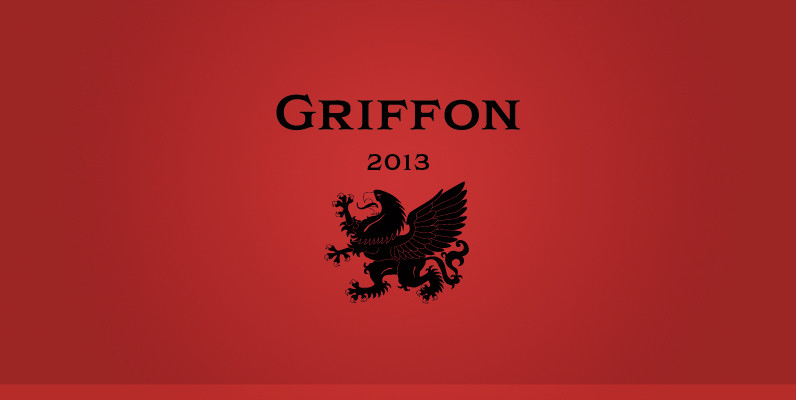
Griffon Font
Griffon, titling face with influence from classic letterforms, inspired by retro faces in the early 20th century. This font family was all redesigned from scratch and now released ranging in 5 weights with small caps from Light to Bold. The
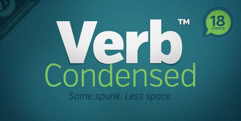
Verb Condensed Font
Verb Condensed from Yellow Design Studio is a modestly condensed version of the original Verb family, taking on more classic sans-serif proportions. It shares the same confidence, energy, and friendliness. At smaller sizes Verb Condensed is open and legible, and
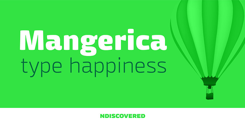
Mangerica Font
This design incorporates different styles into a consistent look. A pinch of script, a little of geometric and some humanistic shapes as well create a very distinguishable sans-serif. It has an overall good feeling specially on the heavier weights that
Abandon Font
A sans-serif font family of five weights designed for headline and text use, with old style numerals and small caps, and extensive kerning. Published by Suomi Type FoundryDownload Abandon

Metrisch Font
Metrisch is new sans serif type family of seven weights plus seven italics uprights in each weights. The typefaces designed based on traditional geometric construction that have been built with letter size wider, the x-heights taller and short descender that
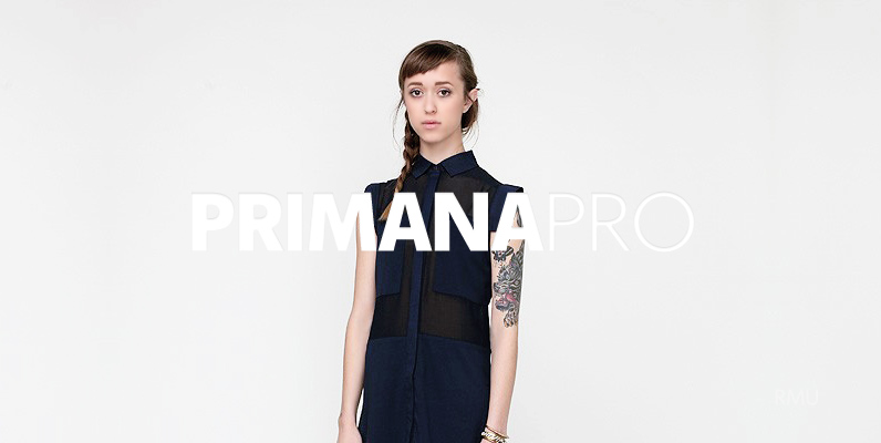
Primana Pro Font
An RMU Typedesign font family of eight styles coming with small caps and oldstyle figures. Published by RMU TypedesignDownload Primana Pro
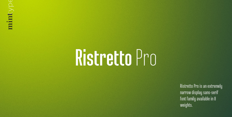
Ristretto Pro Font
Ristretto Pro is an extremely narrow display sans-serif font family available in 8 weights, with consistent character widths across weights. It features rich language support, 6 sets of figures and small caps. Published by Mint TypeDownload Ristretto Pro
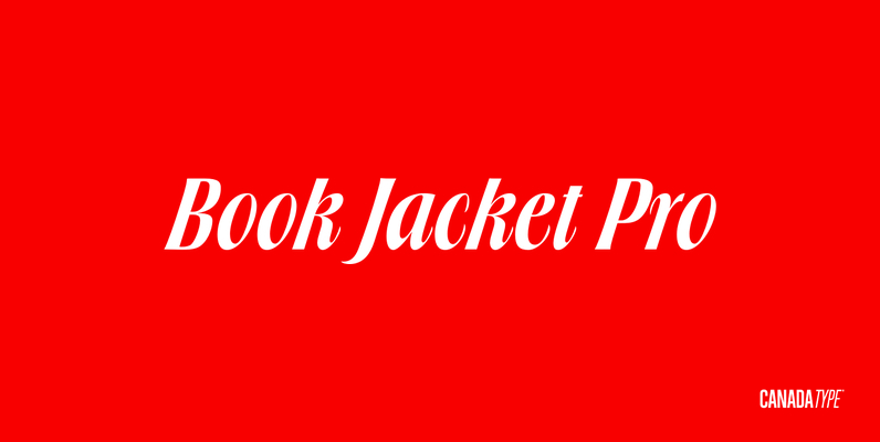
Book Jacket Pro Font
Book Jacket is arguably the most famous of all typefaces done in the Typositor era. Designed by Ursula Suess over an entire year, and published in 1972, Book Jacket became an instant success story that lasted well into the 1980s
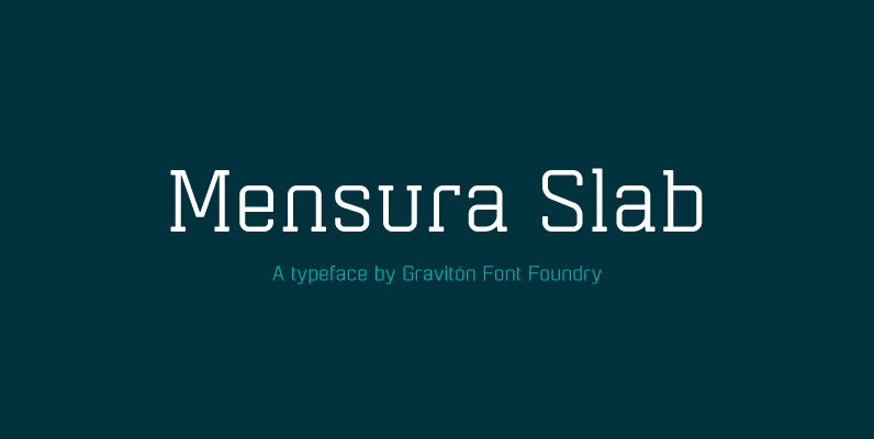
Mensura Slab Font
Mensura Slab font family has been designed for Graviton Font Foundry by Pablo Balcells in 2013. It is a modular, geometric typeface with subtle rounded angles that provides a soft, pleasant appearance. It has been conceived to be primarily a
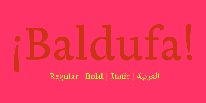
Baldufa Font
Baldufa is a charming typeface with strong personality, which looks very comfortable in text. There is a search to obtain complicated curves and detailed features, which give the typeface a touch of beauty and elegance. However, this is also a

Libertad Font
Design can do without images, but not without typefaces. Libertad is a sans-serif typeface that mixes humanist and grotesk models – It’s most interesting feature is the combination of balanced regulars with dynamic italics, which makes it a very versatile