Tag: small caps

Mr Jones Font

Mr Jones was originally conceived as a family for print design consisting of a sans and a headline. The lowercase are wide for legibility at small sizes while the caps are narrower to save space and keep an even balance

Diploma Font

Diploma is a revival of Diplomat, a metal type made by the in-house team of Ludwig & Mayer and first published in 1964. Strong elegant caps with confident serifs make Diploma a great addition to the toolbox of poster and

Espuma Pro Font

Espuma Pro is a soft and friendly humanist sans-serif font family with strong calligraphic aftertaste. Presented in 7 weights, with true italics each, it features the traditionally rich language support, small caps, 6 sets of figures and a bunch of

Killernuts Font

Killernuts is a woodtype design with a unique twist on its serifs. The small brush-like serifs were intended to resemble aspects of Japanese calligraphy, a sort of east meets west combination. Published by Dharma TypeDownload Killernuts

Clinica Pro Font

Clinica Pro is a modern take on Swiss grotesques, with a little bit of an added personality. It features 8 weights, italics, 6 sets of figures, small caps and a bunch of ligatures. Still relatively neutral, it lets a brand

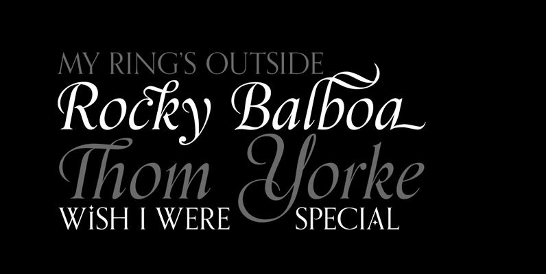
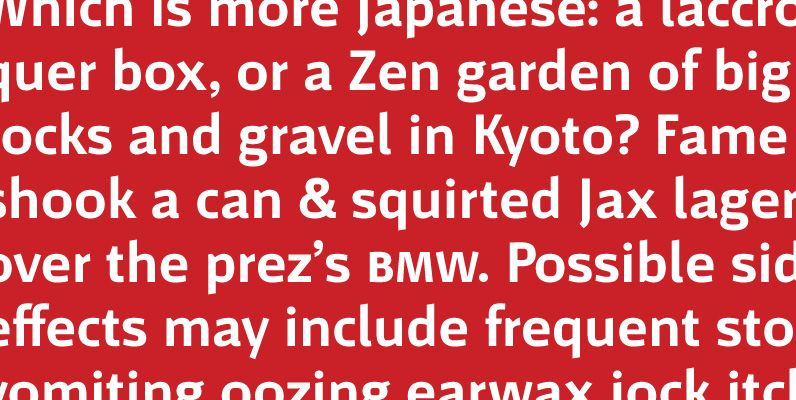
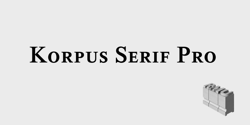
Korpus Serif Pro Font

Inspired by Timeless, Korpus Serif Pro is a completely fresh RMU redesign of this former Typoart! font family. All four styles – Regular, Italic, Demibold and Demibold Italic – contain besides West! and Central European glyph tables those of Greek

Orpheus Pro Font

The original Orpheus design by Walter Tiemann (1926-1928, Klingspor) was certainly a masterpiece. Unfortunately, like so many typefaces of that between-wars era, it got overlooked when type technology changed over to film, and once again when digital type came around.

Argumentum Font

The intention was to make a technical-looking sans with a warmer feel to it, balanced between hard geometric shapes and friendly curves with slightly narrower endings. It should be useful in a wide range of tasks, whether combining the eight

Dieselis Economic Font

Designed by Samy Halim, Dieselis Economic is a FAMILY of 6 monoline sans serif fonts: light, medium and bold weights with Italics. Contemporary, clean, trendy and condensed. Excellent for print or web. Published by FontHausDownload Dieselis Economic

Kumlien Pro Font

Kumlien Pro is the revival and expansion of a typeface designed in 1943 by Akke Kumlien, the famed Swedish book designer, poet, author, painter and arts materials expert. At the time, being the first major Swedish typeface to be designed

Dolly Font

Dolly is a book typeface with flourishes. The family consists of four fonts, which provide a healthy palette for solving most problems within book typography. Dolly Roman is neutral and useful for long texts. Dolly Italic is narrower and lighter

Telemark Font

Telemark is a monolinear slab serif influenced by the wide serif typefaces of the 19th century. The name refers to the vintage form of skiing which was introduced in Norway at the same period of time and allowed more fluid

Motiva Sans Font

Motiva Sans is a clean sans serif with true italics. Sporting Light, Regular and Bold weight, it comes with essential Open Type features such as small caps, caps to small caps, tabular, lining, oldstyle figures, fractions as well as extended

Adriane Swash Font

The Swash version of Adriane Text features of the best characteristics of this lineage without losing the strong personality and elegant design featured in your text styles. Adriane Swash brings a fancy look to this classic style. The family comes