Diamant Pro Font
A legible, most versatile serif font family with an Extended Latin and Cyrillic letter set which makes this font family a real workhorse. Published by RMU TypedesignDownload Diamant Pro
Soin Sans Pro is a clean and modern sans-serif design by Stawix Ruecha. Published by STAWIXDownload Soin Sans Pro
This is the elaborate digital version of Edel Grotesque Bold Condensed (also known as Lessing, Reichgrotesk, and Wotan Bold Condensed) a 1914 typeface by Johannes Wagner, which was later adopted by pretty much every European type foundry, exported into the
Originally designed in 2008 by Olivier Gourvat, this font family gives an impression of modernism, harmony and roundness. These nuances give Sofia a harmonious and sensible appearance for both texts and headlines. Redesigned in 2012, this typeface supports a wide
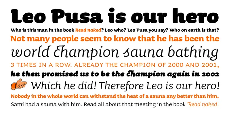
The Sauna family consists of 18 fonts. The family has three weights and two different italics for each weight. The lightest weight also has Small Caps. The basic family consists out of 10 fonts. Not only the numbers are monospaced
This is the rounded, softer version of Canada Type's popular Wagner Grotesk. Originally done in 2011 for a global publisher, this font has already seen plenty of magazine and book cover action, perhaps even more than the sharp condensed face
A legible, most versatile serif font family with an Extended Latin and Cyrillic letter set which makes this font family a real workhorse. Published by RMU TypedesignDownload Diamant Pro
Designed by A. Pat Hickson. An original design based on the Frederick Goudy design first shown in 1912. Originally a caps only design in one weight. Produced as a foundry face by Lanston Monotype 1924. Published by Red RoosterDownload Forum
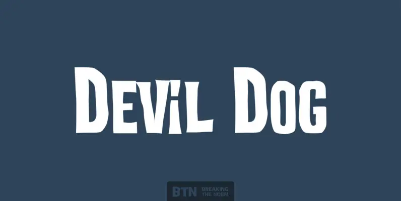
Devil Dog is a fun yet scary typestyle inspired by retro Frankenstein and other horror movie posters. It’s big, it’s bold, it’s caps and smallcaps, it’s a typeface monster. Published by Breaking The NormDownload Devil Dog

Mensura font family has been designed for Graviton Font Foundry by Pablo Balcells in 2012. It is a modular, geometric typeface with subtle rounded angles that provides a soft, pleasent appearence. It has been conceived to be primarily a display
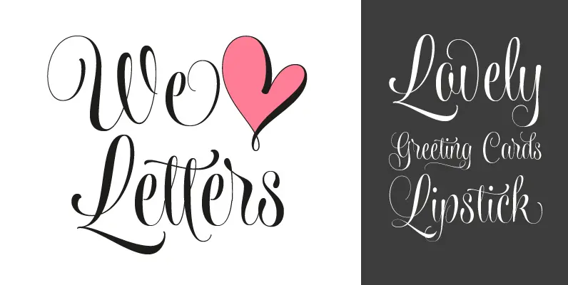
Wishes Script is the best way to express your greetings! All you want to say is more gorgeous when using this pretty font, since it beautifies every message. Programed with Open Type, Wishes offers the designer a complete range of
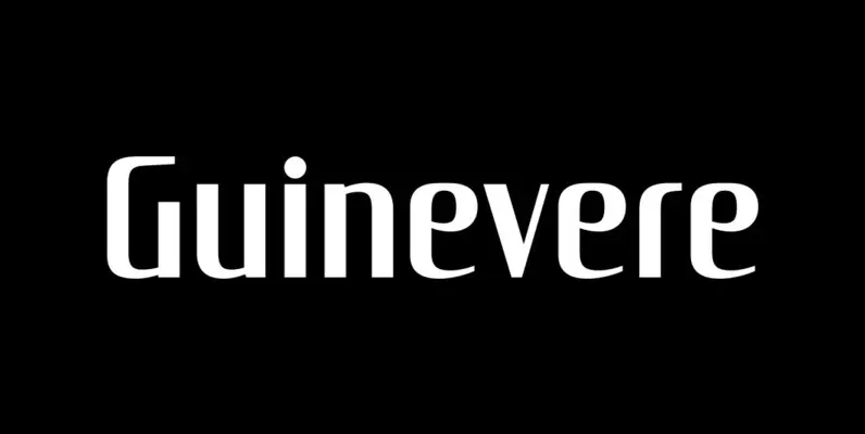
Guinevere Pro is a typeface designed by Icelandic art director Sigurdur Armannsson. It started in 2001 as simple hand-drawn sketches of a few letters built from modules, then became an experiment with four goals: – Construct an original alphabet from