Tag: smart
Prelo Font
Prelo was designed to be a neutral, highly readable typeface, for identity, editorial and information design. With nine weights and nine true italics, from Hairline to Black, Prelo is a workhorse typeface, full of OpenType features such as Small Caps,

Solido Compact Font
Solido is a very versatile and usable type system with five widths: Solido, Solido Constricted, Solido Condensed, Solido Compressed and Solido Compact, in a total of 35 fonts with many of alternate characters. Published by DSTypeDownload Solido Compact

Bookmania Font
Bookmania (2011) is a revival of Bookman Oldstyle (1901) and the Bookmans of the 1960s, but with all the features you would expect in a modern digital font family. Feature Summary: – 5 weights: Light, Regular, Semibold, Bold, and Black
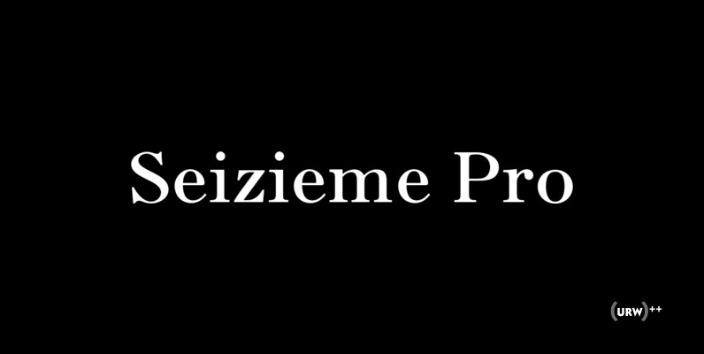
Seizieme Pro Font
In 1905 the Parisian typefounders Peignot & Cie. issued their Série 16. This clear roman with a large x-height and an italics soon enjoyed a great popularity. Coen Hofmann’s drawings made for the Seizième follow the original Peignot Série 16
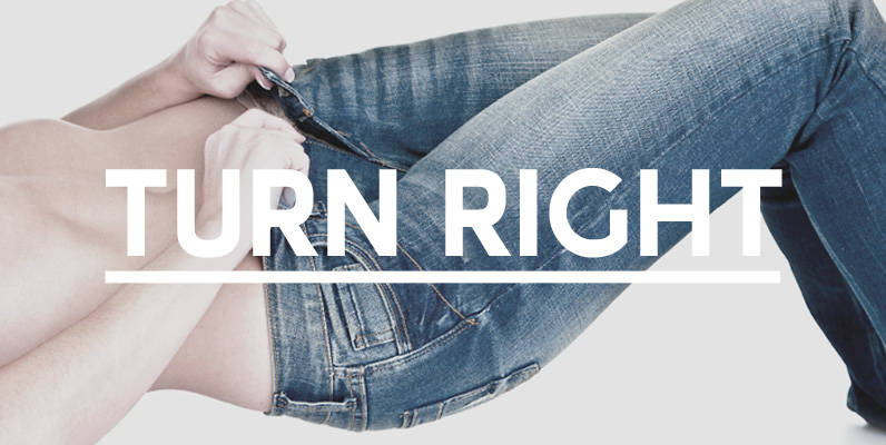
Turn Right Display Font
A display font that attempts to bridge the gap between classic geometric and neo grotesque faces simple shapes with a robust, no nonsense approach. Published by Jamie WinderDownload Turn Right Display

Caturrita Display Font
Caturrita Display is a new version of Caturrita. Better for titles and small pieces, with a large contrast in the heavy weights. It preserves the same structure of Caturrita, but with a more calligraphic touch, in the ligatures and almost

Solido Font
Solido is a very versatile and usable type system with five widths: Solido, Solido Constricted, Solido Condensed, Solido Compressed and Solido Compact, in a total of 35 fonts with many of alternate characters. Published by DSTypeDownload Solido
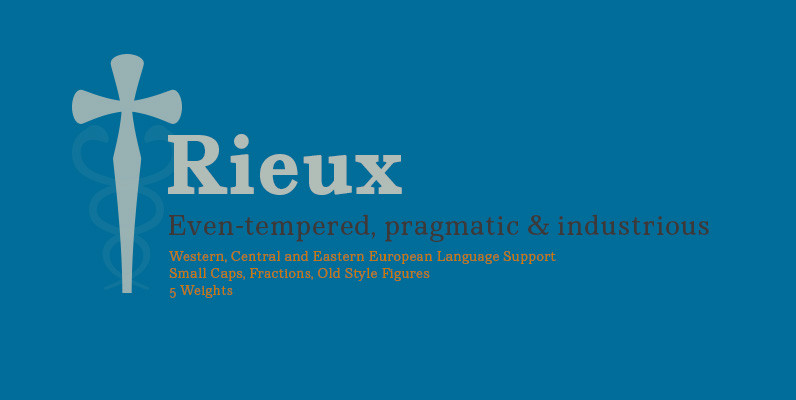
Rieux Font
Named after the steadfast doctor from Albert Camus’ The Plague, Rieux is an even-tempered slab-serif that is confident without being cocky and approachable without being casual. The aesthetic of Rieux is inspired by the industrial age. While the design is

Cornelia Font
Cornelia, an ‘undesigned’ typeface. Made by Novo Typo. Designers from Amsterdam, The Netherlands. Published by Novo TypoDownload Cornelia

Servus Slab Font
This family is very special to me. I started working on it right after my first son was born. I decided to name the typeface “Servus” which means “Hello” in my country. The whole idea of the family symbolizes a
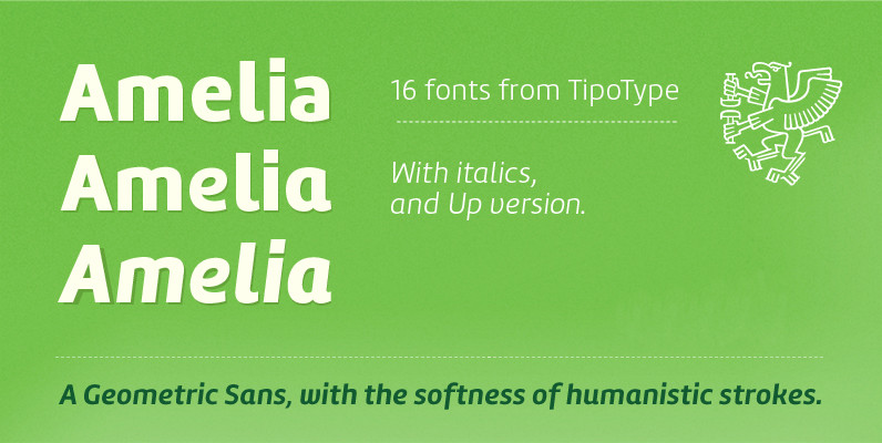
Amelia Family Font
Amelia is a geometric sans, but it keeps the softness of humanistic strokes. The contrast and the different styles allow Amelia to work as a text or display font. Also it incorporates an Up version, that incorporates calligraphic features that
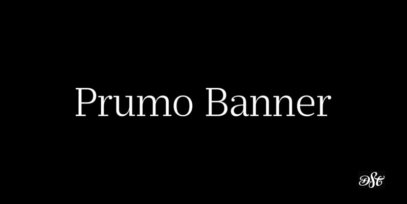
Prumo Banner Font
Prumo is a new type system, based on a unique skeleton that flows, like a pendulum, from high contrast to low contrast fonts, is a sort of typographic journey, from the eighteen century typefaces to the nineteen century slab serif
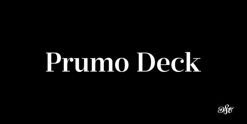
Prumo Deck Font
Prumo is a new type system, based on a unique skeleton that flows, like a pendulum, from high contrast to low contrast fonts, is a sort of typographic journey, from the eighteen century typefaces to the nineteen century slab serif

Filmotype Manchester Font
Originally released in the late 1960s, Filmotype expanded it’s Grotesque typeface category with the introduction of its Miner, Marlette and Manchester typefaces offering its own original take on this modern sans serif style Type designer Rian Hughes refined and further

Solido Compressed Font
Solido is a very versatile and usable type system with five widths: Solido, Solido Constricted, Solido Condensed, Solido Compressed and Solido Compact, in a total of 35 fonts with many of alternate characters. Published by DSTypeDownload Solido Compressed