Tag: soft
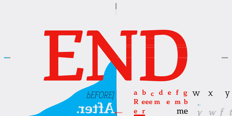
Cavole Slab Font
Cavole Slab is a new slab serif, designed in early 2011, that has a strong influence from Dutch typography. The name is an altered form of the Portuguese word for feather, emphasizing the typefaceís soft and friendly character. Slab serifs
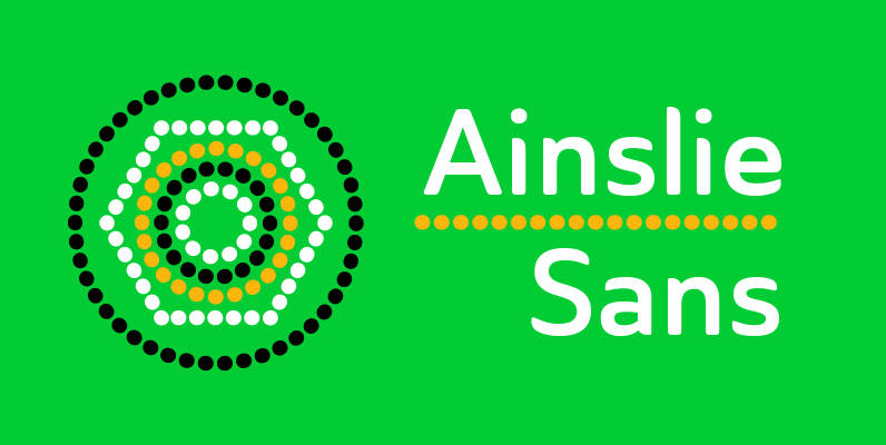
Ainslie Sans Font
The original Ainslie was inspired by Mt. Ainslie and the city of Canberra’s inner suburb of the same name. Canberra is Australia’s capital–a planned city designed by American architect Walter Burley Griffin. Griffin’s style and geometric design for the city,
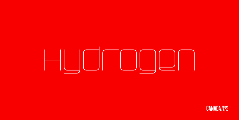
Hydrogen Font
Hydrogen is a clean geometric unicase family that expresses the mechanics, expansive technologies and conflicted ethics of the rapidly changing 21st century. Coupled with the right measure of Oxygen, Hydrogen becomes water, the ace of elements – rhythmic, dynamic, ever-flowing,
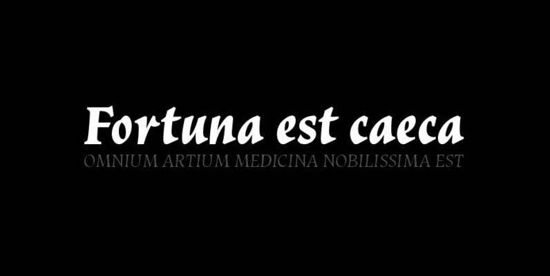
Vatican Font
Vatican is a calligraphic face. The lower case is influenced by the lettering of Arthur Baker but the caps are more formal, the shape of the Cap V reminded me of a Bishops Mitre which led eventually to the name.
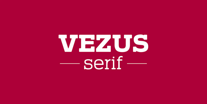
Vezus Serif Font
Vezus Serif is a legible slab design created by Dusan Jelesijevic. Published by Tour de Force Font FoundryDownload Vezus Serif

Normalise Din Font
Normalise Din is a font design released for the Mecanorma Type Collection. Copyright 2004 Trip Productions BV. Published by MecanormaDownload Normalise Din
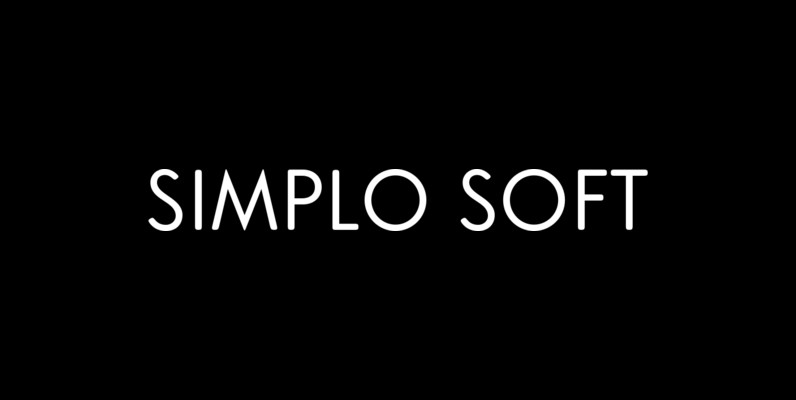
Simplo Soft Font
Simplo Soft is the soft companion of Simplo. In Simplo Soft, Simplo’s original sharp geometrics have been tempered by the moderate rounding of the edges of its characters — creating a softer and friendlier geometric typeface. Simplo Soft is ideal
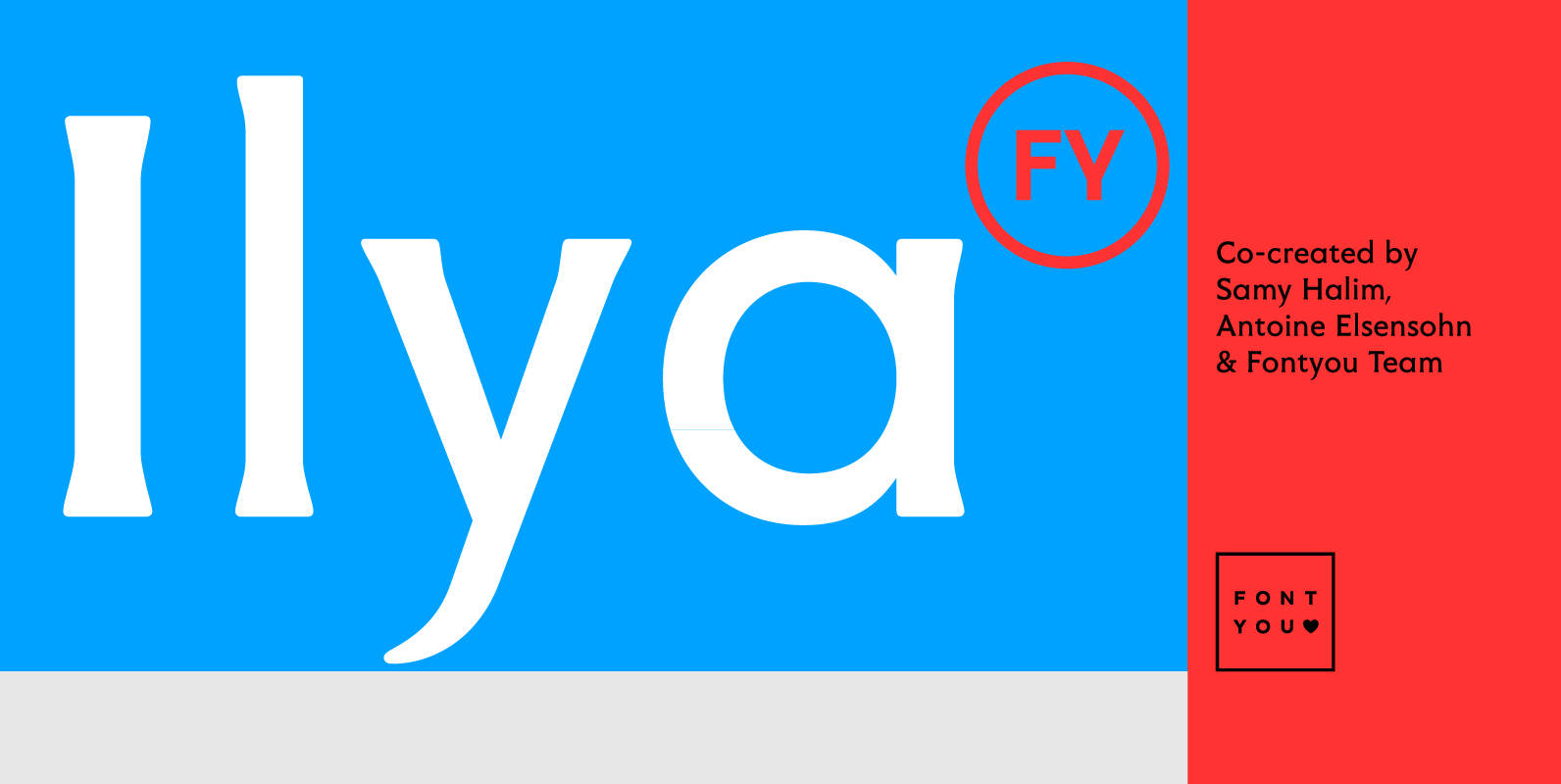
Ilya FY Font
With its soft and triangular serifs and its round shapes, Ilya FY is a friendly and gentle display font. Its tall ascendants and descendants, single storey a, generous uppercases and other nice details give Ilya FY a singular look if
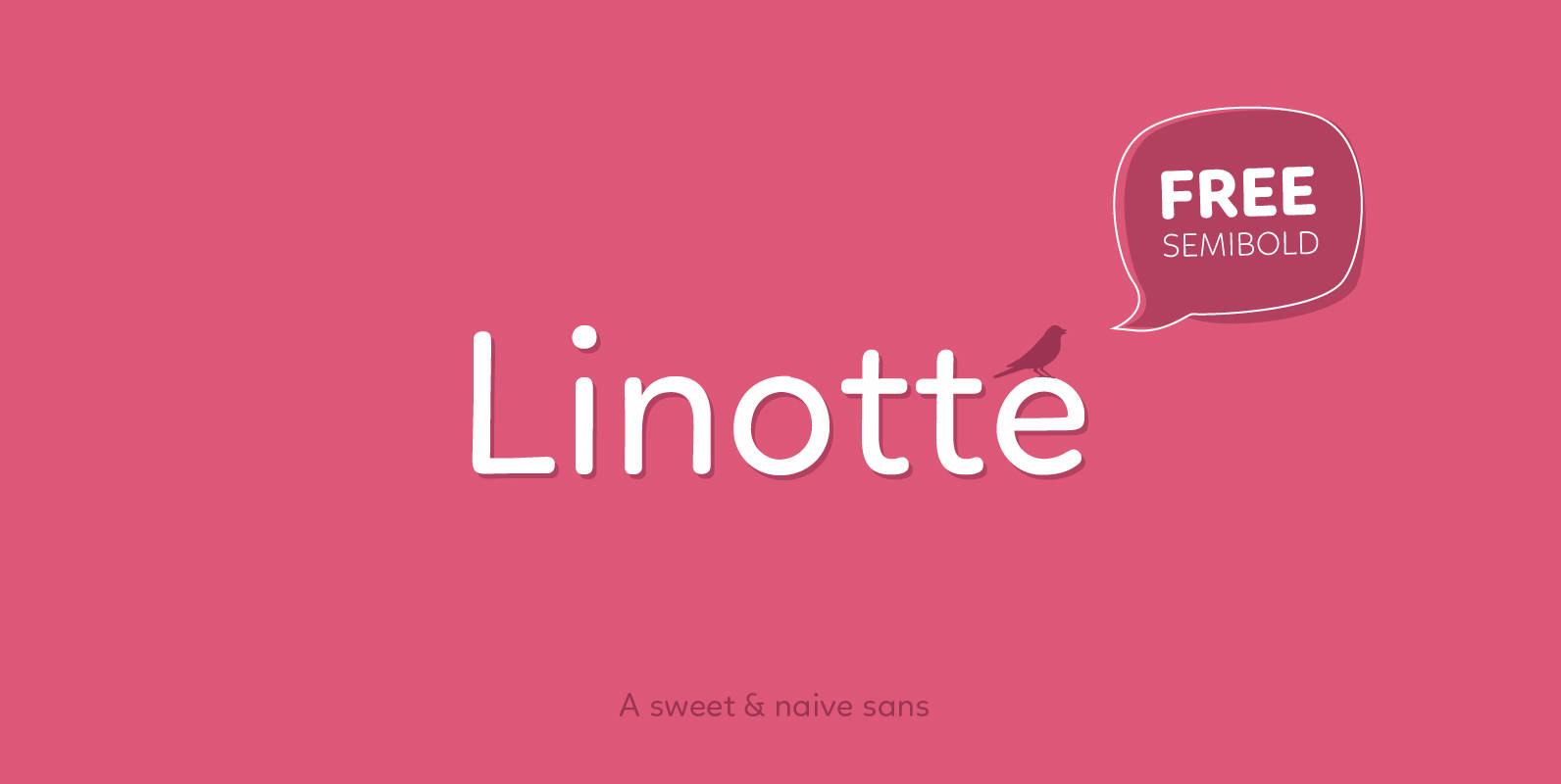
Linotte Font
Linotte is a rounded sans family with good vibes, designed by Joël Carrouché. Slight irregularities give the typeface a warm and naive look, while the solid geometric construction allows good legibility in long texts and small sizes. Linotte is ideal

Naive Inline Font
Naïve Inline is a layered serif handwritten font designed by Fanny Coulez and Julien Saurin in Paris. Our goal was to draw a font with finely irregular lines that give a human and whimsical feeling. We designed three weights to

Ribera Font
Ribera is a contemporary sans serif typeface including three styles. The Ribera characters have smooth curved spins and little contrast combined with a big x-height and big counters. These characteristics make Ribera ideal for almost any type of graphic design.
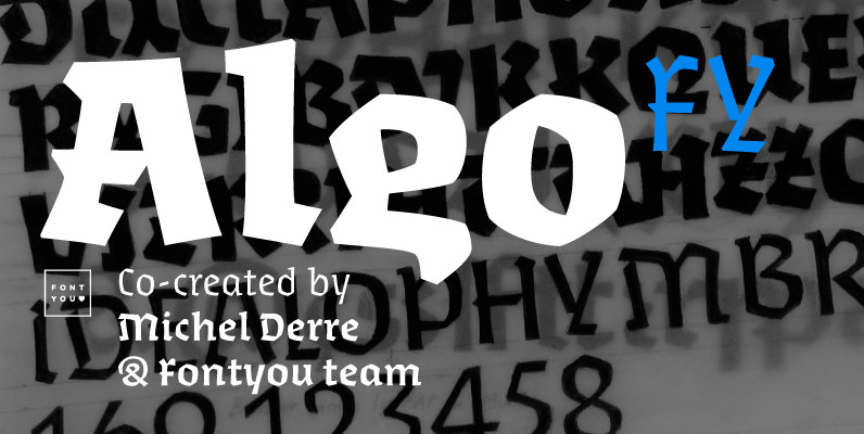
Algo FY Font
Algo FY is a singular font family with broken ductus and blackletter aspect. Clearly inspired by calligraphic shapes, each of the three weights have been especially designed as if the tool has changed. With its special articulations and its differentiated

Creighton Pro Font
Designed by Steve Jackaman and Ashley Muir. It was our initial intention to develop a suitable lowercase for Les Usherwood’s ‘Elston’ typeface, based on a few characters from an old German typeface called Hermes Grotesque (Woellmer, Berlin). However, the new
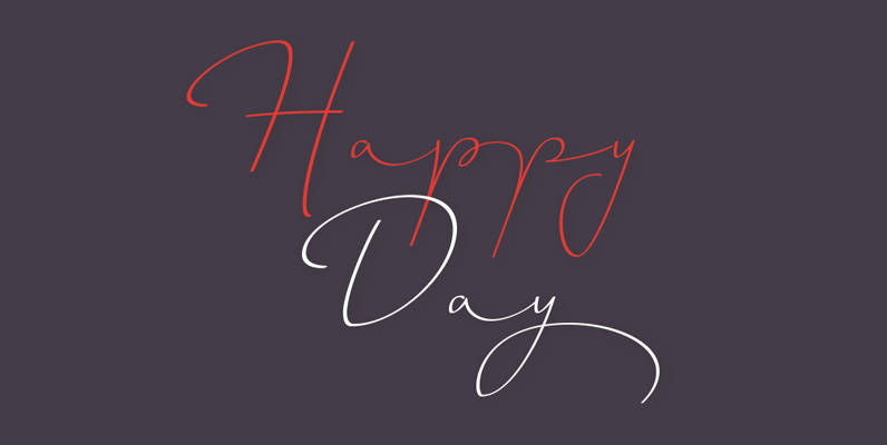
Horizontes Script Font
Horizontes Script is the result of Panco is personal experimental calligraphy project. Designed with the goal of finding a balance between spontaneity, elegance and beauty, his first typography was born and inspired on the horizon´s blue line from the city
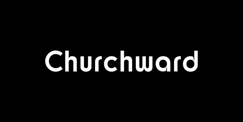
Churchward Design Font
Churchward Design Lines is the latest addition to the Churchward Design family. The family now consists of nine unique fonts, all based on a classic, straightforward geometric glyph forms, with the addition of Churchward’s quirky details. Published by BluHead StudioDownload
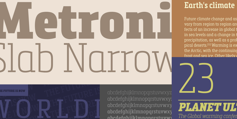
Metronic Slab Narrow Font
Metronic Slab Narrow is the condensed version of the Metronic Slab font family. This condensed style is designed for space-saving typography but with high legibility and versatility in mind. This Family also improved the needs of developers and graphic designers
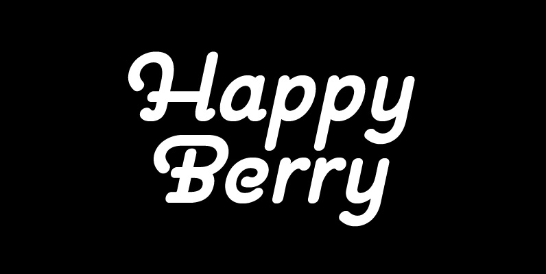
Pauline Font
Pauline is a sans serif with a strong influence from retro scripts. Pauline is a geometric face formed with slow and deliberate rounded brush strokes. The tall ascenders give it a useful touch of naïveté. It’s a face suitable for
