Tag: soft
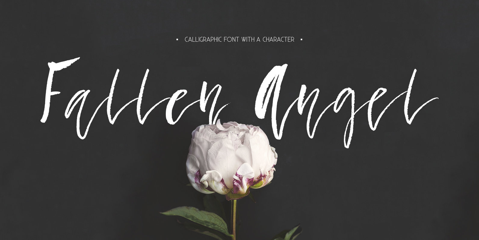
Fallen Angel Font
Fallen Angel is a modern calligraphic font with lots of character and unusual baseline. It comes with alternates for almost all lowercase letters and all of those are PUA encoded! That means that you will be able to access all

Coben Font
Coben is a modern and futuristic san-serif font family. Simple and modern shapes with a tall x-height make the text legible and the spaces between individual letter forms are precisely adjusted to create the perfect typesetting. Coben Family consists of
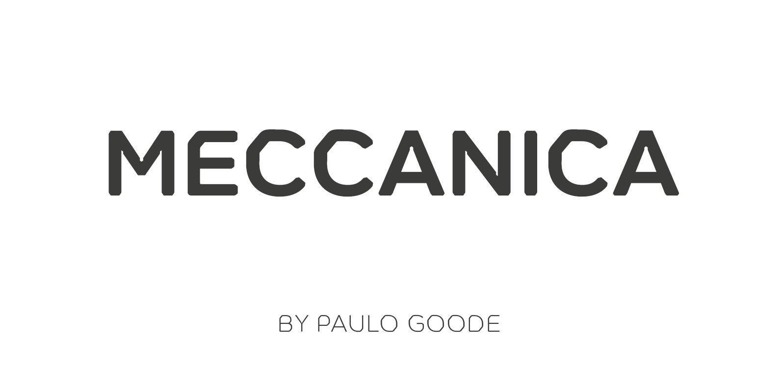
Meccanica Font
Meccanica is a geometric sans typeface like no other, its defining features include soft, chamfered edges, angular bowls and shoulders, angled/hexagonal terminals, and semi-hexagonal ink traps (in a nutshell). Inspired by the mechanics of engineering – the humble nut and
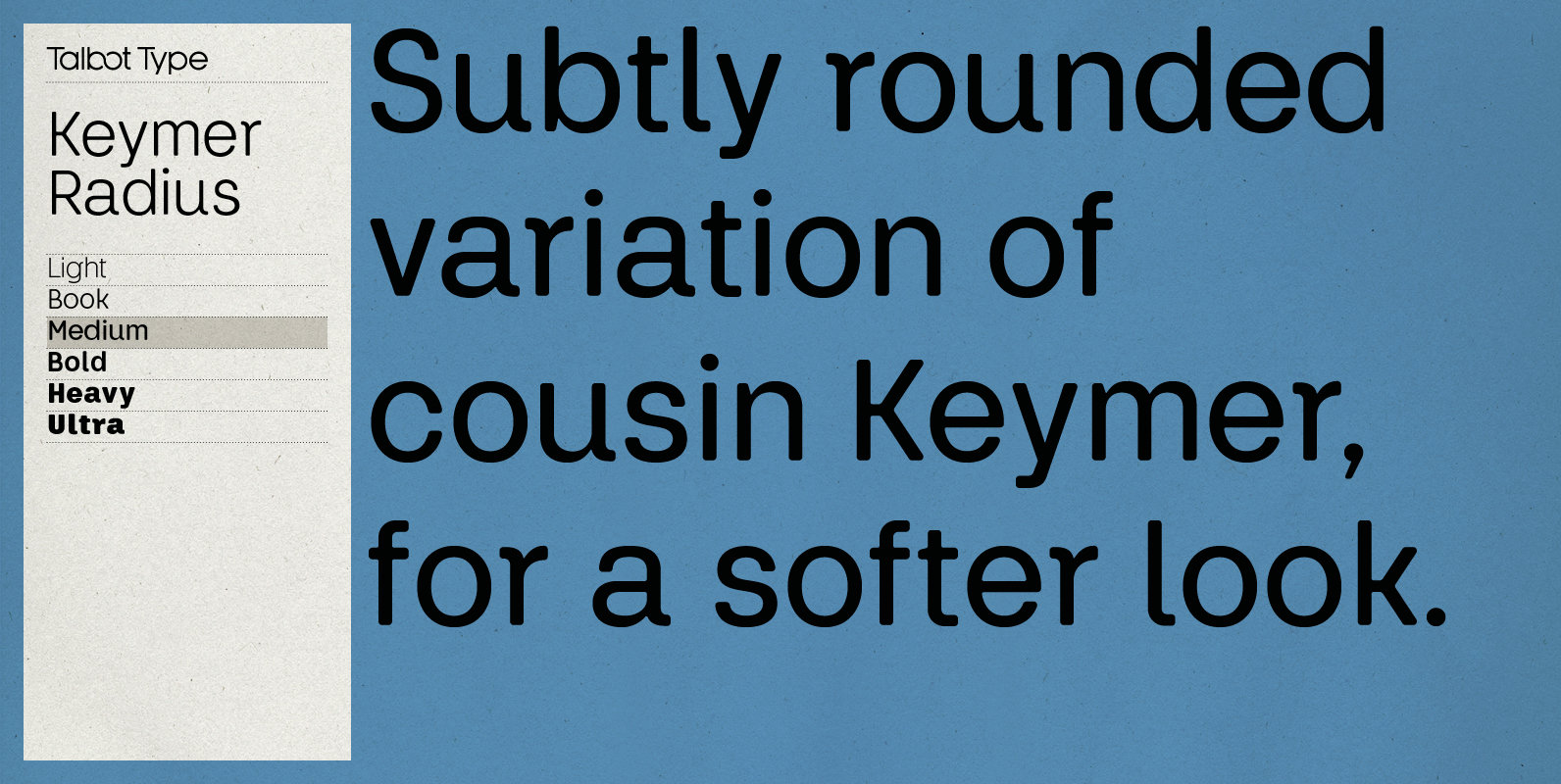
Keymer Radius Font
Talbot Type Keymer Radius is related to Talbot Type Keymer; where Keymer is square-edged, Keymer Radius is subtly rounded for a softer look. Keymer Radius mixes geometric and humanist traits to achieve a modern, clean, elegant appearance. It is a
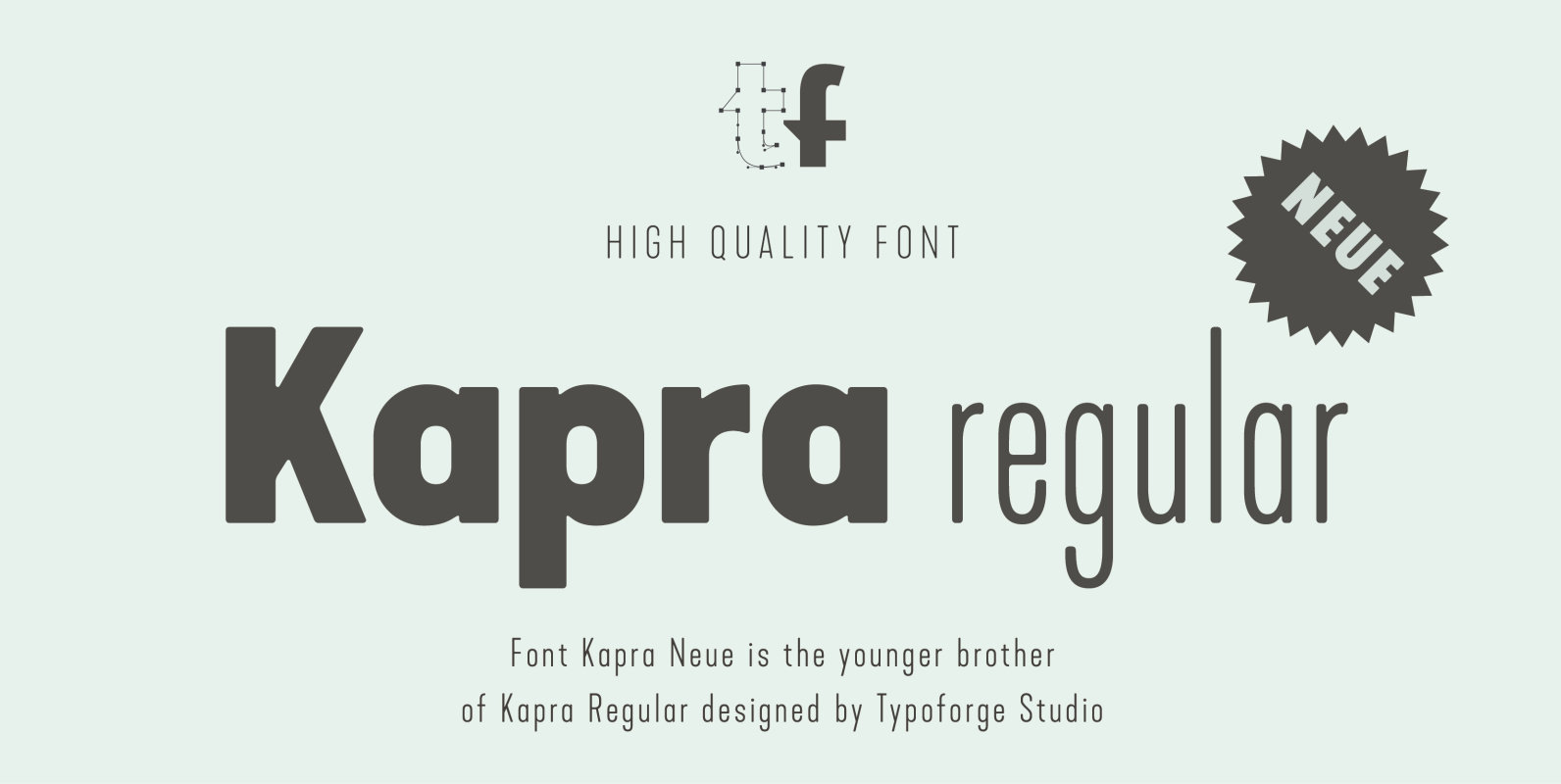
Kapra Neue Font
Kapra Neue is a younger sister of Kapra. New family has refreshed proportions, rounded corners, and a new shape of glyphs. It is characterised by a wide range of instances – 24 new weights, from Thin Condensed to Black Expanded,
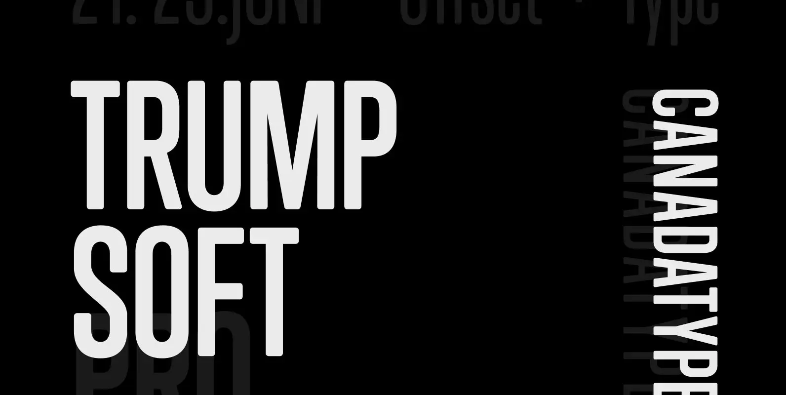
Trump Soft Pro Font
Trump Soft Pro is the softer, round-cornered version of Trump Gothic Pro, the popular condensed gothic seen on films, magazines, book covers and fashion brands all over the globe. Trump Soft offers a friendlier grade of the same economic functionality,
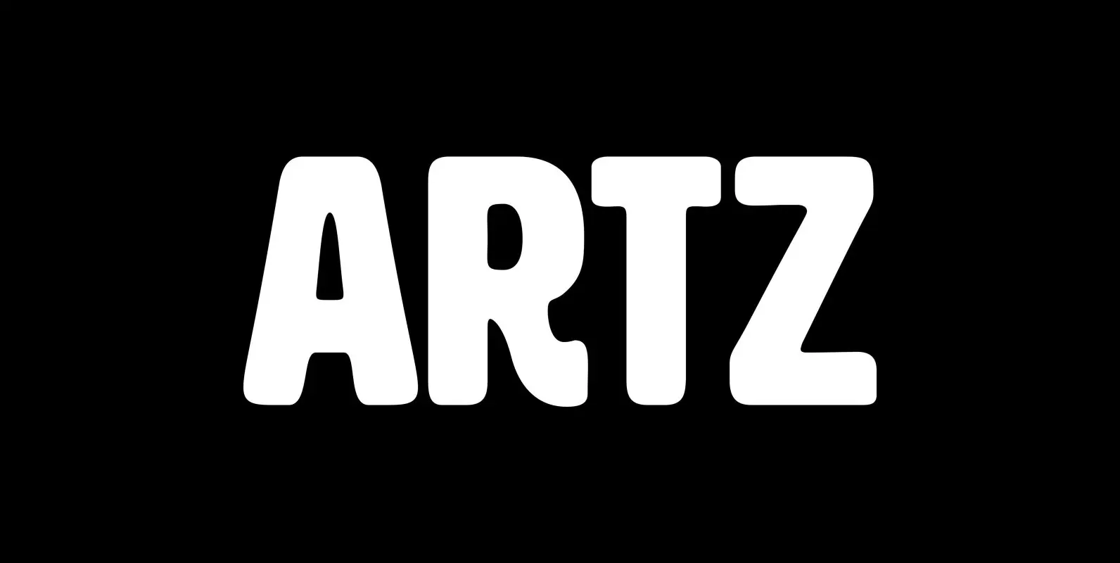
HWT Artz Font
HWT Artz is the newest wood type to be cut at Hamilton Wood Type and Printing Museum. It was designed by venerable type designer Erik Spiekermann for his own print studio (P98a in Berlin), specifically to be cut into large
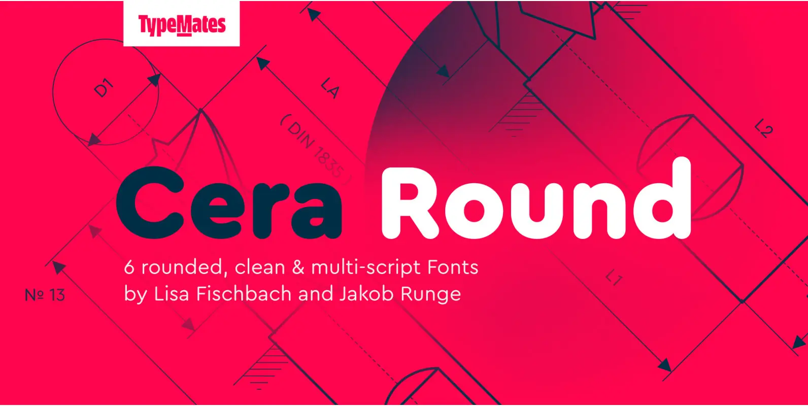
Cera Pro Round Font
The pan-European Cera Collection is driven by pure geometry and contains the bestselling Cera, its stenciled counterpart Cera Stencil, Cera Condensed, the hand-crafted display Cera Brush and the soft Cera Round. As powerful as any other member of the collection,
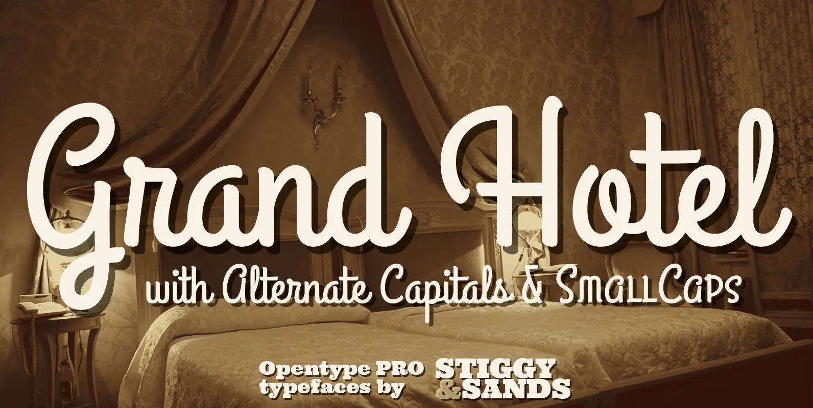
Grand Hotel Pro Font
Our Grand Hotel Pro finds its inspiration from the title screen of the 1937 film “Cafe Metropole” starring Tyrone Power. This condensed upright connecting script has a classic flair and weight to it that feels subtly tied to Holiday and
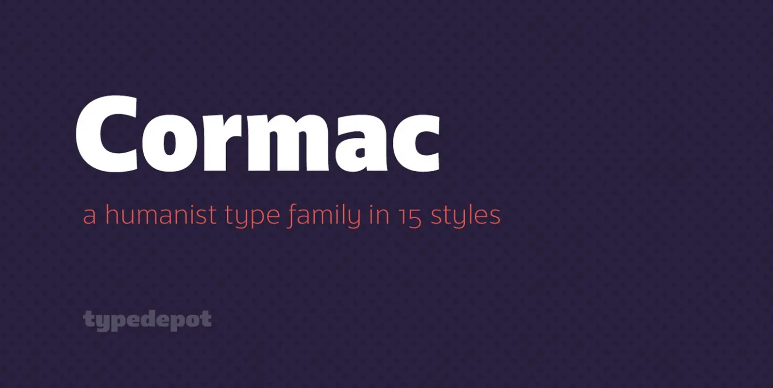
Cormac Font
Cormac is a humanist typeface characterized with it’s large x-height and slightly flared stems. The word that best describes our ideas in the beginning of the project is “simple” – the idea behind it was to strip the letter forms
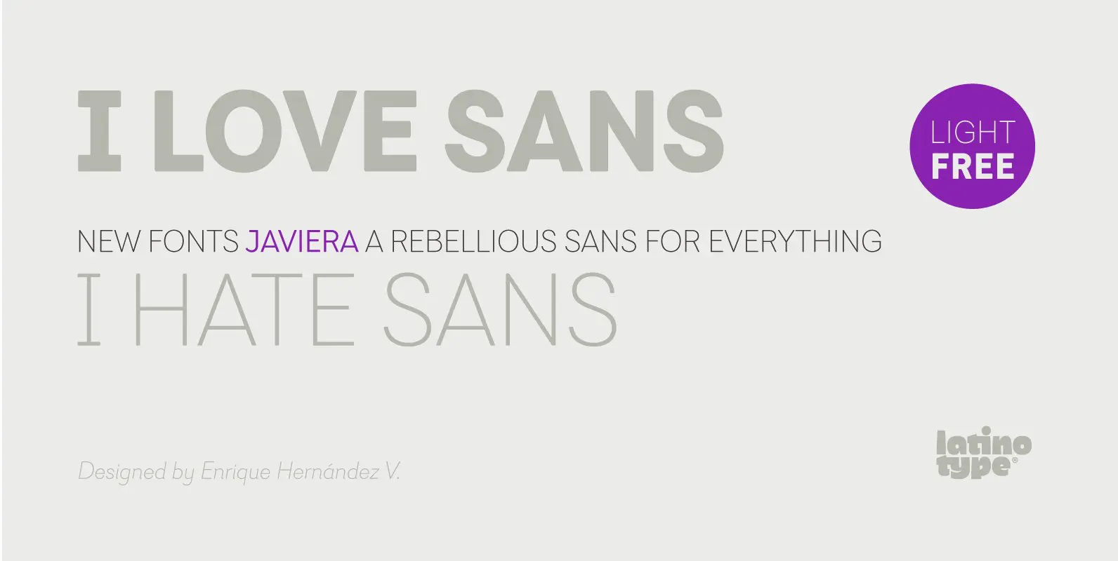
Javiera Font
Javiera is a geometric sans-serif typeface with humanist attributes. One of its main features is its small x-height, which makes ascenders and descenders look longer. The contrast gives the font a more stylised look, typical of humanist fonts. Curves and
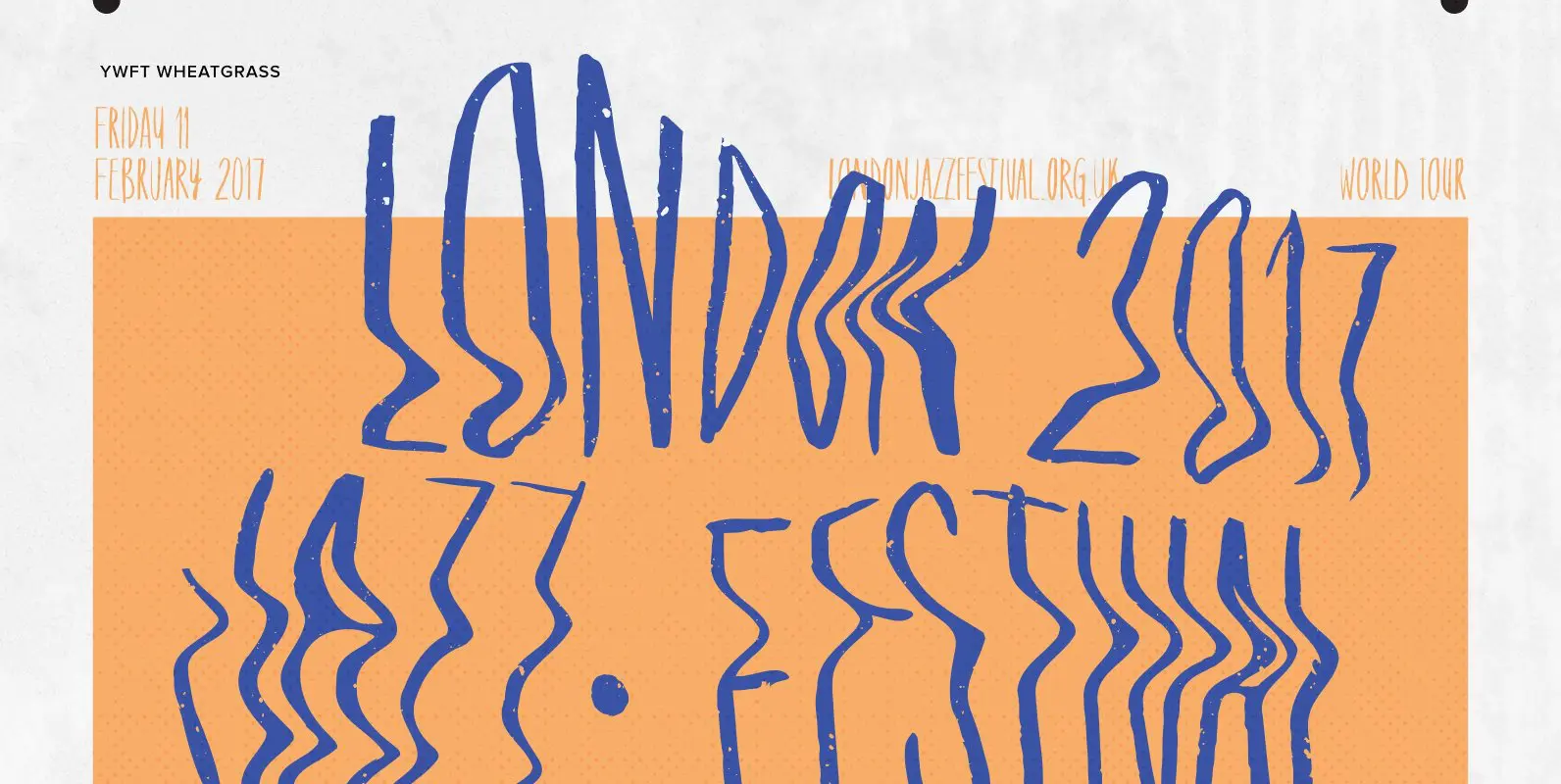
YWFT Wheatgrass Font
“Tall, organic and hand drawn” sounds like it might be a dating profile headline, and if that sounds good to you, you’re going to want to meet up with YWFT Wheatgrass, which fits that description to a handwritten capital T.
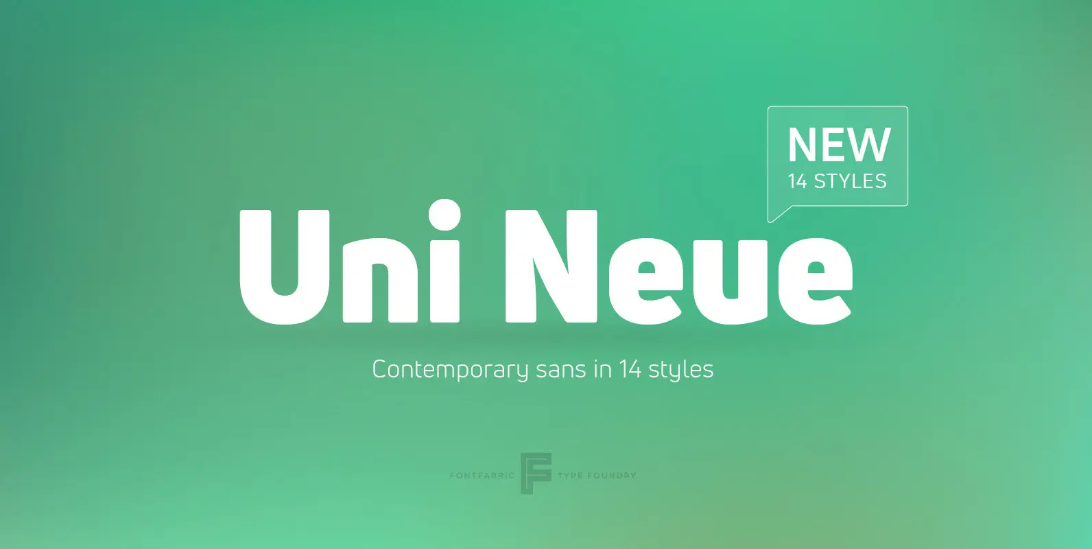
Uni Neue Font
Uni Neue is the whole new redesigned version (remake) of Uni Sans – one the most recognizable and signature font families of Fontfabric type foundry. From major changes like proportions, widths and thickness (weights) to the smaller details, this new
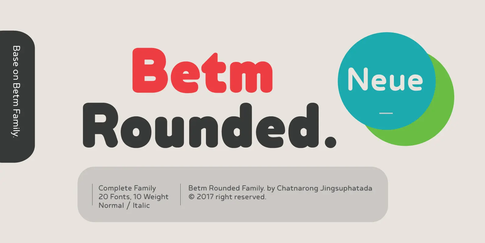
Betm Rounded Font
Betm Rounded is a warm, approachable sans serif with a high degree of legibility, even in small point. It displays a casual persona with an underlying sophistication that makes it appropriate for a wide variety of design projects. Betm Rounded
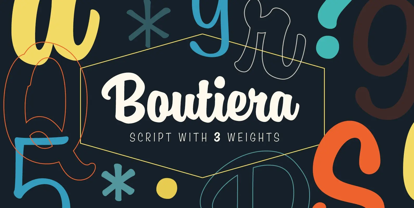
Boutiera Font
Boutiera is an upright and soft vintage script with a modern twist. Its main characteristics are bouncy baseline, round forms and bumpy stems. These qualities gives Boutiera its casual, friendly and handmade looks. It has three weights to give contrast
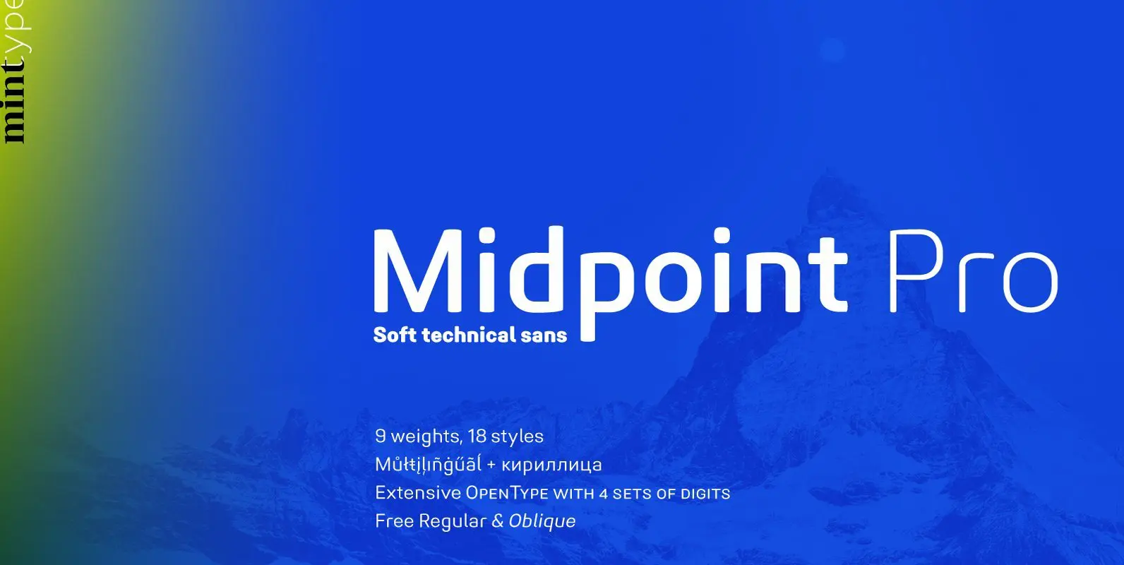
Midpoint Pro Font
Midpoint Pro is a soft sans-serif typeface with a modern technical look. Its spurless design creates a perfect balance between static rigid verticals and softened endings. The interplay of open and closed forms suggests increased legibility in small sizes and
