Tag: solid
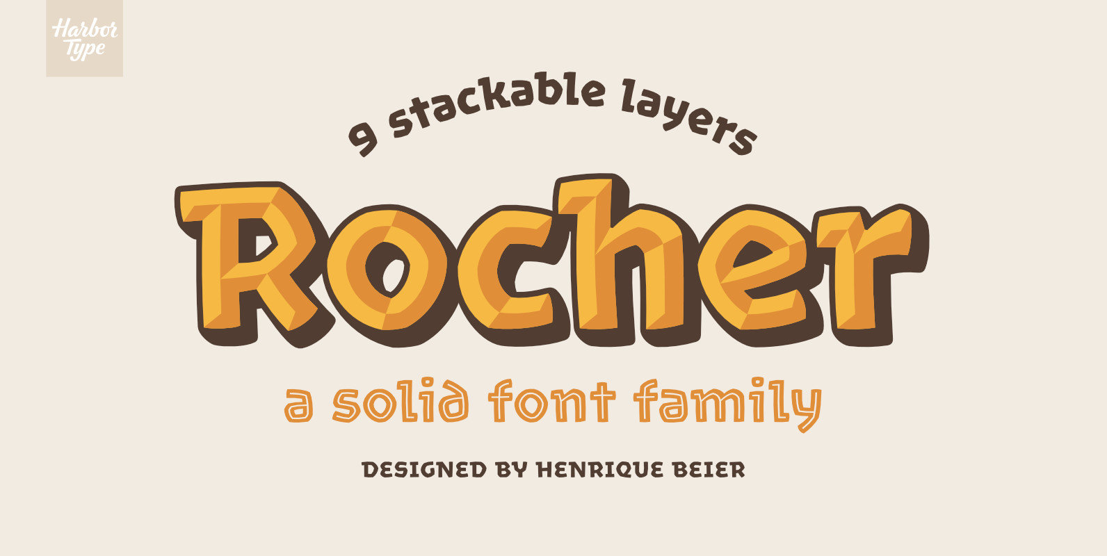
Rocher Font
Rocher was designed while looking for an answer to a simple question: what would a typeface look like if it was made of stone? It certainly would look solid, but did we have to add cracks and rubble so it would
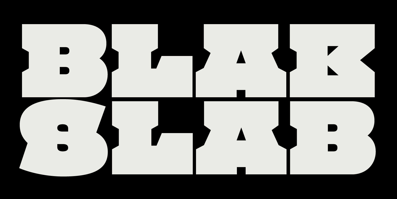
Blak Slab Font
Blak Slab is a slab serif typeface designed for creating solid blocks of type and massive branding. Blak Slab is available in a single weight and includes contextual alternates with support for most Latin languages. Published by MAKEWORKDownload Blak Slab
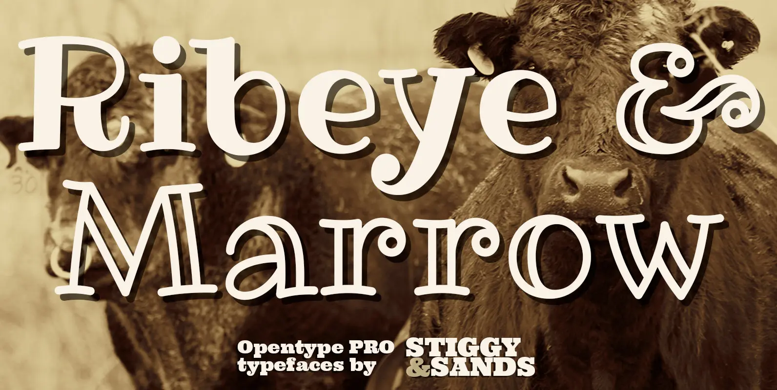
Ribeye Pro Family Font
The Ribeye Pro Family is reminiscent of a cartoon tattoo style of lettering, but exhibits a playfulness that breaks traditional weight distribution across its letterforms. An edgy attitude, friendly syncopation, and highly legible letterforms makes these fonts a real pair
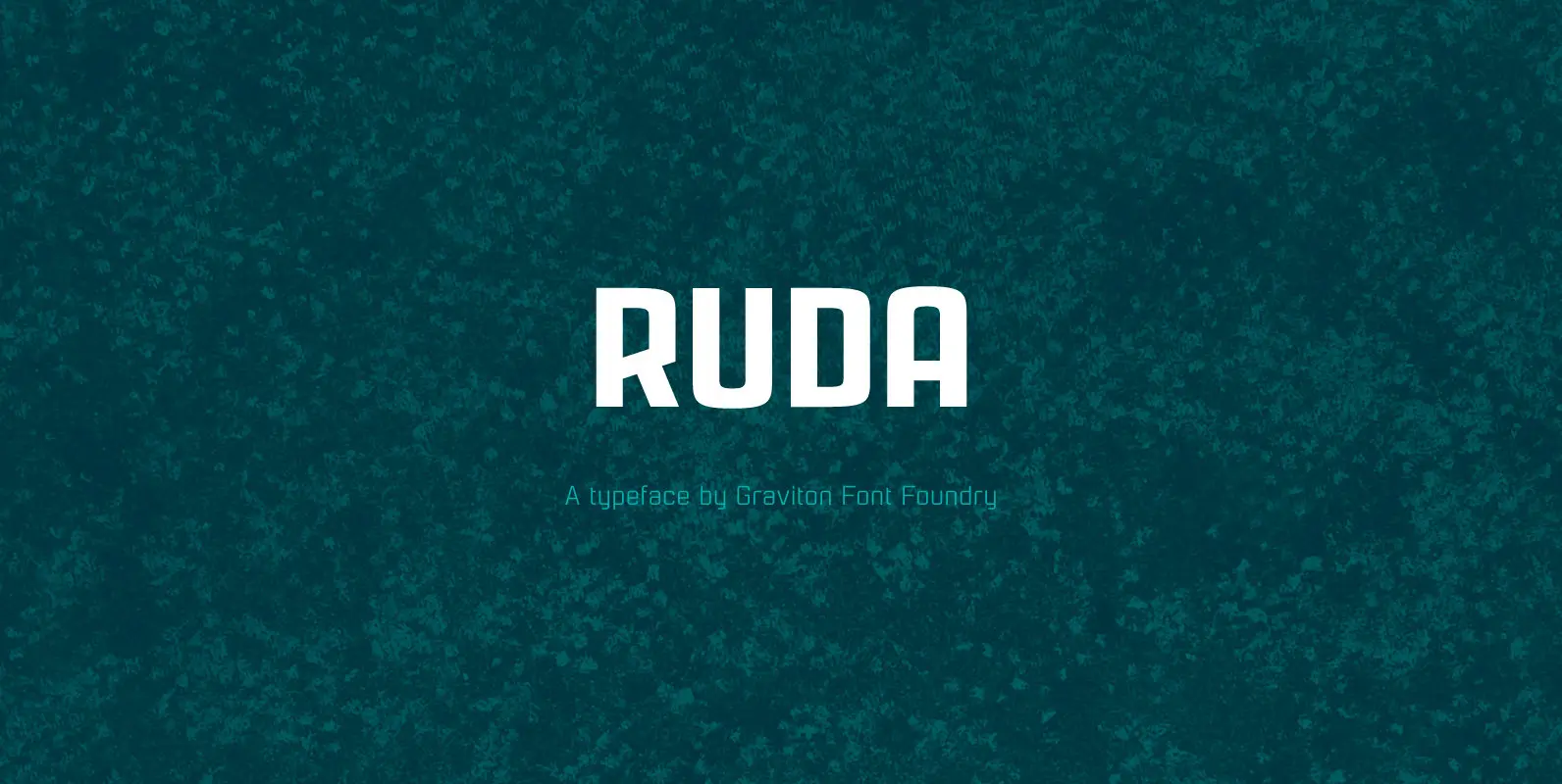
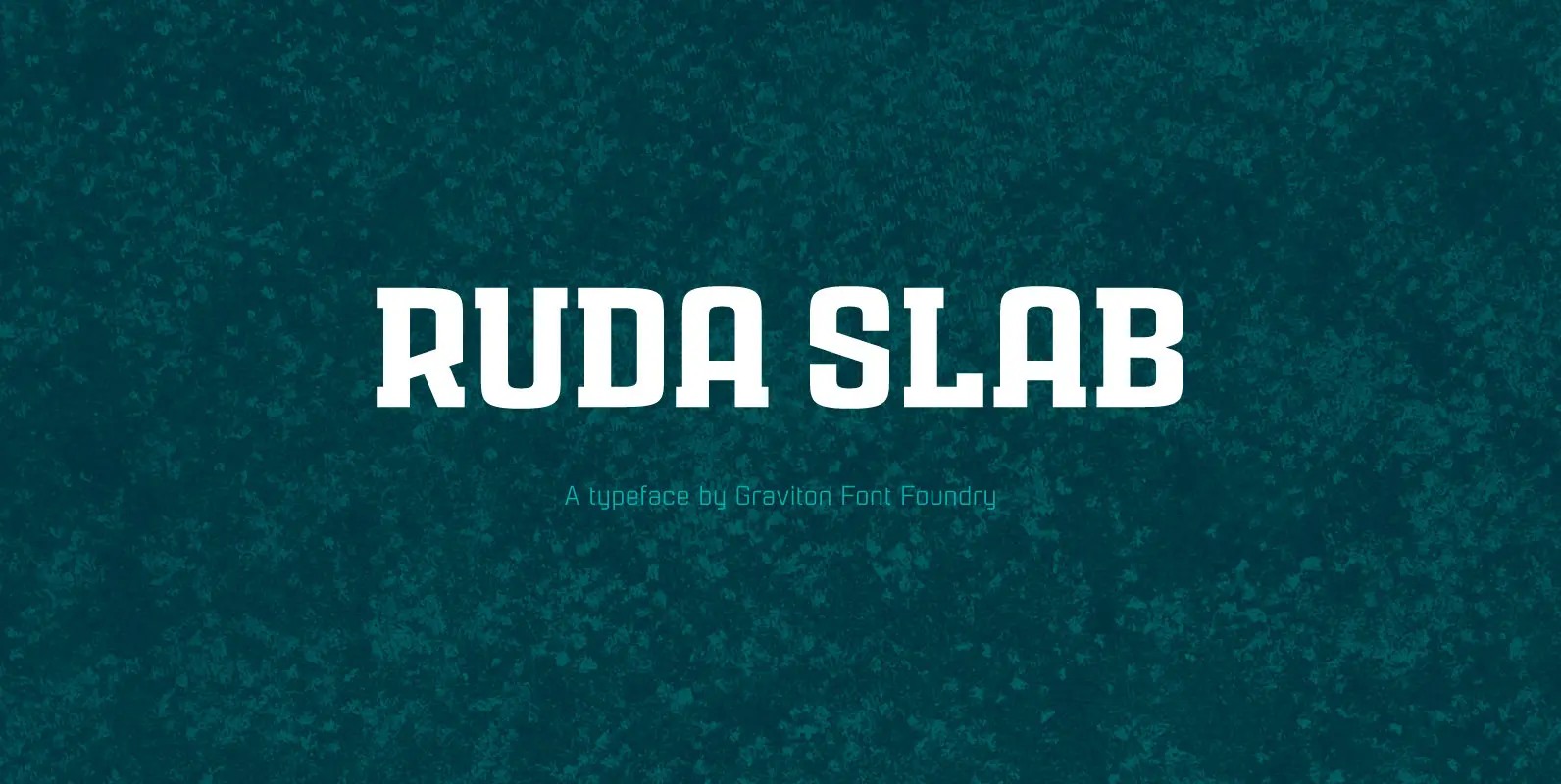
Ruda Slab Font
Rauda Slab font family has been designed for Graviton Font Foundry by Pablo Balcells in 2017. It is a display, slab serif, geometric typeface, with sharp angles that provides a strong and solid appearence. Rauda Slab consists of 8 styles.
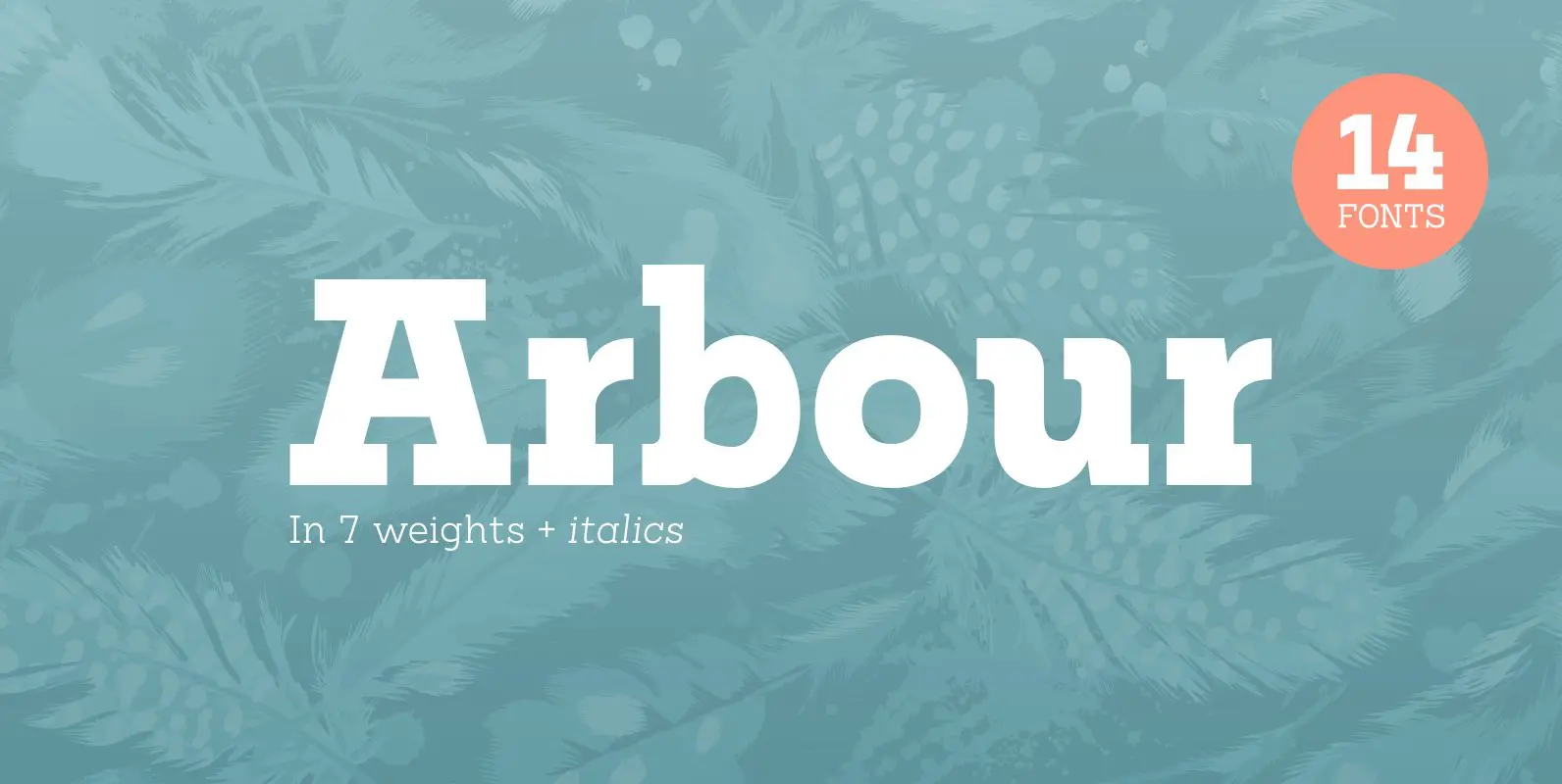
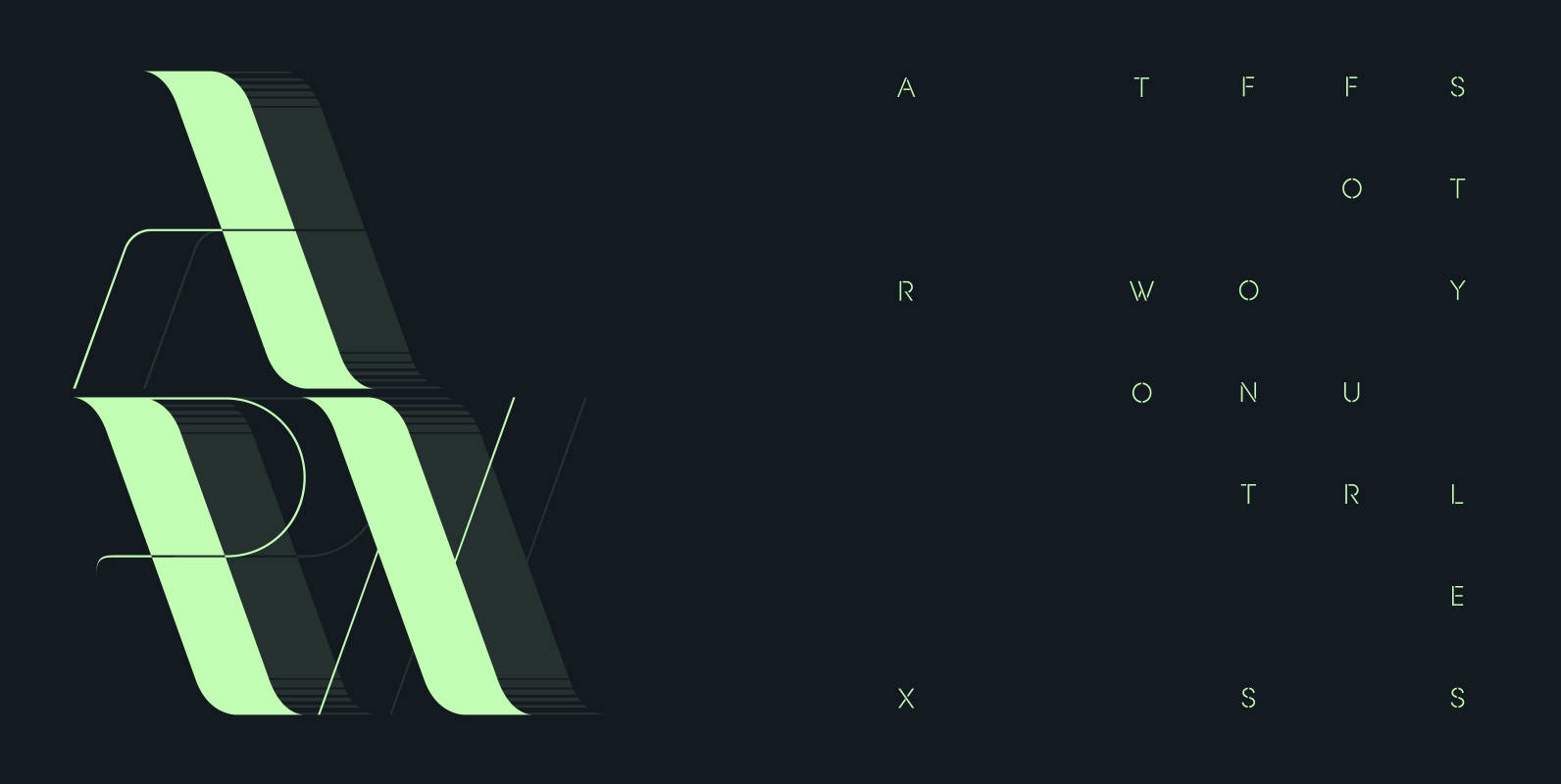
Arbour Font
With its solid slab form, mixed with subtle curved terminals, Arbour is a unique font with the versatility to work in many different scenarios, from branding to digital applications. It comes in 7 weights, from a delicate extra-light to a
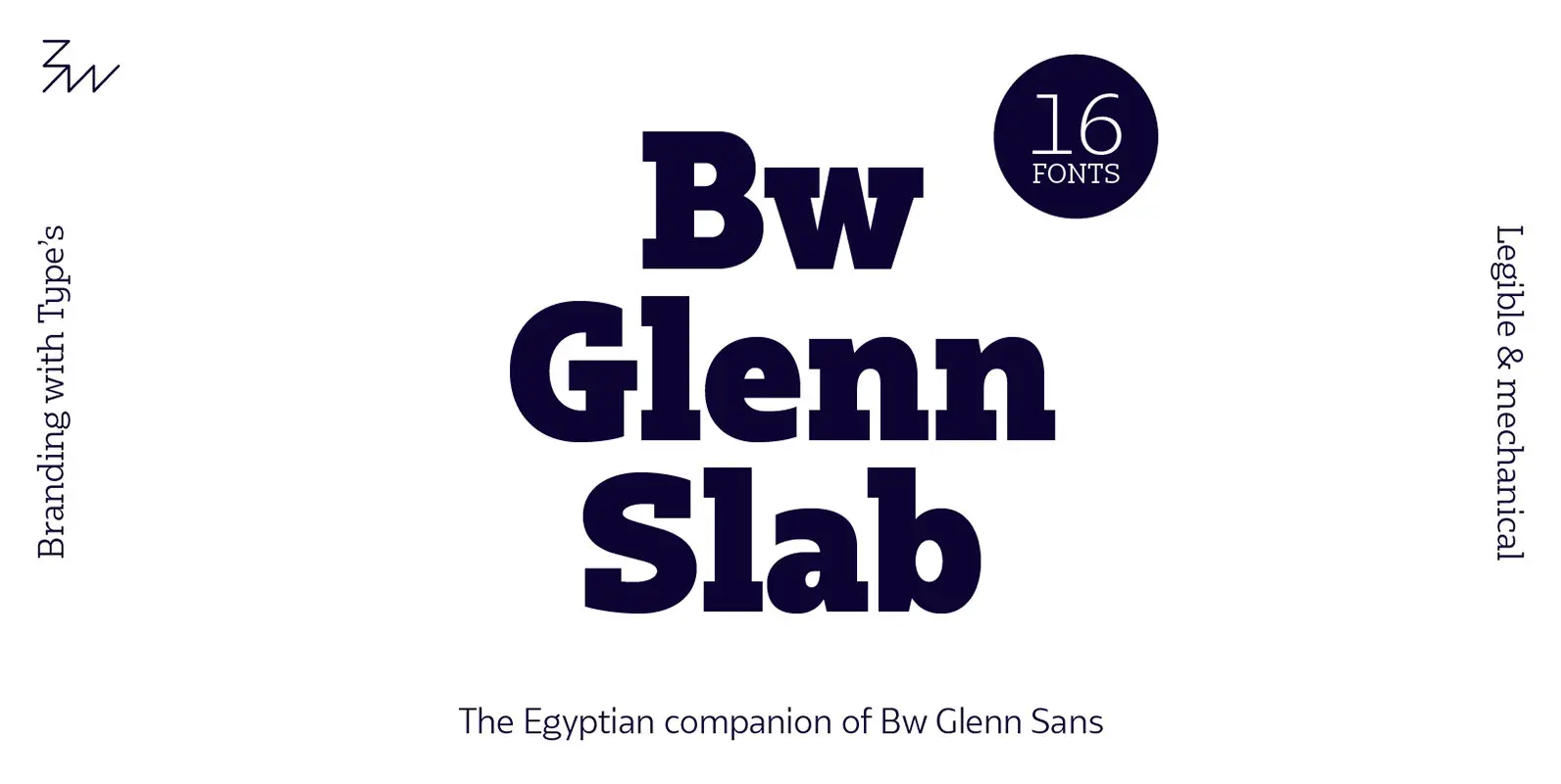
Bw Glenn Slab Font
Bw Glenn Slab is a confident and robust font family with a sturdy feel offering no concessions for ambiguity. Its strict geometry and open shapes provide a very legible and clean texture, performing well on print and screens alike. It’s
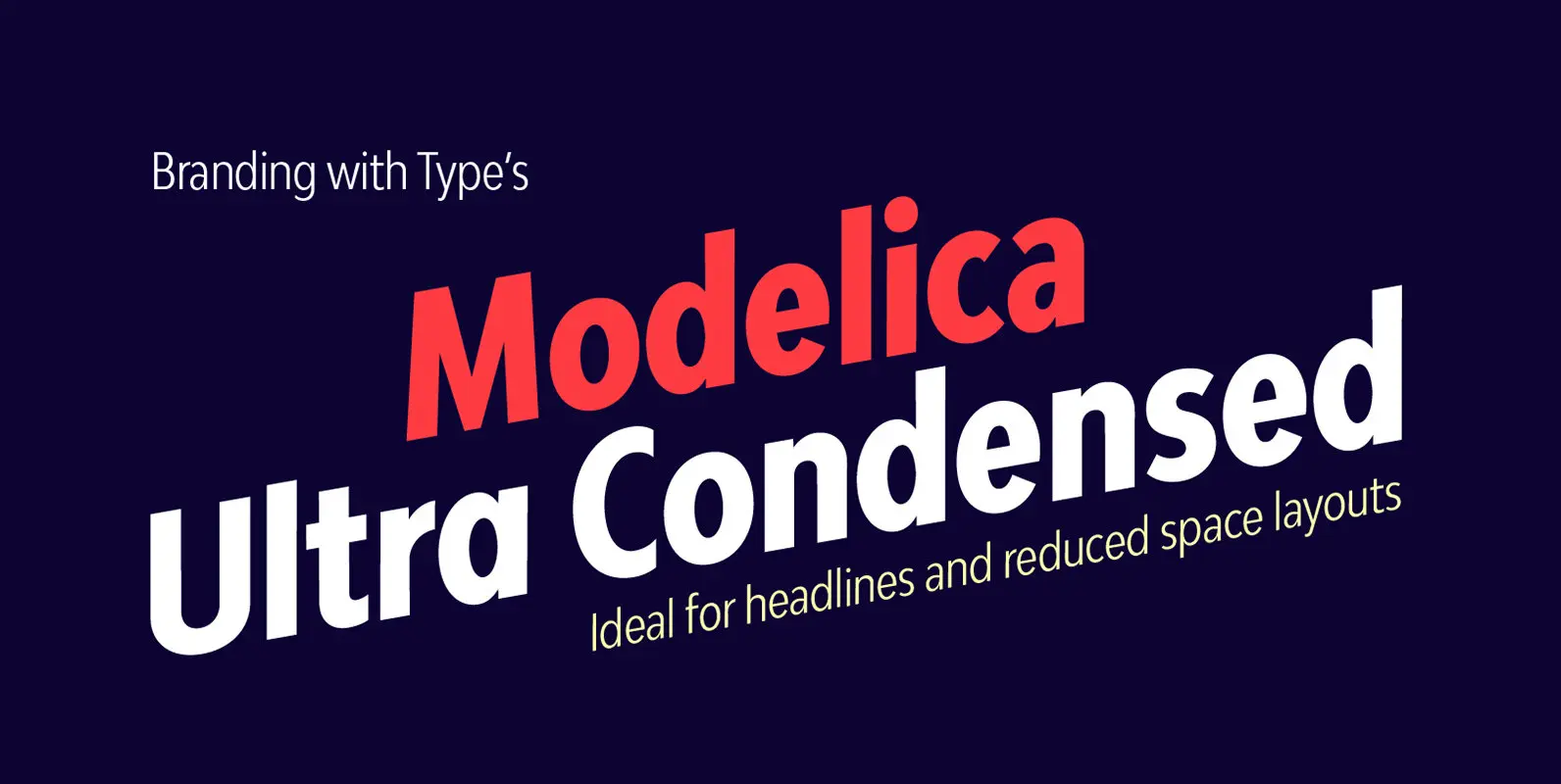
Bw Modelica Ultra Condensed Font
Designed by Alberto Romanos, Bw Modelica is a minimal, robust, reliable & pragmatic geometric sans. Its clean shapes and generous x-height makes it a very competent face for both, display and body copy purposes. It’s available in four widths, each
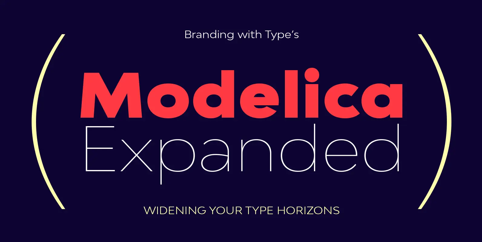
Bw Modelica Expanded Font
Designed by Alberto Romanos, Bw Modelica is a minimal, robust, reliable & pragmatic geometric sans. Its clean shapes and generous x-height makes it a very competent face for both, display and body copy purposes. It’s available in four widths, each
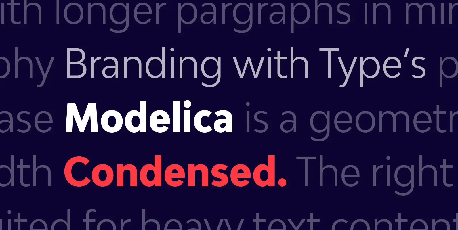
Bw Modelica Condensed Font
Designed by Alberto Romanos, Bw Modelica is a minimal, robust, reliable & pragmatic geometric sans. Its clean shapes and generous x-height makes it a very competent face for both, display and body copy purposes. It’s available in four widths, each
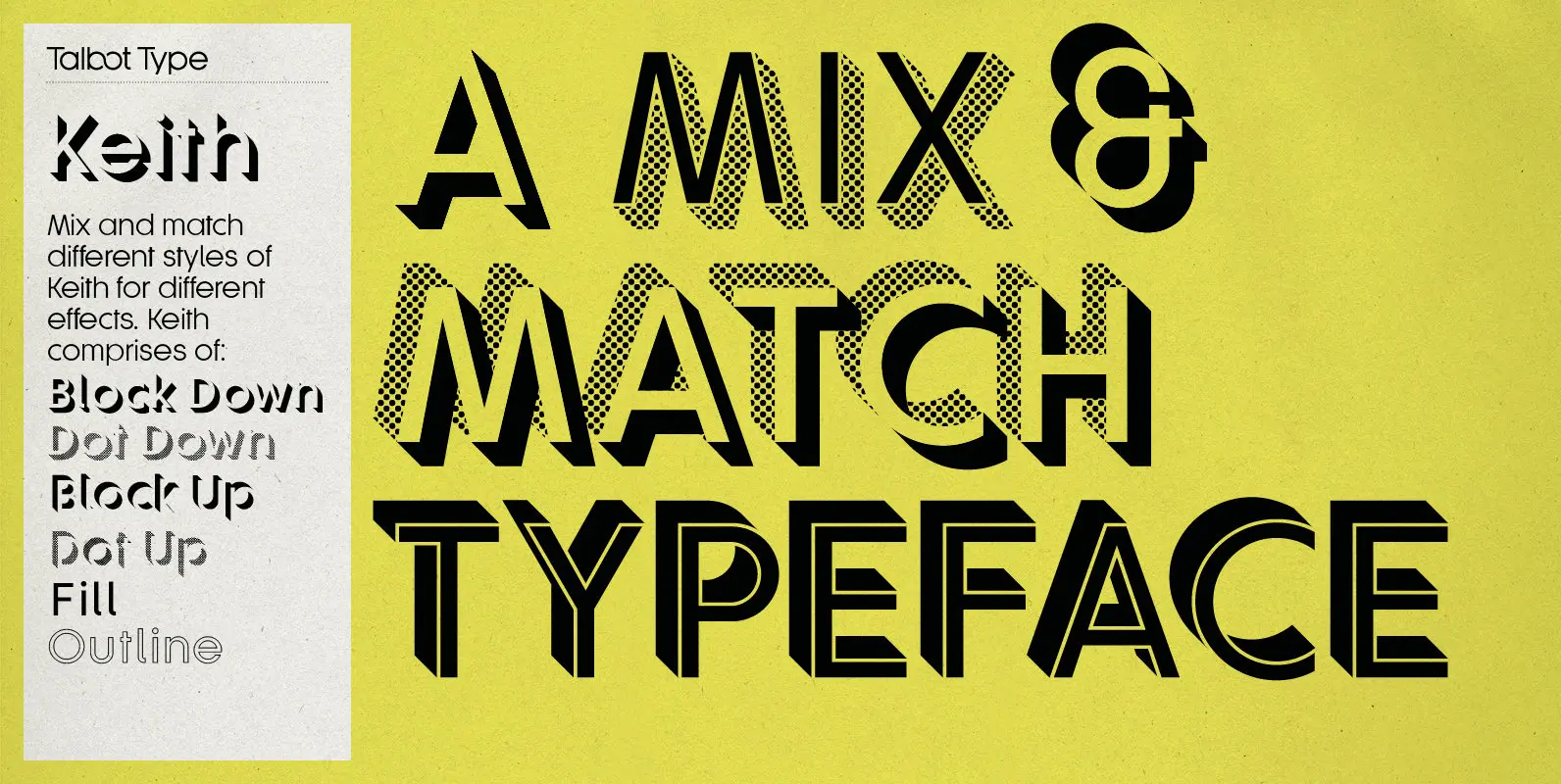
Keith Font
Keith is a striking and playful display font. Mix and match the different shadow styles, to create a variety of different looks and effects. There are four different shadow effects, along with a fill and an outline variation. Keith features
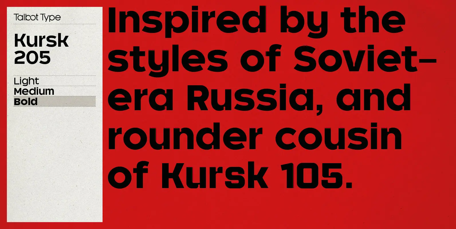
Kursk 205 Font
A text and display font with square proportions, inspired by the type styles of soviet-era Russia. Very shallow ascenders and descenders and a large relative x-height, exaggerate the compact and geometric look. Related to Kursk 105, its squarer-edged cousin. Published
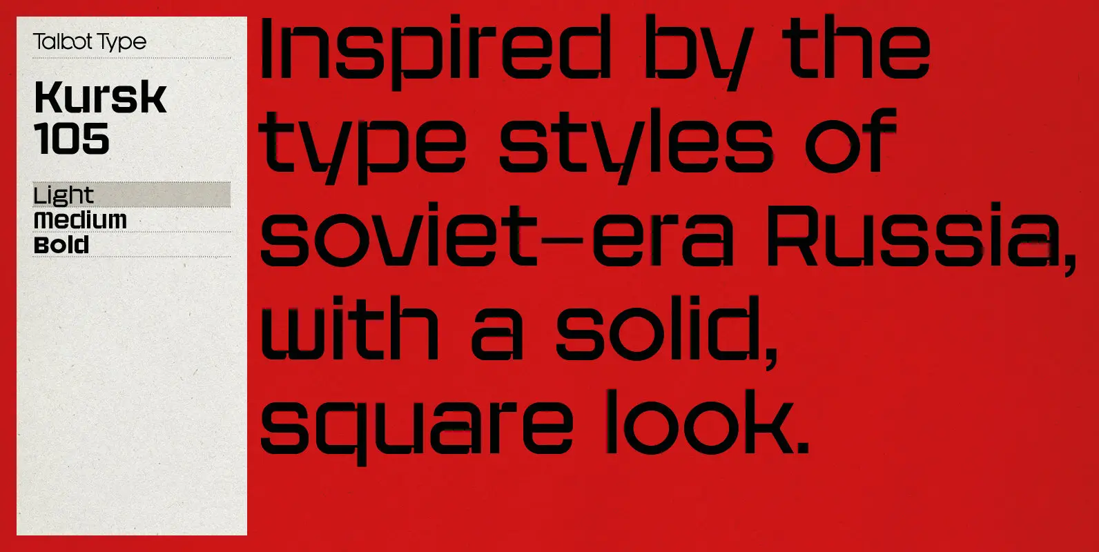
Kursk 105 Font
A text and display font with square proportions, inspired by the type styles of soviet-era Russia. Very shallow ascenders and descenders and a large relative x-height, exaggerate the square look. Related to Kursk 205, its slightly rounder cousin. Published by
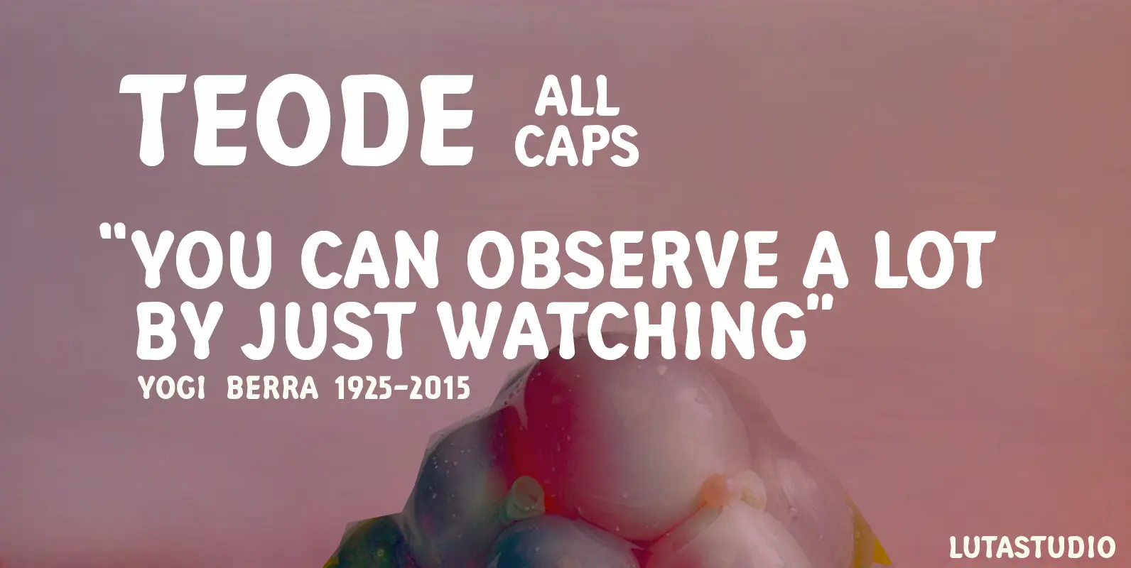
Teode Font
The Teode, designed by Lutastudio, is a display sans font with extensive Latin language support. Published by LutastudioDownload Teode
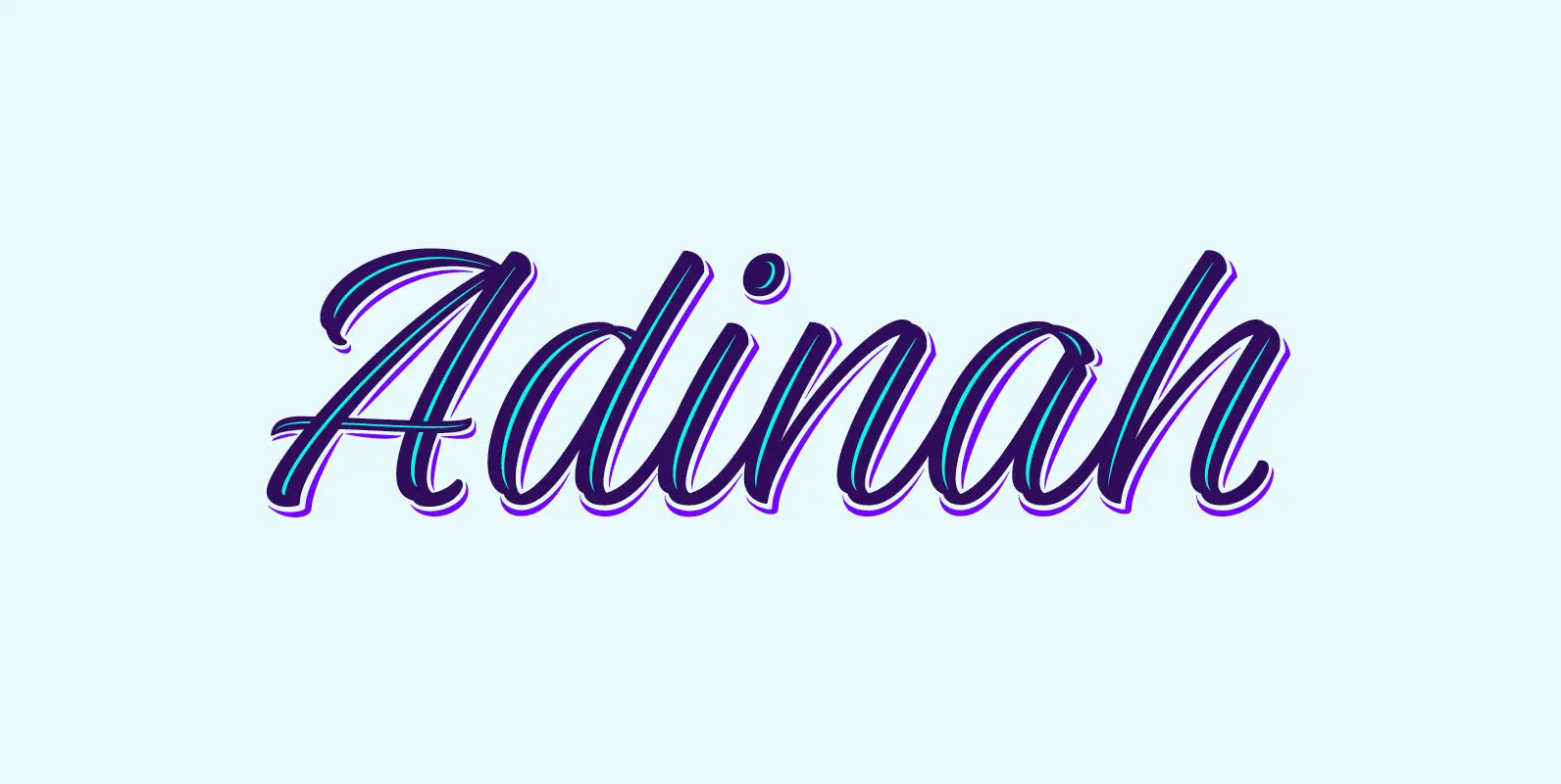
Adinah Font
Adinah: A Lively Layered Brush Script At its core, Adinah is a lively brush script with a strong sense of rhythm. Adinah’s expressive letterforms are based on pointed brush calligraphy with a hint of sign painting. This Sign painting influence

Jackazz Font
Jackass is a four weight display design that plays with a randomization feature to offer a large range of layout solutions for each word. With added ligatures and a selection of number styles, this typeface is a funky solution that
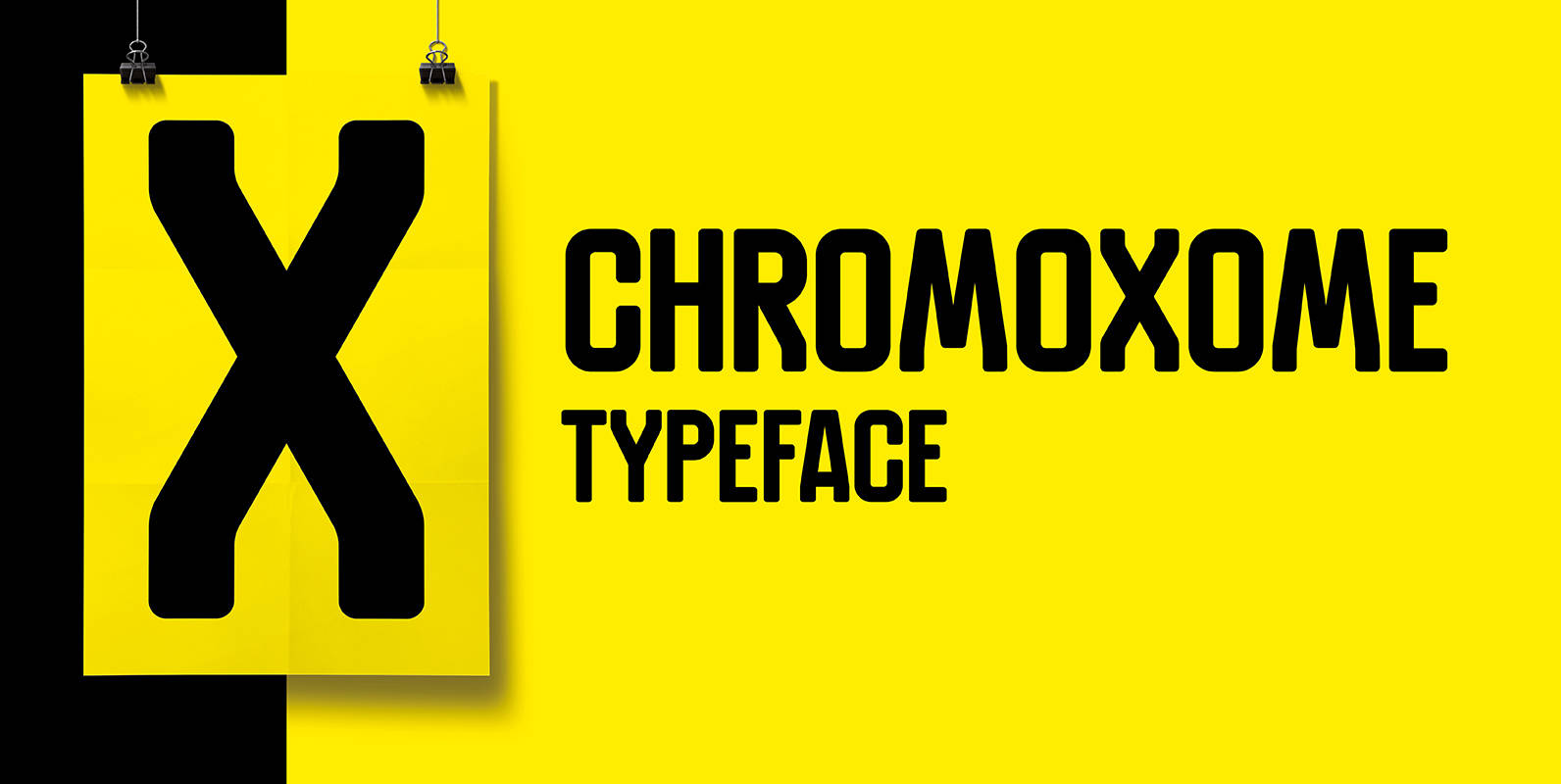
Chromoxome Font
Chromoxome is a modular techno, all caps typeface designed by thmbnl. graphic design. Chromoxome suits perfect for headings and/or logo designs and has an extensive character set (350+). Published by Thom NiessinkDownload Chromoxome