Tag: sophisticated
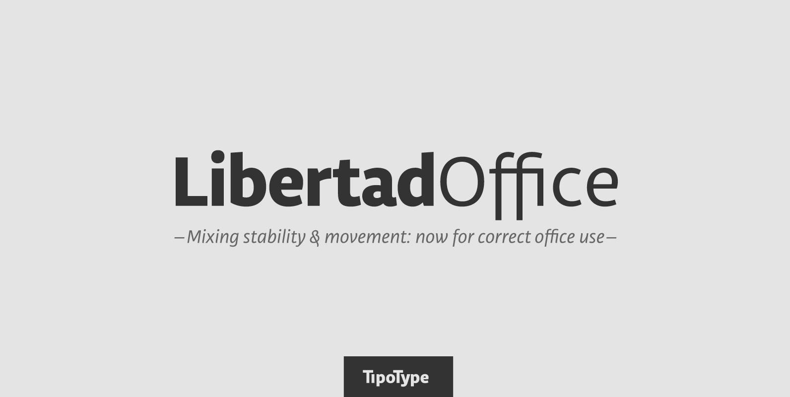
Libertad Office Font
Libertad is a sans-serif typeface that mixes humanist and grotesk models – It’s most interesting feature is the combination of balanced regulars with dynamic italics, which makes it a very versatile font for different uses. This special package is a
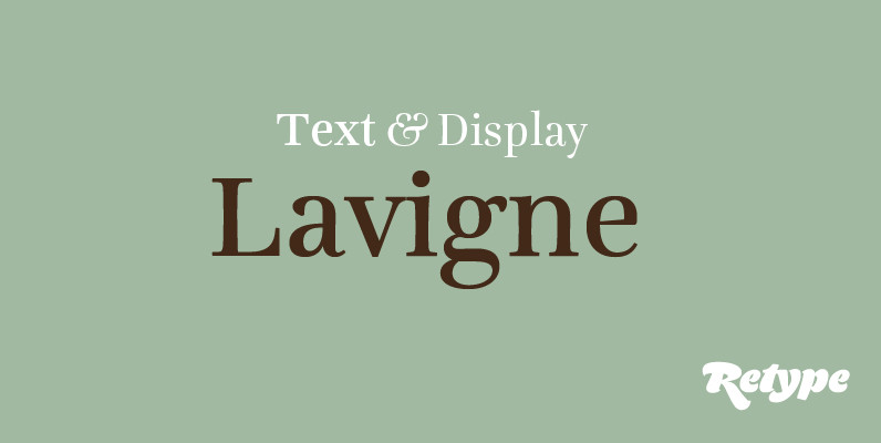
Lavigne Font
Lavigne is a type-family aimed at publications such as interior design and women magazines—anywhere a touch of distinction is to be desired. In the opinion of its designer, glossy magazines have been setting the same type families for years, with
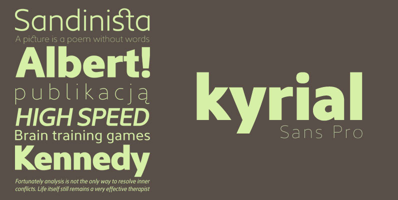
Kyrial Sans Pro Font
Designed in 2011 by Olivier Gourvat, this font family has generous proportions with a range of weights make it a versatile family for print and web design work. Kyrial Display Pro is also a pratical typographic choice to express strength,
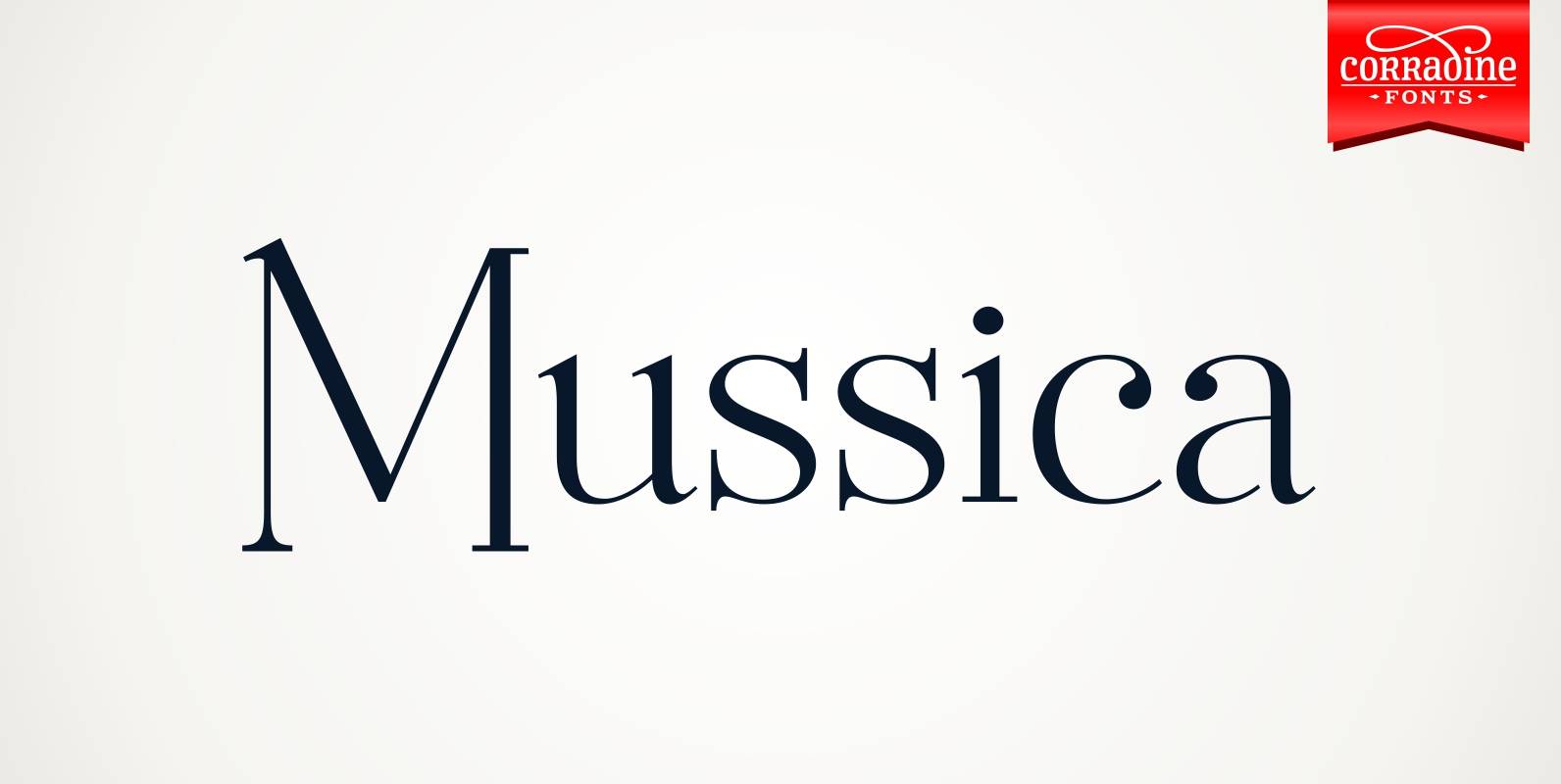
Mussica Font
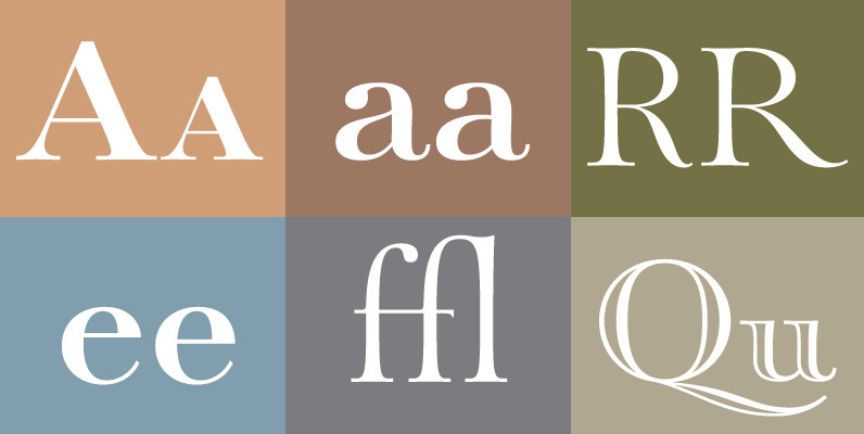
Mussica is an ornamental hybrid font derived mainly of transitional and Didone styles but including some script and uncial quirks too. Its proportions and measurements aren’t conventional giving a very special look. The family consists of two fonts which could
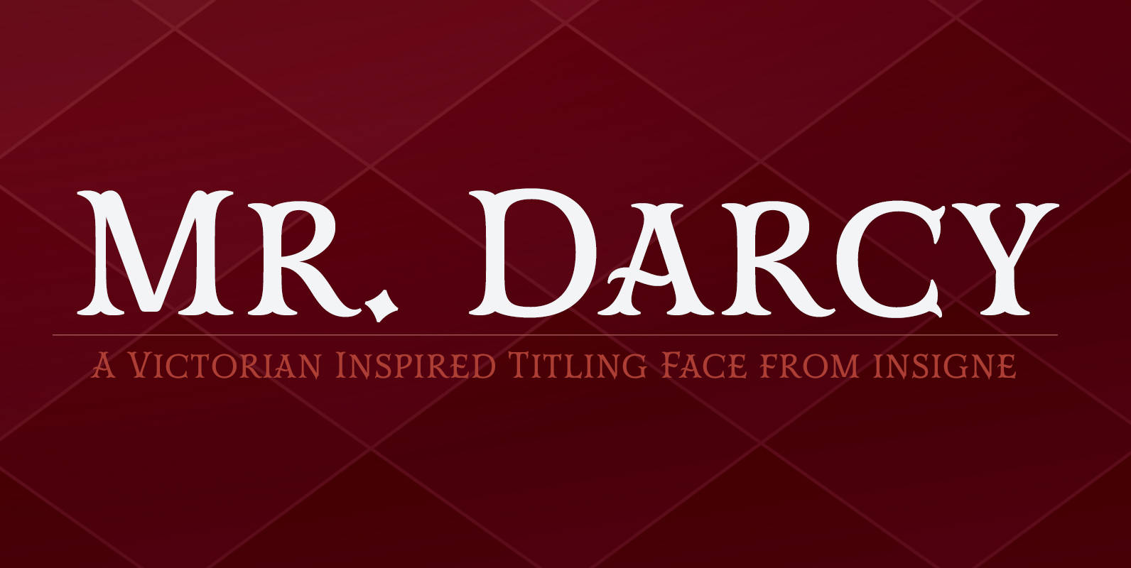
Mr Darcy Font
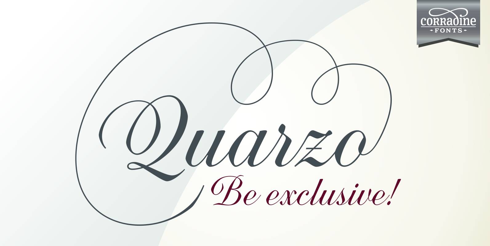
The elegant and very graceful Mr. Darcy is sufficiently compete with its additional characters–to be stated more precisely, over 136 defining alternates. These optional features are carefully displayed within the supplied brochure. The employ of the Mr. Darcy family moreover
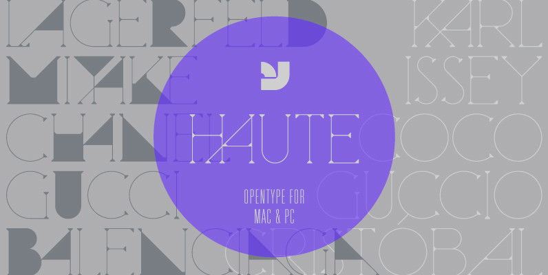
Haute Font
Haute is a finely crafted serif display typeface that blends the fashion world with a subtle Herb Lubalin touch. It includes alternate letterforms which creates a bold geometric rhythm within the typeface. Updated version now includes not only opentype, but
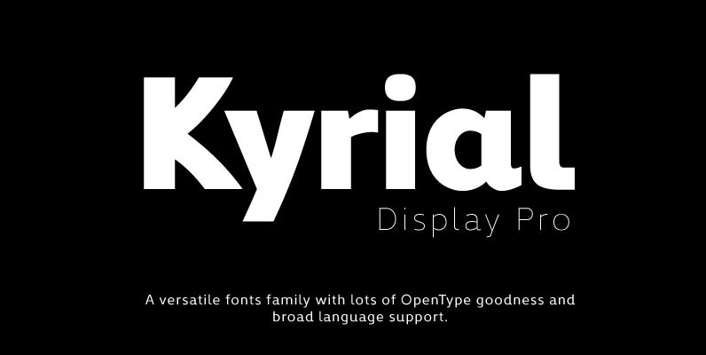
Kyrial Display Pro Font
Designed in 2011 by Olivier Gourvat, this font family has generous proportions with a range of weights make it a versatile family for print and web design work. Kyrial Display Pro is also a pratical typographic choice to express strength,

Creighton Pro Font
Designed by Steve Jackaman and Ashley Muir. It was our initial intention to develop a suitable lowercase for Les Usherwood’s ‘Elston’ typeface, based on a few characters from an old German typeface called Hermes Grotesque (Woellmer, Berlin). However, the new
