Tag: square

Quarca Font
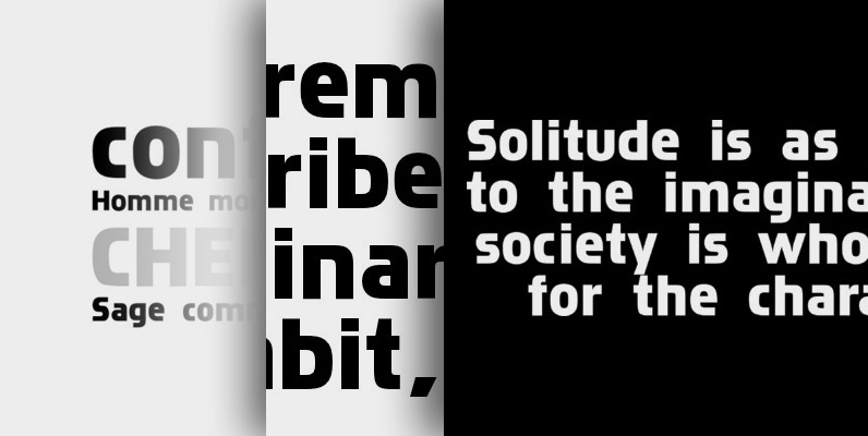
Quarca’s masculine power runs strong across the page with bold self-assurance and a raw energy that courses through its thick veins. Don’t think the continuous, smooth geometry of this semi-modular face is captively chained to the grid, though. Quarca has
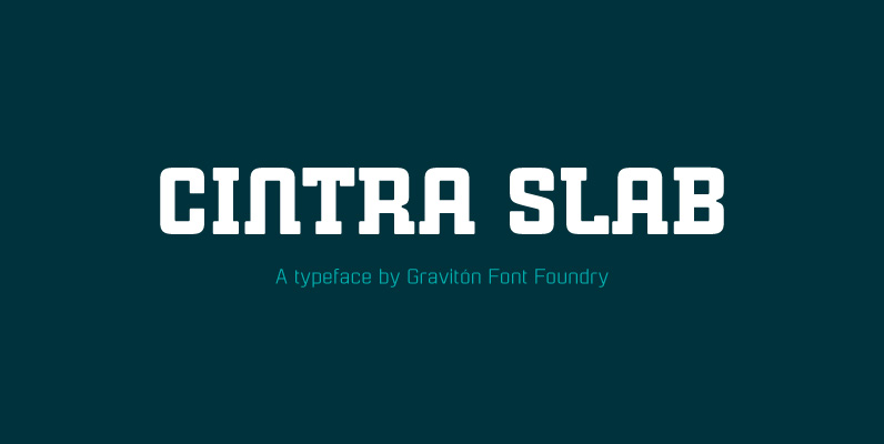
Cintra Slab Font
Cintra Slab font family has been designed for Graviton Font Foundry by Pablo Balcells in 2014. It is a slab serif, bold, geometric typeface with subtle rounded angles, which provides a soft, pleasent appearence. Cintra Slab consists of 4 styles.

Vivala Unicase Font
This square sans is suitable for a small line feed and the spaces between characters are wide enough to be readable even in small sizes. The WebFont numerals are slightly narrow. Published by Johannes HoffmannDownload Vivala Unicase
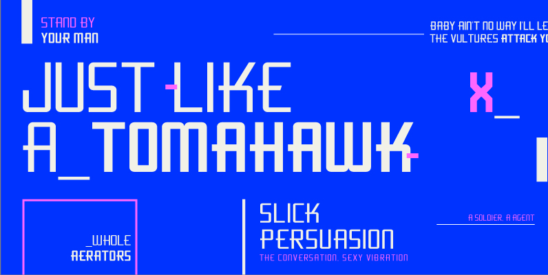
Flywheel Condensed Font
Although Flywheel™ was designed in the early 90s, its design was popular in the 80s and remains popular today as an iconic look for futuristic themes: books, movies, arcade games and packaging. The design is rigid, geometric, straightforward and yes,

Isbit Pro Font
Inspired by the shape of melting icecubes (“isbit” is the norwegian word for “ice cube”), this small superelliptical font family is perfect for logos and headlines. An alternate lowercase a and n is available as stylistic alternates – and a
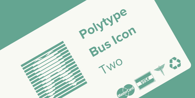
Polytype Business Icon Two Font
Designed by Karl Nayeri, Polytype Business Icon Two is a font released for the Prime Graphics Type Collection. Copyright Prime Graphics. Published by Prime GraphicsDownload Polytype Business Icon Two
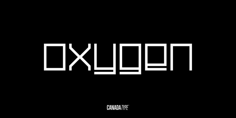
Oxygen Font
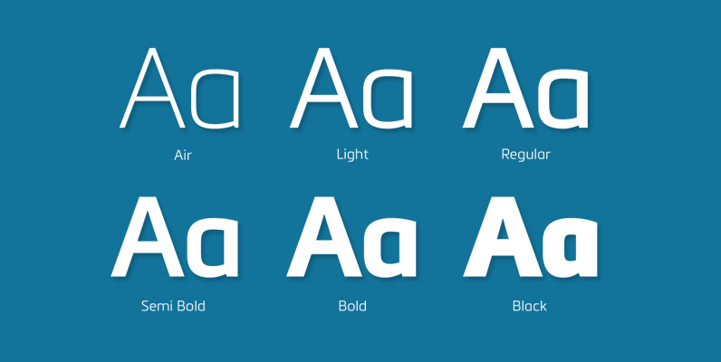
Oxygen is a square and strict grid-based unicase design that expresses the 21st century with an unmatched clinical precision and clarity. With three weights and italic counterparts, Oxygen covers geometric expression ranges from the thin and delicate artist to the
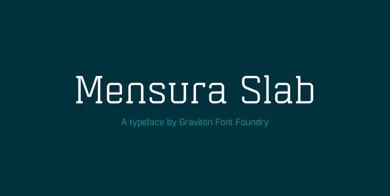
Mensura Slab Font
Mensura Slab font family has been designed for Graviton Font Foundry by Pablo Balcells in 2013. It is a modular, geometric typeface with subtle rounded angles that provides a soft, pleasant appearance. It has been conceived to be primarily a
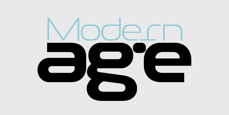
PF Baseline Pro Font
An ultra modern typeface which combined with the proper text font can revive any dull-looking document. The wide simple forms combined with the selective application of a few distinct characteristics has resulted a stylish typeface which shines in the top
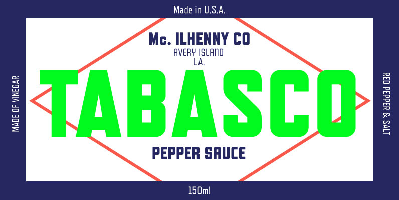
Refrigerator Deluxe Font
Refrigerator Deluxe (2008) was inspired by generic block-style lettering typical of the mid-20th century. It follows the typical American model that can be seen in old lettering manuals, although I designed it purely from memory. I originally released it in

