Tag: squarish
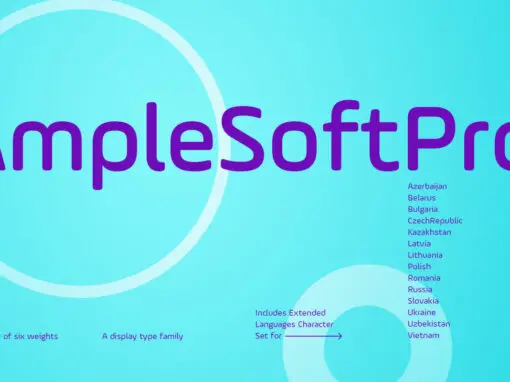
AmpleSoftPro Font
AmpleSoft Pro is an extended version of AmpleSoft type family. AmpleSoft Pro Includes Extended Languages Character Set for the following: Azerbaijan, Belarus, Bulgaria, Czech Republic, Kazakhstan, Latvia, Lithuania, Polish, Romania, Russia, Slovakia, Ukraine, Uzbekistan, Vietnam. AmpleSoft Pro is a display
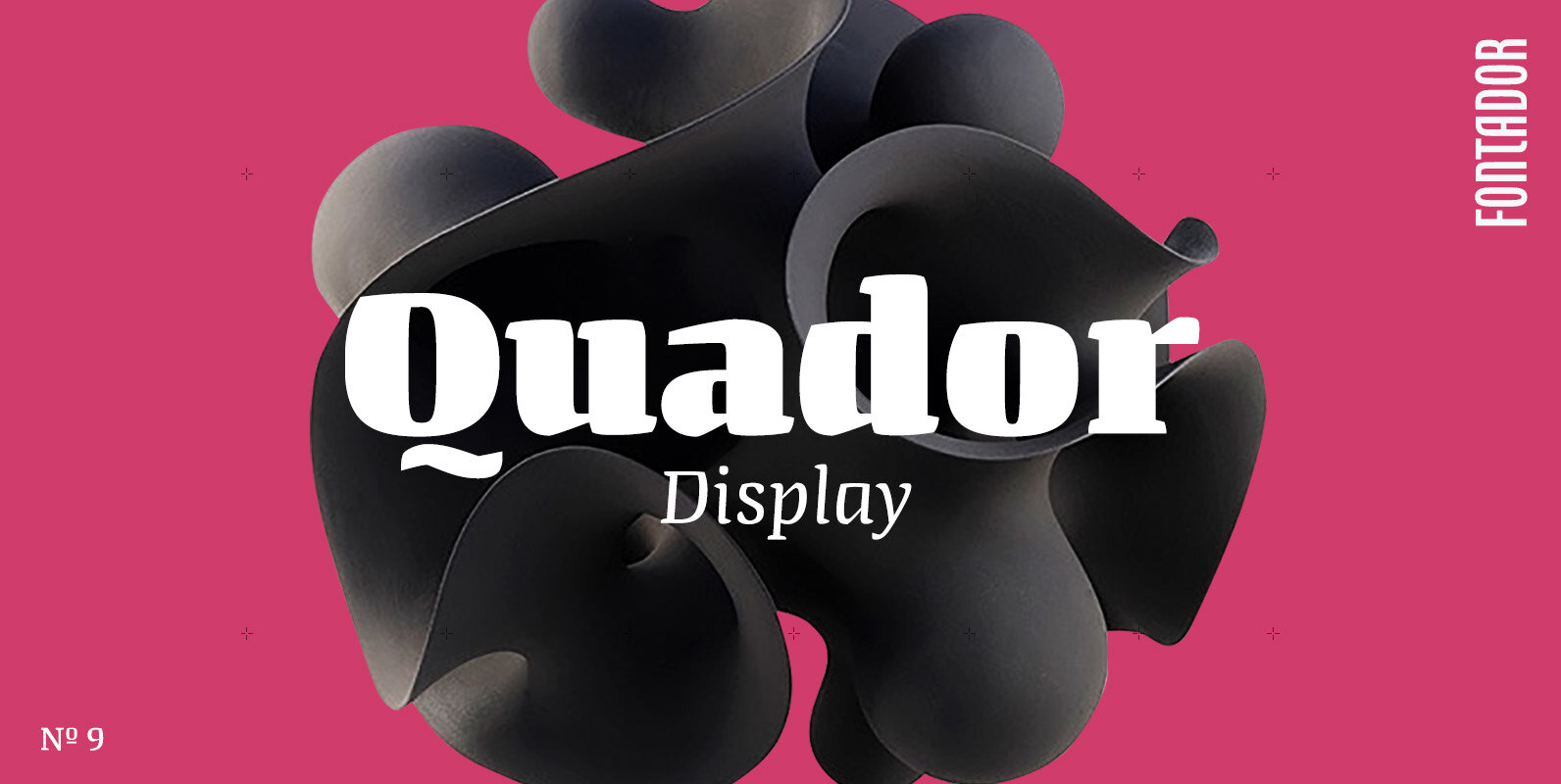
Quador Display Font
Quador Display is a serif, especially designed for contemporary typography on print and screen. The superellipse-based forms and high x-height allow large and open letterforms, perfectly adapted to the pixel grid on screen. The font contains 6 weights from light
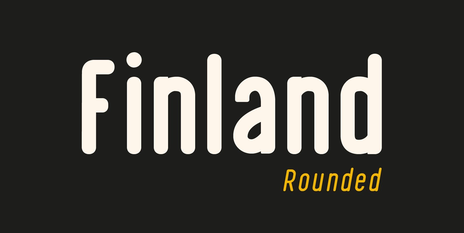
Finland Rounded Font
Finland Rounded Font Family has been crafted from scratch with a structural logic of its own: a fusion of pure geometry and optical balance. Finland Rounded font family comes with 6 Styles, Regular, Italic, Thin, Thin Italic, Bold, Bold Italic.
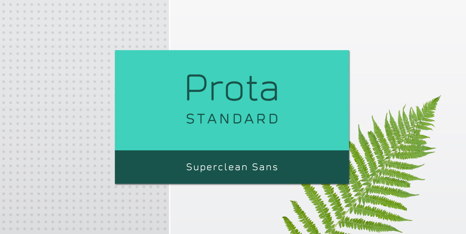
Prota Standard Font
Prota Standard is a new super-clean sans serif font. Using it, you will instantly bring ultramodern and noble-tech look to your artwork (the one like Apple and Tesla have). Do you need a font which will present your business as
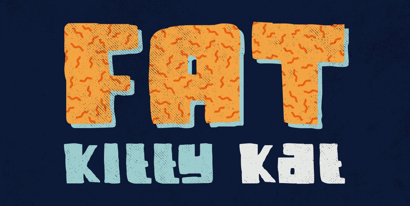
Fat Kitty Kat Font
Fat Kitty Kat is a hand made, rather bouncy and happy font. It was thought up, drawn and vectorised during an unusually long rainy period in a small Porto hotel room. Kitty Kat’s glyphs are rather rough, but legible and
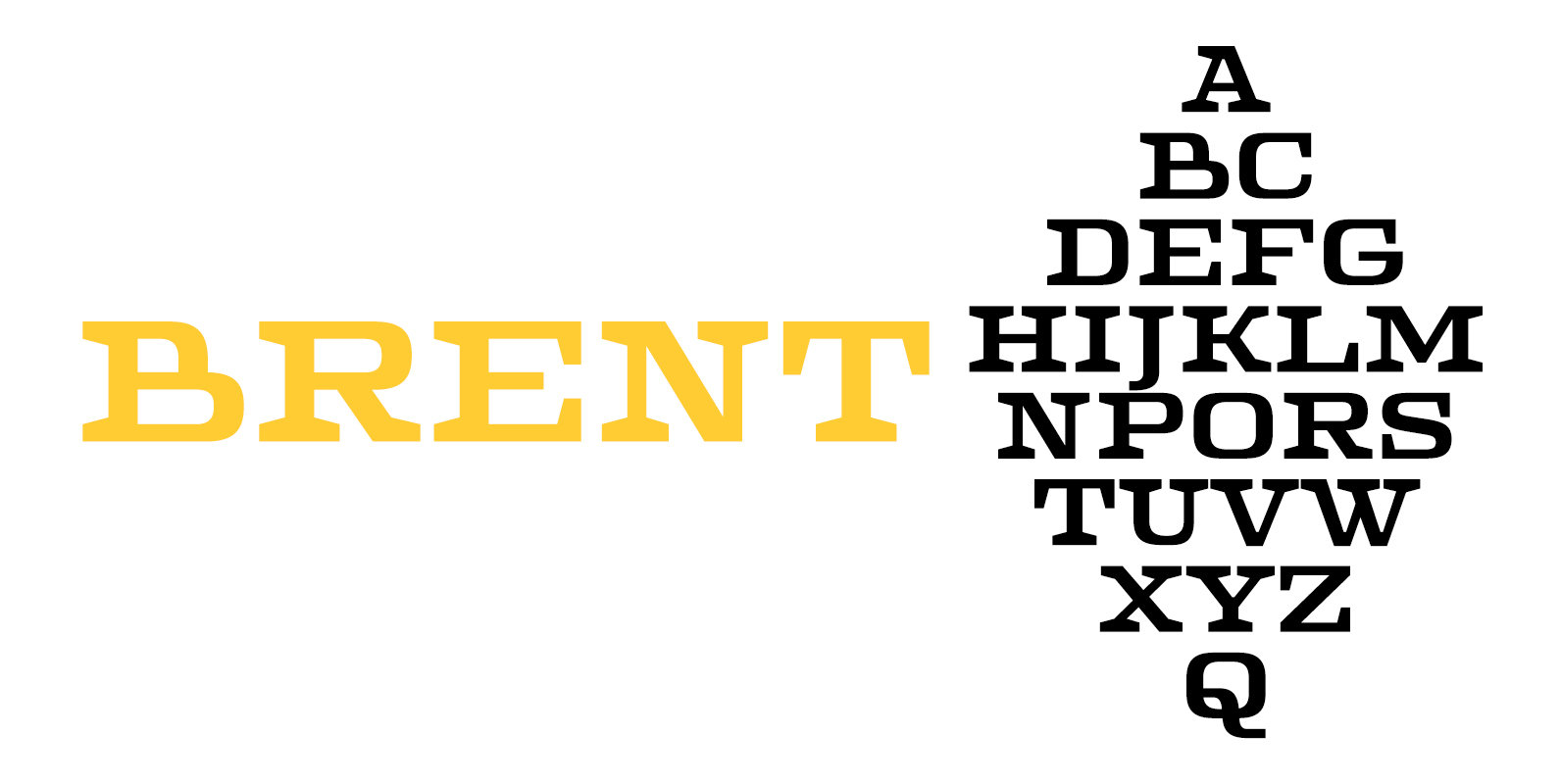
Brent 4F Font
Brent 4F is a serif font design published by Sergiy Tkachenko Published by Sergiy TkachenkoDownload Brent 4F
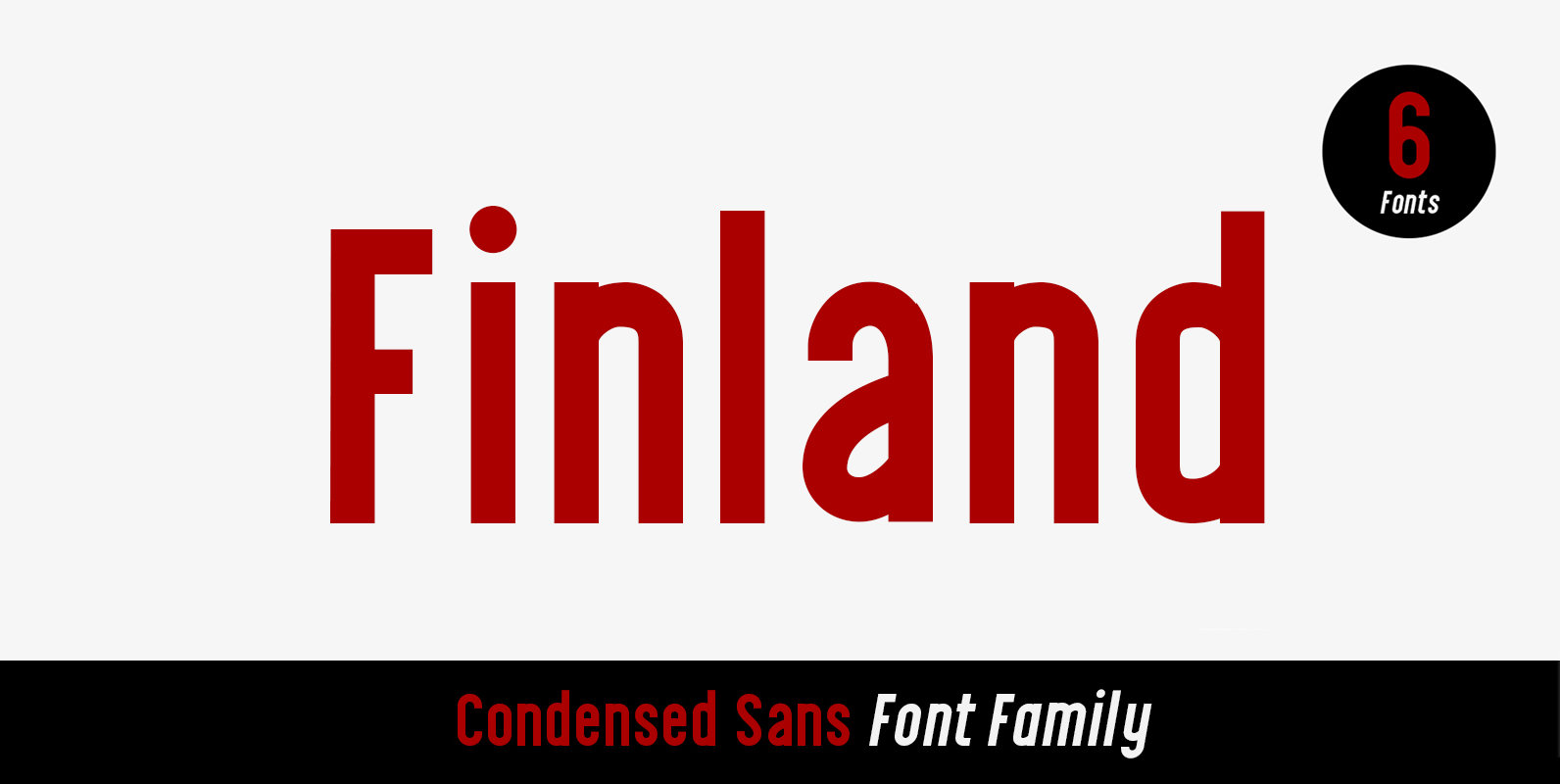
Finland Font
Finland was inspired by European type specimen books, especially Finland type standard. Delivering some glorious vibes of the solid values from the pioneers and keeping one eye on todays demands and technology, Finland is made for high professional use. Finland
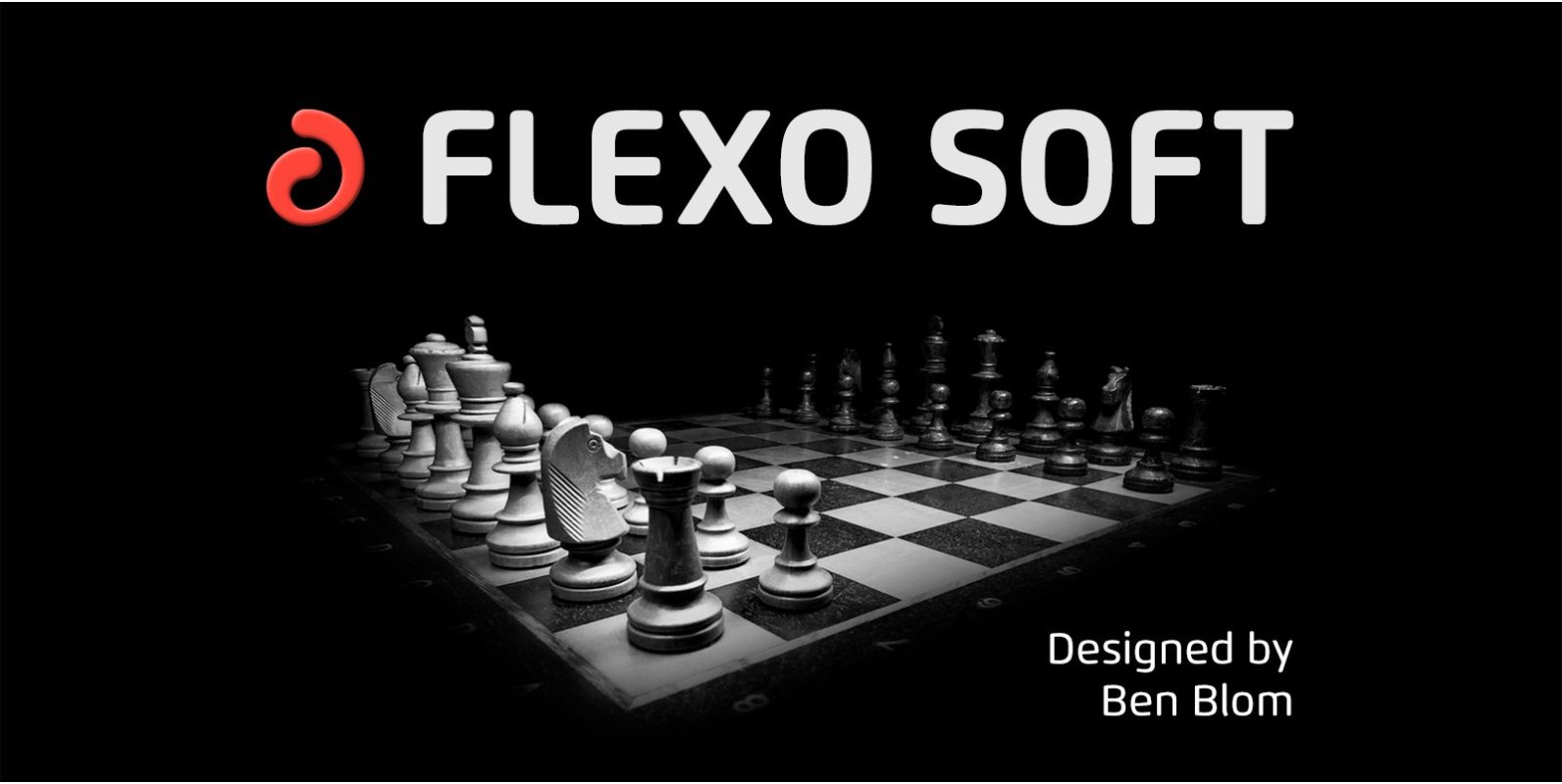
Flexo Soft Font
Flexo Soft is the soft companion of Flexo. In Flexo Soft, the sharp edges of Flexo’s characters have been tempered by a moderate rounding—creating a softer and friendlier typeface. Flexo Soft has a squarish design, making it stand out in
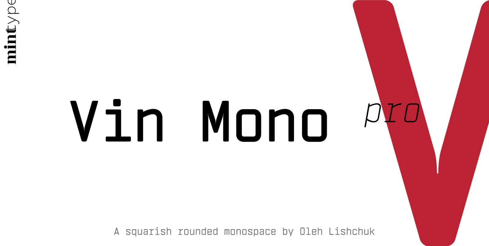
Vin Mono Pro Font
Vin (translated from Ukrainian as “he”) is a superfamily consisting of three distinctly masculine typefaces with pronounced vertical stems and rounded corners. All three typefaces feature very large x-height for even more expression and assertiveness. Vin Mono Pro is a
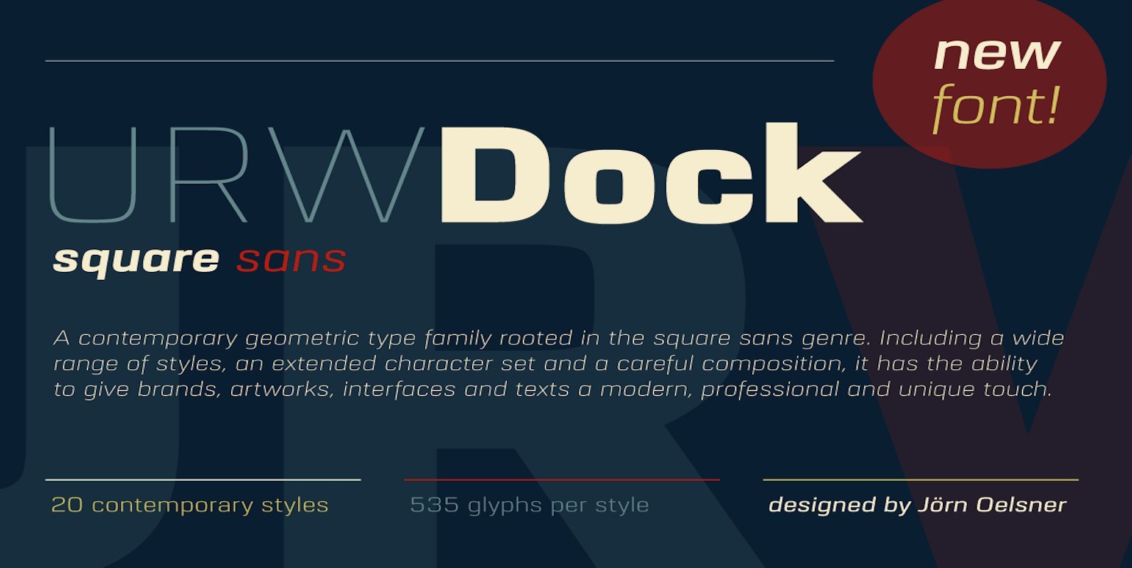
URW Dock Font
URW Dock is a contemporary geometric type family rooted in the square sans genre. Inspired by the square sans typefaces of the 60s, it is a reinterpretation and enhancement particularly designed for today’s requirements of a multipurpose font: to work
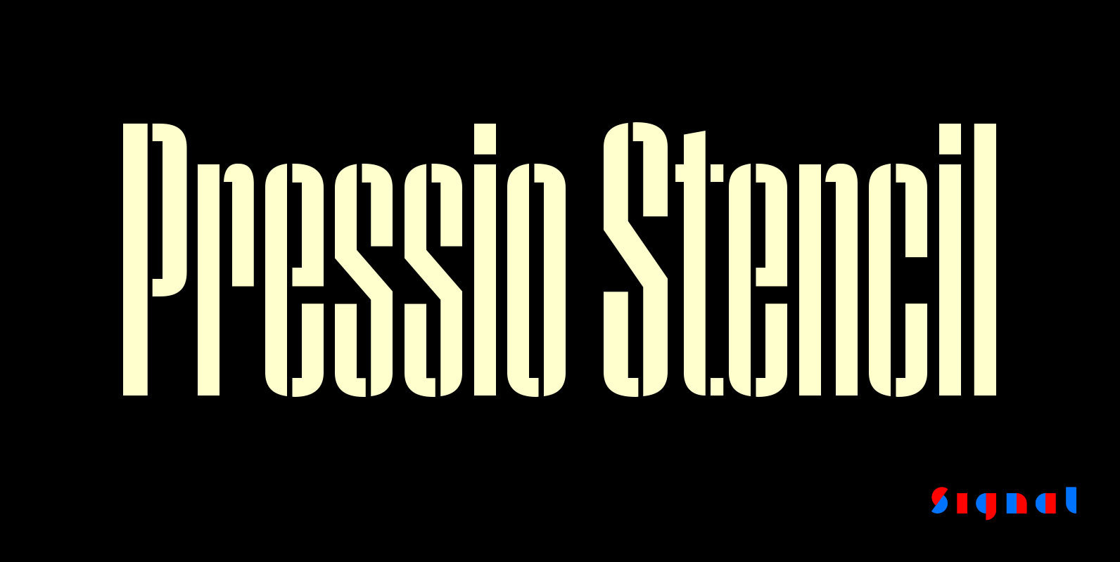
Pressio Stencil Font
Pressio Stencil brings Pressio's square counters and super elliptical curves to the stencil genre. The result is Mid-century Modern with a touch of packing crate. With four widths and five weights, it's far more versatile than most stencil families. The
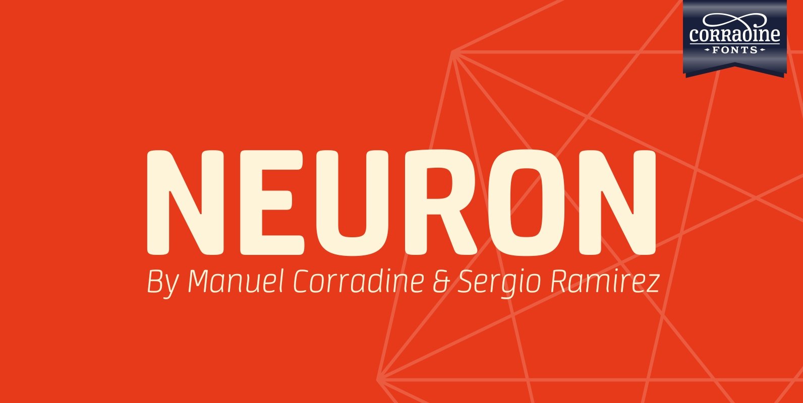
Neuron Font
Neuron puts a chemist’s twist on standard block-style print to create a fresher version of the elemental alphabet. Widely spaced letters and a slightly tall x-height have a clean effect for great readability. Squarish shapes are stylized to retain curved
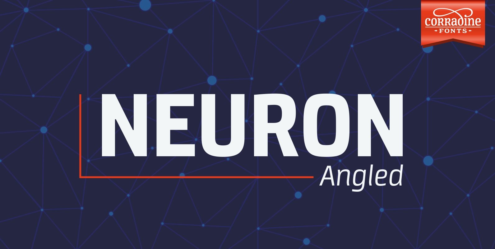
Neuron Angled Font
Neuron Angled is based in the idea of Neuron, the original font designed in 2012 by Corradine Fonts’ team, keeping from its predecessor the proportions and slight narrowness. In this version the rounded edges are replaced by sharp contours and
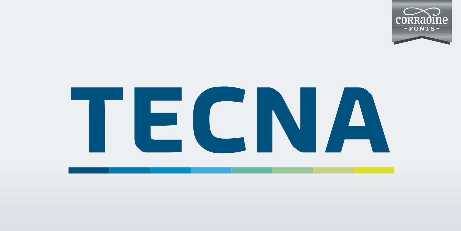
Tecna Font
Tecna is a modern sans typeface with straight cuts, rounded angles and curved thinnings at the endings that make the letter shapes fresher. The rounded characters are squarish giving to the layout a very structural appearance. Its wide proportions give
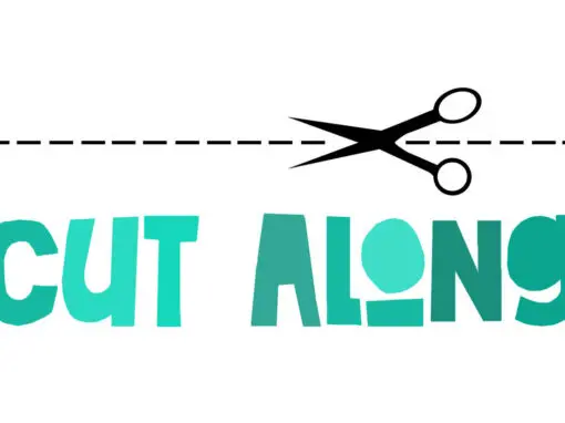
Cut Along Font
I made Cut Along by stealing some red cardboard from my kids (red, because they didn’t have any black…) and cutting out the glyphs one by one with a pair of scissors. I then pasted the shapes onto white paper,
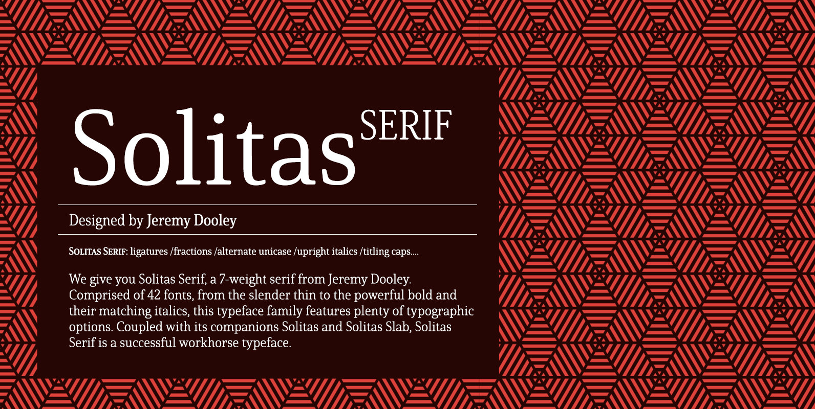
Solitas Serif Font
Say it softer with Solitas Serif. Perfect for the designer needing a serif without the stiffness, Solitas Serif will turn your reader’s eye with its slight serifs and rounded corners. This softer version of the curves found in Solitas and
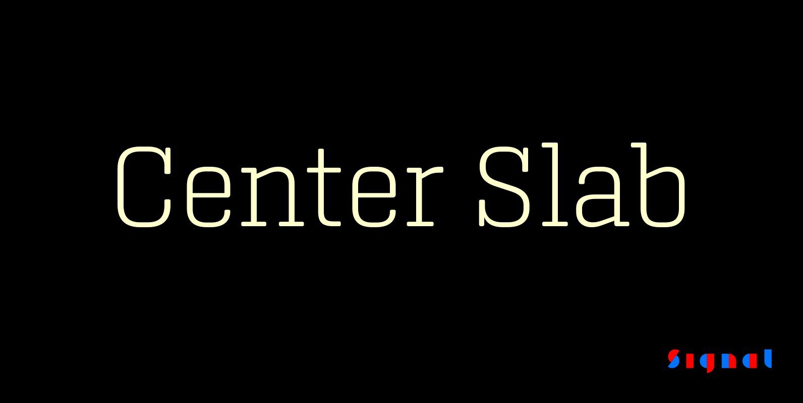
Center Slab Font
A funny thing happened when we added serifs to our best-selling Center family: its look went from digital to analog. Maybe it’s because slab serifs have their roots in 19th Century ‘Egyptians,’ or because monoline serif faces inevitably suggest typewriters.