Tag: strong
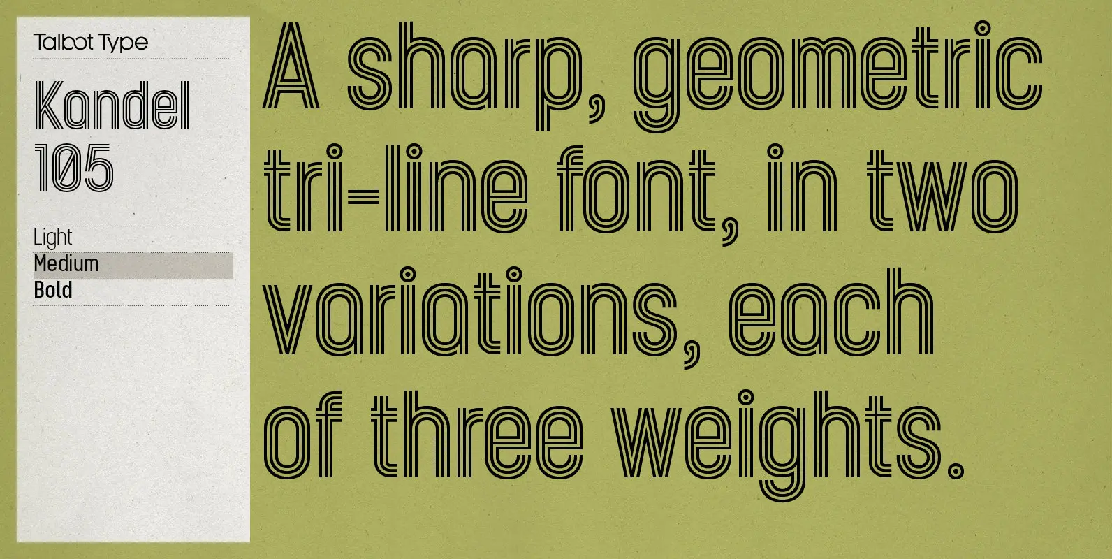
Kandel 105 Font
Kandel 105 is a geometric, tri-line, display and headline font available in a family of three weights. Its bold, graphic styling gives it great stand-out qualities and a highly individual look. It’s particularly well suited to bringing energy to designs,
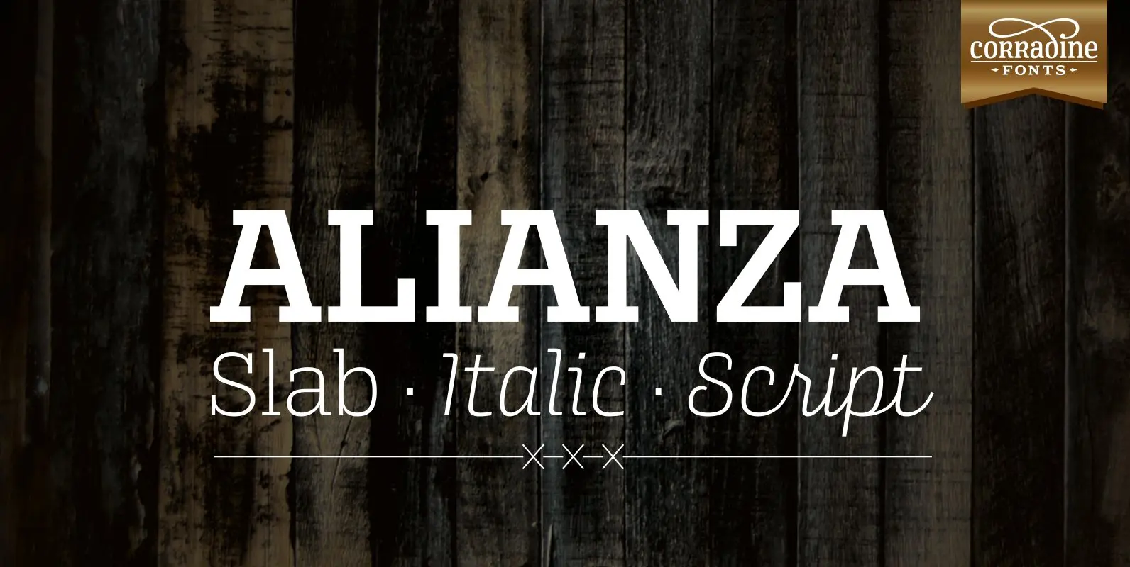
Alianza Font
This is a complex typographic system which includes three different but complementary styles so far: Slab, italic and script, with nine weights each one; plus three sets of ornamental fonts: labels, negative labels and ornaments. The soul of the family
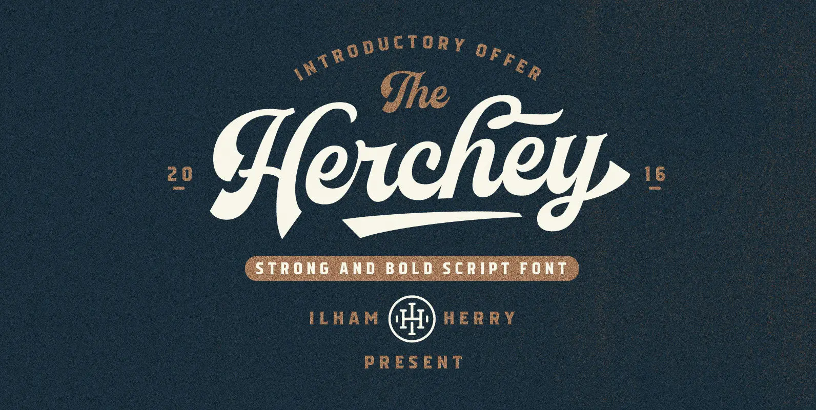
Herchey Font
Herchey is a high quality script font that contains swashes inspired by baseball team logos. Herchey conatins OpenType features such as Stylistic Alternates, Swashes, Ligatures, Stylistic set, Terminal Form and Ornaments. Published by IlhamherryDownload Herchey
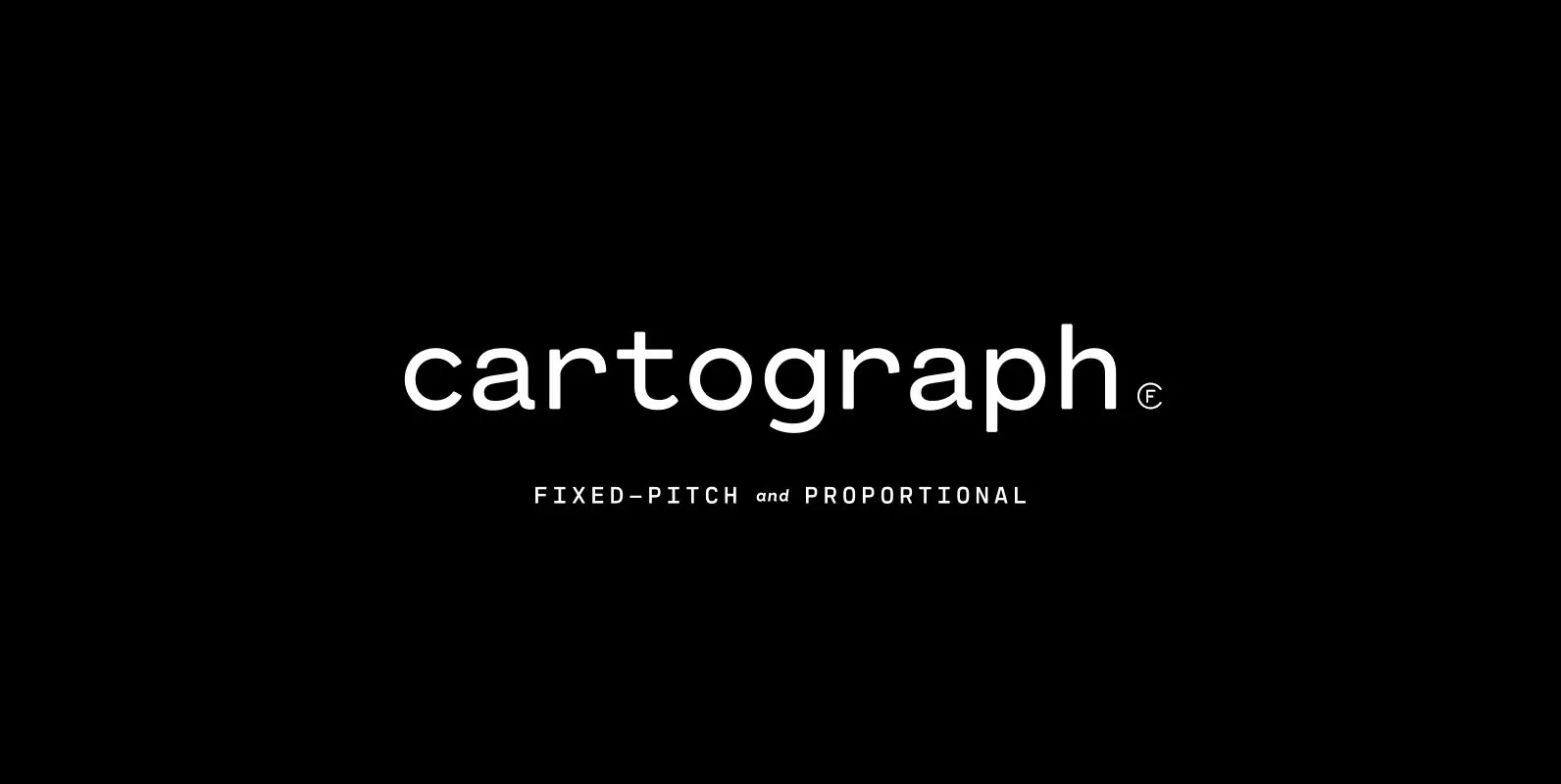
Cartograph CF Font
A monospaced typeface with character and warmth, Cartograph© CF is a handsome font family featuring a lush, cursive italic, code-friendly ligatures, and a proportional set accessible via OpenType. A tribute to the utilitarian beauty of terminals and typewriters, Cartograph excels
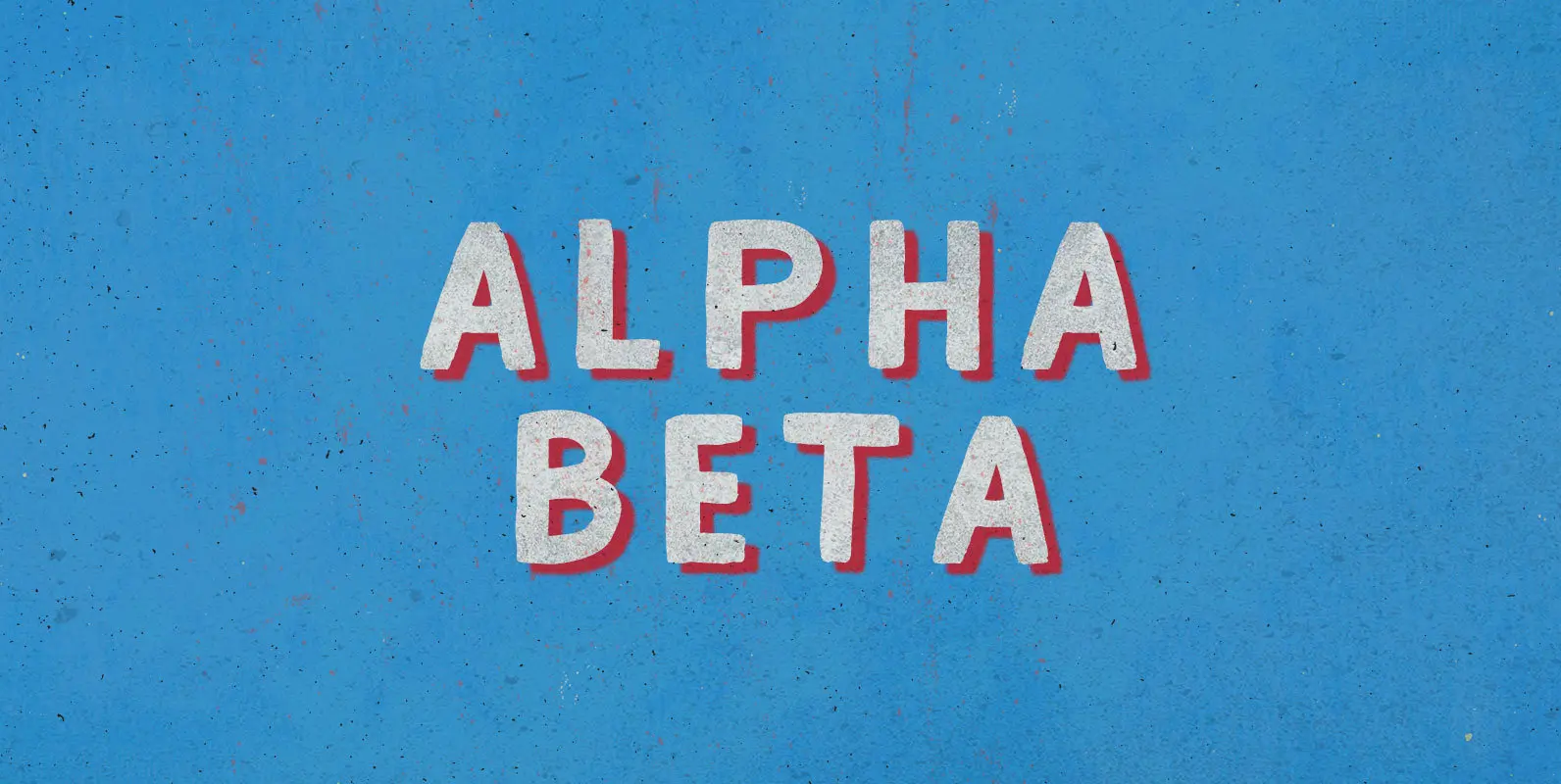
Alpha Beta Font
Steady in its place, ambitious in its outlook: Enter the journeyman of pack leaders. The Alpha Beta comes from behind to run ahead, before falling back; fighting and losing, fighting again, always to win. Published by BLKBKDownload Alpha Beta
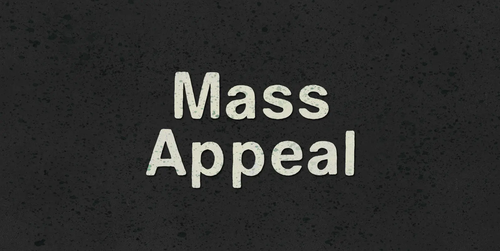
Mass Appeal Font
Down but standing tall under the weight of having it all. Above the clouds, or holding it down on the ground, the solution to and absolution of all problems with gravity: a pillar of planetary Mass Appeal. Published by BLKBKDownload

Humble Font
Humble is a Slab Serif typeface with two different weights and inline style. Heavy and sturdy structure makes Humble Regular assertive. Humble Hairline is gracious and subtle with thin body weight and potent serifs. Inline style creates nice depth on
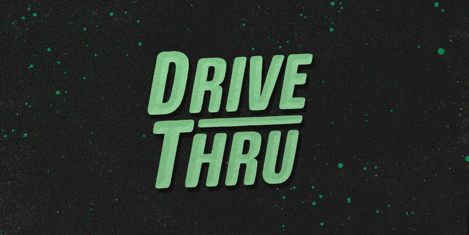
Drive Thru Font
Duncan loves the Drive Thru. He’d drive thru, and thru, and thru, whipping his insatiable appetite into a frenzy. But the glory days came to an end when cheeseburger grease slicked his steering wheel so smooth he couldn’t turn in
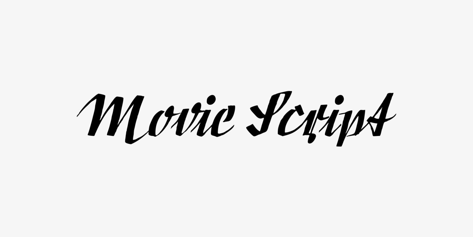
Movie Script Font
“Movie Script” is the script that was used in German movie-brochures. Those were small four page leaflets with a lot of sepia-colored pictures about the movie one was about to see. Today those things are collectors items. The script was
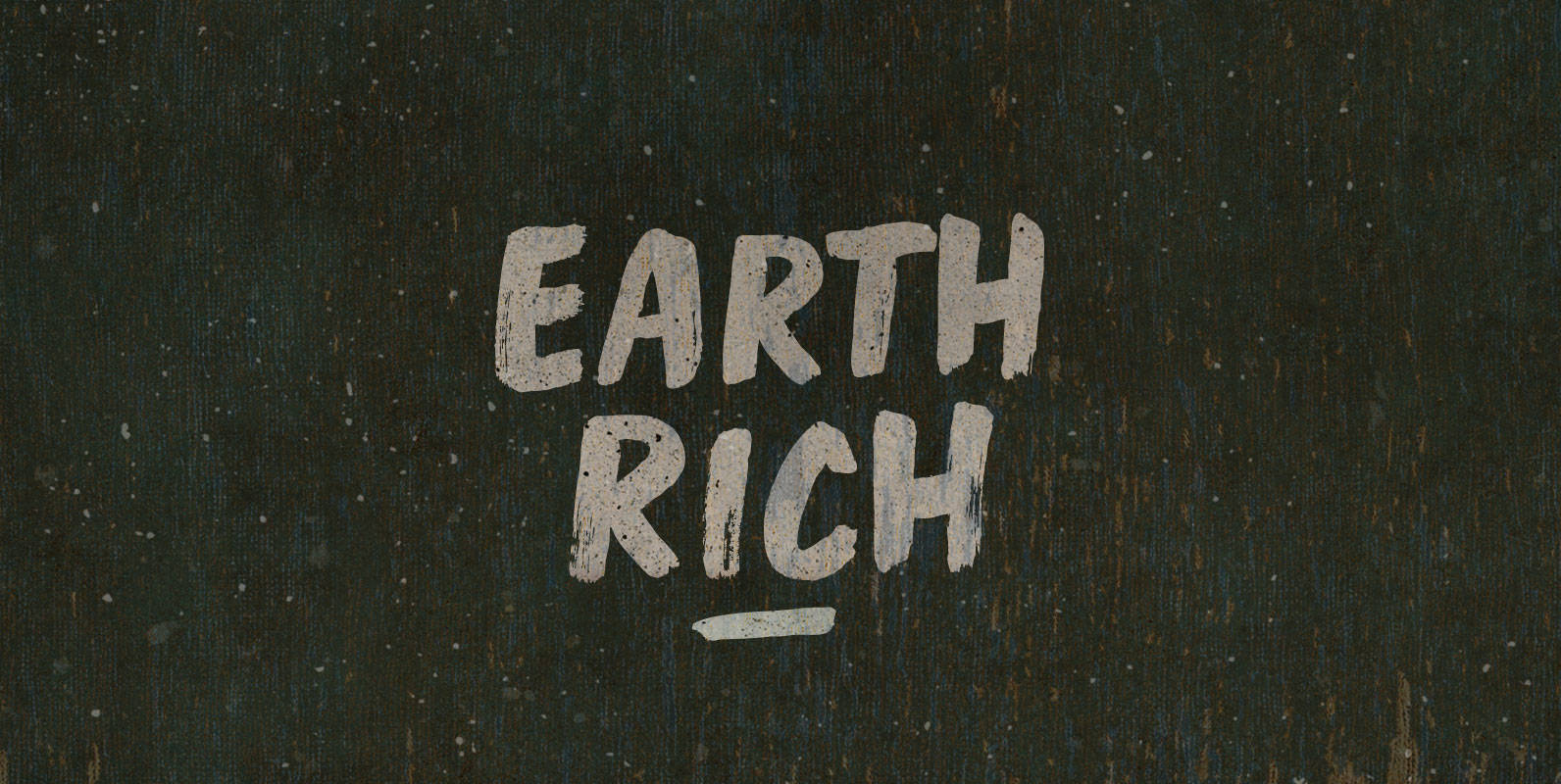
Earth Rich Font
Breathe air, drink water, spit fire, move your feet across an Earth Rich in elements. Open vistas, open dampers, open minds, but close the drapes. All in all it’s always something made when morsels aggregate. Published by BLKBKDownload Earth Rich
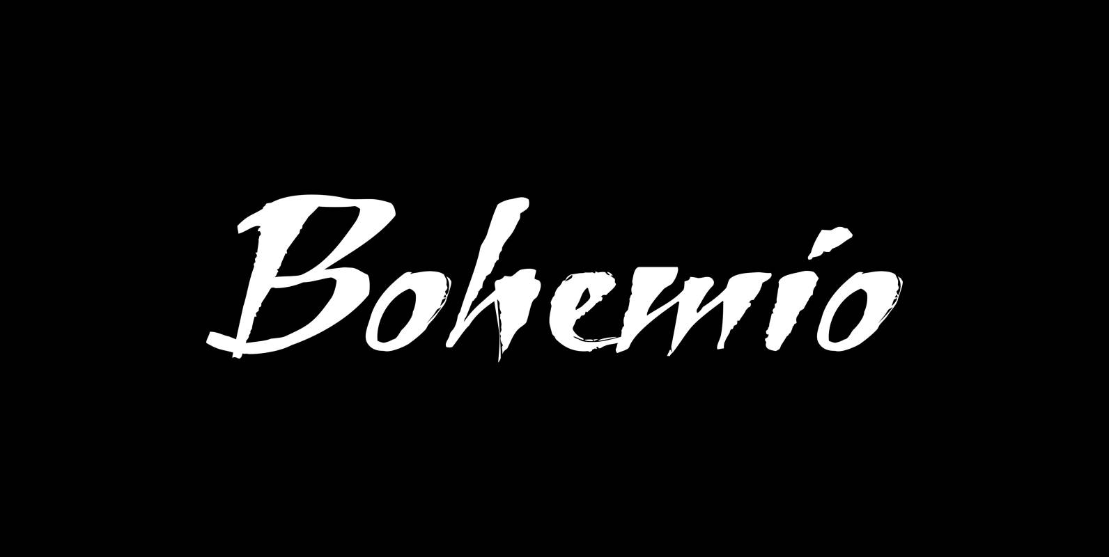
Bohemio Font
“Bohemio” is designed in memoriam of “Gunter Böhmer”, an artist that is famous for his many bookcovers of the 1950’s in Germany. The cover I took as an inspiration for this font is that of a book called “Stiller” (by
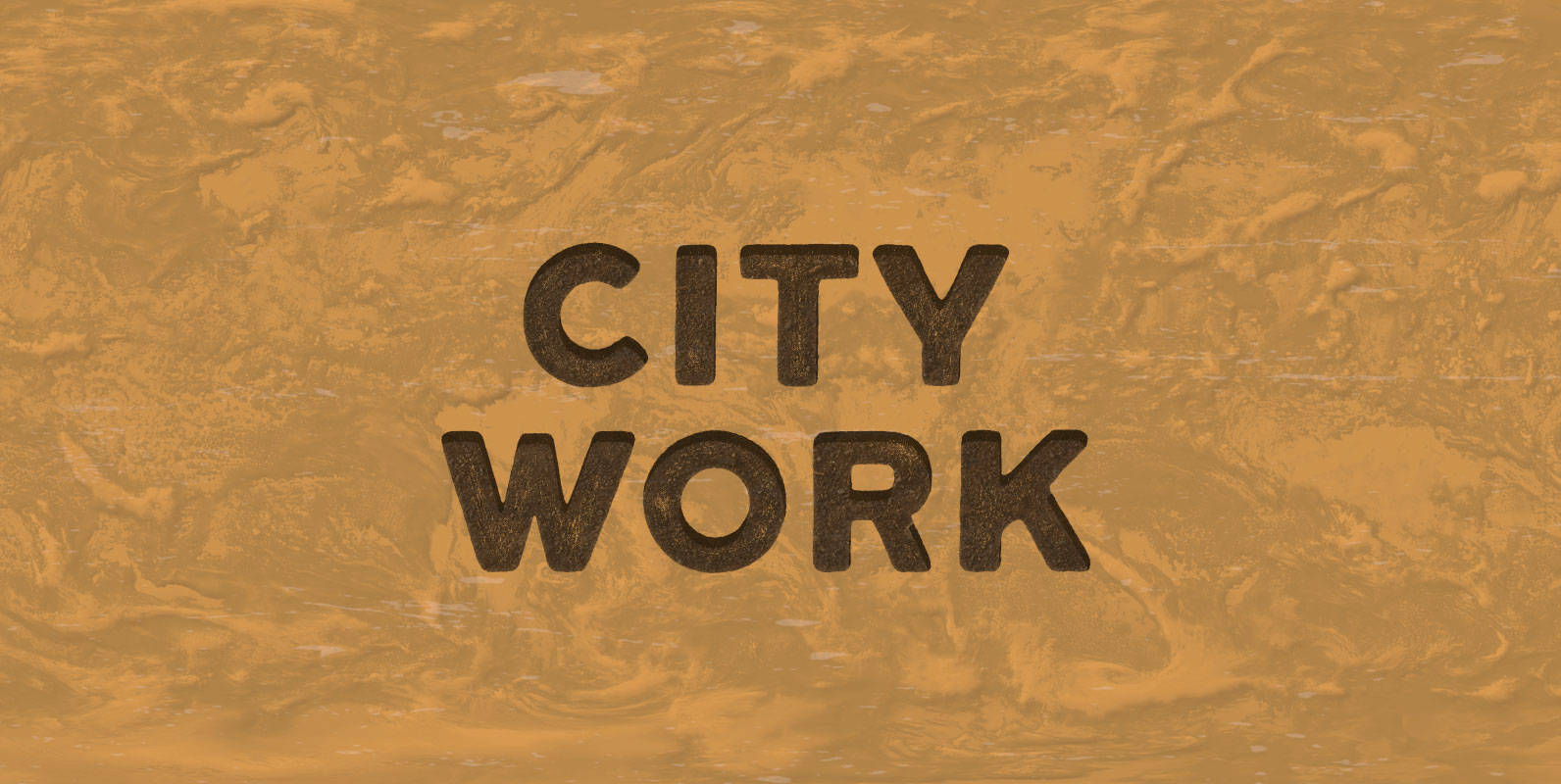
City Work Font
Jackhammers and backup beepers. An inharmonious din. A rumble and a clatter. Night shifts and traffic tie-ups. Garbage men, sewer workers, road crews, and cops. Civil servants in civic servitude. Work the city, make the City Work. Published by BLKBKDownload
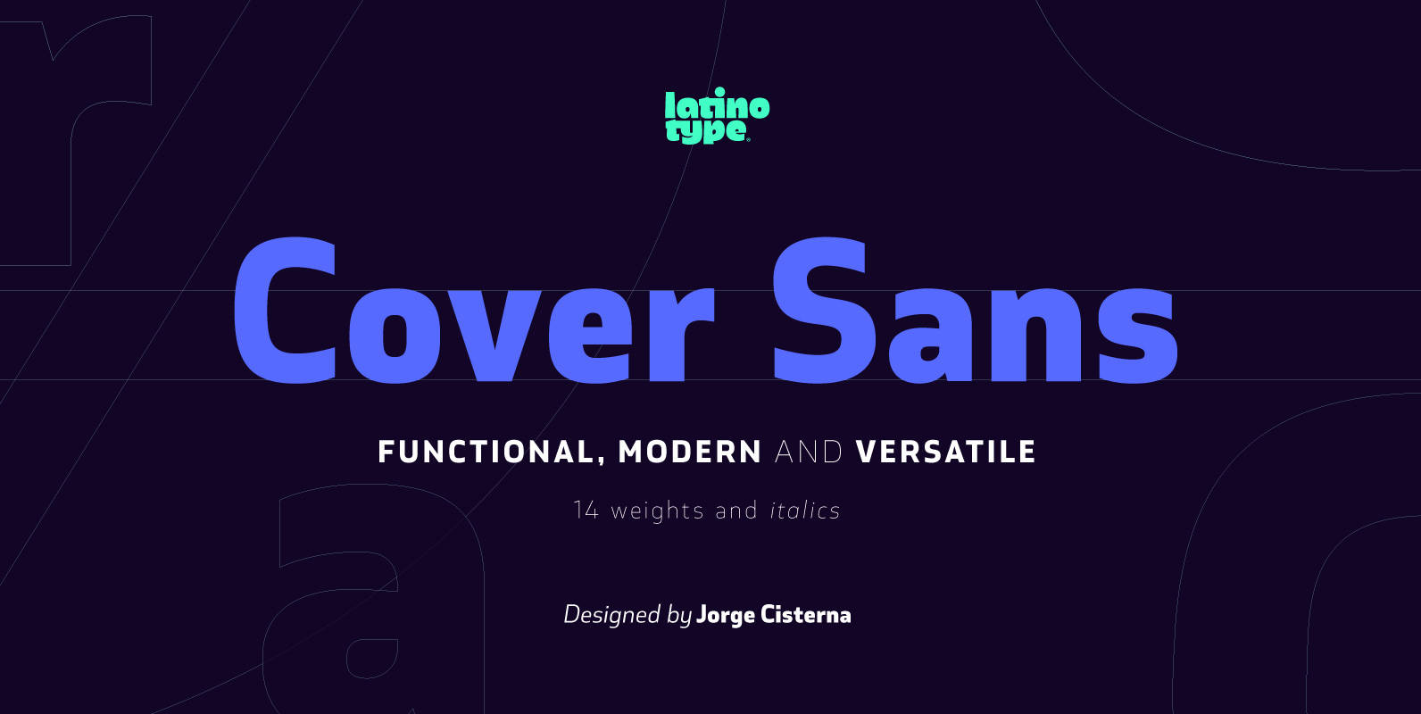
Cover Sans Font
Cover Sans is a humanist geometric typeface with an orthogonal structure, which provides stability when composing a text. Open shapes and low x-height give this font balance and make it an air-breathing typeface. Cover Sans is a stable and strong
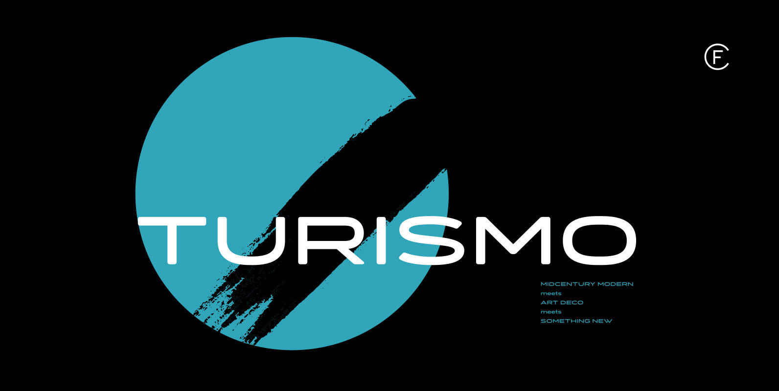
Turismo CF Font
Inspired by midcentury motorsports, technology, and business, Turismo CF is designed for stunning logotypes and gripping headlines. Taking cues from both the 1960s and 1920s, Turismo combines strong rectangular shapes with sloping, elongated curves. Includes seven weights, upper and lower
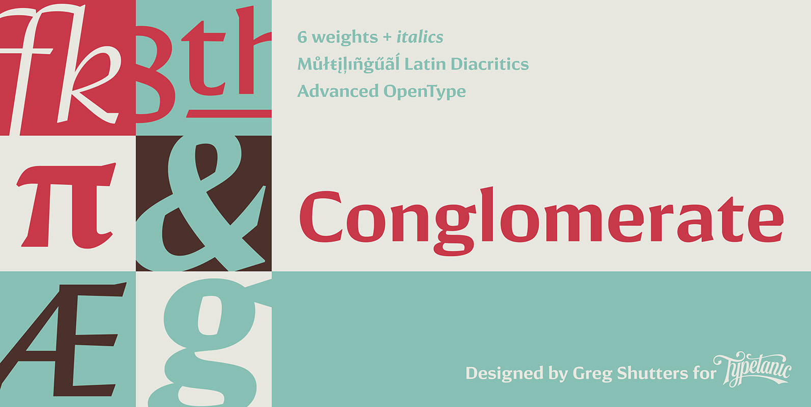
Conglomerate Font
Sans or serif? Square or rounded? Calligraphic or geometric? Conglomerate is both all and none of these things — a subtle yet unorthodox blend of typographic traits resulting in a clean, unique, and versatile font family with large, open counters
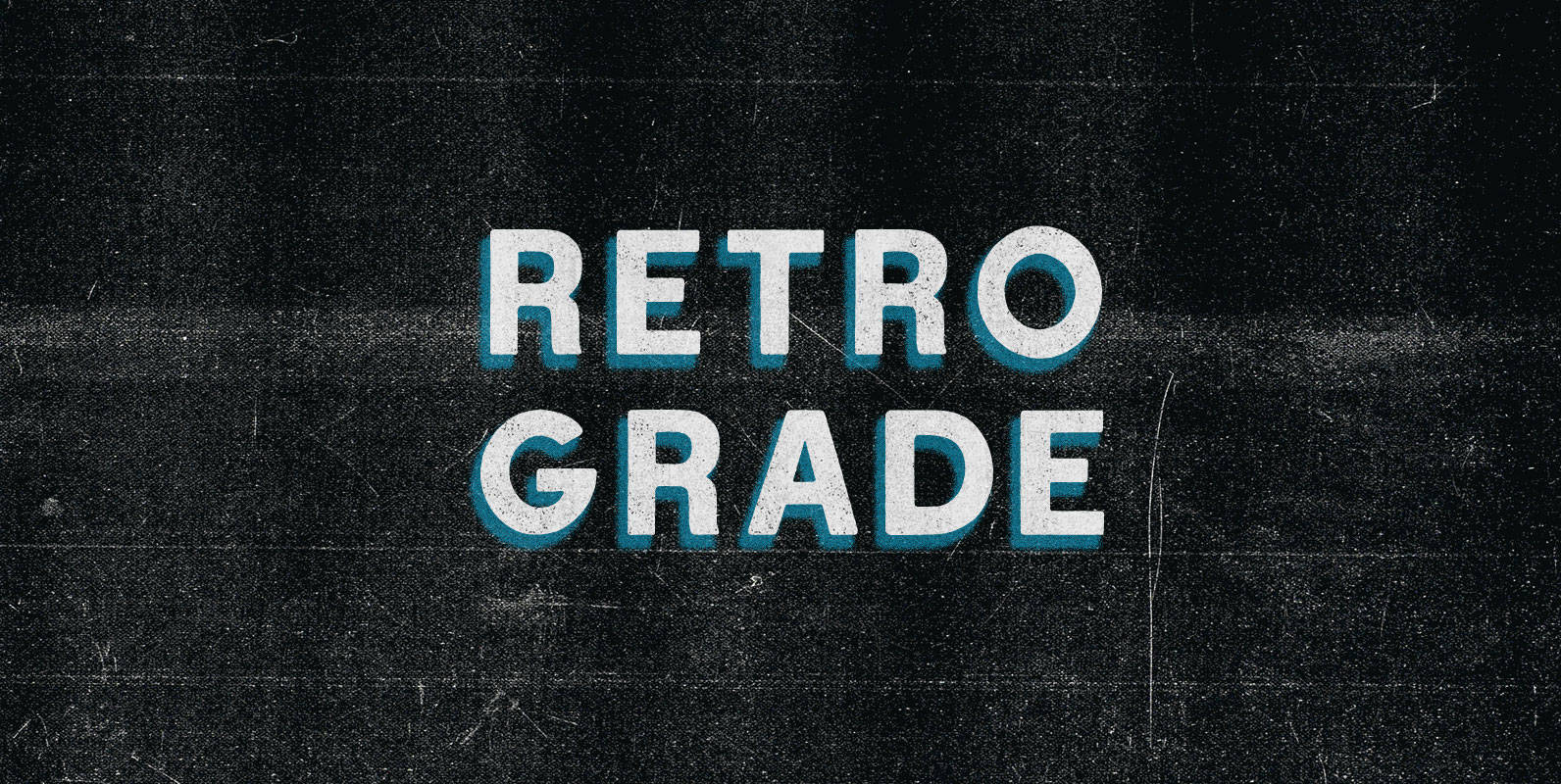
Retro Grade Font
I failed fourth grade until my teacher got sick of my ’80s TV references and knocked me all the way back to Retro Grade. I started down the corridor and my heart sank as I sauntered past the reality-artificiality barrier.
