Tag: strong
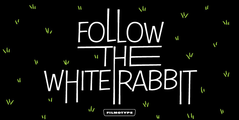
Filmotype Nemo Font
As one of earliest Free Style faces released in the early 1950s by Filmotype, Filmotype Nemo captures the more iconic playful type styles made popular in the early 1950s when a clear message needed to come across as fun to
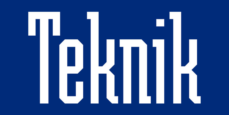
Teknik Font
Inspired by the powerful-looking geometric styles of the 1920’s Soviet constructivist movement, this strong, precise typeface is suitable for a wide variety of headline applications. Teknik is typographically categorized as an Egyptian style due to its slab serifs. Created by
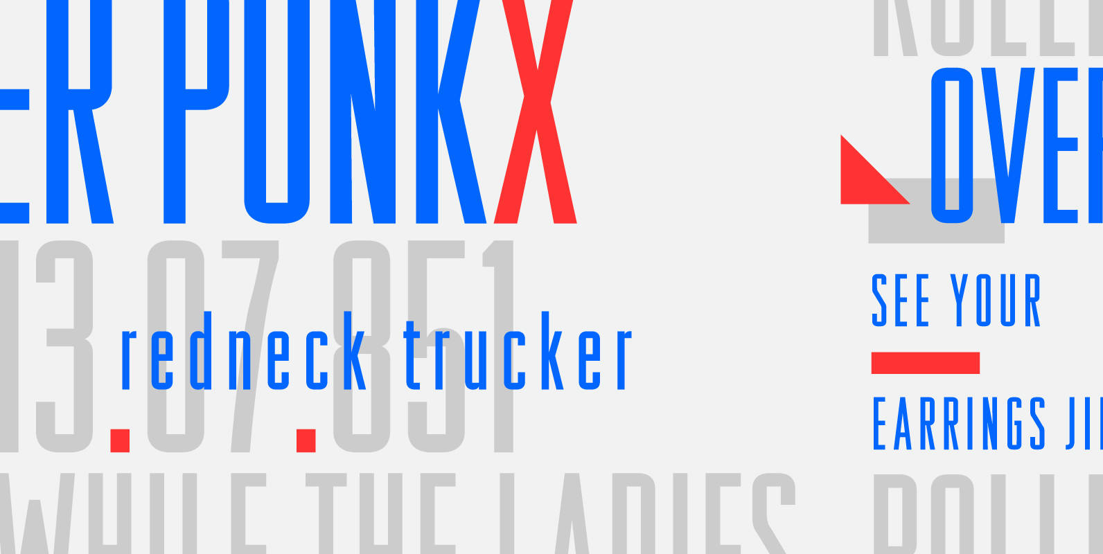
Raleigh Gothic Condensed Font
In 1932, the great American type designer, Morris Fuller Benton was busy directing the creative departments of ATF and designing type. Big on his plate during that period was the development of the Bank Gothic® family among other typefaces like
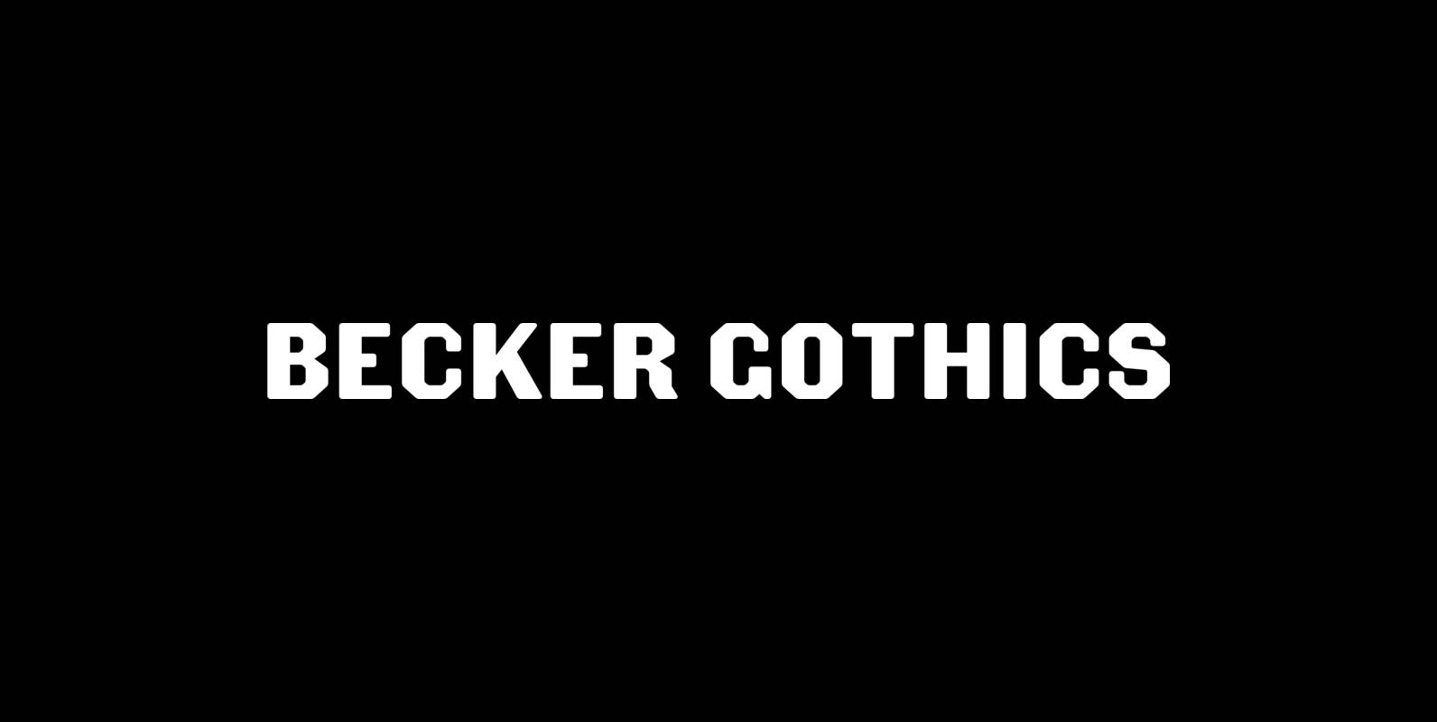
Becker Gothics Font
The Becker Gothics pay homage to the nineteenth century American lettering master George Becker. Designer James Puckett has given new life to the ingenious gothic alphabets found in Becker’s 1854 lettering manual Ornamental Penmanship. Use this quintet of typographic voices
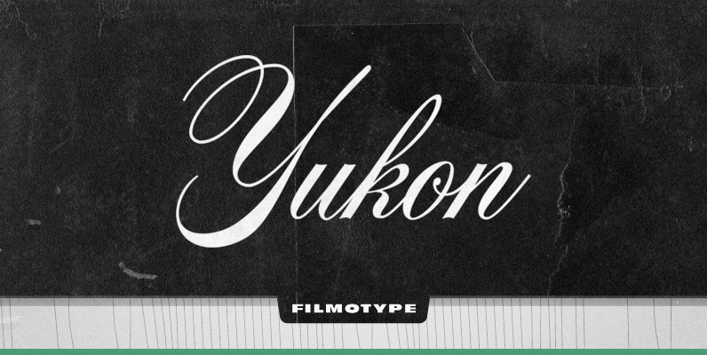
Filmotype Yukon Font
Filmotype Yukon is inspired by the classic Palmer style of penmanship made popular in the late 19th and early 20th centuries. Originally released in the late 1950s, Filmotype Yukon has been meticulously redrawn from the original font filmstrips and has
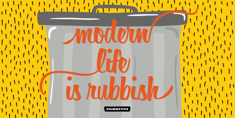
Filmotype Horizon Font
Filmotype Horizon was among the company’s earliest brush lettered casuals and was Introduced by Filmotype in the early-to-mid 1950s. This playful script was among Filmotype’s most popular brush script style typefaces.Filmotype Horizon was developed from the original font filmstrips and
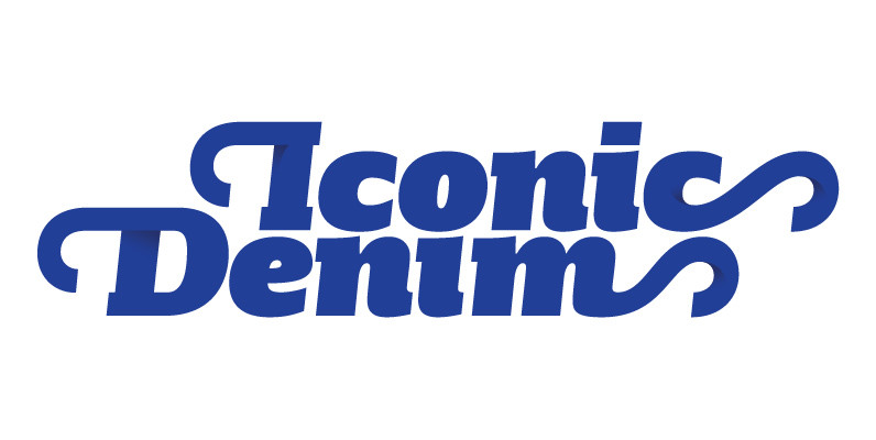
Girga Font
Triumphant, vigorous and strong. These were the keywords for the design of Girga, named after an Egyptian city in the Sohag Governorate. The power and strength of the Egyptian letterforms were balance with a few sans serif forms so the
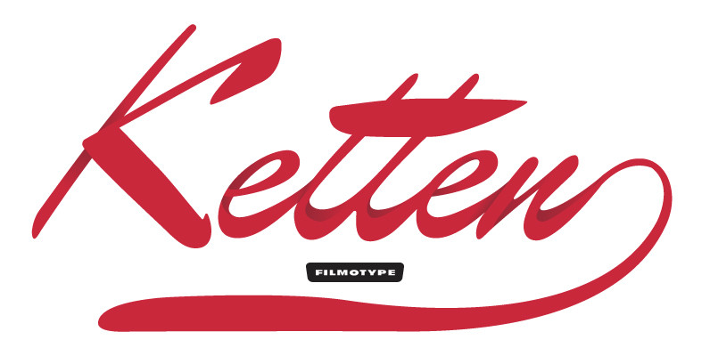
Filmotype Kitten Font
Filmotype Kitten followed in the footsteps of Filmotype Ledger as a high-style connecting script with strong contrasting thick and thin strokes to create an elegant hand-lettered look which found the height of its popularity in the mid-to-late 1950s. This style
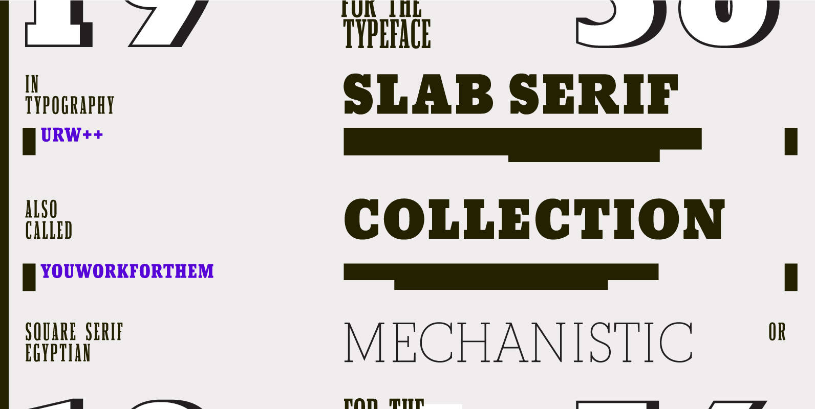
URW Slab Serif Collection Font
The URW++ Slab Serif Collection contains all of the muscle and masculinity of URW++’s finest Slabs, lined up in their boots and spurs, ready to take on all comers. These OpenType killers include various options like stylistic alternates, and make

Robotik Font
This slab serif Egyptian typeface follows the trend for simple, mechanically constructed typefaces and is an ideal choice for communicating a feeling of precision and strength. Robotik is equally effective when set with normal or wide letter and word spacing.

Cornelia Font
Cornelia, an ‘undesigned’ typeface. Made by Novo Typo. Designers from Amsterdam, The Netherlands. Published by Novo TypoDownload Cornelia
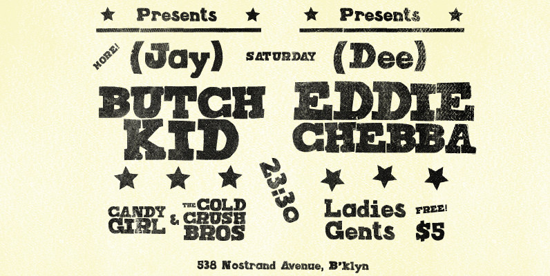
Joseph Font
Joseph is a brand new slab-serif face designed by TOMO. With a wood type look – letterpress print technic, this fatty come in handy when is time to design an informal —yet strong—looking communication piece. Ideal for promotion-matter. Published by
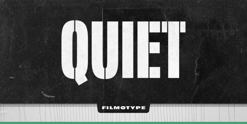
Filmotype Quiet Font
Initially designed in the early-to-mid 1950s, Filmotype Quiet was among the first of its Novelty font designs. Remastered and expanded from the original source, Filmotype Quiet includes a full international character compliment, automatic fractionals, ordinals, and a suite of period
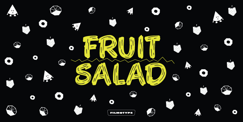
Filmotype Austin Font
Filmotype Austin was among the companies first brush lettered casuals and was Introduced by Filmotype in the early 1950s, it perfectly captures the mid-century playfulness of paint brush sho-card lettering while providing comfortable readability. Filmotype Austin was developed from the
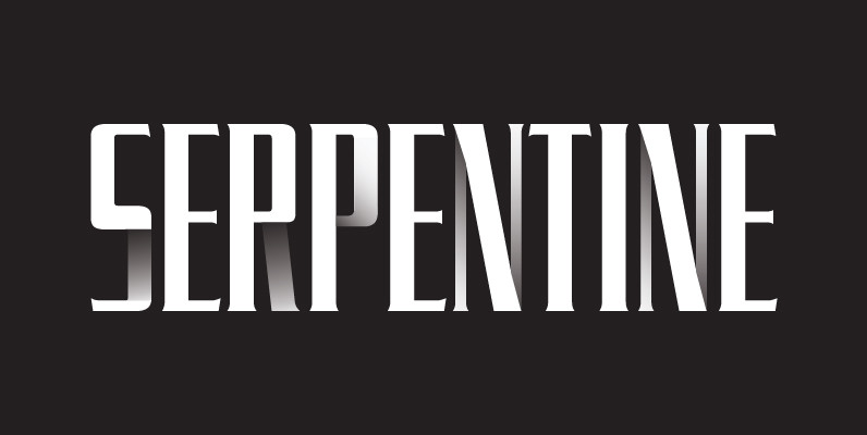
Serpentine Font
Designed by Dick Jensen in 1972, Serpentine is a glyphic sans font design. Serpentine is a font design owned by Linotype. Published by URW Type Foundry GmbHDownload Serpentine

Dobra Slab Font
Dobra is a very geometric and robust typeface with Sans and Slab Serif companions, specially suited for magazines and newspapers, although it works great as a corporate typeface. With five weights ranging from Light to Black with matching italic, available
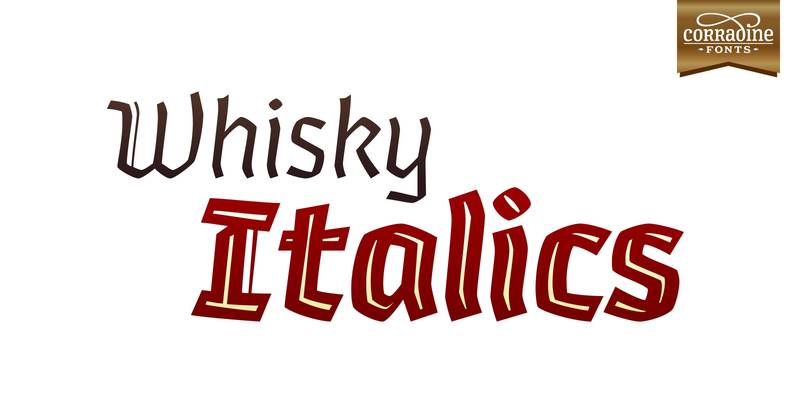
Whisky Italics Font
Whisky is a blackletter font family with a casual touch that makes it look friendly and current. The stroke varies its thickness and angle endings making it form very dynamic bodies of text. Whisky Italics are the corresponding versions to
