Tag: sturdy
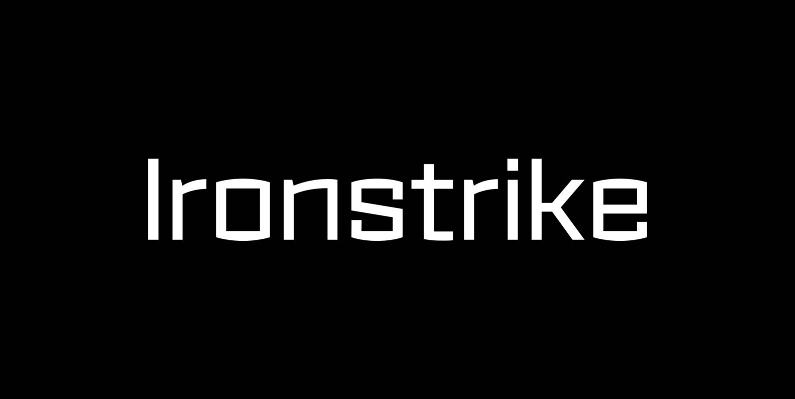
Ironstrike Font
Ironstrike pays homage to industrial and constructivist lettering. Rigid shapes and tall lowercase letters evoke strength and technology. Seven weights with matching italic fonts step up to your tough design challenges. Fine light weights emphasize white space and powerful heavy
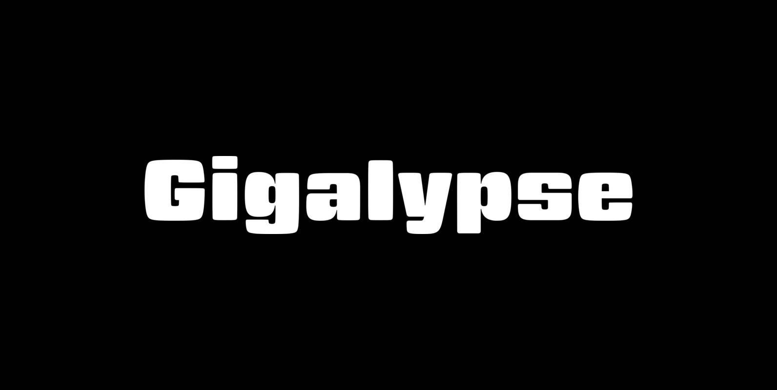
Gigalypse Font
Gigalypse is a one-weight workhorse. As a square sans Gigalypse can look smart, serious, and even futuristic. Round corners and curved sides add warmth and humor tempered by sophisticated geometry. This soft sophistication makes Gigalypse work whenever heavy display type
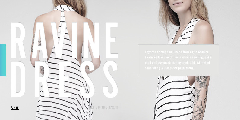
Alternate Gothic Font
Alternate Gothic was designed in 1903 by Morris Fuller Benton for American Type Founders (ATF). The idea was to provide several alternate widths of one design, namely Alternate Gothic No. 1, No. 2 and No. 3, to be more flexible
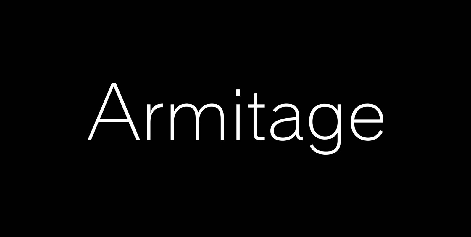
Armitaged Font
Sturdy and humane, Armitage renders type with vintage American warmth. Even with a subtle sparkle, Armitage stays humble to let words work. Rather than build on recent trends, Armitage starts over, derived from designs of the late nineteenth century. Designer
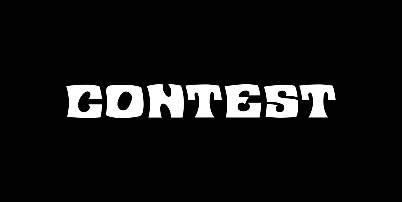
Contest Font
Contest is a font design released for the Mecanorma Type Collection. Copyright 2004 Trip Productions BV. Published by MecanormaDownload Contest
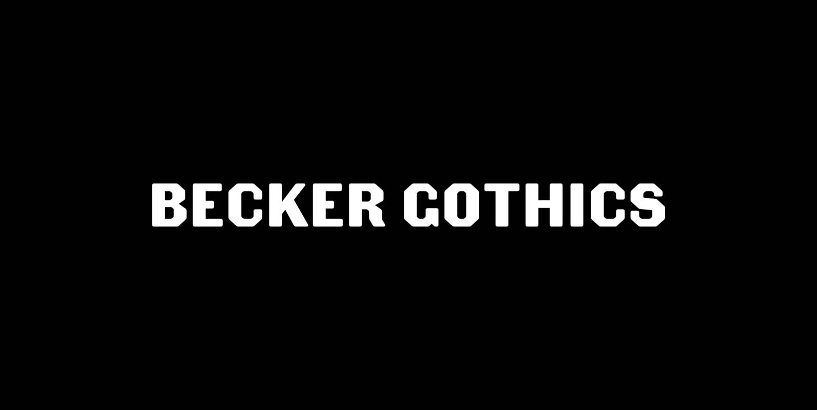
Becker Gothics Font
The Becker Gothics pay homage to the nineteenth century American lettering master George Becker. Designer James Puckett has given new life to the ingenious gothic alphabets found in Becker’s 1854 lettering manual Ornamental Penmanship. Use this quintet of typographic voices
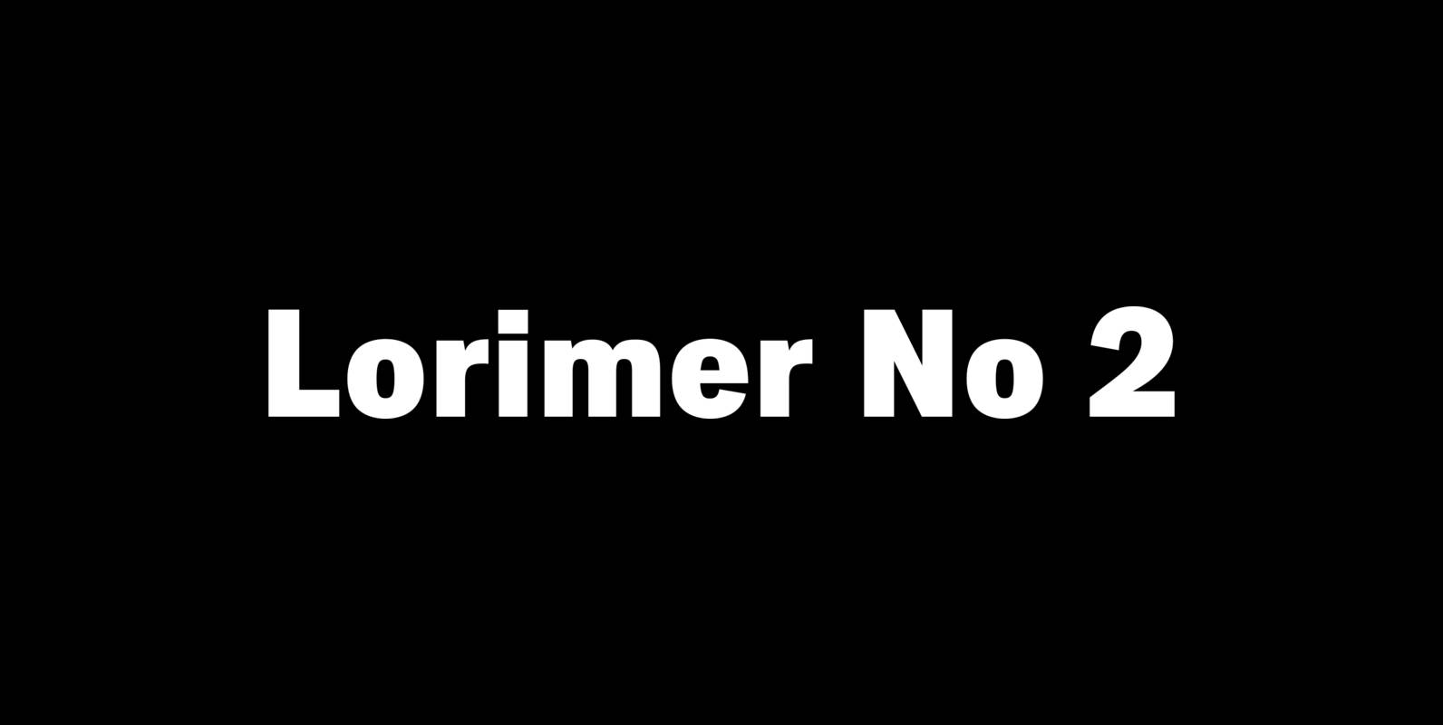
Lorimer No 2 Font
Lorimer No 2 is a sans family designed for display settings. Narrow letters, tight spacing, and a low x-height make Lorimer No. 2 better suited to display settings than fonts adjusted to work in text settings. Packaging, identities, and headlines
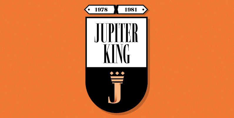
Basilia Font
Basilia was originally designed in 1978 by Andre Gurtler of Swiss typographic team, Team 77, and released as Basilia Haas in 1982. Basilia is a clean text face with good contrast, similar to Walbaum. The contrast in thick and thin
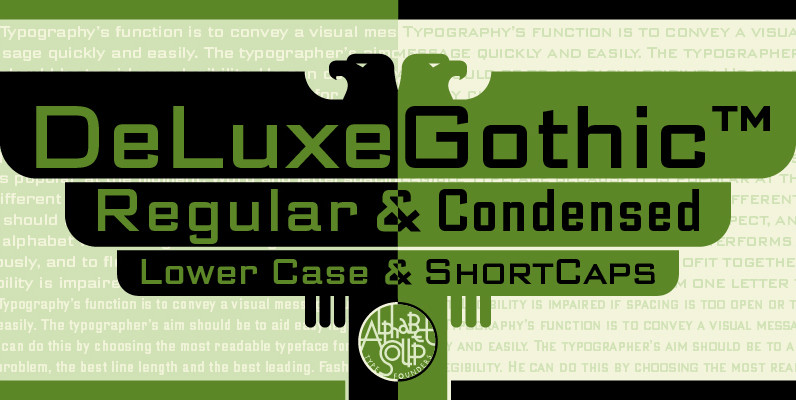
DeLuxe Gothic Font
Michael Doret was always very aware of the fact that Morris Fuller Benton’s classic Bank Gothic, a longtime favorite of his, didn’t contain any lowercase characters. So he set out to remedy that by designing his all new DeLuxe Gothic,
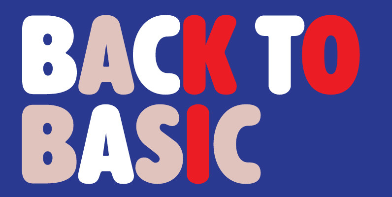
Alphabet Soup Pro Font
Designed by Steve Jackaman. In the early 1980’s, Steve worked at Typographic House in Boston, Massachusetts. At the time, ‘Typo’ House, as it was affectionately known, was the largest type house in New England. This font was designed and produced
