Tag: tabular
Centrale Sans Pro Font
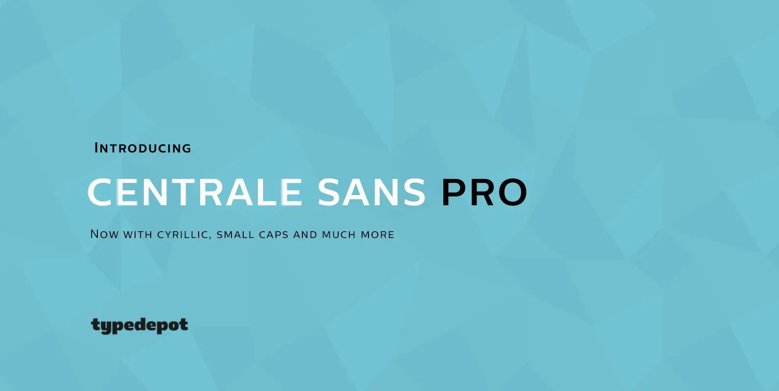
We have finally finished our work on Centrale Sans. A lot of mistakes have been made, and we hope a lot of them have been fixed. But finally we are ready to end this five-year journey and present you the
Haboro Serif Font
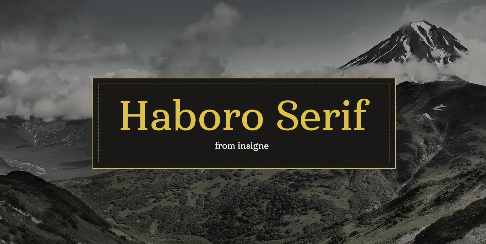
The polls are in. Now here by customer request–Haboro Serif, the newest edition of the Haboro Hyper family. The Haboro fonts are an outstanding upstart success from the first part of 2016. Following the release of the popular Haboro, Haboro
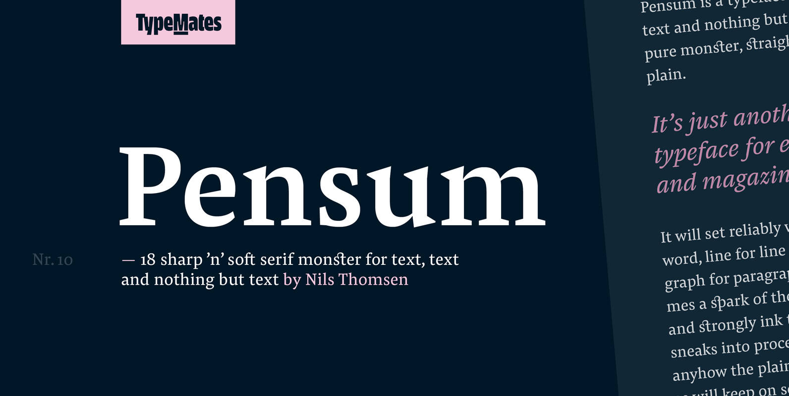
Pensum Pro Font
Pensum is a typeface for text, text and nothing but text. A pure monster, straight and plain, it will reliably set word after word, line after line and paragraph after paragraph. Sometimes a spark of the sexy, curvy and sharply
Grayfel Font
As designers, we seek perfection and originality. The more we step back and look at our work, the more changes we tend to find necessary. Drastic modifications are inevitable. The same is true of Grayfel. Grayfel began as an exercise
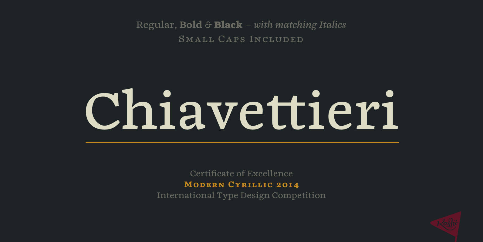
Chiavettieri Font
Chiavettieri draws inspiration from Humanist types, marked by low contrast between thick and thin strokes and the angle of stress in the bowls of letters. On the other hand, generous x-height, clean angled serifs and sharp cuts in the ball
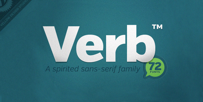
Verb Complete Series Font
Verb from Yellow Design Studio is a 72-font sans-serif superfamily that’s confident, friendly and energetic. At text sizes it’s highly legible, while at larger sizes it reveals lively shapes and personality. It has four subfamilies including Regular, Condensed, Extra Condensed,
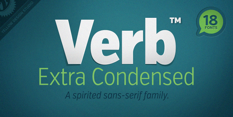
Verb Extra Condensed Font
Like the original Verb family, Verb Extra Condensed from Yellow Design Studio is confident, friendly and energetic, but has been carefully re-drawn with space saving proportions. At text sizes it’s legible and economic, while at larger sizes it reveals lively
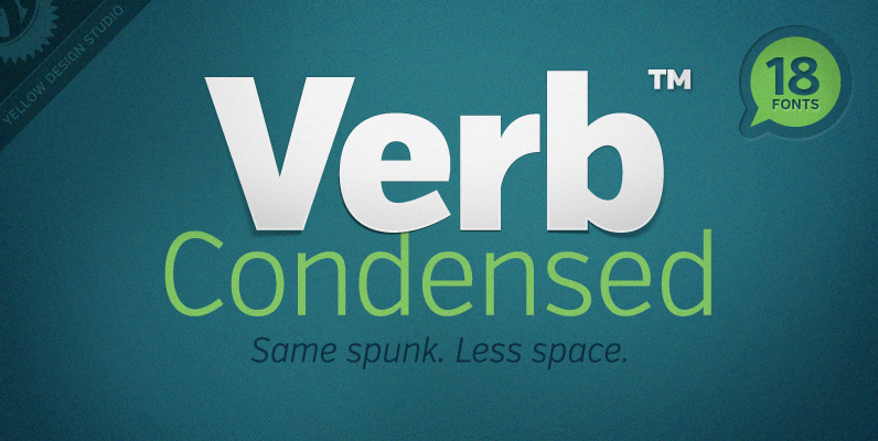
Verb Condensed Font
Verb Condensed from Yellow Design Studio is a modestly condensed version of the original Verb family, taking on more classic sans-serif proportions. It shares the same confidence, energy, and friendliness. At smaller sizes Verb Condensed is open and legible, and
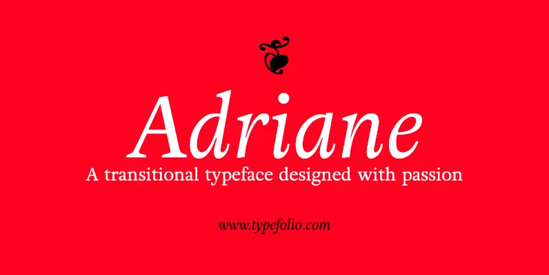
Adriane Text Font
Adriane Text was designed between 2006 and 2007 with additional production completed by Silas Dilworth for this 2008 release [v1.002]. Focusing on text composition and unique typographic characteristics, details within the characters provide both personality and excellent legibility at small
