Tag: technical
NotaBene Font
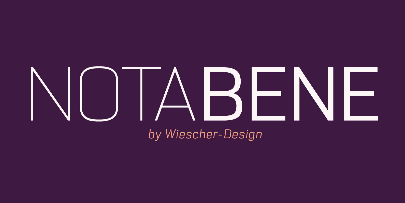
“NOTABENE” is a new, squarish, narrow, technical font– designed by Gert Wiescher in 2015 – has 7 weights with corresponding oblique cuts. “NOTABENE” is well suited for advertising, logo, billboards, small text, signage, branding, packaging, editorial, posters, web and screen
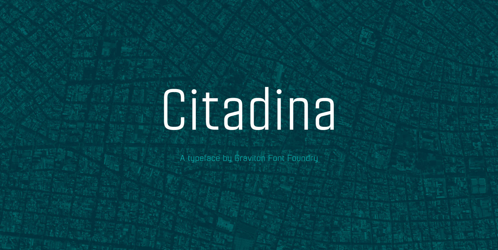
Citadina Font
Citadina font family has been designed for Graviton Font Foundry by Pablo Balcells in 2016. It is a sans serif typeface with a geometrical, mechanic, neutral appearance and a slightly condensed design which makes it particularly effective for space economizing.

Grenale Slab Font
Grenale Slab adds to the new standard of elegance within the Grenale family. Not your typical slab, Grenale has some unique forms that give it a look all its own. This glamourous slab still draws much inspiration from Grenale’s Didone
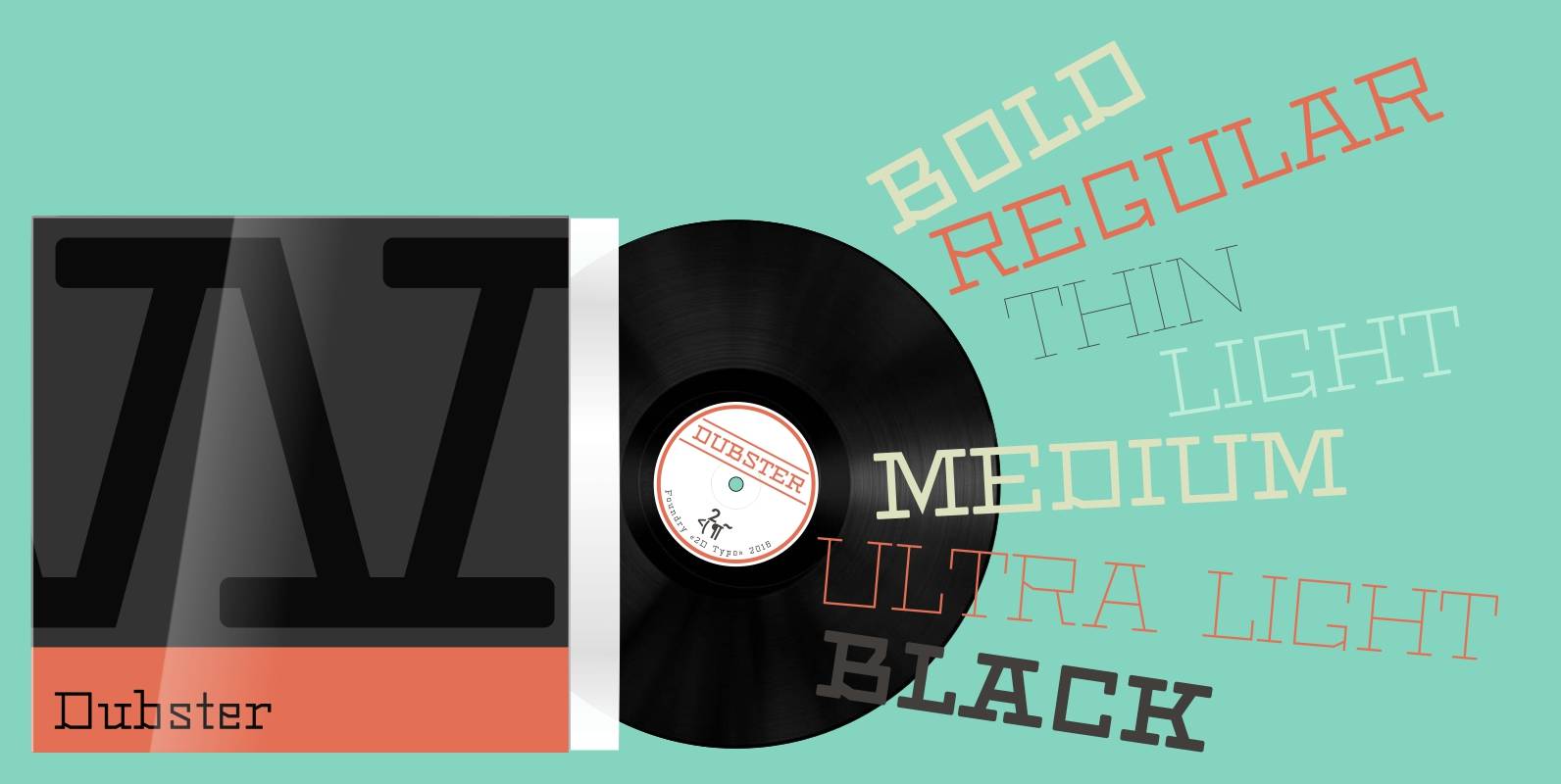
Dubster Font
Strict and technocratic font of modular nature and with wide intensity gradation. Published by 2D TypoDownload Dubster
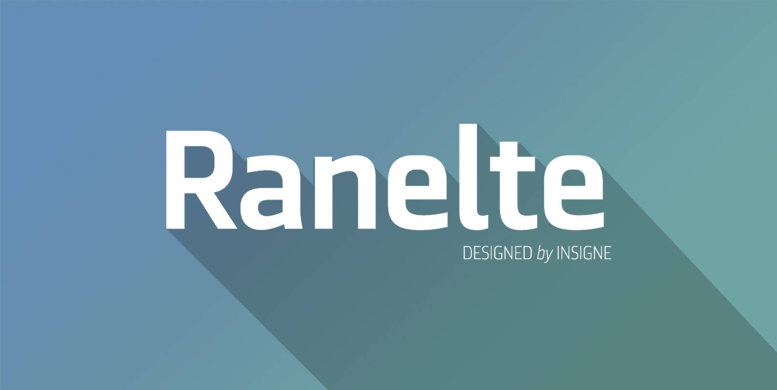
Ranelte Font
The beauty of a classic is that it never really goes out of style. The pure, simple elements which define its greatness only strengthen and solidify with time and exposure–elements like those that inspired Ranelte, the new sans serif from
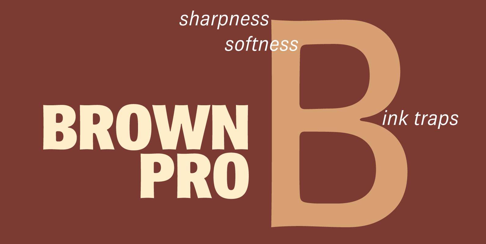
Brown Pro Font
At text size, Brown is a classic grotesque, distinguished by its semi-condensed proportions (especially in the capitals, which harmonize well with the lining figures) and with an exceptional clarity in certain high-resolution media, such as offset printing, achieved by micro-detailing.
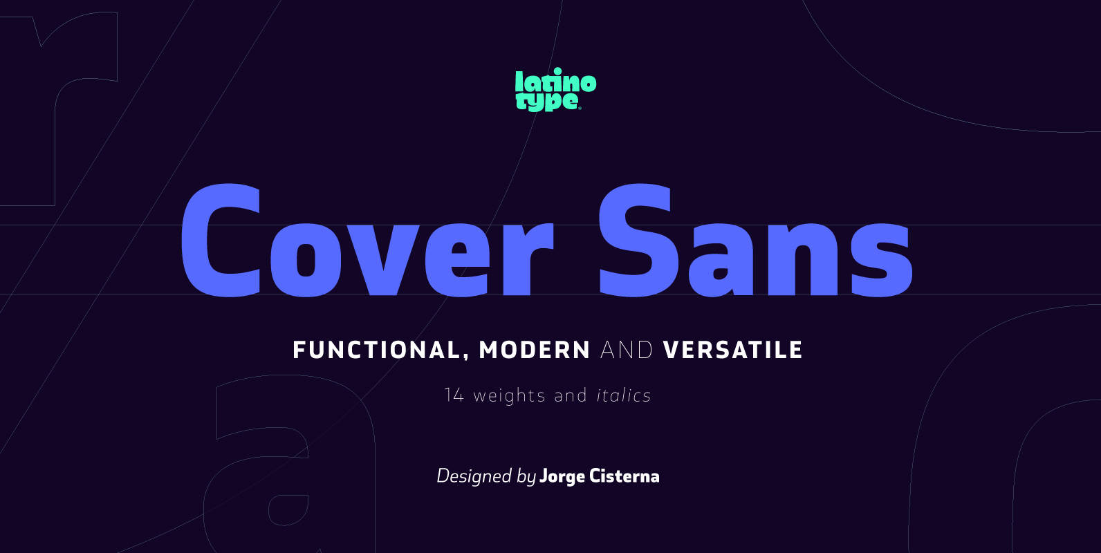
Cover Sans Font
Cover Sans is a humanist geometric typeface with an orthogonal structure, which provides stability when composing a text. Open shapes and low x-height give this font balance and make it an air-breathing typeface. Cover Sans is a stable and strong
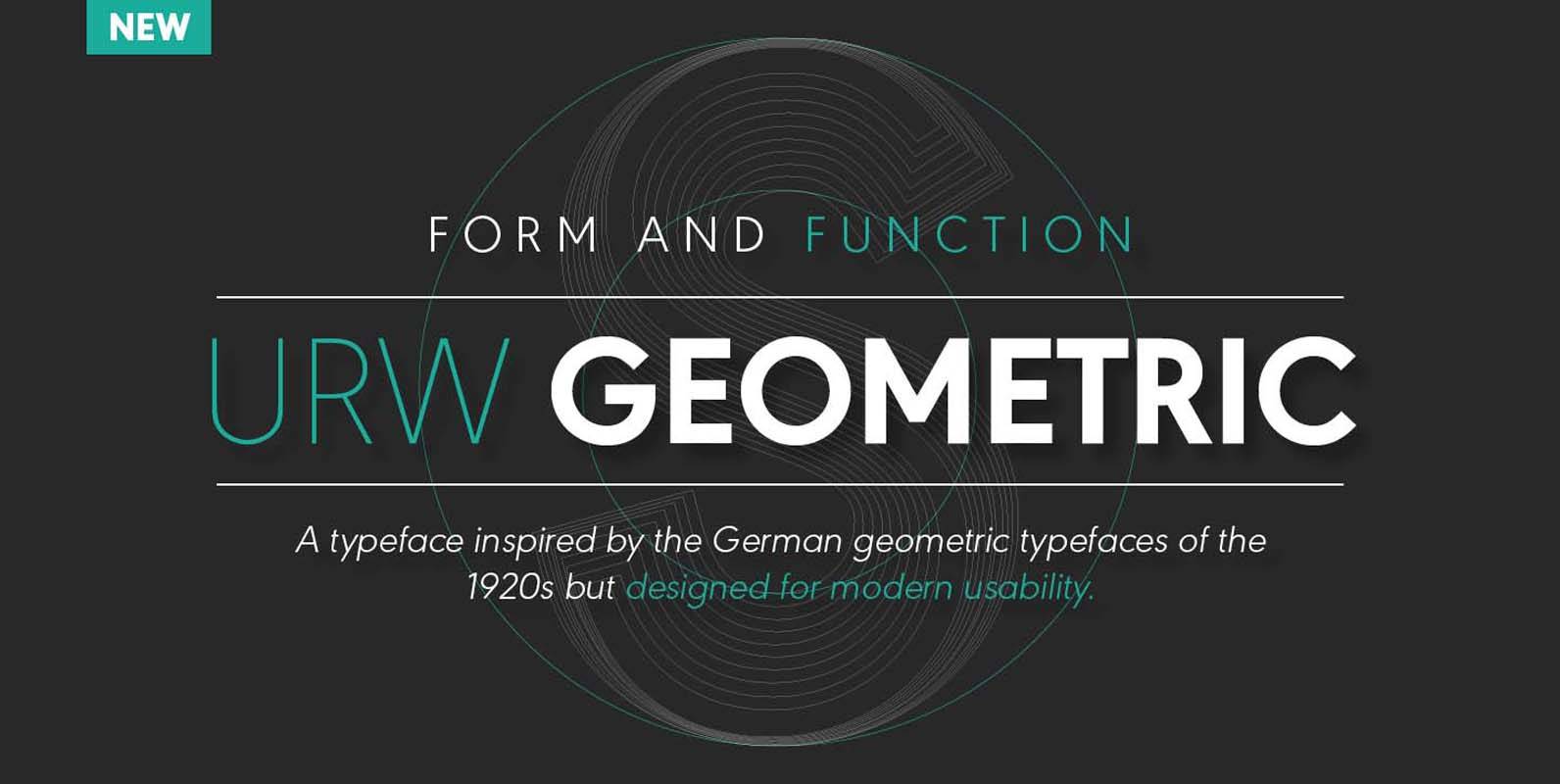
URW Geometric Font
URW Geometric is a sans serif typeface inspired by the German geometric typefaces of the 1920s but designed for modern usability. The character shapes have optimized proportions and an improved balance, the x-height is increased, ascenders and descenders are decreased.
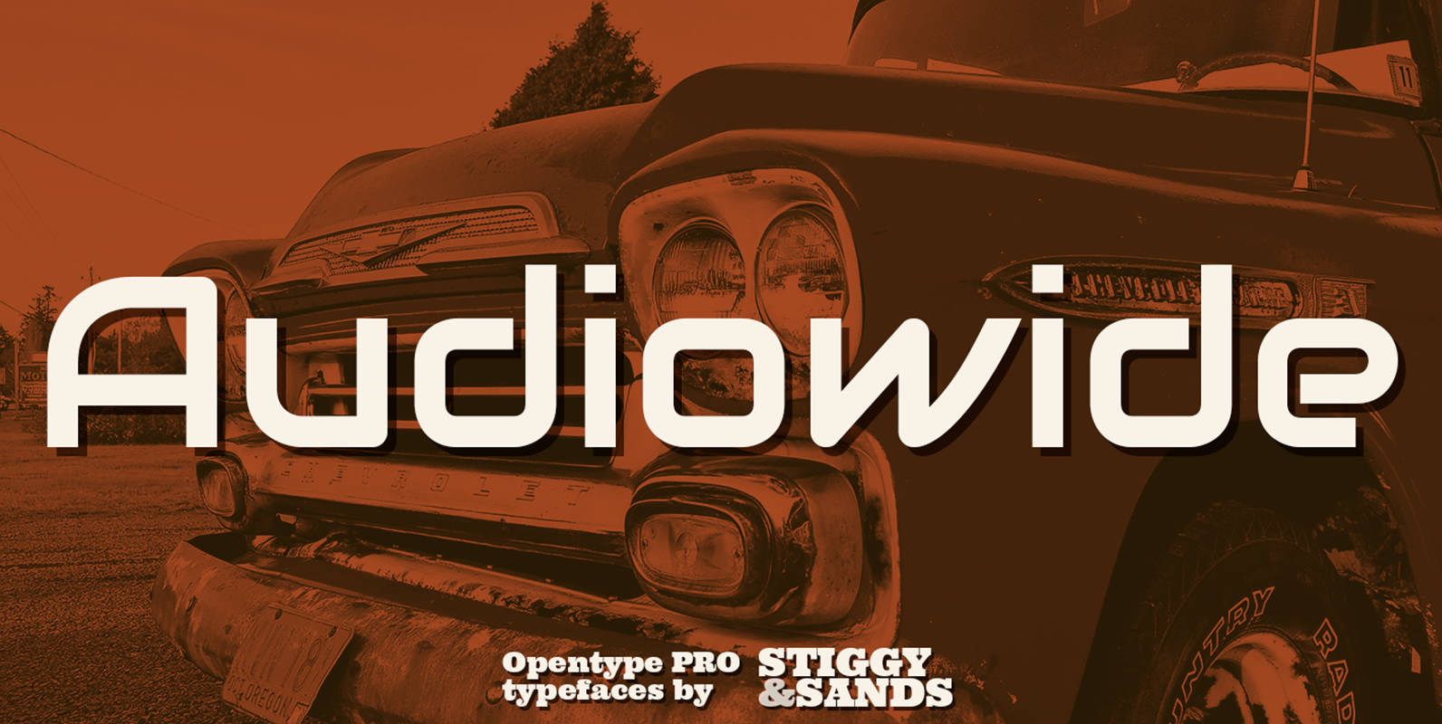
Audiowide Pro Font
Our Audiowide Pro has vague inspirations from other styles like that of Handel Gothic and the Converse logo, yet it veers off in a direction of its own for a slightly more techno-futuristic and yet cleanly readable format. Great for
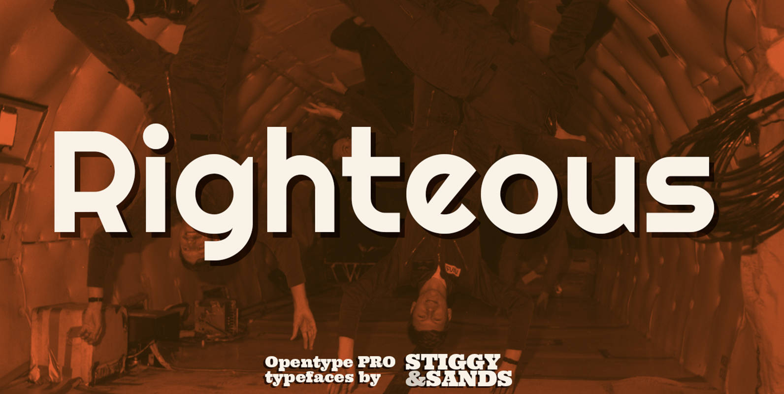
Righteous Pro Font
Our Righteous Pro was inspired by the all-capital letterforms from the deco posters of Hungarian artist Robert Berény for Modiano. Grid based and geometric in execution, the font is highly readable at a wide range of point sizes, ideal for
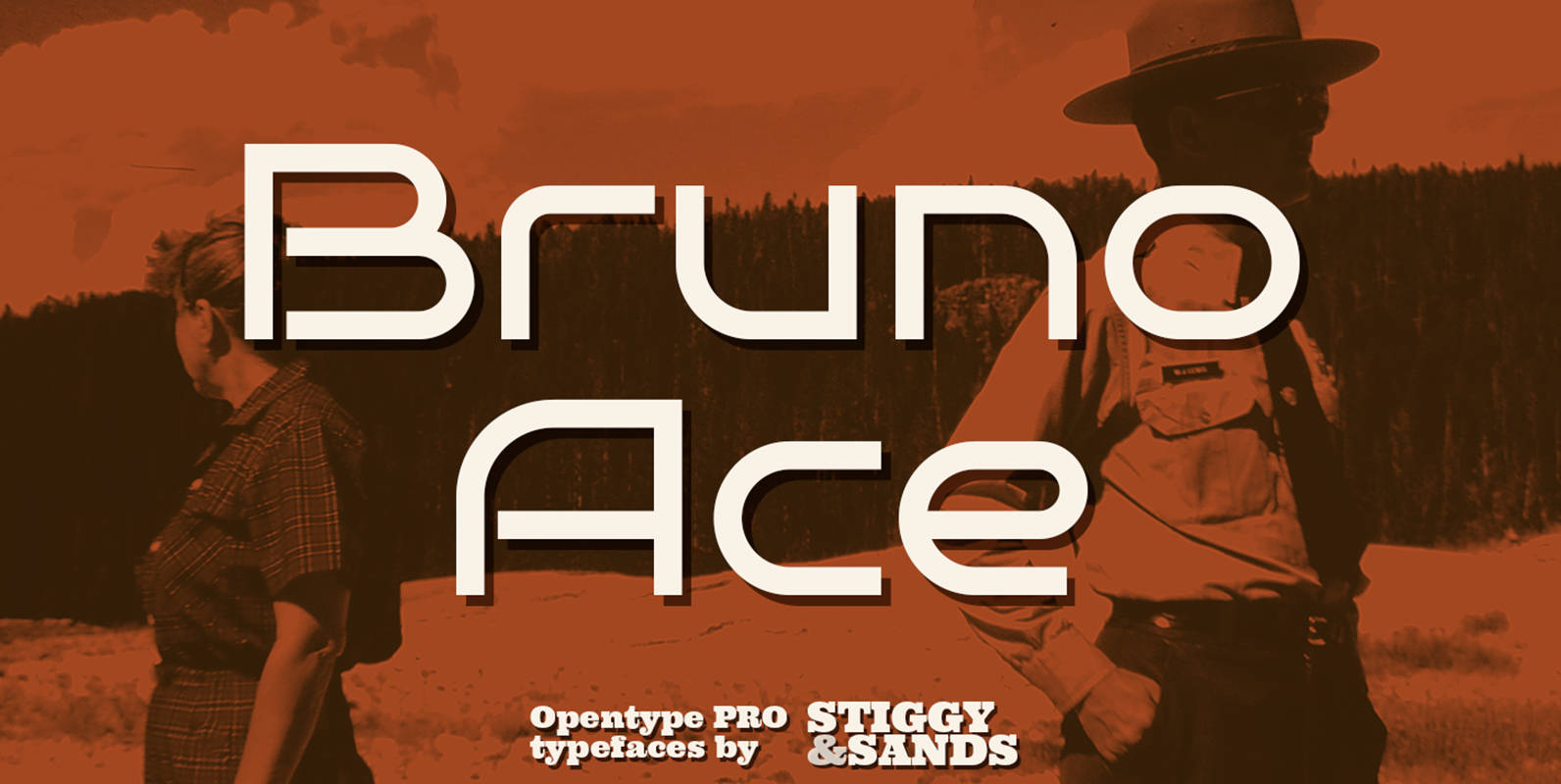
Bruno Ace Pro Font
Our Bruno Ace Pro draws its inspiration from modern automotive logotypes. This geometric sans-serif has a wide stance with a tall x-height for a strong look and appeal, as well as ease of legibility. The SmallCaps and extensive figure sets

Conto Slab Font
Conto Slab — a further family member of the sans serif Conto — is an individual and significant slab serif typeface in eight weights. It is mainly designed for corporate identity along with the editorial design and advertising. An almost
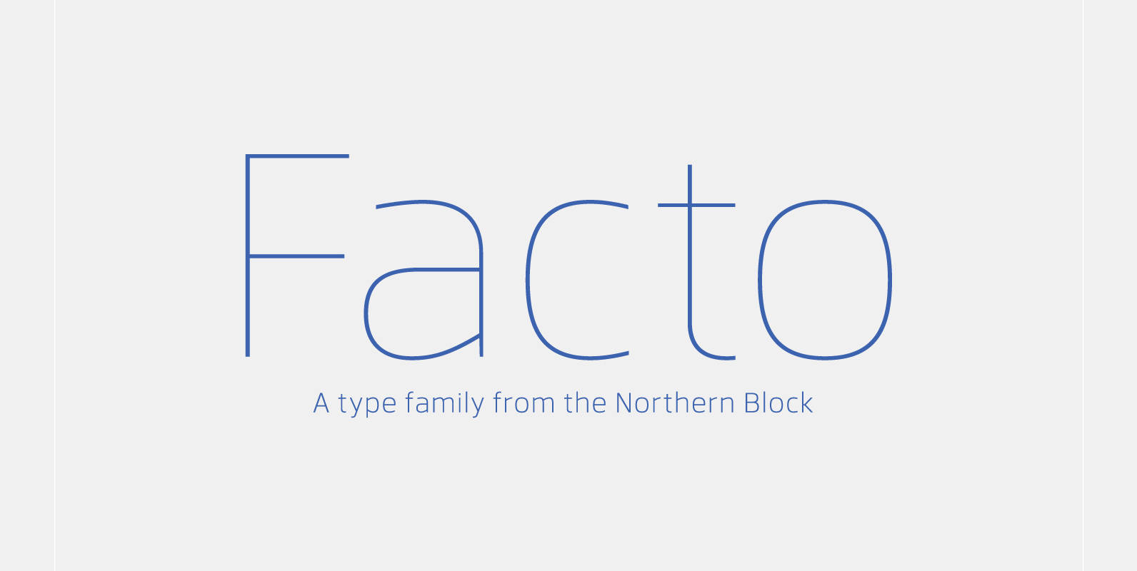
Facto Font
A simple, mechanical typeface without distractions. Slightly condensed curves are developed from a compact grid layout to produce a crisp, fresh and legible type family. The unadorned letterforms work perfectly with complex information-based applications such as user interfaces, mobile devices
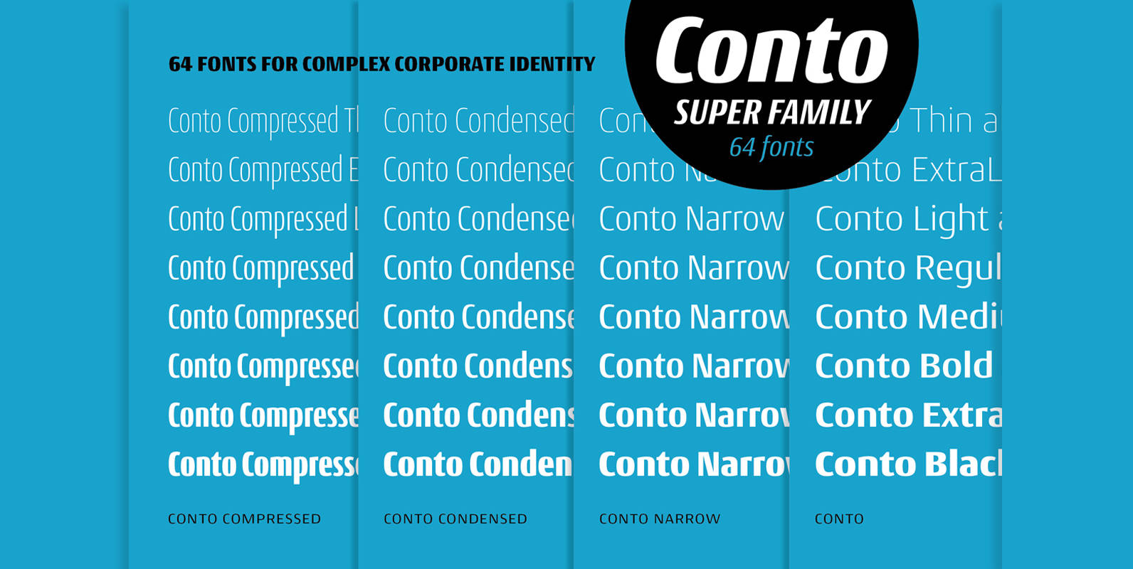
Conto Font
The Conto super family is a powerful and clear typeface for complex corporate typography. From essential text to captions, tables and advertising, the 64 weights have the flexibility to fulfil your every typographic need. The Conto family is simple, serious,
