Tag: techno
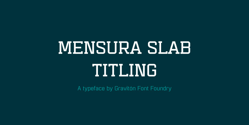
Mensura Slab Titling Font
Mensura Slab Titling font family is the display version of Mensura Slab font family, it has been designed for Graviton Font Foundry by Pablo Balcells in 2014. Mensura Slab Titling consists of 12 styles including italics. The styles included in

Dimensions Font
Dimensions is redesigned font family based on Blackout font released as free font in 2005. The original blackout has been used especially for company or brand logo of fashion and music label in the world. In 2011, Blackout had evolved

Peppered Font
Peppered is an ornate and overloaded dot matrix typestyle complete with positive and negative dot matrixes as well as an ornament variant. It’s blanketed dot matrix style can create interesting bands of tint, much like a halftone when typed at

Speedometer Font
Speedometer is derived from Dimensions font family that is most narrow and black font for titling and logo. This speedometer is more elegant by its contrast between the thickness of stem and thinness of the arms than Dimensions. This contrast
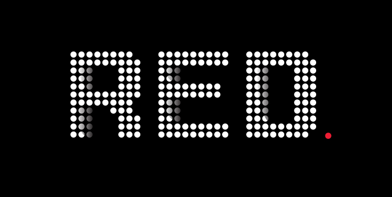
Yardmaster Font
Yardmaster is a decorative/dots styled font release by URW. Contains language support for West, East, Turkish, Baltic, and Romanian. Published by URW Type Foundry GmbHDownload Yardmaster

Alert Font
Alert fonts are primarily intended for heading, display and decorative use. Alert is angular by its structure but soft-outlined typeface with modern industrial strength expression. Alert family consist of seven styles – Regular, Medium, Bold (all with slanted counterparts) and
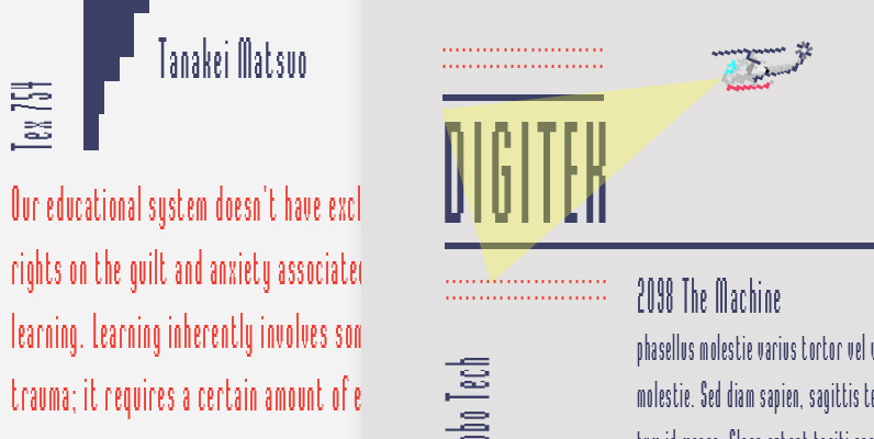
Digitek Font
This futuristic looking typeface was inspired by the appearance of coarse resolution computer bitmap output. Because it is condensed, Digitek is most effective in large headline applications with wide letter and word spacing. An excellent choice where a computer or
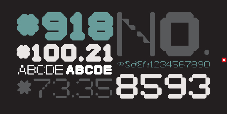
YWFT Selek Font
For striking, stylishly modern design, Selek(t) something incredible. (See what we did there?) YWFT Selek was designed with the idea of bringing a softer touch to machine-like letterforms, with the final result falling between mechanical and electronic. For legibility it
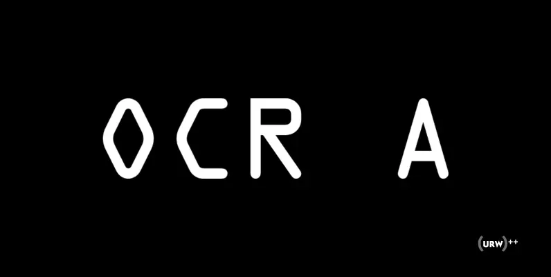
OCR A Font
In the early days of computer optical character recognition, there was a need for a font that could be recognized by the computers of that day, and by humans. The resulting compromise was the OCR-A font, which used simple, thick
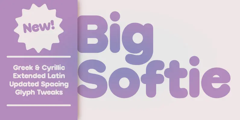
Big Softie Font
A cute, fun, soft bubblegum font in one fatty flavour. Perfect for club posters, flyers and packaging, Big Softie is sure to tingle your clients’ taste buds. The font was built on a geometric skeleton, and then rounded and softened,
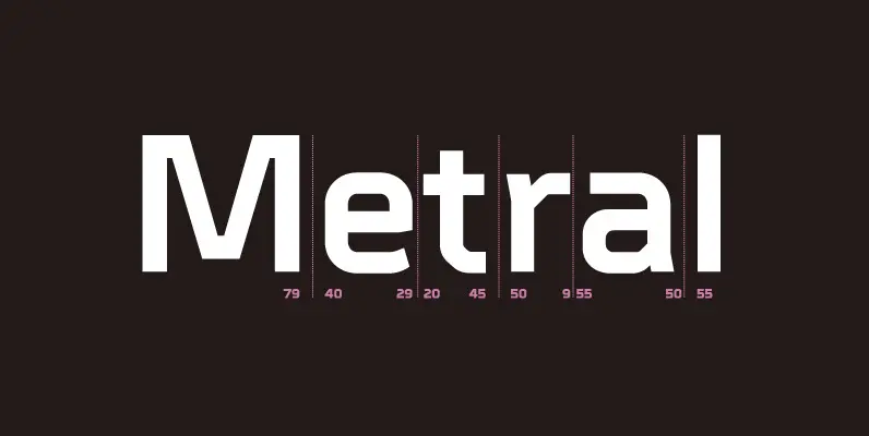
Metral Font
A geometric sans serif with a precise fabricated appearance. Smooth corners are mixed with subtle angles to form a strong, legible typeface ideally suited for a wide range of applications. Details include 6 weights with italics, an extended European character

Shearman STD Font
Shearman STD has a simple design, based on industrial fonts, in particular at the typewriters fonts. It’s a geometric font with curves elimination, noting in particular the O and Q letters. It has smooth angles and clean forms which combine
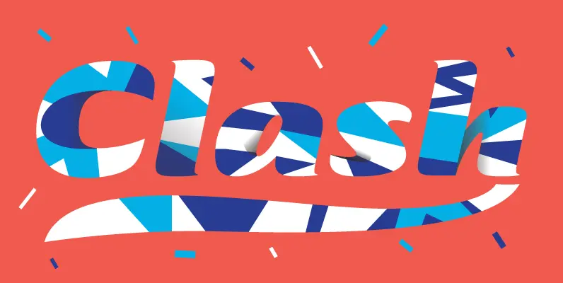
Tabarnak Font
Tabarnak started out as an assessment and correction of an old concept by George Wilkens. The original idea was for a bold upright alphabet reminiscent of Oz Cooper's work, but ornamented with some shocard/signage traits. That idea was radically redrawn
