Tag: technology

Karben 205 Mono Font
Karben 205 Mono is a monospaced variation of Karben 205. The clean and pure geometry of Karben 105 makes it highly suitable for adaptation to this monospaced variant. It has an even look and retains its legibility at very small

Kandel 205 Font
Kandel 205 is a geometric, tri-line, display and headline font available in a family of three weights. Its bold, graphic styling gives it great stand-out qualities and a highly individual look. It’s particularly well suited to bringing energy to designs,

Kandel 105 Font
Kandel 105 is a geometric, tri-line, display and headline font available in a family of three weights. Its bold, graphic styling gives it great stand-out qualities and a highly individual look. It’s particularly well suited to bringing energy to designs,

Cartograph CF Font
A monospaced typeface with character and warmth, Cartograph© CF is a handsome font family featuring a lush, cursive italic, code-friendly ligatures, and a proportional set accessible via OpenType. A tribute to the utilitarian beauty of terminals and typewriters, Cartograph excels
Branding Font
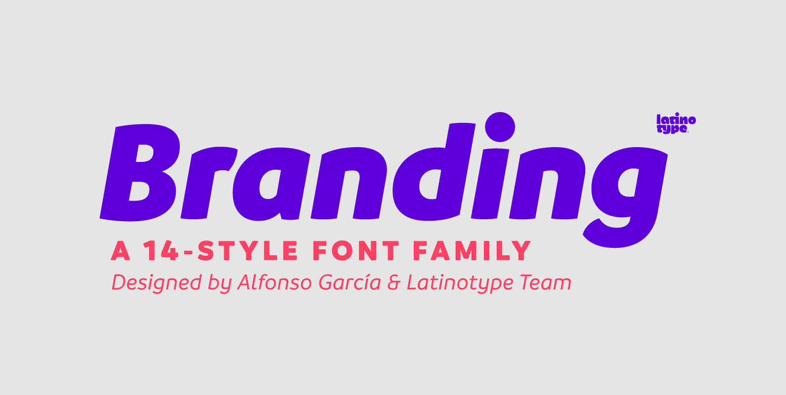
Branding, a modern typeface for modern needs! Branding, especially designed for meeting contemporary aesthetic and functional needs, is the interpretation of a modern typeface from the designer’s own perspective. This typeface encapsulates a wide range of nuances and combines, seemingly,
Citadina Font
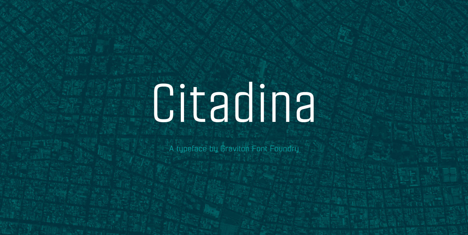
Citadina font family has been designed for Graviton Font Foundry by Pablo Balcells in 2016. It is a sans serif typeface with a geometrical, mechanic, neutral appearance and a slightly condensed design which makes it particularly effective for space economizing.

Erbaum Font
Erbaum is a display square sans serif type family. It is straight-forward in overall structure, simple and rational in details. Erbaum was designed to maximise clarity, with an emphasis on construction and pragmatic aesthetics. The concept behind this typeface was
Turismo CF Font
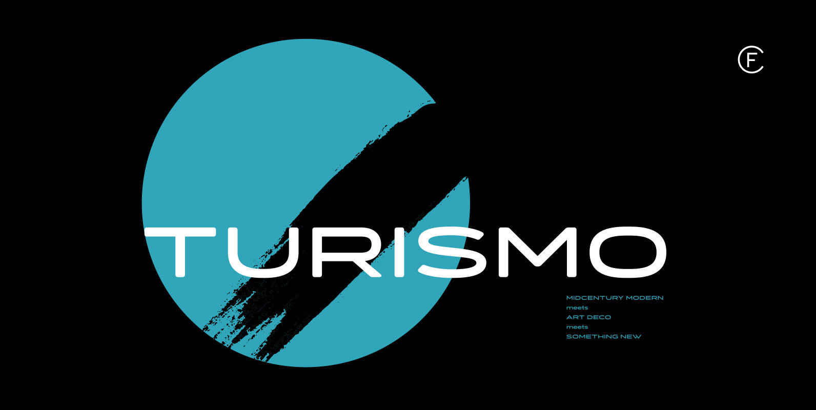
Inspired by midcentury motorsports, technology, and business, Turismo CF is designed for stunning logotypes and gripping headlines. Taking cues from both the 1960s and 1920s, Turismo combines strong rectangular shapes with sloping, elongated curves. Includes seven weights, upper and lower
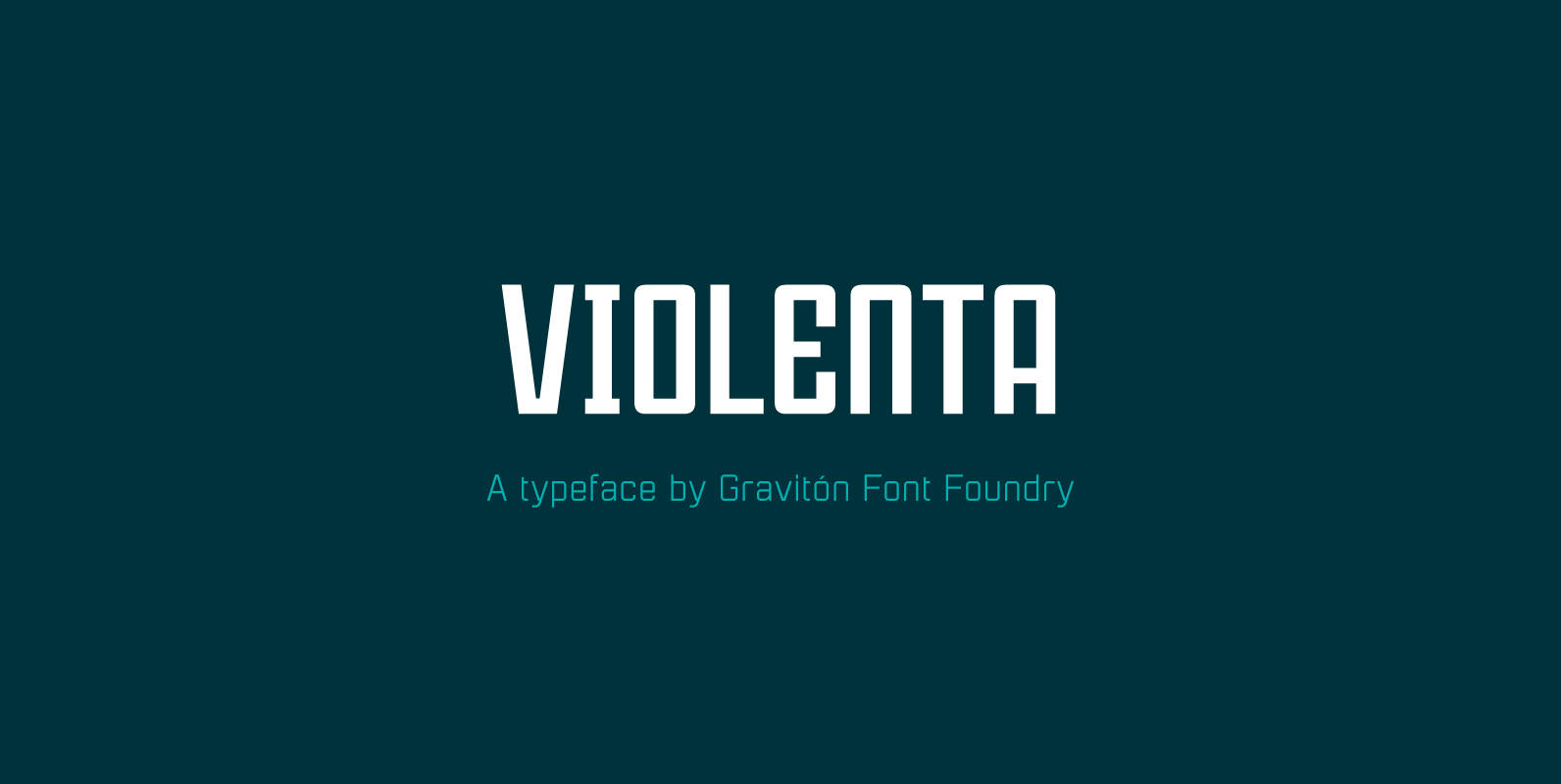
Violenta Font
Violenta font family has been designed for Graviton Font Foundry by Pablo Balcells in 2015. It is a display, geometric typeface, with a condensed design and sharp angles that provides an aggressive and strong appearance. Violenta consists of 8 styles.
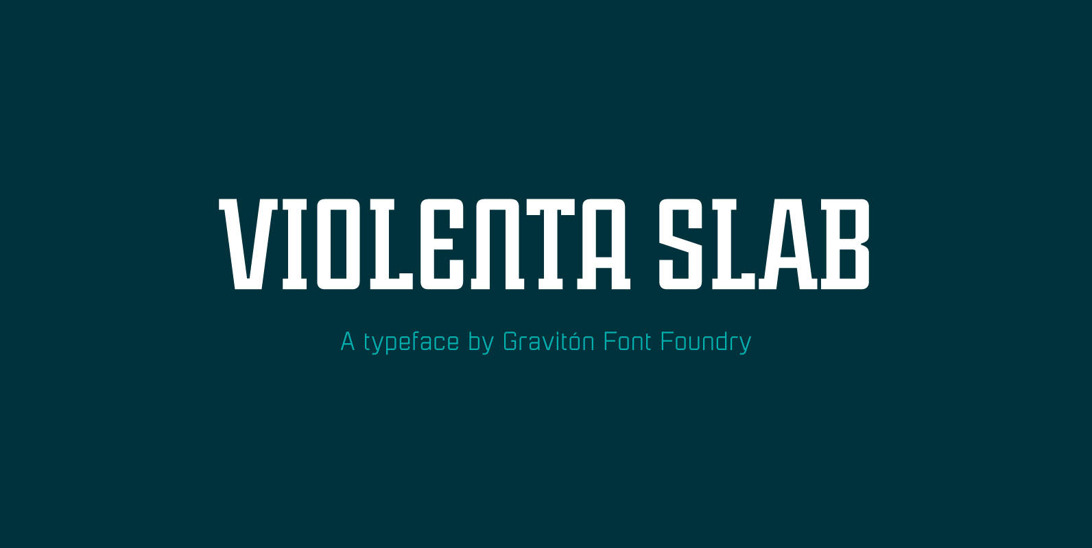
Violenta Slab Font
Violenta Slab font family has been designed for Graviton Font Foundry by Pablo Balcells in 2015. It is a display, geometric typeface, with a condensed design and sharp angles that provides an aggressive and strong appearance. Violenta Slab consists of
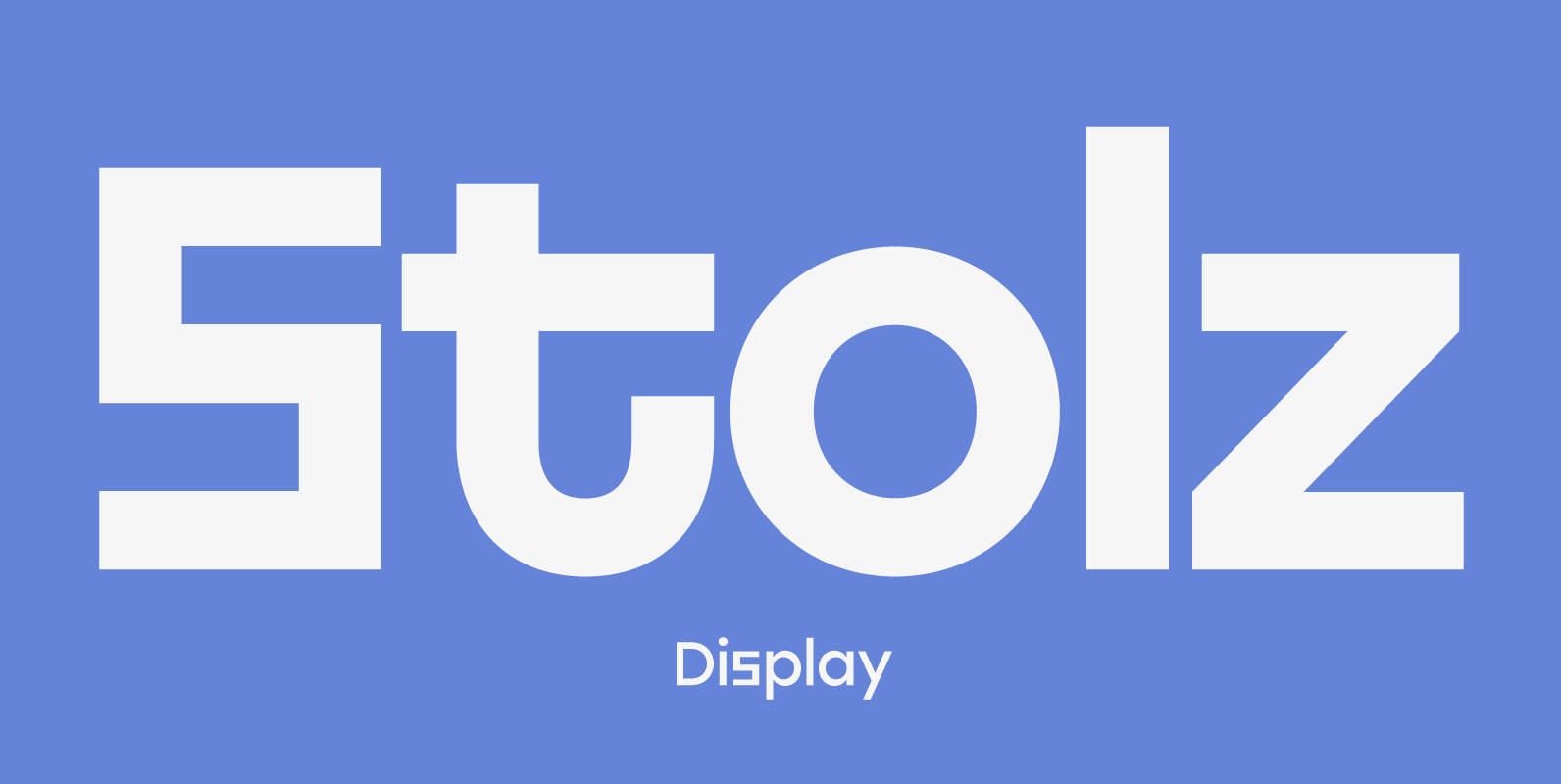
Stolzl Display Font
Stolzl Display is an original font family designed for headlines, titles and subtitles. Based on the combination of contrasting shapes, the harmony of form and rhythm is fundamental to the design. Inspired by Bauhaus, Stolzl represents, not just the significant
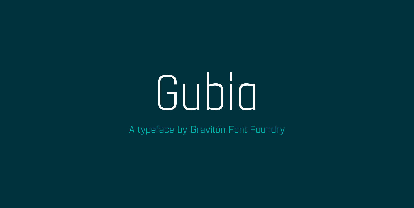
Gubia Font
Gubia font family has been designed for Graviton Font Foundry by Pablo Balcells. It is a geometric, sans serif typeface with a slightly condensed design. It has been conceived to be most suitable for all sized headlines, as well as
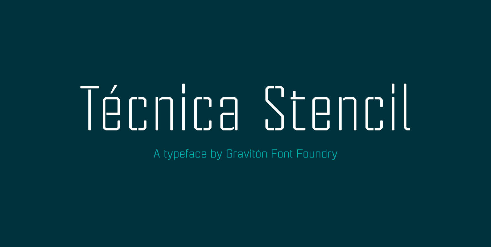
Tecnica Stencil Font
Tecnica Stencil font family is the stencil version of Tecnica font family, it has been designed for Graviton Font Foundry by Pablo Balcells in 2014. Tecnica Stencil consists of 8 styles. The 4 “Stencil 1” styles contain a narrow stem


