Tag: text
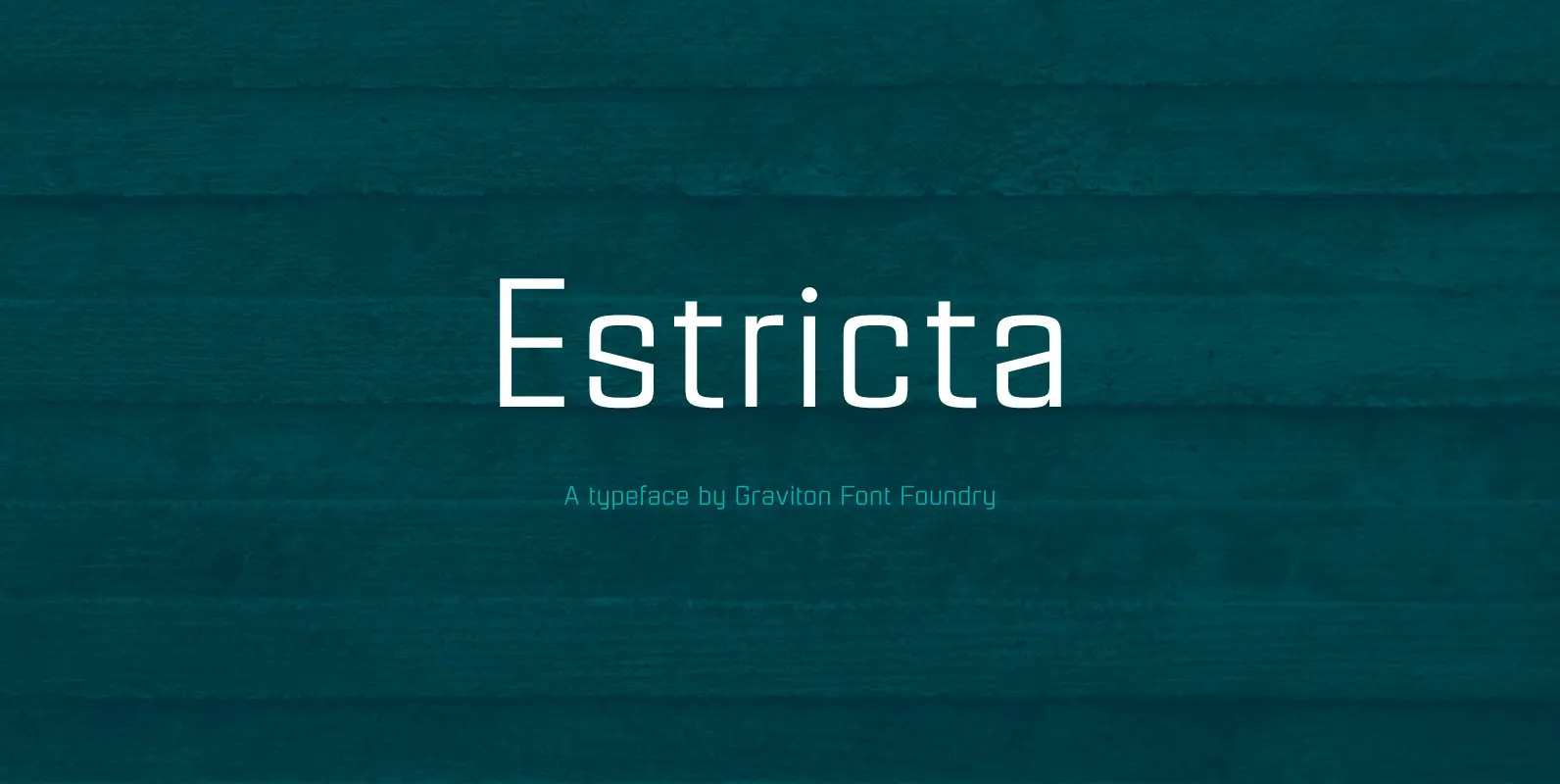
Estricta Font
Estricta font family has been designed for Graviton Font Foundry by Pablo Balcells in 2017. It is a sans serif typeface with a geometrical and mechanical appearance, its sharp, angular edges provide a strong and solid design. It has been
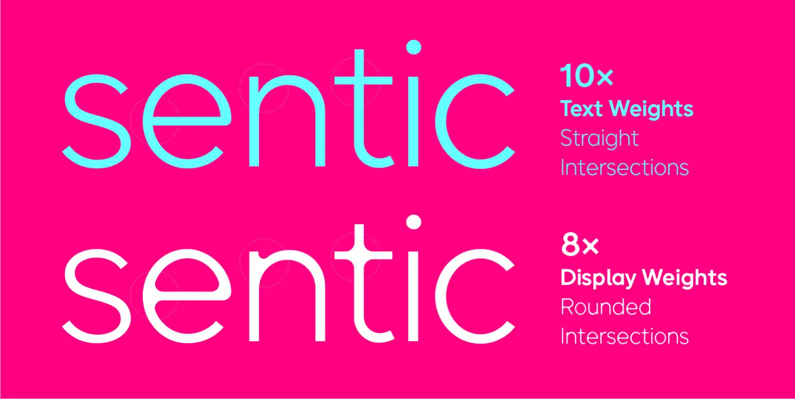
Sentic Font
The font family is called Sentic, it is a sans-serif font based on geometric patterns with humanist elements. The display version of the typeface incorporates rounded intersecting forms. The font exploits the common affective patterns associated with natural language, and the patterns associated
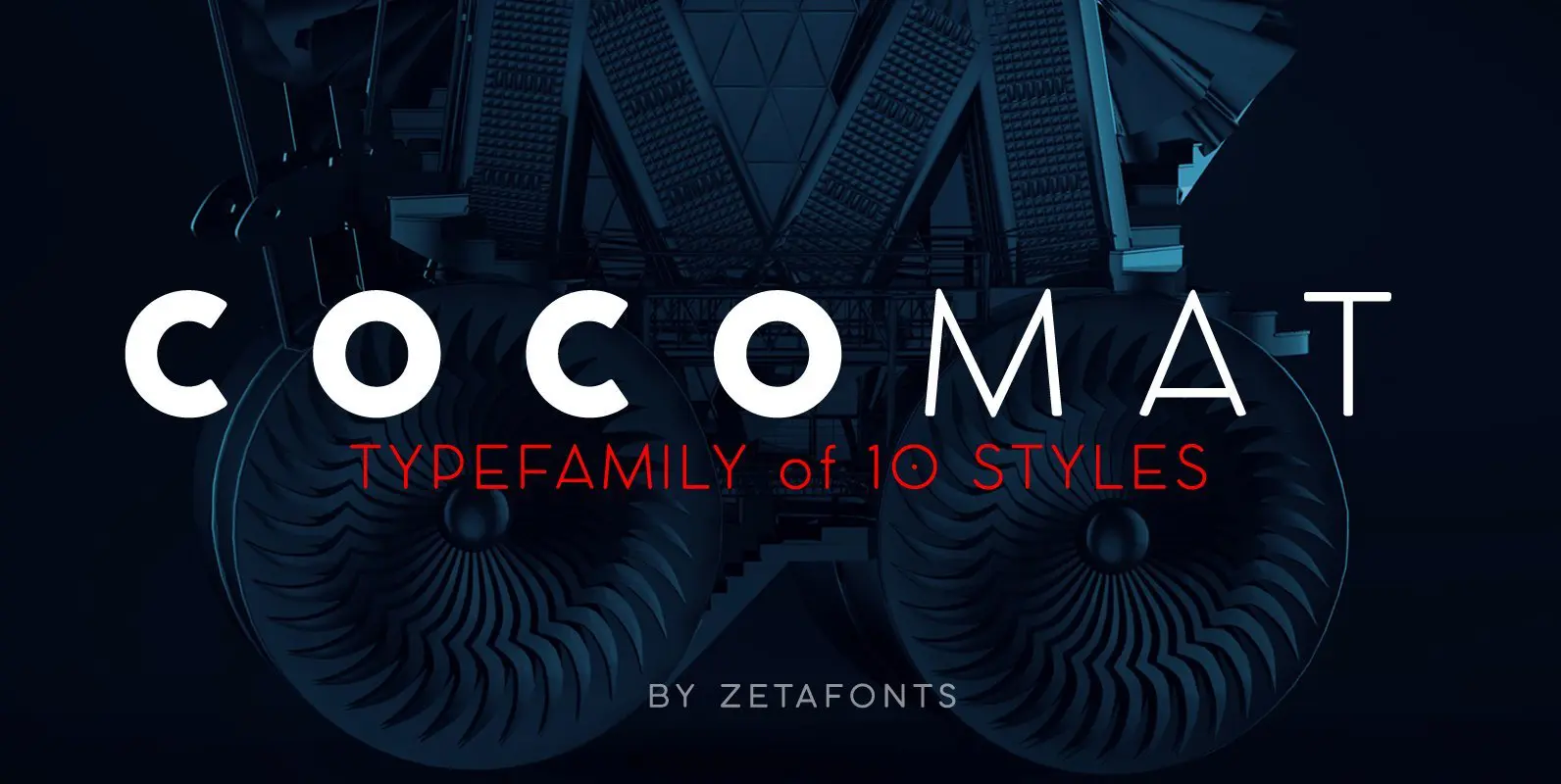
COCOMAT Font
COCOMAT is a typeface variant from the COCO GOTHIC family of sans serif geometric typefaces. It’s inspired by the style of the twenties and the visions of italian futurists like Fortunato Depero, Giacomo Balla and Antonio Sant’Elia. It’s a typeface
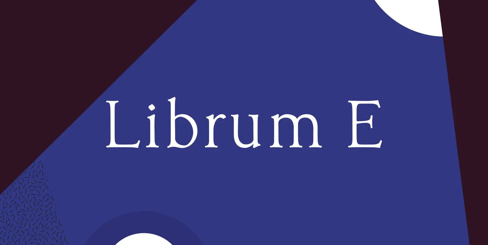
Librum E Font
The major focus of my life and ministry at this point is book design. In the brave new world of 21st century self-publishing a new paradigm has arisen: the indie small shop. One of the problems is that all books

Librum Group Font
Librum is a 4-font text family specifically constructed for its use in book design. Its wider letter spacing works best in body copy sizes from 8-point to 15-point. It is slightly condensed and has several graphics in various rarely used
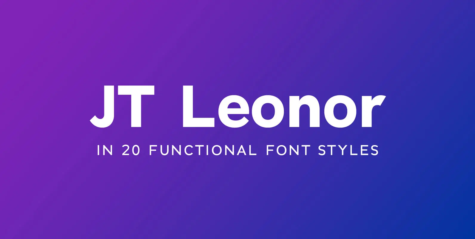
JT Leonor Font
JT Leonor is inspired by the world renowned Gotham typeface but with a more square feel in its light weights and a rounder bold range, this typeface is perfectly suited to both large chunks of body copy as well as
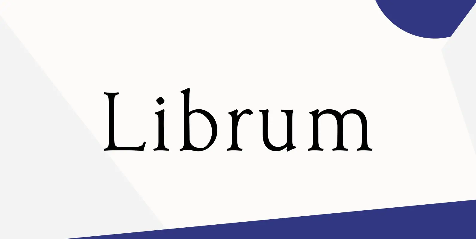
Librum Font
This is the serif text family for the book design group of font families which David designed in the process of writing “Practical Font Design With FontLab 5”. The letterspacing is set wide for body copy use. The main purpose
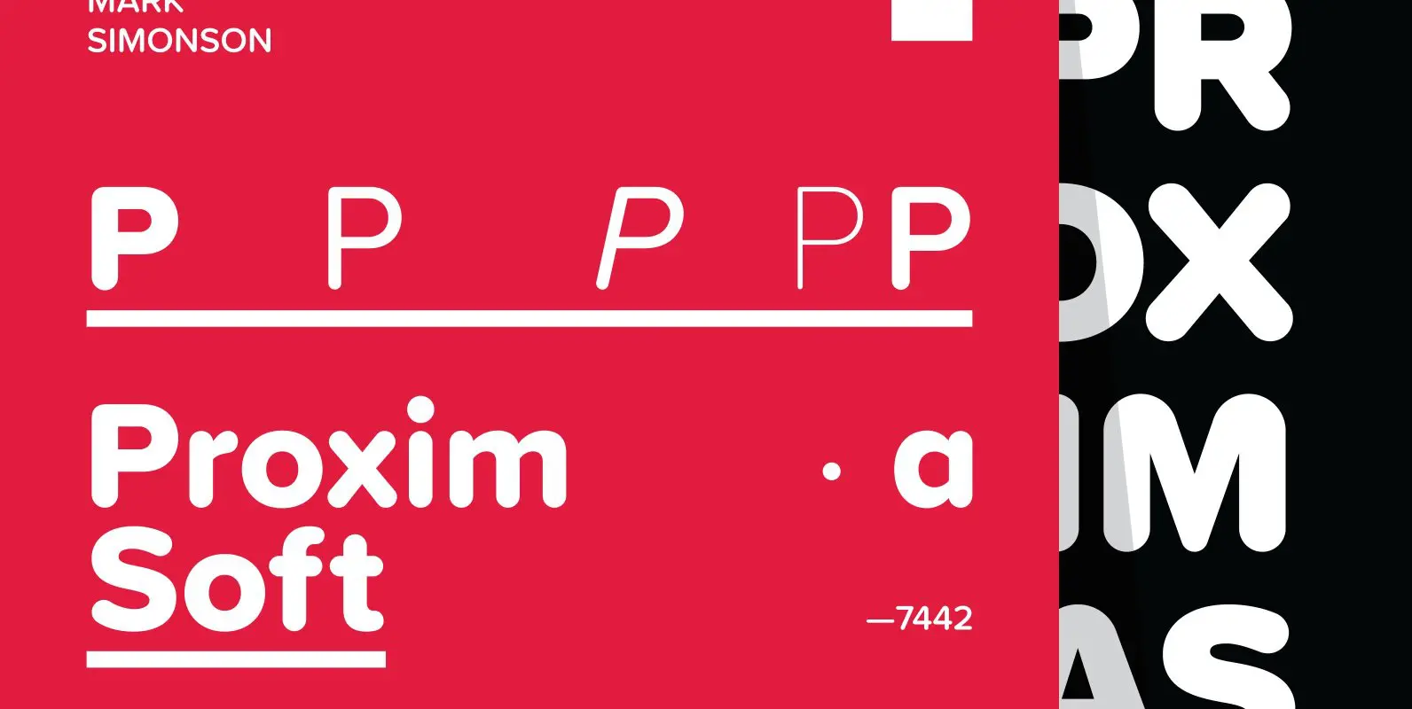
Proxima Soft Font
Proxima Soft (2017) is a rounded version of Proxima Nova. With the same forty-eight styles (eight weights in three widths, plus italics), Proxima Soft fits the bill when you want something a bit warmer and more playful than its older
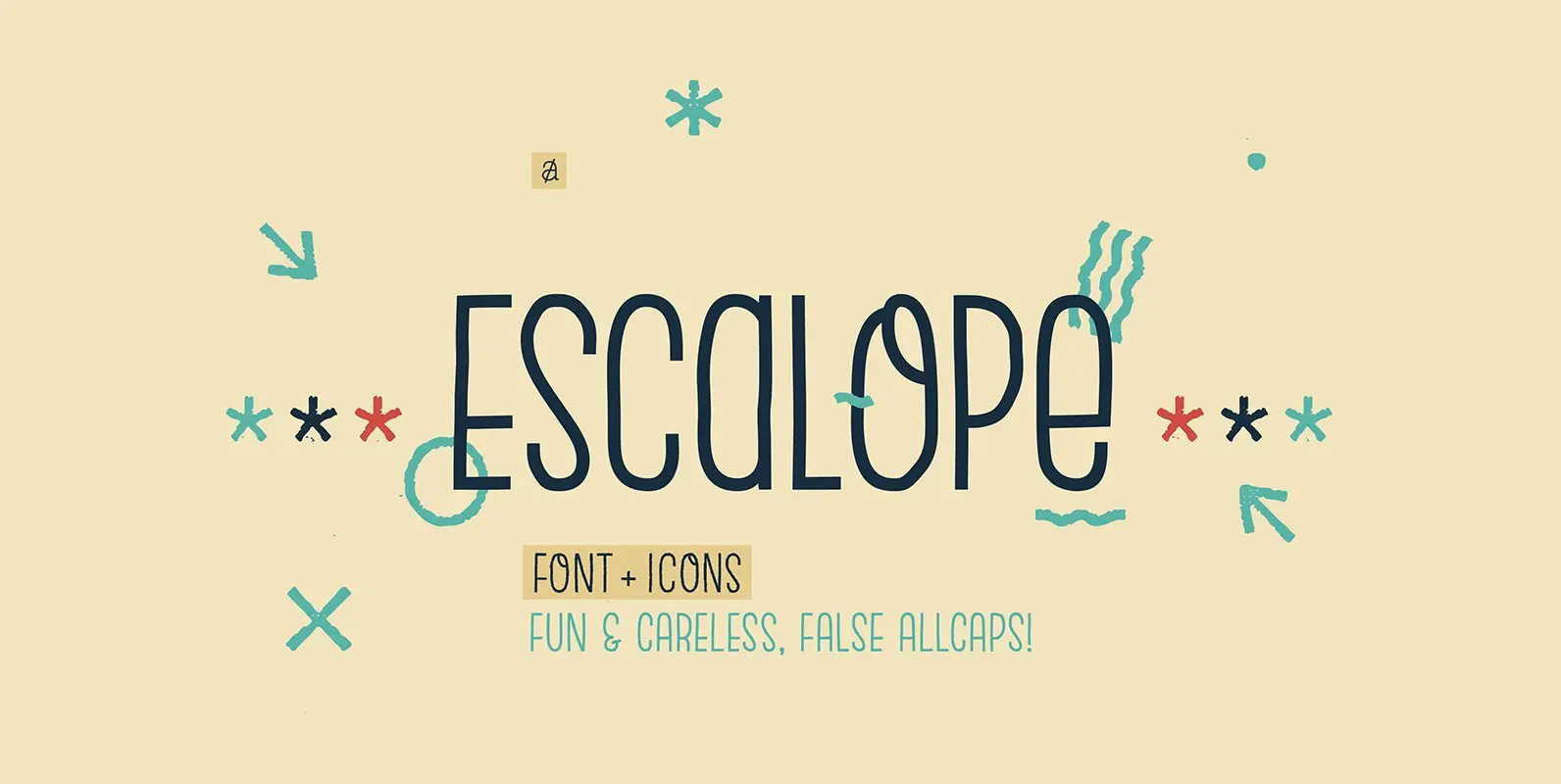
Escalope Font
Escalope is a hand-drawn layered font with a crazy & unique personality: the low midline, the false-All Caps style, all the fun & playful Stylistic Sets will give your projects a new and fresh look! There are many Open-Type features
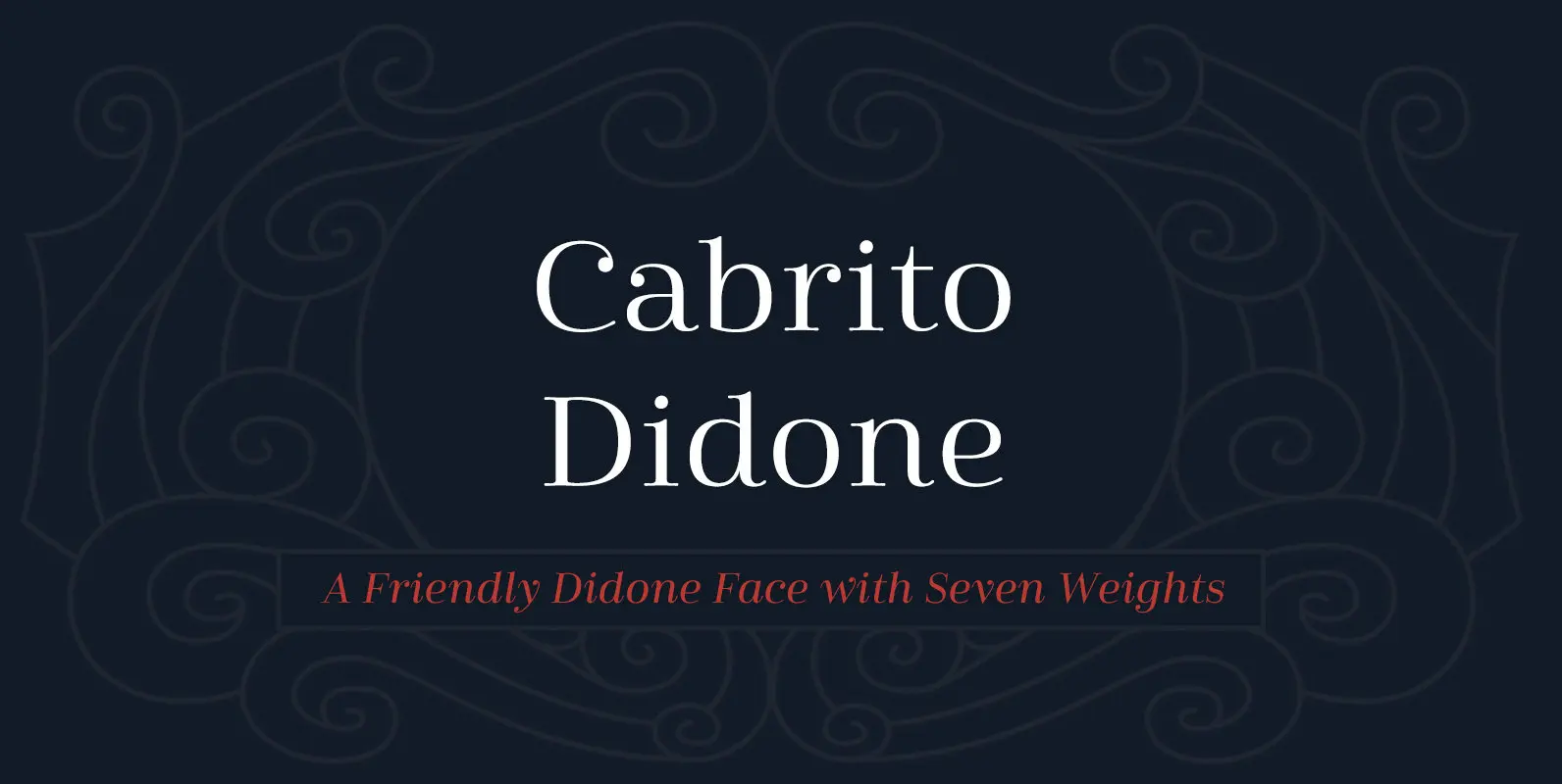
Cabrito Didone Font
A graceful kid if ever you’ve seen one, Cabrito Didone joins the Cabrito family of fonts–a family designed to provide young infants with clear recognition of letter forms. The original letters were released as part of the children’s book about
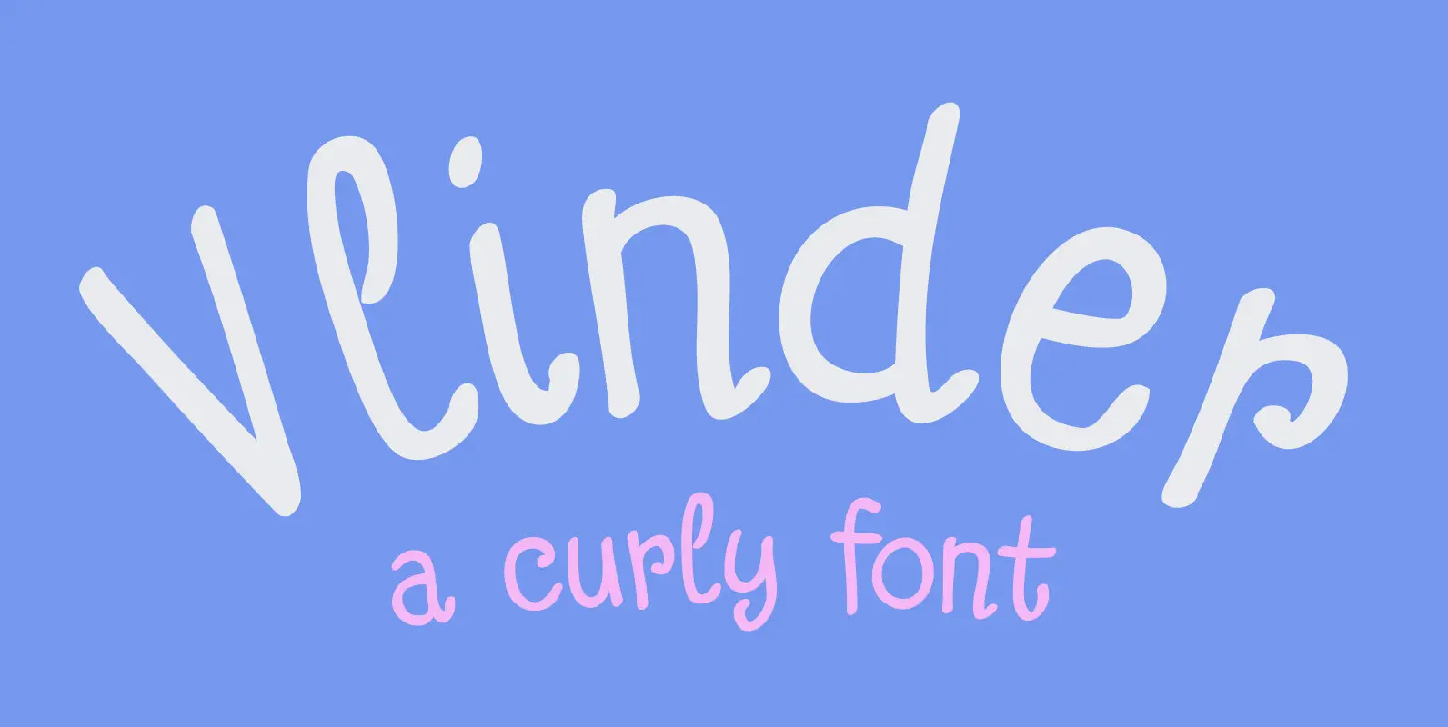
Vlinder Font
Vlinder means butterfly in Dutch. Vlinder font is a cute and curly typeface with fluttering glyphs and an overall happy feel to it. Use it for childrens books, posters and invites. Comes with flowery fields of diacritics. Published by HanodedDownload

Cabarno Font
Cabarno is a sans-serif organic typeface that can be use in any typographic situation. It has his own unique style in expressed perfect condensed forms with a warm and humane feeling. This font can function as headings, subheadings and body
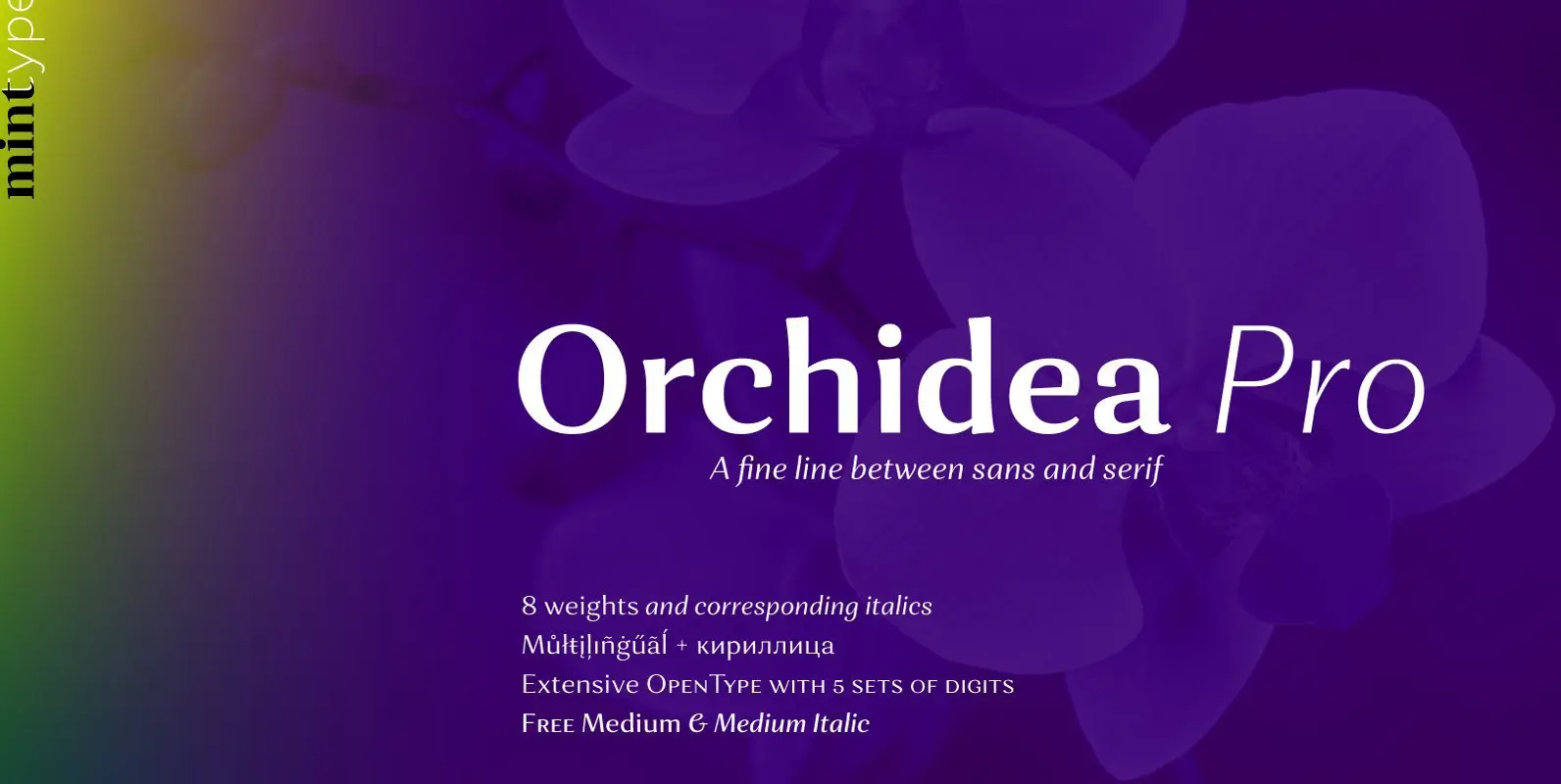
Orchidea Pro Font
Orchidea Pro is a typeface balancing on the verge of sans and serif. Called a stressed sans or a serifless serif, it does not feature any serifs, but resembles a serif typeface by build, and features unilateral nibs that speed
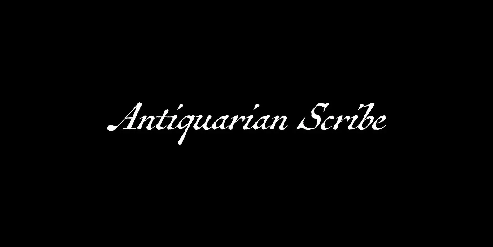
Antiquarian Scribe Font
Antiquarian Scribe is modeled after the neat, oblique hand-lettering displayed on an original page of “Atlas Historique, ou Nouvelle Introduction a L’Histoire”—a world atlas published by Henri Abraham Chatelain between 1705 and 1732 in Amsterdam—that I picked up at an
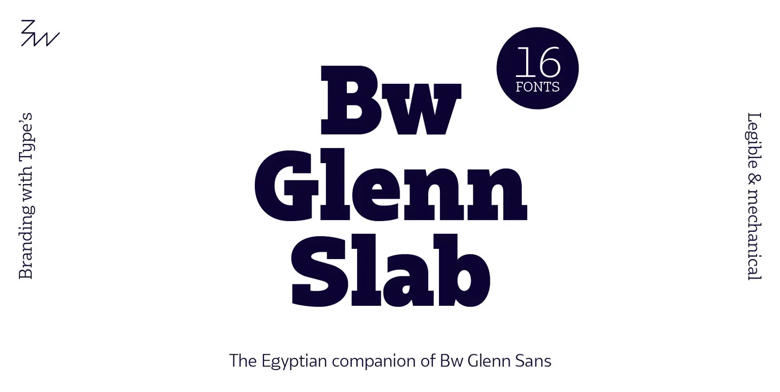
Bw Glenn Slab Font
Bw Glenn Slab is a confident and robust font family with a sturdy feel offering no concessions for ambiguity. Its strict geometry and open shapes provide a very legible and clean texture, performing well on print and screens alike. It’s
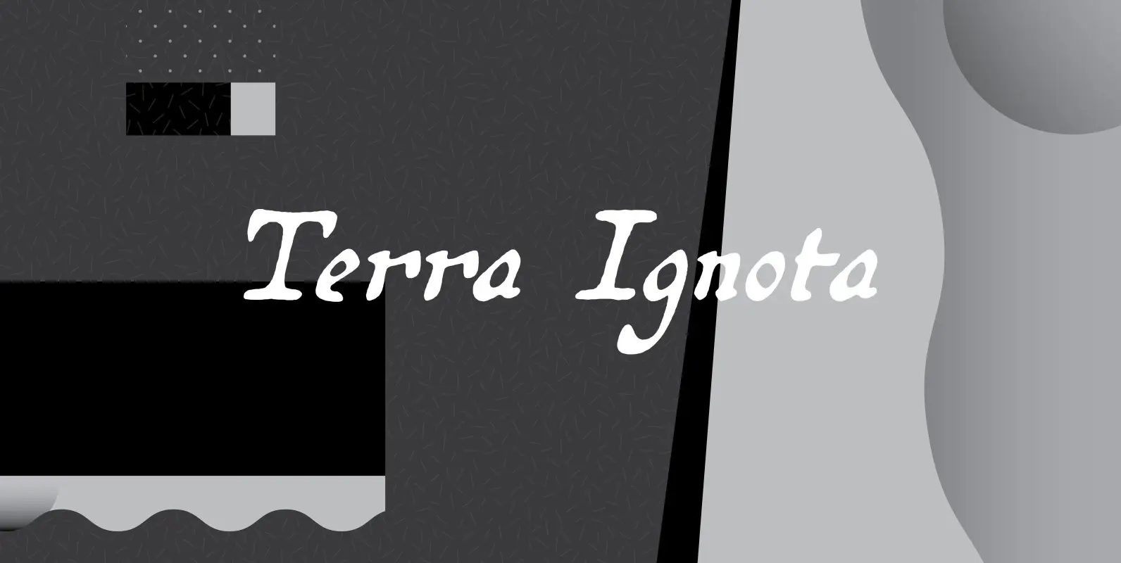
Terra Ignota Font
The idea for Terra Ignota came years before I actually designed it, as I was admiring a reproduction of “Amerique Septentrionale,” a 1650 map by French cartographer Nicolas Sanson, given me by my parents. The hand-lettering has a sort of
