Tag: text
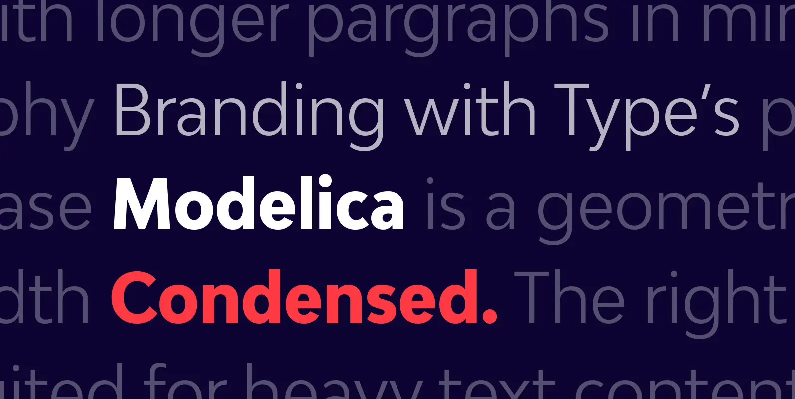
Bw Modelica Condensed Font
Designed by Alberto Romanos, Bw Modelica is a minimal, robust, reliable & pragmatic geometric sans. Its clean shapes and generous x-height makes it a very competent face for both, display and body copy purposes. It’s available in four widths, each
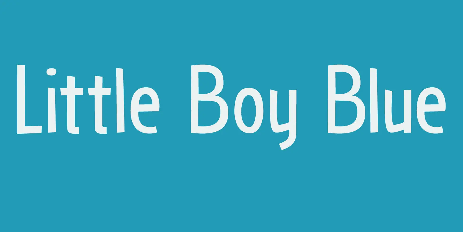
Little Boy Blue Font
I believe it was Picasso who had a Blue Period between 1901 and 1904. It seems that I have one myself – really not comparing myself to Picasso btw… Recently I created Blue Sheep font and now this one: Little
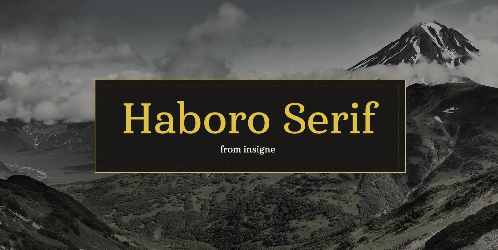
Haboro Serif Font
The polls are in. Now here by customer request–Haboro Serif, the newest edition of the Haboro Hyper family. The Haboro fonts are an outstanding upstart success from the first part of 2016. Following the release of the popular Haboro, Haboro

Contenu Font
This is the 4-font Contenu Medium/Black family Contenu is the new book font family designed for an upcoming book on book family design. The name is French for content and this is what the family is designed for: text, body
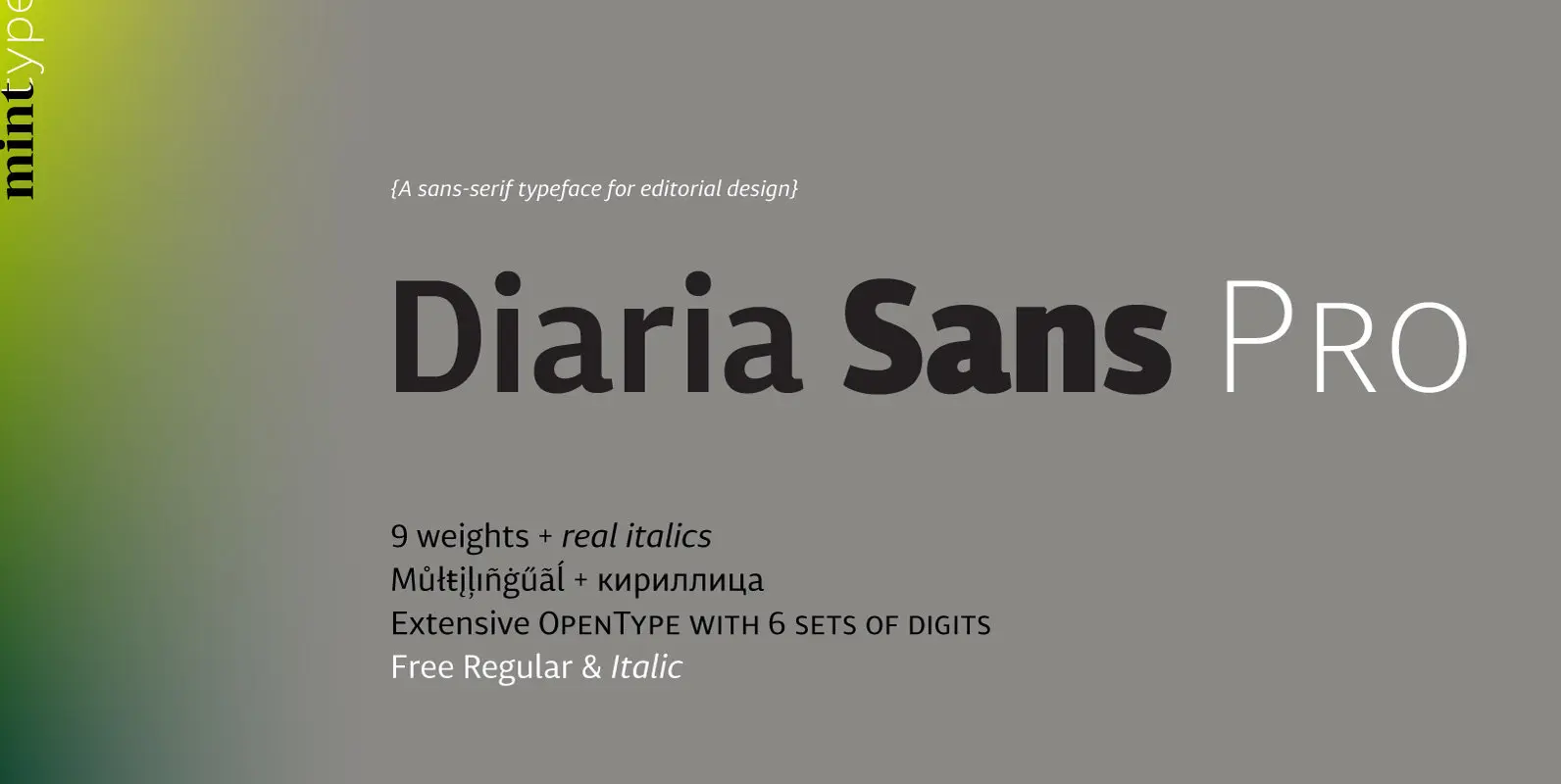
Diaria Sans Pro Font
Diaria Sans Pro is a sans-serif counterpart of Diaria Pro. With its extensive 9 weights and corresponding italics, extensive language support, and various OpenType features it is meant to build visual hierarchies of any detail and complexity in editorial design.
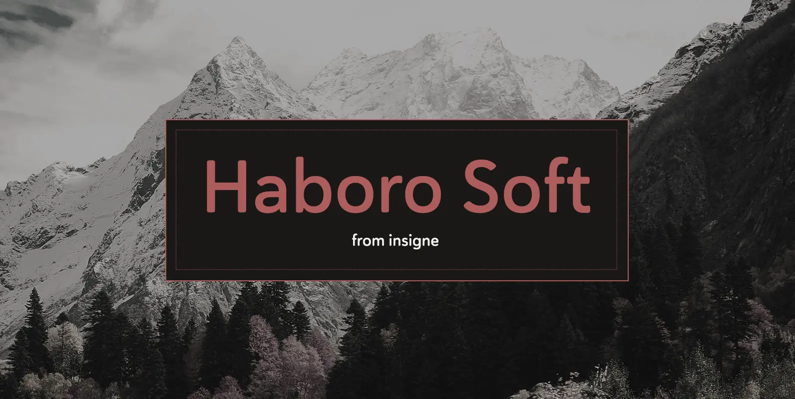
Haboro Soft Font
Stop trekking through the thick, wintery font forest, and step lightly into the fresh life of the Haboro hyper family. Though simple in nature, the Haboro hyper family provides you with a variety of options. Take, for instance, Haboro Soft,
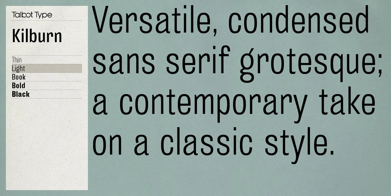
Kilburn Font
Kilburn is a no-nonsense, condensed Gothic sans-serif. For over a century the condensed sans-serif has been the ‘go to’ font for gravitas and authority. Kilburn continues in the fine tradition of fonts such as Franklin Gothic, News Gothic and Trade
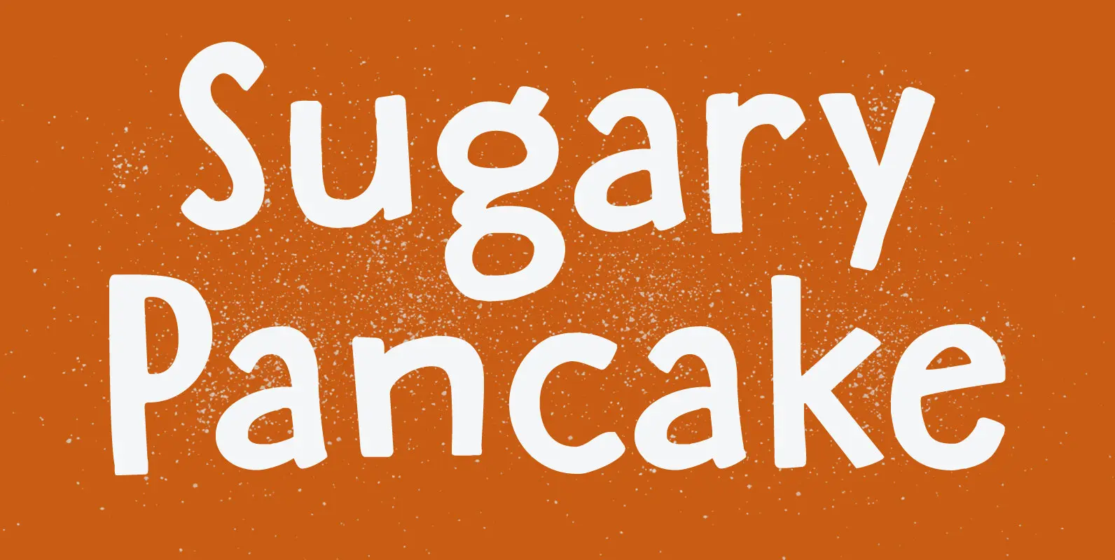
Sugary Pancake Font
enough as it is. This calorie-rich font is ideal for Children’s Books and posters: it is fun, bouncy, very legible and full of character. Comes with a topping of diacritics and a stack of happiness. Published by HanodedDownload Sugary Pancake

Contenu Book Font
These are the five fonts of Contenu Book. Contenu is the new book font family designed for an upcoming book on book family design. The name is French for content and this is what the family is designed for: text,
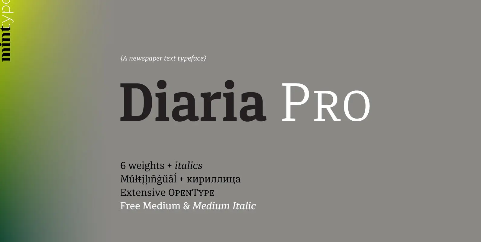
Diaria Pro Font
Diaria started as a project in Typeface Architecture for Master in Advanced Typograghy at EINA, Centre Universitari de Disseny i Art de Barcelona, a course tutored by Laura Meseguer and Íñigo Jerez Quintana. Later it has developed into Diaria Pro,

Brinar Font
I’ve been working on a usable sans serif for body copy since the mid-1990s (though I certainly did not know it at the time). This one works well. It started life back in the mists of time as an old
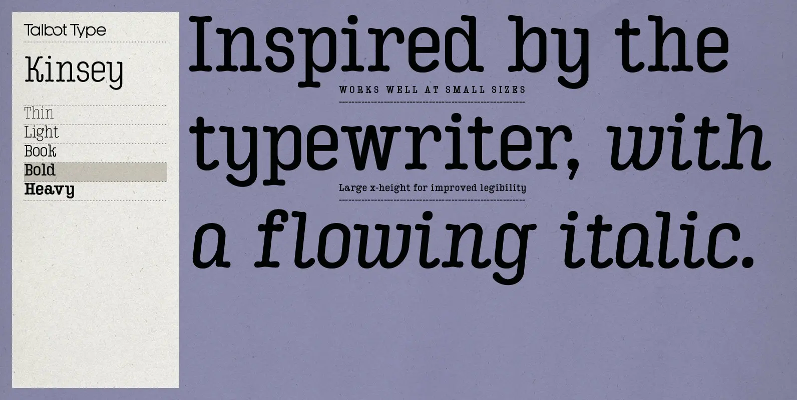
Kinsey Font
Kinsey is inspired by traditional typewriter font styles. Although now largely consigned to history, the bulbous slab serifs and soft curves of typewriter fonts have left a lasting legacy; they’re paradoxically easy on the eye, yet utilitarian and business-like. Kinsey
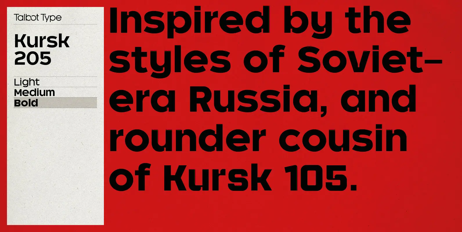
Kursk 205 Font
A text and display font with square proportions, inspired by the type styles of soviet-era Russia. Very shallow ascenders and descenders and a large relative x-height, exaggerate the compact and geometric look. Related to Kursk 105, its squarer-edged cousin. Published
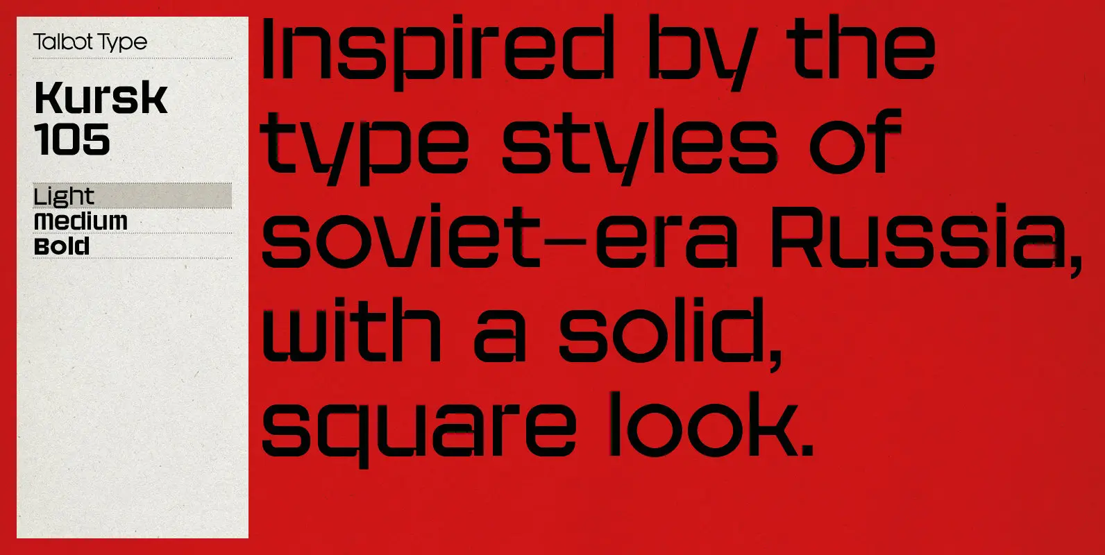
Kursk 105 Font
A text and display font with square proportions, inspired by the type styles of soviet-era Russia. Very shallow ascenders and descenders and a large relative x-height, exaggerate the square look. Related to Kursk 205, its slightly rounder cousin. Published by
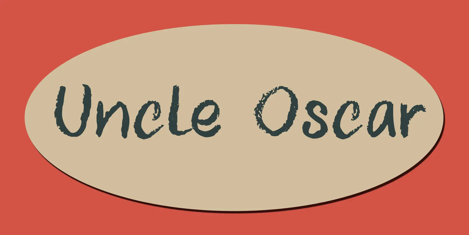
Uncle Oscar Font
I don’t have an Uncle Oscar, so the font is not named after someone I know. The name just kind of stuck. Uncle Oscar is a pencil font, made with a black ‘Lamy’ pencil I took from my son Sam’s
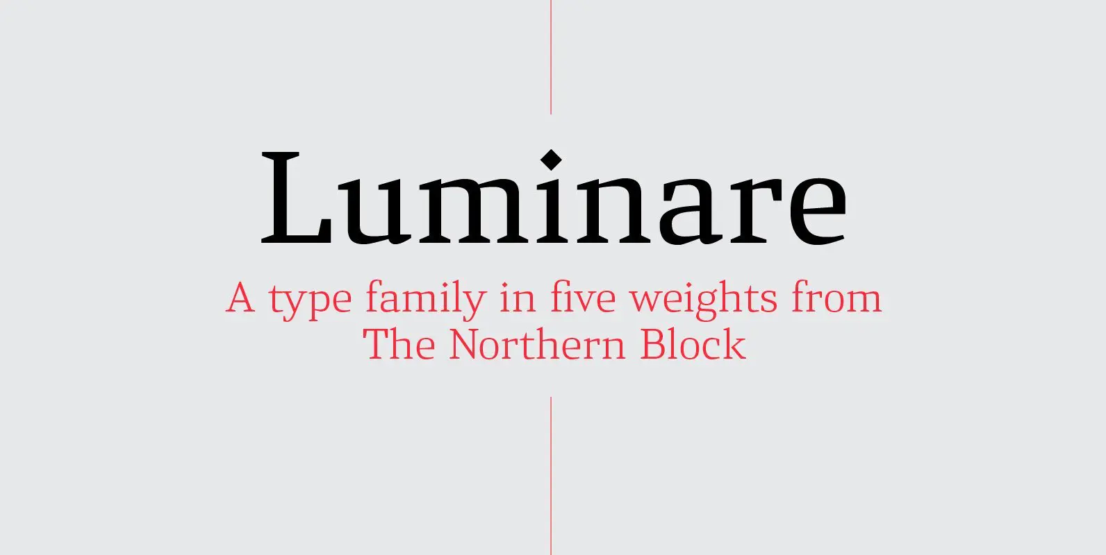
Luminare Font
Luminare is a serif type family with a strong rhythmical structure, clean cut serifs and balanced proportions. Luminare began life as a personal and academic enquiry into stencilled lettering. The key sources of this research where found in liturgical manuscripts
