Tag: text
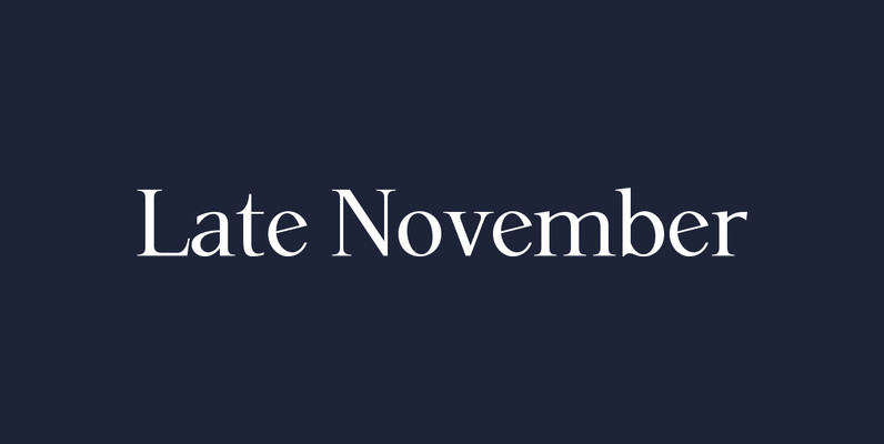
P22 Late November Font
P22 Late November is a new font family from Norwegian type designer Torliev Sverdrup. The font is a transitional Antiqua-inspired type design great for text and display uses Late November is a transitional Antiqua-inspired type design. Says Torliev: “I started
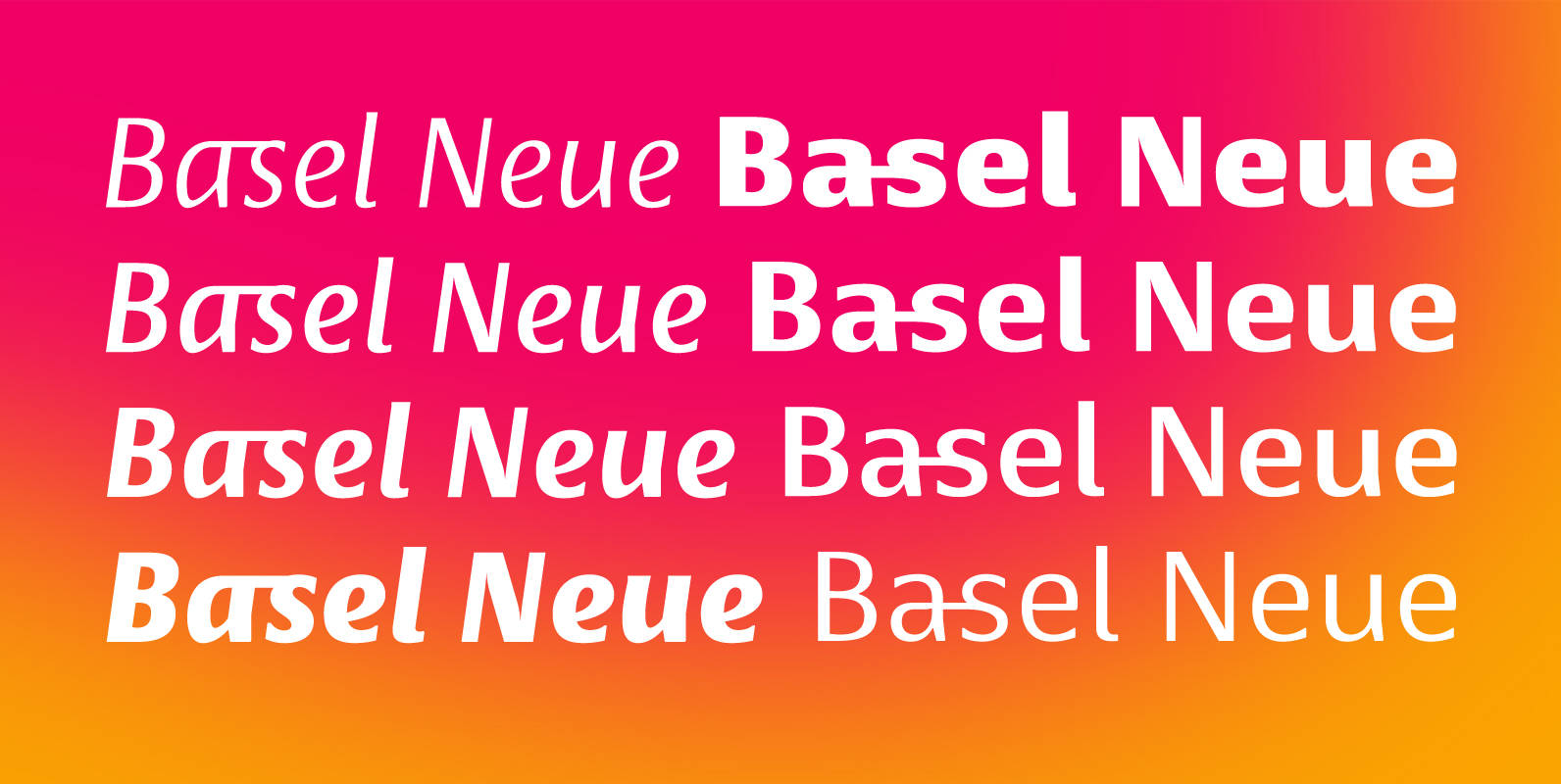
Basel Neue Font
Basel Neue is a legible and discrete typeface, a sans serif with thickness variation and humanistic touch. The family consists of 8 styles, 4 weights plus their respective italic versions. Download the “OT Features” pdf to know and take advantage
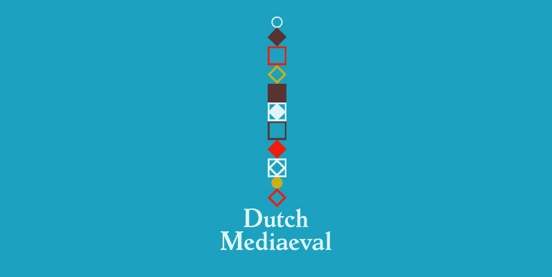
Dutch Mediaeval Font
Dutch Mediaeval is a text family based on Hollandse Mediaeval, the 1912 Sjoerd Hendrik deRoos classic, arguably the most popular Dutch text face of the 20th century. Over the years, many typographers and pressmen have gushed loving words about this
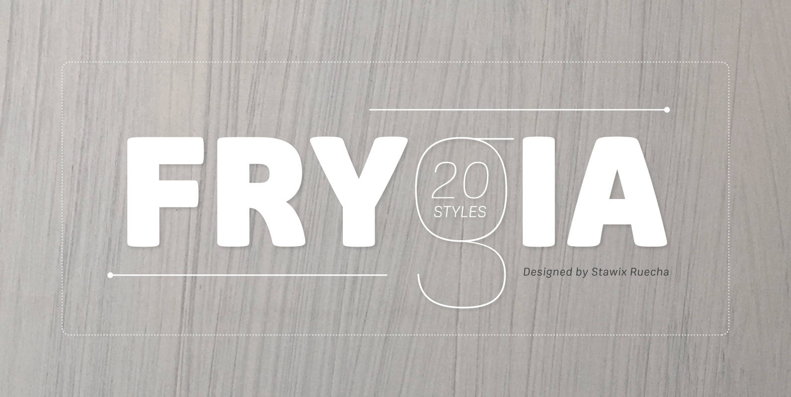
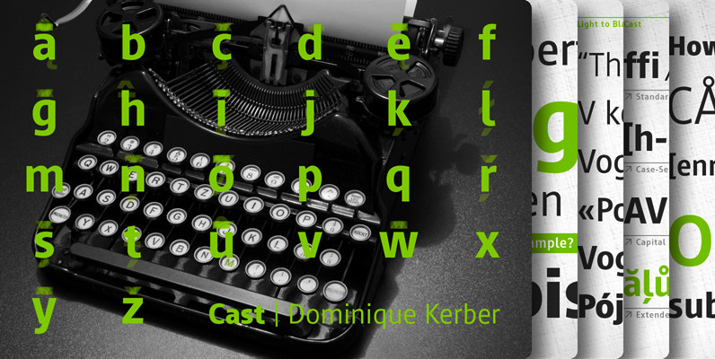
Frygia Font
Frygia is inspired by the astonishing mythology along with a new method and approach of type design. As an example, the construction of the lowercase g; the line structure which is slightly curved helps to aid the optical illusion and
P22 The Stickley Optical Family Font
The P22 Stickley Optical Family is an expansion of P22 Stickley Text, a humanist, Oldstyle-rooted design with a contemporary execution and full OpenType abilities. P22 Stickley Optical Family contains ten distinct cuts across four optical masters—in addition to Text for
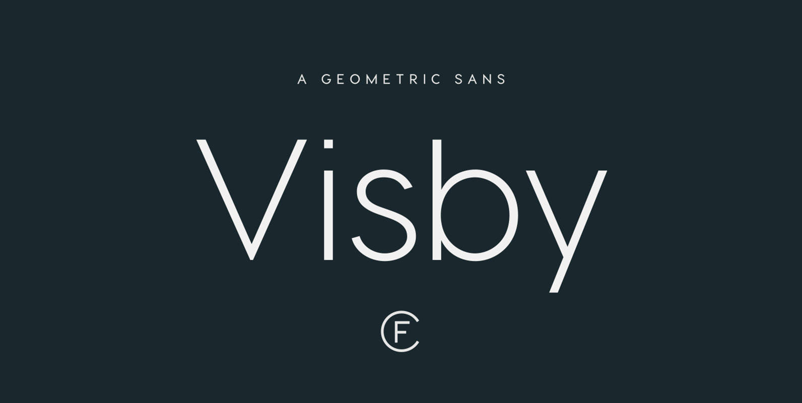
Visby CF Font
Friendly and charismatic in lowercase; sophisticated and authoritative in uppercase. Visby is a geometric font family inspired by the stark beauty and crisp air of the Arctic North. Hard lines and sharp corners mesh with smooth, rounded forms, while subtle
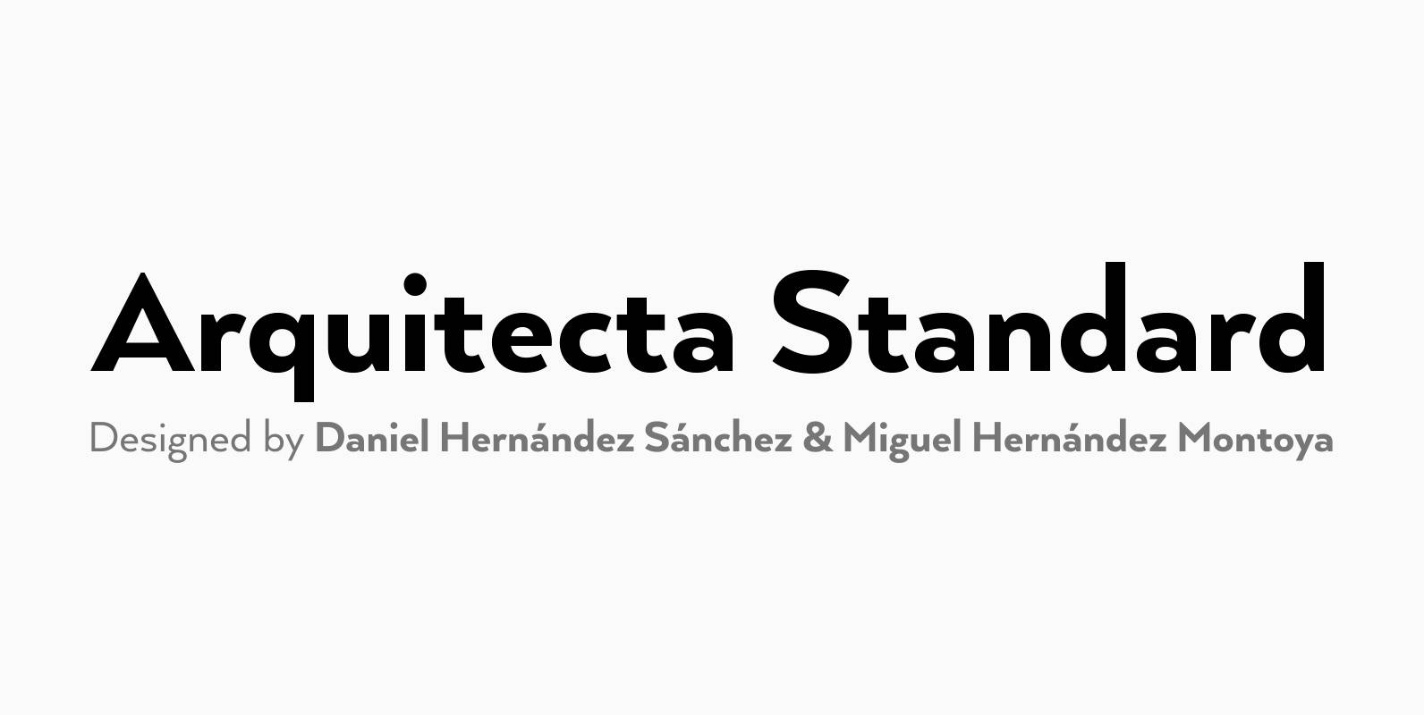
Arquitecta Standard Font
Arquitecta Standard. The humanist typography as a rational project. Since the experimentation from the Bauhaus through modern sans history we looked for a new mix to construct a rational geometric typeface with humanist proportions suitable for text layout and continuous
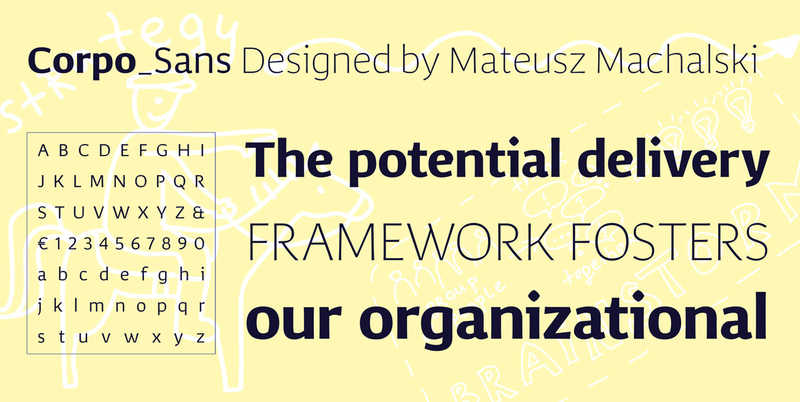
Corpo Sans Font
Corpo Sans is a refreshed version of my old font Korpo_Sans. Corpo_sans, designed by Mateusz Machalski, is a sans type family with a friendly feel. This type comprises 12 variants with 6 weights.The high contrast and high x height is
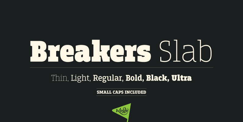
Breakers Slab Font
Breakers Slab is a companion to sans serif Breakers. It’s a versatile typeface that is strong in headlines and legible in text, with a range of distinct weights from delicate thin to chunky ultra. With small caps included and over
Seconda Soft Font
Seconda Soft is the soft companion of Seconda. A little friendlier, a little easier on the eye, a little more informal, a little more fashionable — but still the refined and reliable Seconda. Seconda Soft’s softness comes from the moderate

Pekora Font
To design a font Pekora I was inspired by a You And Me Monthly published by National Magazines Publisher RSW Prasa that appeared from Mai 1960 till December 1973 in Poland. Published by Typoforge StudioDownload Pekora
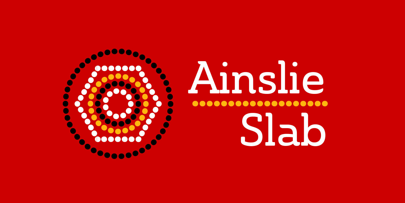
Ainslie Slab Font
Based on the inspiration from Mt. Ainslie and the Ainslie suburb outside Canberra, the original Ainslie adds [these characteristics] to the project. And now the muses of Ainslie are back at work, lending their structure as the foundation of Ainslie
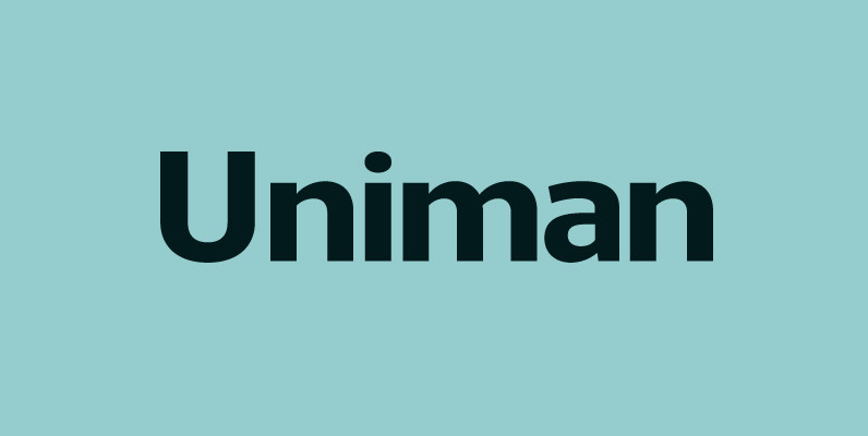
Uniman Font
A clear and simple sans serif typeface. Straight lines are combined with precision curves to form a functional and versatile font best suited for a wide range of applications. Developed to meet the needs of the professional user, details include
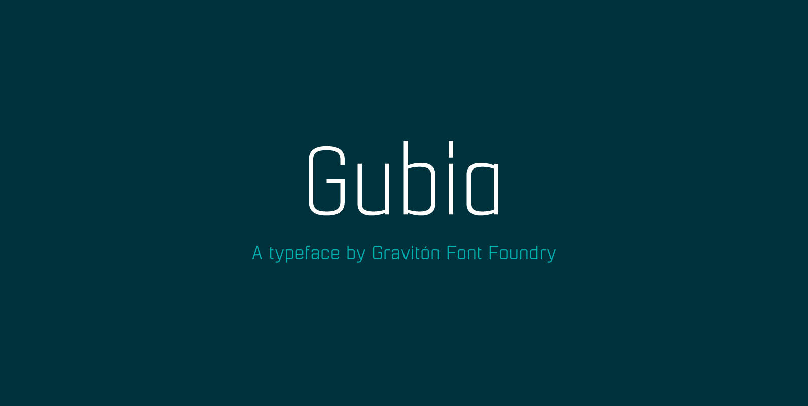
Gubia Font
Gubia font family has been designed for Graviton Font Foundry by Pablo Balcells. It is a geometric, sans serif typeface with a slightly condensed design. It has been conceived to be most suitable for all sized headlines, as well as
YWFT Motown Font
YWFT Motown is a geometric slab serif that contains a total of 5 weights. Although it was intended to be used as a display face, YWFT Motown’s heavier weights can be used effectively for text as well. The angled crossbars
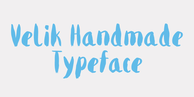
Velik Font
Velik is a hand drawn typeface, originally painted in ink and translated into a digital format for you to work and play with. My font journey so far was about embracing love for rational geometry but there is another child
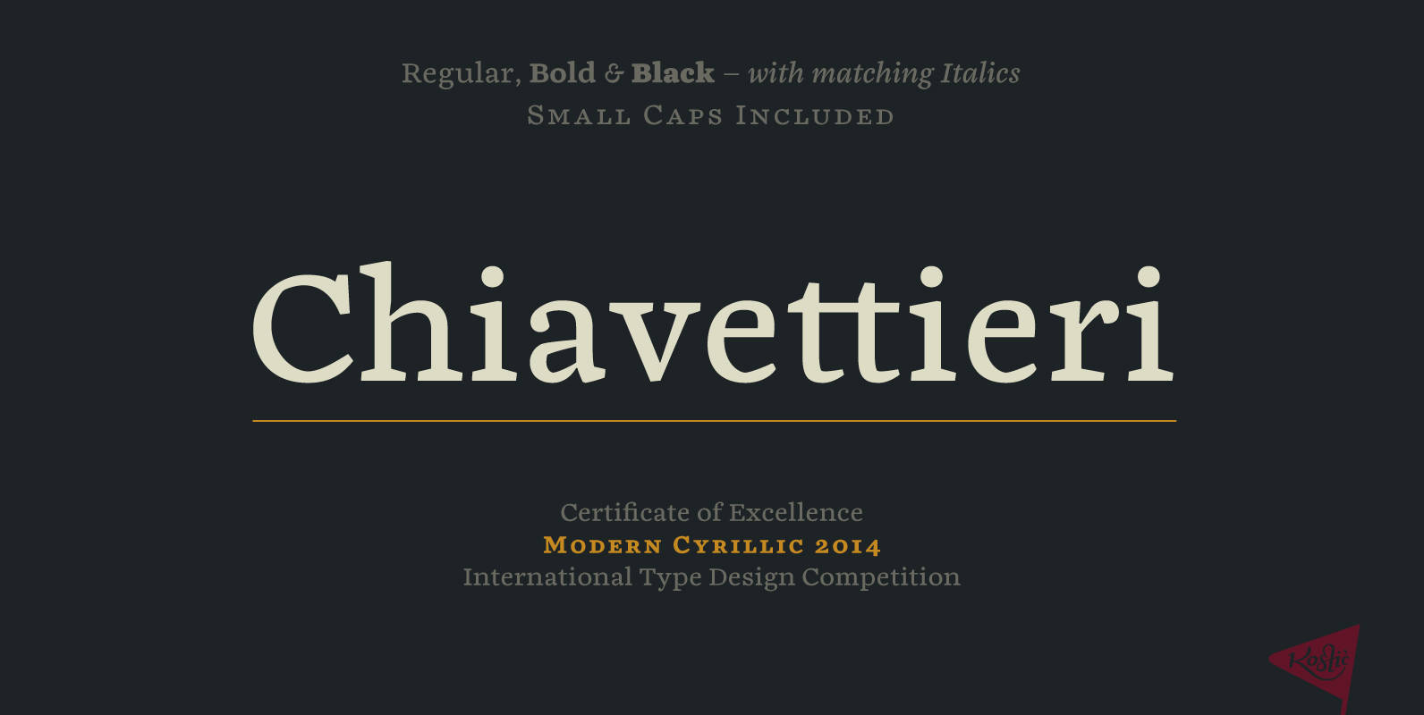
Chiavettieri Font
Chiavettieri draws inspiration from Humanist types, marked by low contrast between thick and thin strokes and the angle of stress in the bowls of letters. On the other hand, generous x-height, clean angled serifs and sharp cuts in the ball