Tag: text
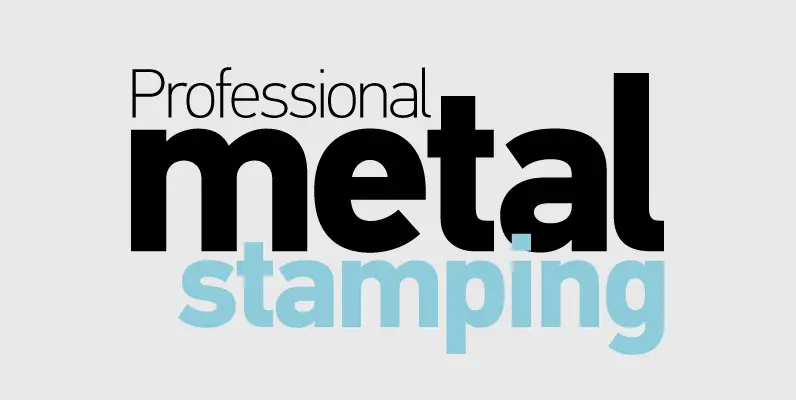
PF DIN Text Pro Font
In 1936 the German Standards committee Deutsches Institut Normung (DIN) proposed DIN 1451 as the standard type of lettering to be used in the field of road traffic. The purpose of this standard was to lay down a style of

Delargo DT Condensed Font
Delargo DT Condensed is a sans-serif font design, published by DTP Types Limited. Published by DTP Types LimitedDownload Delargo DT Condensed
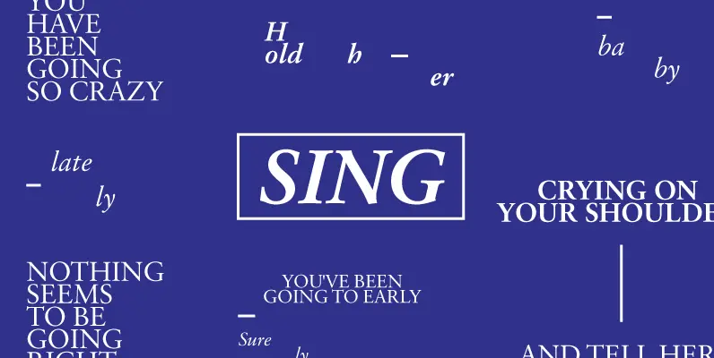
Garamond 96 DT Pro Font
Garamond 96 DT Pro is a sans-serif font design, published by DTP Types Limited. Published by DTP Types LimitedDownload Garamond 96 DT Pro

New Bodoni DT Font
New Bodoni DTP is a serif font design, published by DTP Types Limited. Published by DTP Types LimitedDownload New Bodoni DT
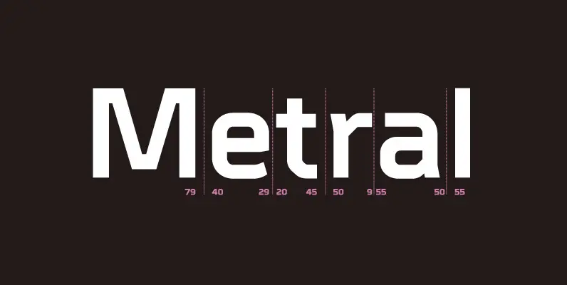
Metral Font
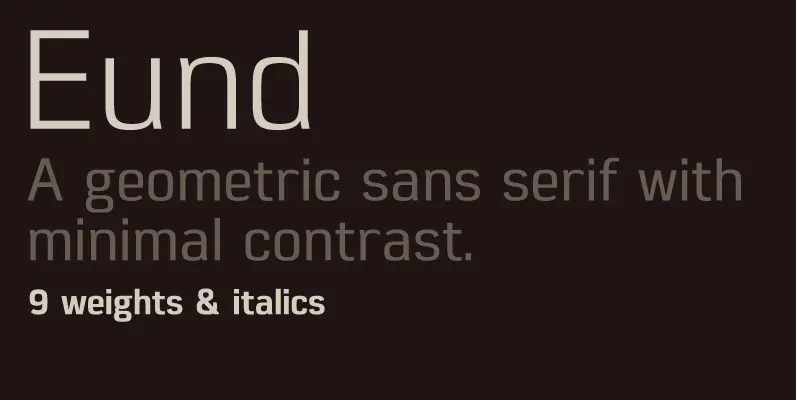
A geometric sans serif with a precise fabricated appearance. Smooth corners are mixed with subtle angles to form a strong, legible typeface ideally suited for a wide range of applications. Details include 6 weights with italics, an extended European character

Shearman STD Font
Shearman STD has a simple design, based on industrial fonts, in particular at the typewriters fonts. It’s a geometric font with curves elimination, noting in particular the O and Q letters. It has smooth angles and clean forms which combine
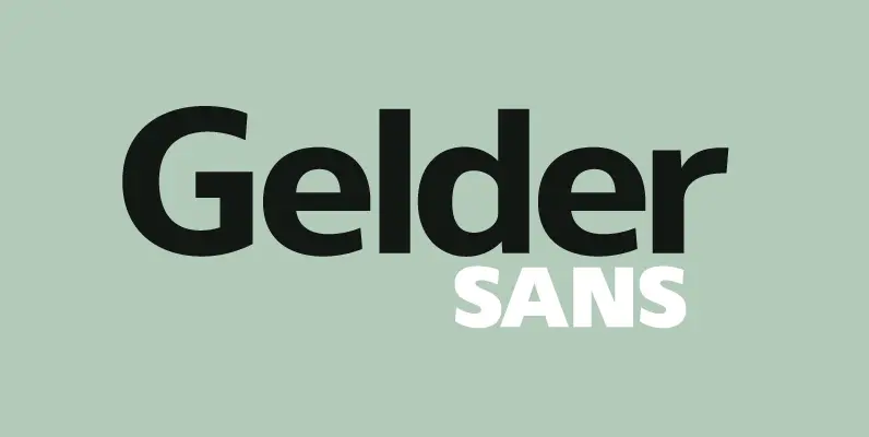
Gelder Sans Font
A clean modern sans serif typeface. The balanced proportions of each character demonstrate great legibility at both small and large scale. The distinctively open apertures further improves visibility when used across the web and hand held devices. Details include 9

Taste Font
Taste, with seven weights, is versatile enough for use in headlines and text. Works out to be quite the workhorse for publication and content design studios. Published by Suomi Type FoundryDownload Taste
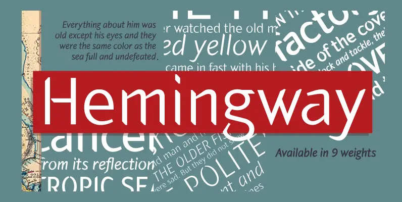
Hemingway Pro Font
Hemingway the latest typeface from Alessandro Segalini was inspired by the prize winning novel The Old Man and the Sea by Ernest Miller Hemingway. Segalini designed his typeface to carry the meaning of sharpness and harshness, and at the same
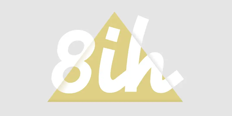
Energia Pro Font
Energia Pro is yet another new, charming and whimsical profonts script typeface designed by Ralph M. Unger. Its design is based on Arno Drescher’s Energos from 1932, but Unger completely redesigned the typeface, extended and completed the character set and

Publio Font
Publio is small unusual and unique font family, characterized with sharp, triangular semi-serifs. Published by Tour de Force Font FoundryDownload Publio
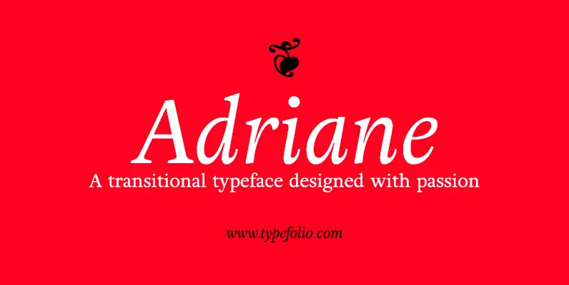
Adriane Text Font
Adriane Text was designed between 2006 and 2007 with additional production completed by Silas Dilworth for this 2008 release [v1.002]. Focusing on text composition and unique typographic characteristics, details within the characters provide both personality and excellent legibility at small
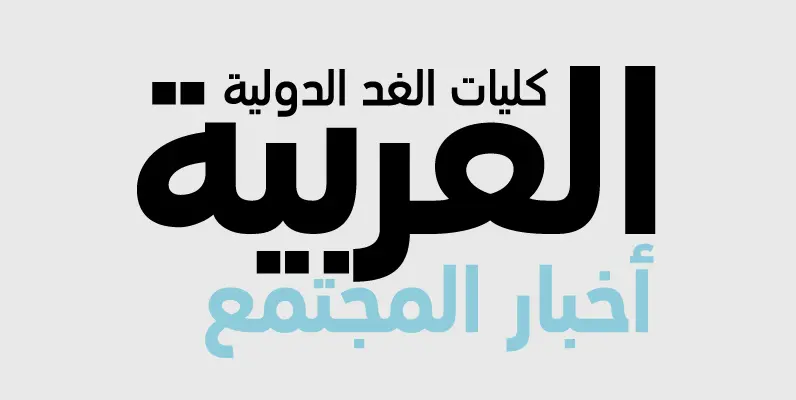
PF DIN Text Arabic Font
The Arabic version of DIN Text Pro is one of Parachute’s most ambitious text typefaces. This is the first ever contemporary arabic equivalent to the comprehensive DIN series of fonts designed. Completed and released in 2010, this set of fonts

Fuller Sans DT Condensed Font
Fuller Sans DT Condensed is a sans-serif font design, published by DTP Types Limited. Published by DTP Types LimitedDownload Fuller Sans DT Condensed
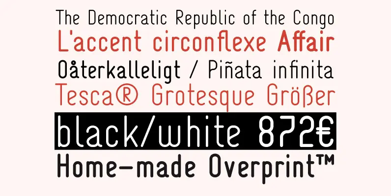
Tesca Grotesque Font
Tesca is a condensed modern grotesque typeface. Tesca is great for uses such as headlines or text body. Features Latin and non-latin glyphs. Published by TomoDownload Tesca Grotesque
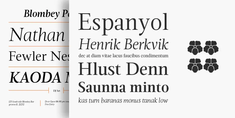
Magneta Font
To describe what inspired Magneta would be to add a little Dwiggins, throw in some Benton with a hint of Austin, wrap it up in a crisp, contemporary package and serve. The skeleton of the family is a Garalde (like
