Tag: thick
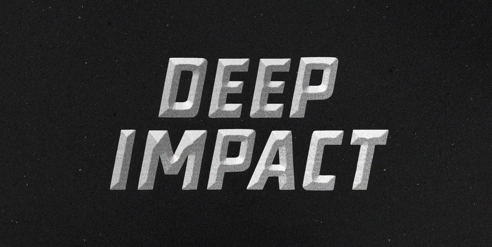
Deep Impact Font
After calibrating your diesel hammer, to optimize its performance , increase its piston’s ascent. Increase the speed of its descent. Break bedrock. Achieve Deep Impact. Published by BLKBKDownload Deep Impact
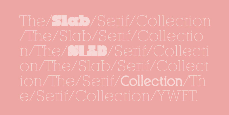
Slab Serif Collection 01 Font
Slab serifs have always been popular on our site, so it was only a matter of time till we got a collection like this online. Filled with five different slab serif designs, this is surely going to offer numerous options
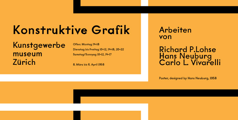
YWFT Mullino Font
Slightly distressed but possessing of serious underlying power, YWFT Mullino can be used as a display typeface or as a text face. This font brings huge diversity, beginning with the fact that there are two styles (Book and Medium) and
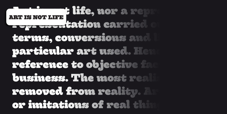
Hernandez Bold Font
Hernandez bold is a ‘slab serif display’ font. It has a unique feature, it gives the possibility of composing words in different rhythms. It has a big number of alternates, which allows the user various combinations within a text. It’s
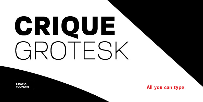
Crique Grotesk Font
The Crique Grotesk This contemporary typeface is inspired from Neo-humanist and Geomatric industrial tone presented the late 2000s typeface. The font family is also composed of the normal width and display width in order to support the different applications on the delicate

Dynatomic Font
A vigorous typeface suited for bold designs. Dynatomic is inspired by an amazing hand-drawn lettering of a 1964 polish movie poster designed by Andrzej Krajewski. Although it’s an uppercase alphabet, this font uses lowercases as variations, providing flexibility to your
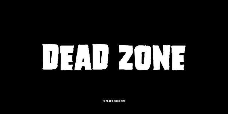
Dead Zone Font
This family was inspired from type found on a horror movie poster of the 1950s. FULL CHARACTER SET Each font in the Dead Zone™ family has a full character set of 232+ letterforms, with all characters designed in the style
Gaslon Font
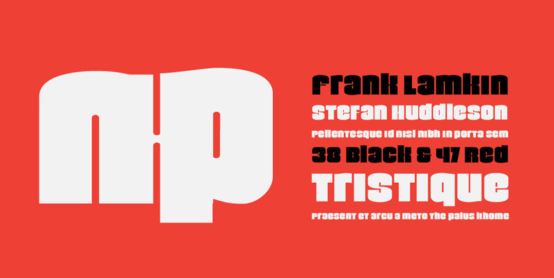
Gaslon is a slight reinterpretation and major expansion of a 1973 film type called Corvina Black, originally designed for VGC by A. Bihari. While the original typeface was popular in its own right, there were some things in it that
Verb Complete Series Font
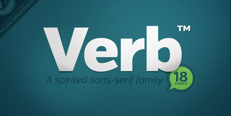
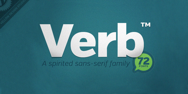
Verb from Yellow Design Studio is a 72-font sans-serif superfamily that’s confident, friendly and energetic. At text sizes it’s highly legible, while at larger sizes it reveals lively shapes and personality. It has four subfamilies including Regular, Condensed, Extra Condensed,
Britannic Font
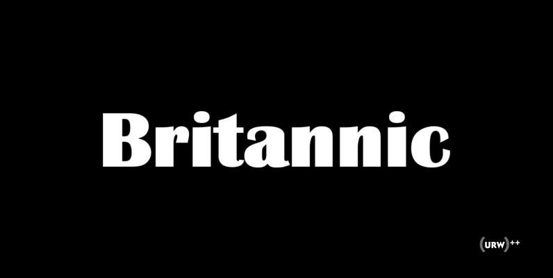
Britannic is a retro and decorative sans originally designed by Stephenson Blake. The complete family contains 6 unique and very interesting type designs. Published by URW Type Foundry GmbHDownload Britannic
Kardia Font
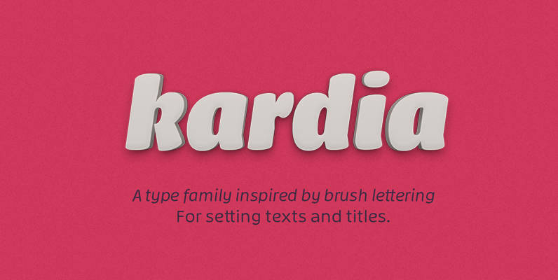
Kardia is a versatile type family that lets you compose a wide range of texts, from extensive reading materials to striking and eye-catching headlines and titles. Features include ample proportions that have been revised to maintain similar line performance across
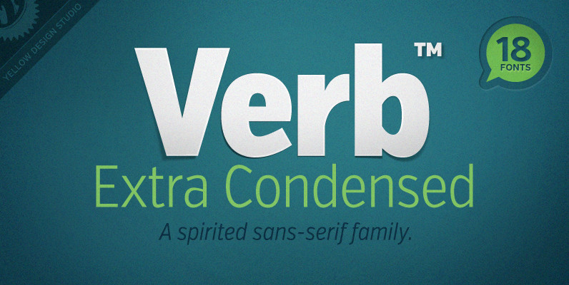
Verb Extra Condensed Font
Like the original Verb family, Verb Extra Condensed from Yellow Design Studio is confident, friendly and energetic, but has been carefully re-drawn with space saving proportions. At text sizes it’s legible and economic, while at larger sizes it reveals lively
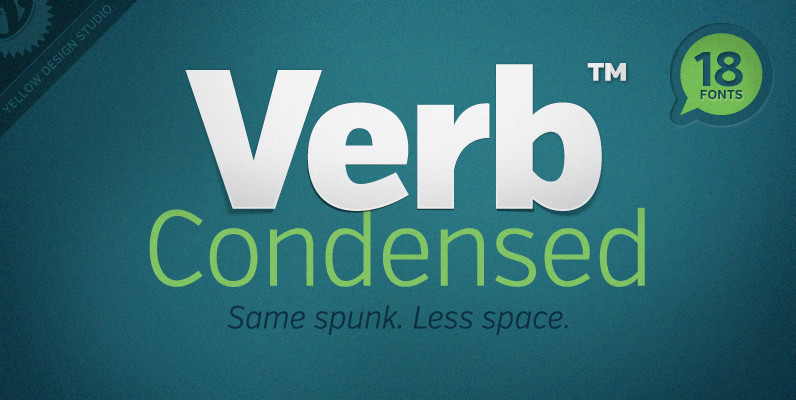
Verb Condensed Font
Verb Condensed from Yellow Design Studio is a modestly condensed version of the original Verb family, taking on more classic sans-serif proportions. It shares the same confidence, energy, and friendliness. At smaller sizes Verb Condensed is open and legible, and
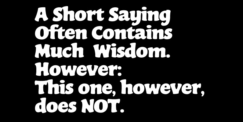
Gator Font
To borrow the title of a classic rock album, Gator is meaty, beaty, big and bouncy. It is one of the finest examples of how expressively animated a thick brush can be, and one of the better substitutes to the
