Tag: times

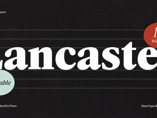
YWFT Lancaster Font

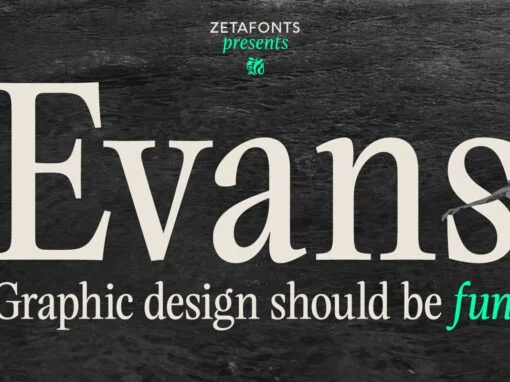
Typography is the latticework of design, forming a grid that guides the eyes, steers the understanding, and appeals subtly to the aesthetic instincts. The craft of a capable graphic or digital designer extends to their choice of font, much like
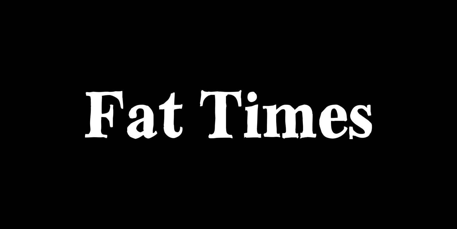
Fat Times Font

“FatTimes” is an extension to my HardTimes family. Times are too hard for boring typefaces, so try the fat one one for a change. Published by Wiescher DesignDownload Fat Times

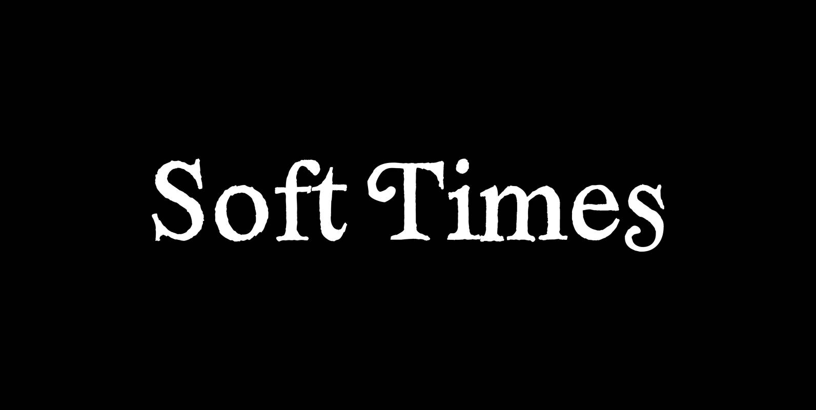
Soft Times Font

“Soft Times” has been easy on my nerves after the strain of “Hard Times”. The harder the Times are the more do we need some soft typefaces, this one is the soft counterpart for “HardTimes”. Published by Wiescher DesignDownload Soft

Hard Times Font

“Hard Times” has been hard work, designing a handmade typeface must always have the right balance between rough and smooth, specially with this Times-like face. It has the big European glyph-set, so that it can be used all over the