Tag: titling
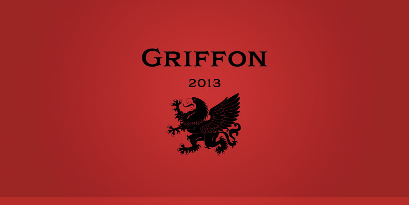
Griffon Font
Griffon, titling face with influence from classic letterforms, inspired by retro faces in the early 20th century. This font family was all redesigned from scratch and now released ranging in 5 weights with small caps from Light to Bold. The
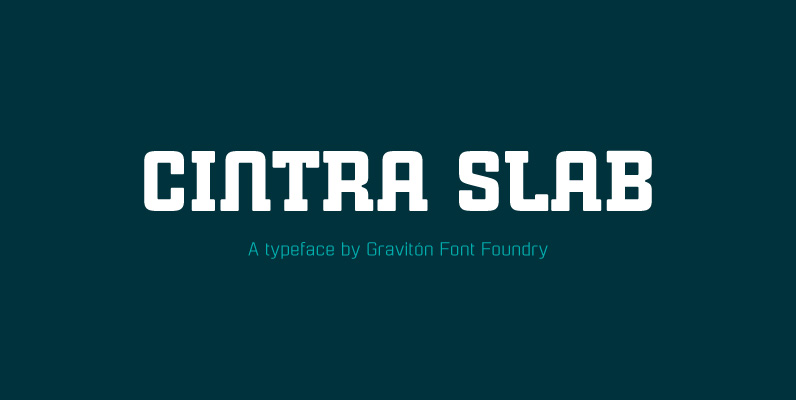
Cintra Slab Font
Cintra Slab font family has been designed for Graviton Font Foundry by Pablo Balcells in 2014. It is a slab serif, bold, geometric typeface with subtle rounded angles, which provides a soft, pleasent appearence. Cintra Slab consists of 4 styles.

Toasted Vein Font
Toasted Vein is a tight deco all caps typestyle complete with regular, bold, a collegiate inline, and a drop shadow style, offering more range than a traditional art deco font. Perfect for logos, titling, and headlines. Published by Breaking The
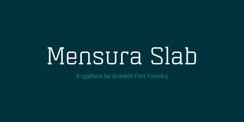
Mensura Slab Font
Mensura Slab font family has been designed for Graviton Font Foundry by Pablo Balcells in 2013. It is a modular, geometric typeface with subtle rounded angles that provides a soft, pleasant appearance. It has been conceived to be primarily a
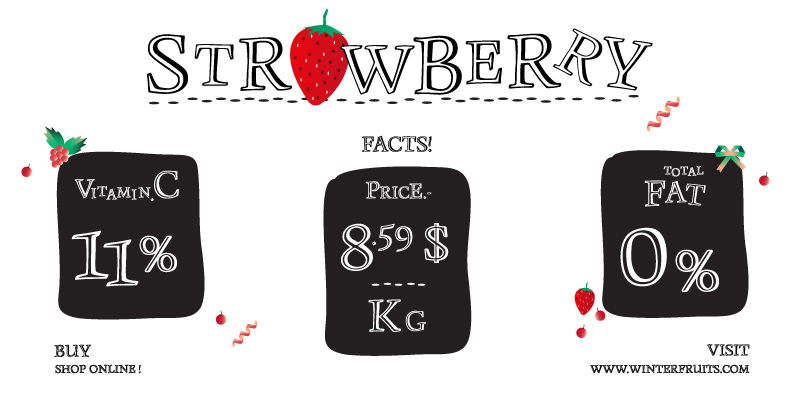
Monument Font
Monument is a titling version of Manuskript Antiqua, originally designed by Oldrich Menhart in 1952. Ralph M. Unger, who also redesigned Menhart’s Manuskript Antiqua, redrew, completed and digitally remastered Monument for profonts. Monument is also available as part of URW’s
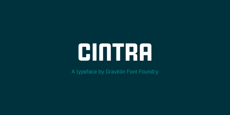
Cintra Font
Cintra font family has been designed for Graviton Font Foundry by Pablo Balcells in 2014. It is a sans serif, bold, geometric typeface with subtle rounded angles, which provides a soft, pleasent appearence. Cintra consists of 4 styles. Published by

Bartender Font
Small family called Bartender, for the lovers of retro style typefaces. Ideal for product names, packages, labels, old fashioned coffee shops, bars and everything with specific characteristics of past times. Published by Tour de Force Font FoundryDownload Bartender
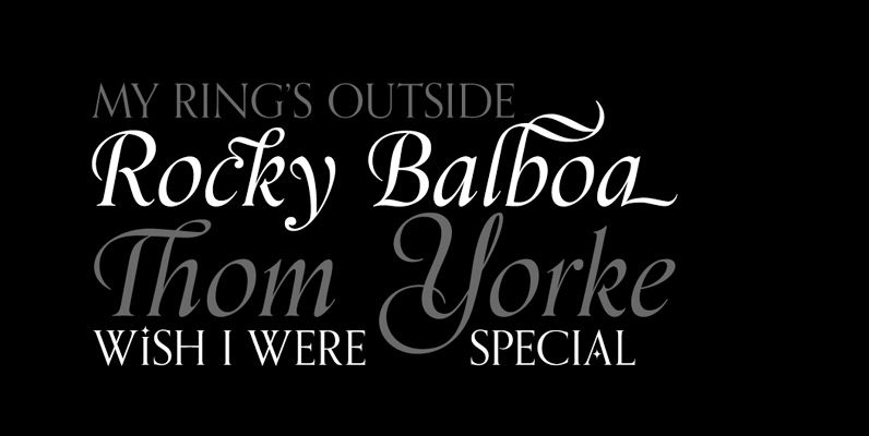
Orpheus Pro Font
The original Orpheus design by Walter Tiemann (1926-1928, Klingspor) was certainly a masterpiece. Unfortunately, like so many typefaces of that between-wars era, it got overlooked when type technology changed over to film, and once again when digital type came around.
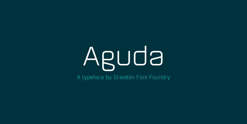
Aguda Font
Aguda font family has been designed for Graviton Font Foundry by Pablo Balcells in 2014. It is a modular, geometric typeface which has been conceived to be primarily a display typeface, but given its clarity it can also be used
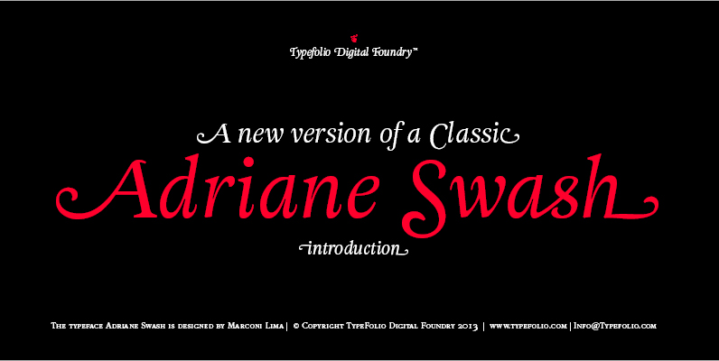
Adriane Swash Font
The Swash version of Adriane Text features of the best characteristics of this lineage without losing the strong personality and elegant design featured in your text styles. Adriane Swash brings a fancy look to this classic style. The family comes
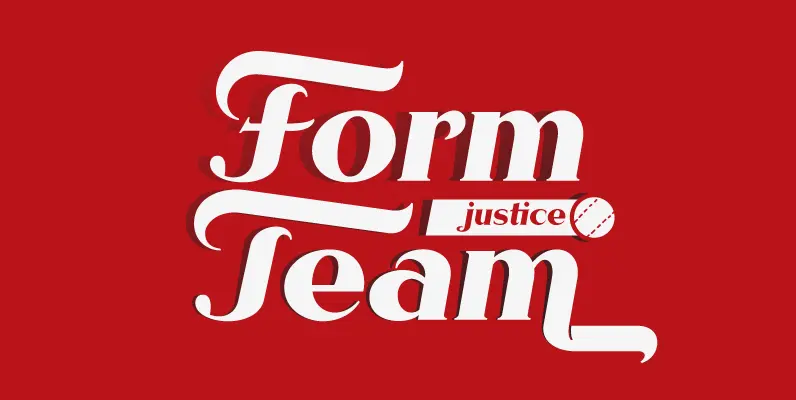
Rhythm Font
I hate the idea of revivals. I have publicly said I choose not to do revivals because they make me uncomfortable. This is as close as I have been to crossing my own line. To be direct, Rhythm is based
