Tag: tough
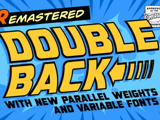
Double Back Font
Great Scott, Marty! This font is your density, charged up to 1.21 gigawatts through the Power of Love! Originally created by Comicraft for the official BACK TO THE FUTURE fan club, Remastered DOUBLEBACK has been rebuilt from the ground up,
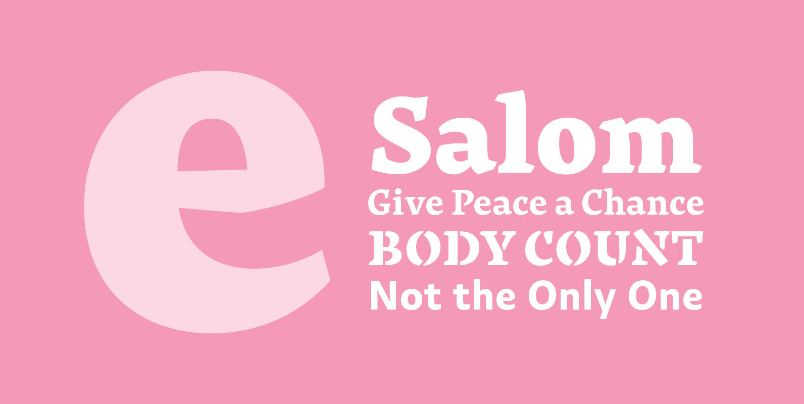
Salom Font
Salom was designed by Austrian type designer Igor Labudovic during his year at Reading University. Besides Latin, it originally included Arabic and Hebrew. The peaceful coexistence of both writing systems in his fonts led him to combine the words Salaam
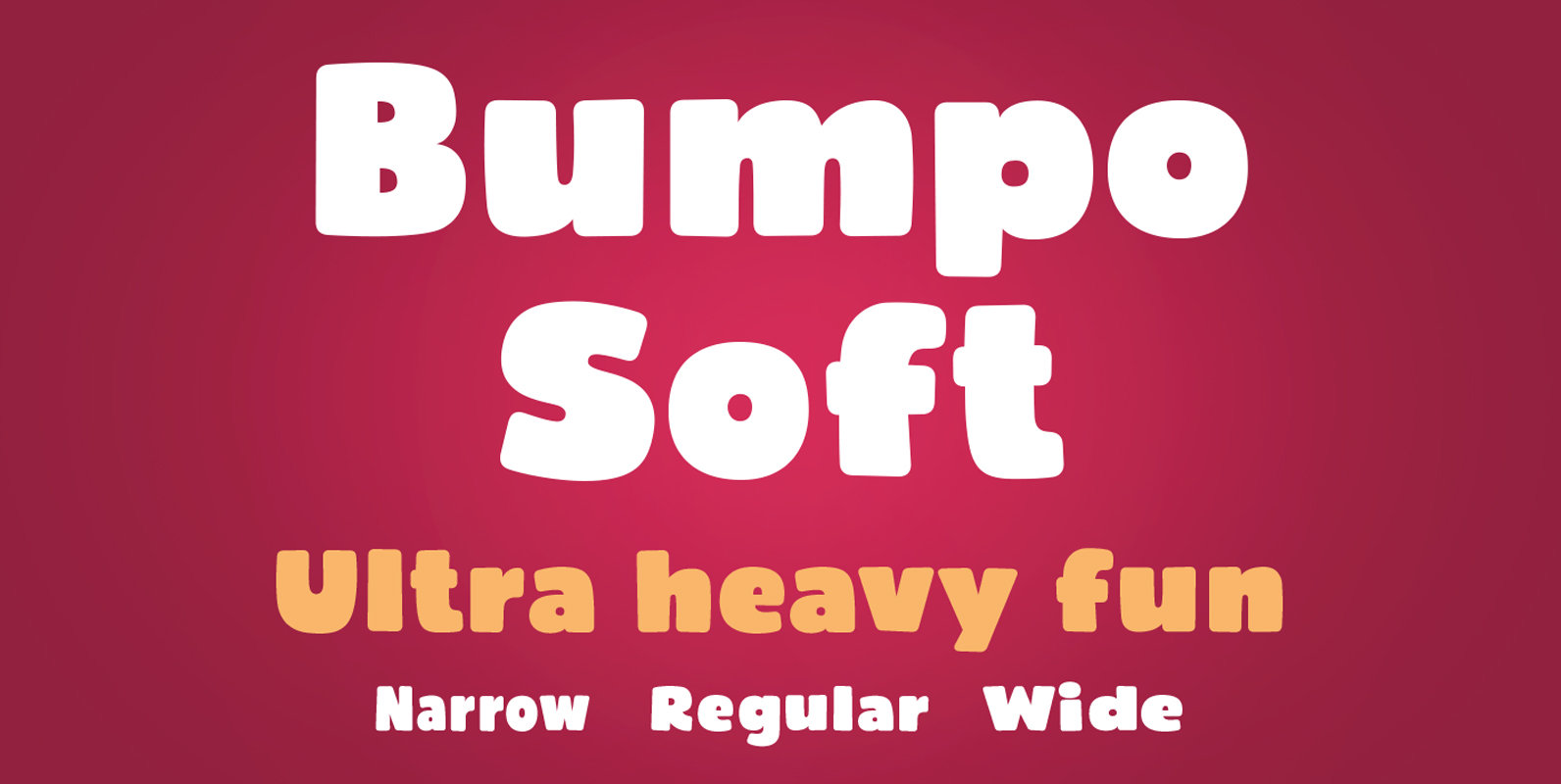
Bumpo Soft Font
Bumpo Soft is a chunky and a fun display typeface family with rounded edges. It is the softer version of Bumpo. With an extra heavy but friendly personality, Bumpo Soft works well for posters, food packaging, children’s products and books,
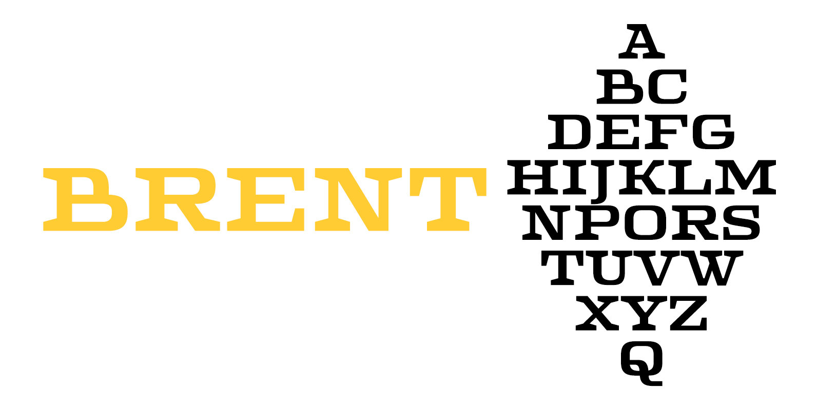
Brent 4F Font
Brent 4F is a serif font design published by Sergiy Tkachenko Published by Sergiy TkachenkoDownload Brent 4F
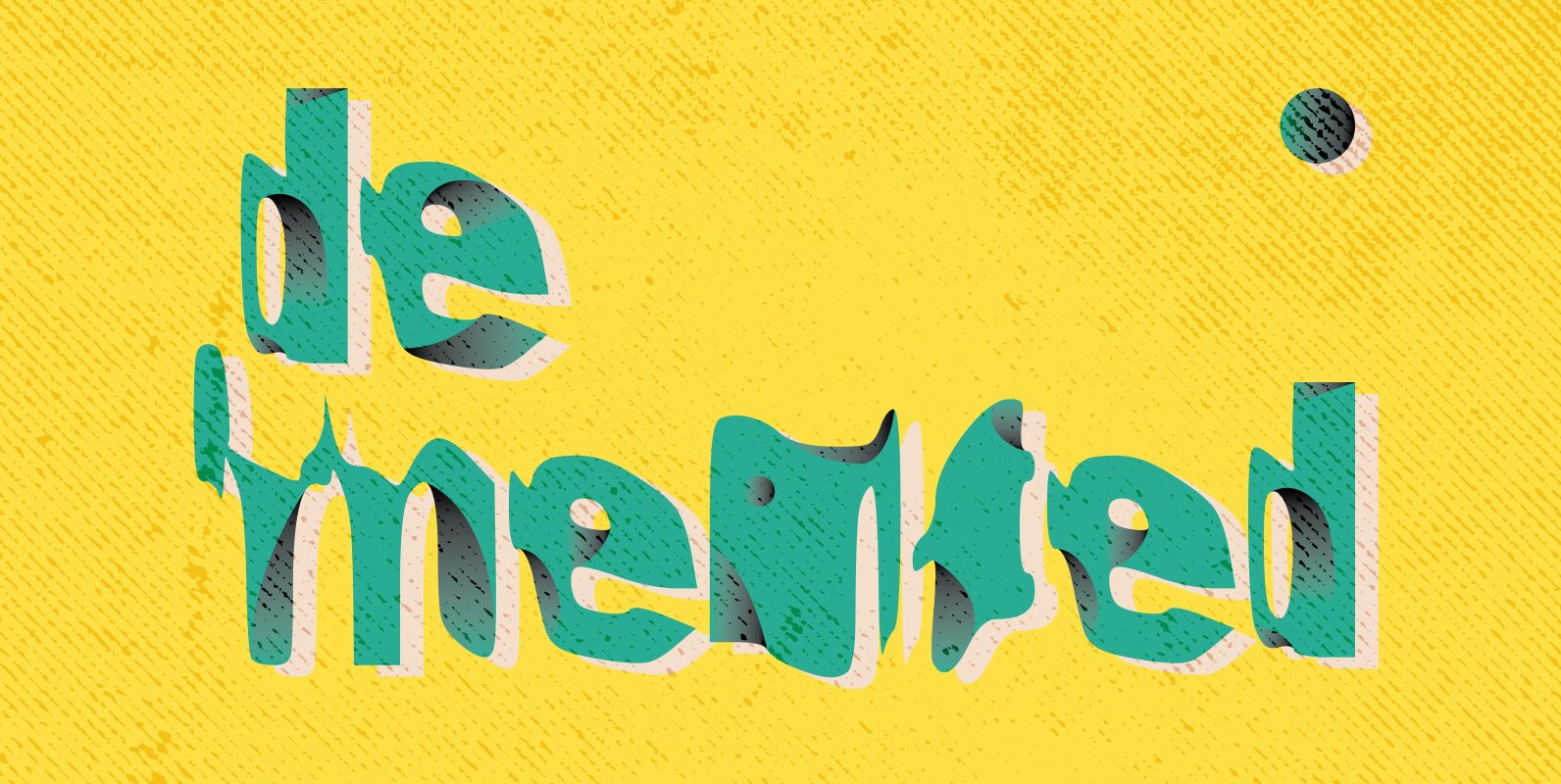
Demented Font
Feeling a bit odd, hearing ‘those’ voice again want to let the world know with a wavy, crazy and odd dream-like font well here it is! Graffiti, hand written / horror film TV series inspired font. Think the ‘Evil Dead’,
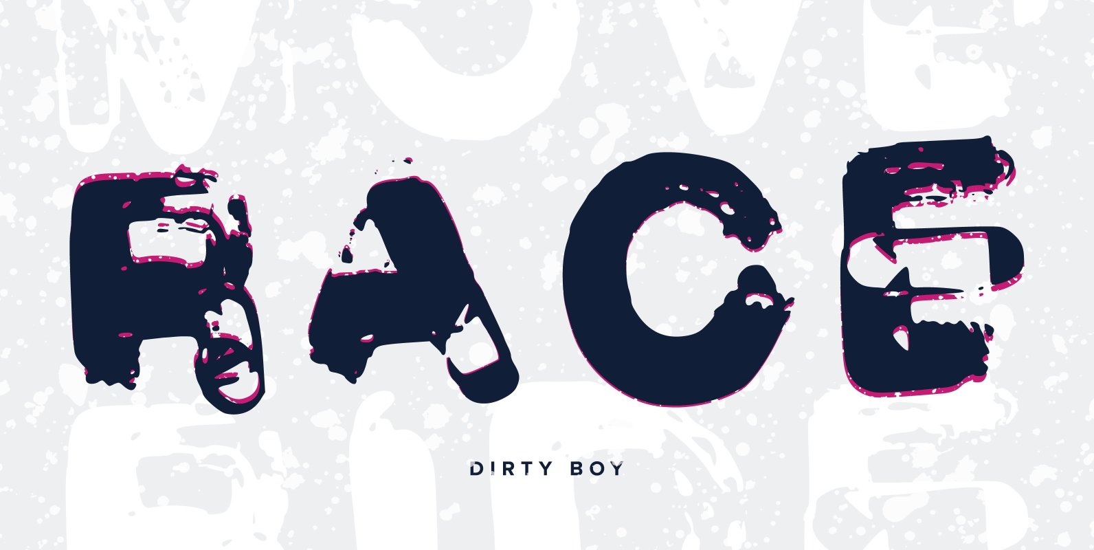
Dirty Boy Font
For all you graffiti home boyz. Brush style script with a dirty urban look. For those looking for a rough brush style ting. This font was created by Benjamin A Melville and features a full upper and lower case alphabet
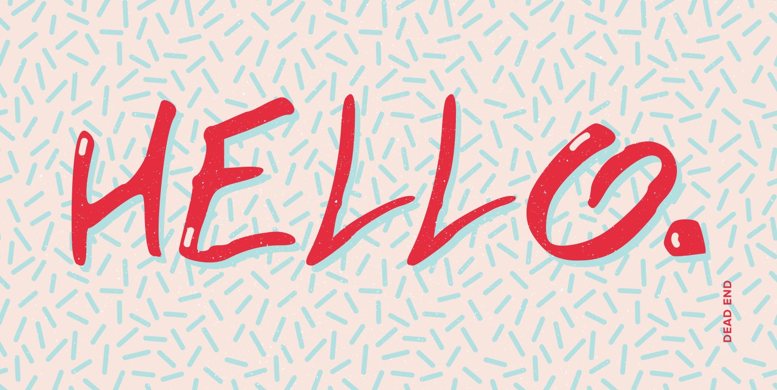
Dead End Font
Graffiti styled font that looks like it has been scratched in a hurry. Dead end implies a sense of a font from a horror film or TV that deals with dark,evil and twisted side of the world. Try thinking of
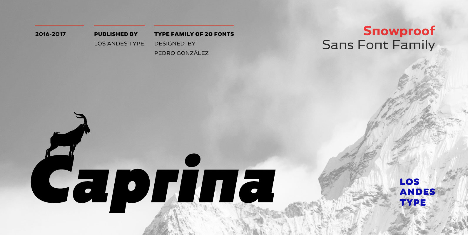
Caprina Font
Caprina (‘relating to or resembling goats’ in Spanish) is an audacious and rough geometric sans-serif font inspired by the wild and untamed personality of mountain goats—amazing animals which can skilfully climb up slopes and withstand very cold temperatures. Caprina comes
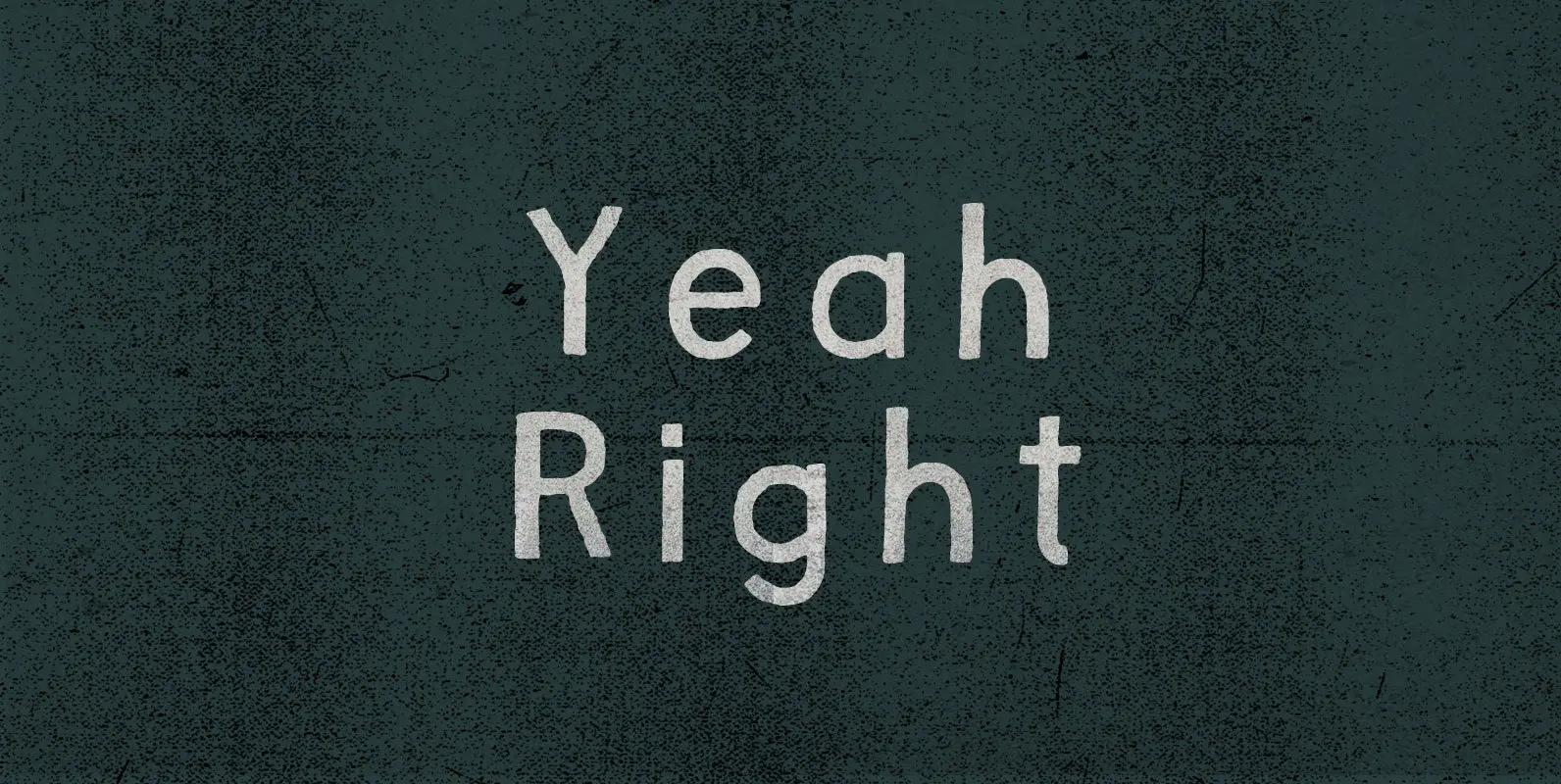
Yeah Right Font
Not far enough removed to harmonize through sarcasm, the remark struck a sour note. Skepticism, on the other hand, ducked that discord and countered with open confrontation: Yeah Right. Convince me. Published by BLKBKDownload Yeah Right
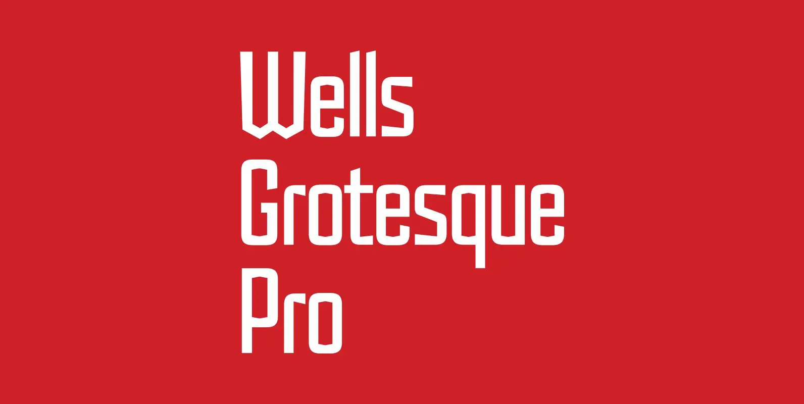
Wells Grotesque Pro Font
Designed by Hal Taylor. Inspired by the H.G.Wells science fiction novel ‘War of the Worlds,’ first published in 1898. Wells Grotesque also contains Small Caps, Old Style Figures and alternate glyphs, plus all the high-end features expected in a quality
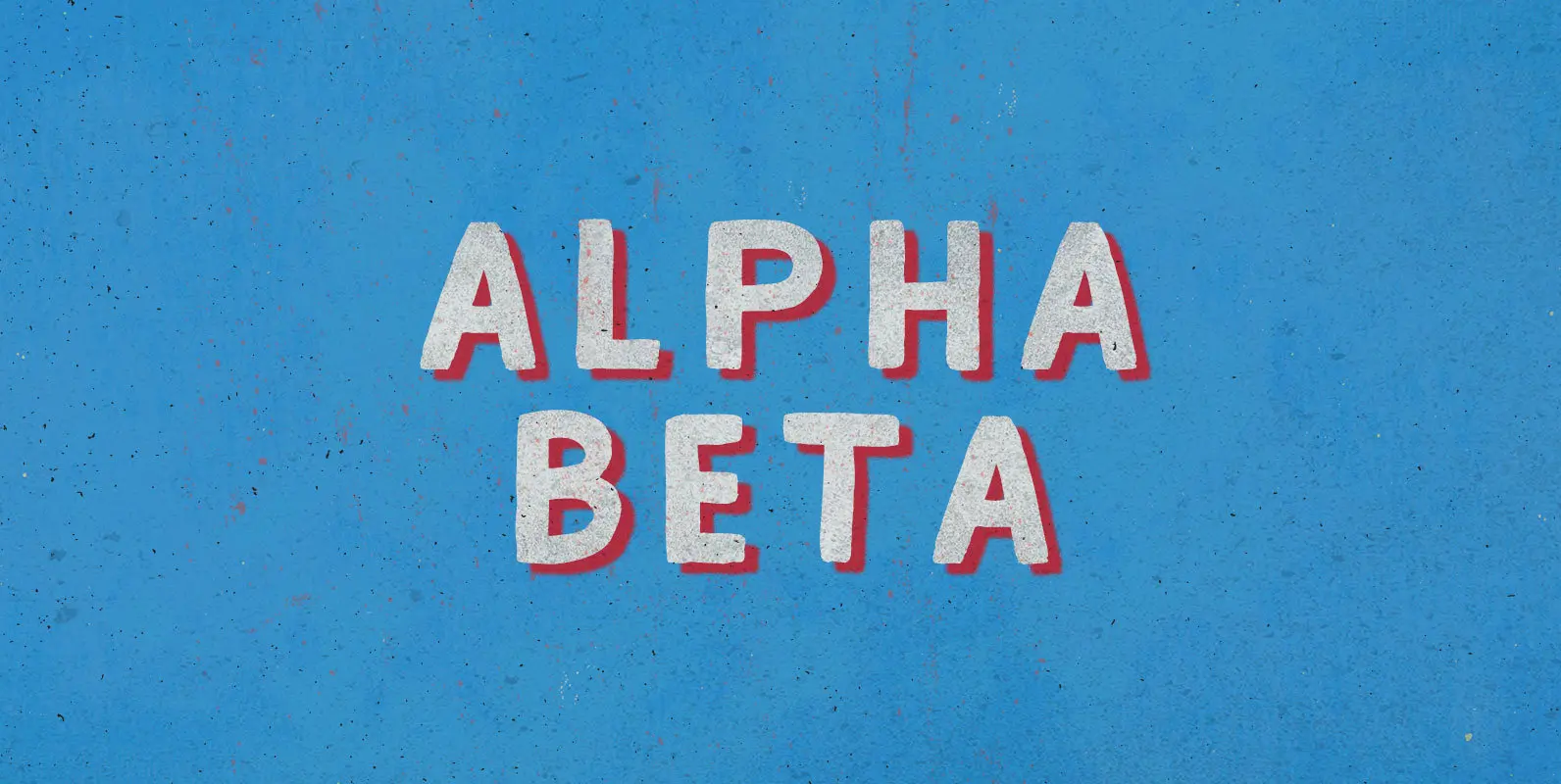
Alpha Beta Font
Steady in its place, ambitious in its outlook: Enter the journeyman of pack leaders. The Alpha Beta comes from behind to run ahead, before falling back; fighting and losing, fighting again, always to win. Published by BLKBKDownload Alpha Beta
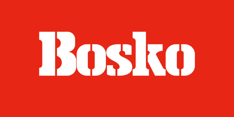
Bosko Font
A robust slab serif typeface that combines classic proportions with contemporary styling. These carefully crafted letterforms are best suited for use on book jackets, news headlines, packaging, posters and t-shirts. Details include 4 distinct styles, a full character set, manually
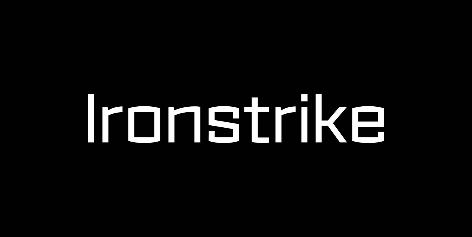
Ironstrike Font
Ironstrike pays homage to industrial and constructivist lettering. Rigid shapes and tall lowercase letters evoke strength and technology. Seven weights with matching italic fonts step up to your tough design challenges. Fine light weights emphasize white space and powerful heavy
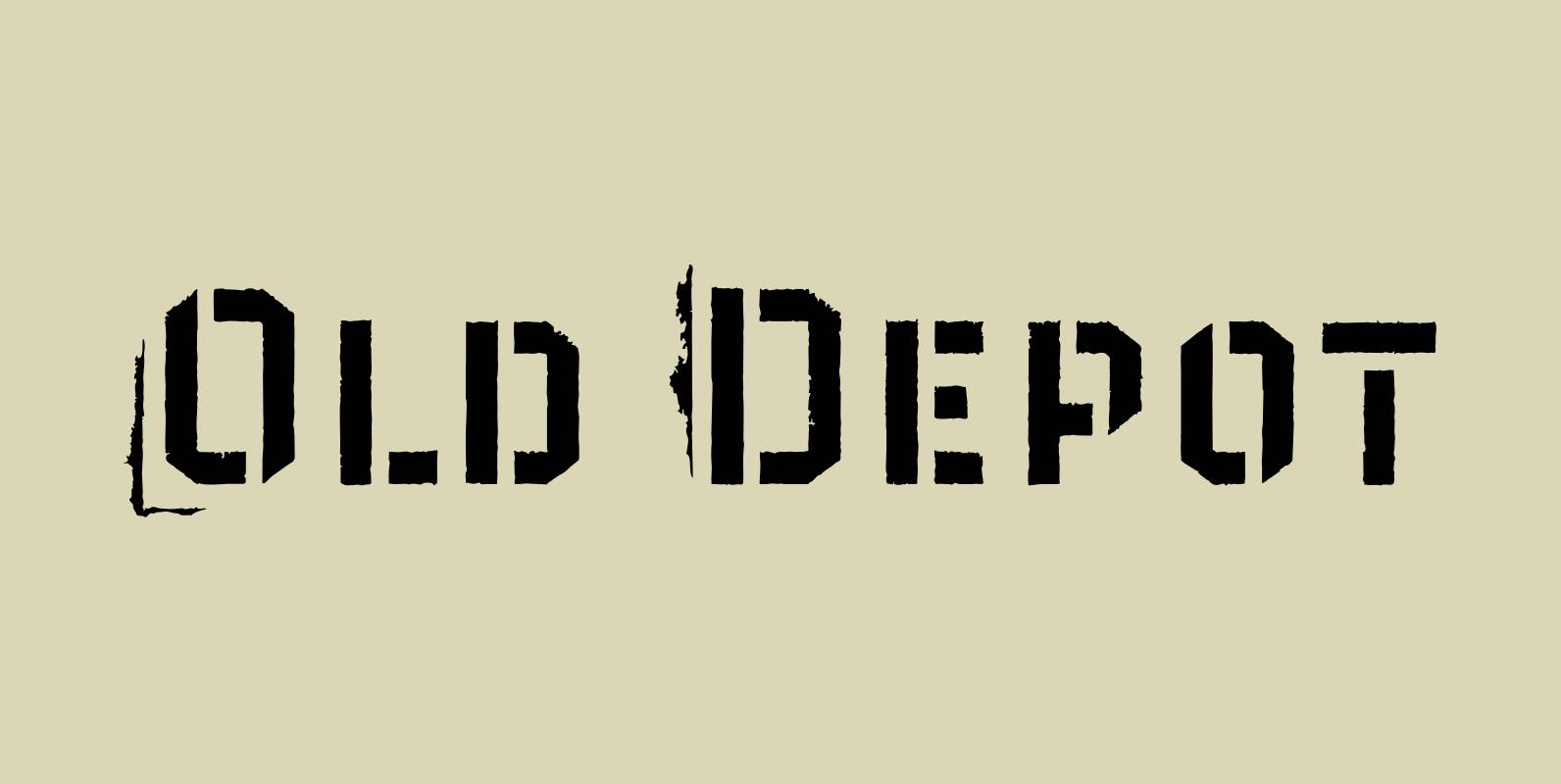
Old Depot Font
Old Depot is a newly reworked idea for the Depot Trapharet 2D font. It supports more languages and is available in more lettering. Old Depot stands out with its industrial nature of archaic spirit. It is a wonderful choice for
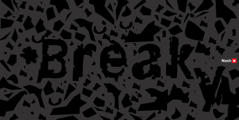
YWFT Nash Font
YWFT Nash was inspired by the grunge movement (design and music) of the 1990s. Nasty, busted, shredded and ripped, this is one gnarly font that perfectly captures the essence of trashed type. Ideally suited for off-road, extreme sports design jobs,
