Tag: traditional
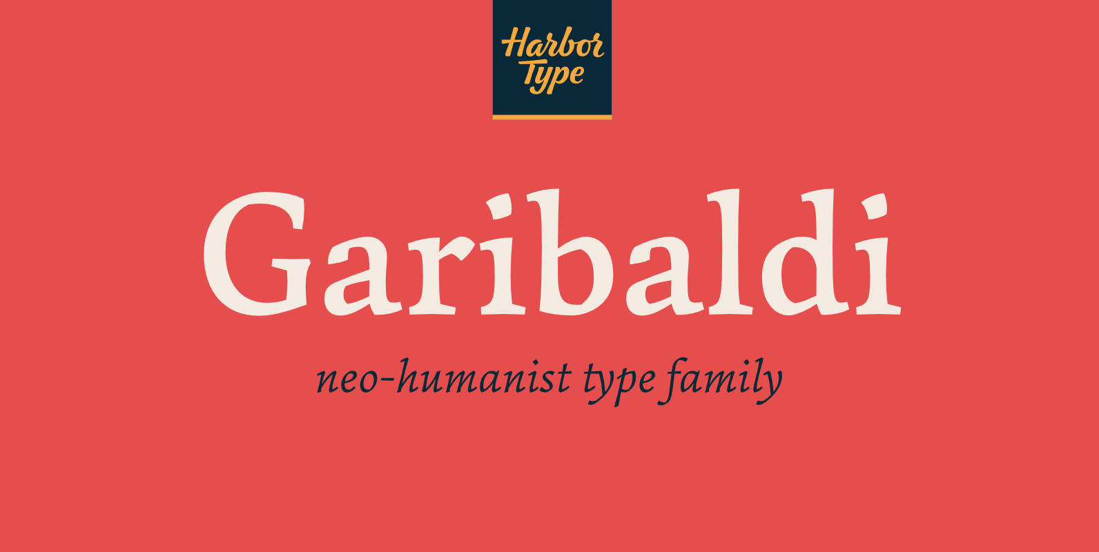
Garibaldi Font
Garibaldi is a text typeface based on humanist calligraphy. It has an organic look and feel, while preserves the traditional construction of roman typography. It all started with a desire to learn more about the origin of the strokes on
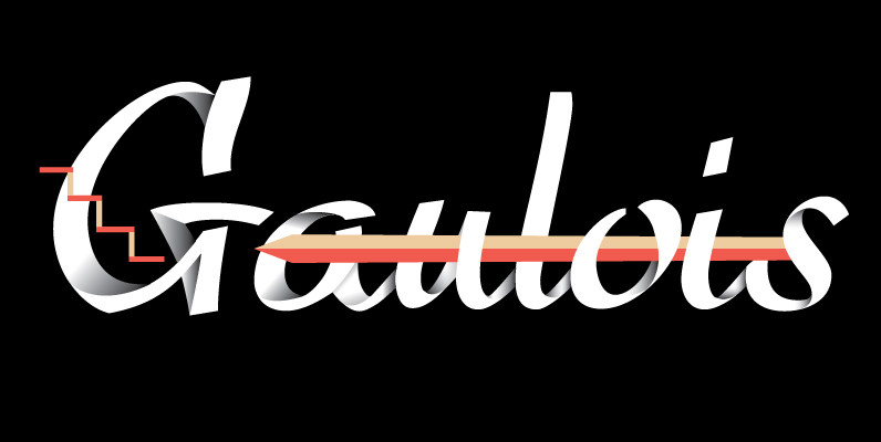
Gaulois Font
A couple of years before the second World War, Marcel Jacno, the popular French graphic designer who in the 1930s designed iconic posters for Gaumont and Paramount and famously illustrated the Gaulish helmet that first adorned the Gauloises cigarette packs
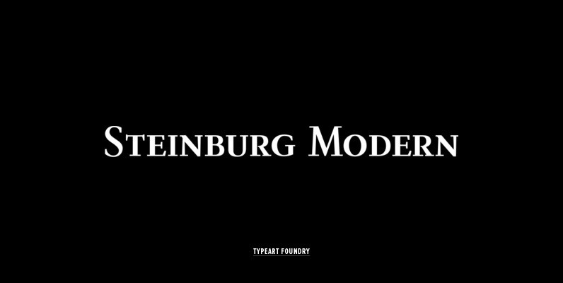
Steinburg Modern Font
Steinburg Modern™ is largely a variation on a Garamond-styled typeface with differences in some character designs and in the overall character proportions. In addition, the curved brackets that were a distinctive part of Garamond’s 16th century design are perhaps the
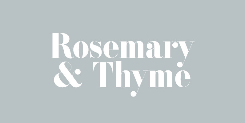
ATC Rosemary Font
ATC Rosemary is a didone print-font comprised of over 315 characters, producing extreme contrast between abrupt and thin serifs at large sizes. The luxurious feel of Rosemary utilizes not only hairlines and ball serifs, but expresses similarities to Romantic fonts
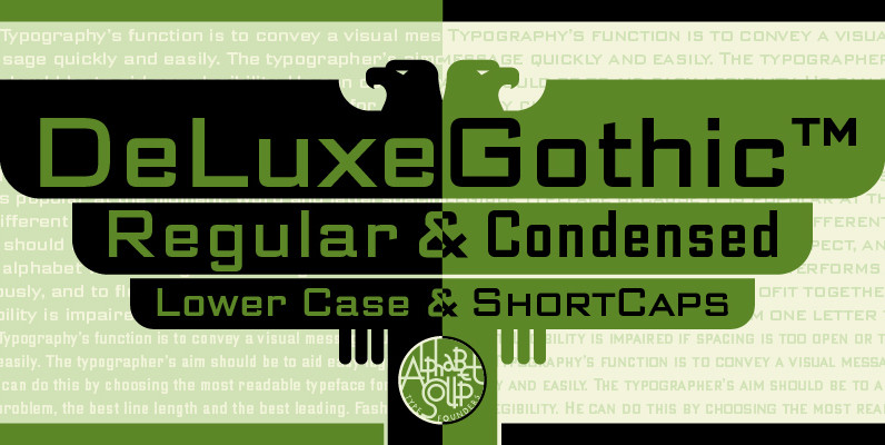
DeLuxe Gothic Font
Michael Doret was always very aware of the fact that Morris Fuller Benton’s classic Bank Gothic, a longtime favorite of his, didn’t contain any lowercase characters. So he set out to remedy that by designing his all new DeLuxe Gothic,
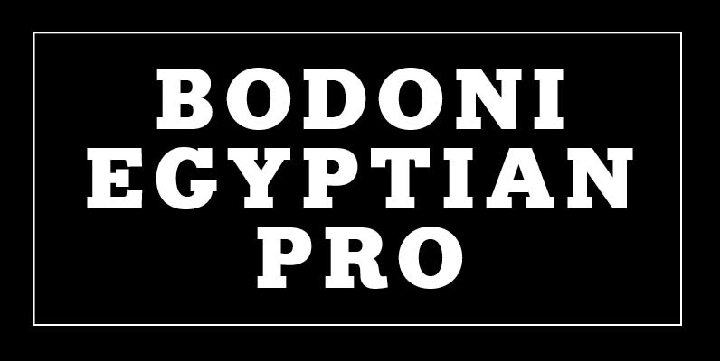
Bodoni Egyptian Pro Font
Beneath the dominant signifier of identity, a surprising dimension of Bodoni is revealed its core architecture, stripped of the famous high contrast cloak. Further subverting typographic norms, a monoline of even width (in all but the heaviest weights) here describes
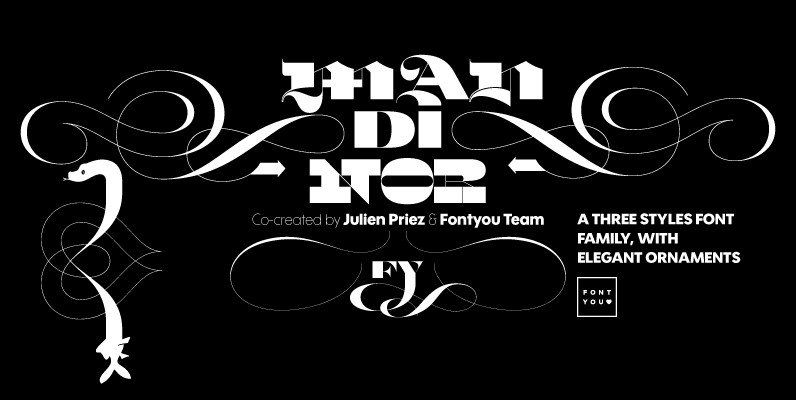
Mandinor FY Font
Normandie FY is a victorian modular family of 3 different typefaces very contrasted: Modern, Gothic & Italian. Perfect for headlines and any other titling creations, this font family feels very good when used in super poster size. Ornaments, letters (and

Journal Font
Journal type family is a low-contrast text face of the Ionic-Legibility group. It was designed at the Polygraphmash Type Design Bureau in 3 styles in 1951–53 by Lev Malanov and Elena Tsaregorodtseva.The fonts were based on Cyrillic version of Excelsior
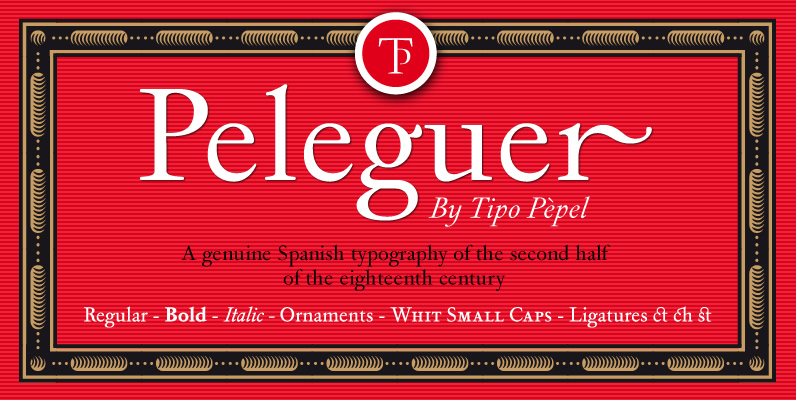
Peleguer Font
Peleguer typeface is the reinterpretation of the characters that the valencias goldsmiths Peleguer Manuel, father and son had opened and merged between 1779 and 1783 on behalf of the Royal Economic Society of Friends of the Land of Valencia “in
Alexander Quill Font
Alexander Quill was originally designed in the early 1980s to be cut in 14 point for casting into foundry type for the setting and printing of limited edition books at Pie Tree Press, Jim Rimmer’s private sanctum. This alphabet exhibits

Shepia Font
Shepia is a Monoline Cursive Handwriting. classic and fun vintage script. With almost 390 glyphs and 188 alternative characters, contain with opentype features. Stylistic alternates, Ornament, swash and more. Can be used for various purposes.such as logos, wedding invitation, t-shirt,

Salzburg Font
Designed by Steve Jackaman, Salzburg is a unique and retro-like sans-serif re-tooled from the QBF Collection. Published by Red RoosterDownload Salzburg
Fellowship Font
Named in tribute to the members of the American Typecasting Fellowship, this font is an original expression of Jim Rimmer's left-handed calligraphy. It was designed and cut in 24 p in the early 1980s, then cast as foundry type on

Saint Louis Font
Designed by Steve Jackaman. Based on Players, a typeface from English designer Adrian Williams, circa 1976. Published by Red RoosterDownload Saint Louis
P22 Matador Font
Matador is a calligraphic styling from prolific author and calligrapher Arthur Baker. It is a contemporary Roman based on the manuscript tradition. The stoic capitals add just the right touch to the slightly fanciful and unmistakable “Baker” lower case. Digitization
Magneta Font
To describe what inspired Magneta would be to add a little Dwiggins, throw in some Benton with a hint of Austin, wrap it up in a crisp, contemporary package and serve. The skeleton of the family is a Garalde (like
Ryder Gothic Pro Font
Designed by Steve Jackaman & Ashley Muir. A revival based on the Harry Winters design ‘Roslyn Gothic’ released by VGC in 1972. We’ve added a new light weight and several alternate glyphs. Ryder Gothic contains all the high-end features expected