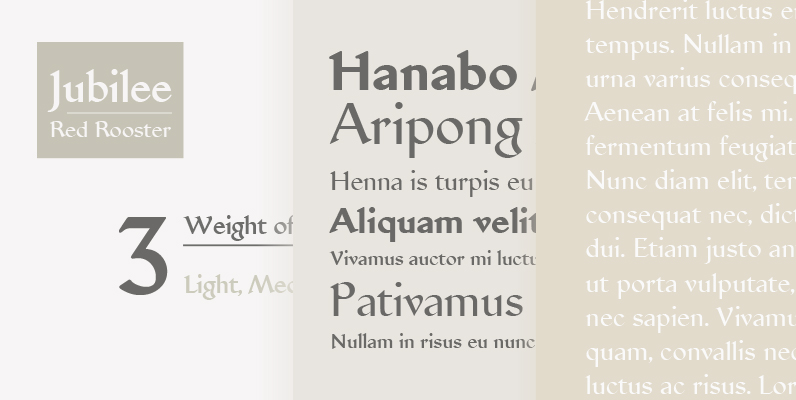
Tag: transitional

Fashion Font
The well-known British designer Alan Meeks elegantly reworked Fashion Compressed No.3 to produce this beautiful, condensed engraved typeface. The fine line weights make it ideal for application wherever a slender feminine effect is desired. Published by LetrasetDownload Fashion

P22 Late November Pro Font
Late November is a transitional Antiqua-inspired type design. From the designer: “I started working with the design one dark, late November night, two years ago. After two years of work, I felt I had to draw the line and consider

Isonorm Font
Isonorm is a font design released for the Mecanorma Type Collection. Copyright 2004 Trip Productions BV. Published by MecanormaDownload Isonorm
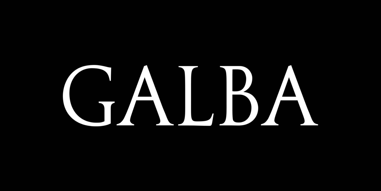
Galba Font
Galba is a font design released for the Mecanorma Type Collection. Copyright 2004 Trip Productions BV. Published by MecanormaDownload Galba
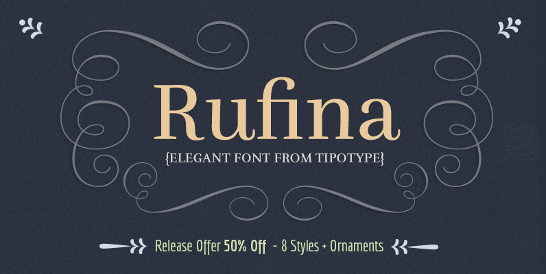
Rufina Font
Rufina was as tall and thin as a reed. Elegant, but with that distance which well defined forms seem to impose. Her voice, however, was sweeter, closer and when she spoke her name, like a slow whisper, one felt like

Normalise Din Font
Normalise Din is a font design released for the Mecanorma Type Collection. Copyright 2004 Trip Productions BV. Published by MecanormaDownload Normalise Din
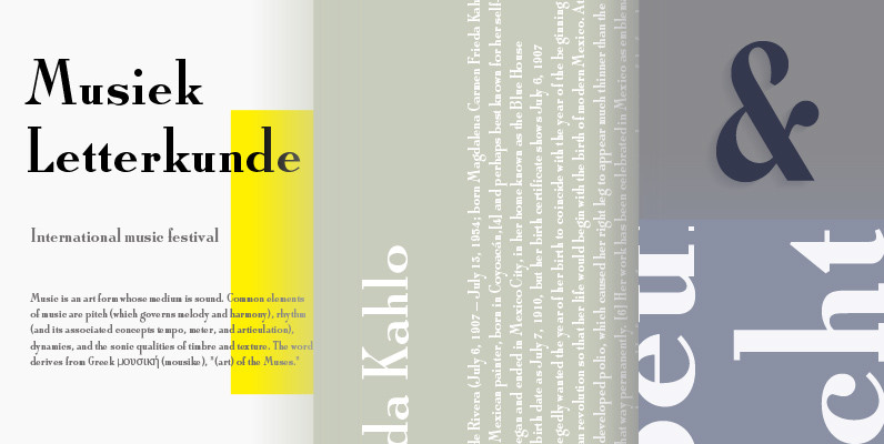
Roman Solid Font
Designed and released in 1995, Roman Solid is a retro serif design by URW. Contains language support for West, East, Turkish, Baltic, and Romanian. Published by URW Type Foundry GmbHDownload Roman Solid
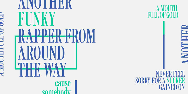
Caslon Extra Condensed Font
Designed by Steve Jackaman, Caslon Extra Condensed is based on the Ludlow/ATF versions of this great typeface. Published by Red RoosterDownload Caslon Extra Condensed
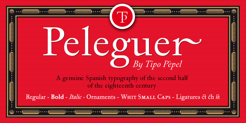
Peleguer Font
Peleguer typeface is the reinterpretation of the characters that the valencias goldsmiths Peleguer Manuel, father and son had opened and merged between 1779 and 1783 on behalf of the Royal Economic Society of Friends of the Land of Valencia “in
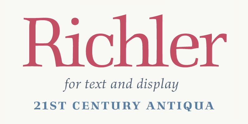
Richler Font
An open, evenly spaced book face designed for quality headlines and enhanced readability in text. Published by ShinntypeDownload Richler
