Tag: True Italic
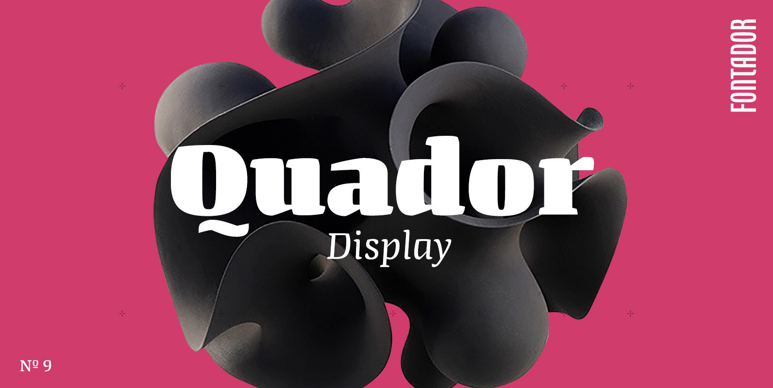
Quador Display Font
Quador Display is a serif, especially designed for contemporary typography on print and screen. The superellipse-based forms and high x-height allow large and open letterforms, perfectly adapted to the pixel grid on screen. The font contains 6 weights from light
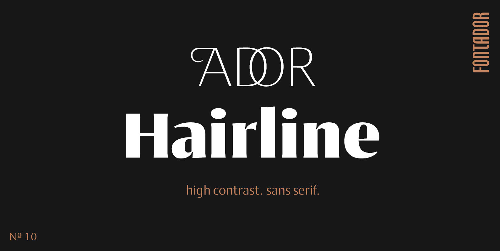
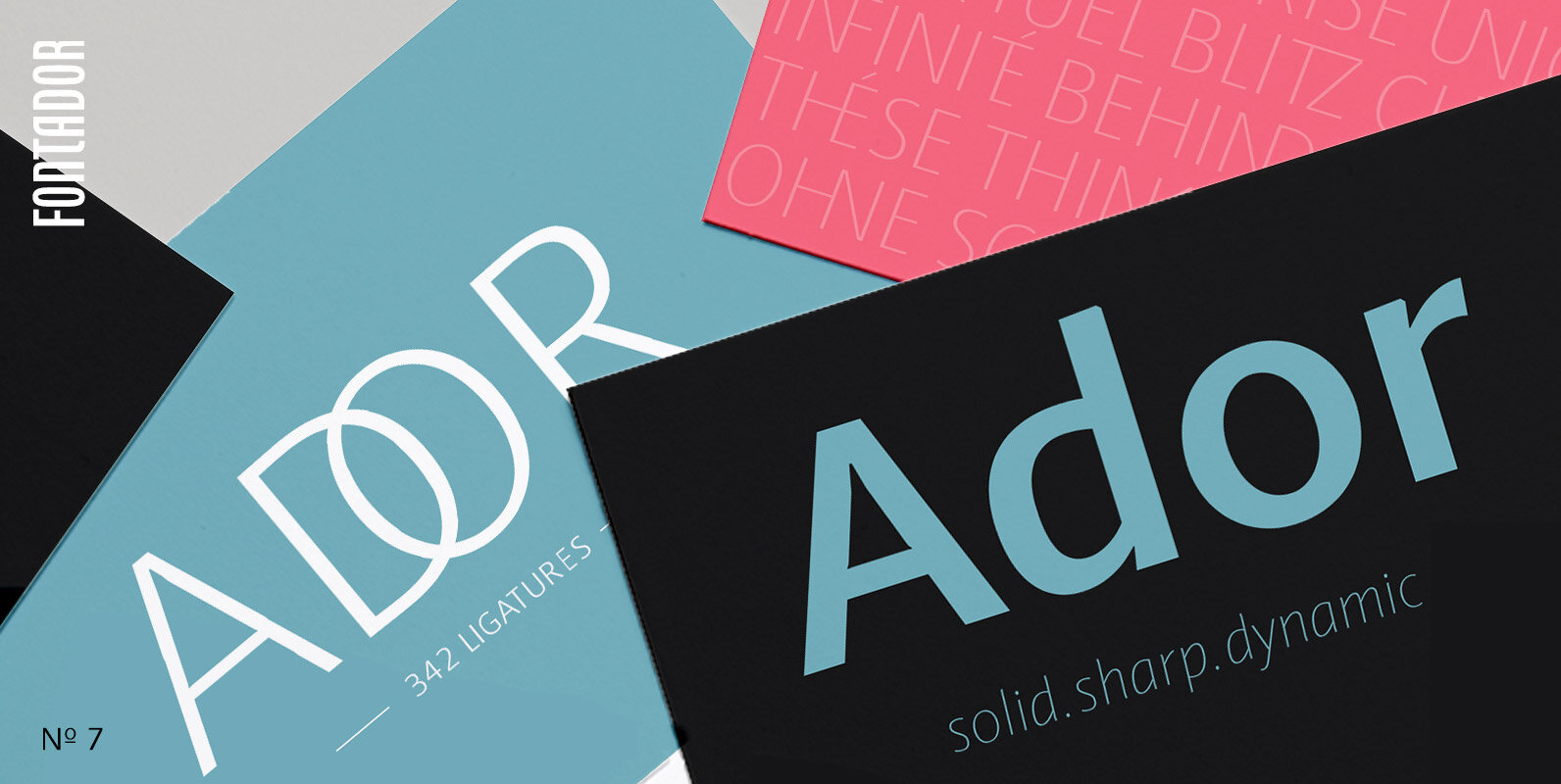
Ador Hairline Font
Ador Hairline is the high contrast version of Ador. A humanist sans serif that falls in the “evil serif” genre, especially designed for contemporary typography and comes up with 7 weights from extralight to black plus true italics and 293
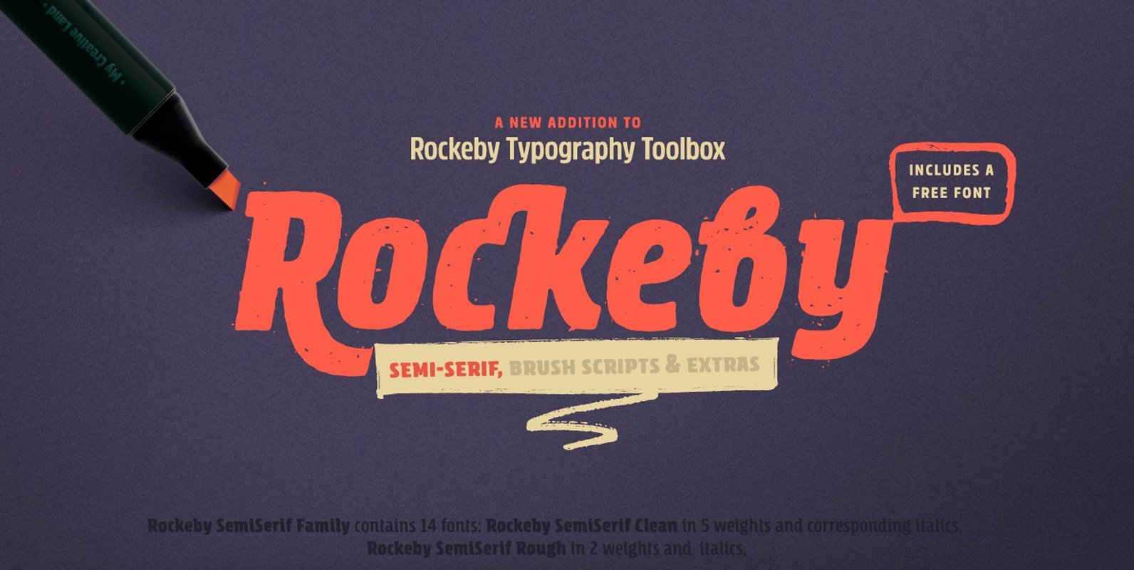
Rockeby Semiserif Font
Rockeby SemiSerif is a font family that joins a well known collection – Rockeby Typography Toolbox. With 14 fonts included, it can be used for any sort of design project including but not limited to branding, websites, brochures, greeting cards
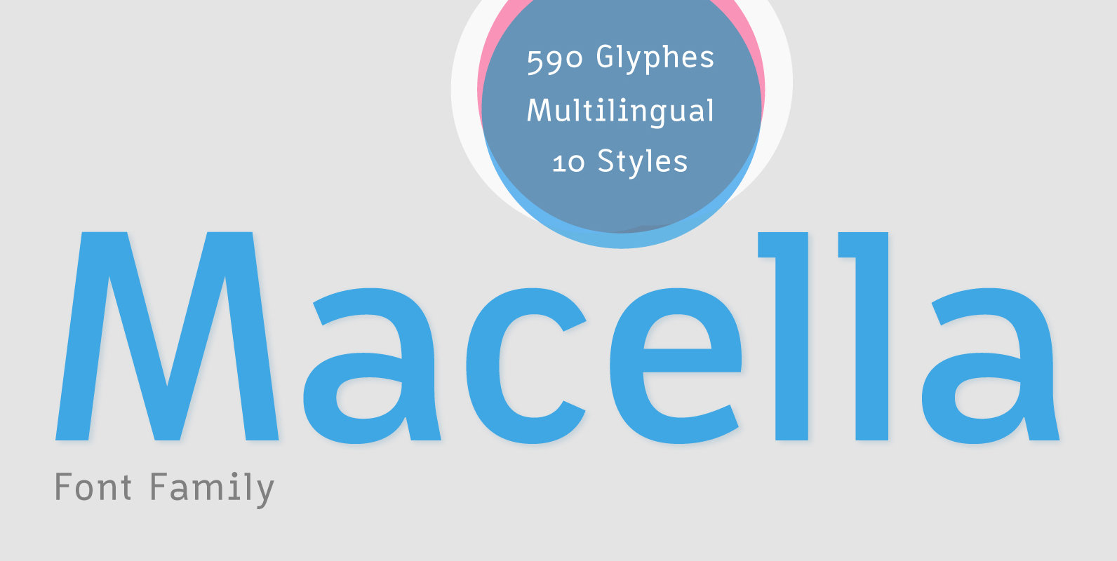
Macella Font
The Macella font family is the proportional version of the monospaced Vivala Code. Both families are well matched and have a comprehensive character set. The Sans Serif contains five weights with matching italics. It is suitable for headlines of all
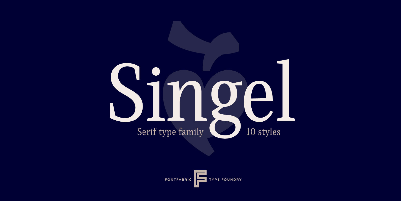
Singel Font
Singel is a neoclassical serif with semi-condensed proportions. As a contemporary interpretation, this typeface combines the rationalist modulated stroke with an elegant silhouette and crisp serifs. The altogether splendid appearance of Singel, completed with a full set of Small Capitals
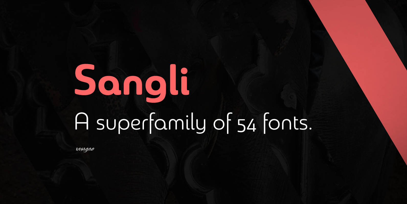
Sangli Font
It started in 2007 with Chennai, the first of a three-part series of sans that I envisioned with slab serif counterparts. Each font would differ from the others in how the stem terminals were expressed. The initial font was extremely
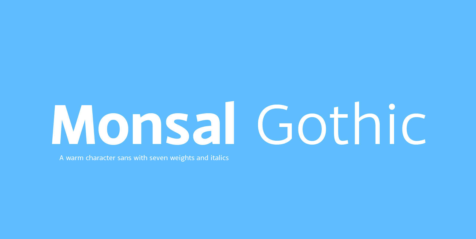
Monsal Gothic Font
A sans-serif typeface with clean and simple proportions. The design pays special attention towards balance and purity of form, creating a functional yet elegant typeface suitable for a wide variety of modern applications. Details include 9 weights, an extended European
Nauman Font
A modern humanist sans serif made for the screen. Broad open letter forms are combined with precise geometry to create a functional and legible font that’s ideally suited to the web and on-screen applications. To reinforce readability and create more
Byker Font
Byker is a geometric sans serif font that blends technology with handcrafted skill. The letterforms are constructed digitally from a technical grid and overlaid with handmade curves. The combination of this process creates a strong, organic font that is precise
Crique Grotesk Font
The Crique Grotesk This contemporary typeface is inspired from Neo-humanist and Geomatric industrial tone presented the late 2000s typeface. The font family is also composed of the normal width and display width in order to support the different applications on the delicate
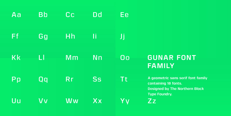
Gunar Font
A geometric sans serif with a square chiseled appearance. Precise curves are met with straight lines and tapered angles to produce a fresh, technical typeface. It’s large x-height and neutral width give it good legibility at small point sizes. These
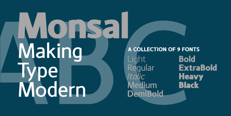
Monsal Font
A sans-serif typeface with clean and simple proportions. The design pays special attention towards balance and purity of form, creating a functional yet elegant typeface suitable for a wide variety of modern applications. Details include 9 weights, an extended European
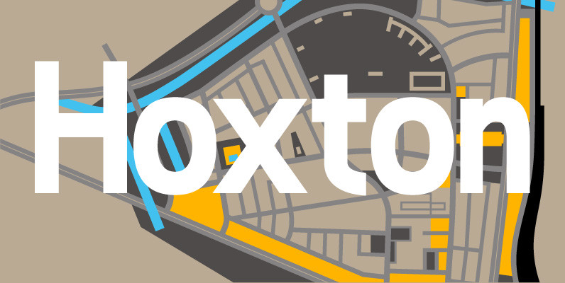
Hoxton Font
A modern humanistic san serif typeface. The horizontal structure of the font gives it a clean lateral dynamic that is ideal for on screen uses. Also the proportions have been condensed to maximise the use of space across various layouts.
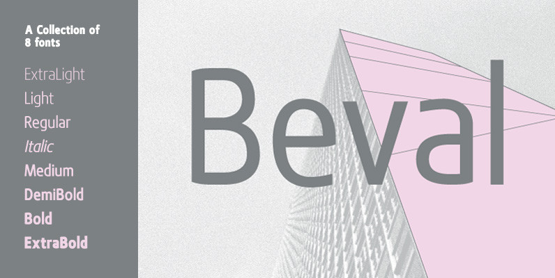
Beval Font
A humanistic sans-serif typeface with subtle chamfer detailing. It’s strong lateral emphasis is combined with open apertures to create sharp and legible letter forms. These balanced and narrow proportions make it ideally suited to a variety of online applications. Details
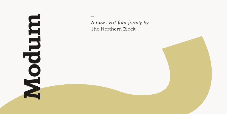
Modum Font
A contemporary serif font family. The design takes influence from traditional serif forms to develop a precise, highly functional text face with a low contrast. Smooth radius details are blended with carefully drawn angles that give a crisp, distinctive aesthetic
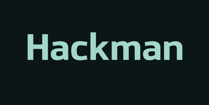
Hackman Font
A geometric sans serif with contemporary lines. Distinctive curves are combined with classical letterforms to produce a clean, linear typeface best suited to identity, mobile and web applications. Details include 9 weights with italics, 500 characters, 5 variations of numerals,
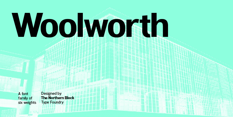
Woolworth Font
A modern sans serif font inspired by the grotesque designs of the late 19th century. Each letter has been developed with careful attention towards balance and purity of form, creating a clean functional and optically correct typeface. These handcrafted details create a