Tag: Tuscan

Flat10 Holy Font
This 8-bit pixel font is designed with respect for 80s game designers and the pixel font pioneers in middle 90s. Use at size 10 pixels or multiples of 10 and anti-alias off is recommended. Published by Dharma TypeDownload Flat10 Holy
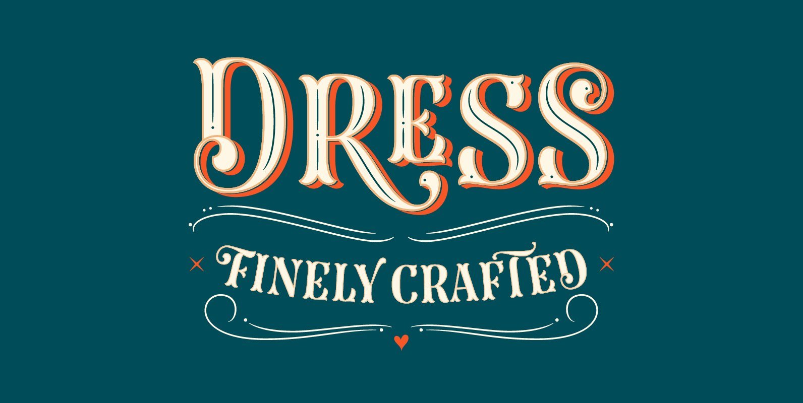
Dress Font
Looking at some specimen books of printing types of late nineteenth century, I found many ornamented capitals for headings among the typefaces. Most of them showed a flourish like a tuscan serif – a characteristic trait of a peculiar capital
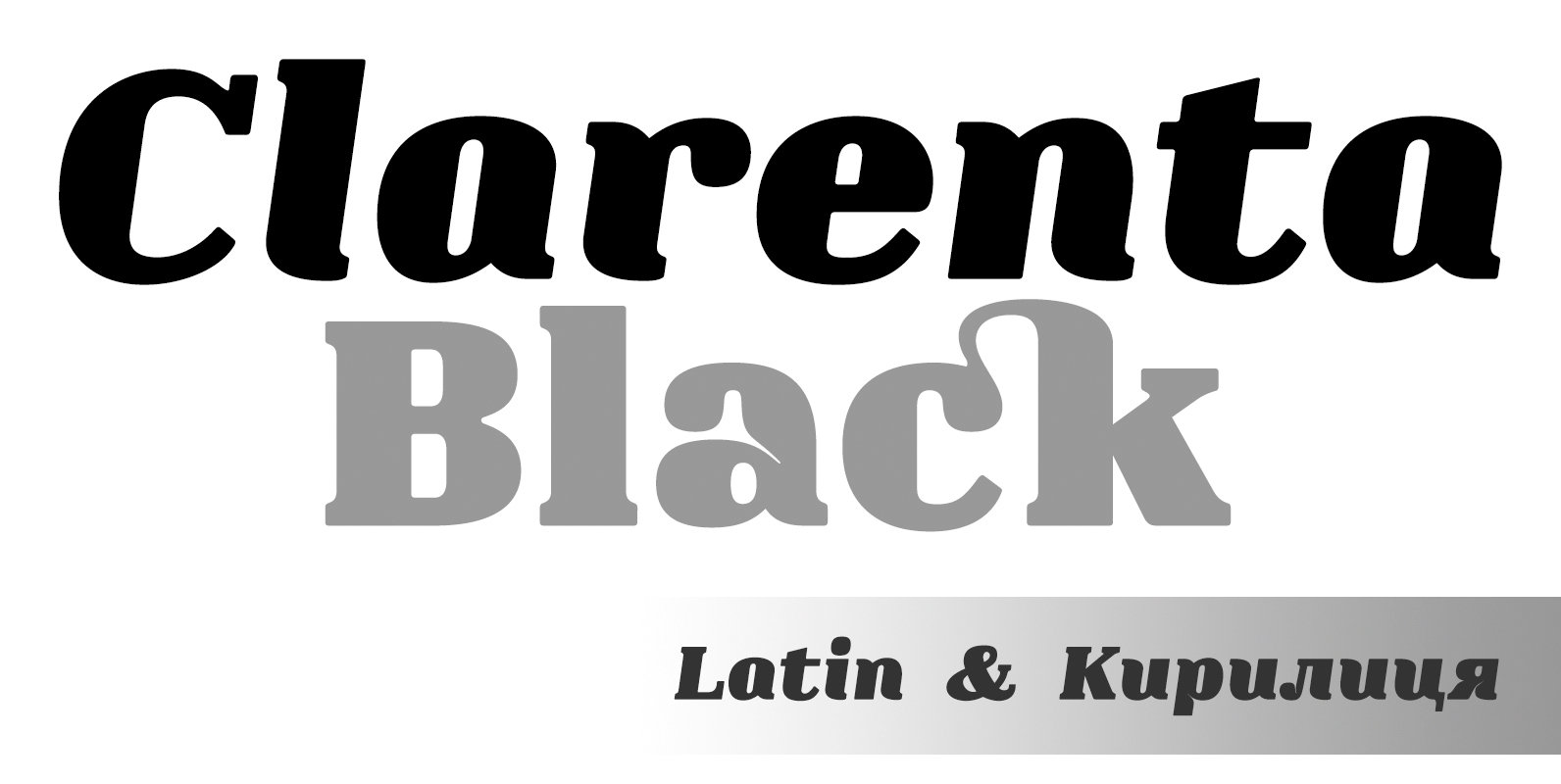
Clarenta 4F Font
Clarenta 4F is a serif font design published by Sergiy Tkachenko Published by Sergiy TkachenkoDownload Clarenta 4F

Cowboy Rodeo Font
Cowboy Rodeo is based on an old Slab Serif font from the late 1800s. Saddle up boys and girls the new Cowboy Rodeo is here, the perfect font for when you need to put a little giddy up in your
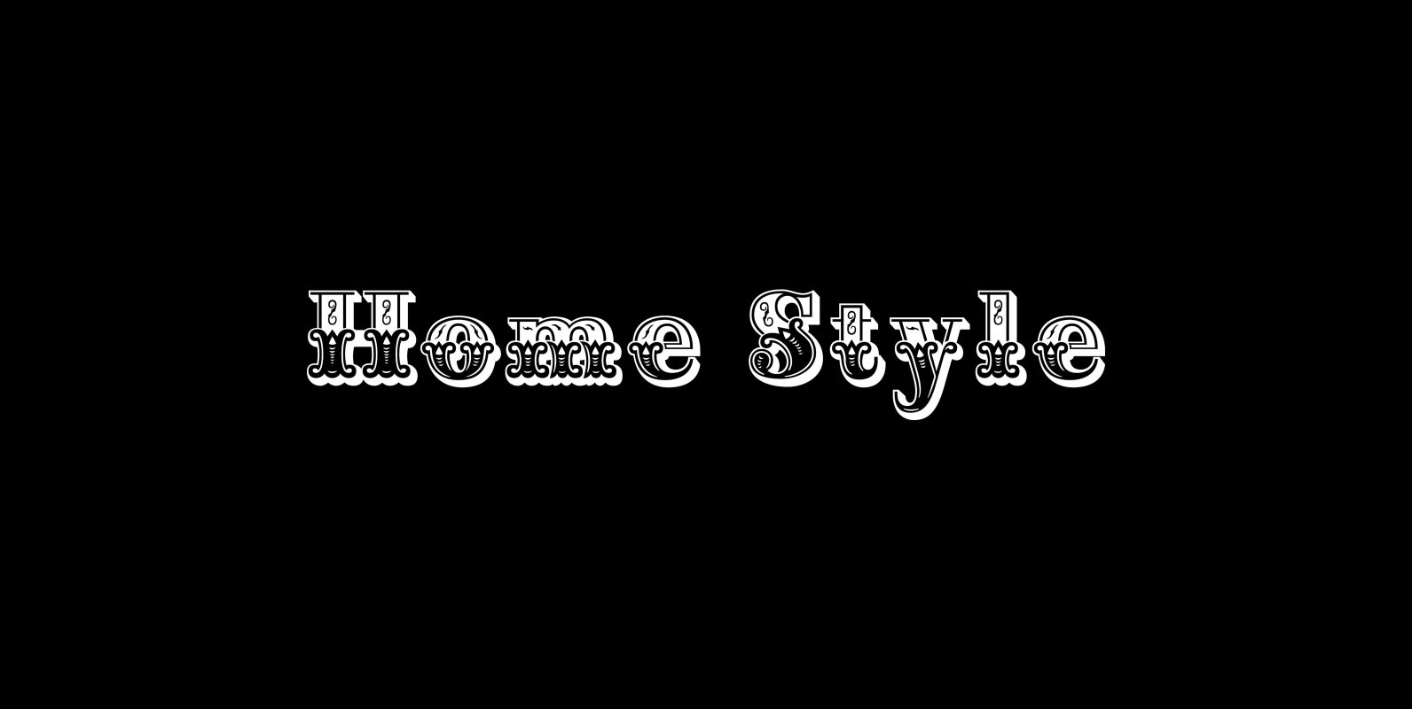
Home Style Font
Home Style is a revival of a very old font previously thought to have been designed by Joseph Gillé in or around the year 1820, however recent evidence from France suggests that an artist by the name of Silvestre from
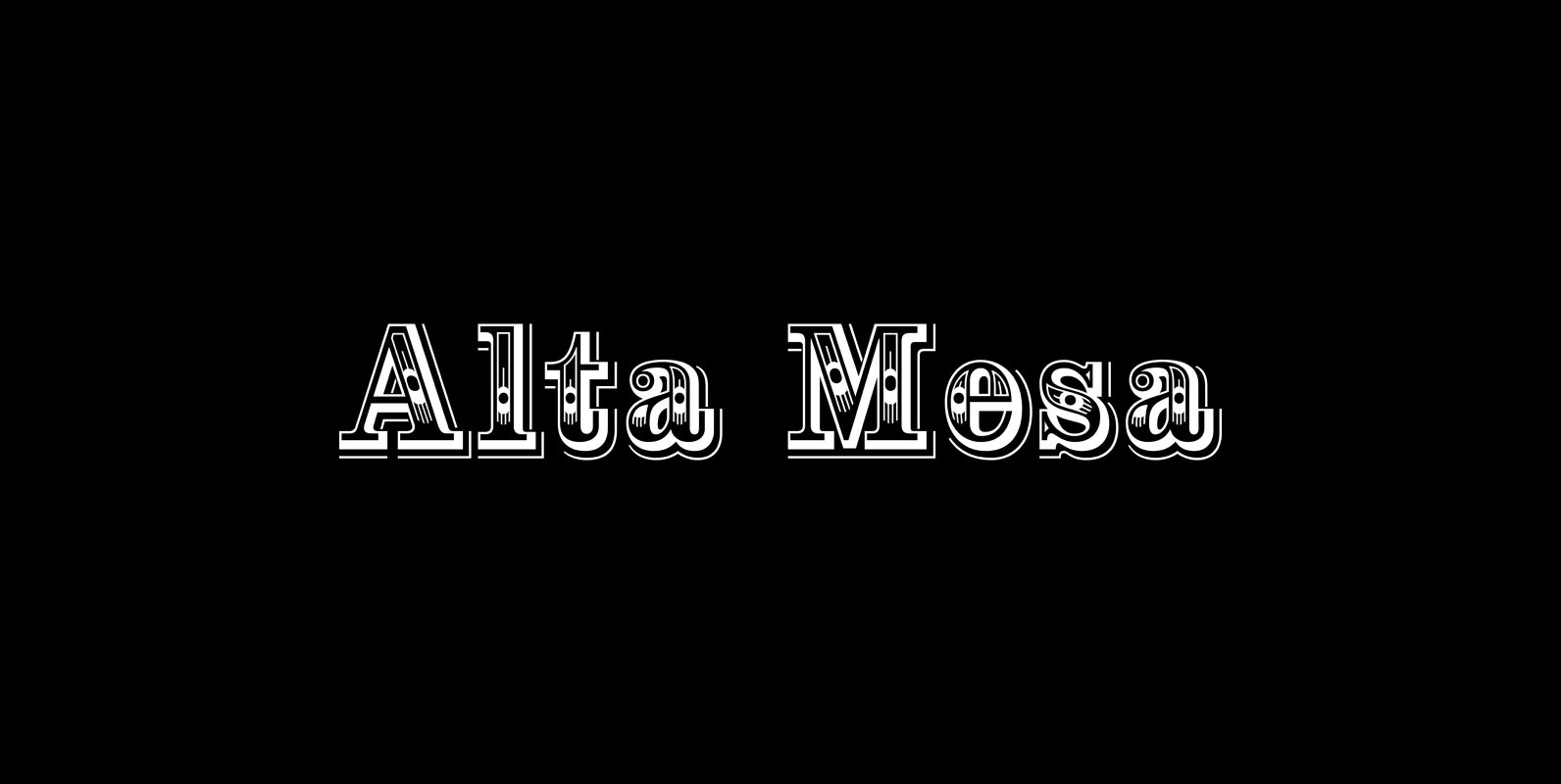
Alta Mesa Font
Alta Mesa is a revival of an old type design from the 1800’s that was sold by most of the type foundries in the US and Europe of that time period so it is difficult to know the foundry of

Maison Luxe Font
Maison Luxe is a revival of a very old font designed in France in or around the year 1820. You may have seen this font in the past under the names of Circus, Roma, Madame and Gillé Classic. As of
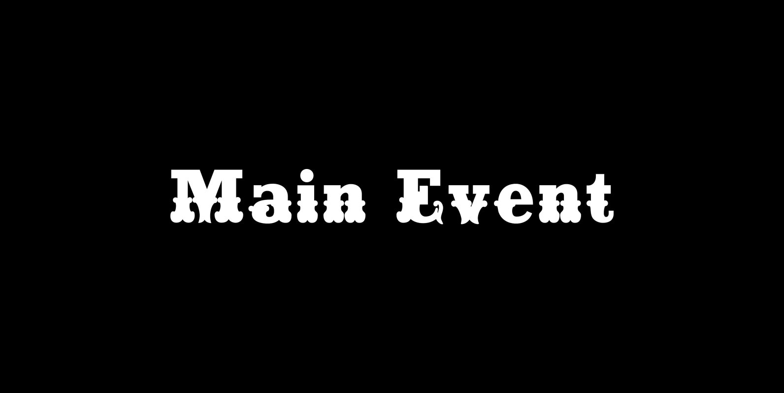
Main Event Font
Main Event is a revival of a very old Italian font that you may have seen in the past under the original name of Tuscan Ornate or Bracelet. Dating back to 1860 or earlier it has never been known to
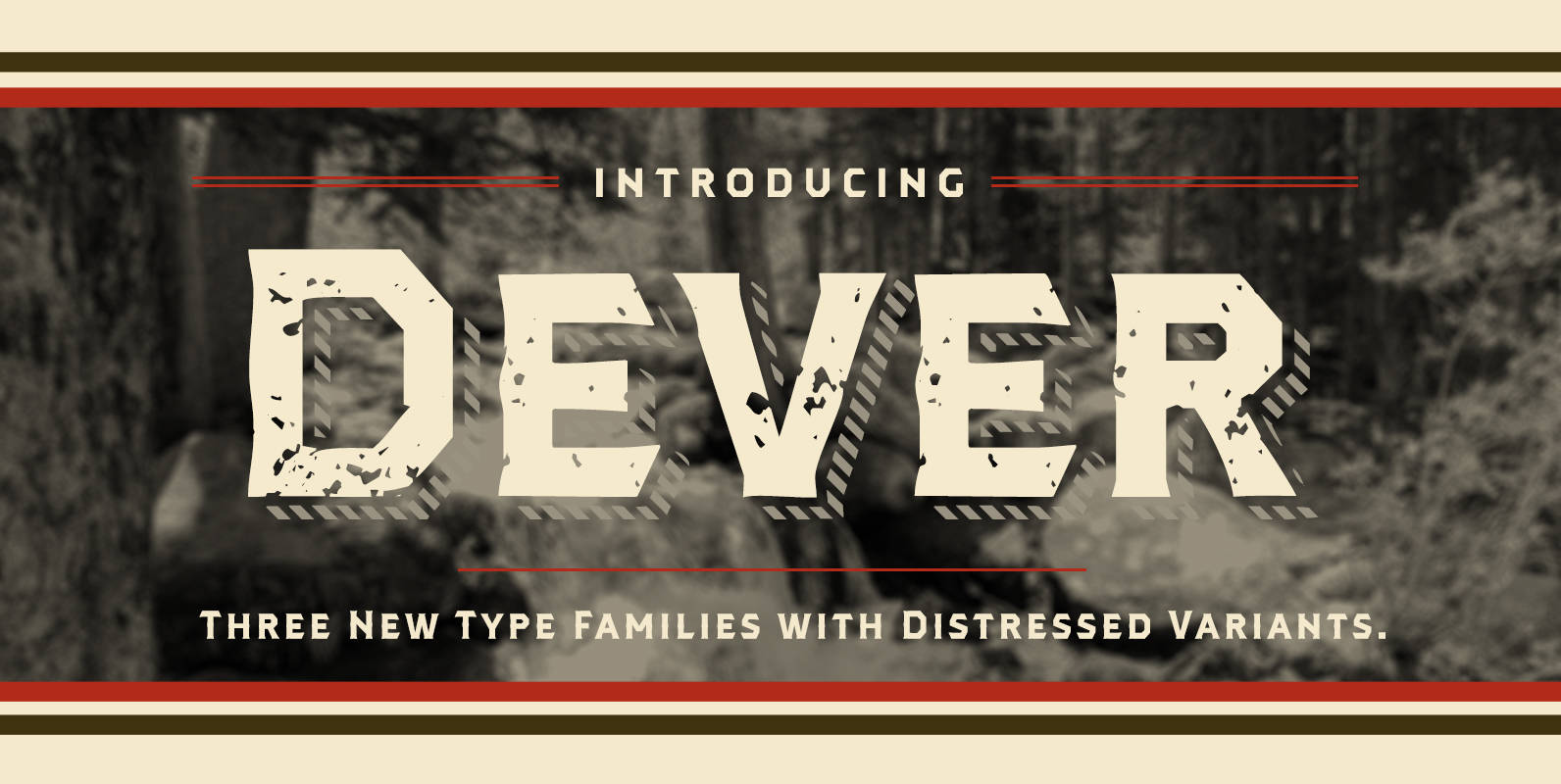
Dever Font
Dever’s brute, industrial lines are rounded up in this new typeface from Jeremy Dooley. Dever combines plenty of inspirations. It’s the flair of the Wild West melded with a shout out to the sign painters and package lettering artists of
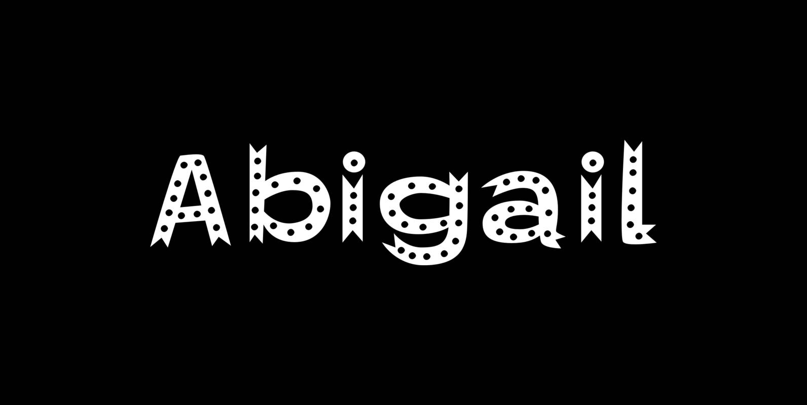
Abigail Font
Abigail is a font designed by Ethan Dunham that looks like it is made of ribbons. It comes in two versions, plain and dots. This whimsical font is perfect for headlines that need a contemporary but informal feel. Published by
P22 Tuscan Expanded Font
P22 Tuscan Expanded is a digitization of the mid 19th century wood type font “Antique Tuscan Expanded – Wells & Webb 1854”. Specimens of this font are rarely, if ever, seen with a lower case. It is noted in the
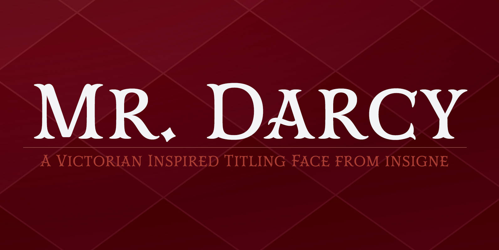
Mr Darcy Font
The elegant and very graceful Mr. Darcy is sufficiently compete with its additional characters–to be stated more precisely, over 136 defining alternates. These optional features are carefully displayed within the supplied brochure. The employ of the Mr. Darcy family moreover
Azalea Rough Font
Azalea’s careful, inky strokes reference classic brush script styles of the 1950s, but its jaunty angularity is distinctly modern. Artfully irregular thicks and thins lend it an organic feel. This rough-edged version is a rustic complement to Azalea Smooth. Azalea
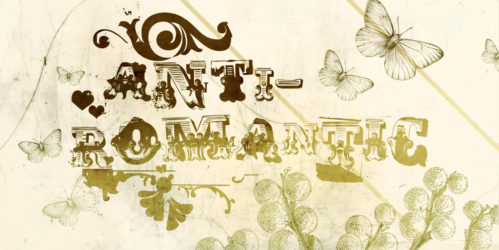
Anti Romantic Font
Anti-Romantic is a romantic, circus, grunge ornamental font family! It is based on the 1800’s Wood Type fonts and it comes with 4 typeface styles: Anti-Romantic Regular, Small Caps, Displaced and X. Published by Misprinted TypeDownload Anti Romantic
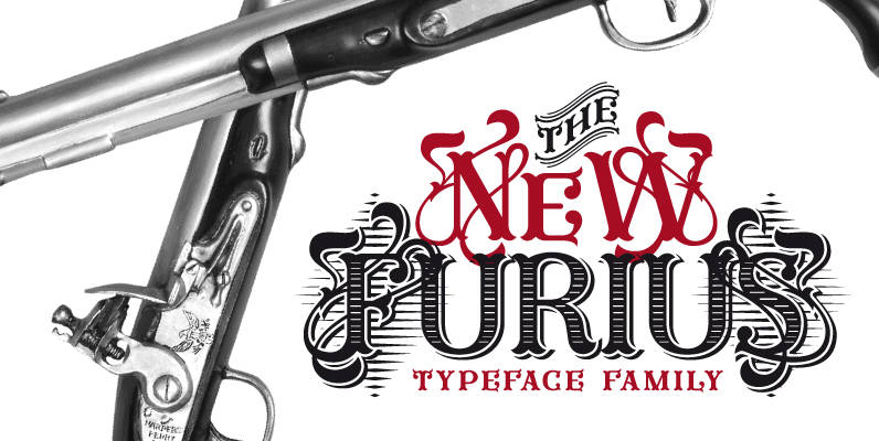
Furius Font
Furius is a display typeface inspired by the split serif style of woodcut or chiseled letters found in roman inscriptions and later popularized by the western genre in the United States. Created as a display typeface, Furius combines a host
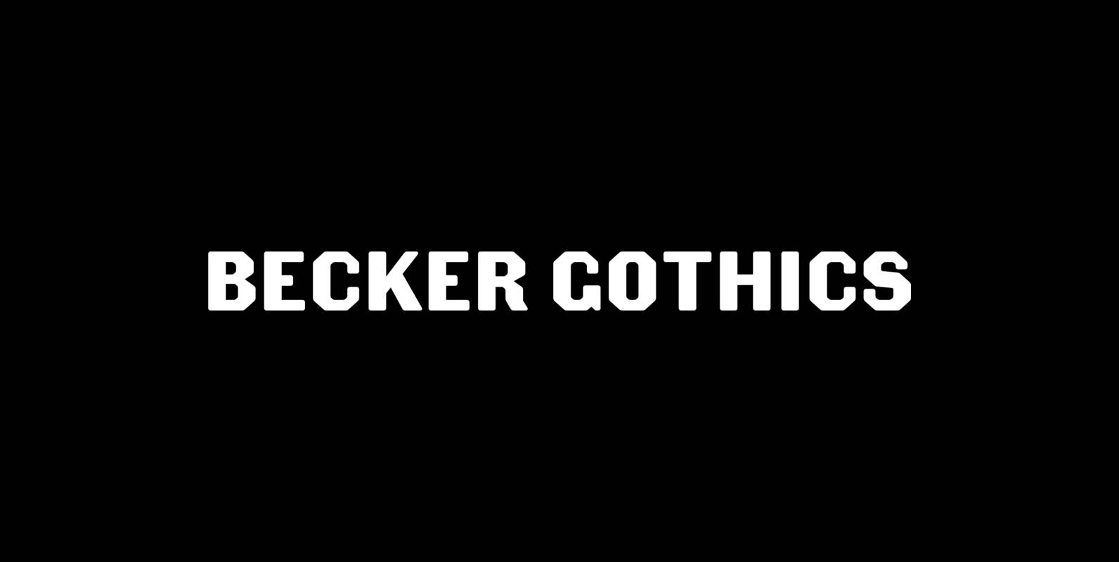
Becker Gothics Font
The Becker Gothics pay homage to the nineteenth century American lettering master George Becker. Designer James Puckett has given new life to the ingenious gothic alphabets found in Becker’s 1854 lettering manual Ornamental Penmanship. Use this quintet of typographic voices
Grandes Vacances Font
This woodtype is the one of the most unique, wild, tuscan themed fonts this side of the frontier. No other woodtype of tuscan decorative is more cute and sweeter than this family. Contains 3 font styles in the family, preview
Azalea Smooth Font
Azalea’s careful, inky strokes reference classic brush script styles of the 1950s, but its jaunty angularity is distinctly modern. Artfully irregular thicks and thins lend it an organic and slightly rustic feel, which is further enhanced in its rough-edged counterpart