Tag: Uneven
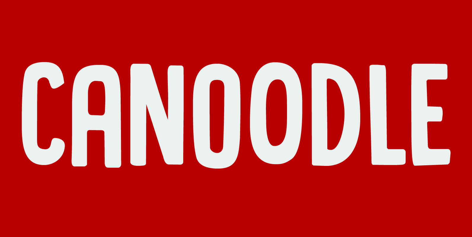
Canoodle Font
To canoodle means to hug and kiss passionately. I leave the rest to your imagination. Canoodle is also a very adorable font – some would even go as far as calling it kissable. It is an all caps typeface, but
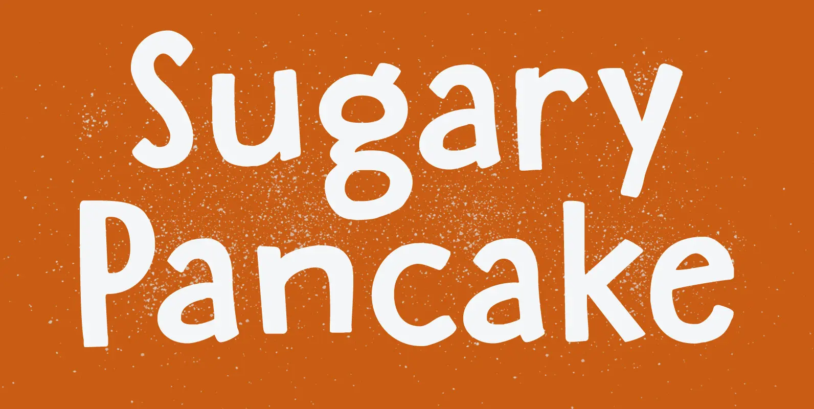
Sugary Pancake Font
enough as it is. This calorie-rich font is ideal for Children’s Books and posters: it is fun, bouncy, very legible and full of character. Comes with a topping of diacritics and a stack of happiness. Published by HanodedDownload Sugary Pancake
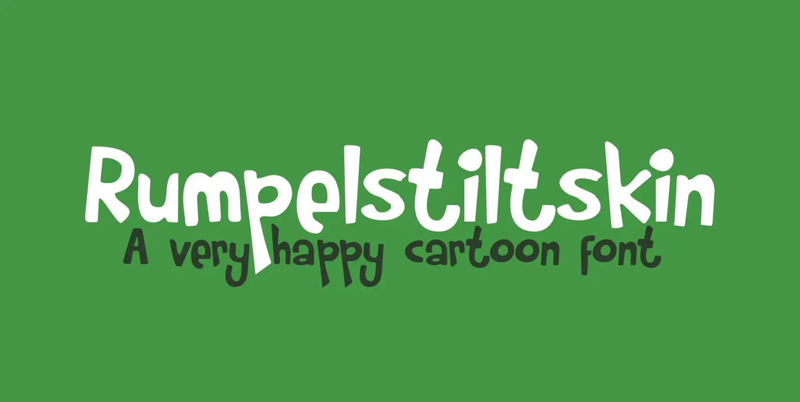
Rumpelstiltskin Font
Rumpelstiltskin has been around for a while now. It is a cartoonish, happy font with an uneven baseline, great for use in children’s books and cards. Comes with a treasure trove of diacritics. Published by HanodedDownload Rumpelstiltskin
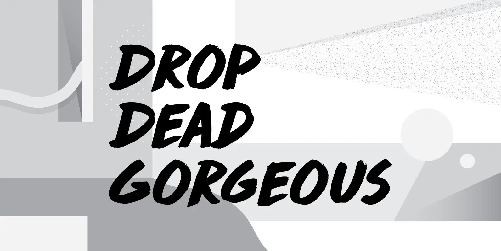
Drop Dead Gorgeous Font
Drop Dead Gorgeous is a slightly slanted all caps Brush font. I made it with the last of my Chinese ink (I ordered a new batch, it should arrive tomorrow). Drop Dead Gorgeous is a very legible font, ideal for
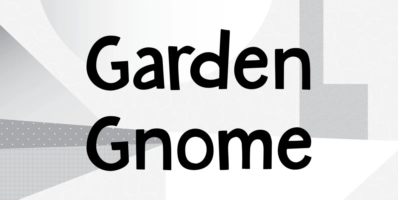
Garden Gnome Font
I am not really fond of Garden Gnomes, but this font is kinda cute and I figured it’d be a nice name. Garden Gnome is a very happy, easy to read Children’s Book font. It is bouncy, rounded and comes
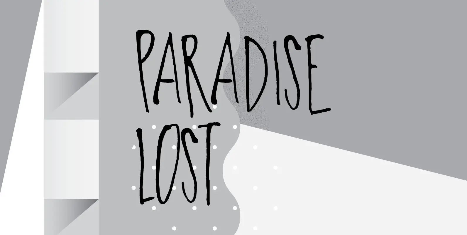
Paradise Lost Font
Paradise Lost is a 1667 poem by John Milton which mostly concerns the Biblical story of the Fall of Man, Eve’s temptation by the devil and the expulsion of Adam and Eve from Eden. It’s quite a hefty read, as
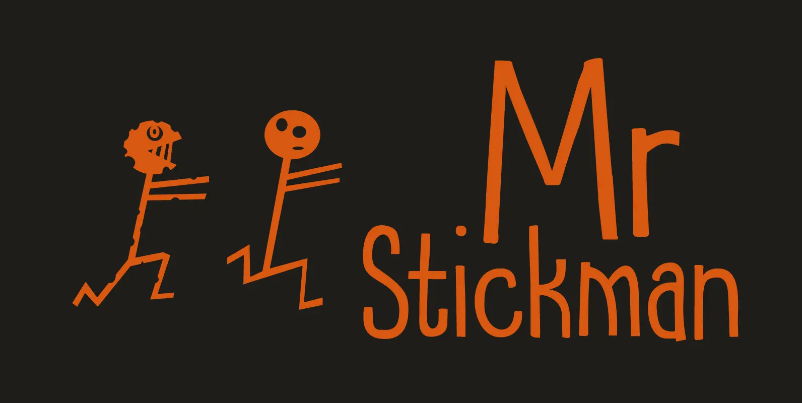
Mr Stickman Font
Mr Stickman is a happy clappy kind of font, inspired by an older font of mine called Oranjerie. Oranjerie is an all caps typeface, but Mr Stickman comes with lower case letters – AND – a Stickman Action Figures pack!
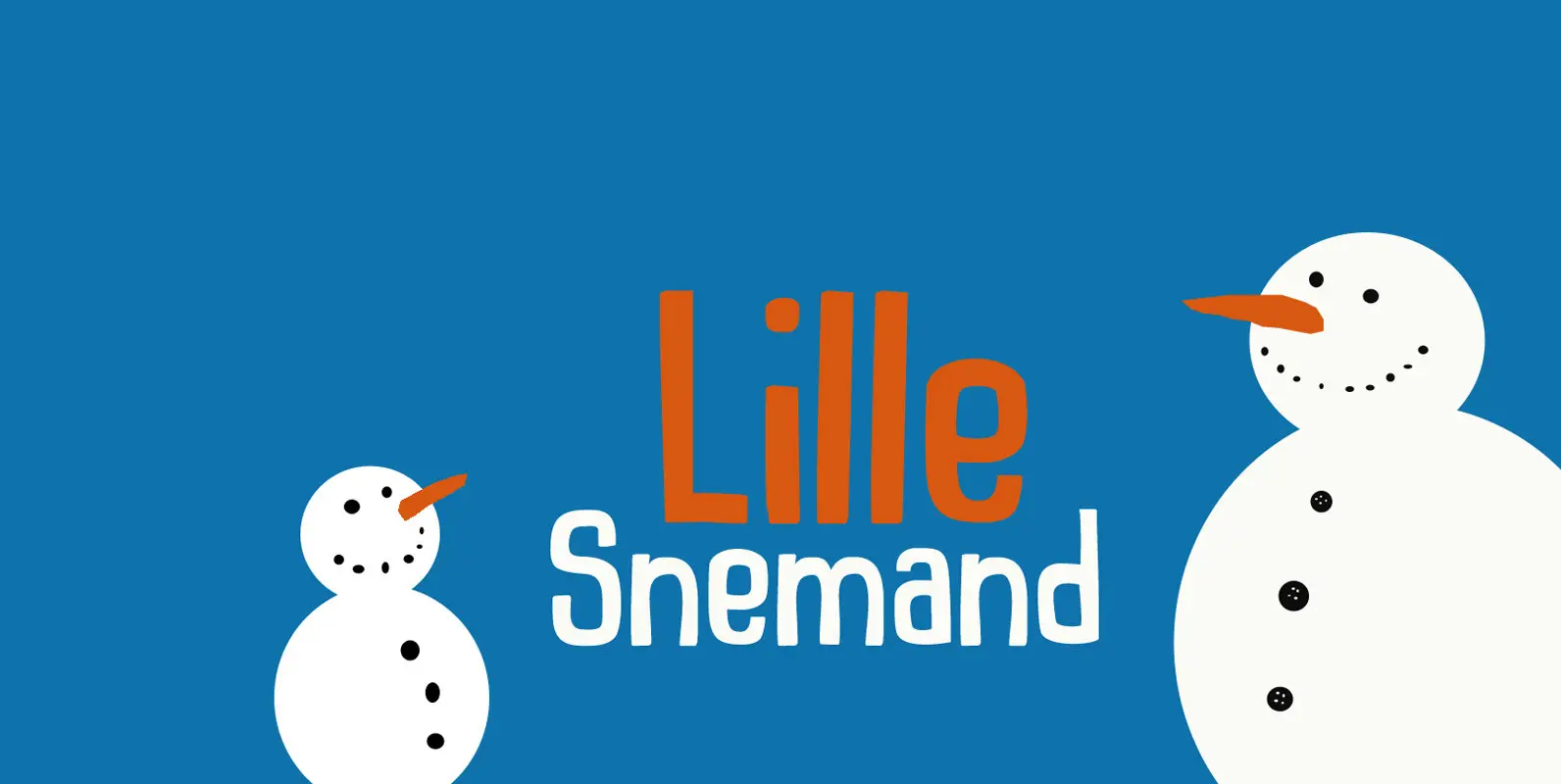
Lille Snemand Font
Lille Snemand, in Danish, means Little Snowman – like the Little Mermaid, but then colder… Lille Snemand is kin to the original Snemand font, which is an all caps typeface, but unlike its big brother, Lille Snemand comes with lowercase
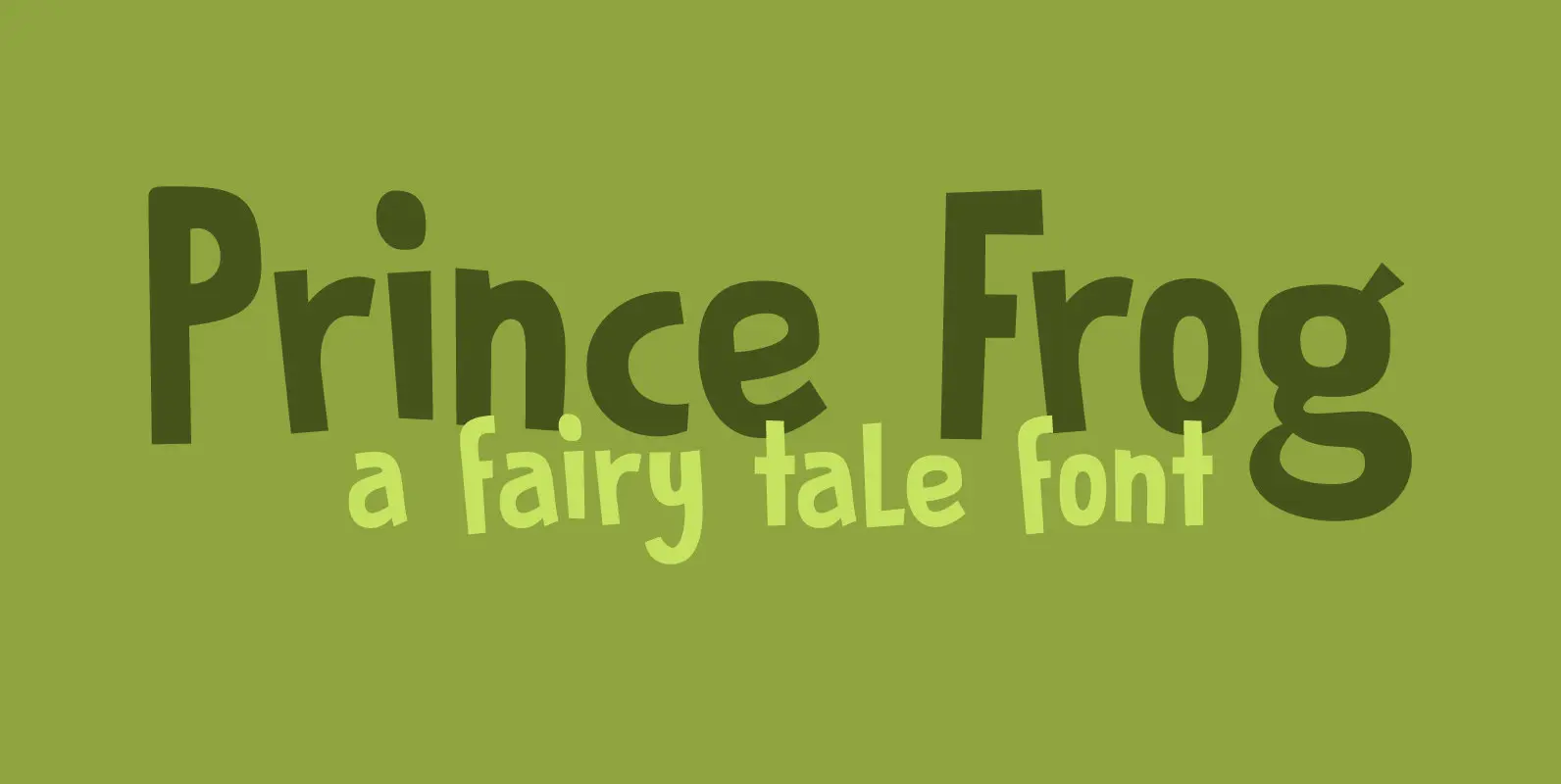
Prince Frog Font
Prince Frog started out as an attempt to ‘pimp’ Rabbit On The Moon font. It quickly evolved into an entirely different typeface with just a hint of ‘Rabbit’ in it. Prince Frog is a very happy, very legible font and
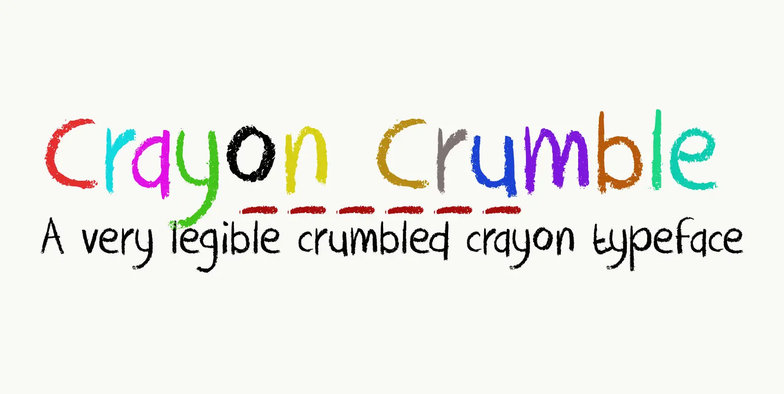
Crayon Crumble Font
Crayon Crumble is exactly what it reads on the package: it was made using cheap crayons, since the cheapies crumble a lot. It is a fun, kiddie font, with a grown-up look to it. It has been used for packaging,
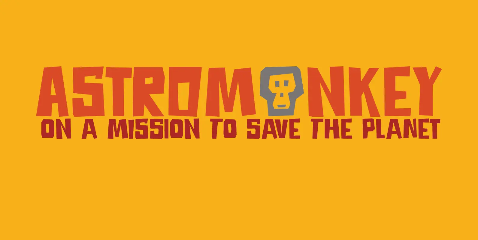
Astromonkey Font
Astromonkey – here he is, all new, all excited to be alive! Astromonkey comes from outer space, where he has rubbed shoulders with the Star Trekkers, the aliens and Major Tom, who is still floating in his tin can. The
