Tag: upright
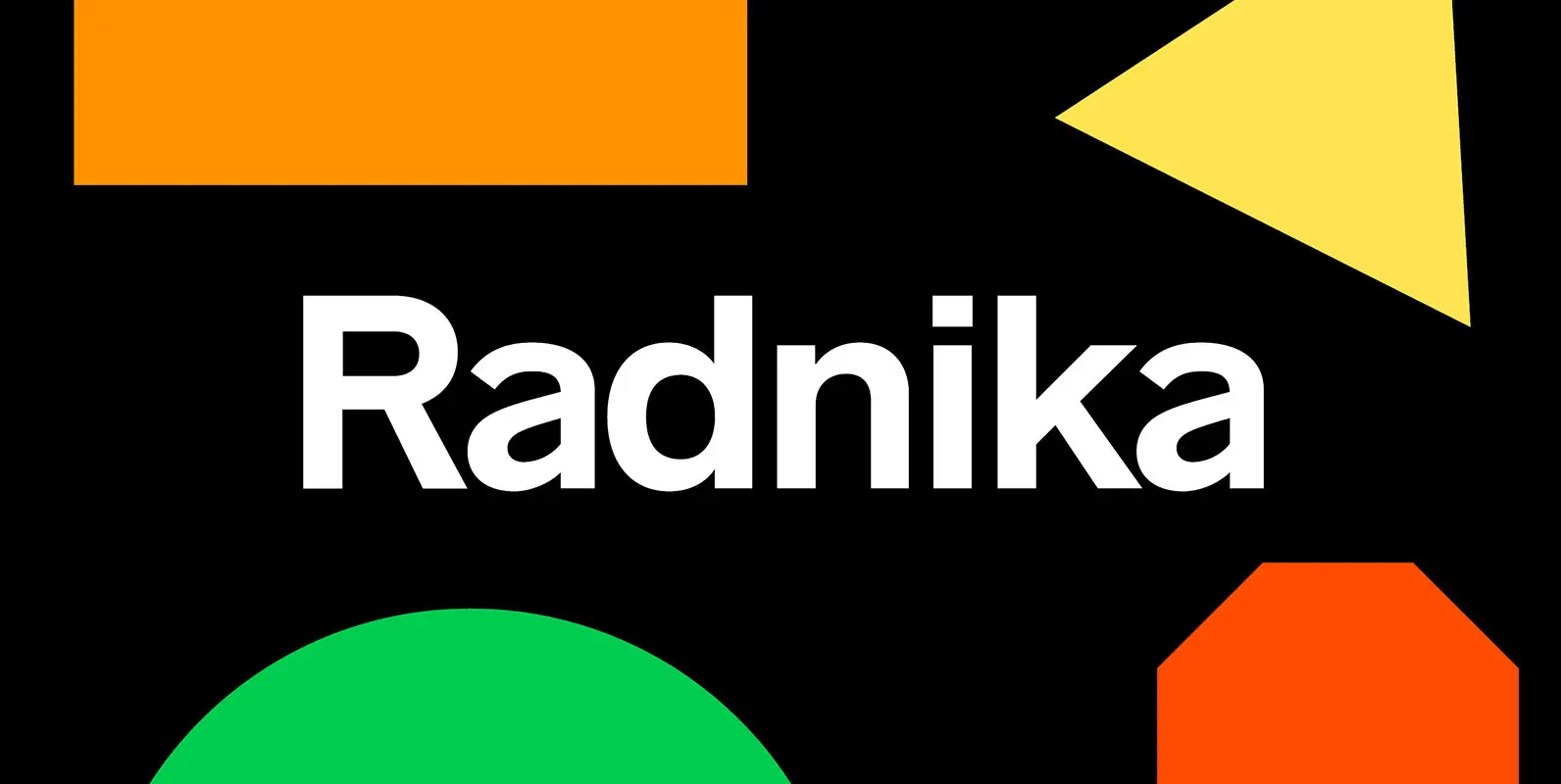
Radnika Font
Radnika is a multi-purpose sans serif typeface that bridges the gap between the strong expressive typefaces of the 19th century and the finer, rather stern, typefaces of the 20th century. Light, Regular, Medium, SemiBold, Bold, and Black each have corresponding
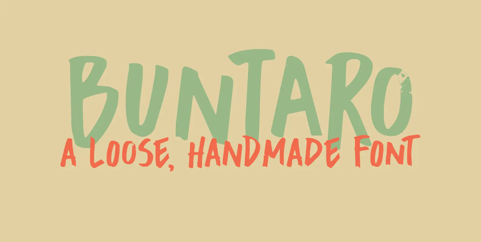
Buntaro Font
I am reading a great book by David Mitchell, called Number 9 Dream. One of the characters is called Buntaro, so I decided to call my new inky font after him. Like the book, Buntaro is quite unusual: it has
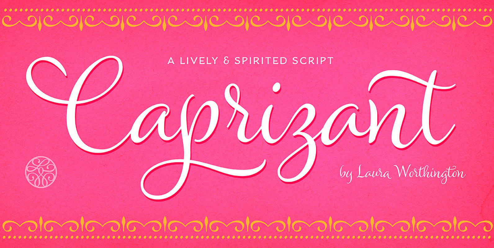
Caprizant Font
A lively upright script based on letters inked with a pointed pen. In its default setting, Caprizant is understated and readable enough to use at smaller sizes — in short blocks of body copy it can easily mimic beautiful handwriting.
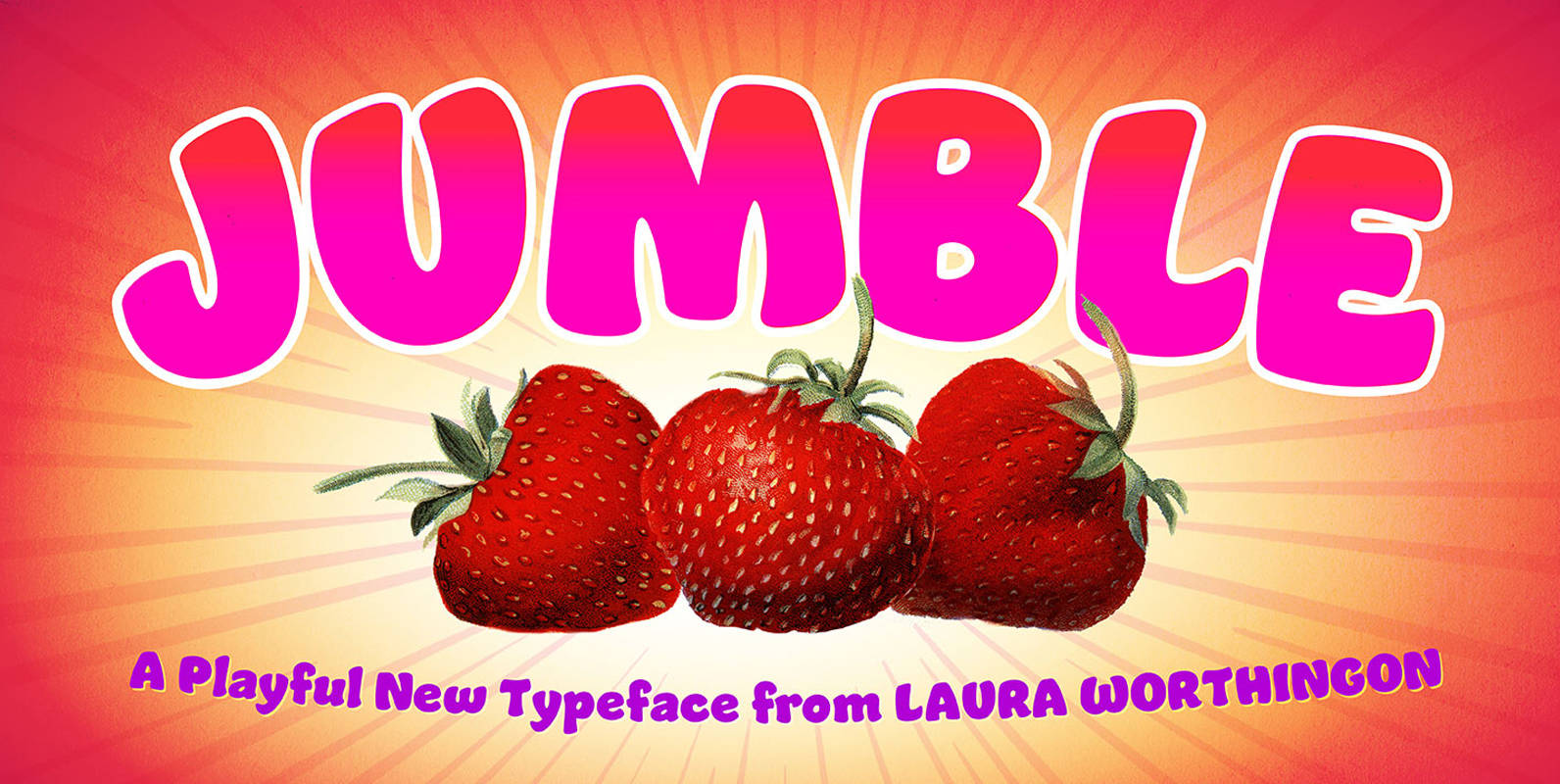
Jumble Font
A font this friendly, welcoming, and easy-to-read is a treat for the eyes. Jumble draws you in with its thick, curvy strokes, jaunty counters, and a whimsical variety of counterforms – no two are alike, even within a single m
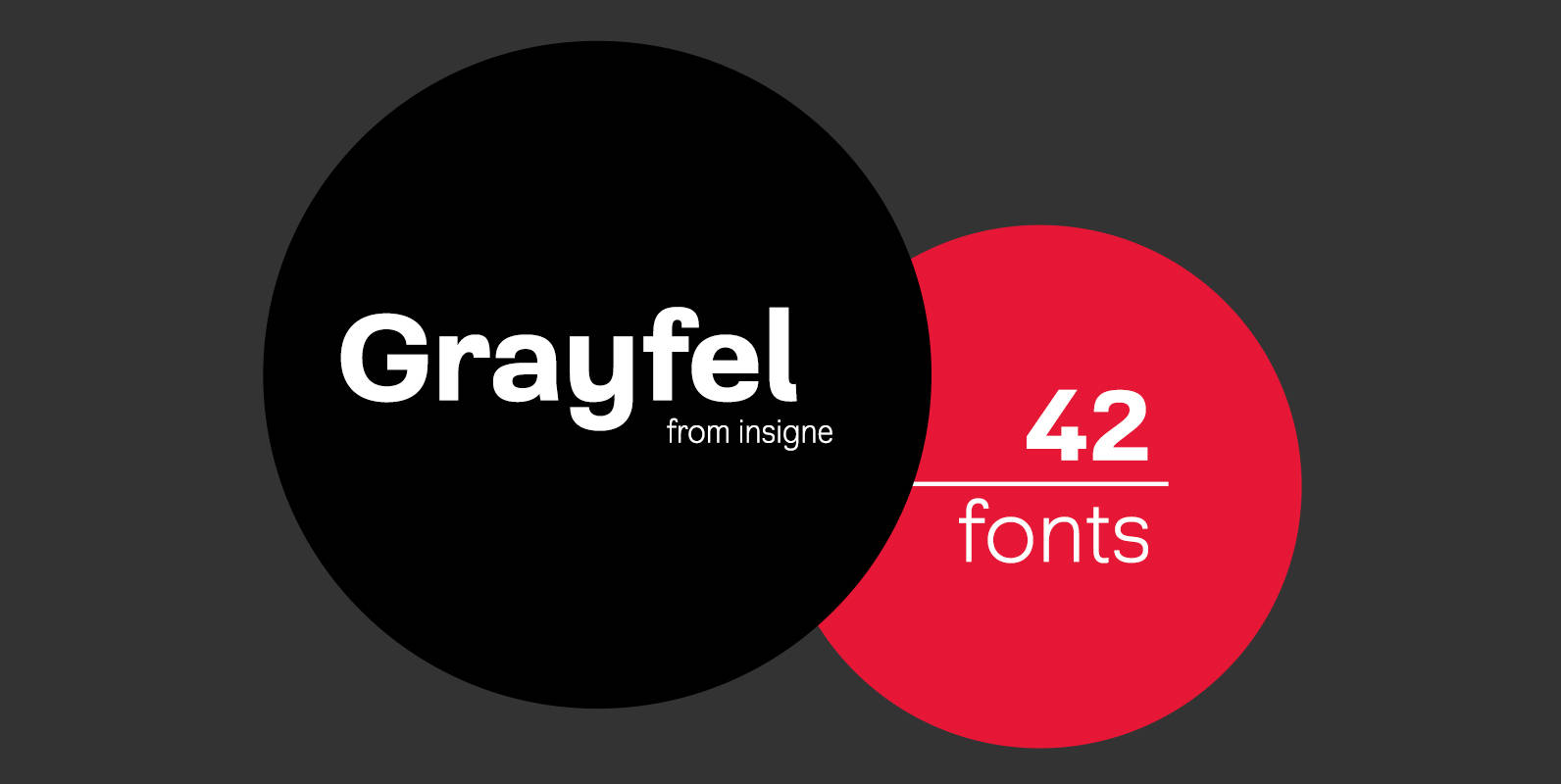
Grayfel Font
As designers, we seek perfection and originality. The more we step back and look at our work, the more changes we tend to find necessary. Drastic modifications are inevitable. The same is true of Grayfel. Grayfel began as an exercise
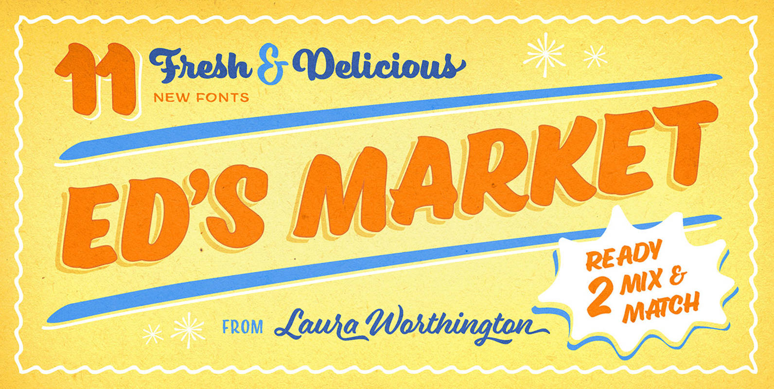
Ed's Market Collection Font
It’s like hiring your own professional sign painter with a solid repertoire of styles. Each one is distinctive, yet clearly by the same hand – in this case, Laura Worthington’s, holding a pointed brush. No variants were created on the
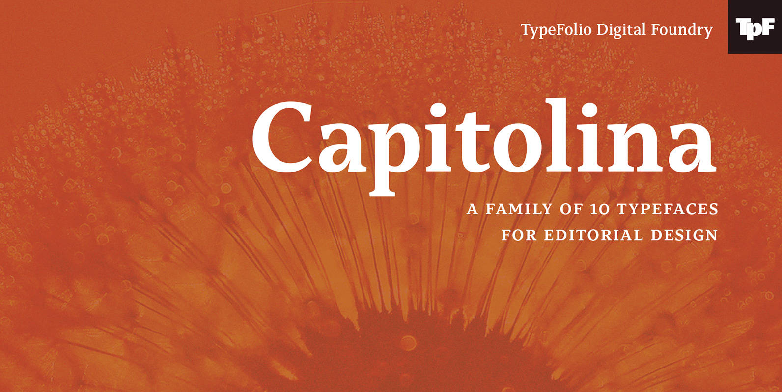
Capitolina Font
Capitolina is a family of 10 typefaces with a contemporary design style, based on different historical models. The original shape of serifs was a reference to 19th century’s Clarendon types though this inspiration remains as a subtle feature of the
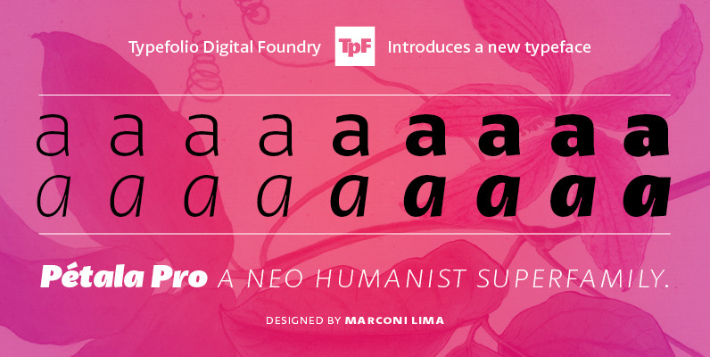
Petala Pro Font
Pétala Pro gave his first steps almost ten years ago. During this time, the quest for perfection had forced several interruptions. It was necessary recalculate the route, tread other ways, discover new maps, and make easy curves. After all, a
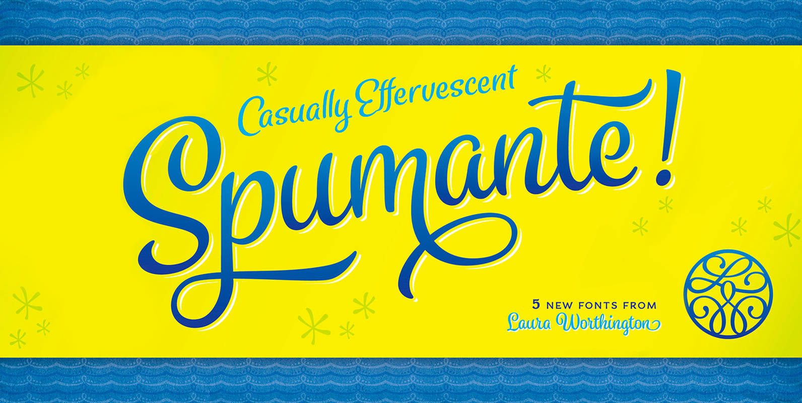
Spumante Font
A slim, semi-connected script with lithely upright curves, Spumante conveys the casual effervescence of its namesake wine. Smoothed brush-script letterforms bounce gently along the baseline, and letters vary slightly in their slant— characteristics that combine to create a very human
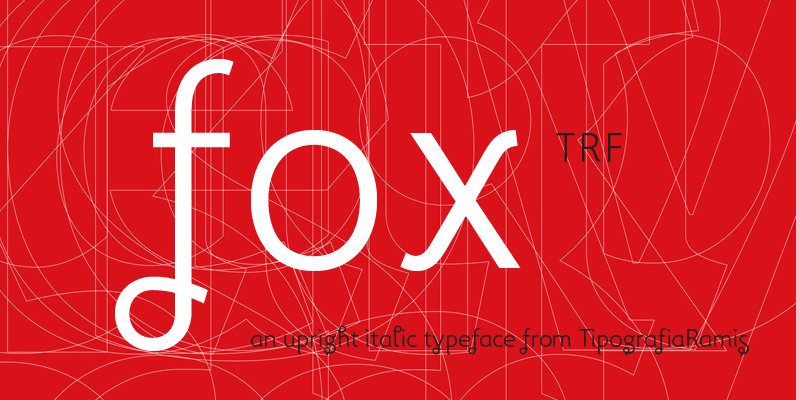
Fox TRF Font
Fox TRF is upright italic typeface with extralight, light, regular, bold and black weight styles. The most distinguished Fox characteristic is the lowercase letters. Their curly, playful and vivid letter forms were derived from handwritten lettering then carefully shaped and
Ronde Script Font
Ronde Script™ (Ronde meaning “A kind of script in which the heavy strokes are nearly upright, giving the characters when taken together a round look.”) is based on the original design named Parisian Ronde released in 1878 by the Chappelle
Azalea Rough Font
Azalea’s careful, inky strokes reference classic brush script styles of the 1950s, but its jaunty angularity is distinctly modern. Artfully irregular thicks and thins lend it an organic feel. This rough-edged version is a rustic complement to Azalea Smooth. Azalea
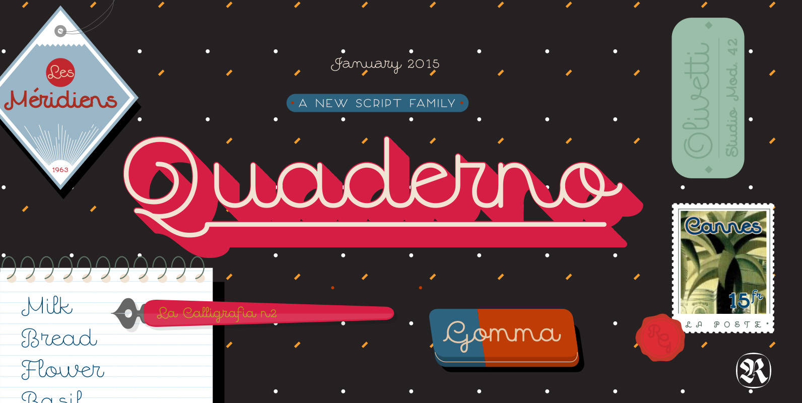
Quaderno Font
Quaderno is a light and mono-linear upright script, accompanied by the heavier weights, noodle and calligraphic versions. This connected script combining elements of the traditional Italian script Bella Scrittura and French script. Quaderno is best suited for middle length texts
Samantha Script Font
Based on pointed-pen lettering, Samantha features slightly condensed characters and a measured rhythm. It’s named after my niece who shares its optimistic style and discipline. Samantha is available in upright or italic variants, each with regular and bold weights. Samantha’s
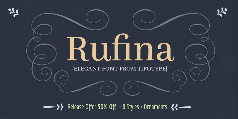
Rufina Font
Rufina was as tall and thin as a reed. Elegant, but with that distance which well defined forms seem to impose. Her voice, however, was sweeter, closer and when she spoke her name, like a slow whisper, one felt like
Azalea Smooth Font
Azalea’s careful, inky strokes reference classic brush script styles of the 1950s, but its jaunty angularity is distinctly modern. Artfully irregular thicks and thins lend it an organic and slightly rustic feel, which is further enhanced in its rough-edged counterpart
Sovba Font
Sovba is an amiable rounded sans-serif inspired by handwriting. Sovba is useful for a look that is uniquely casual, fresh and smooth. Sovba simplifies character forms down to their basic characteristics, and has a strong, silky smooth forward motion. Sovba
Grindel Grove Font
Several years ago, I was asked to design a brochure for a native plant habitat garden. I drew some scenic backgrounds with charcoal, used pen and ink to stipple detailed scientific drawings of the plants to be showcased in the