Tag: upscale
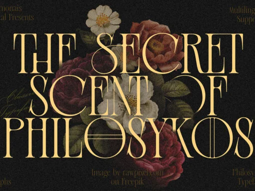
Aesthetic Fonts: Unveiling the Timeless Charm of Old Money Fonts
Step into a world of refined elegance and sophistication with Old Money Aesthetic Fonts. These captivating typefaces possess a timeless charm that transcends eras, making them an ideal choice for designers seeking to infuse their projects with a touch of
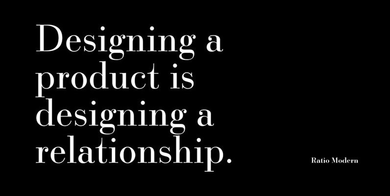
Ratio Modern Font
Designed in 1923 by Friedrich Kleukens for the Stempel foundry, Ratio was one of the first metal faces to bring the Didone genre to the forefront of industrial mass publishing as a headline and magazine face. Though essentially modern in
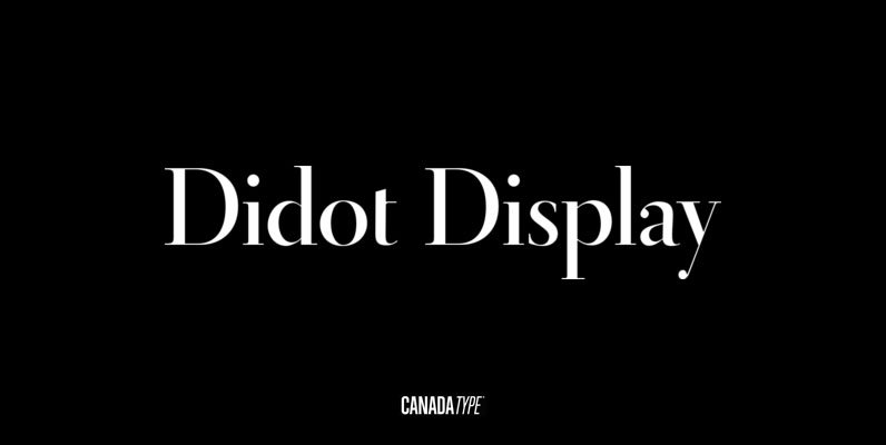
Didot Display Font
In spite of its name, this font family embodies the ultimate classic modern advertising typeface, rather than concern itself with revivalism or Didone authenticity. Naturally the spirit of the original Didot faces still exists in this family, but over twelve
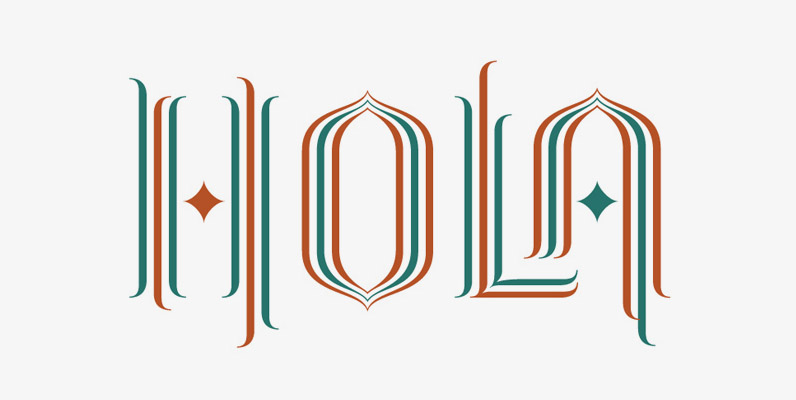
Crescendo Font
A year after the tremendous success of Memoriam in the Lives They Lived issue of the New York Times magazine at the end of 2008, Patrick Griffin and Nancy Harris Rouemy teamed up once more to tackle the same project
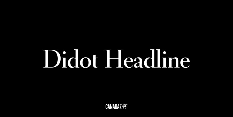
Didot Headline Font
In spite of its name, this font family embodies the ultimate classic modern advertising typeface, rather than concern itself with revivalism or Didone authenticity. Naturally the spirit of the original Didot faces still exists in this family, but over twelve