Tag: venetian

Goldie Old Style Font
Goldie, true to its name, is a captivating serif typeface designed specifically for eye-catching headlines. Its rounded serifs and subtle charm make it a perfect fit for movie titles, novel covers, posters, and other design projects that require a touch
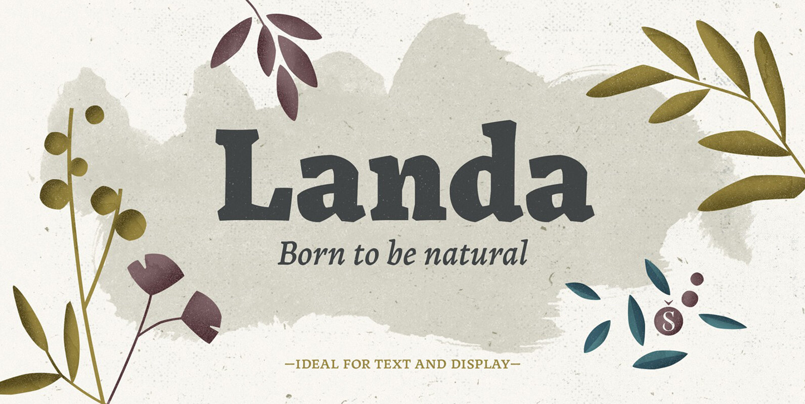
Landa Font
As good as Nylon is, there’s nothing better than a nice woolly blanket. The smell and coarse, uneven texture are relaxing and feel reassuring. More comfortable. In a world where technology can reach millimetric precision, sometimes it’s good to connect
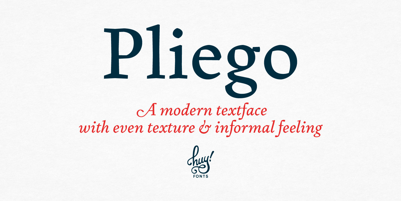
Pliego Font
Pliego is a textface designed to offer a comfortable continuous reading, with humanist proportions, an even texture, and informal calligraphic details noticeable only at big sizes, that gives it a contemporary feeling. Pliego has been named after Pliegos de Cordel,
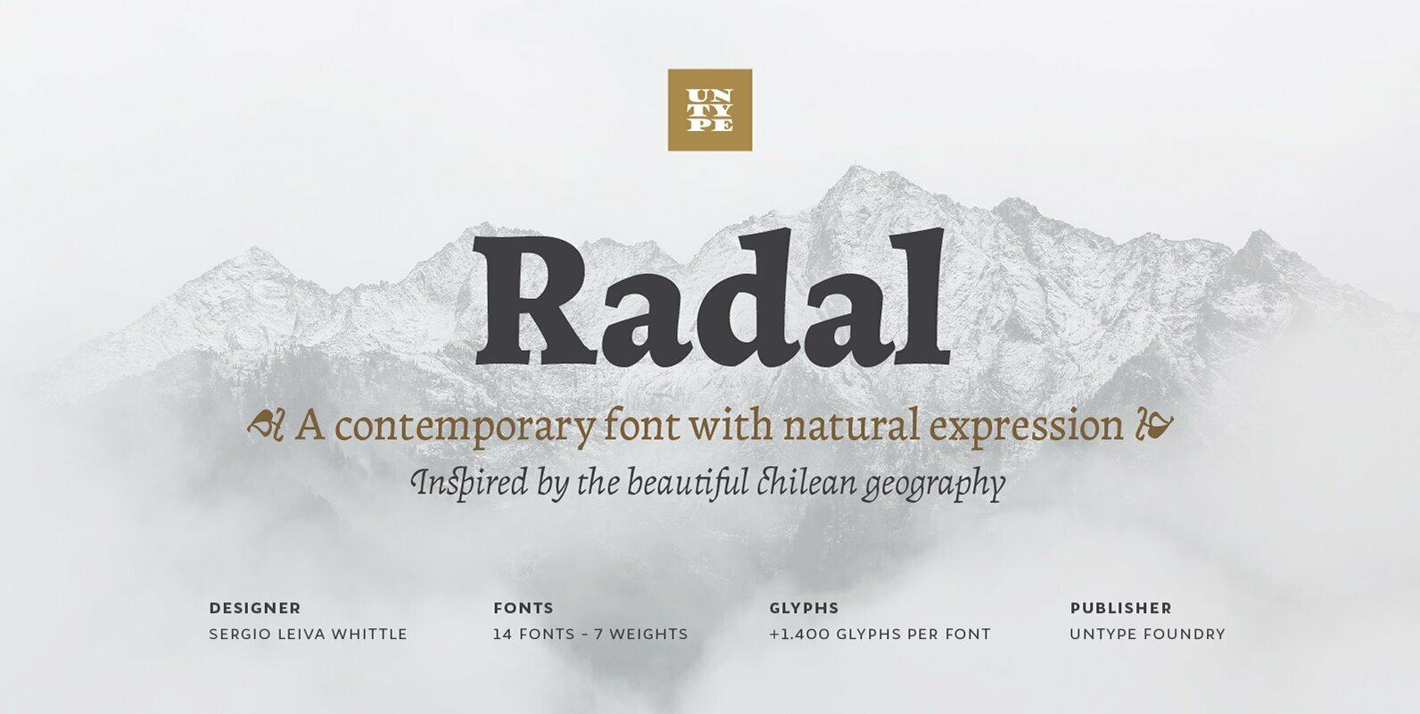
Radal Font
Two times awarded on Bienal Tipos Latinos 2012 and 2014, Radal is one of the most expected releases for all those who know well the Latin American type scene. Inspired by the capricious and temperamental southern Chile geography and the
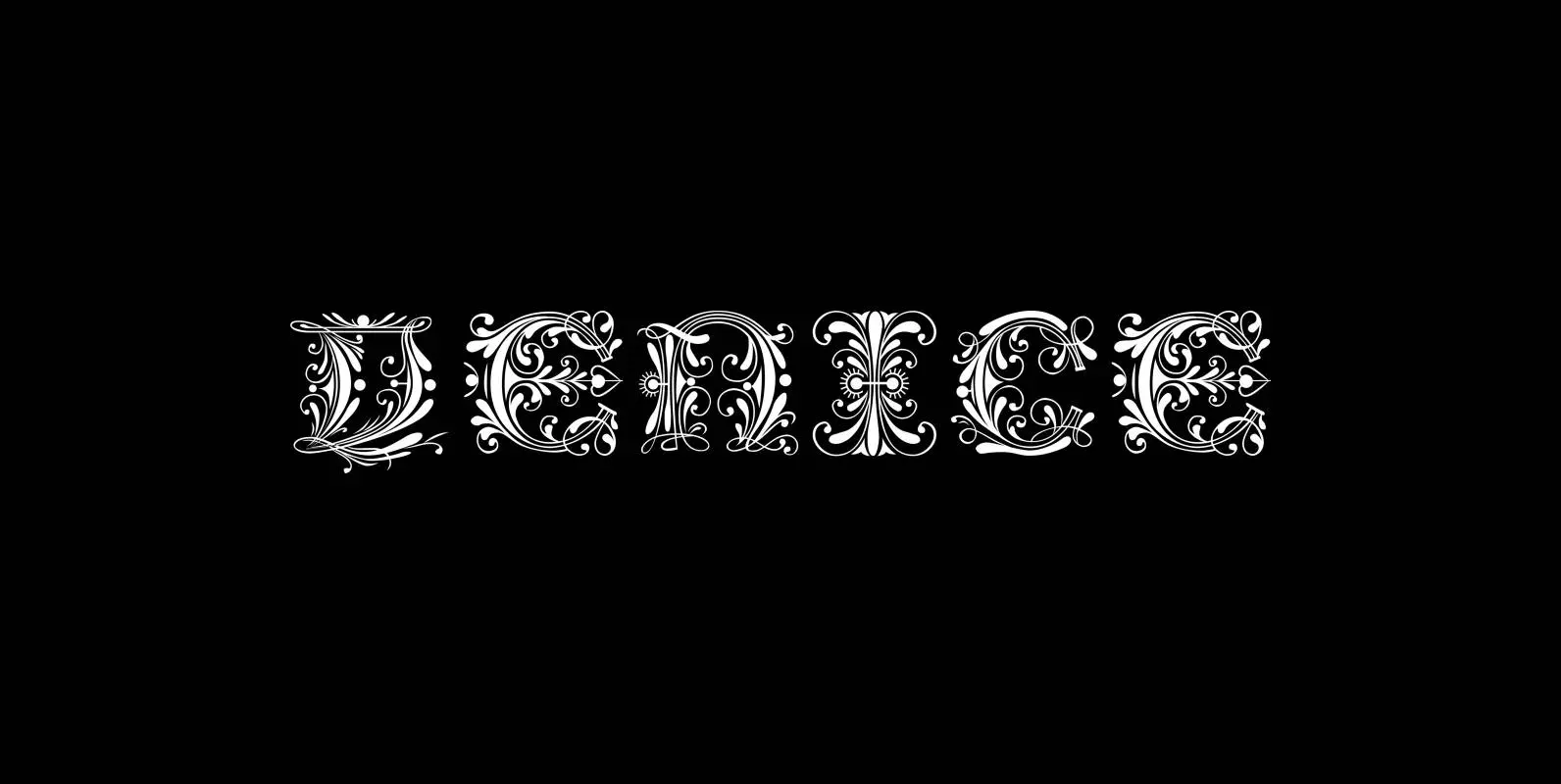
Venice Initials Font
“Venice Initials” are my redesign of a 15th century venetian original by an unknown calligrapher. Unfortunately only parts of the letters existed, so I had to design about half of them myself. Of course I enjoyed doing that. Published by

Dundee Font
Designed by A. Pat Hickson, Dundee is a new design inspired by the various mastheads used in children’s comic books in England, published by D.C. Thompson of Dundee, Scotland. Published by Red RoosterDownload Dundee

Goudy 38 Font
Designed by Les Usherwood. Digitally engineered by Steve Jackaman. Originally designed by Frederick Goudy for the original Life magazine, circa 1908. The typeface was used almost exclusively for their advertising and was often known as Goudy Gimbel; but the typeface

Garamond Font
Garamond was originally designed by R.H. Middleton for Ludlow, circa 1929-30. Digitally engineered by Steve Jackaman. Published by Red RoosterDownload Garamond

Silverado Font
Designed by Steve Jackaman, Silverado is based on a classic serif type design called Eldorado. Published by Red RoosterDownload Silverado

Waverly Font
Waverly is a round and soft serif designed by Les Usherwood, digitally engineered by Steve Jackaman. Published by Red RoosterDownload Waverly

Bellini Font
Designed by A. Pat Hickson, Bellini is an original design based on the typeface Progreso from the Gans foundry circa 1923. Published by Red RoosterDownload Bellini

Modernista Font
“Art Nouveau” happened over Europe under different names. They called it “Jugenstil” in Germany, “Le style moderne” in France, »Sezessionsstil« in Austria and Eastern Europe, “Stile Liberty” in Italy and “Modernista” in Spain. “Jugendstil” in Germany is what started modern

1543 Humane Jenson Font
In 1543 the well-known “De humani corporis fabrica” treatise on anatomy by André Vesale, was printed by Johann Oporinus in Basel (Switzerland). Various typefaces were used for this work, mostly in Latin but including Greek characters. Its Jenson-type font was
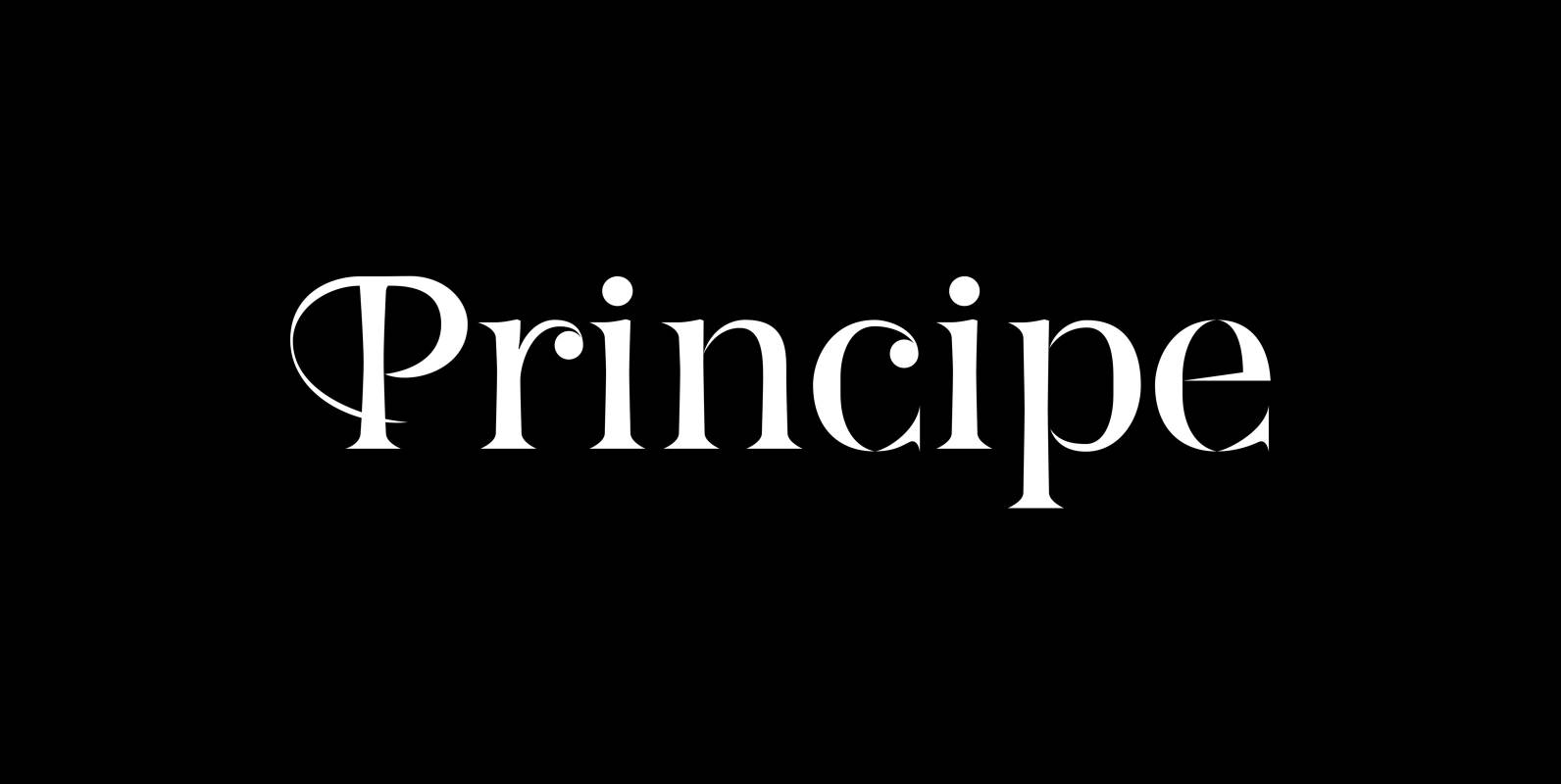
Principe Font
“Principe” is the Bodonian idea driven to the limit by abolishing most of the hairlines! The shape is completed only by the eye of the reader. This gives room for elegant embellishments and makes for a surprisingly new look to
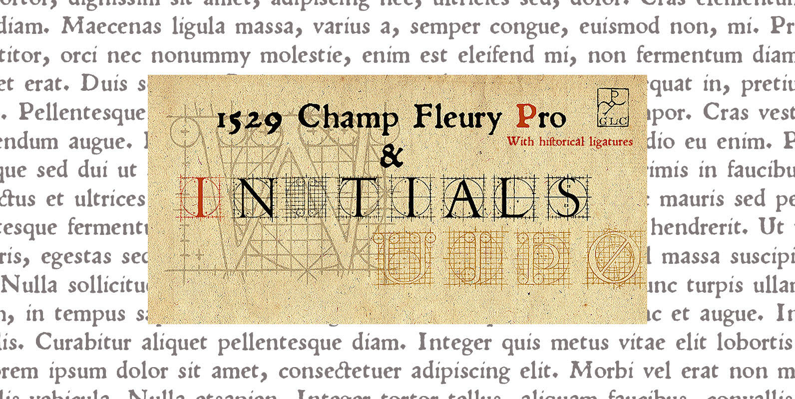
1529 Champ Fleury Pro Font
In 1529, Geofroy Tory, French scholar, engraver, printer, publisher and poet, was publishing the well known so called “Champ Fleury”, printed by Gilles de Gourmond, in Paris. It is a fully illustrated handbook where the author explain how to drawn
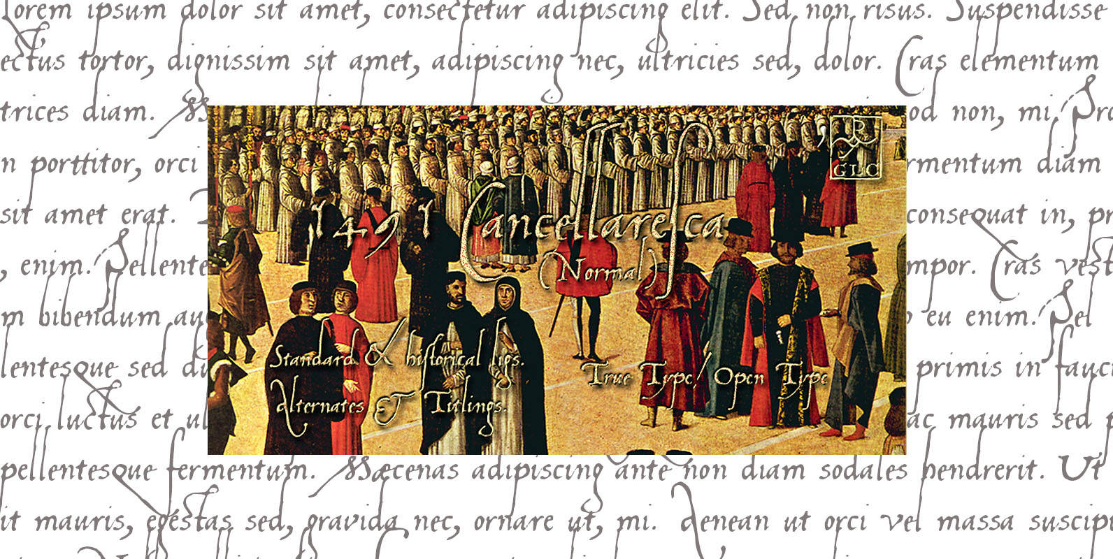
1491 Cancellaresca Font
This font was created inspired from the very well known humanistic script called Cancellaresca. Published by Gilles Le CorreDownload 1491 Cancellaresca
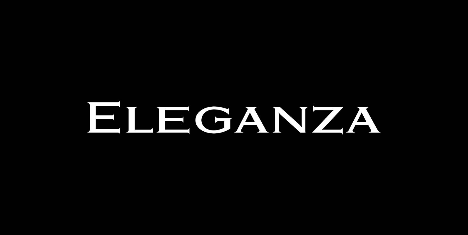
Eleganza Font
“Eleganza” is my most elegant typeface. At least that is what I think! I use it for business cards and everything that has to be elegant with that extra touch. The font comes in pairs for the price of one.

Sistina Font
Sistina, designed by Hermann Zapf in 1950 was first named Aurelia Titling. It is a heavy supplement to the Michelangelo Titling based on studies of inscriptions in Rome. First released in hotmetal at D. Stempel AG, Frankfurt in 1951, Sistina