Gaby Pro Font
Inspired by the 1947 Weber font Gabriele, Gaby Pro is a freshly designed versatile and everyday cursive font that can be use for a wide range of printed products and for web design as well. The font was carefully extended
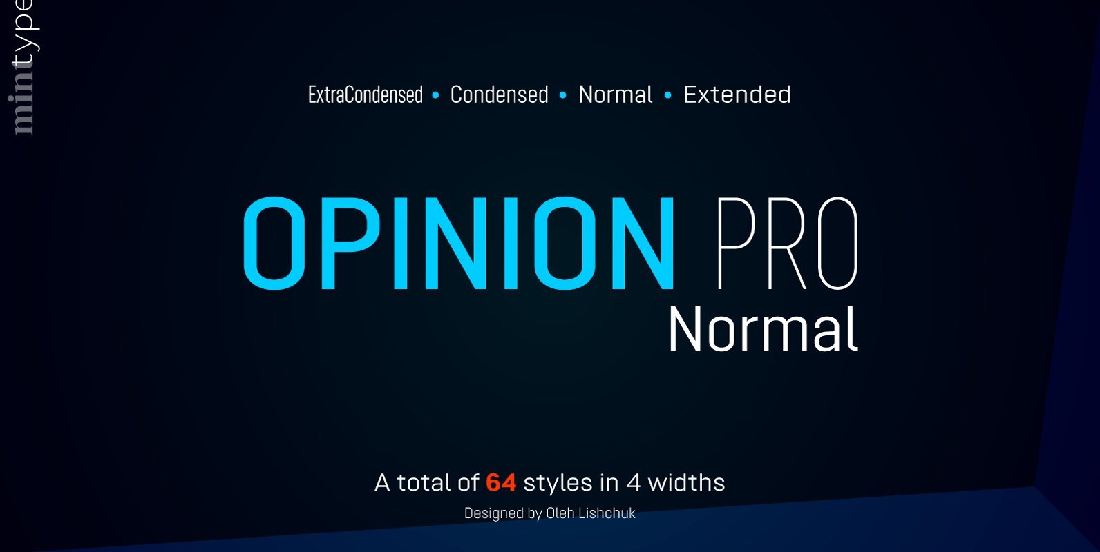
Opinion Pro is a geometric sans-serif typeface with extra-large x-height that comes in 64 styles. It is composed of 4 width variations, each in 8 weights with respective italics. Its rigid curves with pronounced vertical stems makes it useful as
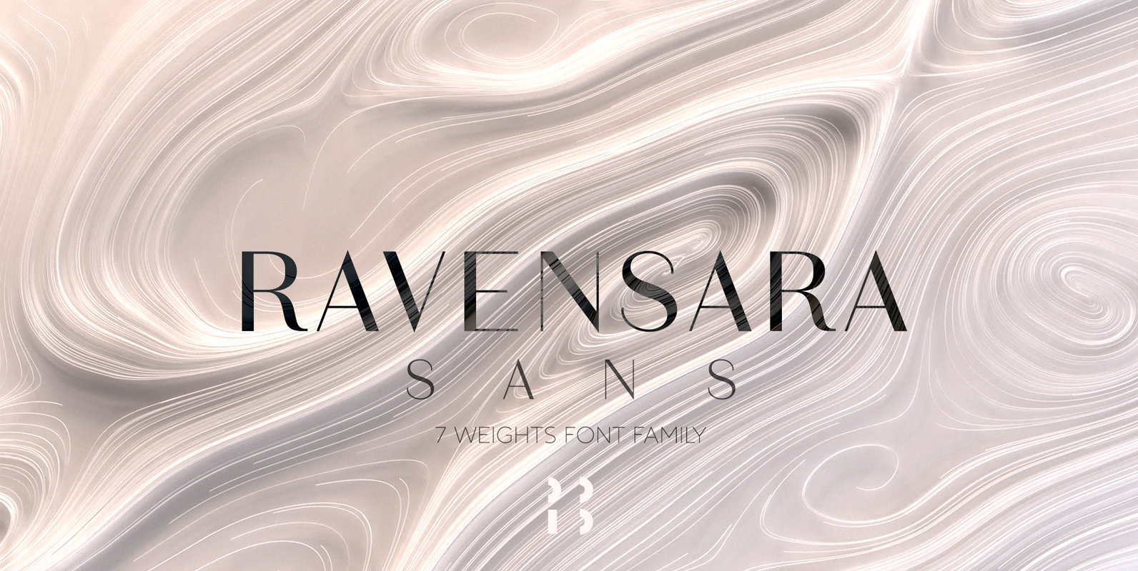
Ravensara is a contemporary, high contrast, sans-serif font family that contains 7 weight options. Published by NaumTypeDownload Ravensara Sans
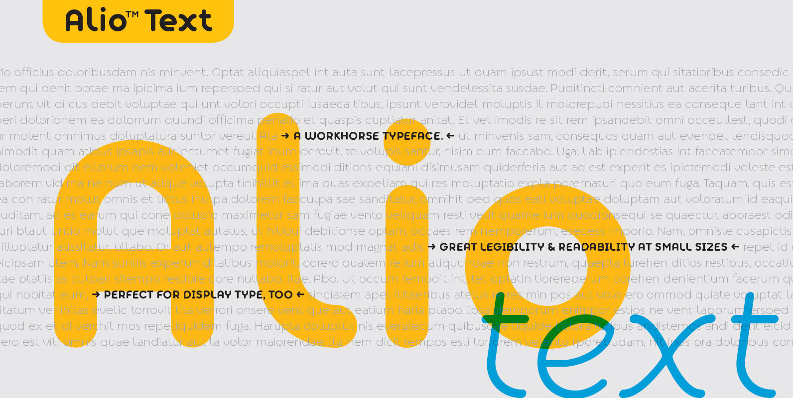
Alio Text is the workhorse of the Alio family. It works beautifully as display type, body copy and anything in between. We redesigned Alio Text with taller x-height, more pronounced accents, and wider letter spacing than its siblings, Alio Pro.
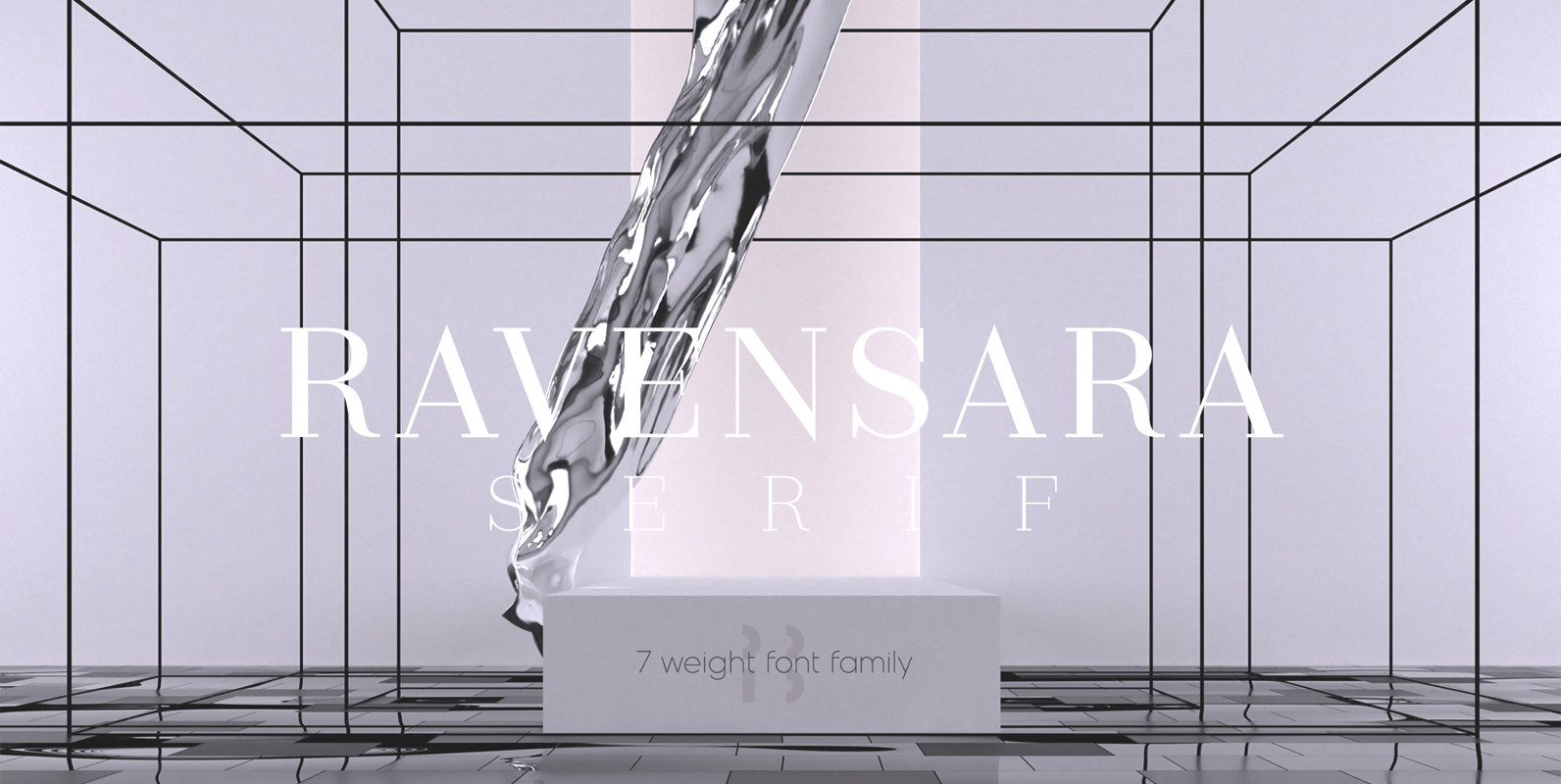
Ravensara is an elegant, high contrast serif design that contains 7 weight options. Published by NaumTypeDownload Ravensara Serif
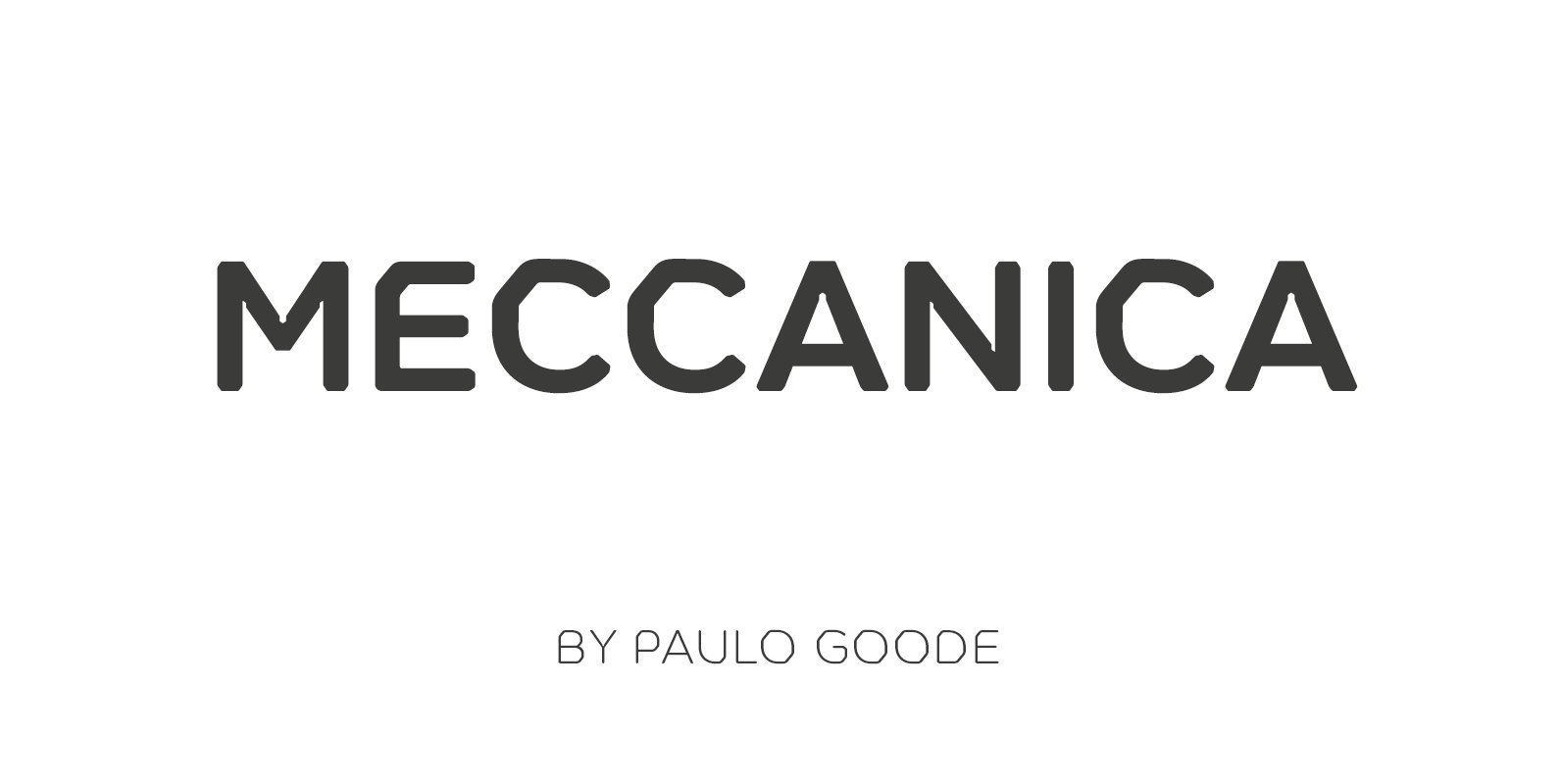
Meccanica is a geometric sans typeface like no other, its defining features include soft, chamfered edges, angular bowls and shoulders, angled/hexagonal terminals, and semi-hexagonal ink traps (in a nutshell). Inspired by the mechanics of engineering – the humble nut and
Inspired by the 1947 Weber font Gabriele, Gaby Pro is a freshly designed versatile and everyday cursive font that can be use for a wide range of printed products and for web design as well. The font was carefully extended
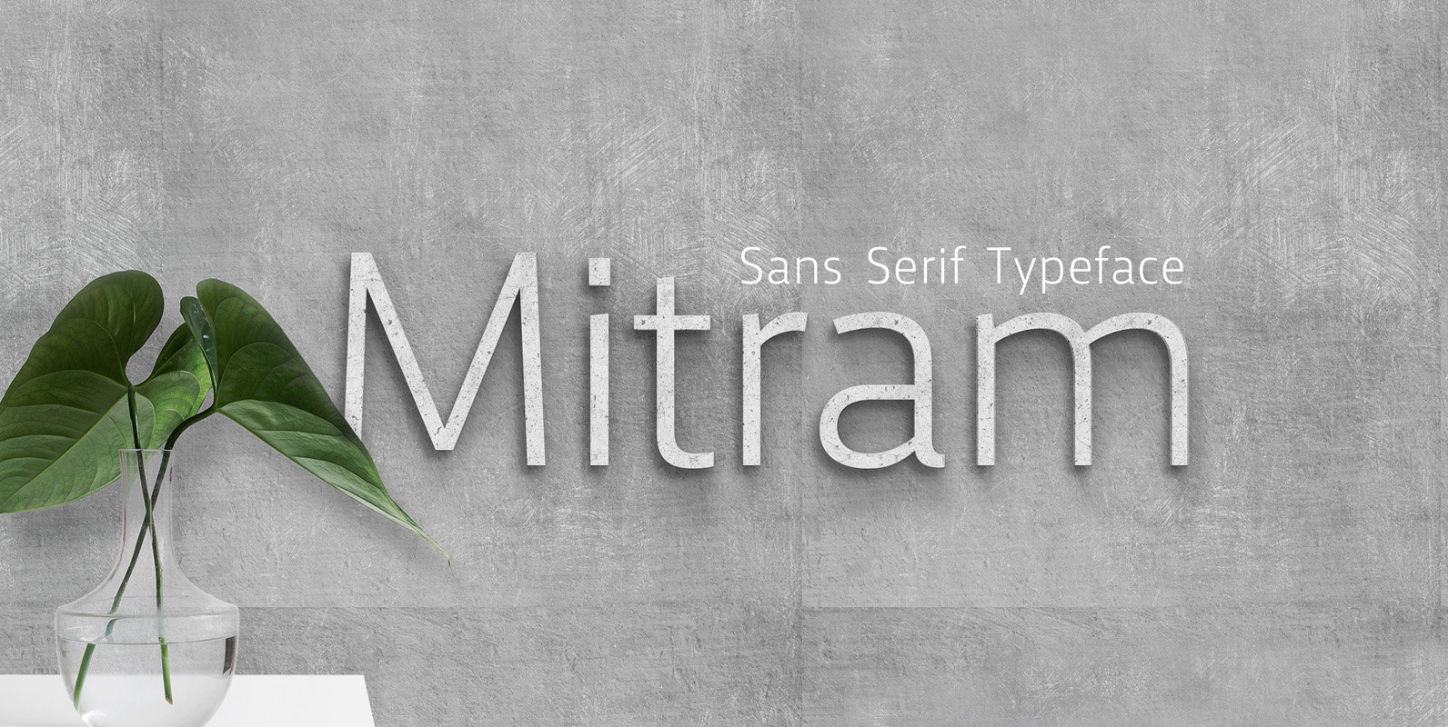
The Mitram family has 7 weights, ranging from Thin to ExtraBold (including italics) and is ideally suited for advertising and packaging, book text, logo, branding and creative industries, small text, wayfinding and signage as well as web and screen design.
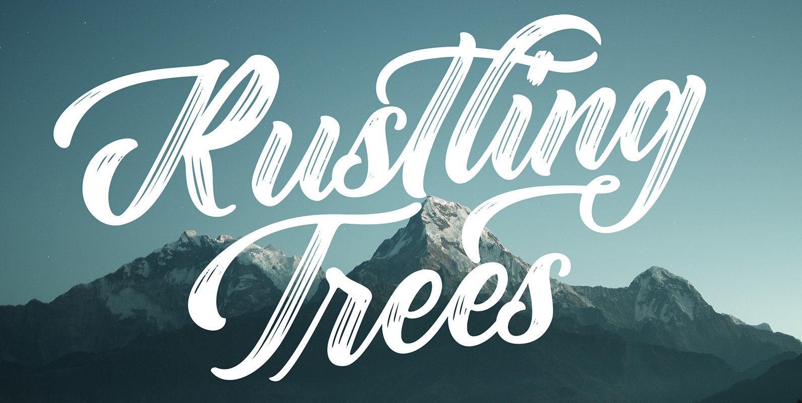
Rustling Trees is a script font design published by Adam Fathony. Published by Adam FathonyDownload Rustling Trees
P22 Blox is a modular system of shapes that can build letterforms and abstract patterns. Created as a working prototype for the letterpress P22 Blox project from P22 Analog and Starshaped Press, this system of shapes presents a unique approach
Over the past couple of decades, the many applications that joined print as media requiring design solutions have combined to necessitate a visual evolution that favours controlled optical geometry and careful counter-space consideration over ornamental features traditionally associated with print
Named after the Portuguese word ‘remember’, Lembra suggests a crossroad between contemporary forms and the calligraphic origins of writing. Hints of the calligraphic pen break the pristine sans-serif shapes, creating an unique overlapping of expressions. This combination of elements also
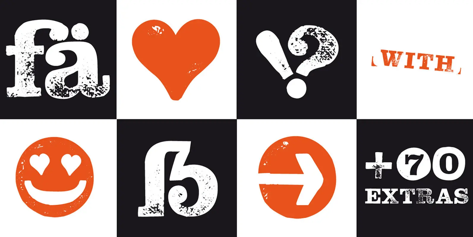
The typeface “Hand Stamp Slab Serif Rough” is designed for the Typo Graphic Design font foundry in 2017 by Manuel Viergutz. The display font with a classic slab serif type for headlines, based on real rubber stamp letters for a
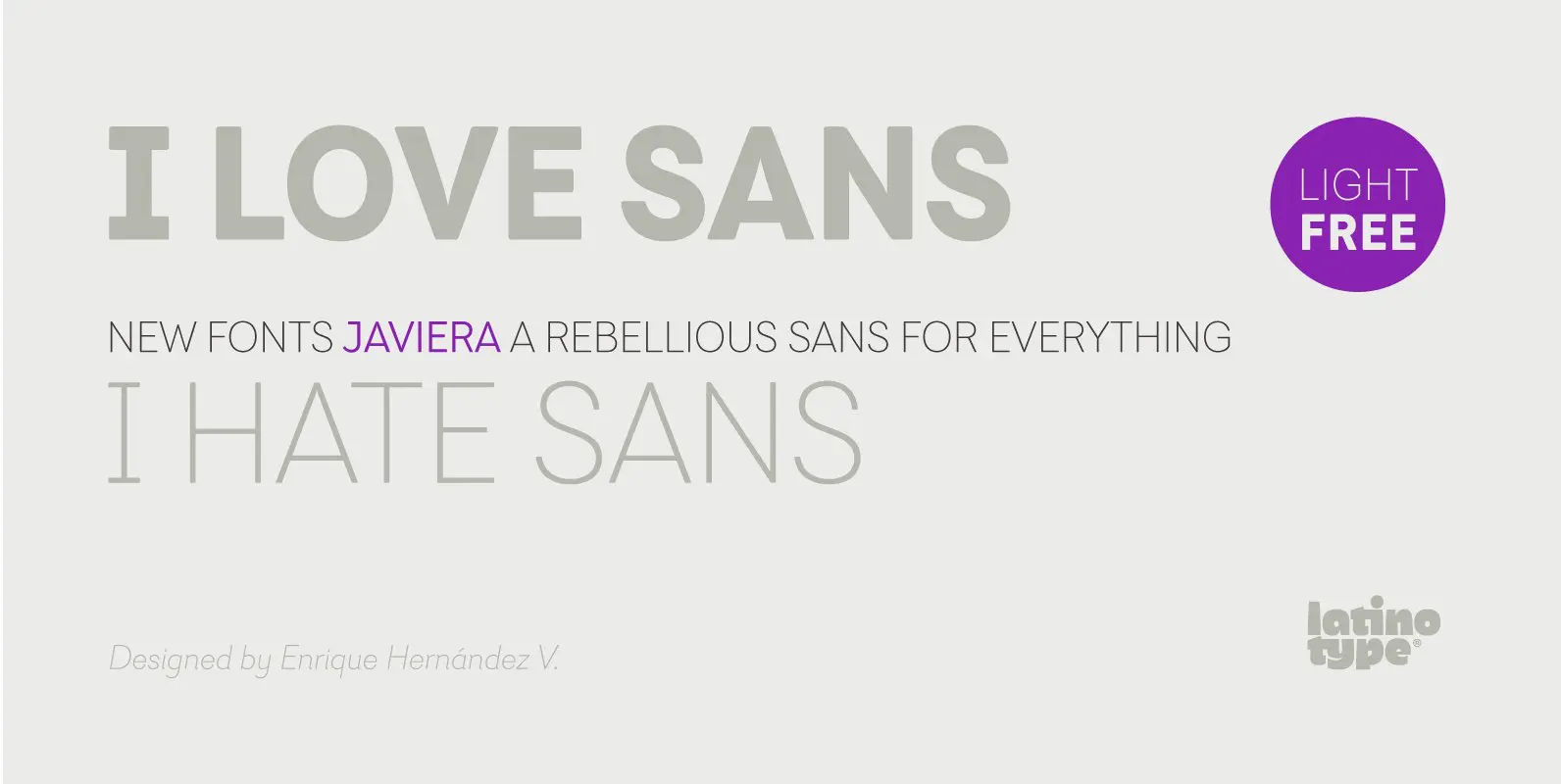
Javiera is a geometric sans-serif typeface with humanist attributes. One of its main features is its small x-height, which makes ascenders and descenders look longer. The contrast gives the font a more stylised look, typical of humanist fonts. Curves and
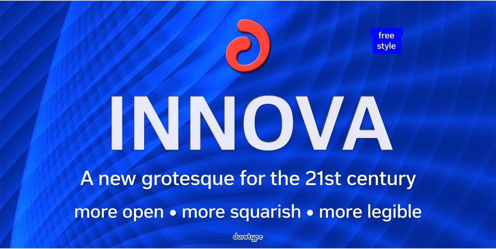
Innova. A new grotesque for the 21st century. More open. More squarish. More legible. After the many grotesques which have been designed over the years, is it still possible to improve this genre? Innova is a new design—a contribution to
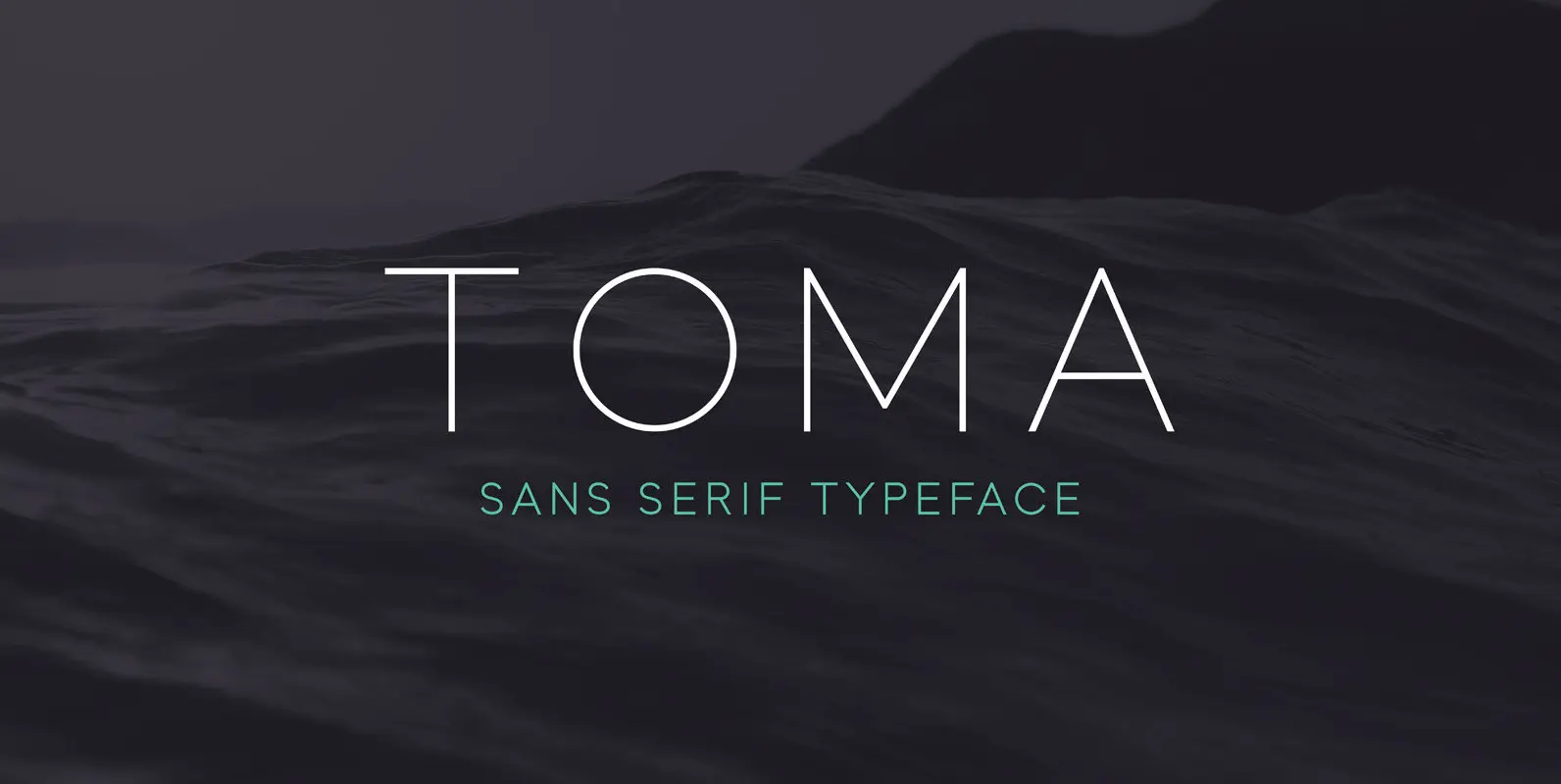
Toma Sans is a sans serif type family of seven weights plus matching italics. Influenced by the geometric-style sans serif faces that were popular during the 1920s and 30s, the fonts are based on geometric forms that have been optically
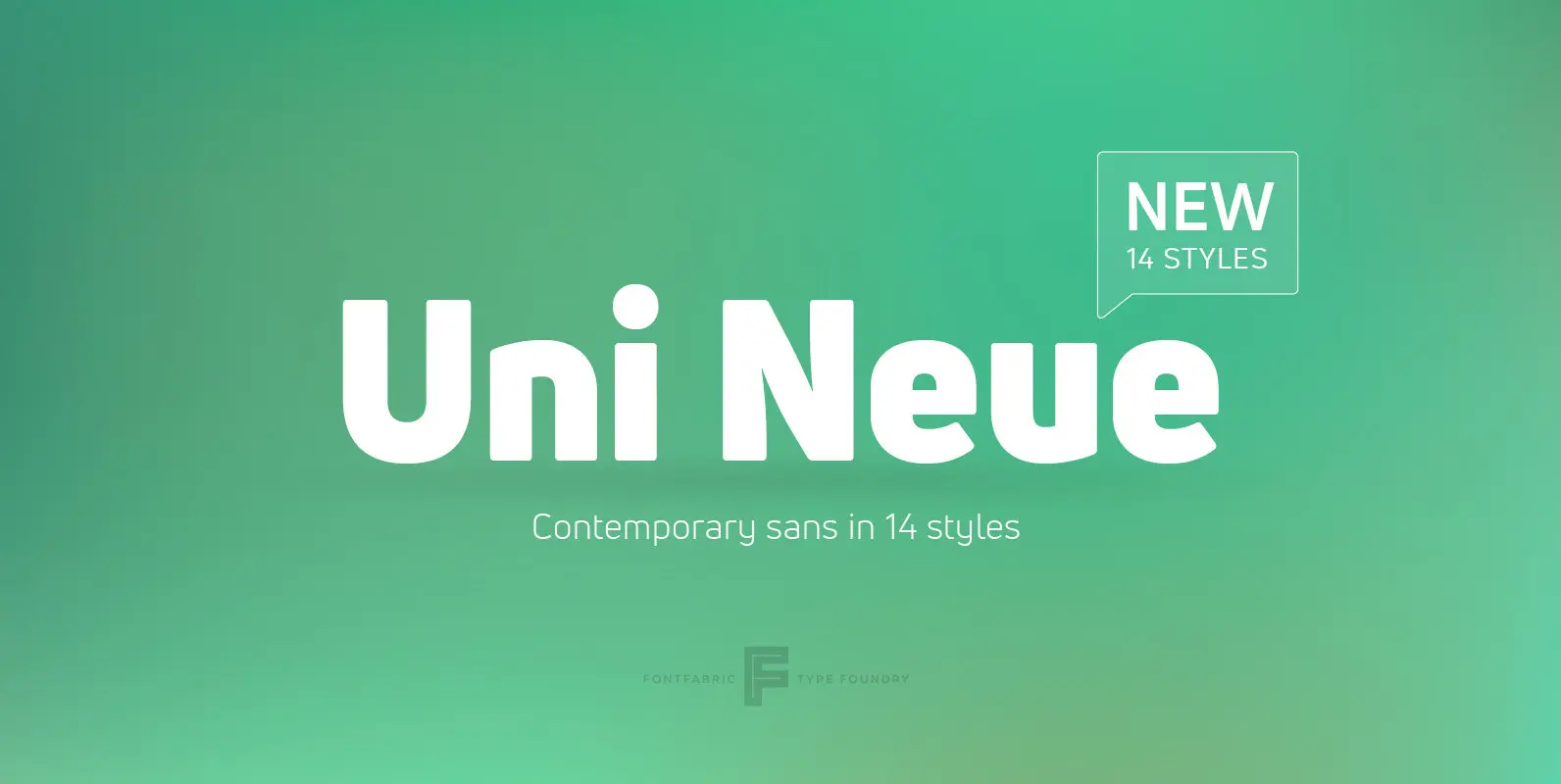
Uni Neue is the whole new redesigned version (remake) of Uni Sans – one the most recognizable and signature font families of Fontfabric type foundry. From major changes like proportions, widths and thickness (weights) to the smaller details, this new
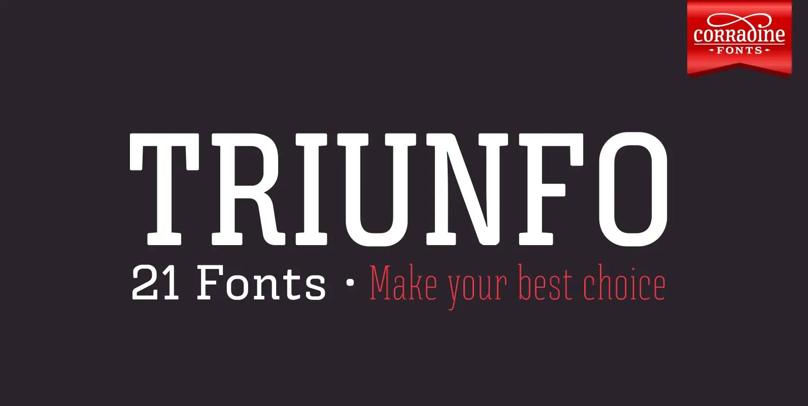
Triunfo is a modern slab serif font family with sports flavor. It comes in 21 variants of weight and wide that allows you to choose the best option to use in your work. Published by Corradine FontsDownload Triunfo